Visual Analytics and Colour Models
INTRODUCTION
This section presents a discussion of colours and how they are represented. Consider an image with a specified number of rows and a specified number of columns. The image is a 2D matrix along its two dimensions: rows for height, and columns for width. Each cell, or element, in that matrix is called a pixel, or picture element. Each pixel in the image contains a colour value. Greyscale images consist of a single colour value. If a continuous scale is used, this colour value ranges from zero (0), indicating black, to one (1), indicating white. If 8-bit values are used to represent colours, then zero indicates black and 255 represents white, as there are 256 values in an 8-bit colour (28 = 256). For colours, various colour models in addition to greyscale exist. The most common colour model is the RGB (Red, Green, and Blue) model. Other colour models include HSV (Hue, Saturation, Value) or HSL (Hue, Saturation, Lightness), and CMYK (Cyan, Magenta, Yellow, Black [K]) . Other colour models exist as well. The RGB colour model is the most common and is widely understood. In the RGB model, there are three channels: one each for red, green, and blue. In addition, an extension to the RGB model is the RGBA model, where “A” indicates alpha, or the transparency value of a pixel. The RGB model generally represents the values for the red, green, and blue channels with eight bits, meaning that each channel has values that range from zero to 255. In a continuous RGB model, each of the three channels have values that range from 0 to 1. However, it is a very easy task to convert from an 8-bit representation to continuous values. For 8-bit RGB values, each of the R, G, and B components are divided by 255 to convert to values that range from 0 to 1. For continuous values, each channel is multiplied by 255, and subsequently rounded, or truncated. For example, suppose that a pixel has an 8-bit RGB value of [120, 30, 255] – that is, the red channel has a value of 120, and the green and blue channels have values of 30 and 255, respectively. Then,
R = 120 / 255 = 0.4706 (to 4 decimal places)
G = 30 / 255 = 0.1176
B = 255 / 255 = 1.
Therefore for 8-bit RGB values of [120, 30, 255], the continuous representation is [0.4706, 0.1176, 1].
As another example, suppose that a continuous RGB value is given as [0.15, 0.8, 0.25]. Then,
R = 0.15 × 255 = 38.25, which, when rounded, is 38
G = 0.8 × 255 = 204.0 = 204
B = 0.25 × 255 = 63.75, which, when rounded, is 64.
There, the continuous RGB values of [0.15, 0.8, 0.25] are represented in 8-bit values as [38, 204, 64].
In the RGB model, grey colours – including black and white – are indicated when all three channels have the same value. For instance, in 8-bit representations, [0, 0, 0] indicates black, [255, 255, 255] indicates white, [40, 40, 40] is a dark grey, and [220, 220, 220] is a light grey.
The CMYK colour model is another model in common usage. C indicates the colour cyan (a colour with equal contributions of green and blue), M indicates magenta (with equal contributions of red and blue), Y indicates yellow (with equal contributions of red and green), and K indicates key, called as such because it is the main colour that determines the image colour. The CMYK model is used extensively in printing. Conversion from RGB to CMYK is dependent on the specific printing device being used. One such conversion formula is as follows, assuming that R, G, and B are represented with continuous values in [0, 1]. Given red, green and blue channels (R, G, and B):
K = min(1 – R, 1 – G, 1 – B)
C = (1 – R – K) / (1 – K)
M = (1 – G – K) / (1 – K)
Y = (1 – B – K) / (1 – K)
Note that to calculate C, M, and Y, the primary (R, G, B) colours that do not contribute are removed. For example, cyan, C, has contributions from green and blue, but not from red, and therefore the red component is removed (subtracted) in the calculation for cyan. Using the example of [75, 200, 32] in RGB, C, M, Y, and K can be determined. First, the 8-bit representation is converted to [0, 1].
R = 75 / 255 = 0.2941 (to 4 decimal places)
G = 200 / 255 = 0.7843 (to 4 decimal places)
B = 32 / 255 = 0.1255 (to 4 decimal places)
Continuing:
K = min(1 – 0.2941, 1 – 0. 0.7843, 1 – 0.1255) = 0.2157
C = (1 – 0.2941– 0.2157) / (1 – 0.2157) = 0.6250
M = (1 – 0.7843 – 0.2157) / (1 – 0.2157) = 0.0
Y = (1 – 0.1255 – 0.2157) / (1 – 0.2157) = 0.8400
Therefore, the 8-bit RGB colour [75, 200, 32] can be represented in CMYK as [0.6250, 0.0, 0.8400, 0.2157]. Converting CMYK to an 8-bit representation is straightforward and is left to the reader.
Example Python code will serve to demonstrate this conversion. Note that intermediate values in the calculation are not rounded to four decimal places, but that the full precision of the interpreter is used.
>>> ## Convert an 8-bit RGB value to CMYK.
>>> R = 75
>>> G = 200
>>> B = 32
>>> ## The R, G, B values must be converted to [0, 1]. An interesting approach using Numpy is shown here to convert all values with one operation; i.e. a vectorized operation. However, simple, straightforward conversion also works.
>>> R, G, B = np.array([R, G, B]) / 255
>>> ## Check.
>>> R
0.29411764705882354
>>> G
0.7843137254901961
>>> B
0.12549019607843137
>>> K = min([1 - R, 1 - G, 1 - B])
>>> K
0.21568627450980393
>>> C = (1 - R - K) / (1 - K)
>>> M = (1 - G - K) / (1 - K)
>>> Y = (1 - B - K) / (1 - K)
>>> cmykColour = (C, M, Y, K)
>>> cmykColour
(0.6249999999999999, 0.0, 0.84, 0.21568627450980393)
The CMYK values are those that were computed manually above, except that full precision was used.
Returning to the RGB model, if each of the three channels is represented with 8-bits, then since each channel has a possible 28 = 256 values, there are 28 × 28 × 28 = 224 = 16,777,216 distinct colour values that can be represented. In higher colour resolutions, such as 16-bit resolution, there are 216 × 216 × 216 = 248 = 281,474,976,710,656, read as 281 trillion 474 billion 976 million 710 thousand 656 distinct colours that can be represented.
Another two colour models that are widely used are HSL and HSV. HSL represents hue, saturation, and lightness, while HSV represents hue, saturation, and value. HSV is also known as HSB (hue, saturation, and brightness). These colour models are alternative representations to the RGB colour model and were designed by researchers in computer graphics to closely align with the way that humans perceive colours. A model related to HSL and HSV is the HSI model, where I indicates intensity. The reader may notice that “lightness”, “value” (or “brightness”), and “intensity” have similar meanings. However, the differences in the models lie in the calculation of L, V, and I. In the HSI model, I is defined as the average of the three red, green, and blue colour components. In the HSV model, the value, or V, is defined as the maximum of the red, green, and blue components, i.e., the maximum RGB component. Let this maximum value be called M, and let the minimum of the three components be called m. In the HSL model, lightness, or L, is defined as the average of the maximum and minimum colour components; that is, the mean (average) of M and m, or (M + m) / 2. HSL, HSV, and HSI values, like RGB values, can be expressed continuously (i.e., from 0 to 1) or in 8-bit representation. As is the case with RGB, higher resolutions (e.g., 16-bit) can also be used for the HSL/HSV/HSI models.
For example, suppose that an 8-bit colour is represented as [120, 200, 40]. The following values can be calculated.
In the HSV model, V = max(120, 200, 40) = 200
In the HSL model, M = max(120, 200, 40) = 200, and m = min(120, 200, 40) = 40, and therefore L = (M + m) / 2 = (200 + 40) / 2 = 240 / 2 = 120
In the HSI model, I = mean(120, 200, 40) = (120 + 200 + 40) / 3 = 360 / 3 = 120
The difficulty with both the HSV and HSL models is that human perception of colour is not adequately taken into account. From a perceptual viewpoint, these models do not accurately separate into their HSV or HSL components. A more perceptually accurate model is to represent lightness as luma, or Y′. Luma is the weighted average of R, G, and B values based on their contribution to the way that humans perceive lightness. This way of representing lightness has been used for many years as the monochromatic dimension in colour television broadcasts. Alternative weightings for luma exist such as Y′601. A full development of the various luma weightings is beyond the scope of the present discussion. However, an example will suffice to illustrate the concept. Returning the example RGB value of [120, 200, 40], a conversion to luma is as follows:
Y’601 = (0.2989 x R) + (0.5870 x G) + (0.1140 x B)
= (0.2989 x 120) + (0.5870 x 200) + (0.1140 x 40) = 157.828 = 158 (rounded).
The weights for the R, G, and B components of the Y’601 model were determined mathematically and experimentally. Note that the weights sum to one; i.e. 0.2989 + 0.5870 + 0.1140 = 0.9999, which is approximately 1.
In the HSV and HSL models, H is hue, or the “colourness” of a particular colour, or what the colour “is”. Red colours have a specific set of hue values, as do green and blue colours. S indicates saturation, or how “deep”, or “bright” (not in the sense of lightness, but in the sense of “richness”) the colour is. The more white (or grey or black) that a colour contains, the less saturated it is. For instance, the colour “pink” can be considered a type of unsaturated red because pink is comprised of red and white. Similarly, “sea green” is an unsaturated colour because it consists of green mixed with white. “Sky blue” is blue mixed with white and is another example of an unsaturated colour. All shades of grey are completely unsaturated, with S values of zero.
Several conversion algorithms exist that transform RGB values into HSV or HSL models. Conversely, algorithms exist that convert HSV or HSL to RGB. Which model is used is dependent on the type of application. Although RGB values are well understood, given three 8-bit numbers representing the three channels of RGB, it is often difficult to immediately perceive what colour is being represented. For example, what colour is [76, 130, 170]? One may accurately guess that it some shade of blue, as the B component has the highest value of 170. One may also assume that the colour is relatively moderately light, as its green and blue channels have relatively high values. It can further be assumed that the colour, when perceived, is perhaps closer to cyan than to blue, as green and blue are the highest valued channels. However, what is the saturation value? It is also difficult to accurately estimate how light the colour is. However, in the HSV or HSL model, one need only look at the at the V or L value to determine how light the colour is. Similarly, the hue provides an indication of what the colour is – whether it is more of a red, yellow, blue, green, or grey – and S indicates the degree of saturation: high values of S indicate a saturated, “bright” colour, whereas low values indicate an unsaturated colour or a colour mixed with white or grey.
A short example in Python will serve to illustrate these concepts. First, the hue of the primary colours, red, green, and blue will be determined. Then, the RGB representation of a pink colour will be determined from its HSV values. The Python library colorsys will be used in answering this question. The following code is entered at the Python command line. In this case, the functions take continuous values from 0 to 1 as arguments, instead of 8-bit integer values ranging from 0 to 255. However, as indicated above, it is simple to convert from one representation to the other. The output of the commands is shown in grey. The >>> is the Python command line prompt and indicates that the code was entered at the command prompt. When experimenting with the operations, do not enter >>>.
>>> import numpy as np ## For numerical functions....
>>> import matplotlib.pyplot as plt ## For plotting....
>>> import colorsys ## For simple colour conversions....
## Determine the hue (H) of red.
>>> R = 1.0
>>> G = 0.0
>>> B = 0.0
## Convert RGB to HSV.
>>> HSV = colorsys.rgb_to_hsv(R, G, B)
## Display the HSV value.
>>> HSV
(0.0, 1.0, 1.0)
## Determine the hue (H) of green.
>>> R = 0.0
>>> G = 1.0
>>> B = 0.0
>>> HSV = colorsys.rgb_to_hsv(R, G, B)
>>> HSV
(0.3333333333333333, 1.0, 1.0)
## Determine the hue (H) of blue.
>>> R = 0.0
>>> G = 0.0
>>> B = 1.0
>>> HSV = colorsys.rgb_to_hsv(R, G, B)
>>> HSV
(0.6666666666666666, 1.0, 1.0)
From these Python operations, it is seen that the hue for red, green, and blue is 0, 1/3 (0.3333…), and 2/3 (0.6666…), respectively. It is important to note that a hue of 0 is equivalent to a hue of 1. Therefore, the hue of red can also be expressed as 1, as can be seen with Python operations.
>>> H = 1
>>> S = 1
>>> V = 1
>>> colorsys.hsv_to_rgb(H, S, V)
(1, 0.0, 0.0)
Setting the hue to 1 and converting returns the expected RGB representation of red, with R = 1, G = 0, and B = 0.
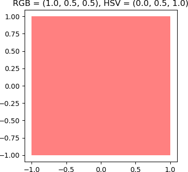
Now, the RGB value of a pink colour will be calculated from its HSV values, and a square filled with the resulting colour will be displayed. Recall that pink can be considered as an unsaturated red; that is, red mixed with white. In this example, partial unsaturation is used. Any S value less than 1 will suffice, but in this example, saturation will be set to 0.5. For simplicity the value/brightness/lightness of the colour will be maximum; that is, V is set to 1.
## Construct a specific pink colour in HSV, and then obtain the RGB value.
## 'Pink' can be considered as an unsaturated red colour.
## Use the maximum value/lightness/brightness.
>>> H = 0.0 ## Hue of red, obtained above....
>>> S = 0.5 ## Partial unsaturation....
>>> V = 1.0 ## Maximum value....
## Determine RGB.
>>> rgbPink = colorsys.hsv_to_rgb(H, S, V)
## Display the value.
>>> rgbPink
(1.0, 0.5, 0.5)
## Display the colour as a 2 x 2 square. Set the x- and y-coordinates.
>>> x = np.array([-1.0, -1.0, 1.0, 1.0])
>>> y = np.array([1.0, -1.0, -1.0, 1.0])
## Display a small figure of size 4 x 4.
>>> plt.figure(figsize = (4, 4))
<Figure size 400x400 with 0 Axes>
## Enforce that the two axes are equal.
>>> plt.axis('equal')
(-0.05, 1.05, -0.05, 1.05)
## Draw a filled polygon using the x- and y-coordinates of the square.
>>> plt.fill(x, y, facecolor = rgbPink)
[<matplotlib.patches.Polygon object at 0x01356EE0>]
>>> ## Extract the RGB values.
>>> R, G, B = rgbPink
## Add a title to the figure.
>>> figTitle = 'RGB = ' + str((R, G, B)) + ', HSV = ' + str((H, S, V))
>>> figTitle
'RGB = (1, 0.5, 0.5), HSV = (0, 0.5, 1)'
>>> plt.title(figTitle)
Text(0.5, 1.0, 'RGB = (1, 0.0, 1.0), HSV = (1, 0.5, 0.5)')
## Display the result
>>> plt.show(block = False)
The resulting Maplotlib figure is shown below.
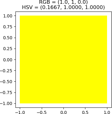
Now, the HSV value will be determined for the colour yellow. Since yellow is the addition of red and green; i.e., the RGB value is (1.0, 1.0, 0.0). Therefore, it is to be expected that the hue for yellow is equally red and green. The hue for red on the [0, 1] scale, as seen above, is 0.0, while the hue for green is 0.333… = 1/3. Therefore, the hue for yellow, having equal contributions from red and green, should be halfway between the hues for red and green. The hue for yellow is therefore 1/6, or (0 + 1/3) / 2. If a completely saturated yellow colour is needed, then the saturation is set to the maximum value of 1.0. The value will also be set to 1.0. Consequently, a calculation for the HSV value for yellow is (1/6, 1, 1). This calculation can be verified with the hsv_to_rgb function in the colorsys library.
>>> H = 1/6
>>> S = 1
>>> V = 1
>>> rgbYellow = colorsys.hsv_to_rgb(H, S, V)
>>> rgbYellow
(1.0, 1, 0.0)
The result is as expected. The colour can be displayed using the same procedure as above. It is best to first close the first figure with the pink square before proceeding.
>>> ## Display the coloured square.
>>> plt.figure(figsize = (4, 4))
<Figure size 400x400 with 0 Axes>
>>> plt.axis('equal')
(-0.05, 1.05, -0.05, 1.05)
>>> plt.fill(x, y, facecolor = rgbYellow)
[<matplotlib.patches.Polygon object at 0x014AC058>]
>>> ## Display floating point values with 4 decimal places.
>>> ## Add a newline character ('\n') to display the title on two lines.
>>> hsvString = "{:.4f}".format(H) + ', ' + "{:.4f}".format(S) + ', ' + "{:.4f}".format(V)
>>> ## Check the string.
>>> hsvString
'0.1667, 1.0000, 1.0000'
>>> ## Add a newline character ('\n') to display the title on two lines.
>>> figTitle = 'RGB = ' + str(rgbYellow) + '\nHSV = (' + hsvString + ')'
>>> ## Check the title.
>>> figTitle
'RGB = (1.0, 1, 0.0)\nHSV = (0.1667, 1.0000, 1.0000)'
>>> plt.title(figTitle)
Text(0.5, 1.0, 'RGB = (1.0, 1, 0.0)\nHSV = (0.1667, 1.0000, 1.0000)')
>>> plt.show(block = False)
The resulting plot is shown below.
As one more example, suppose that a highly unsaturated, dark magenta colour is needed. It is known that red and blue contribute equally to magenta. However, the hue for red is 0, and the hue for blue is 2/3. The midpoint between these two values is 1/3, which is the hue for green. In this case, one can use the fact that the hue for red is represented as either 0 or 1. Consequently, a hue that has equal contributions from red and blue is the midpoint of the hues of red and blue; i.e. halfway between them. The hue for magenta is then (2/3 + 1) / 2 = 5/6 = 0.8333…
Because the colour is to be highly unsaturated, a low value for S is chosen. In this example, S is set to 0.2. Because the colour is to be dark, a low value for V is selected, say, V = 0.3. The Python code to calculate RGB and to display the colour is shown below.
>>> ## Calculate the RGB values for an unsaturated, dark magenta colour.
>>> ## For hue, both red and blue contribute equally.
>>> H = (1 + 2/3) / 2
>>> ## The colour is specified to be highly unsaturated.
>>> S = 0.2
>>> ## The colour is specified to be dark.
>>> V = 0.3
>>> rgb_dark_unsat_magenta = colorsys.hsv_to_rgb(H, S, V)
>>> ## Display the value.
>>> rgb_dark_unsat_magenta
(0.3, 0.24, 0.3)
>>> ## Display the colour.
>>> plt.figure(figsize = (4, 4))
<Figure size 400x400 with 0 Axes>
>>> plt.axis('equal')
(-0.05, 1.05, -0.05, 1.05)
>>> plt.fill(x, y, facecolor = rgb_dark_unsat_magenta)
[<matplotlib.patches.Polygon object at 0x01464778>]
>>> ## Display HSV to 4 decimal places.
>>> hsvString = "{:.4f}".format(H) + ', ' + "{:.4f}".format(S) + ', ' + "{:.4f}".format(V)
>>> ## Add the title.
>>> figTitle = 'RGB = ' + str(rgb_dark_unsat_magenta) + '\nHSV = (' + hsvString + ')'
>>> plt.title(figTitle)
Text(0.5, 1.0, 'RGB = (0.3, 0.24, 0.3)\nHSV = (0.8333, 0.2000, 0.3000)')
>>> ## Finally, display the figure.
>>> plt.show(block = False)
The resulting square is filled with a dark, highly unsaturated magenta colour. Note that because of the low saturation, the colour has a “greyish” prominence.
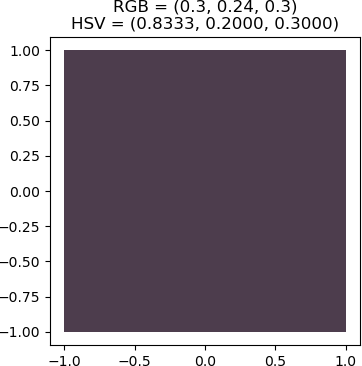
This example can be further analyzed. Recall that in the HSV model, V is the maximum of R, G, and B. Since the RGB of the dark, unsaturated magenta colour is (0.3, 0.24, 0.3), V should be the maximum of these three values, or 0.3, which is, in fact, the value of V that was chosen for the colour. Also recall that for the HSL model, L is the average of the maximum and minimum values of R, G, and B. From the RGB representation, M = 0.3 and m = 0.24. Consequently, L = (M + m) / 2 = 0.27. The colorsys library support a version of HSL, but is called HLS, and the function is called rgb_to_hls, parameterized by R, G, and B. Using Python operations, the H, S, and L values can be determined from the RGB representation as follows:
>>> ## Extract the R, G, and B values from the colour's tuple.
>>> R, G, B = rgb_dark_unsat_magenta
>>> ## Check
>>> R
0.3
>>> G
0.24
>>> B
0.3
>>> ## Convert to HSL using the rgb_to_hls function.
>>> hls_dark_unsat_magenta = colorsys.rgb_to_hls(R, G, B)
>>> ## Display the result.
>>> hls_dark_unsat_magenta
(0.8333333333333334, 0.27, 0.1111111111111111)
As calculated above, the L value is 0.27. Note that this colour model conversion results in a different S value than what was used to construct the original RGB tuple for the colour.
The Importance of Colour in Visual Analytics
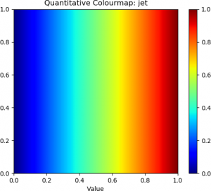
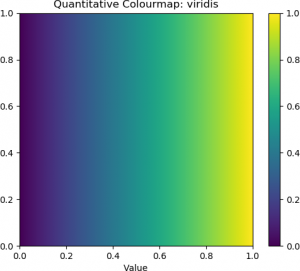
Another important aspect in human computer-interaction for visual analytics is the choice of colours, both for the interface and for the visualization itself. In scientific and information visualizations, it is beneficial to provide the user with a selection of various colour themes and colour maps. There is an increasing recognition of the limitations and problems of interpretability with the standard rainbow (“jet”) colourmap, where red colours represent high values, either numeric or qualitative, and blue colours represent low quantitative or qualitative values, as has been pointed out by several investigators (e.g. (Moreland, n.d.), (Thyng, 2020)). Consequently, the jet colourmap is no longer the default for some scientific visualization systems. In Matplotlib in Python, which is used throughout the course, the default colourmap is the “Viridis” (Thyng, 2020). Therefore, in visual analytics and information visualization systems, it is important to include a variety of colourmaps, which should include standard “Jet” colourmap because of its familiarity to many users, as well as greyscale and diverging colourmaps. The latter colour schemes provide a transition between colors for low and high values through an unsaturated color, such as white, black, or grey, and are employed to address some of the interpretive shortcomings of other maps. They also facilitate interpretation of the visualizations in users with colour deficiencies, particularly with respect to having green and red colours on the same plot (Moreland, n.d.), (Wachowiak et al., 2019).
The importance of colourmaps is due to the interpretability of mapping data values to colour, and consequently, the colour representation must match the way users perceive the colours (Thyng, 2020). For continuous data that are interpreted relative to each other, increases or decreases in magnitude or size should be represented by corresponding changes in lightness. Sequential colourmaps are schemes that show these differences. The previously mentioned diverging colourmaps represent data values relative to some critical point, which is represented with an unsaturated colour. Another important aspect of colourmaps is perceptual uniformity, wherein equal distances along the colourmap are perceived by humans as a corresponding magnitude change (Thyng, 2020). Research has shown that changes in lightness is perceived by the human brain as changes in the data values being viewed, and therefore these changes may be preferable to other changes, such as in the hue. From the analysis of colour in human-computer interaction studies, several discrete and continuous colourmaps have been proposed (Hunter, 2007), (Moreland, n.d.). Colourmaps for discrete, qualitative scales also differ from colourmaps for continuous scales.
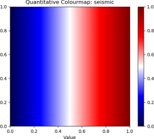
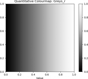
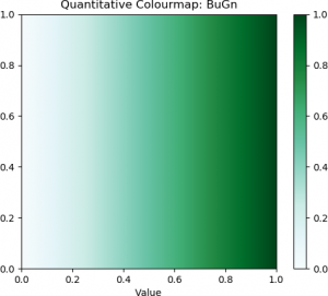
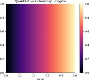
The following Python example demonstrates how to visualize quantitative colourmaps that represent numeric values. In this code, the Numpy and Matplotlib libraries are imported, as well as the Matplotlib colour object to define the colourmap. The name of the colourmap is specified in the cmapName variable. A 256 x 256 heatmap is then allocated, although the dimensions of the heatmap can be specified by the user. The values for the colours, ranging from 0.0 to 1.0, are then specified with the np.arange function, which generates values linearly (evenly) spaced between the starting value and ending value, using a specified number of points; in this case, 0.0, 1.0, and the width (number of columns), respectively. Each column of the image is then filled with these values that range from 0.0 to 1.0. Finally, the image is generated from the 2D array of numeric values, and some formatting of the plot is performed prior to the image being displayed with the chosen colourmap. In the code below, the “jet” colourmap was used. However, other colourmaps can be selected by changing the cmapName variable. A full listing of colourmaps supported by the Matplotlib library is found Here.
import numpy as np
import matplotlib.pyplot as plt
import matplotlib.cm as cm
## Name of the colour map. See
## https://matplotlib.org/stable/tutorials/colors/colormaps.html.
## Other colourmap examples include:
## Diverging: 'seismic', 'PuOr'
## Sequential: 'Greys_r', 'BuGn', 'PuRd'
## Perceptually uniform: 'viridis', 'magma', 'plasma'
cmapName = 'jet'
############################################
##
## Get the colourmap....
##
############################################
cmap = cm.get_cmap(cmapName)
## Allocate memory for an image in which to display the colours.
HEIGHT = 256
WIDTH = 256
## Values to represent as colours....
colourValues = np.linspace(0, WIDTH - 1, num = WIDTH) / (WIDTH - 1)
img = np.zeros((HEIGHT, WIDTH))
## Fill all rows of column i of the image with the colour....
for i in range(0, WIDTH):
img[:, i] = colourValues[i]
## Display the image with the colour map, and ensure that the x- and y-
## range is from 0.0 to 1.0....
plt.imshow(img, cmap = cmapName, extent = [0.0, 1.0, 0.0, 1.0])
## Plot title and x axis label....
plt.title('Quantitative Colourmap: ' + cmapName)
plt.xlabel('Value')
## Add the colour bar....
plt.colorbar()
## Display the plot....
plt.show(block = False)
The “jet” colourmap and some examples of diverging, sequential, and perceptually uniform colourmaps are shown below.
 |
 |
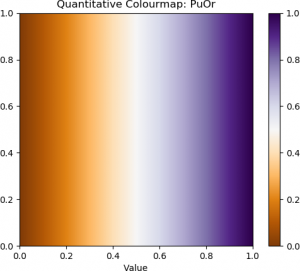 |
| Jet | Seismic (Diverging) | Purple-Orange (Diverging) |
 |
 |
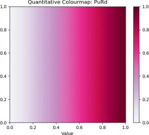 |
| Greyscale | Blue-Green (Sequential) | Purple-Red (Sequential) |
 |
 |
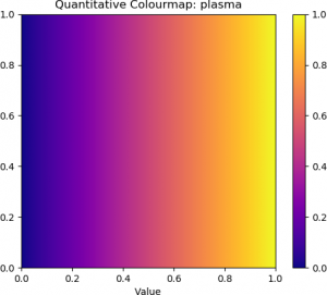 |
| Viridis (Perceptually Uniform) | Magma (Perceptually Uniform) | Plasma (Perceptually Uniform) |
The top row contains the standard “jet” colourmap, along with two examples of diverging colourmaps. The second row contains three examples of sequential colourmaps. The bottom row provides three examples of perceptually uniform colourmaps.
To display qualitative colourmaps, the Python code listed above is modified slightly. The full code is shown below.
import numpy as np
import matplotlib.pyplot as plt
import matplotlib.cm as cm
## Name of the colour map. See https://matplotlib.org/stable/tutorials/colors/colormaps.html.
## Colourmap names also include 'Dark2' and 'Pastel1'.
cmapName = 'Set1'
############################################
##
## Get the colourmap....
##
############################################
cmap = cm.get_cmap(cmapName)
## Allocate memory for an image in which to display the colours.
HEIGHT = 256
WIDTH = cmap.N
## Values to represent as colours, ranging from 0 the the number
## of colours in the qualitative colourmap (cmap.N) minus 1.
colourValues = np.arange(0, cmap.N)
img = np.zeros((HEIGHT, WIDTH))
## Fill all rows of column i of the image with the colour....
for i in range(0, WIDTH):
img[:, i] = colourValues[i]
## Display the image with the colour map, and ensure that the x- and y-
## range is from 0.0 to 1.0....
plt.imshow(img, cmap = cmapName, extent = [0, cmap.N, 0, cmap.N])
plt.xticks = np.arange(0, cmap.N)
## Plot title and x axis label....
plt.title('Qualitative Colourmap: ' + cmapName)
plt.xlabel('Value')
## Add the colour bar....
plt.colorbar()
## Display the plot....
plt.show(block = False)
Examples of qualitative colourmaps are shown below.
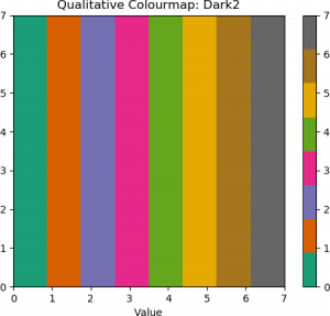 |
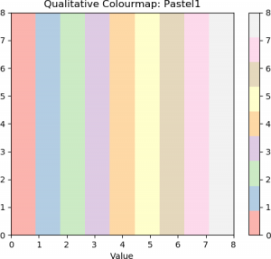 |
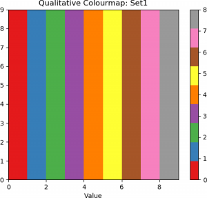 |
| Dark 2 | Pastel 1 | Set 1 |
Colours, colour maps, and colour models are important considerations in visualizations for the digital humanities. Not only do they enhance the aesthetics of visualizations, but they enable and facilitate interpreting and obtaining insights from the complex data used in humanities scholarship.
