Information Visualization
Python/R Code
The Python code to generate the genre tree discussed in this section is available in the file GenreTree_Example.py, and the corresponding interactive Jupyter notebook for this code is available in the file GenreTree_Example.ipynb. The Python code to generate the sunburst plot discussed in this section is available in the file Sunburst_Example.py, and the corresponding interactive Jupyter notebook for this code is available in the file Sunburst_Example.ipynb. All files are included in the distribution for this course. The code to generate the many of the other plots discussed in this section will be presented in subsequent sections.
A complete list of code, data files, and Jupyter Notebooks (where applicable) follows:
Visualizations_Matplotlib_Plotly_Example.py
Jupyter Notebook: Visualizations_Matplotlib_Plotly_Example.ipynb
WordCloud_Example_1.py
SocialRelations_Network_Visualization_Pyvis_Example.py
(Note: This code requires the file SocialRelations_Network_Visualization_Pyvis_Example.csv.) (Note: Weights are slightly different than in the figure in the text.)
SocialNetworks_GIS_Example.py
Jupyter Notebook: SocialNetworks_GIS_Example.ipynb
(Note: This code requires the files capitalCities_LatitudeLongitude.csv and ESC2018_GF.xls.)
GenreTree_Example.py
Jupyter Notebook: GenreTree_Example.ipynb
Sunburst_Example.py
Jupyter Notebook: Sunburst_Example.ipynb
(Note: This code requires the file genresExamples.csv.)
The Concept of Visualization
The digital humanities emerged from text. The field arose from the collaboration of Jesuit scholar Roberto Busa and IBM to produce the Index Thomisticus, a computer-generated concordance of the corpus of Thomas Aquinas. Text encoding, processing, representation, analysis, and interpretation are the main foci of the digital humanities. The Text Encoding Initiative, or TEI, is considered as the most important innovation in the humanities computing, which became the digital humanities (Hockey, 2004). Digital textual archives, hypertext, text mining, are primary concerns of the digital humanities.
One of the most fundamental practices in humanities scholarship is close reading, referring to the thorough analysis and contextualization of a single text. The goal of close reading is to gain deep insights into the text, and to interpret its meaning, “to uncover layers of meaning that
lead to deep comprehension” (Boyles & Scherer, 2012). Close reading analyzes the interactions between individuals, events, and ideas. It is concerned with argument patterns in the text. It also concentrates on specific words and phrases in the text, as well as the text structure and style (Jänicke et al., 2017). Close reading, at least as traditionally practiced, is almost exclusively text-centred and human-centered, and, at least until recently, was not influenced by or in need of computational tools. In the early years of the twenty-first century, however, the concept of distant reading was introduced through the work of literary historian Franco Moretti. Distant reading is the practice of obtaining, collecting, and analyzing a large quantity of textual data, usually from digital libraries and archives, to formulate a broad overview of the collection of texts. Distant reading is applied to literary history, literary theory, and to summarize and synopsize large bodies of literary works. In contrast to close reading, computational tools and technologies play a pivotal role in distant reading due to the sheer amount of textual material that must be processed. Even for those scholars not directly involved in direct reading, and whose work is primarily text-based, the increase in the volume and complexity of textual data has necessitated new approaches, and many of these scholars have also turned to digital tools to facilitate their scholarship.
A computational technique that is widely employed across all disciplines, including the digital humanities, is visualization. Visualization relies on the innate human cognitive ability to interpret and to make sense of visual imagery. An urgent task for scientific communities over the past centuries has been to gain insight into data and to understand its underlying processes, and, consequently, various forms of visualization were proposed to leverage the sense-making capabilities of the synergistic relationship between the human visual system and the human brain. Visualization also allows for fine-grained, detailed, “zoomed-in” views of data, coarse-grained, synoptic, “zoomed-out” views, and the entire spectrum of views between them. Visualizations of all kinds are ubiquitous in daily life. As a very simple example, consider the “14 Day Trend” of weather information (specifically, temperatures) that are updated regularly and viewable on The Weather Network website (for example). This website features both temperatures listed as numeric values and an interactive plot. Although the current trend for weather over the next two weeks is easily interpreted via the numeric temperatures, the plot facilitates faster processing of this information. One can easily see the fluctuation and trends in the temperatures over the 14 days, the variation between the predicted high and low temperatures, represented by the yellow and blue line graphs, respectively, and the departure of these values from the “normal” or 14-day average temperatures, indicated by the two grey dashed lines. Although numeric data can often be easily interpreted, sometimes facilitated by tables, etc., visual presentation is more compact, and enables faster processing and interpretation, and allows more information to be presented in a limited visual space (e.g., the normal high and low temperatures and high-low variation on the 14 Day Trend plot), further aiding the gaining of insights.
As another example, consider the following ten values (x, y) pairs displayed in a table.
| x | y |
| -1.7213534836529842 | -1.0183035816080268 |
| 1.6083728015246643 | 1.1887543612183733 |
| -1.5310203393438686 | -1.2868475902434542 |
| -0.23374997273454629 | 1.9862932689425796 |
| 1.9901335828870605 | 0.19841452130605552 |
| -1.0235925913378459 | 1.7182136674343715 |
| -0.8503168422011566 | 1.8102379036659941 |
| 1.7114468636091091 | 1.0348669639342747 |
| -0.7483203829561159 | -1.854728175354117 |
| -1.9992885991652796 | -0.053339453013075806 |
| -1.867146131705626 | -0.7167742481818924 |
| 1.8694671511005427 | 0.710698649890388 |
| -0.15135400030403626 | -1.9942647684276944 |
| 0.22755493277556835 | 1.9870125194798112 |
| 1.8948791466327868 | -0.639869533308316 |
As presented, these values are very difficult to interpret. Visualizing these pairs as (x, y) coordinates may be employed to get an idea about the structure of the data. For instance, one may simply plot the values as a line graph, connecting the coordinates in sequence with line segments, as shown below.
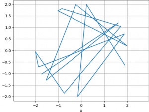
Such a visualization is more interpretable than the table, but, in this case, a structure for the data is still not readily discernible. Therefore, one may consider an alternative plotting method. For instance, a natural way to display a set of (x, y) coordinates is to plot the y values against the x values in a scatter plot, or scatterplot, as shown below.
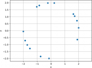
This visualization exhibits much more structure than either the tabular representation or the line plot. From the scatterplot, it can be determined that the data represents points on a circle. Upon close examination, and depending on the application, one may also surmise that the data represent three arcs. If one interprets the plot as points on a circle, other information is also available. It can be observed that the circle is (approximately) centered at the origin, (0, 0), and that its radius is approximately 2 (alternatively, its diameter is 4).
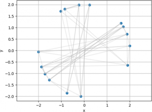
A graph is another type of plot extensively used in the digital humanities. Graphs show connections between entities or objects. For example, they can be used to show relationships between texts, or the how different authors influenced each other. They are also employed for visualizing social networks, in the form of a network visualization. The entities represented on the graph are known as nodes, or vertices (singular. vertex) and the connections between them are called edges, or links. The (x, y) coordinate data shown above can also be represented as a graph. The visualization below is a synthetic example, where each node – or (x, y) coordinate point – is connected to the two most distant (furthest) nodes, and the second closest (second nearest) node. Graphs and network visualizations will be discussed in detail in subsequent sections.
This simple example illustrates the power of visualization – that it assists the human cognitive system to simplify, make sense of, interpret, and gain insight into a complex situation. A large, interactive example of a network visualization showing the nexus of connections between abstract artists in the period 1910-1925 is shown on the website of the Museum of Modern Art.
Visualization in the Digital Humanities
Visualization is increasingly applied to almost all areas of scholarship in the digital humanities. It is a fundamental technique in distant reading, as a large amount of (oftentimes complex and unstructured) textual data must be processed and analyzed. As testimony to the importance of visualization to distant reading, one of Morelli’s seminal works on the topic was titled Graphs, Maps, and Trees (2005) (Moretti, 2005), naming three important categories of visualization techniques. Even in the most elemental textual analysis tasks of close reading and literary studies, visualization is playing a growing and increasingly important role. For instance, a recent study used innovative and artistic visualizations to investigate the sounds and linguistics in poetry. The sonic topology of 18 rhyme categories was presented visually by “paths” drawn through a spatial representation of the poem (McCurdy et al., 2015) (Poemage). The visualization software was developed in the Processing language, a visual programming language and integrated development environment (IDE) for visual design and media arts. Close reading has benefited from relatively simple visual methods, including underlining text with different colours and line styles for annotation, and highlighting words with varying colours and opacities to encode importance within the text (Jänicke et al., 2017). Other techniques use glyphs, or special graphical symbols, to indicate phonetic units and their relationships, or to illustrate the structure of a particular poem (Jänicke et al., 2017). Visualizing connections with various types of tree or graph visualizations illustrate the structure among components of a text, to reveal similar or recurrent patterns in the text, or to track variations among different editions of a text (Jänicke et al., 2017).
Furthermore, many research areas that are now integral to the digital humanities, including cultural heritage, digital history, among others, are inherently visual, and make extensive use of many types of visualization methods. Some examples can be found on (Here).
Visualization and Information Visualization
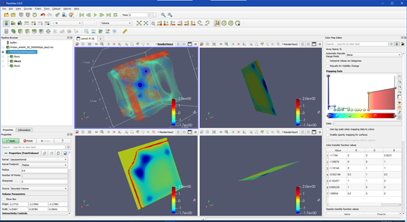
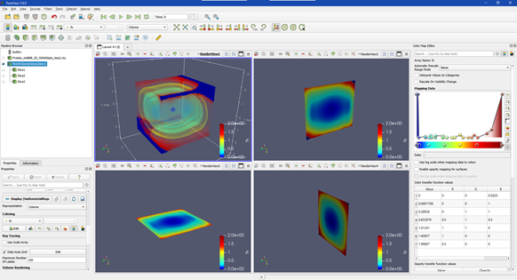
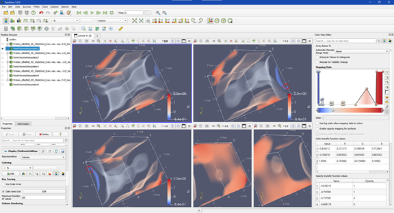
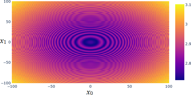
In computer science terms, visualization refers to the use of interactive graphics methods, algorithms, and tools to represent, present, and explore digital data. These data come from a variety of sources, including scientific experiments, measurements from instruments or sensors, calculations, predictions, computer simulations of all types, or from archives. Visualization is closely related to, but distinct from, computer graphics, another area of computer science research, with the latter focusing on visual rendering techniques and representing 3D (or higher dimensional) data on a 2D screen or other output device. It has also traditionally addressed rending of scientific or engineering data. Visualization algorithms, in contrast, employ combinations of scientific, aesthetic, and human-computer interaction methods to provide practical results and insights from data. Another difference between the two fields became noticeable in the early 1990s, when scientific visualization was distinguished from information visualization. Scientific visualization focuses on scientific, physically based, data, such as from measurements, from empirical experiments, or from simulations. An example of a scientific visualization is shown below. This figure represents a 3D interactive visualization to represent a high-dimensional mathematical function.
 |
 |
 |
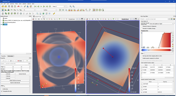 |
| Examples of scientific visualizations of high-dimensional functions, displayed in 3D. Interactive controls allow the user to explore different parts of the 3D visualization. These visualizations were programmed in Python using the ParaView data analysis and visualization library. |
 |
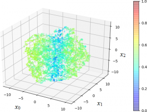 |
Left: gradient plot, plotted with Matlab (The Mathworks, Natick, MA, USA). Right: 3D scatterplot of a high-dimensional space to study the classification performance of a machine learning algorithm, plotted with Python using the Matplotlib library.
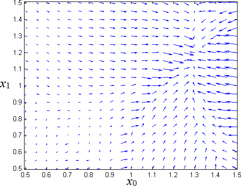
A heatmap to display a 2D slice of a high-dimensional function values in a matrix, or grid. Each of the (x0, x1) positions on the grid has a specific numeric value, displayed as a colour. The colour bar on the right indicates the numeric values. This plot was generated in Python using the Plotly library and was coloured with the “Viridis” colour map.
Information visualization is a special category of visualization that is typically used for displaying non-numeric, qualitative data, and deals with more abstract quantities, including financial data, business records, or document collections (Stone, 2009). Information visualization refers to a collection of algorithms and technologies that use computer-generated visual representations to amplify and enhance human cognition with abstract information. The task of information visualization is the “creation of graphical representations of data that harness the pattern-recognition skills of the human visual system” (Stone, 2009). Although literacy in all types of new media is important for digital scholarship, information visualization is a critical area because of its engagement with human interpretation. Information visualization is supported by data analysis, visual design, and an understanding of human perception and cognition (Stone, 2009).
With the advent of “Big Data” and the development of methods and database technologies to address the issues inherent with it, another visualization technique, visual analytics, was developed to emphasize the role of analysis for these large data volumes. Visual analytics is “the science of analytical reasoning facilitated by interactive visual interfaces” (Thomas & Cook, 2006). The main factors in visual analytics are the affordance of a high degree of interactivity to enable exploration of large, complex data, and the involvement of human cognitive capabilities for sense-making, discovery, and gaining insights.
These visualizations are intended to convey complex ideas clearly, concisely, precisely, and efficiently, thereby encouraging objective analysis and the discovery of new insights (Shen, 2018).
The recognition of the utility and benefits of visualization in the humanities has led to a growth in collaborations between the digital humanities and data visualization communities. There is an increasing interest from researchers in both disciplines in designing and developing visualization tools that can lead to the discovery of new knowledge and insights in humanities data. The cross-fertilization between the digital humanities and visualization science has led to some new challenges, mostly due to its novelty and the difficulties inherent in multi- and inter-disciplinary collaborations. The visualization design process is also difficult to navigate in these applications. Meta-analyses, using the techniques of the digital humanities themselves, have been performed to better elucidate these problems and to assist in finding solutions that will foster more productive collaborations between digital humanities and visualization scholars (Benito-Santos & Sánchez, 2020).
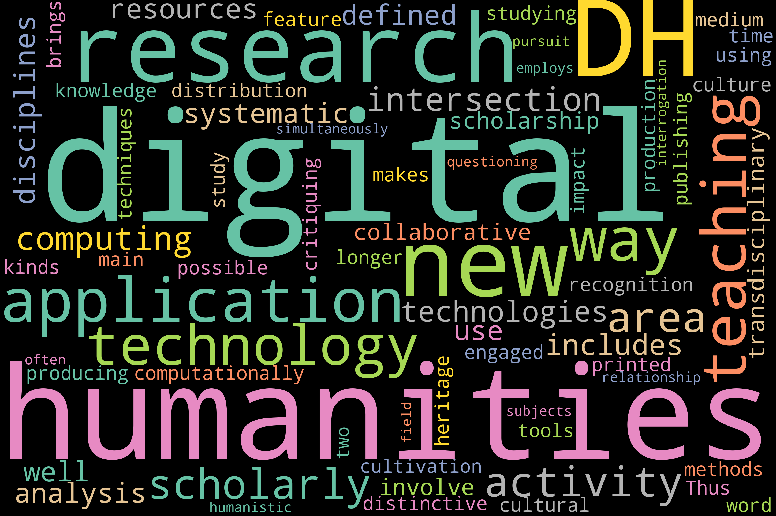
As a recent example of information visualization, tag clouds, or word clouds, are novel graphical depictions of individual words in a text, and is where the weight of a word, usually represented by its size or colour, indicates the relative importance of that word in the text. Tag clouds are one of the primary ways of visualizing free-form text. They are also used to depict keyword metadata, or tags, in web pages. In addition to its aesthetic appeal, tag clouds provide an intuitive way for users to quickly discern the prominence of important keywords and terms in the analysis of a text. There is a wide spectrum of software for generating word clouds, and libraries are available in Python and R. An example of a tag cloud generated from text in the introductory course in this program is shown below.
To illustrate the worth of information visualization in the humanities, three types of visualizations, following the title of Moretti’s book Graphs, Maps, and Trees (Moretti, 2005), will be briefly discussed.
Graphs
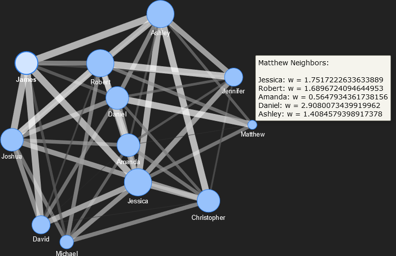
Graph visualizations were introduced above. They are important in the digital humanities because they depict connections, or links, between entities, people, places, things, or ideas. Interactivity can be added to various types of graphs to facilitate analysis, and there are a variety of graph layouts that can be selected for specific types of analyses. For instance, social connections or influences between individuals can be visualized with a network graph. An example of such a network visualization is shown below. The plot is interactive, and the user can move the location of nodes (representing individuals) while maintaining the linkages between them. Physics algorithms can be incorporated to stretch, expand, or contract the graph to allow the user to explore relationships. In this example, the strengths of the linkages are represented by the thickness of the links, and the number of social connections for each person is indicated by the size of the node.
Maps
Humanities scholars are increasingly recognizing the importance of space to their fields. Texts and other sources typically contain references to places. There is a strong relationship between both past and contemporary culture and geography. The connection between geography and humanities fields such as archaeology, history, and the classics is well-known (Gregory et al., 2015). Other, perhaps less obvious examples of the synergy between geography and the humanities includes georeferencing, and geoparsing. Georeferencing is assigning geographic coordinates to data. Geoparsing entails extracting place names and toponyms from text, prior to their locating the names on a map through georeferencing. Geoparsing is used to address the challenges of spatially analyzing unstructured texts (Gregory et al., 2015). As a concrete example, historical textual materials are available in digital collections such as the Old Bailey Online, Early English Books Online, and the British Library’s Nineteenth-Century Newspaper, each containing many millions or billions of words. One of the goals of digitization of the original texts and textual analysis of the digitized materials is to allow them to be searched through keywords, many of which are place names and toponyms. Consequently, automated georeferencing and geoparsing of these corpora (singular Corpus), or large collections of digital texts, facilitates new analyses to be performed, thereby enriching their utility to humanities scholars (Gregory et al., 2015).
Scholarship involving space and location has greatly benefited from computational tools, as mental maps are frequently imprecise, and manual mapping is a time-consuming and error-prone endeavor (Gregory & Murrieta-Flores, 2016). The main enabling technology to facilitate spatial analysis across many fields of scholarship is the geographic information system, or GIS. GIS can be defined as “…a software system that enables spatial information to be stored, manipulated, queried, analysed and visualized” (Gregory & Murrieta-Flores, 2016). Therefore, the main purpose of GIS technology is mapping, generating maps, and the provision of algorithms for analyzing the maps generated, stored, or displayed by the GIS. Database technology is also an integral component of GIS so that thematic questions can be combined with corresponding questions about the “where” aspects of these questions (Gregory & Murrieta-Flores, 2016).
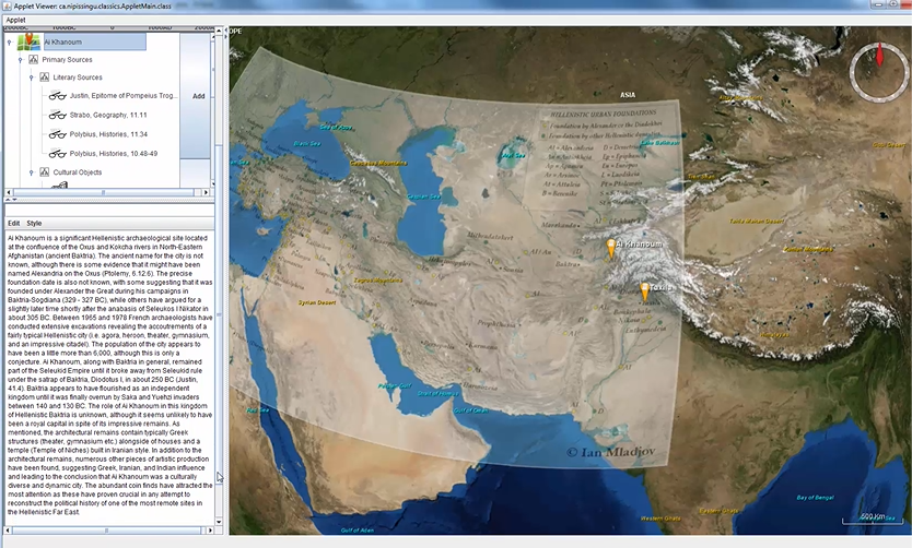
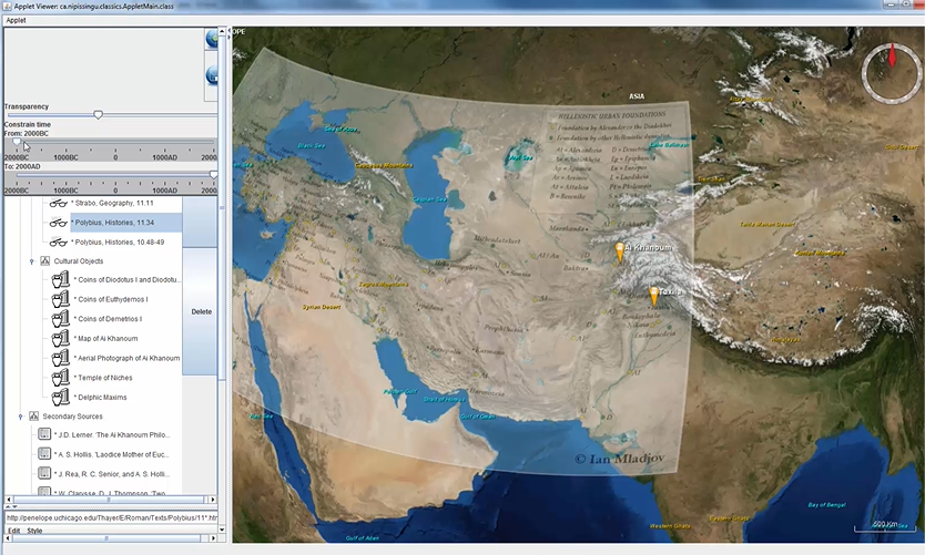
Geospatial technologies, the foremost of which is GIS, is leading the development of spatial humanities. One of the primary sources of the (geo-)spatial humanities is historical geographical information systems (HGIS), useful for displaying, analyzing, storing, and tracking historical changes over time (Gregory & Murrieta-Flores, 2016). Although, as a new paradigm, there is not yet a formal definition of spatial humanities, it is a confluence of geography and the humanities, enabled by GIS. GIS is used with text and other traditional humanities materials, as well as images, virtual landscapes, and historical maps (Gregory & Murrieta-Flores, 2016). Geography is a traditionally quantitative field. Because of its reliance on maps, geography also has a large visual, or imaging, component. Consequently, especially in the spatial humanities, but also in other areas of text analysis where place names must be georeferenced, maps are crucially important visualizations. Maps can be 2D, such as those found in atlases or road maps, or 3D, enabled by interactive displays and satellite imagery, such as Google Earth and the WorldWind GIS system from NASA. Many of these systems provide application programming interfaces (APIs) for scholars to develop their own custom applications to address their specific research questions. For instance, a GIS system was developed using WorldWind and customized using the WorldWind API for scholarship into the Seleucid Empire. The visualization system was integrated with a database and a graphical user interface (GUI) to allow students and researchers to georeferenced primary and secondary source materials (R. Wenghofer and M. Wachowiak, Nipissing University). An example of the 3D topographical map, onto which a political map of the Seleucid Empire was superimposed as a layer (the right section of the GUI) and corresponding source materials (left section) is shown below.
A
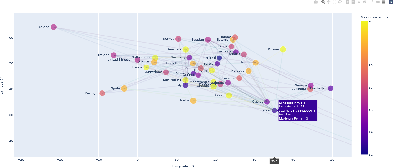
Associations in voting patterns for 2018 European Song Contest are elucidated when the countries are visualized spatially – in this case, according to their georeferenced location (latitude and longitude location coordinates (see the article “Social Network Analysis: From Graph Theory to Applications with Python”, by Dima Goldenberg). An interactive map visualization depicting these associations is shown below.
Trees
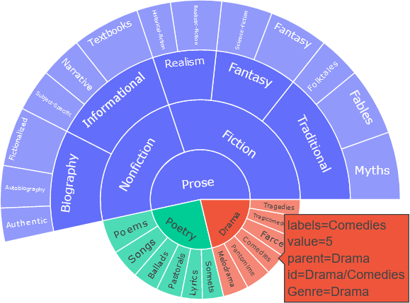
Hierarchical relationships can be visualized with trees. As an example, consider the literature category of written works. There are different types, or genres, of literature, which includes drama, poetry, and prose (the list is not exhaustive). Within each of the genres are subgenres, further subdivided into categories and subcategories. These hierarchical relationships are understood intuitively by indentations in a tree diagram. A partial list of this hierarchy is shown below.

Trees can be visualized in other ways, and interactivity can be added. A sunburst diagram, or sunburst plot, or sunburst wheel, can be used to visualize hierarchical structures. The tree shown above is presented below with a sunburst diagram, where a weight (random in this example) can be assigned to each tree entry. For many users, the sunburst diagram provides a more intuitive high-level view, compared to the tree representation, while also allowing closer examination of the categories and subcategories. The software used to generate this diagram, the Plotly library used with Python, provides capabilities to add interactivity so that more information can be included in the diagram. For example, as shown below, a box containing useful information, appears when the user hovers over a subgenre, “Comedies” in this example.
Sunburst diagrams have been widely used in the digital humanities. For example, they were employed to analyze the statistical distribution of figurative devices of the pre-classical Piyyut corpus of Hebrew liturgical poems in a study of similar patterns in annotated textual literature (Schorr et al., 2020). In a study on narrative acts, or an action that contributes to a narrative sequence, sunburst diagrams were used to represent the hierarchical classification of these narrative acts (Szilas et al., 2020). Sunburst diagrams were also used to represent the hierarchical structure of topics as part of a visual analytics system in a study of themes from corpora on Roman history (Cho et al., 2015).
Summary
Some of the most advanced interactive information visualizations, and even some visual analytics systems, are based upon simpler types of plots. Variations, hybridizations, and enhancements make these systems more applicable for digital humanities research. In turn, the more fundamental plot types rely on the graphics primitives and geometric algorithms that were developed from computer graphics research. Consequently, information visualization continues its reliance on graphical primitives. However, in the digital humanities, especially in cultural studies, many materials are already visual, such as text, frames from video and films, and even magazine covers, and therefore new forms of visualization incorporate these materials directly without the data transformations required of standard visualizations (e.g., representing temperatures on a graph). They therefore do not necessarily map important data dimensions spatially. As a result, the scope of information must be expanded to account for its new instantiations in the digital humanities (Manovich, 2011).
