Geographic Information Systems in the Digital Humanities
Geographic Information Systems in the Digital Humanities
A geographic information system (GIS) is a computer software system for the spatial analysis of data and for designing and generating maps (Gieseking, 2018). It works with geospatial data, which is any data that includes a spatial location, or put another way, data that can be spatially located. GIS is increasingly important in the digital humanities, as evidenced by a large list of thousands of digital humanities projects that employ GIS technologies (see DH GIS Projects). Such projects include mapping the army barracks of 18th century Ireland, a mapping of Mediaeval roads, geospatial representations of organizations in China during the Song dynasty, a geospatial database of the main published collections of Icelandic folklore, and projects directly related to Edmonton, Alberta, Canada. Although maps generally provide point-based information, they can also represent spatial dynamics and patterns of movement.
Another example of the synergy between the digital humanities and GIS is the creation of a GIS-generated 3-D model of Mitchelville, South Carolina, the first town of freed enslaved people in that state. The project, a collaboration of a GIS expert (Eileen Johnson), an art historian (Dana Byrd), and a student, provides users with the experience of those whose history is incomplete because so much of it was often lost, destroyed, or unrecorded (Gieseking, 2018).
The main data for geo-humanities research is predominantly text, images, video, performance, and archival evidence, in contrast to the quantitatively more objective data employed by the social sciences. This distinction between qualitative–quantitative and evidence–data, however, is only superficial, as boundaries between quantitative and qualitative projects are often porous.
GIS, on the other hand, has the potential to bridge the qualitative/quantitative dichotomy, and, in many respects, the digital humanities have the ability to exert a profound influence on the future of GIS itself (Gieseking, 2018). The quantitative (locatedness) and qualitative (spatialities) are combined in digital humanities GIS (GIS in the digital humanities): “There is a move towards using GIS technology to highlight the imbricated relationship between the locatedness of everyday life and the spatialities of cultural practices” (David Cooper and Ian N. Gregory, cited in (Gieseking, 2018)).
Although maps and other geospatial data visualizations related to humanities areas (history, literature, the arts, etc.), as well as the technologies to create them, retain their pivotal importance, are more significant influence of the digital humanities on GIS is the critical analysis of those data visualizations and archives (Gieseking, 2018).
As will become clear in the discussion of the synergistic relationship between geographic information systems (GIS) and the digital humanities, GIS has many important applications in classical studies and cultural analytics, as those fields make extensive use of the concept of space and location. However, GIS is not limited to these areas. For instance, determining locations that occur in texts, whether historic or contemporary, is also necessary. A recent investigation that underscores this synergy is now discussed.
Example: Named Entity Recognition and Geocoding with R
In a recent project in DH GIS, the specific goal is geolocation (otherwise known as geopositioning, or geolocalization), where the geographical position of an entity or object is determined or computed using various data sources. Related to this is named entity recognition (NER), described below, and geocoding, which is determining or computing the spatial coordinates for locations. Locations are expressed using a geographic coordinate system, consisting of latitude and longitude coordinates, explained in detail below.
The specific application described here addresses named entity recognition (NER) and geocoding for digital humanities applications. NER is the process of identifying, or tagging, entities in a text. It is properly the domain of natural language processing (NLP). Entities can be any physical or conceptual objects, or, in the current context, locations. Geocoding is determining spatial coordinates for spatial entities.
The application consists of five steps, carried out iteratively, not strictly linearly:
- Acquiring the data;
- Preprocessing the data;
- Determining annotations for the data;
- Geocoding, as described above;
- Analysis and evaluation.
The process is also imperfect, as it is dealing with text, not primitive data types such as characters and numbers. Consequently, algorithmic approaches and computational processing provide immense assistance, but human interpretation, close reading, and familiarity with the text being considered is indispensable.
The author makes use of R packages and functions, and the reader is encouraged to read, study, implement, and experiment with the code in the web article. The example presented here uses open-data provided by Gutenberg Project and Open Street Maps (OSM). Open-source R packages (Rstats) were used. From the Gutenberg Project, entire books can be downloaded. Once obtained, the data must be preprocessed through cleaning. This cleaning consists of removing titles and front matter, which are not relevant to the analysis. Special characters, certain strings, and some punctuation that are not relevant are also removed.
After preprocessing, the data are tokenized. Tokenization is decomposing, or simplifying text into tokens such as sentences or words. Tokenization is an involved and complex process. However, open source libraries are readily available, including Python and R. Next, locations are identified in the tokens, which is the process of entity tagging. The identified locations can be subsequently grouped and counted, or organized in different ways for possible visualization.
As it is performed with computation, many of the identified locations are incomplete entities, some non-locations that are tagged as locations, and some locations may have been missed. Therefore, automated location identification must be verified by human users. To ensure the results are accurate, the locations must be post-processed, or cleaned. Although this is a tedious task, automated tools and functions exist to assist in the process, guided by the user.
Once locations have been found in the text, they must be contextualized. Close reading and scanning the text for locations and their importance. The result is a filtered data set of locations that are used for subsequent geocoding. Again, specialized functions and libraries, such as the “tinygeocoder” package in R, can be used in conjunction with OSM for geolocating the sites that have previously been identified. If desired, country data can be added for geocoding. Finally, the locations can be plotted on a map and displayed (again, using readily available functions and libraries) to verify whether the geocoding was successful. For unsatisfactory results, the process, or any of its steps, can be re-iterated. To summarize, NLP tools can be used to identify and to locate geographical entities within a text, with subsequent geocoding of the encoded entities. Such an approach is very beneficial to digital humanities research, and demonstrates an iterative approach for combining textual analysis, named entity recognition, and geographic information systems.
An Introduction to Geospatial Coordinates
Latitude coordinates represent north-south positions, and range from 0° (at the Equator) to 90° at the North and South Poles. North and south are distinguished with the N or S designator (e.g. 90° N or 90° S), or with negative values designating measurement angles south from the equator (e.g. a latitude of 90° designates the North Pole, and a latitude of -90° designates the South Pole). Longitude coordinates represent east-west, positions, and range from 0° to 180° east and west. 0° longitude, also known as the prime meridian, is by convention located at the Royal Observatory in Greenwich, England. Positive values for longitude are east of the prime meridian, and negative values are west of that location. For instance, from Google Maps, it can be seen that the Art Gallery of Ontario in Toronto has latitude/longitude coordinates of 43.65464°, -79.39272°. The positive latitude indicates that Toronto is located north of the Equator, and the negative longitude indicates that it is located west of the prime meridian. Mount Logan, Yukon, the highest peak in Canada, has location 60.56793, -140.40529. The Sydney Opera House in Sydney, Australia, has geocoordinates of -33.83243, 151.21095. The negative latitude indicates that this structure is located south of the Equator, and the positive longitude indicates that it is east of the prime meridian.
In addition to measuring latitude and longitude in angles, these values can also be expressed in subunits of degrees, known as minutes and seconds. A minute (with symbol ‘) is 1/60 of a degree, a second (with symbol “) is 1/60 of a minute, or 1/3600 of a degree. A conversion from degree/minute/second (DMS) format to decimal is calculated by performing those divisions. For example, Ottawa, Ontario is located at DMS coordinates 45° 25′ 28.9956″ N and 75° 41’ 42.0000” W. In decimal format, the latitude is 45 + 25/60 + 28.9956/3600 = 45.42472°, and the longitude is -75 + 41/60 + 42/3600 = -75.695° (recall that because the longitude indicates that Ottawa is located west of the prime meridian, the angle is negative).
The converse procedure, that is, converting a decimal latitude/longitude coordinate the DMS, follows from the forward procedure described above. Considering only latitude for illustration, if lat represents a decimal latitude, then degrees (d), minutes (m), and seconds (s) can be calculated as follows:
d = integer part of lat
m = integer part of (lat – d) x 60
Note that lat – d is the fractional part of lat. For example, if lat = 35.84, then the integer part of lat is 35 and the fractional part is 0.84.
s = [lat – d – (m / 60)] x 3600
Using the latitude of Ottawa for demonstration:
lat = 45.42472°
d = 45° (the integral part of lat)
m = integral part of (lat – d) x 60 = integral part of (45.42472 – 45) x 60 = integral part of (0.42472 x 60) = 25
s = [lat – d – (m / 60)] x 3600 = [45.42472 – 45 – (25 / 60)] x 3600 = 28.992
Therefore, 45.42472° in DMS is 45° 25¢ 28.992″.
Note that the seconds calculated in the above procedure is 28.992, which differs slightly from 28.9956, which was determined above. The difference is due to roundoff errors in the calculations, where the full precision of the numbers was not used. However, because the difference is very small in this case, it can be ignored, and the result can be considered correct.
The procedure above can be easily implemented in the two main interactive programming languages for the digital humanities: Python and R.
A Python function, taking lat as an argument (in degrees), returns degrees, minutes, and seconds.
## Use Numpy, if the library has not already been imported.
import numpy as np
###################################################################
##
## INPUT
## x Decimal representation of a latitude or longitude.
##
## OUTPUT
## d Degrees (integral)
## m Minutes (integral)
## s Seconds (fractional)
##
###################################################################
def LatLong_to_DMS(x):
## Obtain the degrees as the integer (integral) part of x.
d = int(x)
## Get the mixed fraction value for minutes.
m_frac = (x - d) * 60.0
## Minutes is the fractional value of m_frac.
m = int(m_frac)
## Seconds are calculated from the remainder.
## The following is equivalent to (lat - d - (m / 60)) * 3600
s = (m_frac - m) * 60.0
## Minutes and degrees are positive.
m = abs(m)
s = abs(s)
## Return the degrees, minutes, and seconds.
return d, m, s
Note that in the above Python function, seconds was calculated as:
s = (mfrac – m) x 60, where mfrac is the fractional part of the minutes, and m is the integral part of the minutes. This calculation seemingly differs from the equation given above, namely:
s = [lat – d – (m / 60)] x 3600
However, some substitution and simplification will show that the calculations are in fact equivalent. Without loss of generality, latitude will continue to be used for this example.
It is first noted that mfrac = (lat – d) x 60. Consequently, lat – d = mfrac / 60. Therefore,
s = [lat – d – (m / 60)] x 3600 = [(mfrac / 60) – (m / 60)] x 3600 = (mfrac – m) / 60 x 3600 = (mfrac – m) x 60.
Therefore, the two approaches and equations yield the same result.
In R language code:
> ## Convert a decimal latitude to DMS format.
> lat = 45.42472
> ## Degrees is simply the integer part of the latitude value.
> d = trunc(lat) ## trunc == truncation
> d
[1] 45
> dec_lat = lat - d
> ## Calculate the decimal/fractional part of the latitude.
> dec_lat = lat - d
> dec_lat
[1] 0.42472
> ## Calculate the minutes by rounding down the product of the fractional part and 60 (minutes/degree).
> m = floor(dec_lat * 60)
> m
[1] 25
> ## Obtain the remainder to calculate seconds.
> dec_lat_sec = dec_lat - 25/60
> dec_lat_sec
[1] 0.008053333
> ## Finally, calculate the seconds by the product of 'dec_lat_sec' and 3600 (seconds/degree).
> s = dec_lat_sec * 3600
> s
[1] 28.992
>
The result is the same as calculated manually above.
Another coordinate system for geolocation is Universal Transverse Mercator, or UTM. In this system, the Earth is divided into 60 north-south zones, with each zone measuring a width of 6° of longitude. Coordinates in each zone are measured in meters as northings and eastings. Consequently, UTM has a straightforward interpretation in terms of distance measured in meters. Latitude and longitude coordinates, expressed either in decimal or in DMS format, can be converted to UTM, and conversely. For example, the location for Ottawa, 45.42472° latitude and -75.695° longitude, is in UTM Zone 18, and has a northing of 5030368 and an easting of 445630. Free converters are available as web services (e.g. Convert Geographic Units). Conversion to UTM from latitude/longitude or to latitude/longitude from UTM is a complex procedure, and is beyond the scope of the current discussion.
Additionally, the mathematical details of geolocation in general are complex, and are likewise beyond the scope of this discussion. However, there are many open-source software libraries available, including packages in Python and R, and easily accessible open-source data.
Example: Network Visualization Using Geospatial Coordinates
A simple example of employing geospatial coordinates is found in the article “Social Network Analysis: From Graph Theory to Applications with Python”, by Dima Goldenberg. The article is a tutorial on libraries for producing networks (or graph) and visualizations in Python, specifically, the “network” library. Such network visualizations are very useful in researching social networks, an increasingly timely topic, given the ubiquity of mobile devices and social media. In the present context however, the focus is on employing geocoordinates to elucidate a visualization.
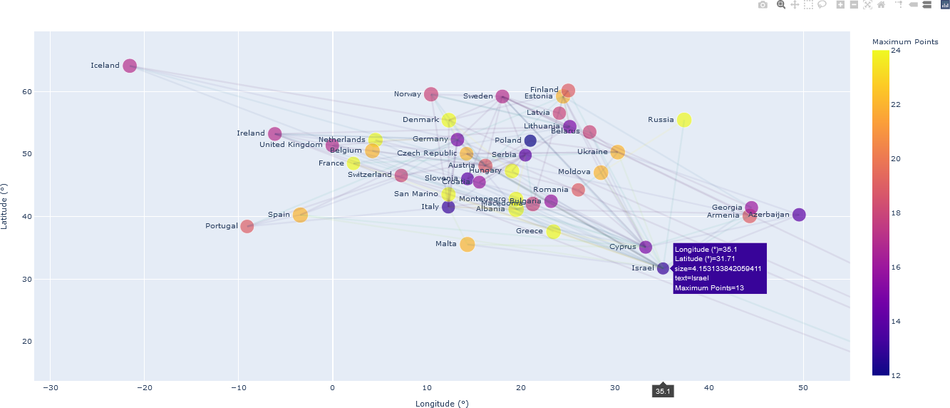
The goal of this work is to analyze the 2018 Eurovision Song Contest. In the various rounds of the contest, songs – specifically the country in which the song originated – are ranked by a jury, as well as by TV viewers, through the awarding of points. The total points for each of the top 26 ranked countries participating in the contest were investigated by visualizing the number of points received from the jury and viewers from other countries. As there is a relationship between countries, specifically, points for the best song, the contest can be visualized as a network, or a graph, where the nodes (coordinate points) of the graph represent a country, and the edges, or links between the countries, denote the flow of awarded points. An obvious placement of country nodes is by their geographic location. Goldenberg demonstrates examples from Python network visualization libraries that generate and display the graphs. However, if the original data are accessible, users can generate custom visualizations conducive to their own research questions, specifically those that address the spatial relationships between the contest’s participating countries.
The original data indicating the points awarded to each country from each of the other countries in the Grand Final round of the 2018 Eurovision Song Contest are available as a Microsoft Excel file. Preprocessing of the data, facilitated by Python functions, facilitate importation of the data into visualization functions. Lists of the latitude and longitude of the capital cities of 202 countries is found HERE. The longitude coordinates on that site are listed with an E or W suffix, and the latitude coordinates contain a N or S suffix. Consequently, the raw data obtained from the site must be preprocessed to indicate positive or negative angles. This is a straightforward task, and the results can be stored in another file in comma-separated value (CSV) format for referencing country locations.
In this example, the nodes indicating each of the top 26 ranked countries were placed on standard graph axis, with the x-axis indicating longitude and the y-axis indicating latitude. For greater geospatial realism, the nodes may have been placed on a “blue marble” globe using GIS visualization software. However, for the present purposes, representing (longitude, latitude) coordinates on a 2D plot is sufficient, if slightly distorted. Edges linking the countries indicate the flow of points. To reduce clutter, edges were drawn only if the source country awarded 12 or more votes to the linked country. The size of each node was chosen to indicate the standard deviation of points in-flowing from other countries. The colour of the node represents the maximum value received from any country, providing an indication of the popularity of that country’s songs. The colour of the semi-transparent edges linking the countries indicates the number of votes received from the source country. The visualization library that was used for this graph, Plotly (supported by both Python and R), facilitates user interaction, wherein users may hover over the plot to obtain additional data about the countries (nodes) and flow of points (edges/links). The plot is displayed in the user’s browser, but does not require Internet connectivity; that is, it can be used off-line. Zooming and other interactions are provided by the Plotly library. The full plot of all 26 countries and the edges (representing flow of points if the number of points is at least 12) is shown below.
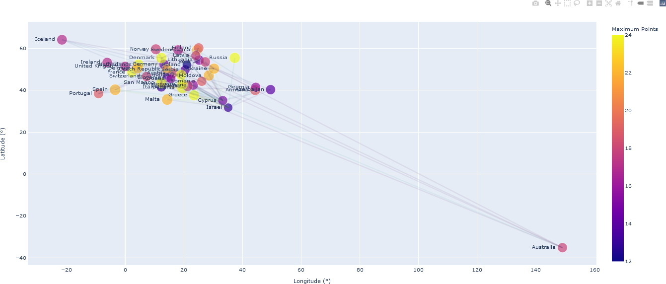
Note that the use of standard geocoordinates distorts the plot, primarily because of the presence of Australia, which is geographically remote from the European continent. By zooming the plot, one can examine only European countries, as shown below. Detailed data for Israel, the top-ranked country in the 2018 contest, are displayed by positioning the mouse over the node representing Israel.
The Python code for the visualizations above is included in the file socialNetwork_Visualization_Eurovision_2018.py, included in the distribution for this course. From this interactive visualization, further analysis can be performed. For instance, the influence of geographic proximity or language on the flow of points between countries could indicate interesting social trends. It also provides a simple application of GIS to the digital humanities.
For those interested in gaining more experience with GIS in R, an introductory example and lab is available (GIS_Density_Mapping_Example.R). A corresponding interactive Jupyter notebook (GIS_Density_Mapping_Example.ipynb) for this R script is also available for this code.
