Introduction to Text Analysis In R
INTRODUCTION
R is a free statistical programming language that has become especially popular in the emerging area of data science and is widely used in the digital humanities in such areas as text analysis. R is both an environment for solving computational problems as well as a language. Specifically, it is an interpreted scripting language, meaning that each line of R code is translated to machine language and executed before the next statement. While compiled languages convert all the original source code (the code written in a programming language by human users) to an executable file, which is subsequently loaded into the memory of the computer and executed, with interpreted languages, each line is executed in sequence. As a result, interpreted languages are not as efficient as compiled languages, and for applications where efficiency is crucial, such as real-time, safety-critical applications or interactive video games, compiled languages such as C, C++, or FORTRAN are preferred. In fact, the R environment is written in C and FORTRAN – and some parts are written in R itself. However, interpreted languages generally offer a high degree of interactivity, as commands and functions can usually be entered into a command window and run one line at a time. R is also relatively simple and intuitive. Like most interpreted languages, it does not require special commands to allocate memory for variables and data structures. It also does not support pointers (as do C and C++), which allow memory locations to be directly accessed. Although the correct use of pointers provides the programmer with powerful capabilities, and, allows the code to “get closer to the hardware”, pointers are also difficult to use and the cause of many hard-to-find errors (Paradis, 2005).
The R environment is packaged with a command line interface and basic integrated programming environment (IDE). R also supports the generation of static (non-interactive) graphics, although several graphing libraries, such as Plotly, are available to facilitate interactive plotting within the R environment.
The capabilities of R are extended through software libraries, called packages, that provide specialized functions, such as text analysis, additional statistical features, and as just mentioned, graphing and plotting functions. These packages are written and provided through an extensive R programming community. The most popular repository of R packages is the Comprehensive R Archive Network, or CRAN, hosting over 10,000 packages. One of the main advantages of the package approach is that these libraries can be easily installed within the R environment with simple commands (Welbers et al., 2017).
R provides multiple packages and functions for text analysis. Analysis usually begins with data preparation. The first step is importing the text. Text importation is followed by preprocessing, which usually includes tokenization, normalization, and stemming or lemmatization, filtering, and weighting. A detailed discussion of these steps is below. The analysis of the prepared and preprocessed text can be accomplished with a variety of statistical and computational techniques, including supervised and unsupervised learning algorithms from machine learning. These steps are described below.
The following discussion is based on (Welbers et al., 2017). (Note: The R source code presented in this paper, and on which the adaptations presented here are based, are available as an online appendix to the paper.
Importing text means that text in a specified format is loaded from storage into the computer’s memory so that it can be computationally processed. For R to execute any functions on text, the text must first be made available to it. Text can be acquired and stored in a variety of formats, the most common of which are standard TXT (text) and CSV (comma separated values). The TXT format, the format used by text editors, consist of ASCII (American Standard Code for Information Interchange) characters and some special characters. Recall that ASCII (American Standard Code for Information Interchange) characters represent the alphanumeric characters available on a keyboard. For instance, the character upper-case “A” is encoded as ASCII 65. Upper-case “B” is encoded as ASCII 66. The zero character, “0”, has ASCII code 48. Tables of ASCII codes are available online. Words in text analysis are known as strings, which are sequences of ASCII characters. The R language features many functions for performing string operations. The CSV format represents values in rows and columns. Each row represents a single entity. The individual elements in each row are separated by a delimiter, a character that the function reading the CSV file interprets as separating the elements in each row. As the name suggests, commas (“,”) are the usual delimiters, but other characters are also sometimes used. In addition to TXT and CSV format, importing functions are available for JSON, web pages and HTML, and XML.
A widely used text format is the Unicode format. In contrast to ASCII codes, of which there are 128 standard characters, the Unicode format encodes characters in all major languages. Consequently, letters with diacritical marks and special characters (for instance, accented symbols in various languages, such as à, ñ, č, Ɖ, or ɝ), as well as many symbols, are encoded . There are different types of Unicode encodings, including UTF-8 and UTF-16, where UTF is an acronym for Unicode Transformation Format. UTF-8 encodings use one byte (8 bits) for the first 128 standard ASCII characters, and up to 4 bytes for additional characters. Consequently, ASCII codes are also UTF-8 characters. UTF8 can represent 1,112,064 different characters. It is a variable-width character encoding system, wherein characters may be represented by a different number of bytes. UTF-8 is the de facto standard for the World Wide Web and is the native character encoding for the Unix and Linux operating systems. UTF-16, or 16-bit Unicode, is also a variable-width system that can represent 1,112,064 different characters. It is used internally by the Microsoft Windows operating system, and the Java and JavaScript programming languages. However, unlike UTF-8, it is not compatible with ASCII. It is only rarely used on web pages. Additional Unicode encodings are available, such as UTF-32. However, UTF-8 is generally recommended for representing text that will be subsequently analyzed with computational algorithms, including those in R. Text encoded with other system can be converted to UTF-8 during the import process (Welbers et al., 2017).
BASIC TEXT PROCESSING CONCEPTS
R supports operations on strings, in which words are represented in text. In R, strings are character objects, which can be stored in an array, or vector. Typical string operations include joining strings together, splitting them apart based on a splitting character or delimiter, and extracting parts of a string, known as substrings. Specialized operations, such as converting all characters in a string to upper-case or lower-case, and removing white space (spaces, tabs, and other non-alphanumeric characters) are also available. Many of these operations are vectorized; that is, the operations are applied to each element of the vector without the need for explicitly programmed loops.
Preprocessing denotes the steps that are taken to prepare the text for analysis. The first step is tokenization. Tokenization is the process of splitting the text into words or short word combinations, known as tokens. Tokenization uses white space, periods, commas, and other punctuation as words boundaries or delimiters. Tokenization functions handle special cases of tokens that contain delimiters, such as “Mr.”. Many of these functions utilize dictionaries of patterns of text to facilitate splitting the text into tokens. R supports a dedicated package for tokenization (the “tokenizers” package) and tokenizer functions are also available in other text processing packages, such as “quanteda” (Welbers et al., 2017).
The next preprocessing step is normalization, which is the process of converting the text to a uniform representation to facilitate analysis. For instance, a typical normalization step is converting all tokens to lower-case so that subsequent analysis will not make an erroneous distinction between a capitalized and non-capitalized word, or a word at the beginning of a sentence with the first letter capitalized. Converting accented characters to their non-accented analogs is also sometimes part of the normalization process.
The next preprocessing step normally involves the removal of stopwords (or stop words), which are words that are to be ignored in subsequent analysis. Several common words, such as “and” and “the” are usually excluded from tokenization. Most text analysis packages have predefined lists of common stopwords. However, some functions also allow the user to provide additional stopwords.
After removal of the stopwords, additional normalization needs to be performed so that words that are written slightly differently but should be considered as the same word are not erroneously distinguished. Examples include conjugations of verbs and plurals, as these different forms all have the same semantics, or meaning, with respect to the text analysis. In other words, what is important is the stem, or main form, of the word. It is therefore desirable to reduce all inflected forms of a word to its stem, a process known as stemming. Stemming is often accomplished with a rule-based algorithm, or an algorithm of the form if-then-else. Another approach is to replace words in a text with its morphological root form by employing a dictionary, a process known as lemmatization. Lemmatization is a more advanced and complex process than stemming, and for weakly-inflected languages, including English, stemming operations usually suffice. It is important to remove stopwords before stemming to so that words that are lexically close but should be distinguished semantically are not treated as identical by the stemming algorithm. These preprocessing steps simplify analysis by reducing the size of the vocabulary, thereby improving the performance and efficiency of subsequent analyses (Welbers et al., 2017).
The lemmatization process also includes part-of-speech tagging, which places words into categories representing parts of speech, e.g., nouns, verbs, adverbs, adjectives, articles, conjunctions, etc. In named-entity recognition, words or sequences of words are related to specific entities, such as people, places, etc. For instance, “Toronto” and “Pacific Ocean” are recognized as places, whereas “Paula” and “Dieter Worthington” are recognized as persons.
Dependency parsing calculates syntactic relationships between tokens, facilitating textual analysis of syntactic clauses. For example, in the phrase “Paula talked with Dieter Worthington”, “Dieter” is related to “Worthington”, and “Dieter Worthington” is recognized as a single entity (Welbers et al., 2017). “Paula” is the nominal subject of the word “talked”, and “Dieter Worthington” is the dative case, indicating that Paula is the one that talks to Dieter Worthington.
DOCUMENT-TERM MATRIX AND DOCUMENT-FREQUENCY MATRIX
The next processing steps employ advanced features, such as document-term matrix, filtering, and weighting. A document-term matrix (DTM) and its sparse representation, the document-frequency matrix (DFM), are 2D matrices where rows represent documents, columns indicate words or terms, and the value of the element DFMi, j (the value of the DFM matrix at row i and column j) is the number of times word j occurred in document i. In R, the DFM is a sparse DTM class that facilitates manipulation and statistical analysis. Because they contain numerical values, DFMs can be processed and analyzed with computational algorithms. In text analysis, and depending on the specific question being investigated, some words and terms are less important than others. Less informative terms that occur frequently in a corpus reduce the accuracy of the statistical distribution of the terms, thereby resulting in a less accurate analysis. The main concern is that certain terms may be over-represented in a corpus or in a single document, and therefore that term has less information content. After the frequency of the words or terms has been determined, removing words or terms that occur very rarely may improve efficiency by reducing the size of the vocabulary, but can also improve the accuracy of subsequent analysis, particularly for analyses such category prediction or topic modeling. A straightforward approach is filtering, in which the number of documents in which a term occurs is determined. These counts are then compared to a threshold value for the minimum and maximum number of documents, or proportion or percentage of documents, containing the term, and those terms falling outside the threshold range are removed from further analysis. As an alternative to removing those terms or adding them to a list of stopwords, the words can be assigned a weight. One method to do this is term frequency-inverse document frequency (tfidf), which assigns weights to terms inversely, based on the frequency with which they occur in a document in the corpus. Applying tfidf has the effect of reducing the weights of these less informative words or terms. The tfidf technique is described in detail in the section describing k-means clustering in machine learning (Welbers et al., 2017).
Analysis can be performed with a variety of statistical and computational methods. Recently, there has been an interest in employing machine learning algorithms to text analysis. Machine learning is a large topic that was discussed in previous sections. Recall that a machine learning algorithm is described as one that requires input data, called training data, to optimize some output result. A machine learning algorithm iteratively adapts its behaviour to this data so that it generates accurate output results with data with which it was not presented during training. This data is known as testing data. Testing data are also labeled. When the algorithm is tested on the testing data, the accuracy is calculated by comparing the labels calculated by the algorithm with the true labels. Machine learning approaches are increasingly used in many fields for classification, clustering, and other types of analysis. As machine learning techniques require data, preferably in large quantities, to produce good results, one of the reasons for their recent popularity is the availability of large quantities of data. Analysis of large quantities of text can therefore potentially benefit from machine learning techniques. There are several categories of these techniques, but the two main categories that will be discussed here are supervised and unsupervised machine learning. In the discussion that follows, “learning” in the context of machine learning techniques refers to the self-adaptation or optimization of the algorithm to improve its performance in generating correct or accurate results (Welbers et al., 2017).
As discussed previously, in supervised machine learning, the algorithm “learns” patterns from an annotated, or labeled, set of training data. Human users manually label the data, and hence the approach is “supervised” by these human users. Through “training”, the algorithm determines numerical features that are computed from the text. An optimization technique is employed to optimize – in this case, minimize – the error between the labels and the output of the algorithm. The process continues (iterates) until an acceptably low error rate is achieved.
Welbers et al. (2017) illustrate the concept with an application from sentiment analysis, in which data, such as text, are used to determine subjective or affective states. Textual training data can be annotated with the labels “positive”, “neutral”, or “negative”, indicating sentiments, and presented to the algorithm. After “training” (that is, the iterative optimization and adaptation process), the algorithm can learn the patterns of textual information that indicate these three sentiments. If the training was successful, then the algorithm generates the correct sentiment on textual data on which it was not trained. Supervised machine learning is both deductive and inductive. The deductive component is that the human “trainers” select and provide correctly labeled training data to the algorithm, so that it can “learn” the correct response given the training data. In this sense, the algorithm is “supervised” by human users. However, the users do not specify rules for determining the output based on the input. In an inductive process, the algorithm determines these rules from the optimization technique and the numerical features, usually unknown to the human “supervisors”, that the algorithm computes based on the input data. In text analysis, these features are typically mathematical transformations of text, which must ultimately be represented numerically in the binary code, and other statistics, such as the DFM matrix (Welbers et al., 2017). Many different supervised machine learning techniques exist. Artificial neural networks (ANNs), which emulate basic functions of the human brain through interconnected nodes, called neurons, are among the most popular. Software, libraries, and R packages for ANNs are widely available. Support-vector machines, decision trees, naïve Bayes classifier, and k-nearest neighbour are among other supervised techniques, and, like ANNs, are widely available in software libraries and R packages (Welbers et al., 2017).
An interesting example described in (Welbers et al., 2017) is training a machine learning algorithm to predict whether inaugural addresses of United States presidents predate World War II. Theoretically, this prediction is possible, as issues facing new presidents change over time, and substantially so after wars. These shifts, indicated by the words and terms used in these addresses and the frequencies with which they occur, will be reflected in Presidents’ inaugural addresses. For this text analysis, the following steps were taken. First, the texts are obtained and preprocessed. The document term matrix (DTM) was then calculated. The DTM was then annotated with a Boolean is_pre_war label, indicating whether the address was given before or after 1945. This variable is what the algorithm is trained to predict. That is, when presented with an inaugural address, the algorithm is to return a value of is_pre_war that is either true or false. The DTM is then broken up into training and testing data. In this example, 40 documents were used for training, and 18 for testing. The DTM and its Boolean annotations were then used to train a supervised Naive Bayes classifier. This approach is supervised because the is_pre_war labels for each address were manually assigned. The example of training described here and discussed in detail in (Welbers et al., 2017) resulted in perfect prediction for the testing data (Welbers et al., 2017).
ADVANCED ALGORITHMS
R packages and functions also support advanced text analysis and natural language processing.
In unsupervised machine learning, algorithms are also presented with training data, but no annotation are supplied, and no rules are specified by users. Instead of the algorithm learning labels, as is the case with supervised learning, an unsupervised approach constructs a model from patterns that it learns from the training data. That is, the algorithm itself determines features that are used in subsequent modeling tasks. A benefit of unsupervised learning is that the algorithm may detect patterns in the data that are not detected by human users. These patterns may ultimately provide a better understanding and improved insights into the data. However, the features that are determined may not be easily interpreted by users and may not be meaningful for the specific questions being studied. However, in many cases, even features that may not immediately appear to be relevant can potentially point to directions that need to be further investigated. In other words, unsupervised learning may help to guide subsequent analyses. Unsupervised learning is used in text analysis in topic modeling, in which a statistical model, known as a topic model, is used to detect abstract topics that occur across multiple documents in a corpus. Topic modeling is useful in text mining, in which semantic structures in text are discovered. Unsupervised methods are also used in the “Wordfish” technique, which is implemented in R programs and packages. Wordfish is a scaling model in which documents are assigned values, or scaled, according to topics found in those documents. For instance, Wordfish may be used to identify political positions in texts (Welbers et al., 2017). The specific model used in known as a Poisson scaling model, and “Wordfish” derives its name from the English translation (“fish”) of the French word “Poisson”.
Another application of unsupervised machine learning is clustering, in which the unsupervised algorithm places unannotated data into groups, or clusters, in such a way that the clusters are compact (the intra-cluster variation is minimized), but the separation between the clusters (the inter-cluster variation) is maximized. The user need not provide any a priori information to the algorithm, other than the number of desired clusters. The popular k-means clustering algorithm is widely used for this purpose, and software libraries and functions in R packages implement this approach.
In a sense, even unsupervised approaches require some degree of human intervention. In the case of clustering, the number of clusters (the k value in the k-means algorithm) is predetermined. Furthermore, human users select the training data. This selection process must be performed carefully to avoid bias in the data, which may lead to inaccurate or misleading results.
Text corpora can also be described with statistical metrics. Common statistics that are used to analyze readability or lexical diversity include average word length, average sentence length, word counts, and syllable counts. The information content of words in a corpus is another statistical metric. The information content values can be ranked, and the words with highest information content can be presented with a word cloud (or tag cloud) visualization. Other statistical measures can be computed from the DTM. Comparing the frequencies of words in two different corpora is useful for determining the features, terms, or words that are likely to occur in documents about a particular topic. This comparison allows scholars to assess how specific topics are represented in the corpus and facilitates query formulation.
The Χ2 (Chi-squared) measure of association can be used to query specific words that occur with greater frequency in one document compared to another (Welbers et al., 2017). Keyness is a statistical metric that measures association scores to identify words in a target and reference group in a collection of documents. Keyness can be calculated from a variety of association measures, such as the Χ2 metric. Other association measures used to calculate keyness include Fisher’s exact test, the likelihood ratio, and pointwise mutual information, a concept from information theory. Although the mathematical definitions of these association measures are beyond the scope of the current discussion, it suffices to note that the choice of a measure is dependent on the question being investigated. The Χ2 value is the default association measure in the “quanteda” package. Keyness is a signed value; that is, it can be positive or negative. A positive keyness value for a word (the work is positively key) indicates that the word occurs more frequently than would be expected by chance, compared to a reference corpus, whereas a negative value (the word is negatively key) indicates that the word occurs less frequently than expected by chance, compared to a reference corpus.
Keyness values provide a mechanism for quantifying these likelihoods, which can be ssubsequently visualized in keyness plots. Keyness plots are used to visualize keyness values of words as a horizontal bar chart. The keyness values of the words are displayed in descending order, with the positive values displayed above the negative values, with the bar drawn to the right of the vertical zero line. The negative keyness values are drawn to the left of the vertical zero line. An example of a keyness plot using keyness values calculated with the Χ2 metric is shown below.

As another example, keyness analysis was performed as part of a research project on a textual analysis on a corpus of U.S. presidential inaugural speeches from 1789 (George Washington) to 2021 (Joseph Biden). One specific analysis was a comparison of the words used by former presidents Barack Obama and Donald Trump in their inaugural speeches. The keyness plot using the Χ2 association measure, as well as other results, is shown in: Example: textual data visualization. (Note: The plot shown on the quanteda site has slight differences from the one in the Welber paper.) From the plot, it can be seen that the words “america”, “american”, and “first” were used much more frequently by Trump than by Obama. Words that were more likely to be used by Obama than Trump include “us”, “can”, “freedom”, “peace”, and “liberty” (Welbers et al., 2017).
EXAMPLE OF TEXT PROCESSING IN R
In this example, several of the concepts discussed above will be illustrated. The R quanteda package for quantitative text analysis will be employed. The full source code is included in the file distribution for this course.
First, the necessary libraries must be loaded:
readtext Importing and processing plain and formatted text
topicmodels Functions for topic models
quanteda.textplots Plot generation for quantitative text analysis
quanteda.textstats Statistical analysis for quantitative text analysis
plotly Visualization
library(readtext)
library(quanteda)
library(topicmodels)
library(quanteda.textplots)
library(quanteda.textstats)
## For visualization....
library(plotly)
Some of the default quanteda settings are changed for the specific application. For example, the maximum number of documents is changed from the default value to 20.
## Set options for more documents in the corpus.
max_ndoc = 20
quanteda_options(print_dfm_max_ndoc = max_ndoc)
quanteda_options(print_corpus_max_ndoc = max_ndoc)
The text is then read in. The text contains the first few paragraphs of Wikipedia entries for some subjects related to the digital humanities.
## Directory and input file name....
inputPath <- '(Your input path)'
inputFn <- 'subjectData.csv'
## Full file path is formed by concatenating the input path and input file name.
fn <- paste(inputPath, inputFn, sep = '')
## Read the text.
rt <- readtext(fn, text_field = "subjText")
From displaying the data read in, rt, it is seen that there are six columns: doc_id, text, subject, subject_area, source, and source_url.
The document names are then extracted from the text read in.
## Get the document names, indicated by "subjects" in this example.
doc_names <- rt$subject
The following document names are observed by displaying doc_names.
> doc_names
[1] "Digital Humanities" "Numerical Analysis"
[3] "Machine Learning" "Wavelet"
[5] "Text Analysis" "Empirical Mode Decomposition"
[7] "Data Analytics" "Visual Analytics"
[9] "Data Science" "Cultural Analytics"
[11] "Software Studies" "Big Data"
A quanteda corpus is then generated, and the result, fulltext, is represented as the text data type.
## Create 'quanteda' corpus.
fulltext <- corpus(rt)
The two data structures, rt and fulltext, have different types, as can be seen as follows:
> typeof(rt)
[1] "list"
> typeof(fulltext)
[1] "character"
The source URLs (web addresses) can be obtained through the source_url field.
> rt$source_url
[1] "https://en.wikipedia.org/wiki/Digital_humanities"
[2] "https://en.wikipedia.org/wiki/Numerical_analysis"
[3] "https://en.wikipedia.org/wiki/Machine_learning"
[4] "https://en.wikipedia.org/wiki/Wavelet"
[5] "https://en.wikipedia.org/wiki/Text_mining"
[6] "https://en.wikipedia.org/wiki/Hilbert%E2%80%93Huang_transform"
[7] "https://en.wikipedia.org/wiki/Analytics"
[8] "https://en.wikipedia.org/wiki/Visual_analytics"
[9] "https://en.wikipedia.org/wiki/Data_science"
[10] "https://en.wikipedia.org/wiki/Cultural_analytics"
[11] "https://en.wikipedia.org/wiki/Software_studies"
[12] "https://en.wikipedia.org/wiki/Big_data"
Next, a document term matrix (DTM) is calculated after preprocessing with the dfm function. In this example, the arguments of dfm are text (input text); tolower and stem, which activate lower-casing and stemming, respectively; remove_punct to remove punctuation; and remove, allowing the user to provide the stopwords for deletion. In this example, standard English stopwords will be removed.
dtm <- dfm(fulltext, tolower = TRUE, stem = TRUE,
remove_punct = TRUE, remove = stopwords("english"))
From displaying the resulting matrix, it is observed that the dtm is an S4 object, which is an R class (data type) for object-oriented design and programming.
Document-feature matrix of: 12 documents, 1,152 features (84.39% sparse) and 4 docvars.
Once the DTM is calculated, it is cast as a dfm structure (also an S4 object) for further text processing in R.
## Cast the document term matrix as a document feature matrix data structure.
dfmat1 <- as.dfm(dtm)
Next, the matrix dfmat1 is weighted by term frequency-inverse document frequency, tfidf. These operations are facilitated and made more efficient through functions that operate on sparse matrices (S4 objects in this example).
tfidf <- dfm_tfidf(dfmat1)
The resulting matrix, tfidf, is also an S4 object. By examining the object with head, the following information is displayed in the header.
> head(tfidf)
Document-feature matrix of: 6 documents, 1,152 features (84.35% sparse) and 4 docvars.
It is seen that the matrix is 84.35% consists of zeros. Consequently, efficient algorithms that operate on sparse matrices can be applied.
Next, the tfidf matrix will be visualized with the Plotly visualization library, although ggplot2 can also be used for this purpose. The goal is to generate a heatmap (matrix visualization) displaying each document as a row, with the features in each column of each row (document). To facilitate the Plotly visualization, tfidf matrix, stored as an S4 object, is converted to a data frame.
dtft <- convert(tfidf, to = "data.frame")
The resulting dtft is a list data structure.
The final step of the procedure is to convert dtft to a standard matrix. The matrix size can be verified as follows with the nrow and ncol functions, demonstrating that the matrix has 12 rows, where each row represents a document, and 1153 columns, where each column represents a feature.
> nrow(daft)
[1] 12
> ncol(dtft)
[1] 1153
The first column of the matrix consists of the column names:
> dtft[,1]
[1] "subjectData.csv.1" "subjectData.csv.2" "subjectData.csv.3" "subjectData.csv.4"
[5] "subjectData.csv.5" "subjectData.csv.6" "subjectData.csv.7" "subjectData.csv.8"
[9] "subjectData.csv.9" "subjectData.csv.10" "subjectData.csv.11" "subjectData.csv.12"
Displaying the first ten column names produces the following:
> colnames(dtft)[1:10]
[1] "doc_id" "digit" "human" "dh" "area" "scholar" "activ"
[8] "intersect" "comput" "technolog"
It is seen that the first column name is doc_id, will not be used as a feature in the visualization. The dtft list is therefore converted to a matrix.
dtft_mat <- data.matrix(dtft)
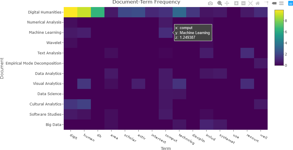
The matrix can now be visualized as a heatmap. Only the second though the last column names are required to be displayed on the x-axis. The document names are designated on the y-axis. Finally, the dtft_mat matrix contains the matrix values that will be displayed in the heatmap. Note that the y-axis is reversed so that the matrix can be easily interpreted. For the purposes of the visualization, 15 terms will be used. Only columns 2 through 16 are needed for the first 15 terms.
## Set the number of terms ('nterms') to use.
nterms <- 15
## Convert dtft to a standard matrix.
dtft_mat <- data.matrix(dtft)
dtft_mat <- dtft_mat[, 2:(nterms+1)]
## DTF of the first 'nterms' terms.
fig <- plot_ly(x = c(colnames(dtft)[2:(nterms+1)]),
y = doc_names,
z = dtft_mat, type = "heatmap")
fig <- fig %>% layout(title = "Document-Term Frequency",
xaxis = list(title = "Term"),
yaxis = list(title = "Document", autorange = "reversed"))
## Display the figure....
fig
The resulting heatmap is shown below.
In the next example, the entire tfidf matrix will be displayed. Again, the tfidf matrix is converted to a data frame, and re-converted to a matrix.
df_tfidf <- convert(tfidf, to = "data.frame")
df_tfidf_mat <- data.matrix(df_tfidf)
The first column, shown below, is not relevant to the visualization, and is removed. The -1 index indicates the last matrix dimension. In this case, df_tfidf_mat[, -1] indicates all rows (first dimension) and the last column (second dimension) of the df_tfidf_mat matrix.
> df_tfidf[,1]
[1] "subjectData.csv.1" "subjectData.csv.2" "subjectData.csv.3" "subjectData.csv.4"
[5] "subjectData.csv.5" "subjectData.csv.6" "subjectData.csv.7" "subjectData.csv.8"
[9] "subjectData.csv.9" "subjectData.csv.10" "subjectData.csv.11" "subjectData.csv.12"
## Remove the first (title) column.
df_tfidf_mat <- df_tfidf_mat[, -1]
## Display the TFIDF matrix.
fig <- plot_ly(x = c(colnames(df_tfidf)[-1]),
y = doc_names,
z = df_tfidf_mat,
type = "heatmap",
colorbar = list(title = "TFIDF"),
colors = colorRamp(c("blue", "yellow"))
)
fig <- fig %>% layout(title = "Term Frequency-Inverse Document Frequency",
xaxis = list(title = "Term"),
yaxis = list(title = "Document", autorange = "reversed"))
## Display the figure....
fig
The resulting plot is shown below.
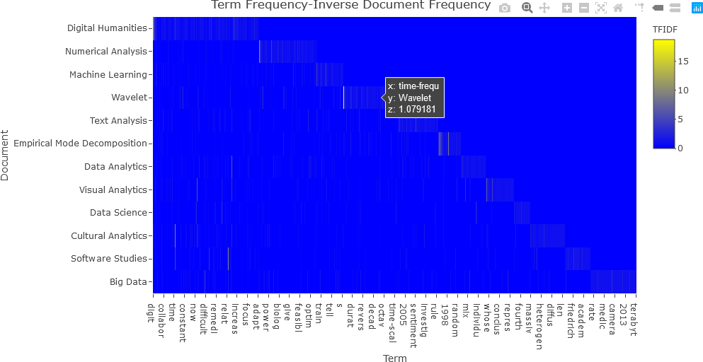
Notice that this plot is difficult to interpret because of the presence of many low values. Consequently, it is beneficial to transform the matrix values so that the dynamic range (the difference between the highest and lowest values) is reduced. Any mathematical transformation can be applied to the matrix values, but to make the values more uniform and to reduce the dynamic range, the square root operation was applied in this case. The modified code and resulting plot are shown below.
## NOTE: z = df_tfidf_mat^(1/2) or z = df_tfidf_mat^2, etc., can also be used.
fig <- plot_ly(x = c(colnames(df_tfidf)[-1]),
y = doc_names,
z = df_tfidf_mat^0.5,
type = "heatmap",
colorbar = list(title = "TFIDF<sup>1/2</sup>"),
colors = colorRamp(c("blue", "yellow"))
)
fig <- fig %>% layout(title = "Term Frequency-Inverse Document Frequency",
xaxis = list(title = "Term"),
yaxis = list(title = "Document", autorange = "reversed"))
## Display the figure....
fig
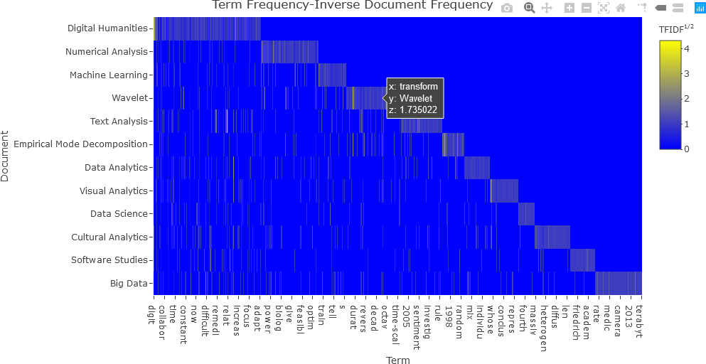
With the square root transformation, the values are better distinguished, and the plot is more easily interpreted.
The next section will further discuss keyness plots, and demonstrate how to generate them with Plotly in R.
KEYNESS PLOTS
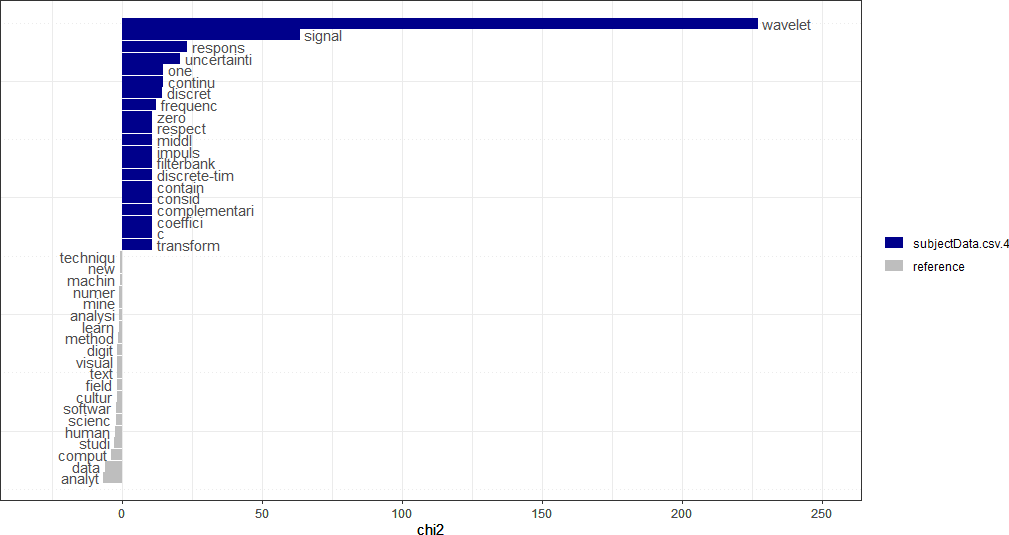
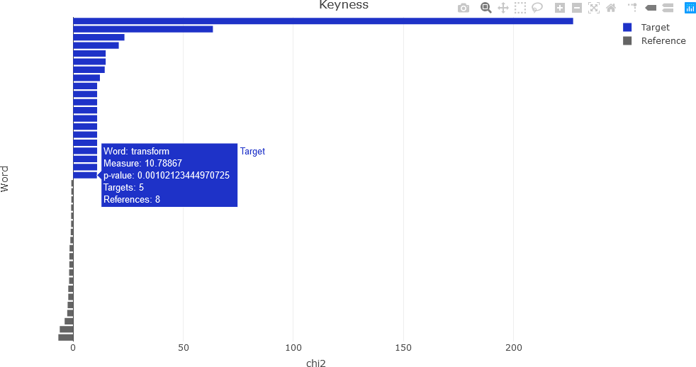
Recall that keyness is a statistical metric that measures association scores to identify words in a target and reference group in a collection of documents. Keyness can be calculated from a the Χ2 metric, the likelihood ratio (G2) and from several other association measures. This section demonstrates calculating keyness values and visualizing them. Specific functions for displaying keyness plots exist, such as the textplot_keyness() function in quanteda.textplots (see , Example: textual data visualization for instance). This function, as well as an interactive visualization of keyness values as a horizontal bar chart in Plotly, will be demonstrated.
First, the keyness values are computed. The quanteda package provides the textstat_keyness() function that takes a DFM as an argument (along with other arguments) and returns a matrix of keyness scores for features occurring differentially across various categories (see Calculate keyness statistics for further information). To compute keyness, a target document must be specified, usually as a document index. The remaining documents comprise a reference group against the target. Feature frequencies of the documents in the reference group are combined. The function also allows the user to specify the association measure: Χ2 (the default metric), likelihood ratio (G2), Fisher’s exact test (the most computationally intensive of the measures), and pointwise mutual information (a metric from information theory). The first example calculates keyness using the default Χ2 measure, with the 4th document as the target. Because subsequent processing will be performed to obtain the final keyness values, the intermediate result is simply named result, which is a list data structure.
## Chi-squared....
result <- textstat_keyness(dtm, target = 4)
> typeof(result)
[1] "list"
The plot can be visualized with a function call to textplot_keyness(), and is shown below.
textplot_keyness(result)
For the interactive Plotly keyness plot, some additional variables are needed, and additional text to display upon the user hovering over a plot feature must be constructed. First, the user determines how many labels there will be for the target and the reference. Based upon the quanteda example above, 20 labels will be used for each for the target and reference.
## Number of labels for each of the target, reference.
Ntop_labels <- 20
The total number of features can be obtained and stored in the variable Nfeatures.
## Get the total number of features.
Nfeatures <- nrow(result)
For generality, the name metric that was used for computing keyness is obtained from the result list. The metric is in the second row of result. In this example, the metric is chi2, as shown below.
## Get the name of the metric.
metric <- colnames(result)[2]
> metric
[1] "chi2"
To facilitate indexing, two index lists are calculated: one for the target values, and one for the reference values. In this example, the top and bottom 20 features are considered. Once the indices have been calculated, the target and reference keyness values and features are obtained, as shown below. (Note: The reader is encouraged to experiment with different ways to plot this data, or with different methods for performing “overhead” tasks, such as indexing.)
## Calculate the indices for the target and reference values to be displayed in the keyness plot.
targetIndx <- 1:Ntop_labels
refIndx <- (Nfeatures - Ntop_labels + 1):Nfeatures
## Extract keyness values from the 'result' data structure.
targetKeyness <- result[[2]][targetIndx]
refKeyness <- result[[2]][refIndx]
## Extract features from the 'result' data structure.
targetFeatures <- result$feature[targetIndx]
refFeatures <- result$feature[refIndx]
To generate text that can be used as hover text in the interactive Plotly visualization, some special processing is required. As is the case with most of what was shown in this demonstration, there are several correct approaches that can be taken. In this example, a separate data frame is generated in a straightforward, but lengthy manner, for the purpose of facilitating accessing the text for the interactive component of the visualization.
## Create a temporary data frame for the hovertext.
res = data.frame(result$feature[targetIndx], result$chi2[targetIndx], result$p[targetIndx], result$n_target[targetIndx], result$n_reference[targetIndx], result$feature[refIndx], result$chi2[refIndx], result$p[refIndx], result$n_target[refIndx], result$n_reference[refIndx])
The column names of the data frame generated in this way are not intuitive, and consequently are renamed. The renaming of the data frame columns also facilitates accessing the individual data columns in the Plotly visualization.
## Rename the columns to be more readable.
colnames(res) <- c('target_feature', 'target_metric', 'target_p', 'target_n_target', 'target_n_reference', 'ref_feature', 'ref_metric', 'ref_p', 'ref_n_target', 'ref_n_reference')
The new column names for the res data frame are verified as follows:
> colnames(res)
[1] "target_feature" "target_metric" "target_p" "target_n_target"
[5] "target_n_reference" "ref_feature" "ref_metric" "ref_p"
[9] "ref_n_target" "ref_n_reference"
The final preprocessing step involves splitting res so that it can be accessed as hover text by Plotly.
## Split the data frame for hovertext.
resultList <- split(res, seq_len(nrow(res)))
At this point, everything is needed to generate the keyness plot. There are several ways to proceed, but in this example, two separate traces are added: one for the target values, and a second trace for the reference values. In this way, the target and reference are easily distinguished. The keyness plot is generated as a horizontal bar chart. Refer to the Plotly documentation for further information.
###########################################################
##
## Add two separate traces for target and reference.
##
###########################################################
## Target....
fig <- plot_ly(x = targetKeyness,
y = c(Nlabels:(Ntop_labels+1)),
type = 'bar',
orientation = 'h',
name = 'Target',
text = targetFeatures,
customdata = resultList,
hovertemplate = paste('Word: %{text}',
'<br>Measure: %{x}',
'<br>p-value: %{customdata.target_p}',
'<br>Targets: %{customdata.target_n_target}',
'<br>References: %{customdata.target_n_reference}'),
marker = list(color = colours[1]))
## Reference....
fig <- fig %>% add_trace(x = refKeyness,
y = c(Ntop_labels:1),
type = 'bar',
orientation = 'h',
name = 'Reference',
text = refFeatures,
customdata = resultList,
hovertemplate = paste('Word: %{text}',
'<br>Measure: %{x}',
'<br>p-value: %{customdata.ref_p}',
'<br>Targets: %{customdata.ref_n_target}',
'<br>References: %{customdata.ref_n_reference}'),
marker = list(color = colours[2]))
## Layout modifications....
fig <- fig %>% layout(title = 'Keyness',
showlegend = TRUE,
xaxis = list(title = metric),
yaxis = list(title = 'Word', showticklabels = FALSE))
## Display the figure.
fig
The resulting interactive plot is shown below, indicating the information available by hovering over a feature.
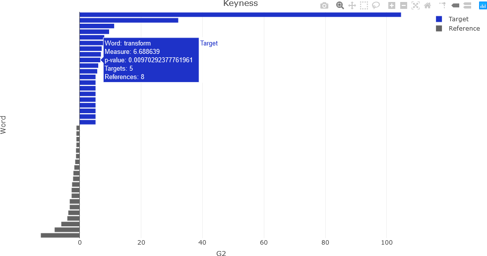
To compute keyness with a different association metric, a different argument is used in the quanteda textstat_keyness() function. In this example, the likelihood ratio (lr argument) is used.
## Likelihood ratio (G-squared)....
result <- textstat_keyness(dtm, measure = 'lr', target = 4)
Following the same procedure as for the Χ2 computations, the following plot is obtained.
CONCLUSION
This section described some basic text analysis and visualization operations in R. The quanteda library supplies many useful functions that facilitate text analysis. The reader is encouraged to experiment with the processes described here and streamline the workflow where needed to better align with specific application or research question of interest.
In the subsequent sections in the next course , some advanced features, including topic modeling, will be introduced.
