Interactive Visualization with Matplotlib And Plotly
INTRODUCTION TO MATPLOTLIB (PYTHON)
In this section, simple visualization techniques will be introduced with Matplotlib, a basic plotting library for Python. Matplotlib supports a variety of graphs, including line graphs, scatterplots, pie charts, and several others. It was used for data visualization for analyzing the landing of the Phoenix spacecraft in 2008. It was also used to generate the first image of a black hole. The visualizations in this section will be presented through examples.
In the first example, some simple connected graphs will be generated.
To use Matplotlib, the library must first be imported.
import matplotlib.pyplot as plt
In this code, the set of plotting functions from the Matplotlib (pyplot) are imported, and accessed through the Pyplot alias, plt (the user can choose a different name for the alias).
For the graph, a number of 2D points on a circle will be randomly generated. Each 2D point consists of an x (horizontal) and y (vertical) coordinate. Recall from basic trigonometry that points on a circle are defined by the radius of the circle and the angle of the point from the positive x (east) axis.
A 2D point on a circle centered at the origin, (0, 0), with radius r has coordinates:
x = r cos(θ)
y = r sin(θ)
where θ is the angle between the positive x-axis (east-facing) and the point. If the 2D circle is centered at a point (xc, yc), then
x = r cos(θ) + xc
y = r sin(θ) + yc
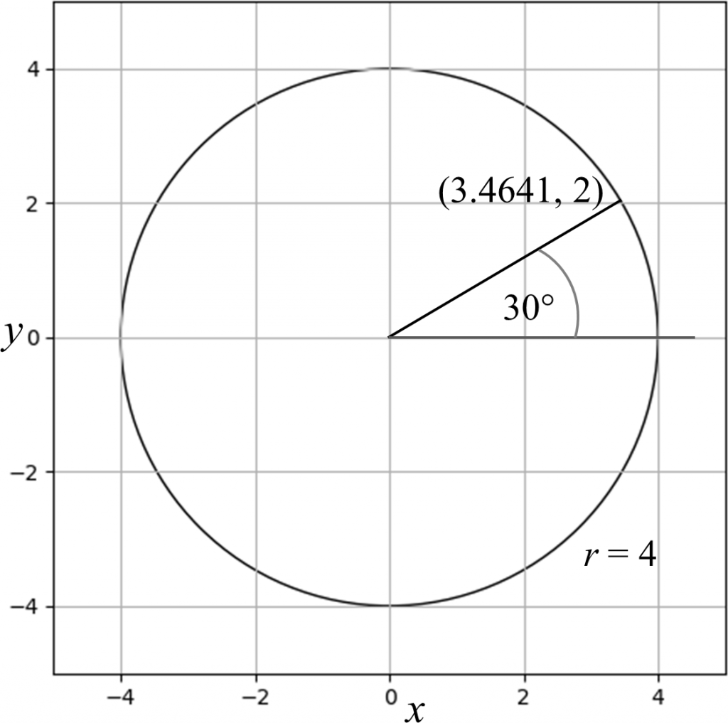
For example, a point on a circle centered at the origin, (0, 0) with radius r = 4 located at an angle of 30° from the positive x axis is calculated as follows.
x = 4 x cos(30°) ≈ 3.4641 (to 4 decimal places)
y = 4 x sin(30°) = 2
To calculate these values in Python, the following code is used
## Import the Numpy numerical library to use mathematical functions.
import numpy as np
## Radius of the circle
r = 4
## Angle, in degrees
deg = 30
## To use the sin and cos functions, the angle must be converted to radians.
rad = np.deg2rad(deg)
## Compute the x and y coordinates.
x = r * np.cos(rad)
y = r * np.sin(rad)
## Display the result as a tuple.
(x, y)
(3.464101615137755, 1.9999999999999998)
Note that the y coordinate, when rounded to 4 decimal places, becomes 2.0000, or simply 2.
The position of the point on the circle is shown below.
If the circle is centered at a different value, (xc, yc), then those components are added to the x and y values. The following code demonstrates an example with xc = -3.5 and yc = 10.
## Centre of the circle
xc = -3.5
yc = 10
r = 4
deg = 30
rad = np.deg2rad(deg)
x = r * np.cos(rad) + xc
y = r * np.sin(rad) + yc
(x, y)
(-0.03589838486224517, 12.0)
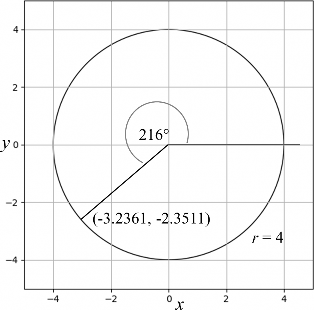
The reader is encouraged to verify that for a circle of radius r = 4.0 and centered at the origin, (0, 0), and if the angle is 216°, then x ≈ -3.2361 and y ≈ -2.3511, as shown below.
The Python code shown above can be vectorized; that is, operations can be performed on vectors, or lists or arrays of values. For this purpose, however, the vectors must be Numpy arrays. For instance, one multiplication operation can be used to compute the product of 4 and all of the values 7, 12, -100, -7.7, 3.5, and π, as follows:
res = 4 * np.array([7, 12, -100, -7.7, 3.5, np.pi])
res
array([ 28. , 48. , -400. , -30.8 , 14. , 12.56637061])
In this code, a Numpy array (or vector) was formed from the list [7, 12, -100, -7.7, 3.5, π] with the np.array() function, and all the elements in the array are multiplied by 4. The result is stored in the variable res, and displayed.
Therefore, the code to calculate the (x, y) coordinate on the circle in the above example can be rewritten as follows, where p0 denotes the centre of the circle, and p contains the (x, y) coordinate.
## Centre of the circle
xc, yc = -3.5, 10
r = 4
deg = 30
rad = np.deg2rad(deg)
## Convert (xc, yc) to a Numpy array.
p0 = np.array([xc, yc])
## Calculate x and y.
p = r * np.array([np.cos(rad), np.sin(rad)]) + p0
p
array([-0.03589838, 12. ])
The next step in the example is to generate N points. For simplicity, the circle is centered at the origin, (0, 0). The N points are generated pseudo-randomly with the Numpy function np.random.rand(N). The values returned by this function are in the range [0, 1). That is, a random number x generated is in the range 0 ≤ x < 1. However, the angles need to be in the range [0°, 360°). For simplicity, since 360° = 2π radians, the generated random numbers can be directly converted to radians.
In the following example, N is set to 15. That is, 15 random angles in the range [0, 2π) will be generated. Note that array (vector) operations are used, as described above.
###############################################################
##
## Generate N points on a circle centered at (0,0) with
## radius r and random angles ranging from 0 radians
## (0 degrees) to 2*pi radians (360 degrees).
##
###############################################################
## Number of (x, y) points to generate....
N = 15
## Radius of the circle....
r = 2
## N random angles....
theta = np.random.rand(N) * 2 * np.pi
## Calculate the (x, y) coordinates: x = r * cos(theta), y = r * sin(theta)
x = r * np.cos(theta)
y = r * np.sin(theta)
The variables x and y are Numpy arrays containing the x and y coordinates, respectively, of the randomly generated points on the circle.
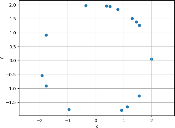
Scatter Plot
Now that the coordinates have been generated, different types of plots will be generated. The first plot is a simple scatter plot, that displays the (x, y) coordinates as points on the graph. Note that the points appear on the circumference of the circle.
################################################
##
## Scatter plot....
##
################################################
plt.figure(0)
plt.scatter(x, y)
plt.axis('equal')
plt.xlabel('x')
plt.ylabel('y')
plt.grid('both')
## Display the plot.
plt.show(block = False)
The first line of the code,
plt.figure(0)
Creates a new figure with identifier 0. Note that the figure is not yet visible. It must be shown with a separate operation. Note that the figure() function is a pyplot (named as plt) function. Therefore, plt.figure() is invoked. There are alternate ways to import the Matplotlib library so that the plt object does not need to be specified. However, plt is explicitly used in this example for clarity.
The next line generates the scatter plot. Again, the function scatter() is invoked on the plt object with the two arguments x and y.
plt.scatter(x, y)
The next three lines of code format the plot. The function call:
plt.axis('equal')
sets the axis to be displayed uniformly, to avoid one axis being stretched more than the other, resulting in a distorted figure.
The next two lines label the x– and y-axes.
plt.xlabel('x')
plt.ylabel('y')
The next line specifies that grid lines are to appear on both the x– and y-axes. Grid lines are not necessary, but sometimes assist the user in interpreting the graph.
plt.grid('both')
As mentioned above, the preceding lines generate and format the plot, but the plot is not displayed. To display the plot, the show() function must be explicitly invoked on the plt object. To allow the user to continue to enter Python commands on the command line while the figure is displayed, the non-blocking display must be specified with the block = False argument.
plt.show(block = False)
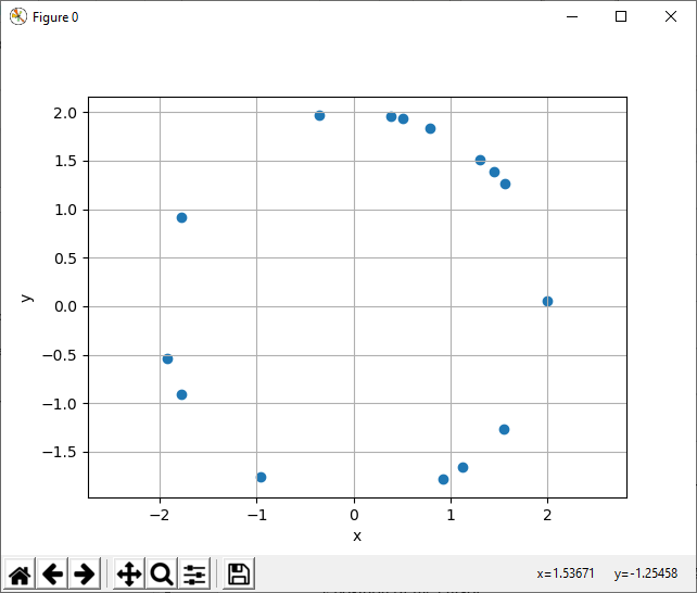
The plot is shown below. Note that because the points are generated randomly, a different set of points will be displayed each time the code is executed, unless the pseudo-random number seed value, an integer with which the pseudo-random number generator is initialized, is explicitly set so that the random number generation sequence starts at the same value, and the sequence is therefore the same each time the code is run. In this example, the pseudo-random number seed was set to 100 before any pseudo random numbers were generated.
## Seed random number generator.
np.random.seed(seed = 100)
The plot has some degree of interactivity. Positioning the cursor over the plot displays the x and y position of the cursor in the lower right corner of the figure window. Note that the window is named Figure 0, as the figure was created with the argument 0: plt.figure(0).
Line Plot
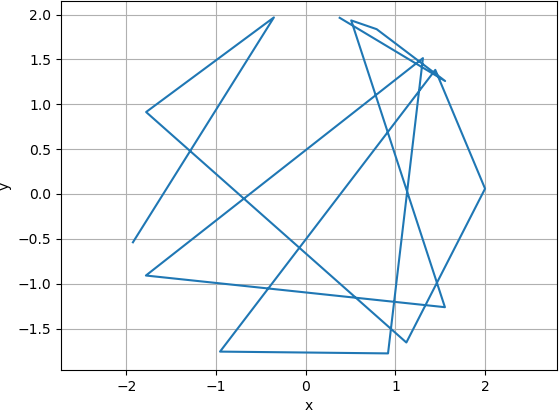
The data can also be displayed as connected line segments with the plot() function. The vertices (endpoints) are connected in the order in which they are generated. For example, the 15 x and y coordinates can be displayed as follows.
x
array([-1.92608295, -0.35461535, -1.77925272, 1.1218389 , 1.99912097,
1.44436861, -0.95524779, 0.91751598, 1.30646139, -1.7814803 ,
1.5515622 , 0.50708491, 0.79050879, 1.5539474 , 0.37849604])
y
array([-0.5387063 , 1.96831094, 0.91337822, -1.65574077, 0.05929021,
1.38340136, -1.75712881, -1.77712251, 1.51431788, -0.90902583,
-1.26200426, 1.93464852, 1.83714339, 1.25906611, 1.96385864])
Consequently, the first vertex is (-1.92608295, -0.5387063), the next vertex is (-0.35461535, 1.96831094), followed by (-1.77925272, 0.91337822), etc. The first line segment is therefore drawn from (-1.92608295, -0.5387063) to (-0.35461535, 1.96831094), and the next line segment is drawn from (-0.35461535, 1.96831094) to (-1.77925272, 0.91337822). The remaining line segments are drawn in the same way. Because there are 15 vertices in this example, and each line segment requires two vertices, there are 14 connected line segments.
Note that the argument for the figure is now 1, so that the line plot is displayed in a new figure, and the original scatter plot is not overwritten. That is, the scatter plot was generated by executing the function plt.figure(0), and is displayed in figure 0, and the line plot was generated by executing the function plt.figure(1), and is displayed in figure 1. The code to set the equal axes, to label the x and y axes, to display the x and y grid lines, and to display the graph is the same as for the scatter plot.
################################################
##
## Line plot....
##
################################################
plt.figure(1)
plt.plot(x, y)
plt.axis('equal')
plt.xlabel('x')
plt.ylabel('y')
plt.grid('both')
## Display the plot.
plt.show(block = False)
The resulting graph is shown below.
Graph
The example continues with creating a graph. In graphs, the nodes (points) and edges, or links, designating the connectivity between the nodes must be specified. In the current example, the connectivity is defined as follows:
- Each node is connected to the two nodes most distant from it.
- Each node is connected to the second-closest node. In other words, it is not connected to the closest node, but to the node having the next greater distance than the closest node.
There are several ways to solve this problem. The current example will take a straightforward approach, wherein the distances between each pair of nodes is calculated, and the connections will be determined based on these distances. The distances will be stored in a distance matrix, a 2D matrix whose elements are the distances from a node in a specified row to a node in a specified column.
Consider the first three nodes, Node 0, Node 1, and Node 2 (recall that Python index numbering starts at 0, not 1). The positions of the three nodes are:
Node 0: (-1.92608295, -0.5387063); that is, x = -1.92608295, and y = -0.5387063.
Node 1: (-0.35461535, 1.96831094)
Node 2: (-1.77925272, 0.91337822)
Let node0 denote the position of Node 0, node1 denote the position of Node 1, and node2 denote the position of Node 2. Let di,j denote the distance between nodei and nodej. The distance can be computed with the Euclidean distance, also known as the 2-norm, or simply norm. The Euclidean distance is related to the Pythagorean theorem, and is given as follows:

Here, xi and yi are the x component and y component, respectively, of nodei, and, xj and yj are the x component and y component, respectively, of nodej.
Using the positions of the node given above, d0,1 = 2.9588 (to 4 decimal places), d0,2 = 1.4595, and d1,2 = 1.7727. These distances can be calculated in Python as follows:
node0 = np.array([x[0], y[0]])
node1 = np.array([x[1], y[1]])
node2 = np.array([x[2], y[2]])
np.linalg.norm(node0-node1)
2.9588250759879373
np.linalg.norm(node0-node2)
1.4594891445345024
np.linalg.norm(node1-node2)
1.7727026428442052
The Euclidean distance is calculated with the norm() function, accessible from linear algebra functions provided by Numpy. The Python code to compute the distances and to store these distances in the distance matrix, called D, is given below.
## Compute the distance matrix, D.
## Initialize the distance matrix to N rows and N columns.
D = np.zeros((N, N))
## Loop through each row of the distance matrix, examining Node i.
for i in range(0, N):
## For simplicity, store the (x, y) coordinates in the
## variables 'node_i' and 'node_j'.
## The 'i' denotes a the i-th row.
node_i = np.array([x[i], y[i]])
## Loop through each column of the distance matrix, calculating the
## Distance between Node i (node_i) and Node j (node_j).
for j in range(0, N):
## The 'j' denotes the j-th column.
node_j = np.array([x[j], y[j]])
## Calculate the Euclidean distance.
d = np.linalg.norm(node_i - node_j)
## Store the result in the i-th row and j-th column of the
## distance matrix.
D[i,j] = d
An intuitive way to assess the distance matrix is to display it as a heatmap (or heat map), where the matrix is displayed as an image, and the pixel in row i and column j is coloured according to the distance value. Heatmaps can be displayed in Matplotlib by displaying the matrix as an image.
## Generate a new figure.
plt.figure(3)
## Create the image with the standard 'jet' colour map.
## NOTE: Other colour maps can be used.
plt.imshow(D, cmap = 'jet')
## Display the colour bar.
plt.colorbar()
## Set the labels for the x and y axes.
plt.xlabel('Node j')
plt.ylabel('Node i')
## Display the plot.
plt.show(block = False)
The resulting heatmap is shown below.
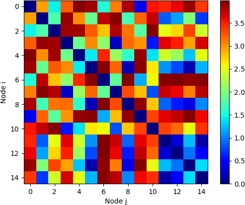
As was the case with the Matplotlib plots demonstrated earlier, positioning the mouse over a square element at row i and column j displays i, j, and the value of di,j, the distance between nodei and nodej, in the lower right corner of the display window. Because the mouse can be positioned in any location within the square, the i and j values may not be integers. Note that the diagonal of this matrix, starting at the upper left and progressing to the lower right, all have values of zero, as the distance between a node and itself is always zero. That is, di,i, = 0 for all values of i, and di,j = 0 if i = j.
The code to obtain the second-closer neighbour and two most distant neighbours to each node is shown below. A new N x 3 2D matrix, named INDX, is allocated. There are N rows, one row per node, and three columns into which to place the indices of the node’s neighbours. In row i of INDX, indicating nodei, the first column is the index of the second closest node to nodei. The second and third columns contain the indices of the most distant node and the second most distant node, respectively. The code adds the edges, or links, to the scatter plot.
## For the edges, get the indices of the two furthest and second closest
## point.
## Allocate a matrix for the indices.
INDX = np.zeros((N, 3))
## Loop through each node.
for i in range(0, N):
## Get the i-th row of the distance matrix D.
d0 = D[i]
## Index of (ascending order) sorted values.
## NOTE: The smallest value is 0 (distance from a point to itself), and
## therefore the first (0-th) element of the sorted indices is not used.
## Get the indices of the ascending assorted row values.
indx = np.argsort(d0)
INDX[i, 0] = indx[2] ## Skip indx[0] (itself) and indx[1] (closest).
INDX[i, 1] = indx[-1] ## Largest (furthest) distance.
INDX[i, 2] = indx[-2] ## Second largest (second furthest) distance.
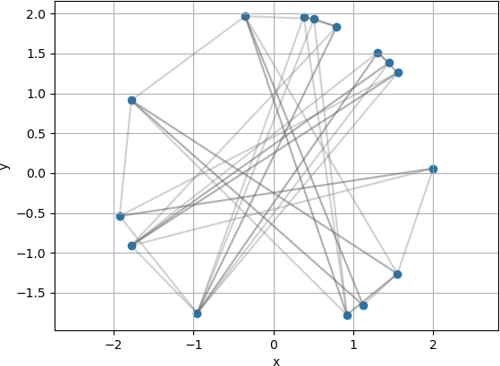
In a graph, the nodes and the edges are both drawn. A new figure is generated, and the scatter plot is first placed onto the plot to represent the nodes in the same manner as shown above.
## First, draw the scatterplot.
plt.figure(2)
plt.scatter(x, y)
plt.axis('equal')
plt.xlabel('x')
plt.ylabel('y')
plt.grid('both')
The next lines of code add the connections between the nodes as lines. Each link is made of the starting and ending x value for edge, and the starting and ending y values for the edge. These values are stored in the variables xline and yline for the x and y coordinates, respectively. The three index values for the connections to nodei are accessed in the inner j loop. In this example, the edges are shown in a semi-transparent grey colour (0.4, 0.4, 0.4) with alpha set to 0.3 for semi-transparency.
## Edge colour....
edge_colour = [0.4, 0.4, 0.4, 0.3]
## Next, draw the connections (edges) calculated above, in a
## semi-transparent grey colour.
## Loop through each node.
for i in range(0, N):
## Determine the connections for node i through the indices of the
## connecting nodes.
for j in range(0, 3):
## x-values of the edge (drawn as a line).
xline = [x[i], x[int(INDX[i, j])]]
## y-values of the edge (drawn as a line).
yline = [y[i], y[int(INDX[i, j])]]
## Add the line to the current plot using the specified colour.
plt.plot(xline, yline, color = edge_colour)
The plot can then be displayed with the show() function.
## Display the plot.
plt.show(block=False)
The result is shown below.
DISPLAYING THE PLOTS WITH PLOTLY
The preceding plots can also be generated with the Plotly library, which provides interactive features and additional options for controlling the visualization. Plotly can be used in two basic ways: through Plotly Express and Plotly Graph Objects. Many visualizations can be generated and displayed with Plotly Express. Plotly Graph Objects are somewhat more powerful and provide additional features but are also somewhat more complex. The examples below will illustrate both approaches.
First, the libraries must be imported. In this example, the Plotly Express functions are named px, and the Plotly Graph Objects functions are named go.
## For Matplotlib plotting....
import matplotlib.pyplot as plt
## For Plotly plotting....
## Plotly express....
import plotly.express as px
## Graphics objects....
import plotly.graph_objects as go
The algorithms and code to generate the nodes on the circumference of the circle and to determine connections for the graph are the same as for using Matplotlib. The code sections below demonstrate generating scatter plots.
## Using Plotly Express....
fig0 = px.scatter(x = x, y = y)
fig0.update_yaxes(scaleanchor = 'x', scaleratio = 1)
fig0.show()
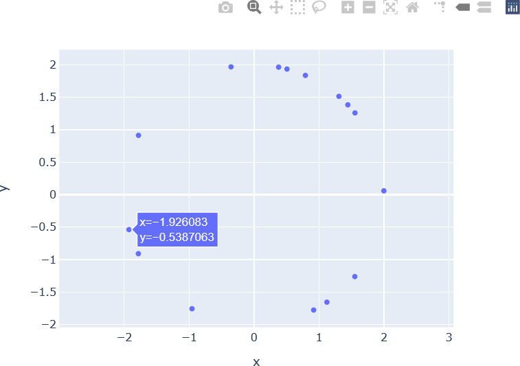
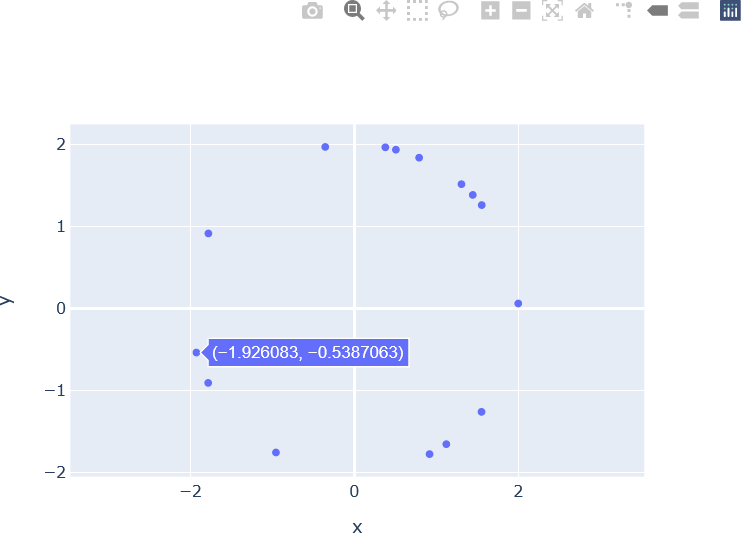
The first set of operations invoke the scatter() function on the Plotly Express library, and generate the plot object, named fig0 in this example. The x and y arguments are set to the variables x and y which were calculated earlier in the code (x = x, y = y). The next line enforces equal scaling for the x and y axes. Specifically, the y-axis is scaled to the x axis with a scale factor (scaleratio) of 1, indicating that the axis scaling is equal. This line is analogous to the plt.axis('equal') function call that was used with Matplotlib. The generated scatter plot is then displayed by invoking the show() function on px. The result is show below. Note the interactive controls provided Plotly, located in the upper right corner of the window. Additionally, hovering over a node (scatter point) displays the x and y coordinates of that node.
The scatter plot can also be generated with Plotly Graph objects as follows:
## Using Graphics Objects....
fig0_go = go.Figure()
fig0_go.add_trace(go.Scatter(x = x, y = y))
fig0_go.update_yaxes(scaleanchor = 'x', scaleratio = 1)
fig0_go.show()
The result is shown below. Note that the plot is almost identical to that produced by Plotly Express.
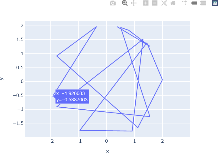
The connected line segments plots are generated in Plotly Express and Plotly Graph Objects as follows:
## Using Plotly Express....
fig1 = px.line(x = x, y = y)
fig1.update_yaxes(scaleanchor = "x", scaleratio = 1)
fig1.update_layout(xaxis_title = 'x', yaxis_title = 'y')
fig1.show()
## Using Graphics Objects....
fig1_go = go.Figure()
fig1_go.add_trace(go.Scatter(x = x, y = y, mode = 'lines'))
fig1_go.update_yaxes(scaleanchor = 'x', scaleratio = 1)
fig1_go.update_layout(xaxis_title = 'x', yaxis_title = 'y')
fig1_go.show()
The plot generated with Plotly Express is shown below.
The plot generated with Graphics Objects is similar.
To display the graph, minor modifications need to be made to the loop to generate the edges. After calculating xline and yline and adding the lines to the Matplotlib plt object, a list of x coordinates (edge_x) and y coordinates (edge_y) for the edges is constructed. The two variables must be allocated first.
## For Plotly....
edge_x = []
edge_y = []
## Next, draw the connections (edges) calculated above, in a
## semi-transparent grey colour.
## Loop through each node.
for i in range(0, N):
## Determine the connections for node i through the indices of the
## connecting nodes.
for j in range(0, 3):
## x-values of the edge (drawn as a line).
xline = [x[i], x[int(INDX[i, j])]]
## y-values of the edge (drawn as a line).
yline = [y[i], y[int(INDX[i, j])]]
## Add the line to the current plot using the specified colour.
plt.plot(xline, yline, color = edge_colour)
## For Plotly plots.
edge_x.append(xline[0])
edge_x.append(xline[1])
edge_x.append('None')
edge_y.append(yline[0])
edge_y.append(yline[1])
edge_y.append('None')
The nodes of the graph are defined by the x and y variables, as was the case with the graph generated with Matplotlib. To generate the plot with Plotly Graph Objects, two separate plot objects, or traces, are added to the plot. A trace must be generated for the graph edges and nodes.
To specify the edge trace (the edge_trace variable) the x and y coordinates for the edge end points are provided in the variable edge_x and edge_y, respectively. In this example, the name (set to ‘Link‘) is used for displaying the legend. The line argument is set to a dictionary that specifies the line characteristics. The line width (width) is set to 0.5, and the line colour (color) is set the previously defined edge colour, converted to an RGBA (for Red, Green, Blue, Alpha) string (edge_colour_rgba). The alpha value indicates the opacity of the colour. The highest alpha value indicates that the colour is completely opaque. If an object has a completely opaque colour, when it is overlaid atop another object, the second object will be hidden by the first one. The lowest alpha value indicates that the colour is completely transparent; that is, it will not be displayed at all. Values between the highest and lowest alpha values indicate the degree to which the colour is translucent. For displaying lines, Plotly Graph Objects require colours in specific formats. One of these formats is an RGBA string. For example, green with an alpha component of 0.8 would be represented in an RGBA string as ‘rgba(0,255,0,0.8)‘. A function, colour2rgbaStr() to convert colours in the range [0, 1] to an RGBA string consisting of 8-bit red, green, and blue values is shown below.
##############################################################
##
## Convert continuous (in [0, 1]) colour tuple or array
## to an RGBA string.
##
##############################################################
def colour2rgbaStr(rgb):
rgbaStr = 'rgba({:.0f},{:.0f},{:.0f},{:f})'
rgbaStr = rgbaStr.format(rgb[0]*255, rgb[1]*255, rgb[2]*255, rgb[3])
return(rgbaStr)
The hoverinfo argument specifies what is to be displayed on hover. In this example, no hover information (‘none‘) is displayed when hovering over edges. The mode argument specifies that lines (‘lines‘) are to be displayed.
## Edges....
edge_trace = go.Scatter(x = edge_x,
y = edge_y,
name = 'Link',
line = dict(width = 0.5, color = edge_colour_rgba),
hoverinfo = 'none',
mode = 'lines')
The code for generating the trace for the nodes (the node_trace trace) is shown below. In this example, the name (set to ‘Node‘) is used for displaying the legend. The mode indicates that markers, or points or nodes, are to be displayed. The marker argument is set to a dictionary of properties for the markers, specifically, the color (a green colour in this example) and the size of the marker (10 in this example).
## The variables 'x' and 'y' contain the x and y positions of the nodes.
node_trace = go.Scatter(x = x,
y = y,
name = 'Node',
mode = 'markers',
marker = dict(
color = colour2rgbaStr([0.3, 0.7, 0.5, 1.0]),
size = 10)
)
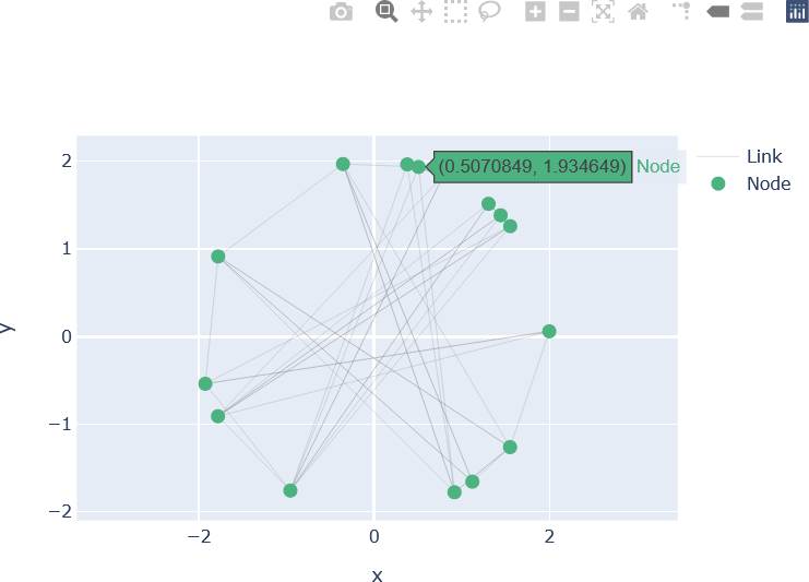
The edge trace and node trace are then added to a new figure object, fig2_go in this example. The axis scaling and labels for the x and y axes are set as before. After these updates, the figure is shown.
fig2_go = go.Figure(data = [edge_trace, node_trace])
fig2_go.update_yaxes(scaleanchor = "x", scaleratio = 1)
fig2_go.update_layout(xaxis_title = 'x', yaxis_title = 'y')
fig2_go.show()
The resulting graph is shown below.
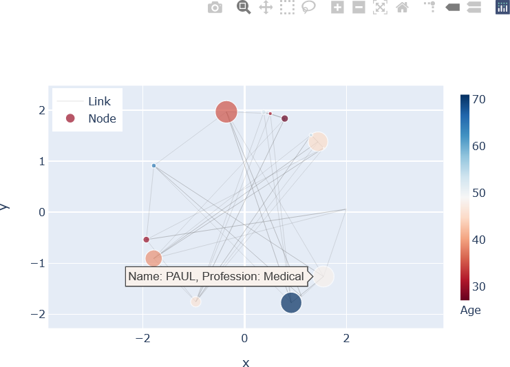
Further modifications can be made. For example, the colours and sizes of each node can reflect specific data. Additional hovering information can also be provided. For example, suppose that the graph represents a social network consisting of N individuals. Each individual has a name, profession, age, and number of posts on a social media platform. Further suppose that these properties are set as follows:
##################################################################
##
## Properties of individuals on a social media network.
##
##################################################################
AGE = [30, 35, 64, 28, 27, 45, 46, 71, 54, 39, 48, 31, 27, 61, 52]
PROFESSION = ['Sales', 'Education', 'Media', 'Engineering', 'Student',
'Education', 'Technical' 'Management', 'Retail', 'Medical',
'Law', 'Medical', 'Technical', 'Education', 'Management',
'Technical']
NAME = ['HERMAN', 'LUKE', 'FRANZ', 'REBECCA', 'CYNTHIA', 'GORDON',
'LORRAINE', 'ELENA', 'JOAN', 'LEAH', 'PAUL', 'ANDREW', 'VERA',
'STANFORD', 'HELEN']
POSTS = [129, 436, 91, 5, 12, 380, 203, 413, 72, 334, 407, 75, 142, 19, 92]
In this example, the individual’s age is indicated by the colour of the node, and the number of posts is represented by the size of the node. The name and profession of the individual is displayed upon hovering over the node for that individual. The code shown above is modified as follows.
## Edges....
edge_trace = go.Scatter(x = edge_x,
y = edge_y,
name = 'Link',
line = dict(width = 0.5, color = edge_colour_rgba),
hoverinfo = 'none',
mode = 'lines')
## The variables 'x' and 'y' contain the x and y positions of the nodes.
node_trace = go.Scatter(x = x,
y = y,
name = 'Node',
mode = 'markers',
hoverinfo = 'text',
marker = dict(
showscale = True,
colorscale='RdBu',
color = [],
size = np.array(POSTS)/max(POSTS) * 25,
colorbar = dict(
thickness = 10,
title = 'Age',
xanchor = 'left',
titleside = 'bottom')
)
)
## Update the node colours by the number of connections
node_trace.marker.color = AGE
## Text to be displayed on hover (hover information)....
node_text = []
## Construct the hover information from the individual's NAME and PROFESSION.clear
for i in range(0, N):
node_text.append('Name: {name}, Profession: {profession}'.format(name =
NAME[i],
profession = PROFESSION[i]))
## Add the node text to the node trace.
node_trace.text = node_text
fig3_go = go.Figure(data = [edge_trace, node_trace])
fig3_go.update_yaxes(scaleanchor = "x", scaleratio = 1)
fig3_go.update_layout(xaxis_title = 'x', yaxis_title = 'y')
## Because a colour bar is shown on the right side, position the
## legend in the upper left corner of the plot.
fig3_go.update_layout(legend = dict(
yanchor = 'top',
y = 0.99,
xanchor = 'left',
x = 0.01
))
## Display the figure.
fig3_go.show()
The resulting plot, displaying an example of hovering over a node, is shown below.
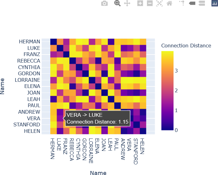
The distance matrix displayed above as a heat map can also be implemented with Plotly Graph Objects. To enhance interactivity, the names of the individuals in each connection are shown by hovering over the corresponding element in the distance matrix. Additionally, the “Connection Distance”, or distance between the individuals’ nodes, is included. The heat map is displayed with the “viridis” colour map, although other colour maps can be used. The reader is encouraged to study the commented Python code below, which may be implemented in alternate ways. The reader is also encouraged to experiment with Plotly’s features, and to enhance this simple interactive plot further.
########################################################
##
## Distance matrix heat map.
##
########################################################
## Initialize a new list for hover text.
hovertext = list()
###################################################################
##
## Construct the text for the heat map.
##
## Iterate through each row (y-dimension). There are N rows.
## np.arange(0, N) returns a Numpy array of integers:
## [0, 1, 2, ..., N-1].
##
###################################################################
for yi, yy in enumerate(np.arange(0, N)):
## Append a new list to 'hovertext' that contains the information
## to be displayed on hovering over a heatmap element.
hovertext.append(list())
## Iterate through each row, appending the text information to
## the end of the hovertext to enforce the order.
for xi, xx in enumerate(np.arange(0, N)):
hovertext[-1].append('{} -> {}<br />Connection Distance: {}'.format(NAME[yi], NAME[xi], "{:.2f}".format(round(D[yi][xi], 2))))
######################################################################
##
## Generate the heat map.
##
######################################################################
fig4_go = go.Figure(data = go.Heatmap(z = D,
x = NAME,
y = NAME,
colorbar = dict(
title = 'Connection Distance'
),
hoverinfo = 'text',
text = hovertext))
## Specify that the matrix rows are displayed from top to bottom.
fig4_go['layout']['yaxis']['autorange'] = 'reversed'
## Specify equal scaling on both axes.
fig4_go['layout']['yaxis']['scaleanchor'] = 'x'
fig4_go['layout']['yaxis']['scaleratio'] = 1
## Update the axis titles.
fig4_go['layout']['xaxis_title'] = 'Name'
fig4_go['layout']['yaxis_title'] = 'Name'
## Display the figure.
fig4_go.show()
The resulting heat map is shown below.
Plotly provides many additional options for modifying the appearance and interactivity of the plot. These features are described in the online documentation.
