A.3 Tables, charts, and graphs
Tables
Uses for tables
Tables are rows and columns of numbers and words (though mostly numbers). They permit rapid access to and relatively easy comparison of information. If the data is arranged chronologically (for example, sales figures over a ten-year period), the table can show trends—patterns of rising or falling activity. However, tables are not necessarily the most vivid or dramatic means of showing such trends or relationships between data—for that, you’d want to use a line graph, which is discussed in the next section.
The biggest use of tables is for numerical data. Imagine that you are comparing different models of laser printers in terms of physical characteristics such as height, depth, length, weight, and so on. This type of data is perfect for a table.
A special type of table is called a matrix. This is where instead of comparing numerical values in the rows and columns, you are comparing qualitative data (words). For example, imagine that you were comparing several models of a laser printer and you want to represent various information, such as cost, print speed, supply costs, and warranty terms, for each printer being considered. This is ideal information for a matrix, and it would be mostly words rather than numbers.
Formatting requirements
In its simplest form, a table is a group of rows and columns of data. At the top of each column is a column heading, which defines or identifies the contents of that column (and often it indicates the unit of measurement). On the left edge of the table are row headings, which define or identify the contents of that row. Things can get tricky when rows or columns must be grouped or subdivided. In such cases, you have to create row or column subheadings, as shown in Figure 5.3.1.

Figure 5.3.1 Format for tables with grouped or subdivided rows and columns.
As you can see, the title and number for the table goes above the table. This is in contrast to other types of graphics where the title and number go below the graphic.
Guidelines for using tables
As with other types of graphics, you should refer to the table in the text just preceding the table. You should also explain the general significance of the data in the table; don’t expect readers to figure it out entirely for themselves.
Don’t overwhelm readers with monster 11-column, 30-row tables! Simplify the table data down to just that amount of data that illustrates your point—without of course distorting that data.
Don’t put the word or abbreviation for the unit of measurement in every cell of a column. For example, in a column of measurements all in millimeters, don’t put “mm” after every number. Put the abbreviation in parentheses in the column or row heading.
Right- or decimal-align numbers in the columns. If the 123 and 4 were in a column, the 4 would be right below the 3, not the 1.
Normally, words in columns are left-justified (although you will occasionally see columns of words all centered).
Column headings are centered over the columns of numerical data (forming a T-shape). When the table contains text rather than numbers, the column headings are left-aligned.
Just as you would cite and reference a paraphrase or a direct quote, so too must you cite and reference any tables that you use that were created by someone else or that were based on someone else’s data. Indicate the source of any graphic or data you have borrowed. Whenever you borrow a graphic or data from some other source, document that fact in the figure title using an in-text citation. You should also include the reference information in the reference list.
Charts and graphs
Uses of charts and graphs
Charts and graphs are just another way of presenting the same data that is presented in tables. At the same time, however, you get less detail or less precision in a chart or graph than you do in the table. Imagine the difference between a table of sales figures for a ten-year period and a line graph for that same data. You get a better sense of the overall trend in the graph but not the precise dollar amount. Other types of charts and graphs are horizontal bar charts, vertical bar charts, and pie charts.
Formatting requirements
In bar charts and line graphs, don’t forget to indicate what the x and y axes represent. One axis might indicate millions of dollars; the other, five-year segments from 1960 to the present.
Bar charts, line graphs, and pie charts often use special colour, shading, or line style (solid or dashed). Be sure to indicate what these mean; translate them in a key (a legend) in some unused place in the chart or graph.
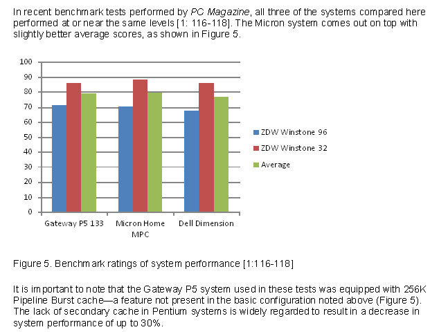
Include a title and numbered label for your charts and graphs. Include the title and label below the graphic, as shown in Figure 5.3.2.

Figure 5.3.2 Example of a chart
As you can see, there is text above and below the chart that calls attention to the graphic and briefly indicates its significance.
Just as you would cite and reference a paraphrase or a direct quote, so too must you cite and reference any charts or graphs that you use that were created by someone else or that were based on someone else’s data. Indicate the source of any graphic or data you have borrowed. Whenever you borrow a graphic or data from some other source, document that fact in the figure title using an in-text citation. You should also include the reference information in the reference list.

