Keyboard Testing
A good way to start your accessible testing is with a keyboard. It is equipment you already have and are familiar with. For some people with disabilities, they exclusively use their keyboard and don’t use a mouse at all. Therefore, all webpage features would need to be keyboard accessible, meaning someone should not need a mouse to interact with your webpage.

Keyboard commands
All internet browsers include these keyboard commands:
- Tab goes to the next clickable element (link or form control), Shift+Tab goes to the previous one.
- When on a link, pressing Enter will click it.
- When on a button, pressing Enter or Space will click it.
- When on a radio button or checkbox, pressing Up/Down or Left/Right arrow keys will cycle through all the elements in the group.
Hover state vs. Focus state
One way that a webpage highlights where a user is on the page is by using visual cues. These visual cues can be called a hover state for mouse navigation or a focus state for keyboard navigation.
A hover state – is a visual highlight feature that appears on a clickable element when a user moves their mouse pointer over it.
A focus state – is a visual highlight feature that appears on a clickable element when a user tabs to it (with their keyboard).
An easily recognizable and visible focus state helps sighted users that only use a keyboard to navigate and interact with a webpage.
When designers/developers customize the focus state, it can make it more difficult to recognize easily. Therefore, it’s especially critical to test the focus state on all clickable elements if elements have been customized.
Visible focus indicator
Specific instances of a focus state can be called a focus indicator. The result is that when a link or button receives focus (by the user tabbing to it), a visible focus indicator is displayed. A visible focus indicator is any dotted line, highlight, or visible marker that shows which clickable element is in focus and actionable.
Examples of a visible focus indicator:
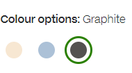
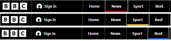
- Dotted (or solid) line around a link:

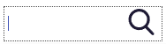
- Cursor inside a text box:

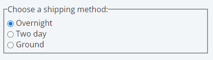
- Styling that shows you which radio button you’ve selected:
- An underline or other marker:
Acceptable visible focus indicators
Currently, Web Content Accessibility Guidelines (WCAG) 2.1 only requires that a focus indicator be visible (2.4.7: Focus Visible). WCAG 2.2 (currently in draft) will provide new, additional success criteria related to what the focus indicator looks like (e.g., size, colour contrast). While these are not current requirements, it is a good idea to prepare for this improvement.
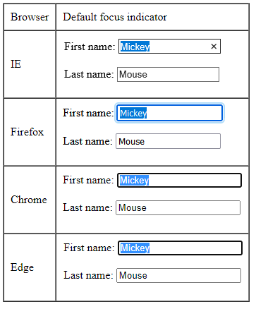
Browsers vary in how strong their focus indicators are, although recent browser versions have been improving. In the table below, Microsoft Internet Explorer has a very poor focus indicator. In comparison, the other browsers have strong focus indicators – Mozilla Firefox has a double border, and Google Chrome and Microsoft Edge have dark borders.
Test cases
When conducting keyboard accessibility testing, here are some recommended test cases:
| Step | Test | Pass | Fail |
|---|---|---|---|
| 1 | Use Tab to navigate around the page, and verify that you can reach all clickable elements. | All clickable elements can be reached. | Some clickable elements can’t be reached. |
| 2 | As you tab around the page, all clickable elements must show a visible focus indicator. | All clickable elements show a visible focus indicator. | Some clickable elements do not show a visible focus indicator. |
| 3 | All clickable elements must be reached in a logical order (top to bottom, left to right). | All clickable elements are reached in a logical order. | Some clickable elements are not reached in a logical order. |
| 4 | Tab to some links and press Enter. | Links function as though they were clicked. | Links do not function as though they were clicked. |
| 5 | When you’ve reached a radio button or checkbox, press the Up/Down arrow keys to cycle through them. | You were able to reach all the elements in the group. | You were not able to reach all the elements in the group. |
| 6 | When you’ve reached a submit button, press Enter or Space to “click” it. | Submit button was clicked. | Submit button was not clicked. |
Resources:
- WCAG Success Criterion 2.4.7: Focus Visible
- WCAG Success Criterion 2.4.11: Focus Appearance (Minimum)
