Colour Contrast
Colour contrast measures the difference in brightness between foreground and background colours – usually the colour of text and the background behind it. Web Content Accessibility Guidelines (WCAG) 2.1 colour contrast guidelines require the following:
- Large text must have a colour contrast of 3.0:1 or higher. (Large text is defined as any of: 1.5em, 18pt, 24px, 1.2em bold, 14pt bold, 19px bold, or larger.)
- Small text must have a colour contrast of 4.5:1 or higher.
- Icons must have a colour contrast of 3.0:1 or higher.
- Logos are exempt from colour contrast guidelines.
There are two common colour contrast assessment tools that are explained below: TPGi Colour Contrast Analyser and Chrome Color Picker.
TPGi Colour Contrast Analyser
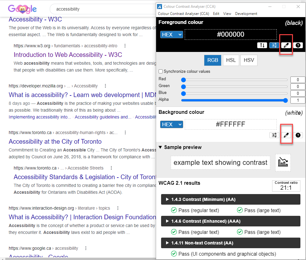
The TPGi Colour Contrast Analyser (CCA) can be used to sample any colours you can see on your screen. As a result, it can be used to test any kind of digital content, including web pages, Word documents, PDFs, etc. To use it, do the following:
- CCA has two eyedroppers – one to sample foreground colours and one to sample background colours.
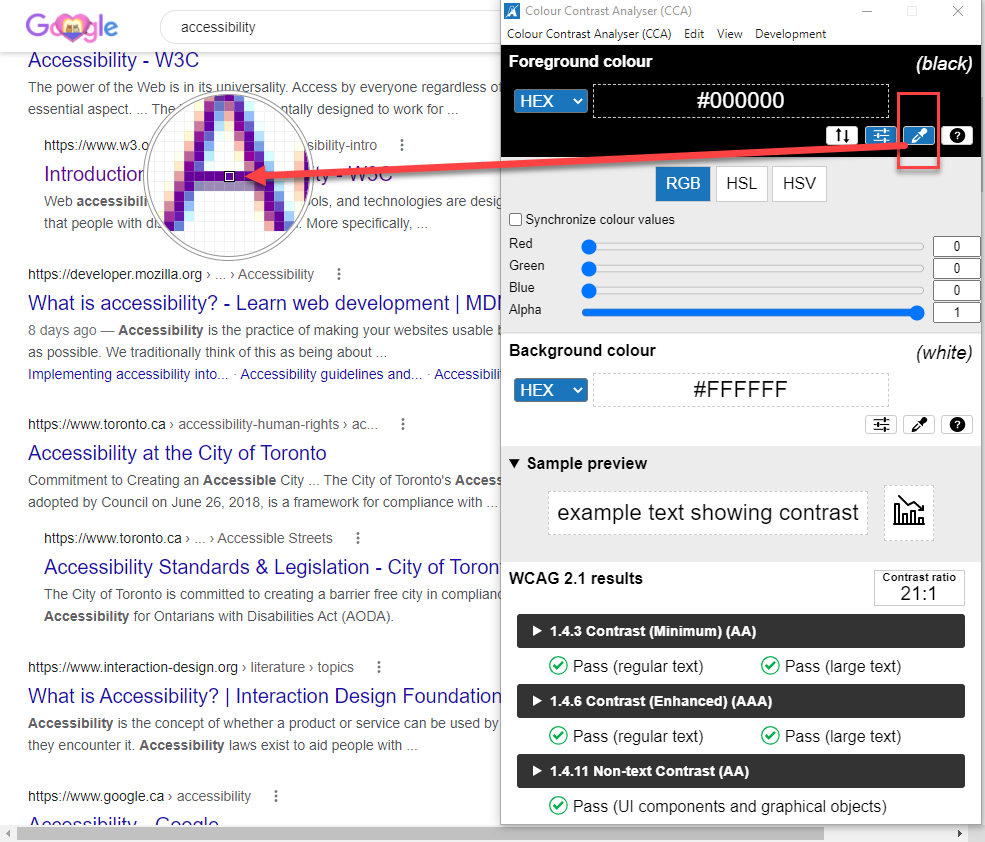
- Select the first eyedropper, and then click on the darkest pixel (that you can find) in the text.
- Select the second eyedropper, and then sample the background colour (white space in this case).
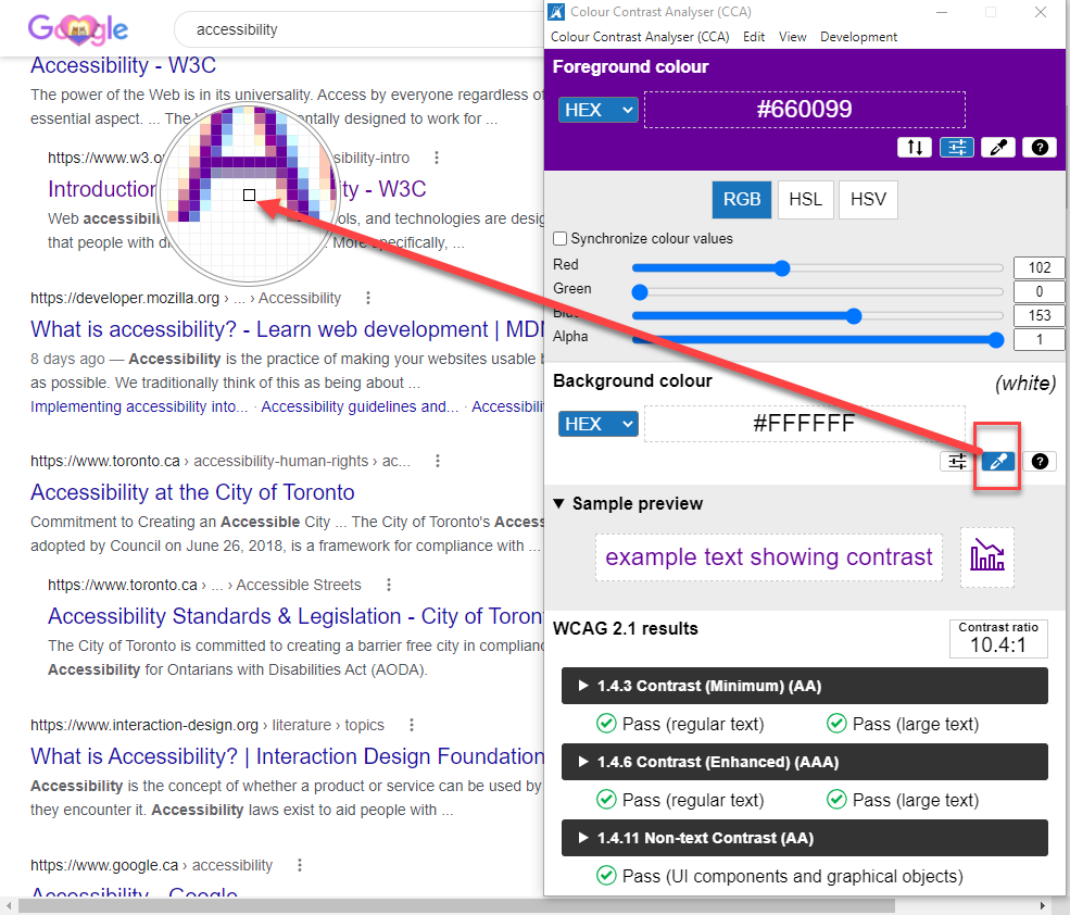
- CCA will display the contrast ratio.
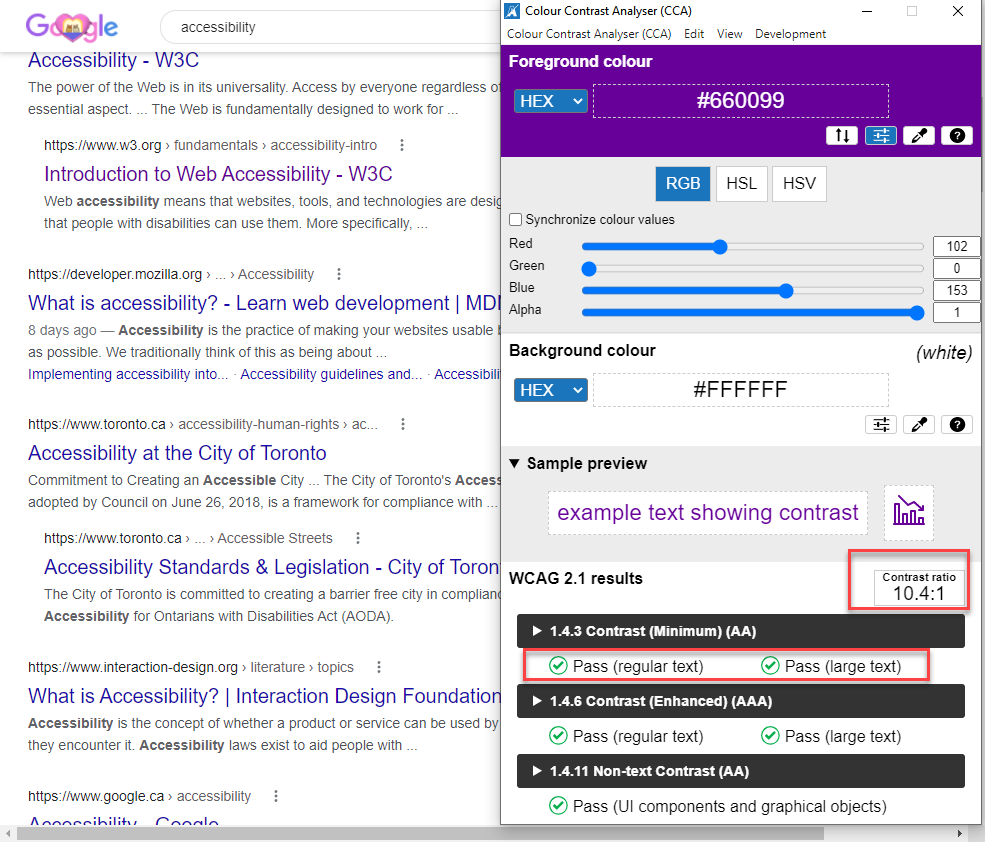
In this example, the colour contrast is 10.4:1 and clearly passes the minimum colour contrast as set out by WCAG 2.1.
Chrome “Color Picker”
In the Chrome browser, the DevTools panel includes a “Color Picker” feature. To use it, do the following:
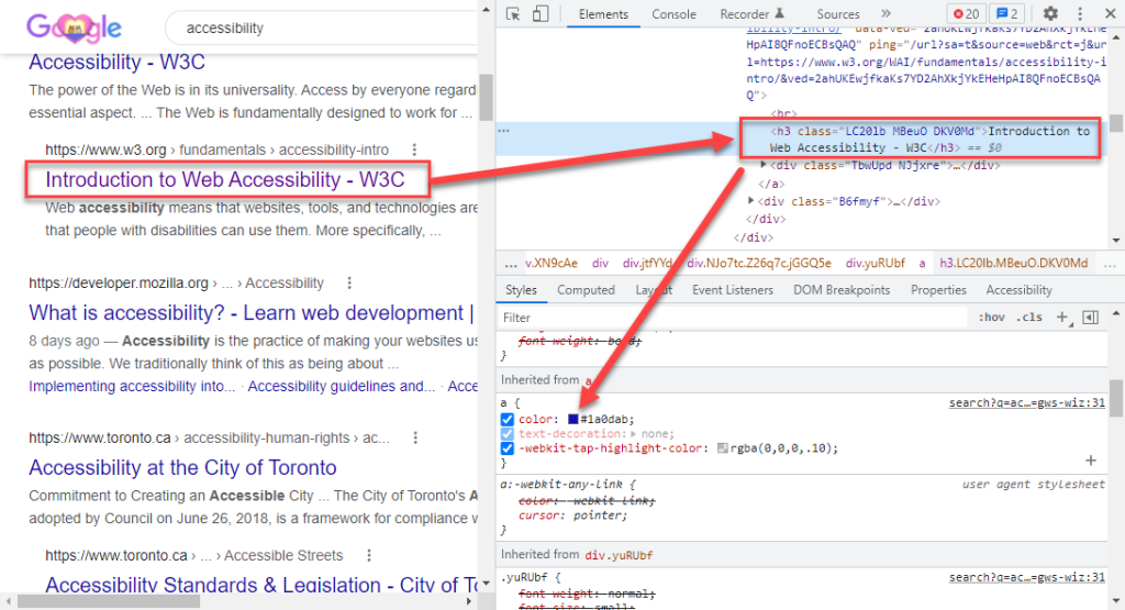
- Find the element (text or icon) you’d like to test, right-click on it, and select Inspect.
- In the DevTools panel, select the Elements tab (unless it’s already selected).
- Click the colour square next to the element’s color value in the Styles pane.
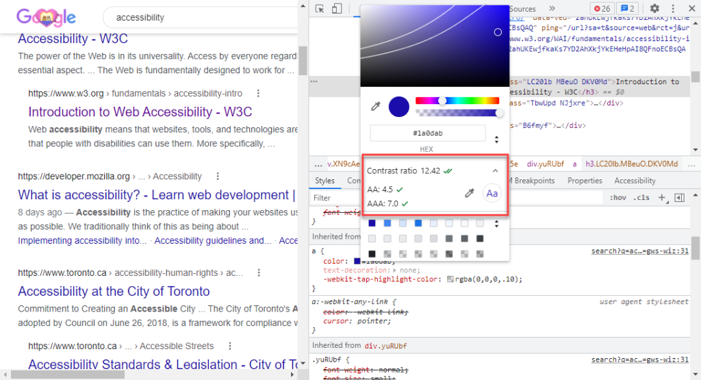
- Have a look at the Contrast ratio section of the Color Picker. It will display the element’s contrast ratio. One checkmark means that the element meets the WCAG single A recommendation (4.5:1). Two checkmarks means that it meets the WCAG double A recommendation (7.0:1).
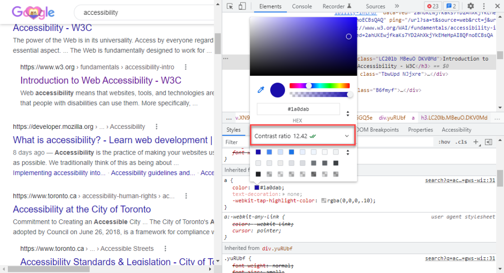
- You can also use the eyedroppers to test other colours you see on the page. The eyedropper for foreground colours is above the hex code. The eyedropper for background colours is in the collapsed section under the Contrast ratio.
Resources:
