Document Accessibility
Documents like PDFs, Excel Sheets, Word Documents, and Presentations create barriers for staff and students if not accessibly created.
Planning your content structure up front will save time in preparing any accessible document. If your goal is to create a PDF, the most direct way to make it accessible is from the source (Word, Excel, PowerPoint, etc.). You will also need Adobe Acrobat Pro or PDF Accessibility Checker (PAC) 2 (Windows only) to make your PDFs accessible.
You can follow these guidelines when aiming to create an accessible document from any application:
- Use plain language
- Add descriptive contextual links
- Add alternative text
- Use document headings
- Consider accessibility for time-based media (audio / video)
- Use built-in accessibility checkers
Use plain language
Plain language (also called simple language) ensures that your text is concise and easy to understand. Using simple language benefits people with learning or other cognitive disabilities and language barriers. Determine the needed level of simplicity based on the target audience. In a post-secondary context, simplicity of language is further complicated as advanced level reading or technical knowledge may be a requirement within certain curricula or programs. However, for information that is meant to be accessed by the public, use plain language as much as possible.
To write using plain language, try the following tips:
- Cut extra words
- Use short, everyday words, for example:
- Ask, instead of inquire
- Next, instead of subsequently
- Help, instead of render assistance
- Use the active voice (i.e., the doer of the action is at the beginning of sentence)
- “Customers can now board the train on platform 12” (active voice)
- “The train on platform 12 can now be boarded” (passive voice)
- Write in short sentences
- Use action verbs
- Avoid difficult words and explain difficult words if you must use them
- Use contractions (i.e., don’t instead of do not)
- Use neutral pronouns (they/them)
- Use bulleted lists
For more information and resources on plain language, checkout these links:
Add descriptive contextual links
On websites and in apps, it is common to have a link that takes you to a different page. Sometimes the text that describes the link is not very clear. For example, if a user who relies on a screen reader hears “Click here” without any additional information, they won’t know what that links to. Link text should make it easy to understand where the link is going. Avoid “click here” or “read more,” because these are not descriptive and do not tell the user what the purpose of those links are or where the links will take them.
Add alternative text
Alternative text are descriptive words applied to visual information, such as images, charts, and diagrams. Alternative text is embedded and usually hidden text. When a screen reader encounters an image, it reads out whatever alternative text is attached to it.
When using MS Word, you can add alternative text, or alt-text, to images by right-clicking on the image and scrolling to “edit alt-text.” In MS PowerPoint, select your image, then navigate to the “picture tools” format on the main ribbon. “Alt-text” is found under the accessibility options.
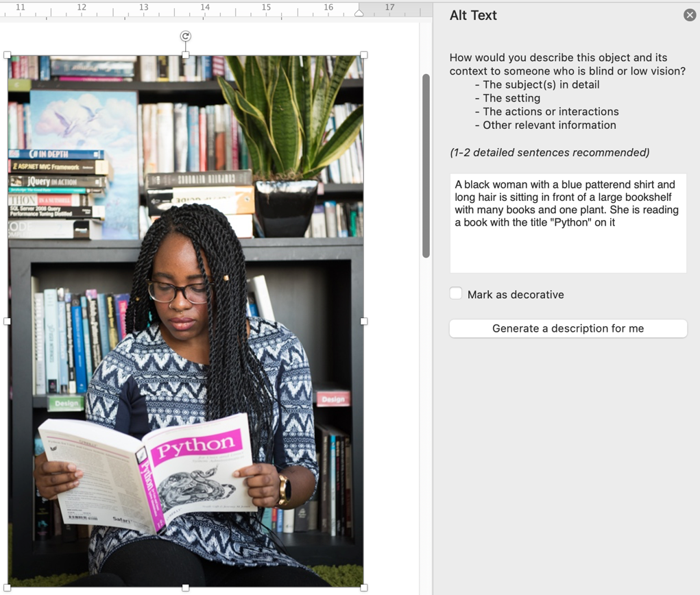
Most other tools, including email systems and PowerPoint also have built in tools to add descriptive text. Many applications will generate automatic descriptions of an image. Do not rely on these descriptions as they are often poor quality.
Use document headings
Headings can help structure a document. They also increase the document’s readability. Headings visually break up text and help the reader navigate and locate the information they are looking for.
It is important that headings are properly coded for persons using screen readers. Use the headings formatting found in the “styles” panel of MS Word. Use level 1 headings for main titles. Use level 2 headings or higher for sub-headings within a specific section. This helps screen reader technology to work effectively and allows a person to navigate the content.
Consider accessibility for time-based media (audio / video)
Be sure to provide a text equivalent for all time-based media formats, including audio and video. Text alternatives include captions and transcripts. Do not rely on audio alone to communicate meaning. Similarly, include descriptive audio in videos and don’t rely on video alone to communicate meaning.
Avoid repetitive animation and flashing effects as this may trigger people with photosensitive seizure disorders. You can also consider programming reduced motions settings, meaning that a user can reduce or remove animations if they wish.
Application-specific guidelines
Adobe PDF (Portable Document Format)
PDF documents can be made accessible by including tags as recommended in the latest PDF/UA Universal Accessibility Guidelines and the WCAG 2.0 PDF Guidelines. Including good accessible formatting in your source document can help with PDF tagging, but additional work will still be needed.
Microsoft products
Microsoft includes accessibility checkers in their applications. To run the checker, click on Tools and then “Check Accessibility”. The program will identify some (not all) potential barriers for people with disabilities and provide suggestion on how to remove those barriers and improve the accessibility of your documents.
Microsoft Excel
Consider the following tips to make your Excel spreadsheet more accessible:
- Add a description of the document layout. For example, a note indicating the direction of the text flow, whether it is top to bottom or left to right.
- Use consistent conventions throughout the document.
- Apply the proper formats for your data cells. Format text data as text, money as currency, and dates as dates.
- Identify row and column headers in data tables.
- Separate headings so that it is understandable.
- Label each worksheet with a meaningful name as opposed to Sheet1, Sheet2, etc.
Microsoft PowerPoint
Consider the following tips to make your PowerPoint presentation more accessible:
- Keep presentations short and clear. This helps people with learning or other cognitive disabilities stay focused.
- Keep your message as concise as possible; do not crowd text on your slides. This also considers differing amounts of time someone might need to read and understand what is on the slide. Considered a maximum of 4-5 bullets per slide.
- Keep in mind that the layer order defines the reading order for assistive technologies from PowerPoint.
- Remember that because presentations are viewed from a distance, font size and colour contrast are highly important. Use a minimum of 24 pt font with high-contrast colours
- Minimize or remove slide animations or transitions because these can cause unnecessary visual distractions.
If your presentation is going to be shared in a digital format, e.g., on your website or in an email, consider persons with vision loss and those using screen-readers.
- Provide alt-text for all images
- Use the built-in slide design templates since they provide navigational structure for screen readers
Anything that might hinder people with disabilities’ full and equal participation. Barriers can be architectural, technological, attitudinal, based on information or communications, or can be the result of a policy or procedure. Barriers can be financial, knowledge based, or directly related to an individual’s disability (e.g., no descriptive alternative text accompanying a photo would be a barrier for someone with a vision impairment).
The design of products, devices, services, environments, technologies, policies and rules in a way that allows all people, including people with a variety of disabilities, to access them.
A technology that helps people who have difficulties seeing to access and interact with digital content, like websites or applications via audio or touch (e.g. Braille). Screen readers include JAWS, NVDA, and VoiceOver.
Specialized hardware or software that can assist people with disabilities to perceive and interact with digital content.
