Desktop vs Mobile Content
Today, mobile and desktop web development are very similar. However, there are still some differences to be considered in development.
Historically, early mobile devices were often feature-poor and low-resolution. Modern mobile devices, on the other hand, like smartphones and tablets, can typically render full websites. Similarly, web content development has moved away from a distinction between desktop and mobile browsers. Responsive design chooses an optimal layout based on the user’s screen dimensions. This is helpful from a developer’s perspective since it allows for a single version of a website. This single version can dynamically update the layout as necessary to accommodate different screen/window sizes and resolutions.
There are still considerations specific to each modality when designing a site for multiple platforms.
Click vs Tap
A user may use a mouse to click on elements in a standard desktop browser. The mouse pointer is a precise means of control. Generally, a person who can use a mouse can click on a small target area.
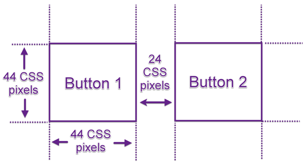
WCAG success criteria specify that targets must have 24 CSS pixels of spacing between them (for level AA conformance), and a target size of 44×44 CSS pixels (for AAA conformance).
In addition to the accessibility considerations around small target areas, you should also consider the mobile experience. Mobile users might use their fingers to tap on icons, buttons, and other User Interface (UI) elements. A user’s finger represents a much larger (and less focused) selection tool when tapping. In addition, the user’s finger will block their view of the screen as they are tapping. Therefore, it is essential to ensure that target areas are large and, where possible, sufficiently separated to allow selections without accidentally triggering neighbouring elements.
Switch vs Keyboard
On desktop systems, assistive technologies often take the form of virtual keyboards. They might use tab keystrokes to move between selectable user interface elements and use arrow keys (or page-up/page-down) to scroll through content.
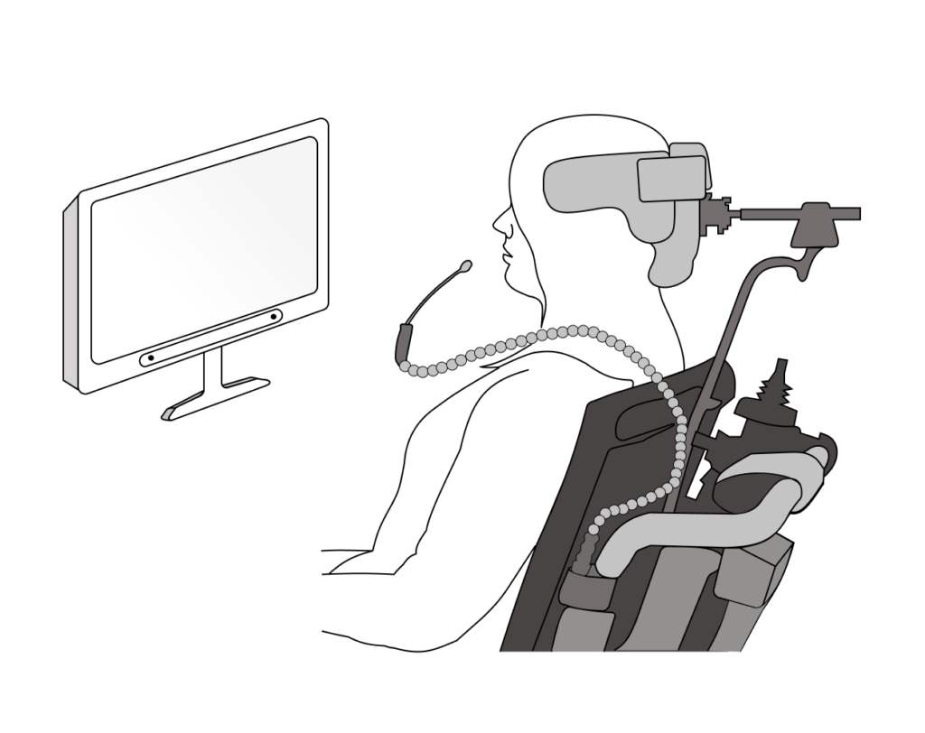
Mobile devices often use different methods. Users with dexterity disabilities can use a switch control unit consisting of two or more switches to iterate between interactive elements, or to select a “targeting” mode. Typically one switch will be used to cycle through UI elements on a page, and another switch will activate the element. Another method is to have an input switch activate a sweep across a screen, allowing a user to directly target elements on the screen. Switches can be handheld, mounted on a wheelchair, or foot-operated.
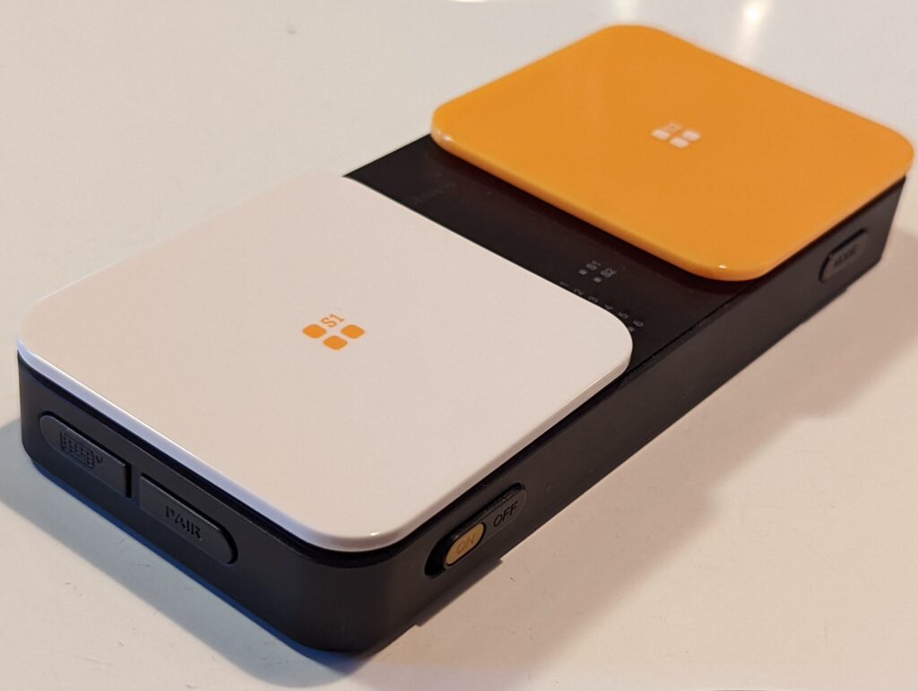
Here’s a basic switch control unit with two switches – one for cycling through UI elements, and the other for activating them.
With a sip and puff switch, sipping will activate one switch, and puffing will activate the other.
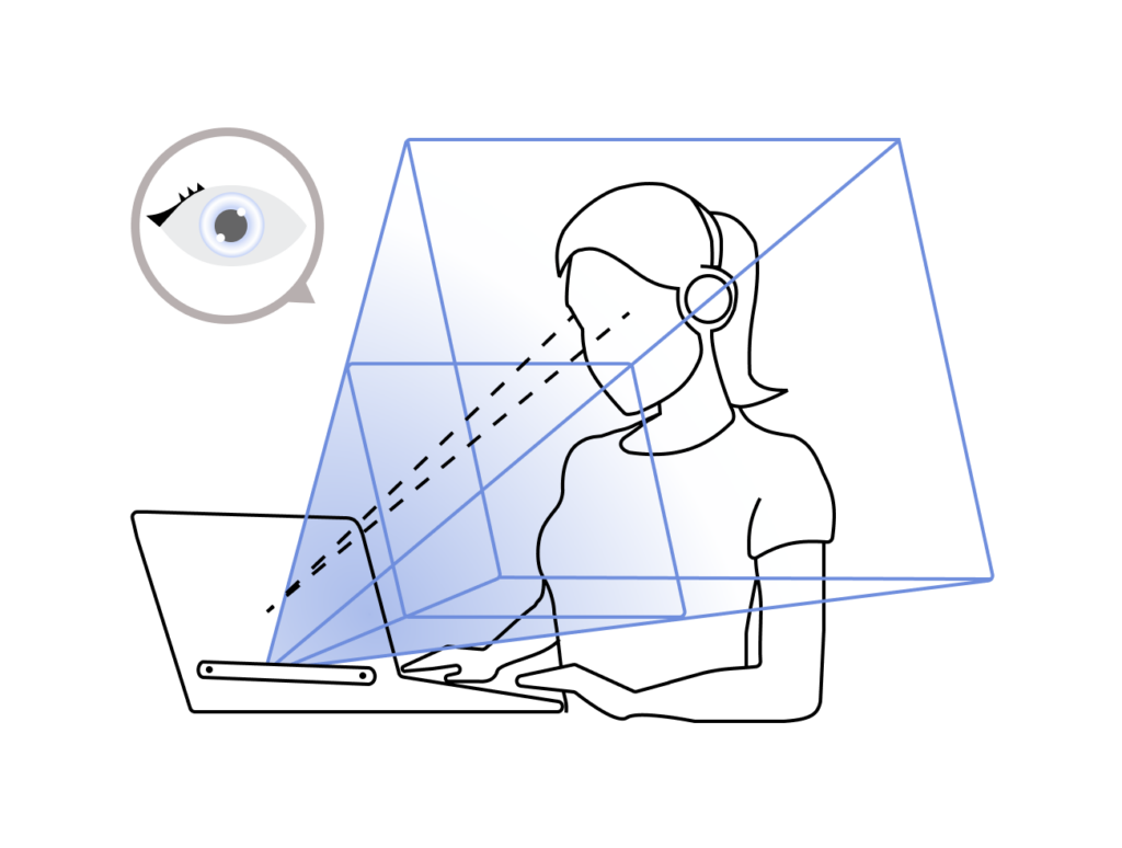
An eye tracking device can be mounted along the bottom of your monitor, where it uses infrared light and a series of cameras to see where your eyes are looking. Looking at a UI element for a pre-set period of time will activate it.
Pinch to Zoom
Mobile users expect to be able to zoom in/out on content on mobile devices. Ensure that your application responds to zoom events, like pinch to zoom gestures, without breaking the layout of the content.
Device font settings
Mobile apps should respect the font system settings for each device, for example, large or bold font. Mobile websites do not need to adapt to the device settings.
Web Content Accessibility Guidelines
How well something, such as a product, service or a system, meets a specified standard.
User Interface
Specialized hardware or software that can assist people with disabilities to perceive and interact with digital content.
Any impairment, or difference in physical, mental, intellectual, cognitive, learning, or communication ability. Disabilities can be permanent, temporary, or episodic (meaning that the impact of the disability can change over time). There are different types of disabilities, including physical, vision-related, hearing-related, and cognitive disabilities. The specifics of a disability vary by person and a person can have more than one disability.
Software that interacts with a digital device using one or more switches instead of the mouse-click or tap on a touchscreen.
