10 How should I represent my data?
Read time: 1 minute
Text, Table, or Figure?
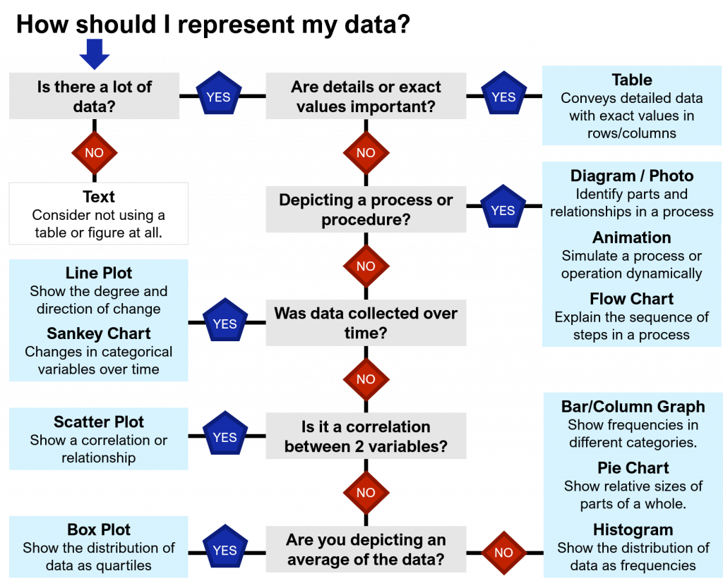
There are many ways to present qualitative or quantitative data to your readers, and this choice can change how well your findings are understood. Simple information can be presented in the text, more data can be laid out into Tables, and complex relationships should be represented as graphs, charts, or other types of Figures. Use the flowchart below (Figure 10.1) to help you decide what is best suited for your data and purpose.

Don’t forget your audience
The first thing to consider, as always, is the audience. For a more general audience, like in a popular magazine or website, data can be simplified to the key message and displayed visually (Figure 10.2 left). The same data is better presented in a Table for an audience that wants to know the exact numbers and details (Figure 2.1.2 right).


