17 Infographics
Read time: 4 minutes
Overview
This chapter discusses one specific type of SciComm: The Infographic.
Sections in this chapter
The Rise of Infographics
Infographics are visual communications that use icons, illustrations, and limited text. They have a fascinating history and have risen in popularity as a way to visualize “big data”, for example,[1] data related to worldwide effects of climate change or global pandemic data. Infographics present these complex systems in a way that makes it easy to see how things relate to one another. By providing a view of the big picture, infographics can give non-experts instant insight that can lead to real change (Figure 17.1).

Creating an Infographic
Infographics are designed to show “big data” in the most minimalistic way, and so the audience, scope, and purpose of the infographic must be well defined in the planning stage.
Purpose
In science, infographics are used to inform, explain, entertain, or to spur action. In the example above, Florence Nightingale had a clear purpose for making her infographic: to get the attention of the government so they would take action to improve sanitary conditions. When creating your own infographic, make sure you have a clear message you are trying to convey to the reader. Knowing the purpose of the infographic will help you know which data and information are essential, and what can be left out.
Audience
Closely linked to the purpose of your infographic is it’s intended audience. Who are you trying to convey your message to? Review the chapter “Knowing your audience” and think about how the age, education, location, and other demographics may influence how you design your infographic.
Scope
The best infographics have some sort of narrative or story that the viewer/reader can follow, one that aligns with the key message and purpose of the visualization. Once you have your audience and purpose, it’s easy to define the scope of your infographic and build a narrative. Write a script or storyboard for this narrative. Start with a hook, like an intriguing question, which will draw in the reader to the details.
See if you can define the purpose, audience, and scope of these infographics:
Click here to show an answer
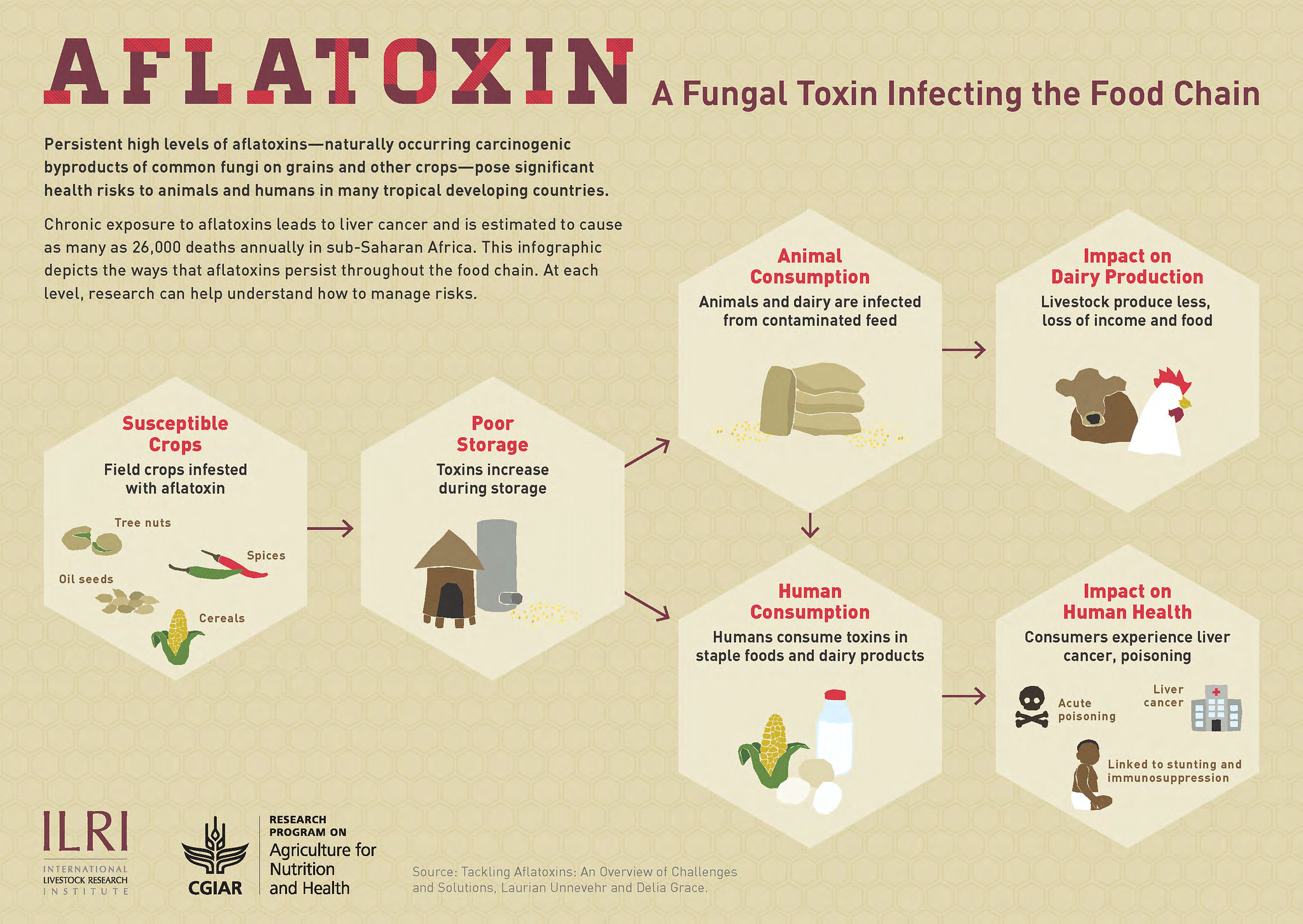
Purpose: Inform and explain
Audience: General but informed public, possible research donors
Scope: Impacts of the fungus on human systems and health in Africa
Click here to show an answer
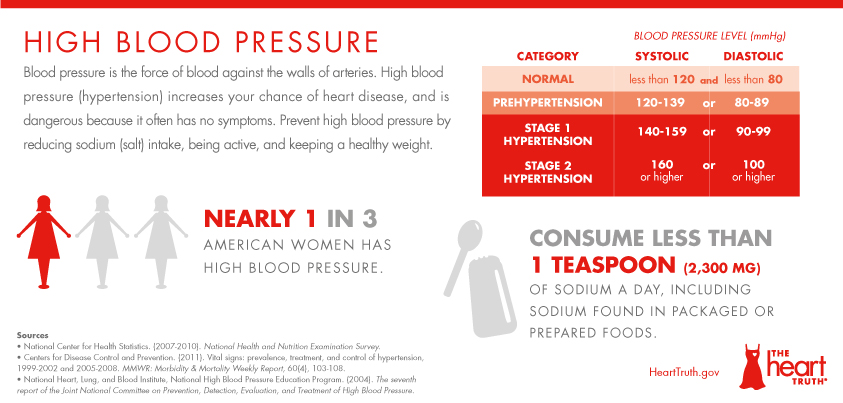
Purpose: Inform and call to action
Audience: Targeted to women
Scope: Inform on the issue and suggest actions for women to take
Click here to show an answer
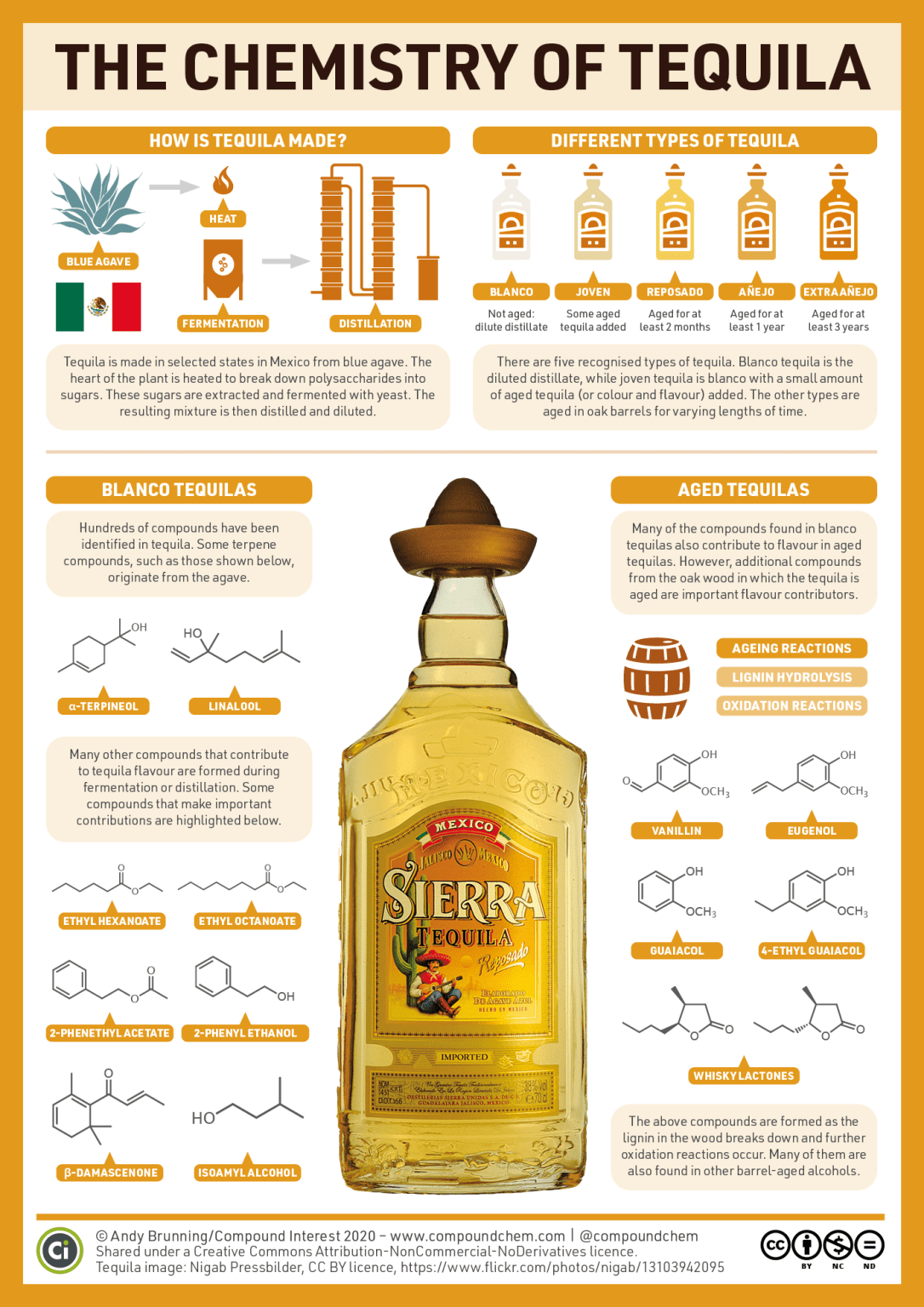
Purpose: Explain, fun
Audience: General public who is interested in food chemistry
Scope: Introduction to tequila and how it’s made, then details of the basic chemistry
Science Meets Art
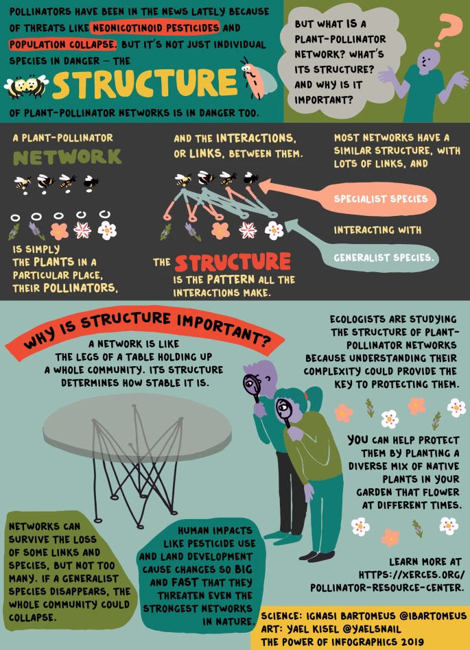
Infographics can be simple, hand-drawn, or complex computer renderings. Many scientists are starting to partner with artists and graphic designers to help them communicate important information and increase the impact of their research (Figure 17.2).[2]
Share
Infographics need to be shareable to reach their intended audience. Most infographics are licensed under Creative Commons, a nonprofit organization that provides copyright licenses to creators. You will notice the Creative Commons logos on many of the infographic above. This type of licensing allows creators to choose how they want their work to be used and shared in the public domain.
The Creative Commons License Options
The list below is from CreativeCommons.org, CC-BY 4.0, Icons by The Noun Project.
![]() CC BY: This license allows reusers to distribute, remix, adapt, and build upon the material in any medium or format, so long as attribution is given to the creator. The license allows for commercial use.
CC BY: This license allows reusers to distribute, remix, adapt, and build upon the material in any medium or format, so long as attribution is given to the creator. The license allows for commercial use.
![]()
CC BY-SA: This license allows reusers to distribute, remix, adapt, and build upon the material in any medium or format, so long as attribution is given to the creator. The license allows for commercial use. If you remix, adapt, or build upon the material, you must license the modified material under identical terms.
![]() CC BY-NC: This license allows reusers to distribute, remix, adapt, and build upon the material in any medium or format for noncommercial purposes only, and only so long as attribution is given to the creator.
CC BY-NC: This license allows reusers to distribute, remix, adapt, and build upon the material in any medium or format for noncommercial purposes only, and only so long as attribution is given to the creator.
![]() CC BY-NC-SA: This license allows reusers to distribute, remix, adapt, and build upon the material in any medium or format for noncommercial purposes only, and only so long as attribution is given to the creator. If you remix, adapt, or build upon the material, you must license the modified material under identical terms.
CC BY-NC-SA: This license allows reusers to distribute, remix, adapt, and build upon the material in any medium or format for noncommercial purposes only, and only so long as attribution is given to the creator. If you remix, adapt, or build upon the material, you must license the modified material under identical terms.
![]() CC BY-ND: This license allows reusers to copy and distribute the material in any medium or format in unadapted form only, and only so long as attribution is given to the creator. The license allows for commercial use.
CC BY-ND: This license allows reusers to copy and distribute the material in any medium or format in unadapted form only, and only so long as attribution is given to the creator. The license allows for commercial use.
![]() CC BY-NC-ND: This license allows reusers to copy and distribute the material in any medium or format in unadapted form only, for noncommercial purposes only, and only so long as attribution is given to the creator.
CC BY-NC-ND: This license allows reusers to copy and distribute the material in any medium or format in unadapted form only, for noncommercial purposes only, and only so long as attribution is given to the creator.
- Clive Thompson, July 2016, "The Surprising History of the Infographic", Accessed 2020-08-27 ↵
- Khoury, C.K., Kisel, Y., Kantar, M. et al. Science–graphic art partnerships to increase research impact. Commun Biol 2, 295 (2019). https://doi.org/10.1038/s42003-019-0516-1 ↵
