14 Accessible and Ethical Design
Read time: 5 minutes
Overview
This chapter will cover two key aspects of communicating data using graphics:
-
Communicating your data honestly and ethically
-
Presenting your data so that it is accessible
This chapter explains the principles of accessible and ethical graphic design, and includes several examples of what not to do!
Sections in this chapter
- Ethics when communicating data
- Data Falsification
- Examples of misleading data visualization
- Universal Design
Ethics when communicating data
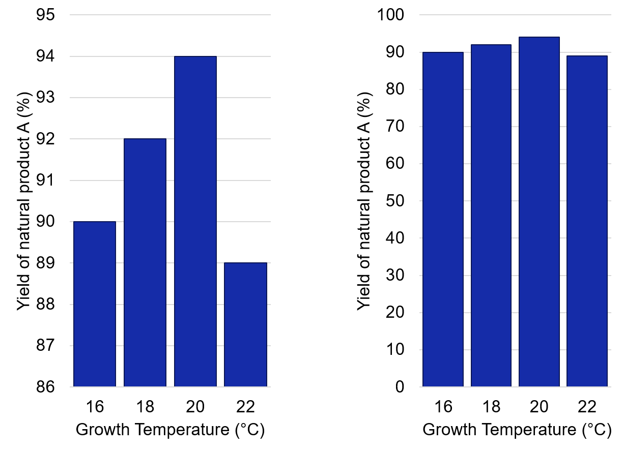
Ethical design requires that graphics be honest and accurate. Scientists should be aware of the many ways that data can be misrepresented. For example, by adjusting the Y-axis scale (Figure 14.1), trends in data can be either exaggerated or made to seem insignificant. Design choices can, either purposefully or inadvertently, introduce bias in favour of the author’s interpretation of the data (See the example below).
Exercise
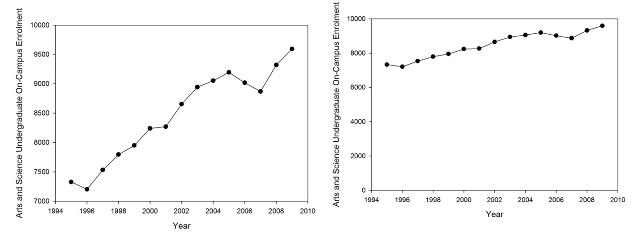
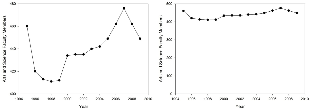
Which presents the data more honestly? Which presents it more clearly?
i) The graphs below show the Faculty of Arts and Science student enrolment over several years. The scaling on the left suggests significant increases in enrollment from year to year, while the scaling on the right suggests a modest increase. The plot on the right makes it harder to determine specific numbers for each year.
ii) The graphs below show the number of Faculty of Arts and Science faculty members over several years. The scaling on the left suggests a large fluctations, which a significant drop in the late 1990s. The scaling on the right suggests the opposite, mainly a fairly consistent number of faculty since 1994.
To avoid visual representation:
- Use an appropriate scale, judge if it may be misleading
- Use the right amount of data: avoid making your visualization overly simple or complicated.
- State the key message or findings of the visualization in the text (caption or article).
This example was brought to light by Andisheh Nouraee (@andishehnouraee):
In just 15 days the total number of #COVID19 cases in Georgia is up 49%, but you wouldn’t know it from looking at the state’s data visualization map of cases. The first map is July 2. The second is today. Do you see a 50% case increase? Can you spot how they’re hiding it?


Data Falsification
The falsification or manipulation of data is a huge breach of academic integrity. There are several high-profile of this occurring over the past few years, as you can see in this ist of scientific misconduct on Wikipedia. Sometimes the intent is clear, to report spectacular findings for individual glory and reputation. Other times, issues with cultural practices or confusion over what constitutes ethical practices are to blame.
Spectra manipulation
NMR spectra are one of the most common places to find data manipulation in chemistry. Some students are not aware that using the “solvent suppression” feature in iNMR constitutes manipulation of data. Be cautious and make sure your peers and coauthors are aware of ethical vs. unethical practices since articles that have manipulation of NMR spectra will be retracted and the authors placed on a watch list.
Don’t be fooled by how easy it is to delete peaks!
Journals like Organic Letters have hired data analysts to examine spectra and other data submitted to the journal. This caught several papers from a single research group where spectra had been manipulation to remove impurities. This eventually led to corrections in retractions of dozens of papers from the Fukuyama lab, and many other labs as well.
Universal Design
The other side to presenting your data is to make it accessible to all readers. When creating your tables and figures, keep in mind the principle of Universal Design: design that makes the product accessible to all people regardless of age, disability, and other possible barriers. This philosophy for design ensures equality and inclusion for all of human diversity.
Colour & Contrast
Not everyone has the same sensitivity to colour – around 5% of the population experiences some form of colour-blindness. The most common form of colour-blindness makes it difficult to distinguish between some shades of red and green. All readers will benefit if the colours in your data visualization are easy to distinguish in tone, shade, and contrast.[1].
Use resources like ColorBrewer 2.0 and Chroma.js to find or create colour-blind friendly palettes with suitable contrast. Contrast is important for distinguishing colours on the screen, but also for printing in black and white or photocopying. Use tools like Color Oracle or the Coblis — Color Blindness Simulator to check your data visualizations.
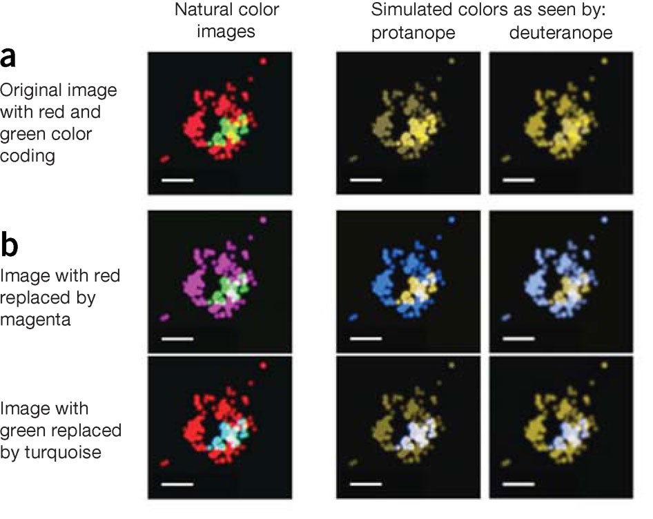
See this blog post by physicist Paul Tol to learn more about colour schemes for accessible design in scientific communication. The image below, from a Nature Methods article called “Points of view: Color blindness” by Bang Wong, shows how common colour schemes in scientific articles can be easily fixed to make them accessible to all readers.
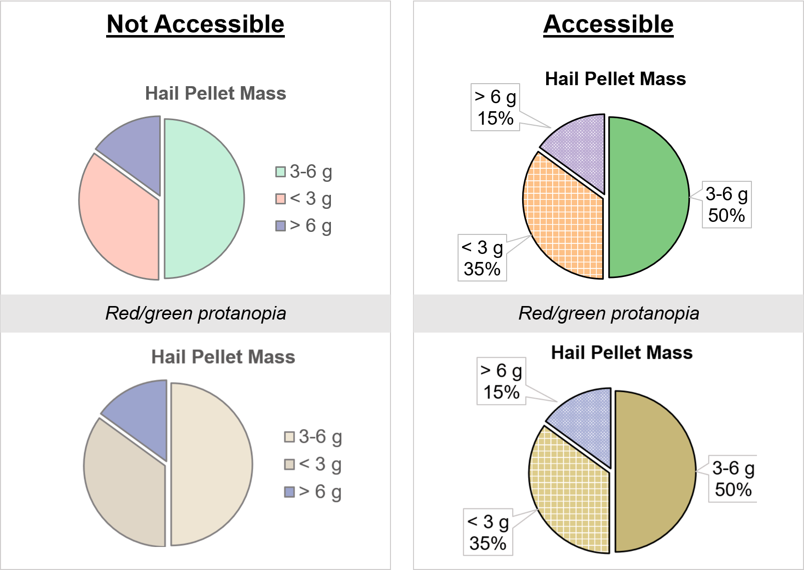
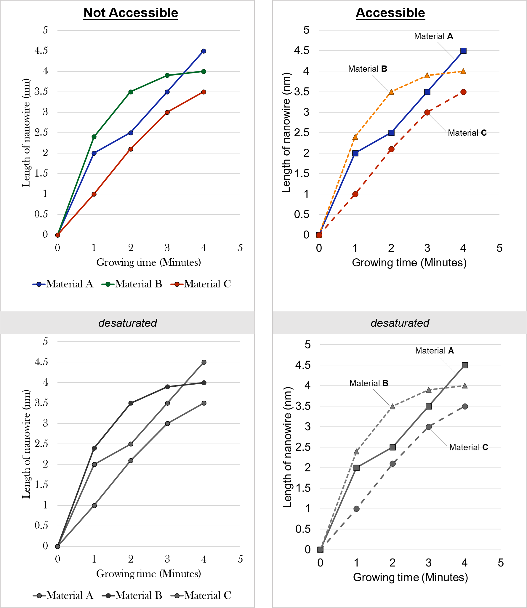
In your data visualizations, don’t use colour alone to convey an idea. Use different shapes for markers, line patterns, and fill textures (Figures 14.2, 14.3). Another tip: instead of having a separate legend, label data series directly on the graph.
Text
The text use in your image or caption is important for all readers, but especially those who are visually impaired or have a reading disability. The text should be in an accessible font size and typeface; the Bureau of Internet Accessibility suggests using san-serif fonts like Arial or Helvetica to make the text more readable for all.
Text should also be readable by a screen-reader, which is an application that will ‘read’ electronic text out loud for the user (see the video below). Make sure your caption is true text and not saved as part of the image file, otherwise it will not be accessible to everyone.
Images online should contain Alt-text, that is, text that describes the image in enough detail for those who are visually impaired. This Alt-text can be a single word or phrase that explains the purpose of the image. Images that are purely decorative don’t require Alt-text, but this is almost never the case in scientific communication!
- Wong, B. Points of view: Color blindness. Nat Methods 8, 441 (2011). https://doi.org/10.1038/nmeth.1618 ↵
