Introduction to graphic design and accessible design
Christine Woolley
Graphic design conveys critical information in visual form, but is this exclusionary in nature?
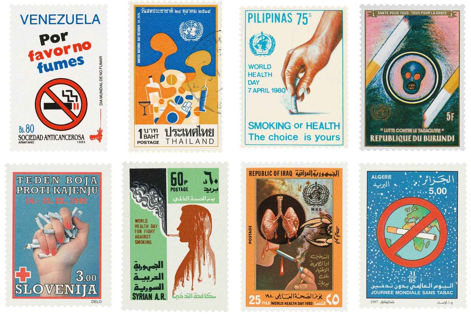
From graphic health warnings and pill packaging to informational campaigns and hospital signage, graphic design allows for the creation of public-facing visuals that educate, persuade, prevent and safeguard (Schrauwen et al., 2017). As shown in the image below, graphic designers can make life-saving information accessible to all. In this example, the World Health Organization used a series of stamps to promote the anti-smoking message.
At the onset of the global Coronavirus pandemic, the United Nations issued its first-ever open brief to creatives around the world to help develop materials that would create awareness and understanding to stop the spread of the virus (Roberts, 2020). This is another example of how graphic design plays a vital role in providing critical information to a wide range of individuals, in different visual languages and cultural contexts.
Graphic designers are in a position to create effective design solutions that provide people with the opportunity to access and use information (Buller & Spevack, 2019). But for communications materials to be effective, they must be both visually clear and accessible to the user so they can access, understand, and use the information (Cornish, Goodman-Deane, Ruggeri, et al., 2015).
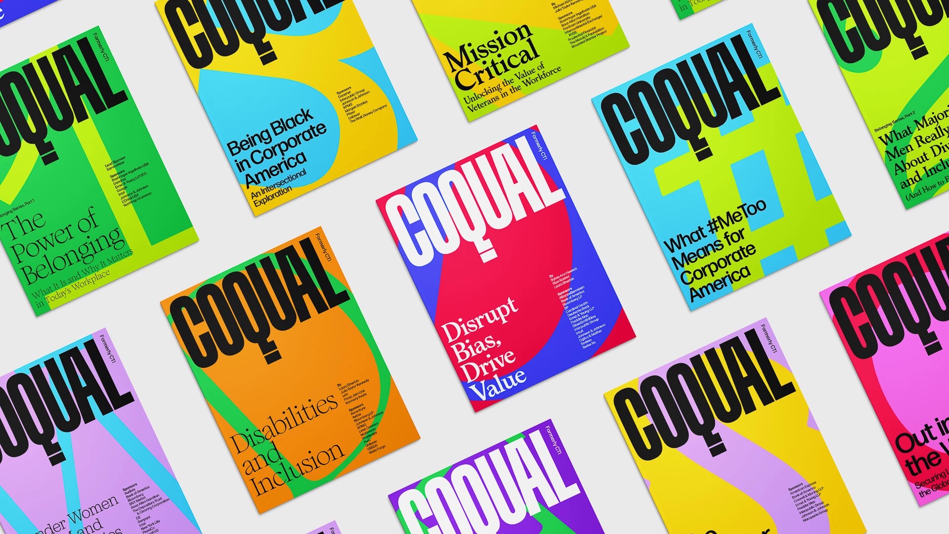
Graphic design theory has long considered how users are accessing and viewing information. Principles of visual hierarchy allow designers to organize and prioritize content in a way that is easy for people to process information. Establishing a visual flow is achieved through basic design principles such as contrast, spacing, typography and position. The posters shown below emphasize how visual hierarchy can lead the viewer’s eye to information in order of importance.
However, there are additional considerations that need to be included in the design process when creating materials that will be published online. This is to ensure assistive technology, such as screen readers, can access the content in a logical and understandable way. Accessible design principles include adding alt text to images, checking colour contrast ratio, correctly structured headings, ensuring all content is tagged, and including multiple modes of delivery.
Owen (2016) defines accessibility design as “a mindset that needs to be in place from the very start of any project”. Designers who do not consider accessibility end up creating materials that exclude people, (Owen, 2016, para. 3). When designers consider accessibility in their work, the result is a better experience for all (Buller & Spevack, 2019).
Studies have shown a lack of consideration has been given to visual accessibility in print-based graphic design (Cornishet al., 2015), and many designers don’t have the knowledge or experience to implement accessibility into their design solutions (Forlizzi & Lebbon, 2002; Lee et al., 2020; Zitkus et al., 2013).
