Creative: Illustrating Food
Ali Kenefick
A Feast for the Eyes
Artist’s Statement
In style, media, and theme, my work always concerns itself with complexity, layers, and entanglements. I am endlessly fascinated by the literal and figurative worlds hidden and distorted by our dominant reality: the political issues glossed over by attractive faces, words, and pictures; the subterranean mycorrhizal network of fungi; the spaces between the lines, the narratives behind the advertising, the bones under the skin; and so on. Therefore, as an artist/designer and food scholar, I become particularly excited by the politics, problems, and paradoxes attached to food, which are swept aside or simplified in favour of the status quo. These are often contentious and controversial issues, and they are often disguised or tucked away to avoid causing distress, disgust, or arousing suspicion among the public. In this way, the otherwise fascinating complexities of these issues—and the materials and entities tethered to them—are reduced into neat categories and tidy answers. Domesticated and tame, their rough edges are sanded down to reduce visibility and to avoid interrogation. I look upon these rough edges as potentials for generating friction in my work, that when exposed or rubbed against, they are capable of creating inquiry, intrigue, discomfort, concern, and curiosity.
I’m particularly attracted to the layers and narratives hidden under the outwardly simple and quotidian experience of buying and consuming food, and I encourage people, through my work, to scrutinize what they’re eating. I want them to recognize the cracks in the veneer of everyday life and rub them against its contentious and controversial issues. In this way, they might see food differently. I want my audiences to be reminded that food is heavy with meaning, impossibly tangled with knots of humans, plants, other animals, minerals and water, and stitched tightly to our social and cultural histories across space and time.
I am most comfortable as an illustrator and graphic designer; my work is therefore always two-dimensional. It is typically a composite of analogue and digital techniques, starting with a piece in analogue and finishing with typography or colour adjustments onscreen. I tend to avoid working strictly digitally if I can. Working through the unpredictable effects of tools and materials native to traditional printmaking, typography, and illustration—their splatters, smudges, and textures—is an important part of my creative process. The use of visual contrast is a common feature in my work, as I like to use bright colours, luminescent whites, heavy blacks, hard edges, and blocky typography to create impact. I often employ cartoon styles so I can stretch and warp my subjects freely, creating exaggerated expressions, environments, and motion. I work with large canvasses and a painstaking amount of detail to create a sensation of overwhelm in my audiences. Essentially I want my audiences to be halted by the art’s boldness, then to be drawn in, and to become lost in its detail and the figurative substance between the lines. Visually speaking, my work is seldom subtle. It is often dark, and it relies on devices of metaphor, symbolism, satire, and subversive humour to communicate meaning.
“A Feast for the Eyes”
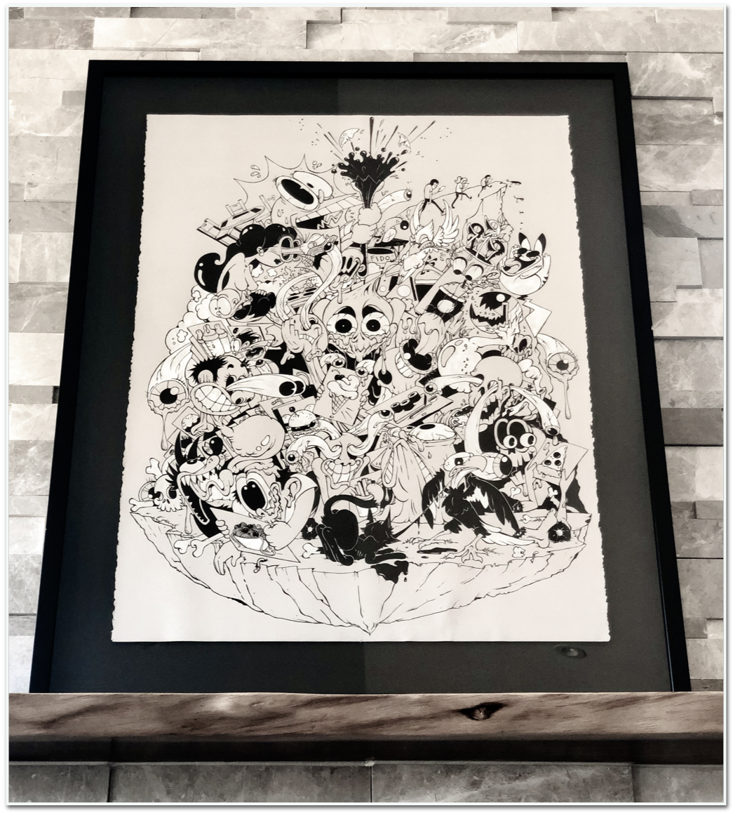
“A Feast for the Eyes” is a 75cm x 55cm illustration that uses black and white ink with dip pens on 80lb., grey, deckle-edge Strathmore paper. It is a large, confronting piece, rendered in the art style of cartoons from the 1920s and1930s called “Rubber Hose.” The name refers to the bendy, tubular limbs of cartoon characters made famous by Disney and Fleischer Studios during the early 20th century, such as Felix the Cat, Betty Boop, and Steamboat Willie (who later became Mickey Mouse). It is a style that draws its inspiration from surrealism and abstraction that, coupled with the characters’ extravagant use of knives, explosives, and poisons to combat their antagonists, tends to evoke humour as much as perturb its audiences.
The piece uses a surreal art style to reflect a surreal theme. Generally speaking, “A Feast for the Eyes” reflects the messy ecology that comprises today’s image-hungry consumer culture. I distort it further through speculation. Although this is a broad arena to play in, I have focused on consumer culture’s obsession with the imagery of food—driven as it is by the glamourized visual appeal of food as projected through social media and television. Sometimes called “food porn,” these images of food are made to be so sensually attractive—while disallowing touch, taste, or smell—that they arouse a similar desire and appetite that real food would otherwise elicit. Food porn images are designed to stimulate both literal hunger and a hunger for the things they symbolize or represent, like exoticism, wealth, or possibility. They aim to fuel vicarity while simultaneously stirring audiences with frustration at the inedibility of their subject. I find this a particularly intriguing and unsettling phenomenon. It is an obsession with the material qualities of food… without the material qualities of food.
In his book, In Defence of Food: An Eater’s Manifesto, author Michael Pollan echoes this phenomenon with what he calls “The Cooking Paradox.” Here Pollan reflects on what it means for our social fabrics as the practices of cooking and commensality jostle for dominance against the tweet-and-share of digital food. But of course, pixel-food could never realistically replace its material counterpart—could it? What if it did? Musing on this theme for “A Feast for the Eyes,” I speculated what the world might be like if, so engrossed with digital food, we forgot to eat. We forgot to cook. We moved deeper and deeper into a life online and onscreen, and left behind our responsibilities as mortal, physical animals. I had read somewhere about evolutionary theorists speculating on the physiological development of the human body as the internet and its offspring of digital devices became increasingly necessary for our daily existence. Some suggest that the human eye may grow aggressively and adaptat to low and blue light. Others speculate that some of our fingers will atrophy, even as we grow another thumb. Hunchbacks. Crooked necks. Grim, but inspirational stuff. What else might an increasingly online life mean for the human body and its material environment?
I started the work by imagining how a life that prioritizes visual consumption over the literal ingestion of food would transform the human body. The figures you see in the piece therefore bear vague resemblance to human animals in various stages of decay, their bodies adapting to the consumption of sound and pictures instead of macronutrients. Body parts litter the chunk of earth at the base of the image as they melt from their hosts. At the same time, eyes have taken on lives of their own and are featured everywhere, devouring images of food that fuel their growth, but do nothing to sustain the rest of their bodies. While I played liberally with the concept of physical decay, I asked what else would start to decompose, or become forgotten without our desire to cook or eat real food. Would someone remember to feed the dog? Would we invest time or money in kitchens, ovens, or dining tables? Would the responsibilities of the material world recede to the background of our consciousness as we become further engrossed in our virtual realities? In his book, Ready Player One, Ernest Cline does a skilful job imagining such a dystopia where our material world becomes an unliveable place, yet with the right AR headset, virtual reality is an easy and satisfying retreat. Like Cline, I made this piece as a commentary on the impossibility of forsaking the material world for the stuff of dreams: the meat of bodies still decays, the Earth still gets hotter, children still need feeding, and the cracks in the veneer keep expanding while the images become increasingly attractive.
Creative Process
A notable amount of research went into this piece before I started the art itself, as it is this research that would inform its style, size, medium, and other aesthetic considerations. As I mentioned, the grim speculation borne of imagining human bodies and a life too distracted to want anything to do with material food fuelled my decision to work with the arguably eerie “Rubber Hose” cartoon style.
This was an important aesthetic consideration because, like the innovation of the internet of the late 20th century, cartoons and film had similarly captured the hearts, eyes, and ears of those living during the 1920s and 30s—an important precursor to the distractions of our contemporary digital age. Since Rubber Hose had been traditionally drawn in black and white ink, and was projected in a grainy-grey film style, I chose to use pens, ink, pencils, and grey paper to echo the mood of the style of the era. I wanted a large canvas because I knew there was an endless number of things attached to my theme that could be discussed, but like a silent film, I needed it to speak volumes without any sound. With my research and rationale in place, I spent some time watching old Steamboat Willie and Felix the Cat clips online and gathering a collection of images of cartoon characters from the 1920s and 30s. With these in hand, I started practicing Rubber Hose characters in my sketchbook before I committed to the piece itself.
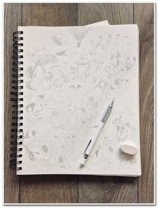
Once I felt I had a solid grasp of the style, I sourced the paper, inks, and nibs I needed for the piece. Looking to the dimensions of the paper as a guide for the general shape of the whole illustration, I started in my sketchbook with a mechanical pencil and and eraser, sketching large acorn shapes that I would then fill will figures (the overall shape of the illustration is like an inverted acorn). I started by identifying where the focal points of the piece would be. In the centre, I knew I wanted a pair of large eyes to hook the viewer into the composition. At the top would be some kind of explosion to move their gaze upward, at the sides would be rounded and directional lines to assist their gaze around the periphery of the piece, and at the base would be a solid chunk of earth to provide some sense of stability as a foil to an otherwise hallucinogenic scene. I also knew I wanted the piece to feel as though it were continually looping and bending like the limbs of Rubber Hose characters. There were some specific figures I knew I wanted to draw, but most of it unfolded as I drew, responding to the shapes and spaces I made with my pencil. I made the version in my sketchbook exactly as I wanted to see it in its final, larger form.
Next, I had to move the draft on to the large paper canvas. I was in no mood to re-draw the entire composition, so I planned to project it at a larger size in order to trace it on the grey paper. I scanned the page of my sketchbook into my computer, attached the computer to a projector, and shone the image onto one of the walls in my apartment. I then carefully pinned the grey paper—careful not to poke holes in it—onto the wall, and using a pencil, lightly traced the image onto its final destination.
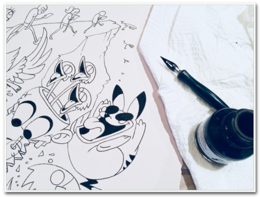
Once that was finished, I closed the computer and the projector, and moved the paper to a large desk where a handful of dip pen nibs, small acrylic paint brushes, India Ink, and acrylic white ink were waiting. The world of pen nibs is expansive, with each nib suited for a different purpose (graphic design, calligraphy, accounting…). Generally speaking, I gravitate toward using a combination of fine/medium fude and flex nibs in my work, which also held true for this piece. My first step was to outline everything with my nib-equipped dip pen (so called for having to dip it into the ink well), let the ink dry, and then erase the pencil underlay. Fortunately India ink dries almost instantaneously when used in the appropriate amount. Next I would start alternating between different nibs, using black ink, while applying different degrees of pressure on the pen in order to develop the weights of each line. In other words, some lines in the composition are thin, others are thick, and others are a bit of both. This helps to give the composition added dimension, and in some areas, a sense of motion. I tend to work clockwise around the paper to avoid smudging my work.
Once the outlines of all my figures were made appropriately thick and thin, I decided which parts were to be flooded black, and which were destined to be white. The qualities of the two inks were important, particularly the white ink, which needed to have a high level of opacity and a low level of reactivity. Opacity refers to the translucence of the medium, and if too low, will cause streaking on grey paper. Reactivity occurs when two inks react with one another, causing unwanted bleeding or lifting. Sometimes low opacity and higher reactivity are suitable when you’re looking to achieve a watercolour or hazy effect, but this composition needed crisp edges and graphic treatment. For these reasons, the white ink I selected had a slightly higher viscosity than the India ink I was using, which also meant it was not particularly suited to dip pens. At a higher viscosity, it tended the clog the pen, so where I needed white, I used fine acrylic brushes.
I had intentionally chosen a weight of paper designed for printmaking—thick and porous—that was ideal for absorbing large amounts of ink without allowing it to seep through or pool on the surface. Unfortunately, this paper was much thirstier and grainier than I had anticipated, and it pulled at the nibs of my finer-tipped pens causing spatter if I moved too quickly or pressed too hard. Overall, the piece took roughly 60 hours to complete from start to finish.
Close-ups
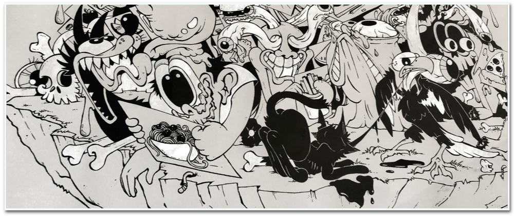
“Compost Scavengers”
At the base of the illustration is a tetrahedron of earth where bones and body parts litter its surface. Here too you can see worms poking out of the sides, as well as several other animals scavenging around the decay. You might notice that, unlike the human figures in this piece, all of the nonhuman animals in this composition are fully composed and recognizable for their species, rather than in various states of decay. Essentially, unconcerned with virtual reality, the cycle of life and death for other animals continues on, with the materiality of food at its heart. Here we can see such animals taking advantage of human decay to feed themselves and their offspring. Humans may lose sight of how their actions effect their surrounding environment and the entities that inhabit it. They may lose the race for survival in the process. But the rest of the world is likely to keep on spinning.
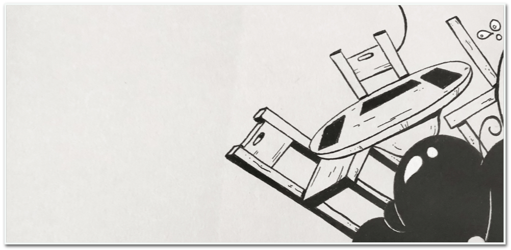
“The Empty Table”
In the upper left of the image, amid the frenzy of the composition is a remarkably static kitchen table and several empty chairs. Here I question whether our withdrawal from cooking and kitchens leaves the kitchen table increasingly useless and unoccupied. Much has been written on the importance of eating at the table together because much happens in this space. Children learn table manners, culinary knowledge is exchanged, stories are told, bonding occurs, bodies are nourished, and new tastes are experienced among other important events. What does it mean for families, friends, and foes as we start to abandon traditional forms of eating together? Will digital commensality become increasingly important? Will we prefer to eat alone? Will these things cease to matter as they are replaced by new forms of communing?
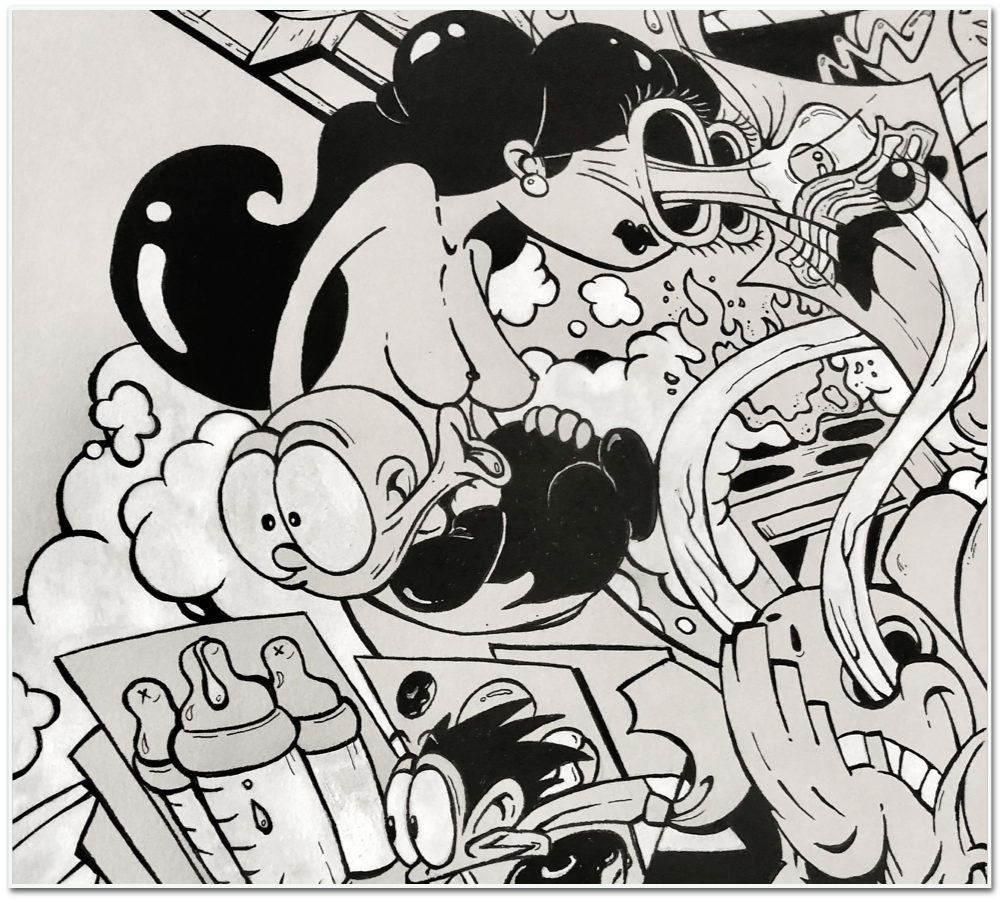
“Mother and Child”
On the far left edge of the illustration, near the centre, is a feminine figure holding a baby. The woman’s torso is exposed as if to breastfeed the baby, however both mother and child are distracted by other things, neither focused on each other or the task at hand. Food has always been an important learning tool, and an important means of bonding mothers with their children. As we become more and more distracted by our virtual realities, what do we communicate and teach to our impressionable youth in the process? Is it likely that we will pass down our habits and teach new ones, or will forthcoming generations transcend them?
Exercises
Exercises in Materiality: Food and Ink
The following exercise introduces you to the medium of ink, and working with the materiality of food as a tool for artistic expression and observation. The objective in this exercise is simply to explore and experiment with the tools provided—to play, be curious, and put your imagination in motion. There is no right or wrong way of completing the exercise—everyone will have a different result. Following is a list of the tools you’ll need and several ‘challenges’ to help guide your explorations.
You will need:
- A variety of papers (e.g., printer paper, construction paper, printmaking paper, vellum, tissue paper, cardboard, card stock, handmade paper, papyrus, notebook paper)
- A small, open container for ink
- Black India ink
- An eyedropper (usually this comes as part of the bottle of India ink)
- A straw
- Straight dip pens and an assortment of nibs
- A variety of small, medium, and large paintbrushes suitable for inks, watercolour, or acrylic
- A variety of mushrooms, fruits, and vegetables (stems, roots, and leaves are encouraged!)
- A small kitchen knife for cutting the food
- A cutting board
- Newspaper (for covering your workspace and surrounding surfaces to keep them clean)
Challenge #1: Cubism and the Shapes of Food
Select a durable paper to use with your dip pens and India ink. Lay it on your workspace, prepare a variety of nibs for your pen, and pour some India ink into a small container.
Choose three foods, and set them on your workspace in front of you, just beyond your paper. You will be drawing these subjects, so make sure you can see them clearly.
Ready yourself to draw, choose a nib, and outfit your pen. It doesn’t matter what kind of nib—choose whatever seems interesting.
Don’t try to capture the food realistically on paper. Instead, carefully observe your chosen subjects. What basic shapes (circle, triangle, square) do you see? Some foods, like an orange, might be little more than a circle. Others, like pineapples, might be patterned with triangles. Most things are composites of many different shapes. How many can you see in your respective subjects?
Dip your pen into your ink. Be careful not to plunge the whole nib into the inkwell—the ink should come just above the vent (the little hole) in the nib. Give it a tap on the rim of your container to shake off any excess, and draw a circle (or whatever shapes you have noted). As you do, experiment with the pressure on your pen. See if you can achieve a line that changes from thick and thin. Do you see other shapes or details that you could add? Maybe some quick dots to replicate the texture of your food, or another circle or triangle to show where a stem was?
Try drawing the food again with a different nib. Experiment with making your lines thick and thin. How do these adjustments change the aesthetics of your drawing? Does the paper absorb the ink differently? Does the nib keep catching on the paper, or does it glide easily?
Continue observing and drawing the shapes that you see. Don’t worry if your lines overlap and a cluster of grapes becomes a confusing bunch of circles. Remember, you’re not trying to draw grapes. You’re drawing the shapes of the grapes.
Try colouring some shapes solid black and see what kind of composition you create.
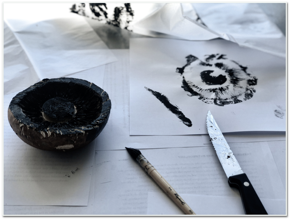
Challenge #2: Relief Printing with Food
Choose a mushroom, fruit, or vegetable with a particularly interesting texture. Ready your ink, brushes, and lay several different types of paper on your workspace.
Paint part of your chosen food’s surface with ink using a soft, wide brush. You may choose to cut the food to expose a desired surface. Remember that the ink will cling to a dry surface, but it won’t adhere well to a wet one. Therefore, painting the peels and rinds of foods is often a better choice than painting their insides. Make sure to coat your chosen surface until it is dark with ink, but not dripping.
Using the food like a stamp, gently press the inky surface on to different papers. See how different papers absorb the ink uniquely; some will reveal more detail than others.
Flip it around: Some papers, like tissue paper, are easily draped over objects. Try painting your food with ink again, then pressing the paper onto the food, then peeling it off to reveal the relief.
Try the same procedure with different foods, and stamp to your heart’s content.
Challenge #3: Several Approaches to Making Ink Splatters
Choose a big piece of paper, and pour some ink into your container. This exercise could get messy, so make sure the surfaces around you are protected.
Tapping: Choose a paintbrush and dip it into your ink. Next lift your paint brush about a foot from your canvas, and sharply tap the paintbrush perpendicularly over either your finger or a pencil/pen. The ink will create an enjoyable splatter effect on the canvas below (and maybe your desk). Experiment at different heights to see how this changes the effect.
Blowing: Dip one end of your straw into the ink, then face the inky end at your canvas. Quickly blow through the other end of the straw. This technique sometimes takes a bit of practice.
Dropping: Suck up some ink using the eyedropper and position it about a foot over your canvas. Experiment with the pressure you use to squeeze the eyedropper in order to release the ink inside: a forceful squeeze will generate a greater splatter, whereas a gentle squeeze will result in slow, heavy droplets. Both effects are equally interesting!
Challenge #4: Pick and Mix
Now that you’ve got some interesting techniques and materials to work with, experiment with a composition that uses everything you’ve learned!
References
Cline, E. 2011. Ready Player One. New York: Crown Publishers.
Pollan, M. 2008. In Defense of Food: An Eater’s Manifesto. New York: Penguin Press.