3.4 The Aesthetic Movement, & the Arts and Crafts Movement
Please Read
William Morris and the Arts & Crafts Movement
Alex Hass (from https://opentextbc.ca/graphicdesign/chapter/chapter-2/)
Conditions and Products of the Industrial Age
The Arts & Crafts movement emerged in the second half of the 19th century in reaction to the social, moral, and aesthetic chaos created by the Industrial Revolution. William Morris was its founder and leader. He abhorred the cheap and cheerful products of manufacturing, the terrible working and living conditions of the poor, and the lack of guiding moral principles of the times. Morris “called for a fitness of purpose, truth to the nature of the materials and methods of production, and individual expression by both artist and worker” (Meggs & Purvis, 2011, p. 160). These philosophical points are still pivotal to the expression of design style and practice to this day. Design styles from the Arts & Crafts movement and on have emphasized, in varying degrees, either fitness of purpose and material integrity, or individual expression and the need for visual subjectivity. Morris based his philosophy on the writings of John Ruskin, a critic of the Industrial Age, and a man who felt that society should work toward promoting the happiness and well-being of every one of its members, by creating a union of art and labour in the service of society. Ruskin admired the medieval Gothic style for these qualities, as well as the Italian aesthetic of medieval art because of its direct and uncomplicated depiction of nature.
Many artists, architects, and designers were attracted to Ruskin’s philosophy and began to integrate components of them into their work. Morris, influenced by his upbringing in an agrarian countryside, was profoundly moved by Ruskin’s stance on fusing work and creativity, and became determined to find a way to make it a reality for society. This path became his life’s work.
Pre-Raphealite Brotherhood
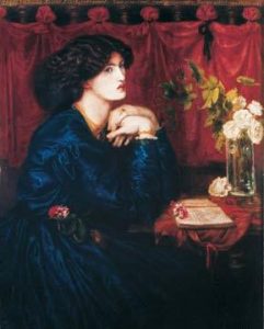
Morris met Edward Burne-Jones at Exeter College when both were studying there. They both read extensively the medieval history, chronicles, and poetry available to them and wrote every day. Morris published his first volume of poetry when he was 24, and continued to write and publish for the rest of his life. After graduation, Morris and Burne-Jones tried a few occupations, and eventually decided to become artists. Both became followers of Dante Gabriel Rossetti who founded the Pre-Raphealite brotherhood that was based on many of Ruskin’s principles. Morris did not last long as a painter, eventually finding his design vocation while creating a home for himself and his new wife (Rosetti’s muse and model).
Discovering the lack of design integrity in Victorian home furnishings and various additional deficiencies in other aspects of home products, he chose to not only design his home, but all its furniture, tapestries, and stained glass.
Morris & Co.
In 1860, Morris established an interior design firm with friends based on the knowledge and experiences he had in crafting and building his home. He began transforming not only the look of home interiors but also the design studio. He brought together craftsmen of all kinds under the umbrella of his studio and began to implement Ruskin’s philosophy of combining art and craft. In Morris’s case, this was focused on making beautiful objects for the home. The craftsmen were encouraged to study principles of art and design, not just production, so they could reintegrate design principles into the production of their products. The objects they created were made and designed with an integrity a craftsman could feel proud of and find joy in creating, while the eventual owner would consider these products on par with works of art (an existing example is the Morris chair). The look of the work coming out of the Morris studio was based specifically on an English medieval aesthetic that the British public could connect to. The English look and its integrity of production made Morris’s work very successful and sought after. His organizational innovations and principled approach gained attention with craftsmen and artisans, and became a model for a number of craft guilds and art societies, which eventually changed the British design landscape.
William Morris and the Kelmscott Press
Morris’s interest in writing never waned and made him acutely aware of how the book publishing industry had been negatively affected by industrialization. One of his many pursuits included the revitalization of the book form and its design components through the establishment of the Kelmscott Press. The press was created in 1888 after Morris, inspired by a lecture about medieval manuscripts and incunabula publications, began the design of his first font, Golden, which was based on the Venetian roman face created originally by Nicolas Jenson.
In his reinterpretation of this earlier font, Morris strove to optimize readability while retaining aesthetic integrity — in the process of reviving interest in font design of earlier periods. Morris used this font in his first book, The Story of Glittering Plain, which he illustrated, printed, and bound at his press. The design approach of this publication and all others Kelmscott produced in its eight years was based on recreating the integrated approach and beauty of the incunabula books and manuscripts of the medieval period. All aspects of the publication were considered and carefully determined to create a cohesive whole. The press itself used hand-operated machinery, the paper was handmade, and the illustrations, fonts, and page design were all created and unified by the same person to make the book a cohesive, beautiful object of design. Morris did not wholly reject mechanization, however, as he recognized the advantages of mechanical process. He considered, redesigned, and improved all aspects of design and production to increase physical and aesthetic quality.
Kelmscott Press produced over 18,000 volumes in the eight years of its existence and inspired a revival of book design on two continents. In addition, Morris inspired a reinterpretation of design and design practice with his steadfast commitment to Ruskin’s principles. Future generations of designers held to Morris’s goals of material integrity — striving for beautiful utilitarian object design and carefully considered functionality.
Explore
Explore
The two Case-studies below; both from the khanacademy.org’s Smarthistory program:
a. Whistler, Symphony in White, No. 1: The White Girl, https://www.khanacademy.org/humanities/art-americas/us-art-19c/civil-war-gilded-age/a/whistler-symphony-in-white-no-1-the-white-girl
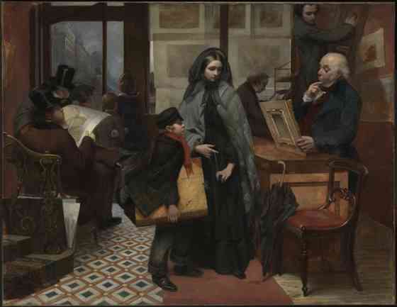
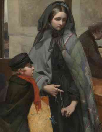
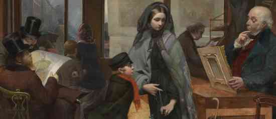
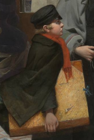
b. Emily Mary Osborne, Nameless and Friendless, https://www.khanacademy.org/humanities/art-history-for-teachers/xeaa3470a:teaching-with-images/xeaa3470a:go-deeper-where-are-the-women-artists/a/emily-mary-osborn-nameless-and-friendless
A. Whistler, Symphony in White, No. 1: The White Girl
Radical portraiture
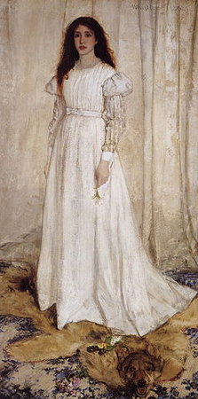
The woman in white stands facing us, her long hair loose, framing her face. Her expression is blank, her surroundings indistinct; posed before some sort of pallid curtain, she appears almost as an immobile prop on a stage.
Symphony in White, No. 1: The White Girl epitomizes James Abbott McNeill Whistler’s departure from the established norms of the era, and was perhaps his most reviled work. When he submitted it to the 1863 Paris Salon, the jury rejected the painting and the artist instead showed The White Girl at Napoleon III’s exhibition of snubbed artwork, the Salon des Refusés. Though it certainly defied many time-honored artistic conventions and earned much derision from critics, The White Girl does show some echoes of older standards. After all, its creator had studied under Marc-Charles Gabriel Gleyre in Paris, learning to paint in the academic manner – thus it is unsurprising that in the representation of his mistress, Joanna Hiffernan, Whistler opts for the customary full-scale society portrait format, and reproduces her features in a seemingly realistic and honest fashion.
The ways in which Whistler follows his own rules, however, far outnumber the few examples of accord, and they include the painting’s flattened and abstracted forms, distorted perspective, limited color palette, and penchant for decorative patterning. Though an intimate portrait, The White Girl is contrived and reveals no overarching mood or the personality of its sitter. While many of Whistler’s stylistic innovations are unique to the artist, he associated himself with other artists – such as Édouard Manet and Gustave Courbet, who also defied the traditions of academicism. The influence of Théophile Gautier is also apparent; in the 1830s, Gautier stated that art need not contain any moral message or describe any narrative, as art making is an end in and of itself – Whistler accepted this credo, “art for art’s sake,” wholeheartedly. In this light, The White Girl is less a faithful portrait painting and more an experimentation in color, pattern, and texture.
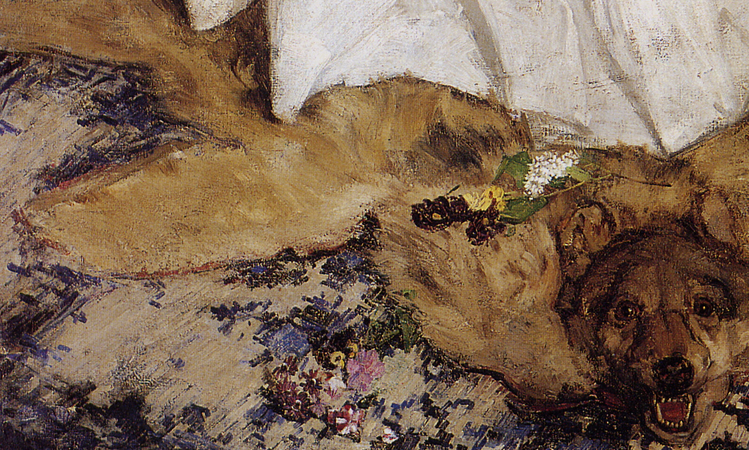
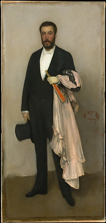
Whistler produced many portraits of similar format in the next decades, and continued to fine-tune his style and technique. In paintings such as Harmony in Gray and Green: Cecily Alexander (1872-74) and Arrangement in Flesh Color and Black: Portrait of Théodore Duret (1883), the artist exercised his need to balance the realist components of a picture with its more abstract needs, cherry-picking elements from the real world and reorganizing them in controlled, harmonious ways. Often these images feature a subdued palette, a lack of depth, unresolved backdrops, and irrational props that serve only as accents. His figures typically stand upon an unthinkably flat floor, appearing almost to hover like specters. As for Whistler’s signature, it evolved to take the form of a butterfly, applied to the surface in the manner of a mere decorative element.
Despite the controversy stirred when he entered the scene, Whistler won many wealthy and prestigious patrons over his career, and his portraits stand as testaments to growing interest in the radical new avant-garde approach to painting.
Please Read
Obniski, Monica. “The Arts and Crafts Movement in America.” (June 2008)
Byko, Maureen. “Louis Comfort Tiffany: Artistry, Chemistry, Secrecy.” Jom Warrendale. 59.9 (2007): 16-20. Print. – https://www.tms.org/pubs/journals/jom/0709/byko-0709.html?gclid=Cj0KCQjw5-WRBhCKARIsAAId9FmwGav77dI5RTTDlafuvKnUXaZQ8Af_w-Oujtm1AeEm4ot9iEDR5LUaApyfEALw_wcB
Explore: The Gilded Age – USA
1: something of no lasting significance —usually used in plural
2ephemera plural : paper items (such as posters, broadsides, and tickets) that were originally meant to be discarded after use but have since become collectibles - Merriam Webster Dictionary

