Visualising Student Activity Logs using Tableau
Geraldine Gray and Pauline Rooney
Introduction
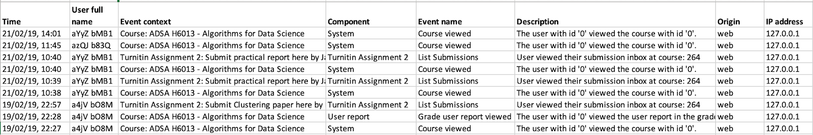
This chapter is a step by step guide to creating visualisations in Tableau that can provide insights into student behaviour on a tech tool. The chapter focuses on visualising data from an activity log. Many tech tools generate a log of every activity taken by users of the tool. This log typically records the date and time of the activity; who did it; and what the activity was (e.g. view a post; submit an assessment etc.). Figure 1 below is a sample from the anonymised Moodle activity log used in this chapter, and available here. [sample data]
Time in Figure 1 is the time of the activity; User full name is the first and surname of the person who carried out the activity, their IP address is also recorded;
Event Context is the label from a resource on a Moodle page and the Component is Moodle’s predefined category for the event context (e.g. assessment, quiz etc.); Event Name is what was done with the resource, and Description describes all this as a sentence. All data has been anonymised.
Resources
- The chapter uses Tableau desktop which can be downloaded from https://www.tableau.com/products/desktop/download. There is an initial 14-day trial period during which you can apply for a free academic license here: https://www.tableau.com/academic/teaching.
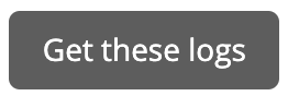
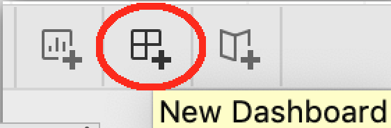
- You will also need an activity log to try it out yourself. It can be from a tech tool you are using, or the Moodle activity log from here. [sample data] If you are a Moodle user, try downloading your own Moodle activity log from a course page. Click on Reports, then Logs, then click on Scroll to the bottom of the page and click Download, as illustrated in Figure 2.

- An attribute is a column in the activity log. For example, in Figure 1 the attributes are Time, User full name, Event Context, etc.
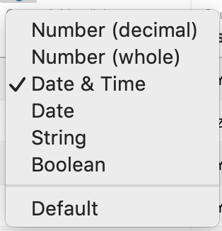
- An attribute’s data type is the type of data listed under that attribute. For example, User full name would be text; Time would be a date & time; if you had number of posts, it would be a number. The data type tells Tableau what it can do with the attribute’s values. It can add numbers together, or calculate an average from a list of numbers. It can’t do maths with
text. Instead, text and date & time fields are used for dividing the data into groups to calculate subtotals. For example, total clicks per student; average clicks per month; or total clicks per student per week. - A record is a row of data in the log file.
Steps for Implementation
Step 1. How to import your log file into Tableau.
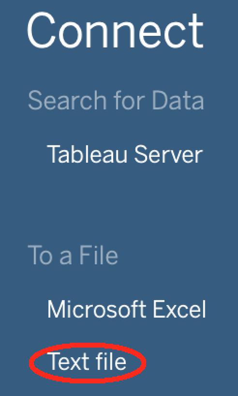
1.1 Startup Tableau from where it is installed on your machine. The initial screen gives various options for importing data on a left-hand blue menu pane.
1.2 Under ‘To a File‘, select the second option, Text file (or choose Excel if your file is an excel file). Navigate to the folder where your log file is stored and select it. This brings you to the main Tableau window illustrated in Figure 3.
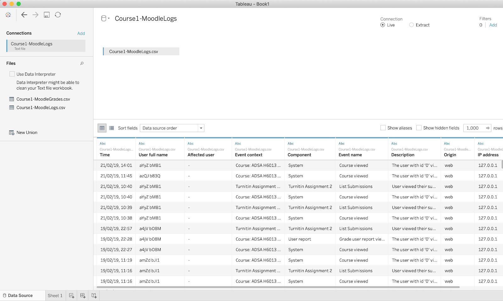
Just like Excel, tabs along the bottom left show different worksheets. The first is the data itself, other worksheets will define visualisations of that data. Before defining these visualisations, it’s important that the data itself has been imported correctly. This typically means checking that Tableau is not confused between numbers, dates and text. You can see in Figure 3 that above the Time column is Abc (in blue) meaning it assumes the data type is text rather than a Date & Time.
1.3 Click on the Abc above Time, and select Date & Time as the correct data type for this column. Now Tableau will automatically know how to calculate subtotals from this attribute, like monthly or weekly activity counts.
Step 2. Creating a visualisation
2.1 Click on the second tab on the bottom left, Sheet 1, for your first worksheet creating a visualisation. All attributes are listed on the left-hand side. The bottom half (measures) are attributes that are numbers. The top half (dimensions ) are all other attributes. Both can be dragged over to rows or columns in the middle pane to generate a chart.
Example one: What are the most popular activities?
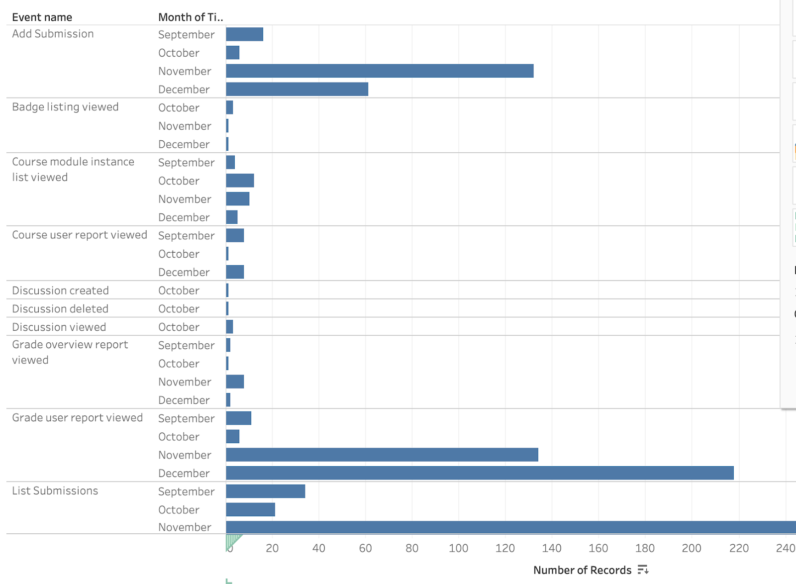
2.2 Our first example illustrates how many times each resource or event was clicked by a user. Drag the column Event Name over as a row (or the equivalent event attribute in your own log file); and drag Number of Records over as a column as illustrated in Figure 4. The bar’s length represents the number of clicks on the corresponding activity. Hover on anything on a visualisation to see the data behind it.
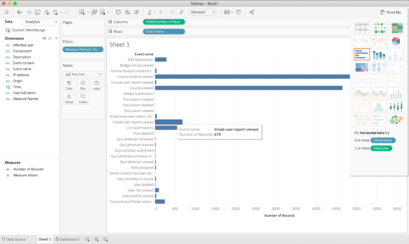
2.3 Sometimes counts from one activity can dominate a chart, like a course module viewed (and course viewed) in Figure 4. As they are the course page rather than a resource on the page, they may not be useful information. Right-click on the course module viewed bar and select Exclude to remove that activity from the chart. Do the same for course viewed. The relative popularity of other events is now easier to see.
2.4 Additional dimensions can be added to rows or columns in a chart. For example, suppose we want to see counts for each activity by month. Drag the time attribute over to row. It defaults to count by year. Bring the mouse up to YEAR(Time). Click on the down arrow that appears beside YEAR(Time) and select month to change to a count by month.
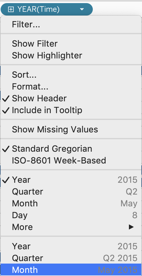
Additionally, you can select filter on the top of the same (right-click) menu to only include certain months. Figure 5 below shows click per month for September to December only.
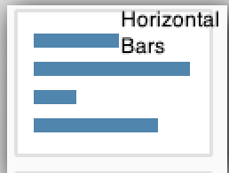
Note: if the style of the chart changes, select the one you want from the options on the right-hand side under show me. The chart type highlighted in orange in the show me pane is Tableau’s recommendation for your selected attributes. You might find other options more intuitive. Figure 5 is Horizontal Bars.
Play around with the setup. For example, drag MONTH(Time) up to be a column rather than a row to see how that changes the chart.
2.5 Like excel, you can rename a visualisation by right-clicking on the tab on the bottom left and select rename. You can also change the title at the top of a chart by right-clicking on it, and selecting Edit Title. Change both the name and the title, to Activity Counts.
Example two: Who are the most active users?
2.6 You can create additional visualisations by clicking on the New worksheet button along the bottom tabs. Open a new worksheet.
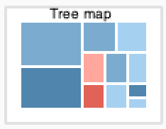
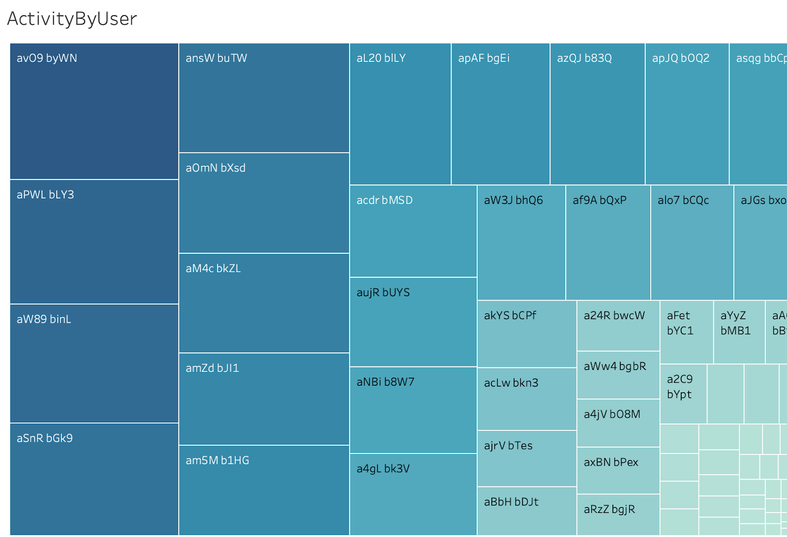
2.7 This next visualisation will show how active each user is. Drag User Full Name as the row, and Number of Records as the column. On the right hand show me pane, change the chart type to treemap to see how it depicts counts for each student. Change the title, and the name, to Activity by User. The result is shown in Figure 6. Both the colour and size of each box depicts the level of activity, with the most active users listed on the left. The text on each box is the user name.
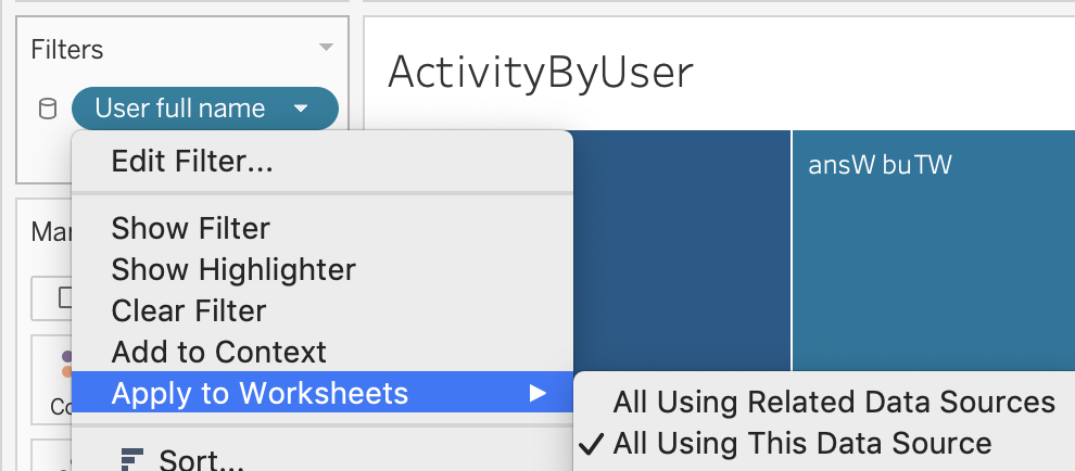
2.8 One more step is needed in preparation for creating a dashboard in Step 3: Drag User full name to the Filter window. Select OK on the window that opens, then click on the arrow that appears beside User Full name to edit the filter. Select Apply to Worksheets, and then select All Using This Data Source. We will see what this does in Step 3.
Step 3. Combining visualisations on a dashboard.
3.1 To create a dashboard showing multiple visualisations, click the New Dashboard tab on the bottom left. That will open a dashboard view. On the left-hand side of the dashboard view is a list of all the worksheets you have created so far.
3.2 Simply drag any worksheet on to the middle panel and organise them as you wish, as illustrated in Figure 7. Be sure to include Activity by User.
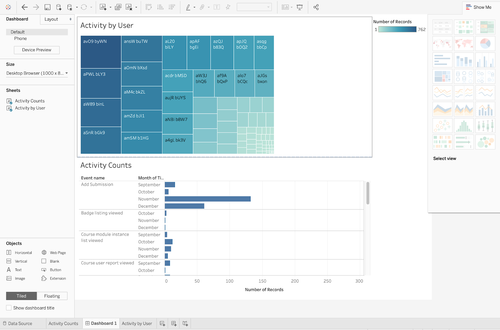
3.3 If you click on any student in Activity by User, only their activity will appear on the other worksheets on the dashboard. Similarly, if you select all high activity students (darker blue), only their data will be included on the bottom sheet. You can do this by dragging the mouse over the students you are interested in. To return to counts for all students, drag the mouse overall students. This is the effect of the User full name filter defined in Step 2.8 above that was applied to all worksheets using the same data source.
Further Reading
The getting started video on the Tableau website is great. You will get a link to this and other resources when you register for an academic license.
Author
 Dr. Geraldine Gray is a senior lecturer in Informatics at Technological University Dublin – Blanchardstown campus. She specialises in data science and runs an online MSc in Applied Data Science and Analytics and supervises both PhD and MSc research students in data science. Active areas of research include psychometric data analysis with a particular interest in data analytics within a learning context. She is an active member of the Society of Learning Analytics Research (SoLAR) and was a guest editor for a special section on Methodological Choices in the Journal of Learning Analytics. In TU Dublin, Geraldine is co-lead with Pauline on the DALTAI project described below and is the Blanchardstown campus contact for the National Forum’s Data-Enabled Student Success Initiative (DESSI).
Dr. Pauline Rooney is an academic developer with TU Dublin where her main role is to coordinate and deliver accredited professional development for academic staff on all things related to learning, teaching and assessment. She is also a Fellow of the UK Staff and Educational Development Association (SEDA). Since 2017 her work has explored strategies for utilising learning analytics to support student success. She has worked with National Forum Learning Analytics Advisory Groups and since 2018 has led the TU Dublin City Campus Data-Enabled Student Success Initiative (DESSI). She is now co-leading a project funded by Ireland’s National Forum for the Enhancement of Teaching & Learning – called DALTAI (Irish for “Student”) – which aims to increase digital proficiencies amongst staff and students in higher education in relation to the effective use of learning data to promote student success.