Visualization
David Szanto
David Szanto is a teacher, consultant, and artist taking an experimental approach to gastronomy and food systems. Past projects include meal performances about urban foodscapes, immersive sensory installations, and interventions involving food, microbes, humans, and digital technology. David has taught at several universities in Canada and Europe and has written extensively on food, art, and performance.
This is (not) a food system: What visualizations do (and don’t)
What is a food system? Many definitions exist, including this one drafted by the Scientific Group of the 2021 UN Food Systems Summit:
Food systems encompass the entire range of actors and their interlinked value-adding activities involved in the production, aggregation, processing, distribution, consumption and disposal of food products that originate from agriculture, forestry or fisheries, and food industries, and the broader economic, societal and natural environments in which they are embedded. (von Braun et al., 2020)
Definitions like this can make complex concepts relatively simple to apprehend, which in turn can be useful in learning contexts. At the same time, definitions that only use words can tend to make it seem that such concepts can be understood simply, or that there is only one way to understand them. Yet concepts such as food systems are necessarily complex, which means that they can and should be understood in many ways. Moreover, creating stable definitions of complex concepts often ignores what makes them interesting and unpredictable. One way to (partially) understand complexity is through the creation of visualizations.
The image below is a visualization of a food system (one that I created for a food studies project a few years ago). Unlike the textual definition above, it is messy and hard to understand. In making it, however, I had to think about what often isn’t shown in straightforward definitions of food systems. This included things like the tools we use for documentation and writing, the abstract ideas we mobilize to express relationships and complexity, and the scaling we choose when trying to express the limits and extents of a large-scale system. As I was making the visualization, I also realized how much it came out of my own perspective, and that my personal biases about food systems were baked into it. I therefore decided to try to leave a degree of confusion in the minds of those who looked at the visualization. By doing so, I believed it would invite people to ask questions, to wonder, to dig deeper, and to push back on my own interpretation of food systems.
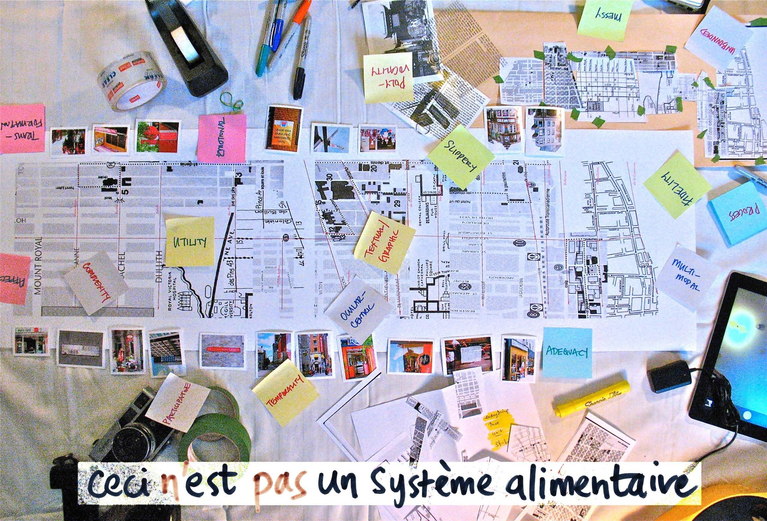
In this sense, my visualization shows how the representation of something is always tied to the positionality of the person who makes it. Similarly, it shows that a visualization is, like a textual definition, a kind of translation of lived experience. That is, a visualization of a food system is not a food system itself—it’s a representation of one.
At the bottom of my visualization, I added the caption, “ceci n’est pas un système alimentaire” (this is not a food system). This is a riff on a painting by surrealist artist René Magritte called La Trahison des images (The Treachery of Images)(Wikipedia, 2021). Magritte’s painting features a wooden pipe on a pale background, with the words “Ceci n’est pas une pipe” (This is not a pipe) written below the image of the pipe. Magritte was making the point that a painting of an object is not a physical, three-dimensional thing, but is instead a two-dimensional, visual representation. While the image shown is indeed a pipe, it is an image of a pipe, and not an actual pipe. In the same way, my visualization is not a food system, but a messy collage of pieces that I used to try to imagine how messy food systems are themselves.
In the social sciences, many types of visualization are used for making complex information more ‘readable’. Simple examples include bar graphs and pie charts, which turn numbers and percentages into different sized and coloured shapes that communicate proportional relationships within the data. More complex sets of data can also be visualized, sometimes in ways that draw attention to qualitative or quantitative details that might otherwise go unnoticed. In my food systems visualization, I tried to get at the idea of representing relationships, rather than what is usually considered data. I also tried to make a visual representation that explicitly shows my own subjectivity and positionality. In this way, the visualization is meant to shout out “David made this from his own perspective and experience! It’s not an actual food system—it’s a collage he made and photographed in his studio! Now tell him what you think about it. Does it look like a food system to you? Do you understand food systems better now? Worse? What are you going to think about next?” In other words, a visualization is meant to invite critical reading—not just the acceptance of one person’s perspective, data, or definition.
My food system visualization is an attempt to help people understand food systems, as well as an attempt to help people understand that food systems are sometimes not so understandable. Visualizations can therefore do double duty—clarifying and simplifying, as well as confusing and complexifying (Cadieux et al., 2016). Looking back at the image now, what do you get from it? Does it say food system to you, or something else? Collage? Mess? Pile of notes? Accident?
Discussion Questions
- Why is it important to differentiate between a thing (like a pipe or a food system) and the representation of a thing (like a painting or a visualization)?
- Data visualizations such as infographics are increasingly popular in mainstream media and science communications. How do they help explain what the data mean? How do they create additional challenges for understanding the data?
- A map is a visualization of a geographic terrain. What do city maps generally include and exclude? How are maps of the countryside different from city maps? Who makes these maps, and what is the intention (or context) behind their being made?
Exercise
Imagine your ‘personal food system’. If you were to make a visualization of it, what would you include? What would you leave out?
- Think about the places, people, technologies, techniques, resources, media, and times of day/week/year that are significant to you and your foodways.
- Think about the relationships and interactions among these things, and how you might choose to represent them visually.
- How would you decide what your visualization includes, and what you would leave out? In other words, what are your ‘translation’ criteria?
- How would your visualization differ if you were making it for your friends and family, versus making it for a course assignment? How would it differ if you were drawing it with pen and paper, versus creating it digitally?
References
Cadieux, K. V., Levkoe, C. Z., Mount, P., & Szanto, D. (2016). Visual Methods for Collaborative Food System Work. In C. Z. Levkoe, J. Brady, & C. Anderson (Eds.), Conversations in Food Studies: Transgressing Boundaries Through Critical Inquiry (pp. 21–49). University of Manitoba Press.
von Braun, J., Afsana, K., Fresco, L., Hassan, M., & Torero, M. (2020). Food Systems – Definition, Concept and Application for the UN Food Systems Summit. UN Food Systems Summit.
Wikipedia. (2021). The Treachery of Images. In Wikipedia. https://en.wikipedia.org/wiki/The_Treachery_of_Images
