6 Using Visuals
A Picture Is Worth 1 000 Words
Learning Objectives
Upon completing this chapter, you should be able to:
- categorize given images as symbols, maps, graphs and tables, diagrams, illustrations, and/or photographs;
- describe the four purposes of using visuals to enhance communication;
- search the Internet for an appropriate visual based on the purpose and content of a message, and insert it into a document or presentation including proper attribution.
It may be a cliché to say, “A picture is worth a thousand words,” but visual images have power. Good communication is a multisensory experience. Children first learning how to read often gravitate toward books with engaging pictures. As adults we graduate to denser books without pictures, yet we still visualize ideas to help us understand the text. Advertisers favour visual media—television, magazines, and billboards—because they are the best way to hook an audience. Websites rely on colour, graphics, icons, and a clear system of visual organization to engage Internet surfers. Visuals bring ideas to life for many readers and audiences in multiple ways:
- As a link between raw data and usable knowledge
- To provide concrete, vivid, and quick representations
- To save space
- To speak in a universal language
- To be persuasive
Source: (Picardi, 2001)
This chapter discusses how to use different kinds of visual aids effectively.
Types of Visuals
In this chapter we will be focusing on the following types of visuals:
- Symbols
- Maps
- Graphs and tables
- Diagrams
- Illustrations
- Photos
Source: (Saunders, 1994)
We will describe these in more detail below:
Symbols: Symbols include a range of items that can be either pictographic or abstract. We are surrounded by symbols, but how often do you think about the symbols that communicate with you everyday? What symbols can you see right now in your surroundings? Maybe the icons for the apps on your phone are familiar symbols to you. How about the TV remote control, which uses symbols to indicate the function of its buttons. Company logos lead you to identify the brand before you even read any words. Or look at the tags on your clothing; they use symbols to tell you how to wash and dry the garments as intended.
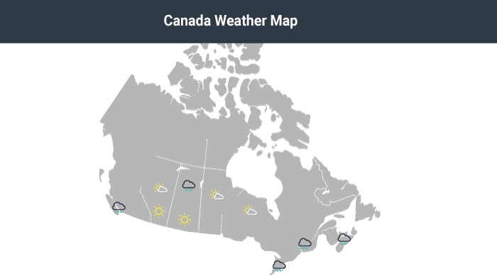
Maps: Maps sometimes include map charts, or statistical maps. Maps are often used to communicate geographical and other information in one visual (Picardi, 2001).
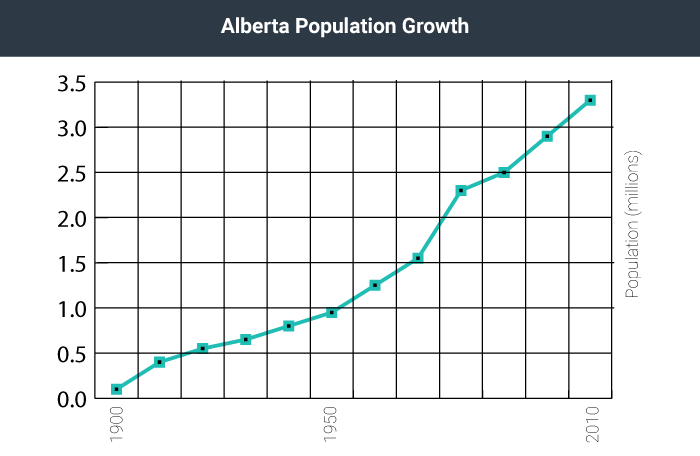
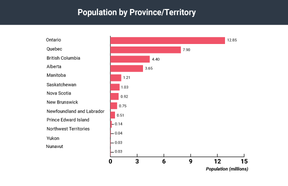
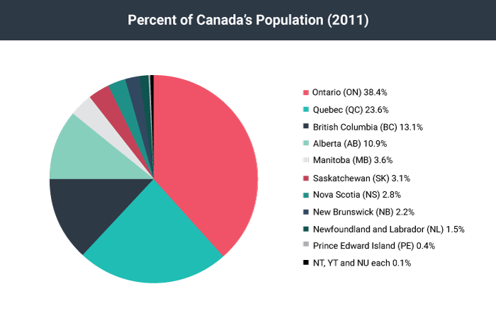
Graphs and Tables: Graphs can take a variety of forms, the most common being line graphs, bar graphs, and pie charts. Each type is better suited to different situations and purposes. For example, line graphs show change quickly, while bar charts are effective to compare data, and pie charts visualize the relation between parts and the whole (Picardi, 2001). Tables can be more effective for situations that call for qualitative data (not just numbers).
Tip: If you are working with numerical information, consider whether a pie chart, bar graph, or line graph might be an effective way to present the content. A table can help you organize numerical information, but it is not the most effective way to emphasize contrasting data or to show changes over time.
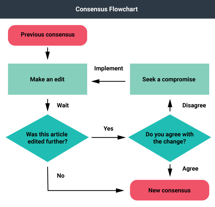
Diagrams: Saunders (1994) describes diagrams as “visuals drawn to represent and identify parts of a whole, a process, a general scheme, and/or the flow of results of an action or process.” One example of a diagram would be a flow chart. Flow charts are often used to show physical processes, such as in a manufacturing facility, or in the decision making procedures of a larger corporation, for example. Flow charts combine the use of text, colour, and shapes to indicate various functions performed in a process.
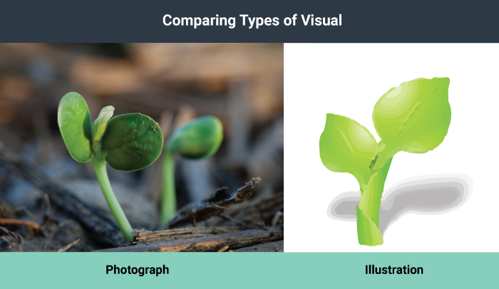
Photographs: Photographs (still or moving) depict concrete objects, tell a story, provide a scenario, and persuade an audience.
Illustrations: Illustrations can be realistic or abstract. There are instances where a photograph may be too rich in visual elements and a simpler line drawing communicates more quickly and clearly. For example, next time you are in a public building, look around for the fire escape plan. Is it a photograph or a line drawing? Illustrations offer a simpler visual and can be easier to understand than photographs because they filter out unnecessary information.
Purpose of Visuals
There are a number of reasons you might consider including visuals in documents, presentations, and other communications. Four reasons are detailed below:
Decorative: Visuals that do not represent objects or actions within the text but are added, instead, for aesthetic effect are considered decorative. Decorative visuals are often added to gain attention or increase the audience’s interest. Visuals can be used this way but can detract from the message you are trying to communicate and, thus, should be used with caution.
Representational: These visuals physically represent or physically resemble objects or actions in the text and are relevant to the content of the text. For example, rather than giving a detailed textual description of a new playground, you might include an image or render of the new playground and use the text to highlight specific features or information.
Analogical: Analogical visuals are used to compare and contrast two things, and explain their likeness or correspondence. For example, a marketing consultant might try to clarify the difference between targeted marketing and mass marketing by including images of a single fisherman with a single fishing rod and line next to an image of a bigger boat with a fishing net. By using the fishing analogy, the marketing consultant is attempting to connect possible prior understanding of the audience, a visual, and the concepts of targeted marketing versus mass marketing.
Organizational: The purpose of organizational images is to provide structure to information, visually define relationships, and illustrate connections. A chart of the hierarchical structure of a company is one example of an organizational image.
Communication professionals have offered their visual preferences for various communication needs. See if you match or agree with their recommendations.
There are many considerations to keep in mind when choosing visuals. When possible, use a variety of types of visuals, but remember that any visuals you use should enhance the content of the text. For example, only add photos if viewing the photos will clarify the text. Near each visual, explain its purpose concisely. Do not expect your readers to figure out the values of the visuals on their own.
Finding and Crediting Visuals
You have three choices for finding visuals to use in your work. You can search the Internet, use photos you have taken, or create images yourself.
Finding Visuals Online
The Internet is a powerful tool you can use to find visuals to complement your work. If you simply click on “images” for your topic in a search engine, you will generate both royalty-free and copyright-protected images. However, if you include a term such as stock images, stock photos, or royalty-free images along with your topic, you will be able to narrow your search to royalty-free items. Some search engines can help you filter your search by license type as well. For example, Google images includes a search tool that allows you to filter the results by license type. We should mention, however, that this tool is not perfect, and you should check the source of the image directly for its licensing requirements. You should not take an image from a search engine unless you are sure that the creator has provided a license that allows you to do so.
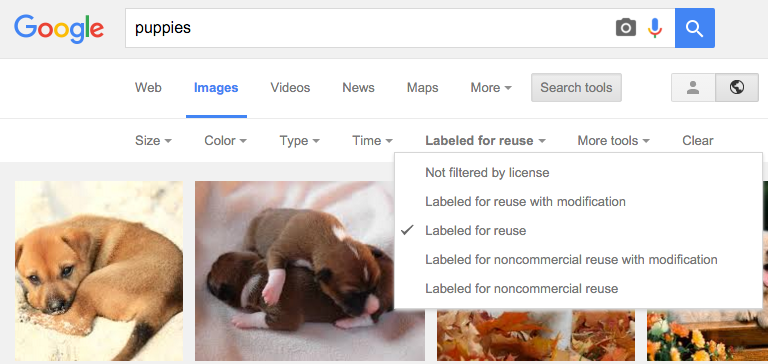
When searching Google Images, you can search for images with specific permissions by clicking “Search Tools,” then “Usage Rights.”
You could also use a stock photo website that provides pay-per-use professional photos. Even on these sites you also need to be sure that the creator has provided a license for the image to be used freely in the way you intend to use it (for example, under a Creative Commons license).
 Any time an individual or group creates something, such as a visual, they automatically have the rights to that visual and copies of it (i.e., copyright). They do not need to register with any organization in order to get the copyrights for their work; it is assumed as soon as they create it. This means that others are required to seek permission, and often pay a fee, n order to use the work. For example, a photographer might sell one of their photos to a magazine under the condition that they will be paid based on the number of copies printed or sold.
 Creative Commons is a way for creators to share their work with fewer restrictions than copyright alone. There are four distinct conditions available in a Creative Commons license: attribution, share-alike, non-commercial, and no derivatives. Upon creating a work, an author may attach a Creative Commons license that offers a combination of these conditions. The table below outlines the conditions in more detail.
![]()
Check Your Understanding
Match the images of Creative Commons licenses with what you would be allowed to do with a work bearing that license.
When using Creative Commons works, ensure you follow the requirements that the work you are using is licensed under. This often includes identifying the original creator and a link to the Creative Commons license itself.
An image may also be in the Public Domain, meaning that the creator’s intellectual property rights have expired, been forfeited, or are inapplicable. In this case, the image is free to use globally without restriction.
For guidance on how to find Creative Commons materials, using the creative common search portal, see How to Find Creative Commons Materials Using the Creative Commons Search Portal: A Guide for Instructors and Students
Using Your Own Photos
You could, of course, use any photographs you take yourself. To avoid rights issues, ask any human subjects included in your photos to sign a waiver giving you permission to use their likenesses. In the case of minors, you need to ask their guardians to sign the permission form.
Similarly, pictures taken by friends or relatives could be available as long as you get signed permission to use the photo as well as signed permission from any human subjects in the photo. Although it might seem silly to ask your sister, for example, to give you signed permission to use her photo or image, you never know what complications you could encounter later on. So, always protect yourself with permission.
Making Your Own Visuals
A third option is to create your visuals. You do not have to be an artist to choose this option successfully. You can use computer programs to generate professional-looking charts, graphs, tables, flowcharts, and diagrams, or hire a graphic designer to do this for you.
Subject your visuals to the same level of scrutiny as your writing. Keep in mind that if you find one person has a problem with one of your visuals, there will be others who also take exception. On the other hand, remember that you can never please everyone, so you will have to use your judgement.
Positioning Images into Text (Layout)
When you insert an image into your text, you must make some physical decisions.

When you insert an image into your text, you must make some physical decisions.
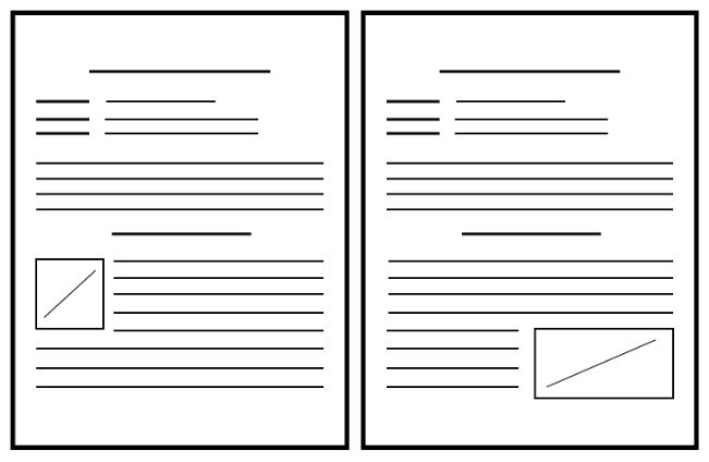
Another choice is to move the text down to create page-wide space for the image. In such situations, the image is typically placed above the related text. This format is usually used at the beginning of a document where the image treatment does not break up the text.
Using White Space
Incorporating charts, graphs, and other visuals is a way to break up blocks of text using visuals and white space. You can add white space by presenting lists vertically rather than running them horizontally across the page as part of a sentence. Also, leave enough white space around images to frame the images and separate them from the text.
Uses and Abuses of Visual Rhetoric
Choose visuals to advance your argument rather than just to decorate your pages. Just as you would not include words that are fluff, you should not include meaningless images. Also, just as you aim to avoid the use of fallacies in your text, you also need to be careful not to use fallacious visuals. For example, if you were arguing for the proposition that big dogs make good pets for families, you might show a picture of a friendly-looking Rottweiler puppy. But if you were against families having big dogs for pets, you might choose an image of a mean-looking adult Rottweiler baring its teeth. Watch out for the use of visuals that sway your opinion in the material you read, and use objective images in your own work.
Thanks to programs such as Adobe Photoshop, you can easily alter a photo, but make sure to do so ethically. For example, say that you are making an argument that a company unfairly hires only young people and disposes of employees as they age. You decide to show a photo of some of the employees to make your point. You take a photo of the company’s employees (both old and young) and crop the original photo to show only the young employees. This cropping choice would be misleading and unethical.
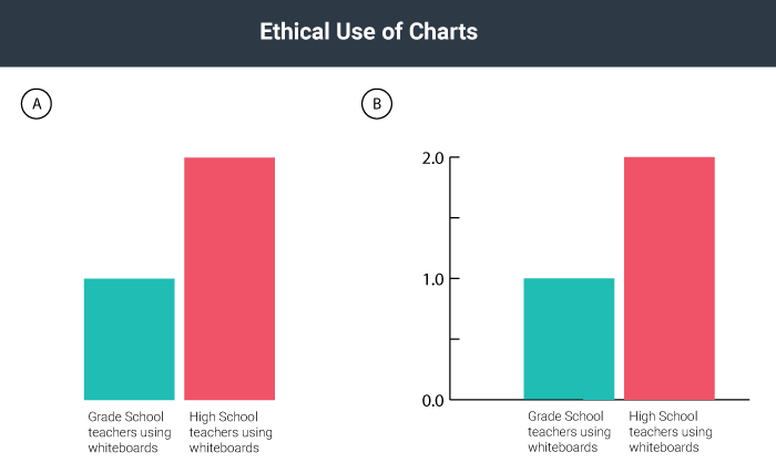
You have probably seen tables or graphs that convey something that is not exactly accurate. For example, the two graphs in the image below could be used as proof that “twice as many” high school teachers as grade school teachers choose to use computer-driven whiteboards. Graph A seems to support this statement nicely. If you look at Graph B, however, you realize that the entire sample includes only two teachers, so “twice as many” means, literally, two rather than one—an inadequate sample that leads to neither impressive nor convincing data. Be very careful not to misrepresent data using tables and graphs, whether knowingly or accidentally.
Weighing Your Options for Visuals
Visuals, like verbal or written text, can make ethical, logical, and emotional appeals. Two examples of ethical appeals are a respected logo and a photo of the author in professional dress. Graphs, charts, and tables are examples of logical appeals. For the most part, nearly all visuals, because they quickly catch a reader’s eye, operate on an emotional level—even those that are designed to make ethical and logical appeals.
Consider the following options when you choose visuals for your work:
- Choose visuals that your audience will understand and appreciate. Besides adding information, visuals can help to establish common ground with your audience.
- Think about the possible emotional reactions to your visuals and decide if you they are reactions you want to evoke.
- Make sure you choose ethically.
- Make sure you present the information accurately and in a balanced way when using images such as charts and tables.
- Look for visuals that are royalty free or create your own, unless you are prepared to pay for visuals.
- Make sure you choose visuals that align with the ethical standards of your work, because visuals can sway readers quickly. If your text is solidly ethical but your picture(s) are inflammatory, you might compromise the ethics of your work.
- Keep captions brief if you need to use them. Some images carry meaning without any explanation. If you cannot keep the caption brief, you probably need a different visual or better context for the visual in the text surrounding it.
Conclusion
In this chapter you have thought about the reasons to use a visual in your professional documents and have looked at different types of visuals, from diagrams and charts to illustrations and photographs. You have read about the purposes visuals serve and have learned that knowing whether your visual is intended to decorate, represent, analyze, or organize is key to choosing the right type of image.
You have also looked at ways to find and credit images, learning about Creative Commons licensing and exploring ways to fairly use others’ images in your work. You have also learned a little bit about positioning images within your documents and the uses (and abuses) of visual rhetoric.
When you are confident in your ability to use images in your work, move on to the next chapter.
Key Takeaways and Check In
Learning Highlights
- You can satisfy your need for images in your work by reusing or remixing Creative Commons works, purchasing photos or images, taking your own photos, or creating your own visuals from scratch.
- You can freely use images you create or photos you capture with a camera. If you choose to use images created by others or photos taken by others, you must secure permission and/or attribute the work as specified by the creator/author.
- When inserting images, you can wrap text to provide rectangle white space, tightly fitting white space, or paper-width white space.
- Visual elements of communication are especially powerful rhetorical tools that can easily be abused but can also be used responsibly and effectively.
Check Your Understanding
Further Reading and Links
If you would like to read more about finding, using, and attributing Creative Commons–licensed materials, see the following sites:
- How to find Creative Commons–licensed materials (http://bit.ly/1Km9EqJ)
- How to find Creative Commons materials using Google (http://bit.ly/1R1LPDq)
- How to find Creative Commons materials using YouTube (http://bit.ly/1W9AQsU)
References and Attribution
Picardi, R. P. (2001). Skills of workplace communication: A handbook for T&D specialists and their organizations. Westport, Conn.: Quorum Books, 2001.
Saunders, A.C. (1994). Graphics and how they communicate. In D.M. Moore and F.M. Dwyer, eds. Visual literacy: A spectrum of visual learning. Englewood Cliffs, NJ: Educational Technology Publications.
Attribution Statement (Visuals)
This chapter is a remix containing content from a variety of sources published under a variety of open licenses, including the following:
Chapter Content
-
- Original content contributed by the Olds College OER Development Team, of Olds College to Professional Communications Open Curriculum under a CC-BY 4.0 license
- Content created by Creative Commons, originally published at https://creativecommons.org/about/downloads/ under a CC BY 4.0 international license
- An image of a horse, created by Peter O’Connor, originally published at https://www.flickr.com/photos/anemoneprojectors/3683153132 under a CC BY-SA 2.0 license
- An icon created by IconTexto, published at https://www.iconfinder.com/icons/35391/garden_green_leaf_nature_organic_plant_icon#size=128 under a CC BY-NC-SA 3.0 license
- An image of a soybean sprout, created by the United Soybean Board, originally published at https://www.flickr.com/photos/unitedsoybean/9629679955/ under a CC BY 2.0 license
- A derivative of an icon created by Алексей Миронов, originally published at https://www.iconfinder.com/icons/281830/call_circle_communication_mobile_phone_telephone_icon#size=128 in accordance with IconFinder’s terms of service and the conditions specified by the creator
- A derivative of an icon created by Samat Odedara (https://www.iconfinder.com/samatodedara), originally published at https://www.iconfinder.com/icons/709539/bubble_chat_conversation_message_sms_talk_text_icon#size=128 in accordance with IconFinder’s terms of service and the conditions specified by the creator
- A derivative of an icon created by the AIGA, originally published at https://www.iconfinder.com/icons/134146/email_mail_icon#size=128 under the public domain
- A derivative of an icon created by Google, published at https://www.iconfinder.com/icons/326567/circle_fill_pause_icon#size=128 in accordance with IconFinder’s terms of service and the conditions specified by the creator
- A derivative of an icon created by Gregor Čresnar, originally published at https://www.iconfinder.com/icons/647888/arrow_direction_down_download_open_save_update_icon#size=128 in accordance with IconFinder’s terms of service and the conditions specified by the creator
- A derivative of an icon created by Designmodo, published at https://www.iconfinder.com/icons/103167/audio_music_sound_speaker_volume_icon#size=128 under a CC BY 3.0 license
- A derivative of an icon created by Alessio Atzeni, originally published at https://www.iconfinder.com/icons/110801/sun_icon#size=128 in accordance with IconFinder’s terms of service and the conditions specified by the creator
- A derivative of an icon created by Yannick Lung, originally published at https://www.iconfinder.com/icons/183558/cloud_rain_icon#size=128 in accordance with IconFinder’s terms of service and the conditions specified by the creator
- A derivative of an image created by Casito, published at https://en.wikipedia.org/wiki/File:Alberta_population.svg under a CC BY-SA 3.0 license
- A derivative of an image created by Srm038, published at https://commons.wikimedia.org/wiki/File:2011_Canadian_Population_(bar_chart).png under a CC BY-SA 4.0 license
- A derivative of an image created by Hwy43, published at https://commons.wikimedia.org/wiki/File:2011_Canada_Pop_Pie.png under a CC BY 3.0 license
- A derivative of an image created by Locke Cole, published at https://commons.wikimedia.org/wiki/File:Consensus_Flowchart.svg under a CC BY-SA 3.0 license
- Content created by Anonymous for Creating and Finding Visuals, in Writers’ Handbook, previously shared at http://2012books.lardbucket.org/books/writers-handbook/s13-02-creating-and-finding-visuals.html under a CC BY-NC-SA 3.0 license
- Content created by Anonymous for Incorperating Images, Charts, and Graphs, in Writers’ Handbook, previously shared at http://2012books.lardbucket.org/books/writers-handbook/s13-03-incorporating-images-charts-an.html under a CC BY-NC-SA 3.0 license
- Content created by Anonymous for Incorperating Effective Visuals into a Presentation, in Successful Writing, previously shared at http://2012books.lardbucket.org/books/successful-writing/s18-02-incorporating-effective-visual.html under a CC BY-NC-SA 3.0 license
- A screenshot of a Google Images search, including
- Puppy on Halong Bay created by Andrea Scaffer, published at https://en.wikipedia.org/wiki/Puppy#/media/File:Puppy_on_Halong_Bay.jpg under a CC BY 2.0 license
-
- Newborn Basenji puppies, published at https://en.wikipedia.org/wiki/Puppy#/media/File:Basenji_puppies.jpg by copperfeesh, CC BY SA 2.0 license
- Google and the Google logo are registered trademarks of Google Inc., used with permission.
Check Your Understandings
- Original assessment items contributed by the Olds College OER Development Team, of Olds College to Professional Communications Open Curriculum under a CC-BY 4.0 license
- Assessment items created by The Saylor Foundation for a Saylor.org course BUS210: Corporate Communication, previously shared at https://www.oercommons.org/courses/business-administration-corporate-communication-unit-6-quiz under a CC BY 3.0 US license
- Assessment items created by The Saylor Foundation for a Saylor.org course BUS210: Corporate Communication, previously shared at https://www.oercommons.org/courses/business-administration-corporate-communication-unit-11-quiz under a CC BY 3.0 US license

.png)