23 Presentation Aids
Learning Objectives
Upon completing this chapter, you should be able to
- explain how visual aids can improve the quality and impact of a presentation,
- distinguish unique benefits of different types of visual aids, and
- develop visual aids that are consistent with standard presentation quality criteria
Introduction
Presentations can be enhanced by the effective use of visual aids. These include handouts, overhead transparencies, drawings on the whiteboard, PowerPoint slides, and many other types of props. Once you have chosen a topic, consider how you are going to show your audience what you are talking about. Visuals can provide a reference, illustration, or image to help the audience to understand and remember your point.
Visual aids accomplish several goals:
- Make your speech more interesting
- Enhance your credibility as a speaker
- Guide transitions, helping the audience stay on track
- Communicate complex information in a short time
- Reinforce your message
- Encourage retention
Emphasis, Support, and Clarity
The purpose for each visual aid should be clear and speak for itself. If you can’t quickly link the purpose of a visual aid to the verbal message, consider whether it should be used. Visual aids can be distracting or confusing if they are not clearly connected to what you are saying.
Perhaps you want to highlight a trend between two related issues, such as socioeconomic status and educational attainment. You might show a line graph that compares the two, showing that as socioeconomic status rises, educational attainment also rises. People learn in different ways. Some of us learn best using visual stimuli; others learn by taking notes or by using tactile objects. So, by using visuals to support your presentation and, if possible, tactile aids or demos, you can help a significant proportion of the audience learn about your topic.
Clarity is key in the use of visual aids. Limit the number of words on your slides. No more than 10 words per slide, with a font large enough to be read at the back of the room or auditorium, is a good rule of thumb.
Methods and Materials
Slide Decks
The most common visual aid used in presentations, slide decks may be developed using software such as PowerPoint, Keynote, Prezi, or Google Slides. These tools allow you to show text, images, and charts and even to play audio or video files. They are an excellent enhancement to your presentation, but they do require a contingency plan. Computers sometimes fail to work as planned, so make sure you have a whiteboard or handout as a backup in case of any technical issues. You can minimize the risk by testing out equipment ahead of time.
Also, remember that these are an aid to your central, verbal message. Resist the urge to read directly from them with your back to the audience, or to pack slides full of text in lieu of speaking all of the information you want to get across.
Flip Charts, Whiteboards, and Large Prints
Flip charts and whiteboards are a good choice when you don’t have access to a computer and projector. Alternatively, you can print some visual aids like charts and graphs in large sizes and show them during your presentation. If you plan to get a lot of audience input and want to write or draw things out, then a whiteboard is an ideal choice. But make sure your writing is large enough to be seen at the back of the room and that it is easy to read.
Handouts
If it will be helpful for your audience to refer to the information you’re sharing at a later date, they’ll appreciate it if you leave them with a handout. But never give handouts to the audience at the beginning of your speech. They will be distracted by reading and tune you out. If you decide to use one, let the audience know at the beginning of the speech that you’ll provide it at the end. This will relieve them from having to capture all your content by taking notes, and keep their attention focused on you while you speak.
Demonstrations and Tactile Aids
If your presentation is about how to do something, for example, how to cook a particular dish or how to use a tool, you will want to show the audience a demonstration. Sometimes it is helpful to pass around a tactile aid, for example, a model. These can be very helpful if you want your audience to learn by doing. Make sure to pass items around during pauses in your presentation so that you don’t lose the audience’s attention. If audience members need to move around to use a tactile aid, make sure the location has enough space to make this possible.
Using Visual Aids
Designing Slide Decks
Using PowerPoint or a similar program, You’ll be able to import, or cut and paste, words from text files, images, or video clips to represent your ideas. You can even incorporate web links.
At first, you might be overwhelmed by the possibilities, and you might be tempted to use all the bells, whistles, and sounds, not to mention the flying, and animated graphics. If used wisely, a simple transition can be effective, But if used indiscriminately, it can annoy the audience to the point where they cringe in anticipation of the sound effect at the start of each slide.
Stick to one main idea per slide. The presentation is for the audience’s benefit, not yours. Pictures and images can be understood more quickly and easily than text, so you can use this to your advantage as you present.
If you develop a slide deck for your presentation, test these out in the location beforehand, not just on your own computer screen, as different computers and software versions can make your slides look different than you expected. Allow time for revision based on what you learn.
Your visual aids should meet the following criteria:
- Big – legible for everyone, even the back row
- Clear – the audience should “get it” the first time they see it
- Simple – simplify concepts rather than complicating them
- Consistent – use the same visual style throughout
Font
Another consideration that you’ll need to make when designing your slide decks is font. As previously mentioned, think about the people at the back of the room when choosing the size of your text, to make sure it can be read by everyone.
A common mistake that presenters make is to use decorative fonts, or to incorporate many different fonts in their slides. This not only creates a mixed message for the audience but also makes your message difficult to read. Choose legible, common fonts that do not have thin elements that may be difficult to see.
Colour
When considering your choice of colours to use, legibility must be your priority. Contrast can help the audience read your key terms more easily. Make sure the background colour and the images you plan to use complement each other. Repeat colours, from your graphics to your text, to help unify each slide. To reduce visual noise, try not to use more than two or three colours.
According to the standard colour wheel, colours are grouped into primary, secondary, and tertiary categories. Primary colours are the colours from which other colours are made through various combinations: blue, red, and yellow. Secondary colours—green, orange, and purple—combine two primary colours, while tertiary colours are made from combinations of primary and secondary colours.
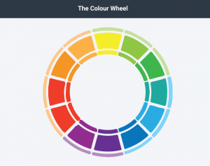
Figure 3.3.1 The Colour Wheel by Laura Underwood
Colours have relationships depending on their location on the wheel. Colours that are opposite each other are called complementary, and they contrast, creating a dynamic effect. Analogous colours are located next to each other and promote continuity and sense of unity.
Blue-green colour blindness, and red-green colour blindness are fairly common, so avoid using these colour combinations if it is important for the audience to differentiate between them. If you are using a pie chart, for example, avoid putting a blue segment
next to a green one. Use labelling so that even if someone is colour blind, they will be able to tell the relative sizes of the pie segments and what they signify.
Colour is also a matter of culture. Some colours may be perceived as formal or informal, or masculine or feminine. Certain colours have understood meanings; for example, red is usually associated with danger, while green signals “go.” Make sure the colours you use align with your message. If you are discussing climate change or the natural world, for example, you’d be more likely to use blues and greens rather than metallic colours to avoid confusing the audience.
Helpful Hints
Visual aids can be a powerful tool when used effectively but can run the risk of dominating your presentation. Consider your audience and how the portrayal of images, text, graphic, animated sequences, or sound files will contribute or detract from your presentation. Here are some hints to keep in mind as you prepare yours.
- Keep it simple
- One idea per slide
- Avoid clutter
- Use large, bold fonts that can be read from at least 20 feet away
- Use contrasting colours for a dynamic effect
- Use analogous colours to unify ideas
- Do not use clip art
- Proofread each slide with care
- Test in the presentation room beforehand
- If you are using a computer for your visual aids, have a backup plan
Conclusion
Using visual aids takes time and practice. The more you practise before your speech, the more comfortable you will be with your visual aids and the role they serve. Know your material well enough that you refer to your visual aids, not rely on them.
Check Your Understanding
Attribution Statement (Presentation Aids)
This chapter is a remix containing content from a variety of sources published under a variety of open licenses, including the following:
Chapter Content
- Original content contributed by the Olds College OER Development Team, of Olds College to Professional Communications Open Curriculum under a CC-BY 4.0 license
- Content adapted from Nonverbal Delivery in Communication for Business Success, created by Anonymous, for previously shared at http://2012books.lardbucket.org/books/communication-for-business-success-canadian-edition/s15-non-verbal-delivery.html under a CC BY-NC-SA 3.0 license
- Content created by Jenn Q. Goddu, for Providing Feedback to Speakers from The Public Speaking Project, previously shared at http://publicspeakingproject.org/listening.html under a CC BY-NC-ND 4.0 license
Check Your Understandings
- Original assessment items contributed by the Olds College OER Development Team, of Olds College to Professional Communications Open Curriculum under a CC-BY 4.0 license
- Assessment items adapted from Boundless, for Boundless Communications, Choosing Appropriate Words Chapter Quiz, previously shared at https://www.boundless.com/quizzes/using-language-effectively-quiz-81357/ under a CC BY-SA 4.0 license
- Assessment items adapted from Boundless, for Boundless Communications, Defining an Informative Speech Chapter Quiz, previously shared at https://www.boundless.com/communications/textbooks/boundless-communications-textbook/informative-speaking-13/introduction-to-informative-speaking-69/defining-an-informative-speech-270-76/ under a CC BY-SA 4.0 license
- Assessment items adapted from Boundless, for Boundless Communications, Presentation Quiz, previously shared at https://www.boundless.com/quizzes/week-4-boundless-presentation-quiz-77222/ under a CC BY-SA 4.0 license
