6.2 Describing Data Using Distributions and Graphs
Learning Objectives
By the end of this section, you will be able to:
- Construct and interpret common graphical representations of data, including histograms, bar charts, and pie charts
- Define the term frequency and calculate a frequency distribution, relative frequency distribution, and cumulative frequency distribution.
- Construct and interpret frequency tables for nominal and ordinal data.
- Construct and interpret frequency and relative frequency histograms.
- Describe distributions in terms of their shape, mode and skew.
Before we can understand our analyses, we must first understand our data. The first step in doing this is using tables, charts, graphs, plots, and other visual tools to see what our data look like.
Graphing Qualitative Variables
When Apple Computer introduced the iMac computer in August 1998, the company wanted to learn whether the iMac was expanding Apple’s market share. Was the iMac just attracting previous Macintosh owners? Or was it purchased by newcomers to the computer market and by previous Windows users who were switching over? To find out, [latex]500[/latex] iMac customers were interviewed. Each customer was categorized as a previous Macintosh owner, a previous Windows owner, or a new computer purchaser.
This section examines graphical methods for displaying the results of the interviews. We’ll learn some general lessons about how to graph data that fall into a small number of categories. A later section will consider how to graph numerical data in which each observation is represented by a number in some range. The key point about the qualitative data that occupy us in the present section is that they do not come with a pre-established ordering (the way numbers are ordered). For example, there is no natural sense in which the category of previous Windows users comes before or after the category of previous Macintosh users. This situation may be contrasted with quantitative data, such as a person’s weight. People of one weight are naturally ordered with respect to people of a different weight.
Frequency Tables
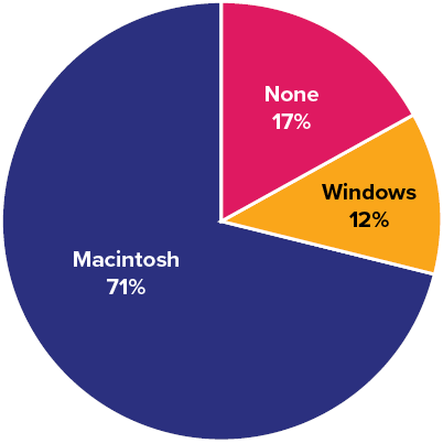
All of the graphical methods shown in this section are derived from frequency tables. Table 6.2.1 shows a frequency table for the results of the iMac study; it shows the frequencies of the various response categories. It also shows the relative frequencies, which are the proportion of responses in each category. For example, the relative frequency for “none” of [latex].17 = 85/500[/latex].
|
Previous Ownership |
Frequency |
Relative Frequency |
|---|---|---|
|
None |
[latex]85[/latex] |
[latex]0.17[/latex] |
|
Windows |
[latex]60[/latex] |
[latex]0.12[/latex] |
|
Macintosh |
[latex]355[/latex] |
[latex]0.71[/latex] |
|
Total |
[latex]500[/latex] |
[latex]1.00[/latex] |
Pie Charts
The pie chart in Figure 6.2.1 shows the results of the iMac study. In a pie chart, each category is represented by a slice of the pie. The area of the slice is proportional to the percentage of responses in the category. This is simply the relative frequency multiplied by [latex]100[/latex]. Although most iMac purchasers were Macintosh owners ([latex]71\%[/latex]), Apple was encouraged by the [latex]12\%[/latex] of purchasers who were former Windows users, and by the [latex]17\%[/latex] of purchasers who were buying a computer for the first time.
Pie charts are effective for displaying the relative frequencies of a small number of categories. They are not recommended, however, when you have a large number of categories. Pie charts can also be confusing when they are used to compare the outcomes of two different surveys or experiments. In an influential book on the use of graphs, Edward Tufte asserted, “The only worse design than a pie chart is several of them.”[1]
Here is another important point about pie charts. If they are based on a small number of observations, it can be misleading to label the pie slices with percentages. For example, if just [latex]5[/latex] people had been interviewed by Apple Computers, and [latex]3[/latex] were former Windows users, it would be misleading to display a pie chart with the Windows slice showing [latex]60\%[/latex]. With so few people interviewed, such a large percentage of Windows users might easily have occurred since chance can cause large errors with small samples. In this case, it is better to alert the user of the pie chart to the actual numbers involved. The slices should therefore be labelled with the actual frequencies observed (e.g., [latex]3[/latex]) instead of with percentages.
Try It
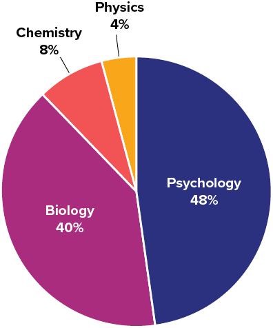
1) Based on the pie chart below, which was made from a sample of [latex]300[/latex] students, construct a frequency table of college majors.
Solution
The frequency table appears below:
|
Major |
Frequency |
|---|---|
|
Psychology |
[latex]144[/latex] |
|
Biology |
[latex]120[/latex] |
|
Chemistry |
[latex]24[/latex] |
|
Physics |
[latex]12[/latex] |
Bar Charts
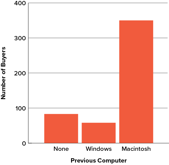
Bar charts can also be used to represent frequencies of different categories. A bar chart of the iMac purchases is shown in Figure 6.2.3. Frequencies are shown on the [latex]y[/latex]-axis and the type of computer previously owned is shown on the [latex]x[/latex]-axis. Typically, the [latex]y[/latex]-axis shows the number of observations in each category rather than the percentage of observations in each category as is typical in pie charts.
Try It
2) Given the following data, construct a pie chart and a bar chart. Which do you think is the more appropriate or useful way to display the data?
|
Favourite Movie Genre |
Frequency |
|---|---|
|
Comedy |
[latex]14[/latex] |
|
Horror |
[latex]9[/latex] |
|
Romance |
[latex]8[/latex] |
|
Action |
[latex]12[/latex] |
Solution
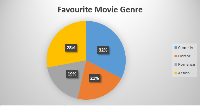
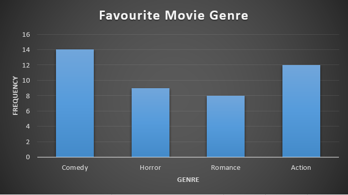
In this case, it seems that both of the graphs represent the data well. The bar chart might be the best way to represent the data because we can see the number of respondents that answered each genre. If the reader is provided with the frequency table or the number of participants, the pie chart could be acceptable.
Comparing Distributions
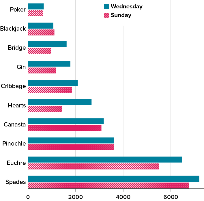
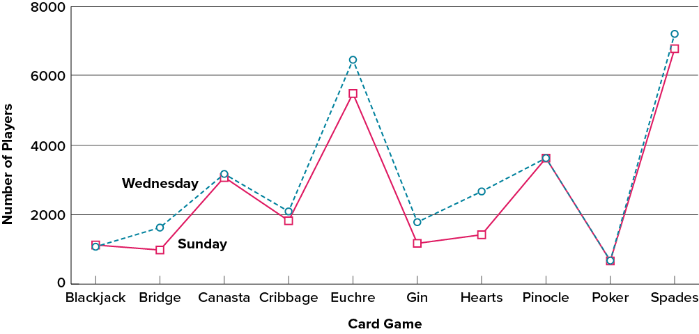
Often we need to compare the results of different surveys, or of different conditions within the same overall survey. In this case, we are comparing the “distributions” of responses between the surveys or conditions. Bar charts are often excellent for illustrating differences between two distributions. Figure 6.2.6 shows the number of people playing card games at the Yahoo web site on a Sunday and on a Wednesday in the spring of 2001. We see that there were more players overall on Wednesday compared to Sunday. The number of people playing Pinochle was nonetheless the same on these two days. In contrast, there were about twice as many people playing Hearts on Wednesday as on Sunday. Facts like these emerge clearly from a well-designed bar chart.
The bars in Figure 6.2.6 are oriented horizontally rather than vertically. The horizontal format is useful when you have many categories because there is more room for the category labels. We’ll have more to say about bar charts when we consider numerical quantities later in this chapter.
Some Graphical Mistakes to Avoid
Don’t get fancy! People sometimes add features to graphs that don’t help to convey their information. For example, three-dimensional bar charts such as the one shown in Figure 6.2.7 are usually not as effective as their two-dimensional counterparts.
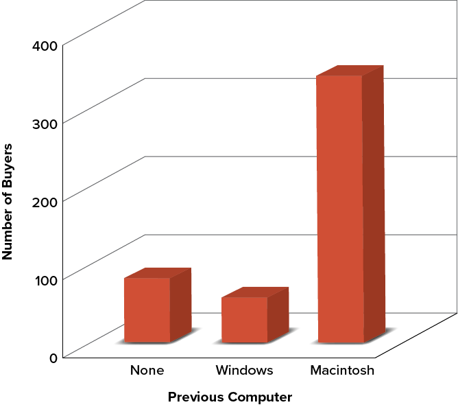
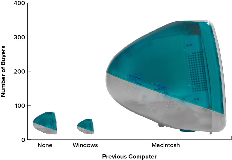
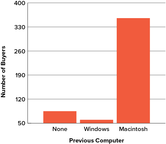
Here is another way that fanciness can lead to trouble. Instead of plain bars, it is tempting to substitute meaningful images. For example, Figure 6.2.8 presents the iMac data using pictures of computers. The heights of the pictures accurately represent the number of buyers, yet Figure 6.2.8 is misleading because the viewer’s attention will be captured by areas. The areas can exaggerate the size differences between the groups. In terms of percentages, the ratio of previous Macintosh owners to previous Windows owners is about [latex]6[/latex] to [latex]1[/latex]. But the ratio of the two areas in Figure 6.2.8 is about [latex]35[/latex] to [latex]1[/latex]. A biased person wishing to hide the fact that many Windows owners purchased iMacs would be tempted to use Figure 6.2.8 instead of Figure 6.2.3!
Edward Tufte coined the term lie factor to refer to the ratio of the size of the effect shown in a graph to the size of the effect shown in the data. He suggests that lie factors greater than [latex]1.05[/latex] or less than [latex]0.95[/latex] produce unacceptable distortion.
Another distortion in bar charts results from setting the baseline to a value other than zero. The baseline is the bottom of the [latex]y[/latex]-axis, representing the least number of cases that could have occurred in a category. Normally, but not always, this number should be zero. Figure 6.2.9 shows the iMac data with a baseline of [latex]50[/latex]. Once again, the differences in areas suggests a different story than the true differences in percentages. The number of Windows-switchers seems minuscule compared to its true value of [latex]12\%[/latex].
Finally, we note that it is a serious mistake to use a line graph when the [latex]x[/latex]-axis contains merely qualitative variables. A line graph is essentially a bar graph with the tops of the bars represented by points joined by lines (the rest of the bar is suppressed). Figure 6.2.10 inappropriately shows a line graph of the card game data from Yahoo that was presented in Figure 6.2.6. The drawback to Figure 6.2.10 is that it gives the false impression that the games are naturally ordered in a numerical way when, in fact, they are ordered alphabetically.
Try It
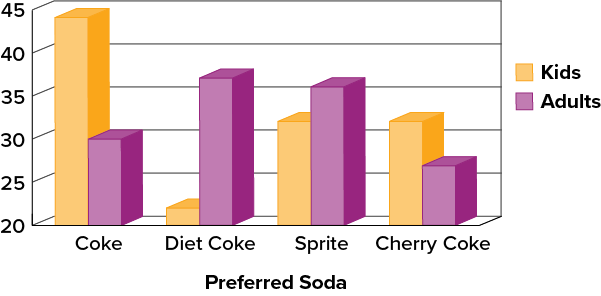
3) A graph appears below showing the number of adults and children who prefer each type of soda. There were [latex]130[/latex] adults and kids surveyed. Discuss some ways in which the graph could be improved.
Solution
There are multiple answers possible for this question. Here are a few suggestions. Give the graph a title (place it at the top) and a title for the vertical axis. The legend can be placed inside the chart area. Add more graduations along the vertical axis to make the total of each bar more clear. A two-dimensional graph may be clearer to compare this data. Start the vertical axis scale at [latex]0[/latex] or add a line break. A short description of the graph can be added at the bottom as a caption.
Summary
Pie charts and bar charts can both be effective methods of portraying qualitative data. Bar charts are better when there are more than just a few categories and for comparing two or more distributions. Be careful to avoid creating misleading graphs.
Graphing Quantitative Variables
As discussed in the section on variables in 6.1 Basics of Statistics, quantitative variables are variables measured on a numeric scale. Height, weight, response time, subjective rating of pain, temperature, and score on an exam are all examples of quantitative variables. Quantitative variables are distinguished from qualitative variables (sometimes called categorical variables or nominal variables), such as favourite colour, religion, city of birth, and favourite sport, in which there is no ordering or measuring involved.
There are many types of graphs that can be used to portray distributions of quantitative variables. The upcoming sections cover the following types of graphs: (1) stem-and-leaf displays, (2) histograms, (3) frequency polygons, (4) box plots, (5) bar charts, (6) line graphs, (7) dot plots, and (8) scatter plots. Some graph types, such as stem-and-leaf displays, are best-suited for small to moderate amounts of data, whereas others, such as histograms, are best-suited for large amounts of data. Graph types such as box plots are good at depicting differences between distributions. Scatter plots are used to show the relationship between two variables.
Stem-and-Leaf Displays
A stem-and-leaf display is a graphical method of displaying data. It is particularly useful when your data are not too numerous. In this section, we will explain how to construct and interpret this kind of graph.
As usual, we will start with an example. Consider Figure 6.2.12, which shows the number of touchdown passes (TD passes) thrown by each of the [latex]31[/latex] teams in the National Football League during the 2000 season
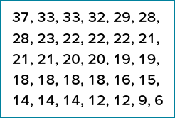
A stem-and-leaf display of the data is shown in Figure 6.2.11. The left portion of Figure 6.2.13 contains the stems. They are the numbers [latex]3[/latex], [latex]2[/latex], [latex]1[/latex], and [latex]0[/latex], arranged as a column to the left of the bars. Think of these numbers as [latex]10[/latex]s digits. A stem of [latex]3[/latex], for example, can be used to represent the [latex]10[/latex]s digit in any of the numbers from [latex]30[/latex] to [latex]39[/latex]. The numbers to the right of the bar are leaves, and they represent the [latex]1[/latex]s digits. Every leaf in the graph therefore stands for the result of adding the leaf to [latex]10[/latex] times its stem.
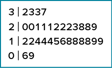
To make this clear, let us examine Figure 6.2.13 more closely. In the top row, the four leaves to the right of stem [latex]3[/latex] are [latex]2[/latex], [latex]3[/latex], [latex]3[/latex], and [latex]7[/latex]. Combined with the stem, these leaves represent the numbers [latex]32[/latex], [latex]33[/latex], [latex]33[/latex], and [latex]37[/latex], which are the numbers of TD passes for the first four teams in Figure 6.2.12. The next row has a stem of [latex]2[/latex] and [latex]12[/latex] leaves. Together, they represent [latex]12[/latex] data points, namely, two occurrences of [latex]20[/latex] TD passes, three occurrences of [latex]21[/latex] TD passes, three occurrences of [latex]22[/latex] TD passes, one occurrence of [latex]23[/latex] TD passes, two occurrences of [latex]28[/latex] TD passes, and one occurrence of [latex]29[/latex] TD passes. We leave it to you to figure out what the third row represents. The fourth row has a stem of [latex]0[/latex] and two leaves. It stands for the last two entries in Figure 6.2.12, namely [latex]9[/latex] TD passes and [latex]6[/latex] TD passes. (The latter two numbers may be thought of as [latex]09[/latex] and [latex]06[/latex].)
One purpose of a stem-and-leaf display is to clarify the shape of the distribution. You can see many facts about TD passes more easily in Figure 6.2.13 than in Figure 6.2.12. For example, by looking at the stems and the shape of the plot, you can tell that most of the teams had between [latex]10[/latex] and [latex]29[/latex] passing TDs, with a few having more and a few having less. The precise numbers of TD passes can be determined by examining the leaves.
We can make our figure even more revealing by splitting each stem into two parts. Figure 6.2.14 shows how to do this. The top row is reserved for numbers from [latex]35[/latex] to [latex]39[/latex] and holds only the [latex]37[/latex] TD passes made by the first team in Figure 6.2.12. The second row is reserved for the numbers from [latex]30[/latex] to [latex]34[/latex] and holds the [latex]32[/latex], [latex]33[/latex], and [latex]33[/latex] TD passes made by the next three teams in the table. You can see for yourself what the other rows represent.
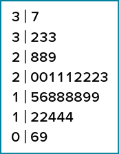
Figure 6.2.14 is more revealing than Figure 6.2.13 because the latter figure lumps too many values into a single row. Whether you should split stems in a display depends on the exact form of your data. If rows get too long with single stems, you might try splitting them into two or more parts.
There is a variation of stem-and-leaf displays that is useful for comparing distributions. The two distributions are placed back to back along a common column of stems. The result is a back-to-back stem-and-leaf display, as shown in Figure 6.2.15. It compares the numbers of TD passes in the 1998 and 2000 seasons. The stems are in the middle, the leaves to the left are for the 1998 data, and the leaves to the right are for the 2000 data. For example, the second-to-last row shows that in 1998 there were teams with [latex]11[/latex], [latex]12[/latex], and [latex]13[/latex] TD passes, and in 2000 there were two teams with [latex]12[/latex] and three teams with [latex]14[/latex] TD passes.
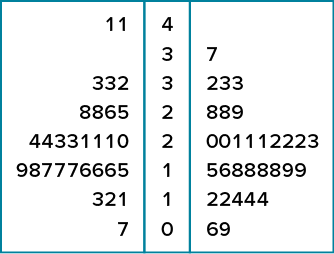
Figure 6.2.15 helps us see that the two seasons were similar, but that only in 1998 did any teams throw more than [latex]40[/latex] TD passes.
There are two things about the football data that make them easy to graph with stems and leaves. First, the data are limited to whole numbers that can be represented with a one-digit stem and a one-digit leaf. Second, all the numbers are positive. If the data include numbers with three or more digits, or contain decimals, they can be rounded to two-digit accuracy. Negative values are also easily handled. Let us look at another example.
Figure 6.2.16 shows data from the Weapons and Aggression case study developed at Rice University. Each value is the mean difference over a series of trials between the times it took an experimental subject to name aggressive words (like punch) under two conditions. In one condition, the words were preceded by a non-weapon word such as bug. In the second condition, the same words were preceded by a weapon word such as gun or knife. The issue addressed by the experiment was whether a preceding weapon word would speed up (or prime) pronunciation of the aggressive word compared to a non-weapon priming word. A positive difference implies greater priming of the aggressive word by the weapon word. Negative differences imply that the priming by the weapon word was less than for a neutral word.
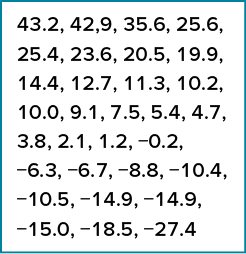
You see that the numbers range from [latex]43.2[/latex] to [latex]-27.4[/latex]. The first value indicates that one subject was [latex]43.2[/latex] milliseconds faster pronouncing aggressive words when they were preceded by weapon words than when preceded by neutral words. The value [latex]-27.4[/latex] indicates that another subject was [latex]27.4[/latex] milliseconds slower pronouncing aggressive words when they were preceded by weapon words.
The data are displayed with stems and leaves in Figure 6.2.17. Since stem-and-leaf displays can only portray two whole digits (one for the stem and one for the leaf) the numbers are first rounded. Thus, the value [latex]43.2[/latex] is rounded to [latex]43[/latex] and represented with a stem of [latex]4[/latex] and a leaf of [latex]3[/latex]. Similarly, [latex]42.9[/latex] is rounded to [latex]43[/latex]. To represent negative numbers, we simply use negative stems. For example, the bottom row of the figure represents the number[latex]-27[/latex]. The second-to-last row represents the numbers [latex]-10[/latex], [latex]-10[/latex], [latex]-15[/latex], etc. Once again, we have rounded the original values from Figure 6.2.16.
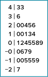
Observe that the figure contains a row headed by “[latex]0[/latex]” and another headed by “[latex]-0[/latex].” The stem of [latex]0[/latex] is for numbers between [latex]0[/latex] and [latex]9[/latex], whereas the stem of [latex]-0[/latex] is for numbers between [latex]0[/latex] and [latex]-9[/latex]. For example, the fifth row of the table holds the numbers [latex]1[/latex], [latex]2[/latex], [latex]4[/latex], [latex]5[/latex], [latex]5[/latex], [latex]8[/latex], [latex]9[/latex] and the sixth row holds [latex]0[/latex], [latex]-6[/latex], [latex]-7[/latex], and [latex]-9[/latex]. Values that are exactly [latex]0[/latex] before rounding should be split as evenly as possible between the “[latex]0[/latex]” and “[latex]-0[/latex]” rows. In Figure 6.2.16, none of the values are [latex]0[/latex] before rounding. The “[latex]0[/latex]” that appears in the “[latex]-0[/latex]” row comes from the original value of [latex]-0.2[/latex] in the table.
Although stem-and-leaf displays are unwieldy for large datasets, they are often useful for datasets with up to [latex]200[/latex] observations. Figure 6.2.18 portrays the distribution of populations of [latex]185[/latex] U.S. cities in 1998. To be included, a city had to have between [latex]100,000[/latex] and [latex]500,000[/latex] residents.
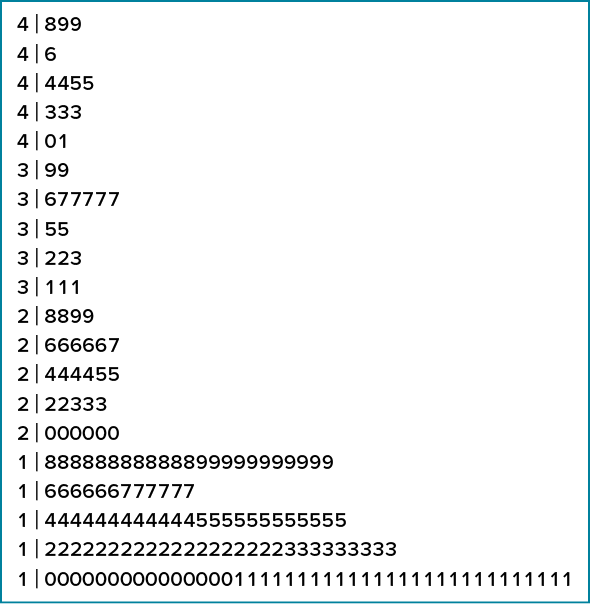
Since a stem-and-leaf plot shows only two-place accuracy, we had to round the numbers to the nearest [latex]10,000[/latex]. For example the largest number ([latex]493,559[/latex]) was rounded to [latex]490,000[/latex] and then plotted with a stem of [latex]4[/latex] and a leaf of [latex]9[/latex]. The fourth highest number ([latex]463,201[/latex]) was rounded to [latex]460,000[/latex] and plotted with a stem of [latex]4[/latex] and a leaf of [latex]6[/latex]. Thus, the stems represent units of [latex]100,000[/latex], and the leaves represent units of [latex]10,000[/latex]. Notice that each stem value is split into five parts: [latex]0[/latex] to [latex]1[/latex], [latex]2[/latex] to [latex]3[/latex], [latex]4[/latex] to [latex]5[/latex], [latex]6[/latex] to [latex]7[/latex], and [latex]8[/latex] to [latex]9[/latex].
Whether your data can be suitably represented by a stem-and-leaf display depends on whether they can be rounded without loss of important information. Also, their extreme values must fit into two successive digits, as the data in Figure 6.2.18 fit into the [latex]10,000[/latex] and [latex]100,000[/latex] places (for leaves and stems, respectively). Deciding what kind of graph is best suited to displaying your data thus requires good judgment. Statistics is not just recipes!
Histograms
A histogram is a graphical method for displaying the shape of a distribution. It is particularly useful when there are a large number of observations. We begin with an example consisting of the scores of [latex]642[/latex] students on a psychology test. The test consists of [latex]197[/latex] items, each graded as “correct” or “incorrect.” The students’ scores ranged from [latex]46[/latex] to [latex]167[/latex].
The first step is to create a frequency table. Unfortunately, a simple frequency table would be too big, containing over [latex]100[/latex] rows. To simplify the table, we group scores together as shown in Table 6.2.4.
|
Interval’s Lower Limit |
Interval’s Upper Limit |
Class Frequency |
|---|---|---|
|
[latex]39.5[/latex] |
[latex]49.5[/latex] |
[latex]3[/latex] |
|
[latex]49.5[/latex] |
[latex]59.5[/latex] |
[latex]10[/latex] |
|
[latex]59.5[/latex] |
[latex]69.5[/latex] |
[latex]53[/latex] |
|
[latex]69.5[/latex] |
[latex]79.5[/latex] |
[latex]107[/latex] |
|
[latex]79.5[/latex] |
[latex]89.5[/latex] |
[latex]147[/latex] |
|
[latex]89.5[/latex] |
[latex]99.5[/latex] |
[latex]130[/latex] |
|
[latex]99.5[/latex] |
[latex]109.5[/latex] |
[latex]78[/latex] |
|
[latex]109.5[/latex] |
[latex]119.5[/latex] |
[latex]59[/latex] |
|
[latex]119.5[/latex] |
[latex]129.5[/latex] |
[latex]36[/latex] |
|
[latex]129.5[/latex] |
[latex]139.5[/latex] |
[latex]11[/latex] |
|
[latex]139.5[/latex] |
[latex]149.5[/latex] |
[latex]6[/latex] |
|
[latex]149.5[/latex] |
[latex]159.5[/latex] |
[latex]1[/latex] |
|
[latex]159.5[/latex] |
[latex]169.5[/latex] |
[latex]1[/latex] |
To create this table, the range of scores was broken into intervals, called class intervals. The first interval is from [latex]39.5[/latex] to [latex]49.5[/latex], the second from [latex]49.5[/latex] to [latex]59.5[/latex], etc. Next, the number of scores falling into each interval was counted to obtain the class frequencies. There are [latex]3[/latex] scores in the first interval, [latex]10[/latex] in the second, etc.
Class intervals of width [latex]10[/latex] provide enough detail about the distribution to be revealing without making the graph too “choppy.” More information on choosing the widths of class intervals is presented later in this section. Placing the limits of the class intervals midway between two numbers (e.g., [latex]49.5[/latex]) ensures that every score will fall in an interval rather than on the boundary between intervals.
In a histogram, the class frequencies are represented by bars. The height of each bar corresponds to its class frequency. A histogram of these data is shown in Figure 6.2.19.
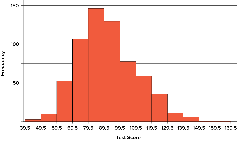
The histogram makes it plain that most of the scores are in the middle of the distribution, with fewer scores in the extremes. You can also see that the distribution is not symmetric: the scores extend farther to the right than they do to the left. The distribution is therefore said to be skewed.
In our example, the observations are whole numbers. Histograms can also be used when the scores are measured on a more continuous scale such as the length of time (in milliseconds) required to perform a task. In this case, there is no need to worry about fence sitters since they are improbable. (It would be quite a coincidence for a task to require exactly [latex]7[/latex] seconds, measured to the nearest thousandth of a second.) We are therefore free to choose whole numbers as boundaries for our class intervals, for example, [latex]4000[/latex], [latex]5000[/latex], etc. The class frequency is then the number of observations that are greater than or equal to the lower bound, and strictly less than the upper bound. For example, one interval might hold times from [latex]4000[/latex] to [latex]4999[/latex] milliseconds. Using whole numbers as boundaries avoids a cluttered appearance, and is the practice of many computer programs that create histograms. Note also that some computer programs label the middle of each interval rather than the end points.
Histograms can be based on relative frequencies instead of actual frequencies. Histograms based on relative frequencies show the proportion of scores in each interval rather than the number of scores. In this case, the [latex]y[/latex]-axis runs from [latex]0[/latex] to [latex]1[/latex] (or somewhere in between if there are no extreme proportions). You can change a histogram based on frequencies to one based on relative frequencies by (a) dividing each class frequency by the total number of observations, and then (b) plotting the quotients on the [latex]y[/latex]-axis (labelled as proportion).
There is more to be said about the widths of the class intervals, sometimes called bin widths. Your choice of bin width determines the number of class intervals. This decision, along with the choice of starting point for the first interval, affects the shape of the histogram. The best advice is to experiment with different choices of width, and to choose a histogram according to how well it communicates the shape of the distribution.
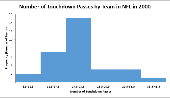
In the next example, we will show a way to create a histogram given a specific number of bins. Once again, consider Figure 6.2.20, which shows the number of touchdown passes (TD passes) thrown by each of the [latex]31[/latex] teams in the National Football League during the 2000 season.
| Number of Touchdowns | Frequency | Relative Frequency |
| [latex]6[/latex] – [latex]11[/latex] | [latex]2[/latex] | [latex]0.06[/latex] |
| [latex]12[/latex] – [latex]17[/latex] | [latex]7[/latex] | [latex]0.23[/latex] |
| [latex]18[/latex] – [latex]23[/latex] | [latex]15[/latex] | [latex]0.48[/latex] |
| [latex]24[/latex] – [latex]29[/latex] | [latex]3[/latex] | [latex]0.10[/latex] |
| [latex]30[/latex] – [latex]35[/latex] | [latex]3[/latex] | [latex]0.10[/latex] |
| [latex]36[/latex] – [latex]41[/latex] | [latex]1[/latex] | [latex]0.03[/latex] |
| Total | [latex]31[/latex] | [latex]1.00[/latex] |
Using this frequency table, we can create either a frequency histogram or a relative frequency histogram. To figure out our boundaries we take the midpoint between each bin.
|
Interval’s Lower Limit |
Interval’s Upper Limit |
Number of Touchdowns |
|---|---|---|
|
[latex]5.5[/latex] |
[latex]11.5[/latex] |
[latex]2[/latex] |
|
[latex]11.5[/latex] |
[latex]17.5[/latex] |
[latex]7[/latex] |
|
[latex]17.5[/latex] |
[latex]23.5[/latex] |
[latex]15[/latex] |
|
[latex]23.5[/latex] |
[latex]29.5[/latex] |
[latex]3[/latex] |
|
[latex]29.5[/latex] |
[latex]35.5[/latex] |
[latex]3[/latex] |
|
[latex]35.5[/latex] |
[latex]41.5[/latex] |
[latex]1[/latex] |
Now, we can take the information and place it into a frequency histogram.
This is what would be expected if we asked students to graph a histogram by hand on an assessment. That said, sometimes using technology to graph can allow us to investigate which number of bins would be most appropriate to represent the data.
Try It
4) Pretend you are constructing a histogram for describing the distribution of salaries for individuals who are [latex]40[/latex] years or older but not yet retired.
- What is on the [latex]y[/latex]-axis? Explain.
- What is on the [latex]x[/latex]-axis? Explain.
- What would be the probable shape of the salary distribution? Explain why.
Solution
[You do not need to draw the histogram, only describe it.]
- The [latex]y[/latex]-axis would show the frequency or proportion because this is always the case in histograms.
- The [latex]x[/latex]-axis would show income, because this is our quantitative variable of interest.
- Because most income data are positively skewed, this histogram would likely be skewed positively too.
Try It
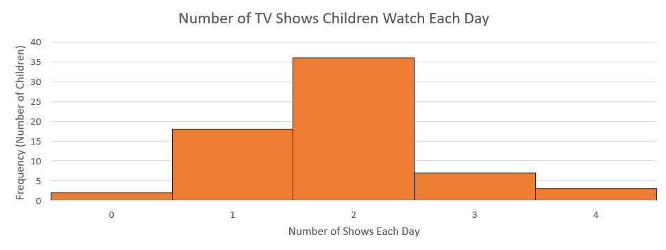
5) Create a histogram of the following data representing how many shows children said they watch each day:
| Number of TV Shows | Frequency |
| [latex]0[/latex] | [latex]2[/latex] |
| [latex]1[/latex] | [latex]18[/latex] |
| [latex]2[/latex] | [latex]36[/latex] |
| [latex]3[/latex] | [latex]7[/latex] |
| [latex]4[/latex] | [latex]3[/latex] |
Solution
Try It
6) Create a histogram of the following data. Determine if it is skewed (and direction, if so) or symmetrical.
|
Hours Worked per Week |
Proportion |
|---|---|
|
[latex]0[/latex]–[latex]10[/latex] |
[latex]4[/latex] |
|
[latex]10[/latex]–[latex]20[/latex] |
[latex]8[/latex] |
|
[latex]20[/latex]–[latex]30[/latex] |
[latex]11[/latex] |
|
[latex]30[/latex]–[latex]40[/latex] |
[latex]51[/latex] |
|
[latex]40[/latex]–[latex]50[/latex] |
[latex]12[/latex] |
|
[latex]50[/latex]–[latex]60[/latex] |
[latex]9[/latex] |
|
[latex]60+[/latex] |
[latex]5[/latex] |
Solution
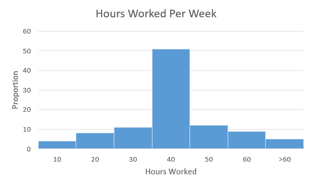
This distribution is symmetrical. Almost perfectly symmetrical, in fact.
Frequency Polygons
Frequency polygons are a graphical device for understanding the shapes of distributions. They serve the same purpose as histograms, but are especially helpful for comparing sets of data. Frequency polygons are also a good choice for displaying cumulative frequency distributions.
To create a frequency polygon, start just as for histograms, by choosing a class interval. Then draw an [latex]x[/latex]-axis representing the values of the scores in your data. Mark the middle of each class interval with a tick mark, and label it with the middle value represented by the class. Draw the [latex]y[/latex]-axis to indicate the frequency of each class. Place a point in the middle of each class interval at the height corresponding to its frequency. Finally, connect the points. You should include one class interval below the lowest value in your data and one above the highest value. The graph will then touch the [latex]x[/latex]-axis on both sides.
The frequency distribution of [latex]642[/latex] psychology test scores, shown in Table 6.2.9, was used to create the frequency polygon shown in Figure 6.2.19.
|
Lower Limit |
Upper Limit |
Count |
Cumulative Count |
|---|---|---|---|
|
[latex]29.5[/latex] |
[latex]39.5[/latex] |
[latex]0[/latex] |
[latex]0[/latex] |
|
[latex]39.5[/latex] |
[latex]49.5[/latex] |
[latex]3[/latex] |
[latex]3[/latex] |
|
[latex]49.5[/latex] |
[latex]59.5[/latex] |
[latex]10[/latex] |
[latex]13[/latex] |
|
[latex]59.5[/latex] |
[latex]69.5[/latex] |
[latex]53[/latex] |
[latex]66[/latex] |
|
[latex]69.5[/latex] |
[latex]79.5[/latex] |
[latex]107[/latex] |
[latex]173[/latex] |
|
[latex]79.5[/latex] |
[latex]89.5[/latex] |
[latex]147[/latex] |
[latex]320[/latex] |
|
[latex]89.5[/latex] |
[latex]99.5[/latex] |
[latex]130[/latex] |
[latex]450[/latex] |
|
[latex]99.5[/latex] |
[latex]109.5[/latex] |
[latex]78[/latex] |
[latex]528[/latex] |
|
[latex]109.5[/latex] |
[latex]119.5[/latex] |
[latex]59[/latex] |
[latex]587[/latex] |
|
[latex]119.5[/latex] |
[latex]129.5[/latex] |
[latex]36[/latex] |
[latex]623[/latex] |
|
[latex]129.5[/latex] |
[latex]139.5[/latex] |
[latex]11[/latex] |
[latex]634[/latex] |
|
[latex]139.5[/latex] |
[latex]149.5[/latex] |
[latex]6[/latex] |
[latex]640[/latex] |
|
[latex]149.5[/latex] |
[latex]159.5[/latex] |
[latex]1[/latex] |
[latex]641[/latex] |
|
[latex]159.5[/latex] |
[latex]169.5[/latex] |
[latex]1[/latex] |
[latex]642[/latex] |
|
[latex]169.5[/latex] |
[latex]170.5[/latex] |
[latex]0[/latex] |
[latex]642[/latex] |
The first label on the [latex]x[/latex]-axis is [latex]35[/latex]. This represents an interval extending from [latex]29.5[/latex] to [latex]39.5[/latex]. Since the lowest test score is [latex]46[/latex], this interval has a frequency of [latex]0[/latex]. The point labelled [latex]45[/latex] represents the interval from [latex]39.5[/latex] to [latex]49.5[/latex]. There are three scores in this interval. There are [latex]147[/latex] scores in the interval that surrounds [latex]85[/latex].
You can easily discern the shape of the distribution from Figure 6.2.24. Most of the scores are between [latex]65[/latex] and [latex]115[/latex]. It is clear that the distribution is not symmetric inasmuch as good scores (to the right) trail off more gradually than poor scores (to the left). In the terminology of distribution shapes, the distribution is skewed.
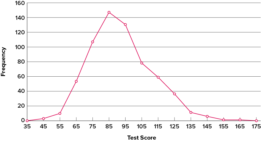
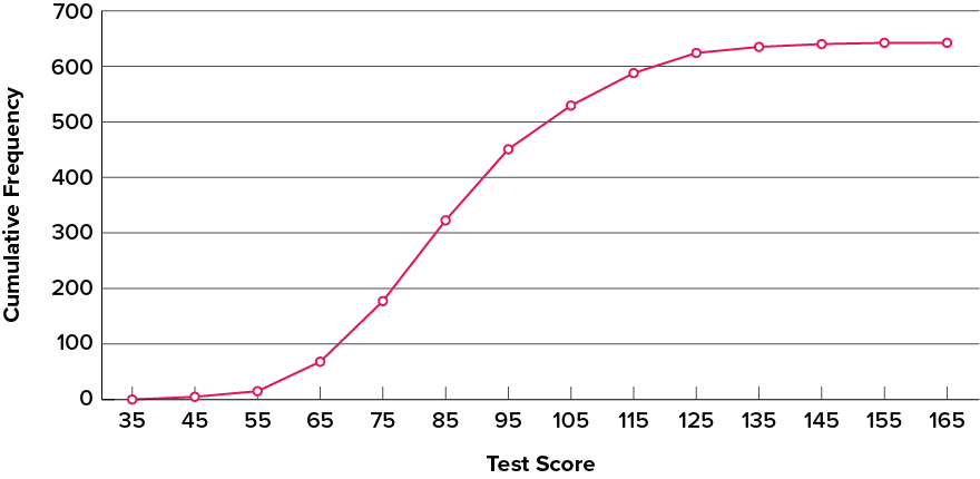
A cumulative frequency polygon for the same test scores is shown in Figure 6.2.25. The graph is the same as before except that the [latex]y[/latex] value for each point is the number of students in the corresponding class interval plus all numbers in lower intervals. For example, there are no scores in the interval labelled “[latex]35[/latex],” three in the interval “[latex]45[/latex],” and [latex]10[/latex] in the interval “[latex]55[/latex].” Therefore, the [latex]y[/latex] value corresponding to “[latex]55[/latex]” is [latex]13[/latex]. Since [latex]642[/latex] students took the test, the cumulative frequency for the last interval is [latex]642[/latex].
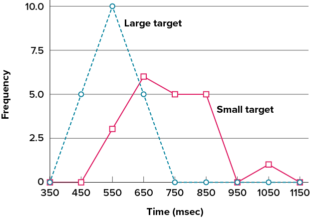
Frequency polygons are useful for comparing distributions. This is achieved by overlaying the frequency polygons drawn for different datasets. Figure 6.2.26 provides an example. The data come from a task in which the goal is to move a computer cursor to a target on the screen as fast as possible. On [latex]20[/latex] of the trials, the target was a small rectangle; on the other [latex]20[/latex], the target was a large rectangle. Time to reach the target was recorded on each trial. The two distributions (one for each target) are plotted together in Figure 6.2.26. The figure shows that, although there is some overlap in times, it generally took longer to move the cursor to the small target than to the large one.
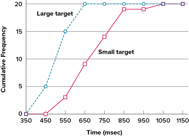
It is also possible to plot two cumulative frequency distributions in the same graph. This is illustrated in Figure 6.2.27 using the same data from the cursor task. The difference in distributions for the two targets is again evident.
Box Plots
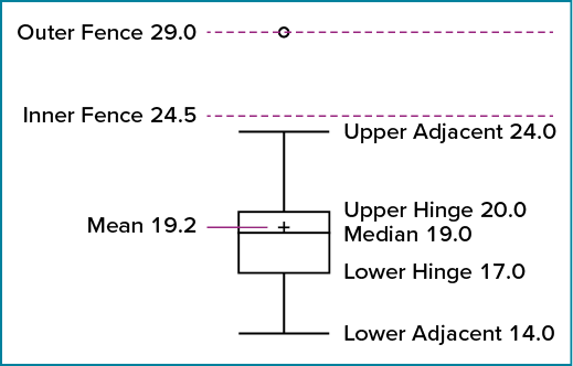
We have already discussed techniques for visually representing data (see histograms and frequency polygons). In this section we present another important graph, called a box plot. Box plots are useful for identifying outliers and for comparing distributions. We will explain box plots with the help of data from an in-class experiment. Students in Introductory Statistics were presented with a page containing [latex]30[/latex] coloured rectangles. Their task was to name the colours as quickly as possible. Their times (in seconds) were recorded. We’ll compare the scores for the [latex]16[/latex] men and [latex]31[/latex] women who participated in the experiment by making separate box plots for each gender. Such a display is said to involve parallel box plots. The data for the women in our sample are shown in Figure 6.2.28.
There are several steps in constructing a box plot. The first relies on the [latex]25^{th}[/latex], [latex]50^{th}[/latex], and [latex]75^{th}[/latex] percentiles in the distribution of scores. Figure 6.2.29 shows how these three statistics are used. For each gender we draw a box extending from the [latex]25^{th}[/latex] percentile to the [latex]75^{th}[/latex] percentile. The [latex]50^{th}[/latex] percentile is drawn inside the box. Therefore, the bottom of each box is the [latex]25^{th}[/latex] percentile, the top is the [latex]75^{th}[/latex] percentile, and the line in the middle is the [latex]50^{th}[/latex] percentile.
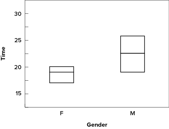
For the data reflecting the women’s times, the [latex]25^{th}[/latex] percentile is [latex]17[/latex], the [latex]50^{th}[/latex] percentile is [latex]19[/latex], and the [latex]75^{th}[/latex] percentile is [latex]20[/latex]. For the men (whose data are not shown), the [latex]25^{th}[/latex] percentile is [latex]19[/latex], the [latex]50^{th}[/latex] percentile is [latex]22.5[/latex], and the [latex]75^{th}[/latex] percentile is [latex]25.5[/latex].
Before proceeding, the terminology in Table 6.2.10 is helpful.
|
Name |
Formula |
Value |
|---|---|---|
|
Upper Hinge |
[latex]75^{th}[/latex] percentile |
[latex]20[/latex] |
|
Lower Hinge |
[latex]25^{th}[/latex] percentile |
[latex]17[/latex] |
|
H-Spread |
Upper Hinge − Lower Hinge |
[latex]3[/latex] |
|
Step |
[latex]1.5[/latex] × H-Spread |
[latex]4.5[/latex] |
|
Upper Inner Fence |
Upper Hinge + [latex]1[/latex] Step |
[latex]24.5[/latex] |
|
Lower Inner Fence |
Lower Hinge − [latex]1[/latex] Step |
[latex]12.5[/latex] |
|
Upper Outer Fence |
Upper Hinge + [latex]2[/latex] Steps |
[latex]29[/latex] |
|
Lower Outer Fence |
Lower Hing − [latex]2[/latex] Steps |
[latex]8[/latex] |
|
Upper Adjacent |
Largest value below Upper Inner Fence |
[latex]24[/latex] |
|
Lower Adjacent |
Smallest value above Lower Inner Fence |
[latex]14[/latex] |
|
Outside Value |
A value beyond an Inner Fence but not beyond an Outer Fence |
[latex]29[/latex] |
|
Far Out Value |
A value beyond an Outer Fence |
None |
Continuing with the box plots, we put “whiskers” above and below each box to give additional information about the spread of data. Whiskers are vertical lines that end in a horizontal stroke. Whiskers are drawn from the upper and lower hinges to the upper and lower adjacent values ([latex]24[/latex] and [latex]14[/latex] for the women’s data), as shown in Figure 6.2.30.

Although we don’t draw whiskers all the way to outside or far out values, we still wish to represent them in our box plots. This is achieved by adding additional marks beyond the whiskers. Specifically, outside values are indicated by small circles, and far out values are indicated by asterisks (*). In our data, there are no far-out values and just one outside value. This outside value of [latex]29[/latex] is for the women and is shown in Figure 6.2.31.

There is one more mark to include in box plots (although sometimes it is omitted). We indicate the mean score for a group by inserting a plus sign. Figure 6.2.32 shows the result of adding means to our box plots.
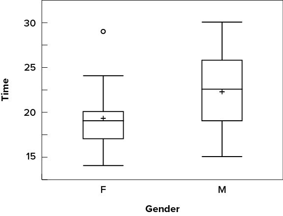
Figure 6.2.32 provides a revealing summary of the data. Since half the scores in a distribution are between the hinges (recall that the hinges are the [latex]25^{th}[/latex] and [latex]75^{th}[/latex] percentiles), we see that half the women’s times are between [latex]17[/latex] and [latex]20[/latex] seconds whereas half the men’s times are between [latex]19[/latex] and [latex]25.5[/latex] seconds. We also see that women generally named the colours faster than the men did, although one woman was slower than almost all of the men. Figure 6.2.33 shows the box plot for the women’s data with detailed labels.
Box plots provide basic information about a distribution. For example, a distribution with a positive skew would have a longer whisker in the positive direction than in the negative direction. A larger mean than median would also indicate a positive skew. Box plots are good at portraying extreme values and are especially good at showing differences between distributions. However, many of the details of a distribution are not revealed in a box plot; to examine these details one should create a histogram and/or a stem-and-leaf display.
Try It
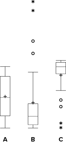
7) Which of the box plots on the graph has a large positive skew? Which has a large negative skew?
Solution
Chart B has the positive skew because the outliers (dots and asterisks) are on the upper (higher) end; Chart C has the negative skew because the outliers are on the lower end.
Bar Charts
In the section on qualitative variables, we saw how bar charts could be used to illustrate the frequencies of different categories. For example, as we saw earlier in this chapter, the bar chart shown in Figure 6.2.3 shows how many purchasers of iMac computers were previous Macintosh users, previous Windows users, and new computer purchasers.
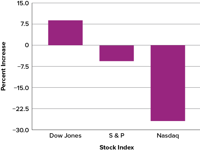
In this section we show how bar charts can be used to present other kinds of quantitative information, not just frequency counts. The bar chart in Figure 6.2.35 shows the percent increases in the Dow Jones, Standard & Poor 500 (S&P), and Nasdaq stock indexes from May 24, 2000, to May 24, 2001. Notice that both the S&P and the Nasdaq had “negative increases” which means that they decreased in value. In this bar chart, the [latex]y[/latex]-axis is not frequency but rather the signed quantity percentage increase.
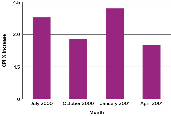
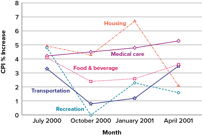
Bar charts are particularly effective for showing change over time. Figure 6.2.36, for example, shows the percent increase in the Consumer Price Index (CPI) over four three-month periods. The fluctuation in inflation is apparent in the graph.
Bar charts are often used to compare the means of different experimental conditions. Figure 6.2.37 shows the mean time it took one person to move the cursor to either a small target or a large target. On average, more time was required for small targets than for large ones.
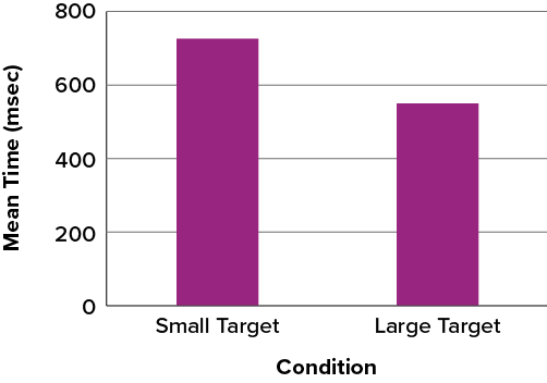
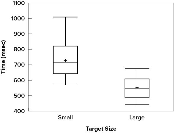
Although bar charts can display means, we do not recommend them for this purpose. Box plots should be used instead since they provide more information than bar charts without taking up more space. For example, a box plot of the cursor-movement data is shown in Figure 6.2.38. You can see that Figure 6.2.38 reveals more about the distribution of movement times than does Figure 6.2.37.
The section on qualitative variables presented earlier in this chapter discussed the use of bar charts for comparing distributions. Some common graphical mistakes were also noted. The earlier discussion applies equally well to the use of bar charts to display quantitative variables.
Try It
8) Explain the differences between bar charts and histograms. When would each be used?
Solution
In bar charts, the bars do not touch; in histograms, the bars do touch. Bar charts are appropriate for qualitative variables, whereas histograms are better for quantitative variables.
Line Graphs
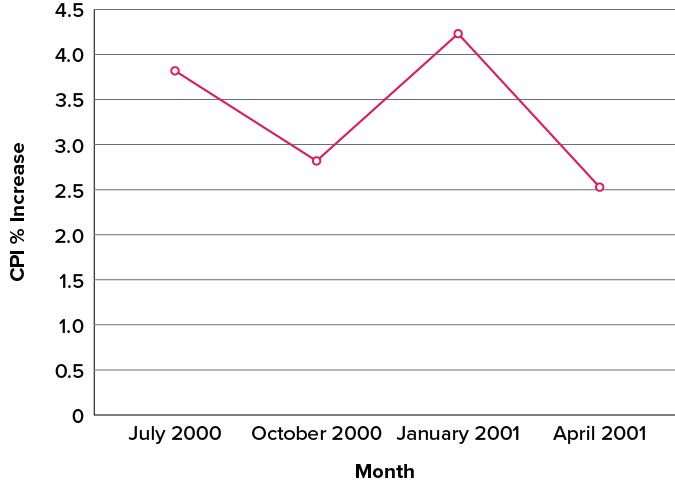
A line graph is a bar graph with the tops of the bars represented by points joined by lines (the rest of the bar is suppressed). For example, Figure 6.2.36, which was presented in the section on bar charts, shows changes in the Consumer Price Index (CPI) over time. A line graph of these same data is shown in Figure 6.2.39. Although the figures are similar, the line graph emphasizes the change from period to period.
Line graphs are appropriate only when both the [latex]x[/latex]– and [latex]y[/latex]-axes display ordered (rather than qualitative) variables. Although bar charts can also be used in this situation, line graphs are generally better at comparing changes over time. Figure 6.2.40, for example, shows percent increases and decreases in five components of the CPI. The figure makes it easy to see that medical costs had a steadier progression than the other components. Although you could create an analogous bar chart, its interpretation would not be as easy.
Let us stress that it is misleading to use a line graph when the [latex]x[/latex]-axis contains merely qualitative variables. As we saw earlier in this chapter, Figure 6.2.8 inappropriately shows a line graph of the card game data from Yahoo, discussed in the section on qualitative variables. The defect in Figure 6.2.8 is that it gives the false impression that the games are naturally ordered in a numerical way.
Try It
9) Name some ways to graph quantitative variables and some ways to graph qualitative variables.
Solution
Qualitative variables are displayed using pie charts and bar charts. Quantitative variables are displayed as box plots, histograms, etc.
The Shape of Distribution
Finally, it is useful to present discussion on how we describe the shapes of distributions, to learn how different shapes affect our numerical descriptors of data and distributions.
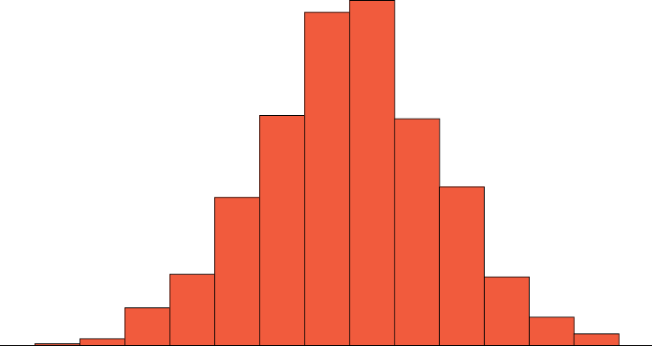
The primary characteristic we are concerned about when assessing the shape of a distribution is whether the distribution is symmetrical or skewed. A symmetrical distribution, as the name suggests, can be cut down the centre to form two mirror images. Although in practice we will never get a perfectly symmetrical distribution, we would like our data to be as close to symmetrical as possible. Many types of distributions are symmetrical, but by far the most common and pertinent distribution at this point is the normal distribution, shown in Figure 6.2.41. Notice that although the symmetry is not perfect (for instance, the bar just to the right of the centre is taller than the one just to the left), the two sides are roughly the same shape. The normal distribution has a single peak, known as the centre, and two tails that extend out equally, forming what is known as a bell shape or bell curve.
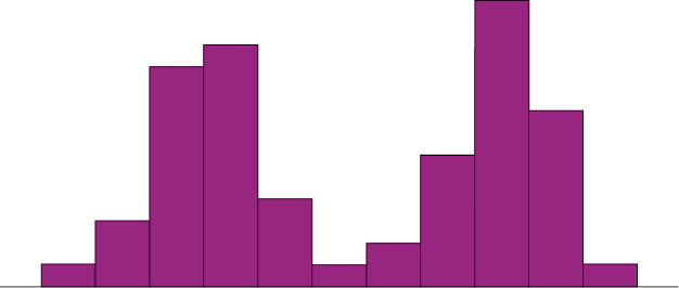
Symmetrical distributions can also have multiple peaks. Figure 6.2.42 shows a bimodal distribution, named for the two peaks that lie roughly symmetrically on either side of the centre point. As we will see, this is not a particularly desirable characteristic of our data, and, worse, this is a relatively difficult characteristic to detect numerically. Thus, it is important to visualize your data before moving ahead with any formal analyses.
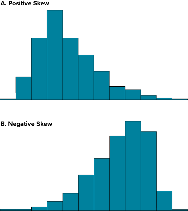
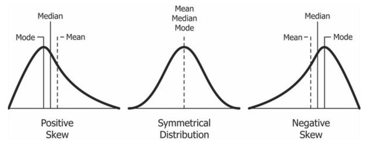
Distributions that are not symmetrical also come in many forms, more than can be described here. The most common asymmetry to be encountered is referred to as skew, in which one of the two tails of the distribution is disproportionately longer than the other. This property can affect the value of the averages we use in our analyses and make them an inaccurate representation of our data, which causes many problems.
Skew can either be positive or negative (also known as right or left, respectively), based on which tail is longer. It is very easy to get the two confused at first; many students want to describe the skew by where the bulk of the data (larger portion of the histogram, known as the body) is placed, but the correct determination is based on which tail is longer. You can think of the tail as an arrow; whichever direction the arrow is pointing is the direction of the skew. Figure 6.2.43 shows positive (right) and negative (left) skew, respectively.
Try It
10) Draw a histogram of a distribution that is
- Negatively skewed
- Symmetrical
- Positively skewed
Solution
Self Check
a) After completing the exercises, use this checklist to evaluate your mastery of the objectives of this section.
b) After looking at the checklist, do you think you are well-prepared for the next section? Why or why not?
Glossary
- bell curve
- The bell curve is a symmetrical distribution in which there is a single peak at the center and tails that extend equally out to each side. The bell curve represents a normal distribution.
- bimodal distribution
- A distribution with two distinct peaks that lie roughly symmetrically on either side of the center point.
- bin widths
- The widths of the class intervals. The choice of bin width determines the number of class intervals. This decision, along with the choice of starting point for the first interval, affects the shape of the histogram.
- box plots
- One of the more effective graphical summaries of a data set, the box plot generally shows the median, 25th and 75th percentiles, and outliers.
- categorical variables
- Also known as qualitative variables, categorical variables cannot be quantified, or measured numerically. Instead, they are measured on a nominal or ordinal scale.
- frequency polygons
- A frequency polygon is a graphical representation of a distribution that is similar in appearance to a line graph. Frequency polygons can be grouped or ungrouped.
- histogram
- A graphical representation of a distribution that is similar in appearance to a bar chart. It partitions the variable on the x-axis into various contiguous class intervals of (usually) equal widths. The heights of the bars represent the class frequencies.
- lie factor
- The ratio of the size of the effect shown in a graph to the size of the effect shown in the data. This term was coined by Edward Tufte, who suggested that lie factors greater than 1.05 or less than 0.95 produce unacceptable distortion.
- skew
- A distribution is skewed if one tail extends out further than the other, making the distribution asymmetrical. A distribution has a positive skew (is skewed to the right) if the tail to the right is longer. A distribution has a negative skew (is skewed to the left) if the tail to the left is longer.
- stem-and-leaf display
- A quasi-graphical representation of numerical data. Generally, all but the final digit of each value is a stem, and the final digit is the leaf. The stems are placed in a vertical list, with each matched leaf on one side.
- whiskers
- Vertical lines ending in a horizontal stroke that are added to box plots to indicate the spread of the data points. Whiskers are drawn from the upper and lower hinges to the upper and lower adjacent values.

- Tufte, E. R. (1983). The visual display of quantitative information (p. 178). Graphics Press. ↵
Also known as qualitative variables, categorical variables cannot be quantified, or measured numerically. Instead, they are measured on a nominal or ordinal scale.
A quasi-graphical representation of numerical data. Generally, all but the final digit of each value is a stem, and the final digit is the leaf. The stems are placed in a vertical list, with each matched leaf on one side.
A graphical representation of a distribution that is similar in appearance to a bar chart. It partitions the variable on the x-axis into various contiguous class intervals of (usually) equal widths. The heights of the bars represent the class frequencies.
A distribution is skewed if one tail extends out further than the other, making the distribution asymmetrical. A distribution has a positive skew (is skewed to the right) if the tail to the right is longer. A distribution has a negative skew (is skewed to the left) if the tail to the left is longer.
The widths of the class intervals. The choice of bin width determines the number of class intervals. This decision, along with the choice of starting point for the first interval, affects the shape of the histogram.
A frequency polygon is a graphical representation of a distribution that is similar in appearance to a line graph. Frequency polygons can be grouped or ungrouped.
One of the more effective graphical summaries of a data set, the box plot generally shows the median, 25th and 75th percentiles, and outliers.
Vertical lines ending in a horizontal stroke that are added to box plots to indicate the spread of the data points. Whiskers are drawn from the upper and lower hinges to the upper and lower adjacent values.
The bell curve is a symmetrical distribution in which there is a single peak at the center and tails that extend equally out to each side. The bell curve represents a normal distribution.
A distribution with two distinct peaks that lie roughly symmetrically on either side of the center point.
The ratio of the size of the effect shown in a graph to the size of the effect shown in the data. This term was coined by Edward Tufte, who suggested that lie factors greater than 1.05 or less than 0.95 produce unacceptable distortion.
