WCAG Standards
The WCAG standards are divided into four main principles: Perceivable, Operable, Understandable and Robust – or POUR.
Perceivable, Operable, Understandable and Robust (POUR)
- Perceivable: involves making information and the interface presentable to users in ways that they can perceive. A user must be able to perceive the content being presented and it cannot be invisible to all of their senses. One example of this is including alternative text for an image so a person who is blind can listen to its description.
- Operable: means ensuring that all user interface components and navigation can be operated by the user. There cannot be any interaction or navigation that a user cannot perform. Making the web content accessible by keyboard is an example of this.
- Understandable: involves making certain that the information and use of the interface are clear and easy to understand. Both the content and the operation of the interface must not be beyond the user’s level of understanding.
- Robust: refers to the ability of content to be interpreted and understood by various means. One example is ensuring that content and interface are compatible with assistive technologies.

WCAG standards also include three different levels of compliance: A, AA and AAA. Level A indicates a minimum level of compliance, while level AAA indicates the highest level of compliance. As mentioned above, the AODA requires all organizations to comply with the WCAG guidelines at level AA.
The following section provides detailed explanations of some of the WCAG standard requirements for elements commonly used in OER. Each explanation will provide a brief description of the requirement, why it is necessary and how it can be implemented.
Core Principles of Digital Accessibility in OER
The following section provides an overview of explanations of some of the WCAG standard requirements for elements commonly used in digital OER content. Each explanation will provide a brief description of the requirement, why it is necessary and how it can be implemented.
Structure
What: Clear content organized through chapters, headings, subheadings, and lists helps users see how different ideas relate to each other and provides a hierarchical structure to the document.
Why: Adding semantic structure to your documents is useful for everyone, including people with learning disabilities or visual impairments. Sighted users will be able to navigate quickly through the document to find the specific information they need, and people using assistive technologies such as screen readers will be able to navigate sections efficiently and identify when a list is included.
How: Use heading levels in sequential order to represent the structure of a page, rather than making the text appear as a heading by applying visual elements such as bold text and a larger font size. Headings can be easily created in web authoring platforms (such as Pressbooks and WordPress) as well as most word-processing programs. Similarly, create lists using bulleted and numbered options in various platforms.
Font Styles
What: Selecting the appropriate font style and size ensures that text is legible for users.
Why: Ensuring an appropriate font style and size is useful for all users, especially those with disabilities requiring the use of assistive technologies.
How: For text to be easy understood, it’s important to ensure that font style is sans serif (e.g., Calibri, Arial and Open Sans) and that the size is not too small and that text can be enlarged. The WCAG standard recommends a font size of 12 points or more (with 9 points or more for footnotes), as well as the ability to zoom the text up to 200%.
Hyperlinks
What: All links (to other web pages or to non-web content) must be included in a meaningful way. Make sure the link text is descriptive.
Why: Descriptive link text is helpful for everyone to understand, but it’s particularly useful for people with physical, cognitive, hearing, or visual disabilities. It helps people understand links, even when they’re out of context. For example, students using screen readers can set the software to read all the links on a page.
How: Descriptive link text that describes the content of the link and doesn’t just say “click here” is very useful. For example, hyperlink the text, “information on open education at the University of Ottawa is available online“. It’s a good idea to open external links in a new tab. Indicate in the descriptive text of the link that it is not another web page (e.g. [PDF]).
Tables
What: Use simple tables to present information and data that can be easily navigated.
Why: Tables can be helpful to present and categorize information but can be complex and difficult for learners with disabilities to navigate – and for screen readers to read. See this example from WebAIM which demonstrates why presenting information in a table can be confusing.
How: There are many items to consider when wanting to create and use accessible tables. A few key items are to use tables for data only and not page layout, to not have merged or split cells, use header rows and break large complex tables into smaller tables. More comprehensive guidance can be found in the Creating Accessible Tables resource from WebAIM.
Alternative Text
What: Providing alternative information on an image in a text format can help ensure that users will be able to access and use the information in a way that best suits their accessibility needs.
Why: Providing information in various accessible formats helps ensure that all users can easily understand and access the information. Any purposeful (non-decorative) images should also include textual information describing them to non-sighted learners.
How: If the images you are using are purposeful (i.e. they convey non-textual content), you need to provide an alternative text that would convey the same information as the image. This can be a description in the surrounding text (a good option for complex images, as the description of the image content is provided for everyone), alt tags (useful for simple images – include a one- or two-sentence description of the image) or long descriptions (an option for complex images that can’t be described in the surrounding text – provide a link to a separate, longer image description). Make sure that your alternative text conveys content and functionality and is not simply a literal description of the image. A decorative image that doesn’t convey content does not require alt text, and screen readers will ignore it.
Here is an example on how to write poor, good and better alt-text:

Attribution: Arctic Beach Life by Vidar Nordli-Mathisen on Unsplash, Unsplash License.
Poor: People swimming at the beach
Good: People running into the water at the beach to go swimming
Better: A group of eight adult men and women dressed in swimsuits running into the water at the beach on a sunny day with cliffs and mountains in the background.
Colour Contrast
What: Colour contrast refers to the contrast of two adjacent colours.
Why: There must be sufficient contrast between the two adjacent colours. The most common example of this is text and background colours. This is important to ensure text legibility for all people, but especially for people with visual impairments, low contrast visual acuity, colour blindness or who use monochromatic devices.
How: Ensure that colour is not the only means of conveying important information (such as essential information in images or links in text). WCAG 2.0 level AA requires that the visual presentation of text and text images have a contrast ratio of at least 4.5:1 while to meet level AAA, the contrast ratio should be at least 7:1[1].
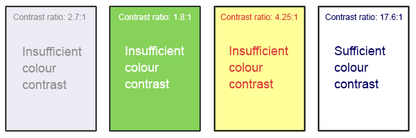
Attribution: A. Coolidge, S. Donner, T. Robertson & J. Gray (2018), Accessibility Toolkit – 2nd Edition, BCcampus, CC BY 4.0.
Captions and Transcripts
What: Captions and transcripts are text versions of the spoken words in audio, videos, and multimedia presentations.
Why: Providing video captions and audio transcriptions details what is being said and broadens the ability for all users to understand what is being said. This is particularly important for deaf or hard of hearing students, students for whom English is not their first language, as well as students with other learning disabilities better understand the content of the media.
How: Most video hosting platforms (e.g., YouTube, Kaltura, Vimeo, Yuja, Microsoft, etc.) offer machine-generated captions which can and should be edited for accuracy. Transcripts can also be added as a document under videos embedded in a website or learning management system. They can also be easily added to most video platforms. A good practice to follow for accurate transcripts is to generate a script ahead of time to use when recording.
 Activity: Core Principles of Digital Accessibility
Assess your understanding of the core principles of digital accessibility by completing this H5P activity.
- W3C, Web Content Accessibility Guidelines (WCAG) 2.0, 1.4.3 Contrast (Minimum) and 1.4.6 Contrast (Enhanced), https://www.w3.org/TR/WCAG20/ ↵
