5 Brochures, Newsletters and Posters
Amber Gulbranson; Nancy Jacob; and Haley Sakki
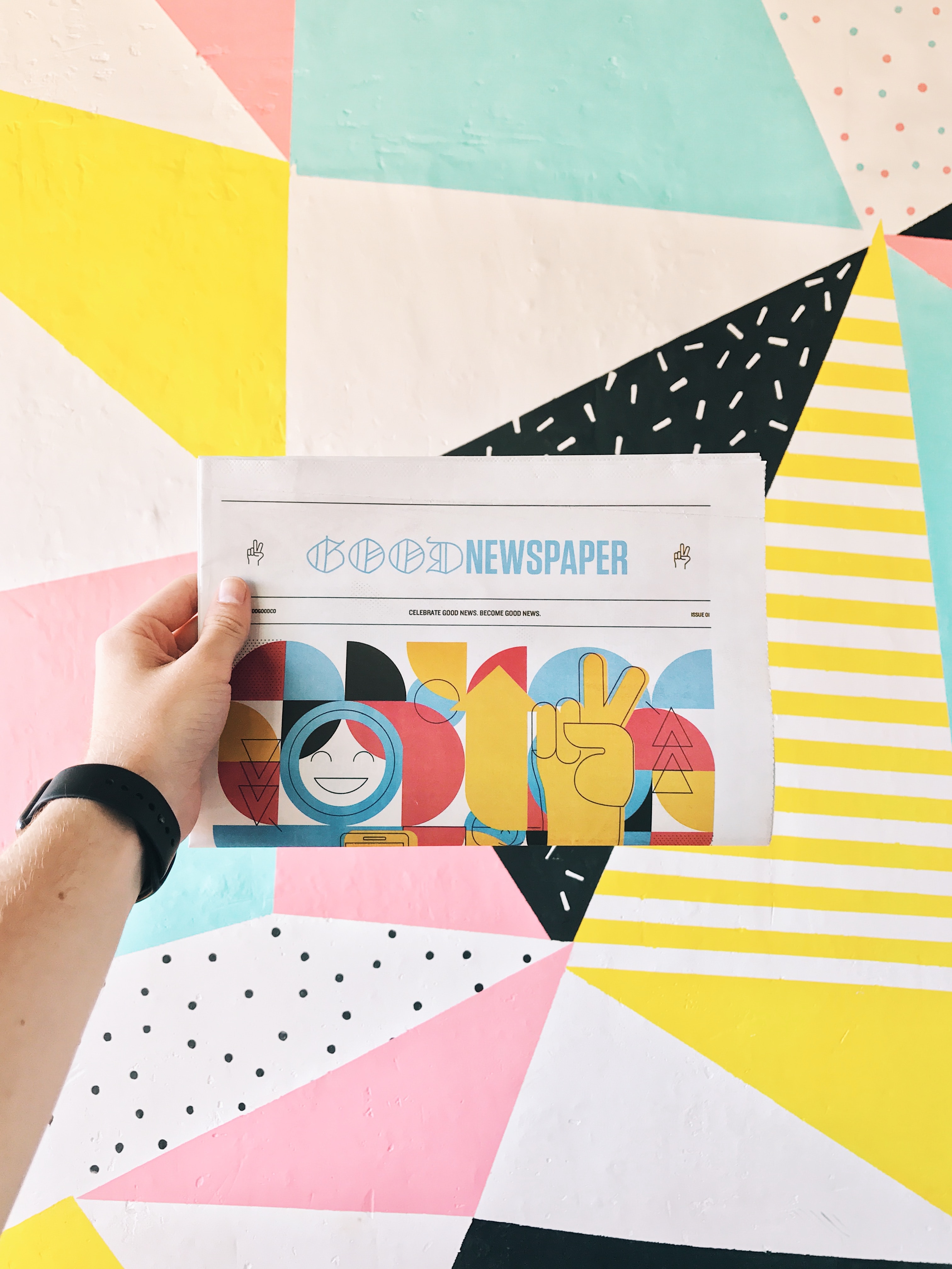
Photo by Branden Harvey on Unsplash
Chapter Objectives
- Create informative brochures, newsletters and posters
- Apply basic design principles to brochures, newsletters and posters
- Identify purpose for creating brochures, newsletters and posters
Brochures, Newsletters, and Posters
Introduction
Brochures, Newsletters, and Posters are one of the most practical forms of distributing information to a wide population. They are useful to reach out to the general public to spread awareness of a specific topic or to bring attention to companies and introduce particular services. Brochures and/or pamphlets are a practical way to inform readers about a service (e.g., outreach programs, counselling, etc. ), advertise to the public about companies (e.g., Elizabeth Fry Society, Salvation Army, etc.), or to promote products (e.g., harm reduction equipment such as sterile water, crack pipes, needles, etc.). Brochures are distributed at locations such as your doctors office, schools, restaurants, local companies, etc. Newsletters are a common way for businesses, institutions, and organization to update it’s subscribers on recent information and/or activities. Newsletters contain many different fonts, pictures, and shapes to attract the readers attention. They are issued periodically to those of interest. Newsletters are a creative way to communicate and advertise new ideas. Newsletters are similar to newspapers but instead newspapers are sent out on a daily basis while newsletters are often only sent out on a weekly basis. Posters include eye-catching images and visual designs, bright colours, and various text fonts and sizes to draw in attention. Posters give people an opportunity to reach out to the general public to spread awareness to a topic or to bring attention to companies and introduce services at numerous locations. Posters aren’t required to be handed out and only require someone to pass by and take a couple moments to read on a wall resulting in no one being chased down to offer them one.
Brochures
A brochure, also known as a pamphlet, is an informational paper that is mainly used for advertising. A brochure is a single piece of paper that can be folded in many different ways, with summary information regarding an organization, company, product, service, etc., printed on either side of it. There are six main types of brochures that are most commonly used: the Gate Fold Brochure, the Tri-Fold Brochure, the Bi-Fold Brochure, Leaflets/ Flyers, Folders/ Insert Brochures, and Z-Fold Brochures. These different types of brochures will be discussed later on in the chapter.
Purpose of a Brochure
The main purpose of a brochure is to promote something, whether this be an organization, company, product, or service, and inform the reader of the benefits of the item being promoted. An example of a good usage of a brochure would be for the Elizabeth Fry Society to promote their programs and services and inform the public about them. The brochure would have the Elizabeth Fry Society logo on it, and in it would be summarized information on each of their services: Ongoing support & volunteer services, Community reintegration & housing support, Bail verification and supervision program, Restorative justice and conflict mediation, and the Open arts studio. The information included in a brochure is usually summarized as there is minimal room.
The purpose of a brochure is to capture the attention of the reader to then “extend the reader’s knowledge on one specific topic in which the brochure centers around”(Edraw. 2014).
When would a Brochure be Used?
A brochure would be used when someone wants to release information about a certain topic in a condensed way that is easy to read and interesting to look at. A brochure can also be used when a company or organization wants to advertise a new program or get out information about an old program, or if any business/ organization has a product/ service that they would like to promote or inform about.
What Elements Should be Included?
There are eight key elements that should be considered when creating a brochure:
8 Key Elements of a Brochure
Command Attention with the Cover
- The first thing to do is to create a cover for the brochure that catches the eye of the reader. An eye catching cover has an uncluttered design and consists of 3 main elements:
- the company’s logo
- an image that stands out
- a phrase that captivates the reader to want to learn more
- The phrases that are typically most effective usually are in a large font, fewer than ten words, and placed at the top or the bottom or the brochure as opposed to the middle.
Attract Attention With Compelling Text
- The design on the cover is going to get people to take a look, but the phrase on the cover is whats is going to convince the to pick up the brochure and read it. There are two techniques to arouse the reader’s curiosity…
- Ask a question on the cover and answer it on the inside.
- Start a phrase on the cover and continue it on the inside.
Set the Tone With Colour
- Using colour is a great way to set the mood of your message. Bright colours are a good choice for you if your business is fun and whimsical, if you want to portray a more serious business message then more neutral hues will be better suited for you.
Choose the Right Font and Size
- Another way to set the right mood of your message is to choose the right font. You want to make sure that the font you chose to use is easy to read. Using different sizes will also help highlight importance of different information. The more important information should be in the larger size with the subheadings in a smaller size. Different sizes also help provide visual interest for the reader.
Use white Space Strategically
- White space is another word for empty space. This white space is as important as images and text. Having white space keeps your brochure from looking cluttered. White space can also be used to draw attention to key images or information.
Organize with Boxes
- Boxes are another way to draw attention to key images or information. If you are using boxing be sure to use them sparingly or else it defeats the purpose of using them.
Choose an Appropriate Fold
- There are many different types of folds that can be used for a brochure. Some of the fold are better used for brochures with little information whereas some of the folds are better used for brochures with lots of information. A Z-Fold is used when a lot of information is being presented as only one panel at a time is being displayed which stops the reader from being bombarded with information. A basic Tri-Fold is used for brochures with less information and a large central image. The 6 different types of folds will be discussed later on in the chapter.
Bring the Brochure to Life with Photographs
- Pictures and images are a great way to communicate your company’s message without using text. Make sure not to rely too heavily on pictures, 2-4 pictures is sufficient to ensure that the reader is not too overwhelmed.
Examples of Brochures (6 folds)
Gate Fold Brochure

- The gate fold brochure is fairly uncommon but when it is used correctly can have a great impact. They are uncommonly used because of their cost, therefore mainly being used for high-end marketing. Theses brochures are made of high quality paper which makes them more durable and easy to distribute. The inward fold of this brochure is a unique feature that makes it easy to carry. The gate fold brochure has an eight panel structure which allows for a lot of room for information or images.
Tri-Fold Brochure

- This type of brochure has three folds. It provides six panels to place information and images as opposed to the eight panels of the gate fold brochure. The tri-fold brochure is a very common type of brochure because of their low cost.
Bi-Fold Brochure

- This is the type of brochure that is most commonly used. They are folded in half which creates four panels: the front cover, the back cover, and the two middle panels. It is a simple brochure which makes it easy for the reader to scan through the information. A more advanced form of the bi-fold brochure is the booklet. The booklet is more useful for companies that produce many products or services and need a lot of space for advertising.
Leaflets/ Flyers

- A leaflet/ flyer is different from the other types as they are used for targeting a large number of people. Since leaflets are common, you need to ensure that you are unique in your design and presentation. There is only one page in a leaflet/ flyer making it very reader-friendly. The information is also concise and to the point on a leaflet.
Folders and Inserts Brochure

- These types of brochures have an additional feature. They have folders within the brochure. These types of brochures are useful for storing feedback forms or an enrollment form which can be filled out on the spot by the reader.
Z-Fold Brochure

- This brochure gets its name because it folds into a ‘Z’. It looks like an accordion, and it’s more advanced version which has more folds is called the accordion fold brochure. The Z-Fold brochure allows information to be proposed in great detail as there are three panels. The z-fold is also a good alternative to the tri-fold.
The above information was adapted from: (Motkar, S. 2018)
Newsletters
A Newsletter is a printed or electronic report that is sent out to those with specific interest. It contains analysis and news about information and activities within a certain business, institution, or organization. It is issued periodically to its subscribers. A Newsletter should include a good title, eye catching pictures, with relevant and interesting information.
Purpose of a Newsletter
A Newsletters main purpose is to keeps customers or employees informed of what is taking place in your community or company. They also help promote organizations, products, services, and businesses. Newsletters are appealing and easy to read. It helps build regular communication with customers and employees, while being a cost-effective way to do so.
When Would a Newsletter be Used?
A newsletter is used to spread awareness of information and activities to its subscribers.
What Elements Should be Included?
There are six key elements that should be considered while creating a newsletter:
6 Key Elements of a Newsletter
Good Title
- Having a good title will determine whether or not someone will read your newsletter. You should have a creative title that will catch the readers attention while informing them on what your newsletter is about. Your title should be professional. Having a good title can also prevent E-Newsletter from being automatically sent to junk mail.
Eye-Catching Picture
- One of the most appealing parts of a newsletter is the pictures you include. These pictures can help catch the readers attention. The pictures should convey what the newsletter is about. It is important to only include pictures that are related to your topic while making them appealing to the eye.
Quality Content
- Your newsletter should contain information only about your business, organization, or services. Your newsletter can be creative and funny but it should always bring back to it’s main purpose. Don’t include details that aren’t related to your topic.
Length
- Your Newsletter should be short and straight to the point. The length can sometimes determine whether or not someone will read your article. If readers see something that is lengthy they will often begin to lose interest fast.
Offer a Call to Action
- Give your readers a reason to either use your product, services, or website. You can do this by asking the readers to refer you to a friend. This can help increase the chance in sales while getting your business, organization, or service out there.
Make Unsubscribing Easy
- Make readers feel comfortable and like they have a way out. This will often help them develop more trust in you and gain more interest in your company.
All information above was adapted from: (Lerner, K. 2011)
Examples of Newsletters
There are three different main types of newsletters that can be used: Company Newsletters, Consumers Newsletters, and Organization Newsletters.
3 Examples of Newsletters
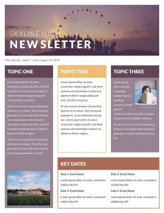
Company Newsletters
- Used in businesses to keep employees and staff informed. In these newsletters it will contain information about new products, services, changes, and policies.

Lucidpress (2017).
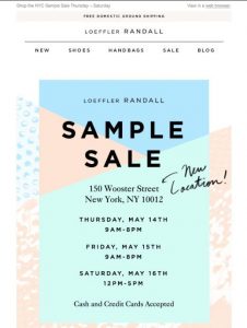
Consumer Newsletters
-
Used to stay in touch with customers. Informs them on new product launch, industry news, and changes to services.
 45 Engaging Email Newsletter Templates (2019)
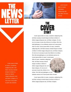
Organization Newsletter
- This is a combination of a consumer and customer newsletter. This provides both employees and customers with updates, information, tips, and announcements. This is often used by non-profit agencies and ministries.

Letterflat (2018).
All information above was adapted from: (Word Wise Tips).
Posters
A poster is a single piece of paper that is posted all over the community to draw in the attention of the public while providing information about a particular topic. Posters include eye catching images and visual designs, bright colours, and various text fonts and sizes.
Purpose of a poster
Posters give people an opportunity to reach out to the general public to spread awareness to a topic or to bring attention to companies and introduce services at numerous locations. Posters aren’t required to be handed out and only require someone to pass by and take a couple moments to read on a wall resulting in no one being chased down to offer them one.
There are five different types of posters than can be featured: Advertising, Informative, Subjective, Affirmation, and Propaganda.
Types of Posters
Advertising
- Advertisement posters are used to promote an event, a new product, and/or a new company/organization. Advertising posters are usually colourful and include large visuals to draw in the attention of individuals walking by where it can be readily seen.
Informative
- Informative posters are used to educate and influence individuals about a specific topic. They are used to raise awareness to local, national, or international problems and to inform people of campaigns happening to contribute to causes.
Subjective
- Subjective posters are used to publicize a topic in particular. They are sold/provided at public events, exhibits, or functions for organizations and/or companies.
Affirmation
- Affirmation posters are used for inspiring the public. Motivational quotes, meaningful pictures, bible verses, and slogans can be features. They’re meant to brighten someone’s day and lift them up. Affirmation posters can often be used for public reminders to remain insight of their goals, priorities, and their future.
Propaganda
- Propaganda posters are used to associate with corporate communication or political campaigns. Often times they feature organization/company logos and provide the values or mission statement of a company, organization, or political candidate.
All information above was adapted from: (Naillon, B.).
There are six key structure/format elements included in a poster: Header, Title, Main Area, Footer Area, Background, and Fonts.
Structure/Format
Header
- Headings aren’t required in all posters, but would be the ideal spot to place the logo of the company or organization the poster is being made for.
Title
- The title should be clearly visible, not too lengthy, and be interesting enough to catch the attention of the public. Due to lack of space, titles are often placed beside the logo.
Main Area
- In the main area, the poster’s main statement and/or visual is to be placed here. The main area can be structured and sub-divided by using multiple columns or an image across all columns, etc. The main area is to provide the eye-catching content to draw in the attention of others.
Footer Area
- Header and footer can be viewed as a framework tying the whole posterl together. However, the footer is not just a graphic element; this is where you can indicate references and contact details as well.
Background
- Posters not only use bright colours to stand out, but often times will include a structure or image as the background. This visual should be related to the poster’s topic and be faint enough to not be distracting and take away the attention from the purpose of the poster; getting a message across.
Fonts
- In a poster you can use various types of fonts that will catch the attention of readers, but also not be too distracting or difficult to read. Large and decorative fonts should be avoided. Emphasis such as underscores, italics, and coloured font should also be avoided.
All information above was adapted from: (Structure and types of Posters).
References
Edraw. (2014). What is a Brochure? Retrieved from: https://www.edrawsoft.com/what-is-brochure.php
Motkar, S. (2018, May 8). Types of Brochures. Retrieved from: https://marketingwit.com/types-of-brochures
Naillon, B. (n.d). Types of Posters. Retrieved from: https://bizfluent.com/facts-6152556-types-posters.html
Print Place. (2006). 8 Key Brochure Design Elements. Retrieved from: https://www.printplace.com/articles/key-brochure-design-elements
Structure and types of Posters. (2018). A Poster’s Structure. Retrieved from: http://www.geo.uzh.ch/microsite/olwa/olwa/en/html/unit5_kap53.html
Elizabeth Fry Society. Programs. Retrieved from: http://efrysudbury.com/#
Lerner, K. (2011). The 5 Things Your Newsletter Must Include. Retrieved from https://www.topleftdesign.com/blog/2011/08/the-5-things-your-newsletter-must-include/
Word Wise Tips. 3 Types of Newsletters. Retrieved from: https://www.nonprofitcopywriter.com/types-of-newsletters.html
Lucidpress. (2017). Skyline Hight Classroom Newsletter Template. Retrieved from: https://www.lucidpress.com/pages/templates/newsletters/classroom-newsletter-template
45 Engaging Email Newsletter Templates, Design Tips & Examples For 2019. (2019). Retrieved from https://www.pinterest.ca/pin/152066924903894228/7
Letterflat. Company Newsletter Templates. (2018). Retrieved from https://letterflat.com/7-company-newsletter-templates/


