4.10 The Components and Purpose of a Colour Management System
Alan Martin
Our primary goal in colour management is to provide a consistent perceptual experience. As we move from device to device, within the limits of the individual device’s colour gamut, our interpretation of the colour event should be the same.
As we’ve discussed, but it’s worth repeating, we achieve that goal in two fundamental steps:
- We give colour its meaning through device independent colour values correlated to a specific device’s RGB or CMYK numbers.
- We transform our destination device’s specific values to match the perceived colour definitions of our source.
The Components
We have spoken at great length about colour profiles, but there are three additional pieces required to enact a colour-managed workflow: the profile connection space (PCS), a colour management module (CMM), and rendering intents.
The PCS provides the device independent colour definitions to which device values can be matched. The ICC specification allows the XYZ or Lab colour spaces for the PCS.
Profiles provide the look up table for the conversion of device values to PCS and vice versa. Any conversion requires two profiles (or a device link into which two profiles have been merged).
The CMM is the software engine that actually does the conversion. It lives in a product like Adobe Photoshop or Kodak Prinergy, where file processing takes place. The CMM provides two major benefits: it reduces profile size by doing the interpolation in colour calculations and compensates for shortcomings in the Lab colour space. The CMM does the heavy lifting by providing the computation of the conversion. For consistency, it is best to keep to a common CMM as much as possible. The Adobe Color Engine or ACE is the CMM seen referenced in the Color Setup dialog window of the Adobe Creative products.
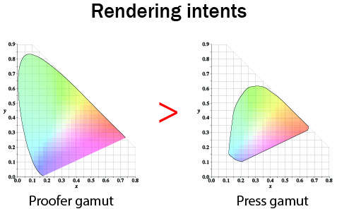
Rendering intents are the instructions for dealing with out-of-gamut colours (see Figure 4.10). They are user-selectable controls to define colour rendition when you move colour from one device to another. There are four types of rendering intents: perceptual, saturation, relative colorimetric, and absolute colorimetric. Each intent represents a different colour conversion compromise, resulting in a different gamut mapping style.

Perceptual and saturation intents use gamut compression, where the overall gamut space is adjusted. Relative and absolute colorimetric intents use gamut clipping, where colour matching is maintained throughout the available gamut, and out-of-gamut colours are moved to the available extremes of the destination gamut.
The perceptual intent is used mainly for RGB to CMYK transformations, which are typically image conversions. Since we are moving from a larger gamut (RGB) to a smaller gamut (CMYK), it makes sense to employ a rendering intent that preserves the overall relationship rather than one that emphasizes one-to-one colour matching within the gamut.
The saturation intent is the least relevant for colour-managed workflows. When you use this intent, colour saturation is preserved as much as possible at the expense of hue and luminance. The result is a bad colour match, but the vividness of pure colours is preserved. This intent is usually used for documents such as presentations, charts, and diagrams, but not for graphic arts jobs.
The two colorimetric intents, relative and absolute, are closely related. They are both used for CMYK to CMYK conversions where the gamuts of source and destination are closely matched or the destination is larger (typical of a proofer compared to the press it is matching). They emphasize exact colour matching for in-gamut colours and clip out-of-gamut colours.
The only difference between the two colorimetric rendering intents is in white point handling. The absolute intent pays attention to the colour of white in the source and reproduces that in the destination. Think of newspaper printing where the whitest colour is the paper that has a dull and beige tone. With an absolute rendering intent, a proofer matching the newspaper would add that beige colour to all of the white areas of the proof. This matching of white destination to white source colour is not usually necessary due to the chromatic adaptation or colour constancy that we discussed earlier. We have a built-in mechanism for adjusting to judge the overall colour relationship independent of the appearance of white. For this reason, the relative colorimetric intent is used most of the time and the white of the destination is not adjusted to simulate the white point of the source.
With all of the pieces of the colour management process clearly delineated, we can put them to use in our standard graphic arts workflow applications.
Attribution
Figure 4.10
Image modified from: Comparison of some RGB and CMYK colour gamut by BenRG and cmglee is used under a CC BY SA 3.0 license.
