Epidemiology Lab Outline
Introduction
Epidemiology, Infectious Disease, and an Aging Population
In Canada, we are seeing a rapid increase in the number of people over the age of 65. Currently, the number of Canadians aged 65 and older represents 19% of the population (Statistics Canada, 2022). By 2041, it is predicted that there will be about 10.7 million people over the age of 65, or about 24% of the population (Statistics Canada, 2019). This is typical of a global trend as diseases that commonly resulted in mortality are now treatable or preventable.
In part, we can thank increased awareness of public health for the trend in longer lifespan. Improved sanitation through sewage systems, access to clean drinking water, and improved public hygiene are all common practices that have resulted in a dramatic decrease in infectious diseases (Oeppen and Vaupel, 2002). Countries whose average lifespan age has not increased are associated with poorer public health standards. Additionally, two modern medical practices profoundly impact infectious disease rates: the use of antibiotics to treat disease and the use of vaccines to prevent disease (Riley, 2001).
The elderly are often the most likely to suffer severe complications with an infection. Across the whole population, the top two causes of death in Canada are cancer and heart disease. However, deaths from influenza and pneumonia rank higher in the youngest (1 to 14 years) and most elderly (over 64 years) segments of the population relative to those aged 15 – 64 years. (Statistics Canada, 2020b). There are a few aspects of infections in aging populations that we should consider:
- the immune system works less well as we age – this is known as immunosenescence
- vaccines become less effective over the age of 65
- increased health issues lead to increased exposure to high risk environments, e.g. hospitals and nursing homes
Epidemiology is the field of medicine that studies the incidence of disease, the distribution of disease in a population, the causes of disease, and the prevention or control of disease incidence.
Epidemiology is the foundation of public and global health. We have several researchers here at McMaster who model rates and trends in infection. This includes the Department of Health Research Methods, Evidence, and Impact (HEI) and researchers such as Dr. David Earn (Department of Mathematics and Statistics), Dr. Jonathon Dushoff (Department of Biology), Dr. Ben Bolker (jointly appointed to the Department of Math & Statistics and Biology) and Dr. Andrew McArthur (Department of Biochemistry and Biomedical Sciences) who study patterns of infection and identify strategies for controlling or eradicating infectious disease.
In this lab module we will model a “real life” infectious disease outbreak during class time, model a simulated infectious disease outbreak using NetLogo (Wilensky, U. 1999), and discuss the parameters of infectivity. Refer to figure 1, which provides an animated summary of the biological basis for the SEIR infectious disease model we will use in this lab.

Lab Overview and Timeline
| Time (min) |
What will you be doing? | Total Time (min) |
|---|---|---|
| 0 - 15 | Overview of lab activities by the TA. Fill in pre-lab of lab notebook |
15 |
| 15 - 40 | Lab Part 1: Explore an Outbreak of Influenza Lab Protocol 1: "Meet and Greet" |
25 |
| 40 - 60 | Lab Part 2: A Basic Mathematic Model for Studying Infectious Disease Spread Lab Protocol 2: Running the 'SEIR-Model-Base-Seasonal' model in NetLogo Lab Protocol 3: Exporting and Analyzing Raw Data from NetLogo Simulations in Excel |
20 |
| 60 - 170 | Lab Part 3: Testing Which Parameters Affect the Spread of Disease Lab Protocol 4: Testing Your Hypotheses in NetLogo Finish lab notebook and submit on Crowdmark |
110 |
Lab Part 1: Explore an Outbreak of Influenza
Purpose:
To simulate an infectious disease outbreak through social interactions in the classroom.
Summary of Activities:
Each student in the class will receive a vial of “bodily fluids” and be asked to interact and “exchange fluids” with three classmates. Each interaction will be documented with the aim to investigate an infection outbreak and identify “patient zero” (the original “infected” person).
After the “meet and greet” exercise, the TA will facilitate a class discussion based on your class results.
PLEASE NOTE: There are no actual infectious reagents involved in this scenario. We will be modelling transmission using acid/base solutions.
Materials:
- A vial of clear solution, marked with a number (this is your personal identifier)
- 96-well plate (1 for every 12 students)
- Plastic eyedropper
- Phenol red indicator solution
- A pen or pencil
- Notecard
Safety Reminders
You should always exercise caution and use common sense when working in any lab. In this module, you will be working with clear solutions that contain hydrochloric acid and sodium hydroxide up to 1 M concentration. Use the following precautions:
- Read the Safety Data Sheet (SDS) for hydrochloric acid and sodium hydroxide for information on proper handling.
- Wear your lab coat, gloves and goggles when handling solutions.
- Follow standard spill protocols if spill is larger than 5 mL.
Lab Protocol 1: “Meet and Greet”
Imagine the following:
You are at a student conference where you are aiming to network and build connections with fellow junior scientists. You attend a “meet and greet” event in hopes of securing a summer research position. Naturally, this will involve directly interacting with people in close spaces (e.g. shaking hands standing closely to people, etc.). Your goal is to chat up three (3) colleagues during the event. Unbeknownst to you, there is someone in attendance who is “sick.”
REMEMBER: There are no actual infectious reagents involved in this scenario. We will be modelling transmission using acid/base solutions.
- Select a vial from the rack provided to you by the TA.
- On your notecard, write your name and the number noted on your vial. This is your personal identifier for this exercise.
- Take 100 uL from your vial using a micropipette and pipette it onto your designated column (well A) on the 96 well plate.
- When instructed to do so, find a classmate. Introduce yourselves and write down on your notecard their name and ID number from their vial.
- Open your vial and use an eyedropper pipette to transfer the content of one vial over to the other vial. Close the lid and mix by gently rocking the tube back and forth. Using the eyedropper pipette, transfer approximately half of the mixed solution back to the empty tube of your classmate. You have now “exchanged” your “bodily fluids.”
- Take 100 uL from your vial using a micropipette and pipet it into the next well (B) in your designated column on the 96 well plate.
- Repeat steps 4-6 two additional times with different classmates. When you are finished, bring the 96-well plate back to your TA.
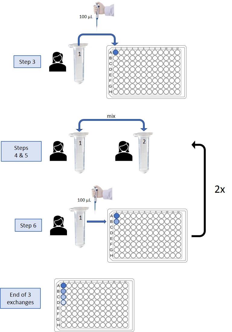
The TA will then add a drop of phenol red solution to the last well of each student’s sample column on the 96-well plates. Wells that turn red have been exposed to the infectious agent and therefore the corresponding individuals are “infected.” Take note of how many people in the class were “infected” by the end of the meet and greet.
Class Discussion Questions:
Question 1: In our meet and greet scenario, let’s assume an attendee was “infected” with influenza. What do you know about influenza? What are the symptoms? What tissue or organs are affected?
Question 2: What is/are the primary transmission route(s) that would allow influenza to spread in our outbreak scenario?
Question 3: Looking at the final outcome as indicated by the red wells in the 96-well plates, based on the number of people “infected” by the end of the outbreak scenario, what are your observations on the spread of infection during this exercise?
Question 4: For those of you who “caught” the infection, can you trace back to who you might have caught it from? Take a few minutes in your pod group to discuss how contact tracing might be done, then come back as a group to discuss. How would you determine who the original infected individual was (i.e. patient zero)?
Question 5: In the next part of this lab you will be using a virtual simulation through NetLogo software to model an outbreak on campus. Part of your simulations will ask you to try implementing an intervention: isolation, vaccination or antivirals. If you were to repeat our in-person exercise, how could you model an intervention strategy to see a different outcome?
Question 6: Having now seen how infection can spread, do you think an influenza outbreak could affect more than 40% of campus in less than 2 weeks?
Lab Part 2: A Basic Mathematical Model for Studying Infectious Disease Spread
Purpose
To learn about disease modelling using a SEIR (Susceptible – Exposed – Infectious – Recovered) model for seasonal influenza that is run using NetLogo (modelling software).
Summary of Activities
Open the SEIR-Model-Base-Seasonal.nlogo in NetLogo and practice using this software to model and analyze data from a hypothetical influenza outbreak.
Materials
- SEIR-Model-Base-Seasonal.nlogo (located on the desktop of the lab computer)
- NetLogo software (located on the desktop of the lab computer)
Lab Protocol 2: Running the ‘SEIR-Model-Base-Seasonal’ model in NetLogo
- Open up the SEIR-Model-Base-Seasonal model in NetLogo (the TA will guide you through this initial tour of the software, but you must be following along on the lab computer at your station!)
-
- Run NetLogo on your computer
- Open up the ‘SEIR-Model-Base-Seasonal.nlogo’ file in NetLogo:
- File > Open > Select ‘SEIR-Model-Base-Seasonal.nlogo’ from the desktop
- When the warning prompt ‘this model was created in NetLogo 5.0.4….’ appears, select ‘continue’

-
-
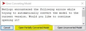
- When the window ‘error converting model’ appears, select ‘open partially converted model’
-
-
- You are ready to spread disease and infection!
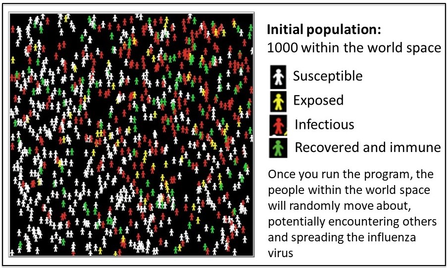
Keep in mind the following definitions for each SEIR category displayed in figure 3:
Susceptible: Individuals do not have an immune response and do not produce antibodies against the influenza proteins.
Exposed: Individuals who have come into close contact with an infectious individual. Usually, influenza is spread by droplets from coughing or sneezing. The droplets can enter the mouth or nasal passage with potential to attach to the tissue.
Infectious: Individuals who are carrying and transmitting influenza virus. For seasonal flu, people may become infectious within the first day of exposure and up to 5-7 days after they are symptomatic.
Recovered: An individual whose immune system has successfully overcome influenza virus. Antibodies recognize and destroy the virus. This results in permanent immunity to that strain of influenza.

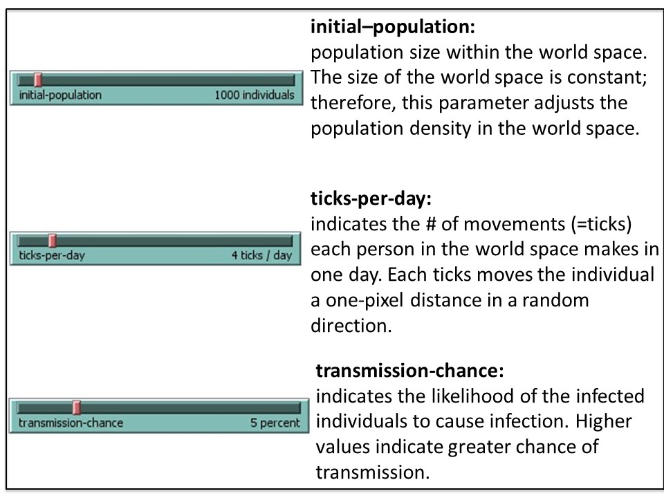
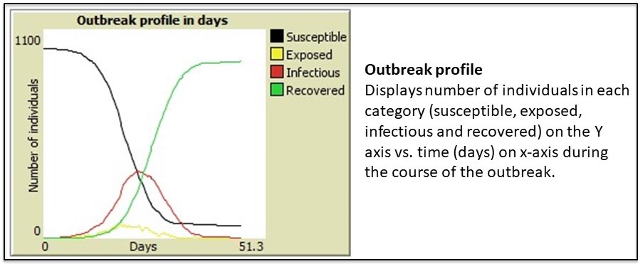
NetLogo is a modeling tool that can help predict trends in outbreaks. The NetLogo interface for the SEIR-Model-Base-Seasonal model contains five elements: (1) Simulated World Space, (2) Environmental Parameters, (3) Viral Parameters, (4) Data Output and (5) Outbreak Profile (graph). These are described in the figures 4A-E.
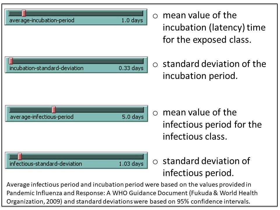
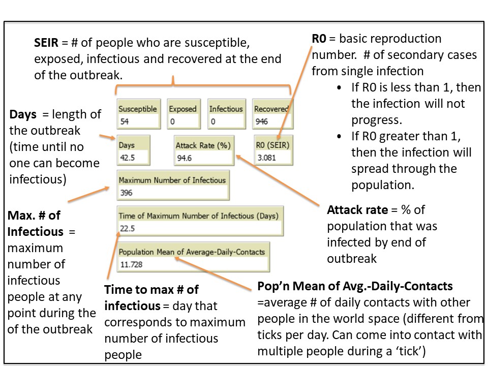
2. Run a simulation using the default (baseline) parameters
2A. Select ‘setup’ (purple button, top left. See figure 5) to populate your simulated world space (figure 4A) according to the default parameters (figure 4B and C). It will look similar (but not identical) to figure 5, below.
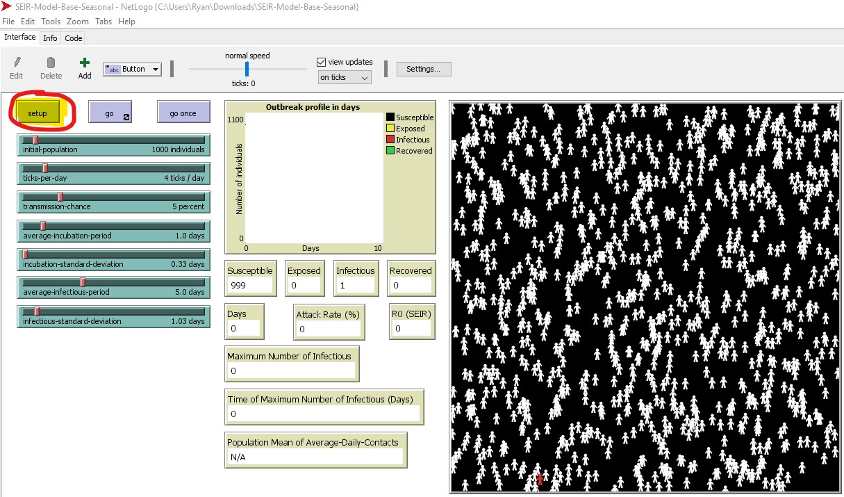
2B. Initially, one individual is infectious (red) and the remaining individuals are susceptible (white) in the simulated world space. We outlined the starting infectious individual in purple – look to the lower left of the world space in figure 6. The starting location of the infectious individual is random. The simulation will run as follows:
- If this infectious individual comes into contact with a susceptible individual, there is a chance for transmission, where the susceptible individual could become infected.
- If that occurs, this individual moves from S > E and will change from white > yellow
- After a period of time (dependent on the incubation period), the individual will then move from E > I (change from yellow > red), where they can now infect others they come into contact with.
- After another period of time (dependent on the infectious period), this person will move from I > R (change from red > green), and can no longer infect others or be re-infected.
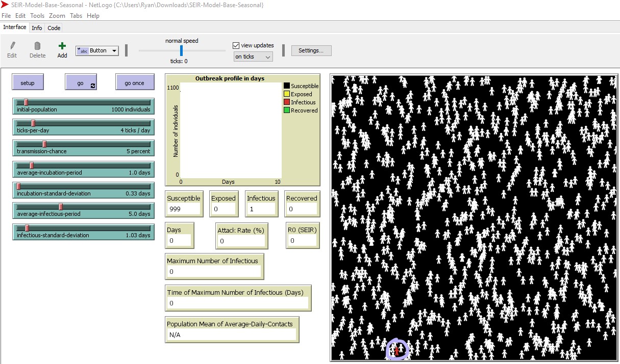
2C. Run the program by selecting ‘go’ (to the right of the ‘setup’ button). The simulation will run until the infection can no longer spread.
3. Analyzing the results (data output)
Once the simulation ends, various data outputs (e.g. attack rate, R0 – basic reproductive number) are calculated and displayed (figure 4D). The outbreak profile (figure 4E) is a graph which displays the the number of people (Y-axis) in each of the four categories (S-E-I-R) over time (X-axis) . There are four data plots displayed simultaneously in the graph – one for each category (S-E-I-R).
There are two possible outcomes each time you run a simulation:
- You have a disease outbreak, and the influenza virus will spread among the population until enough people have moved from S > E > I > R and the virus can no longer infect anyone, at which point it stops spreading. In this situation you will see an R0 (basic reproductive number) that is greater than 1.
- There is no outbreak – the disease does not spread throughout the population. In this case R0 < 1. Even if you set up the simulation with the exact same variables each time, you will likely not get the same exact result each time, as there is randomization built into the model (e.g. random starting location of the first infectious individual, random direction each individual moves each day).
One way to analyze the severity of the outbreak is by looking at the the data outputs (endpoints) from your simulation. The primary endpoints displayed in the Netlogo interface are: maximum number of infected, time to maximum number infected, duration of the outbreak in days, attack rate, and the R0 value.
You can consider other endpoints (e.g. % of individuals affected on a specific day of the outbreak). That requires exporting the raw data from the simulation into Excel. Your TA will demonstrate how this is done. We have provided the instructions below so you can try it out if you have time.
Lab Protocol 3: Exporting and Analyzing Raw Data from NetLogo Simulations in Excel
NOTE: Your TA will demonstrate how to work with the raw data in Excel.
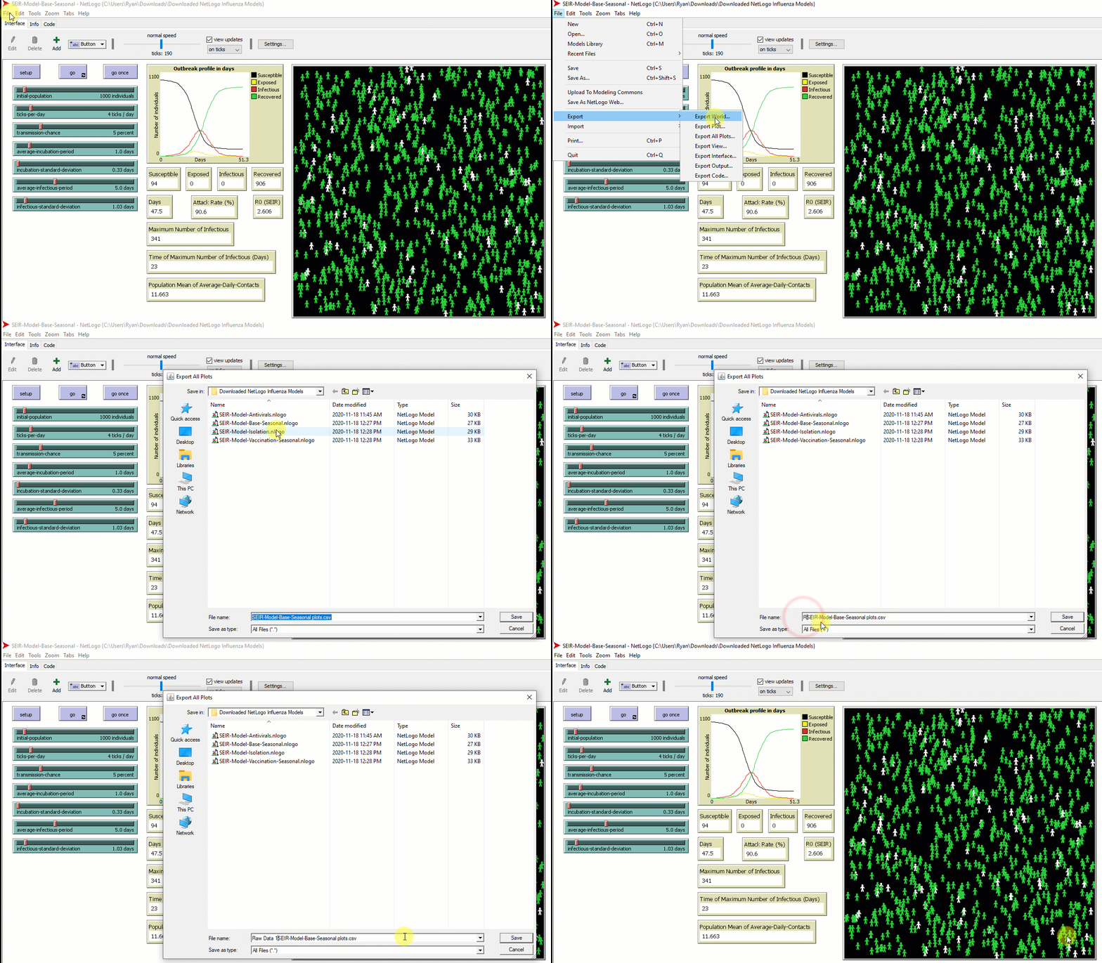
- When the simulation is complete, export the data for analysis in Microsoft Excel (figure 7):
-
- File > Export > Export All Plots
- Save the file (.csv) on your computer. You MUST add .csv to the file name during the saving process. If you do not, it will not recognize the file type.
- Note: the file type is now a comma separated values or comma delimited file (.csv). This is a common file type for data sets. It is a text file where the data in each ‘column’ is separated by a character, such as a comma. When you open a .csv file in Excel, Excel will automatically organized the data into columns. You can save it as an Excel file type (e.g. Excel workbook, .xlsx) once opened:
- File > Save As > change the file type from the drop down menu.
2. Open the file in Microsoft Excel.
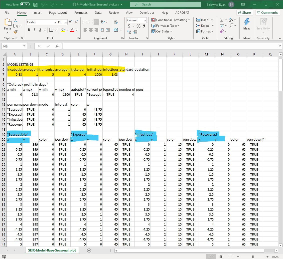
- Once you open the raw data from the NetLogo simulation in Excel, it will look similar to figure 8.
- Format the file so you can find information and analyze it more easily, by wrapping text or by resizing column widths. You may also wish to delete columns or rows that do not contain data you need for completing the analysis. Just be very careful to not inadvertently delete rows or columns you do need!
- This type of data is called raw data (or source data) – it is unprocessed. Make sure to keep a copy of this file, in addition to other personal notes you deem relevant while working through this activity.
3. Calculate a different data output (endpoint) than the ones reported by NetLogo.
- Think back to the discussion at the start of lab – we asked if you thought 40% of campus could be affected by an influenza outbreak within two weeks.
- You will need to pull this information from the raw data, as NetLogo does not calculate this specific output.
- For this reason, we will have to agree upon this term “affected”. Let’s agree that ‘affected’ would include anyone who is infected and can infect others (i.e. infectious, I) , or anyone who was previously infected but has recovered (i.e. recovered, R)

- You can calculate the % affected for each time point during the outbreak from the raw data you exported from NetLogo. This calculation is actually telling you the attack rate (%) at each timepoint in the outbreak, while the attack rate (%) reported by NetLogo is the attack rate at the last time point of the outbreak. If this is confusing, consider plotting the attack rate vs. time point to visualize it.
- Refer to figure 9 to see how this formula can be set up in the Excel file.
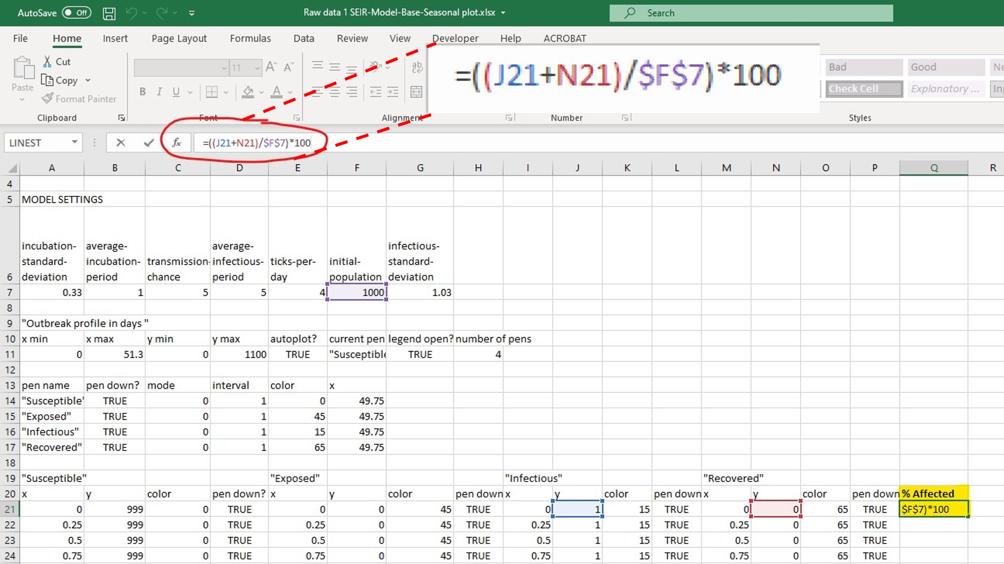
- Based on the NetLogo simulation and the associated raw data (yours will look similar but not identical to the example above), you could look at the timepoint of interest and determine the percentage of individuals affected (in this example, looking at day 14.0 and measuring the % affected at that timepoint).
- Why does each time point increase by increments of 0.25 days when using the default settings for fixed and variable parameters? Hint: look at the # of ticks per day.
- What is the attack rate on day 14? Day 20? Day 33? What is the attack rate on the final day of the outbreak?
- Compare the attack rate on the final day of the outbreak using your equation in the exported data spreadsheet to the attack rate generated by NetLogo and presented in the data output.
Lab Part 3: Testing Which Parameters Affect the Spread of Disease
Purpose
To formulate and test hypotheses about which parameters might affect the spread of influenza on campus using NetLogo and the base seasonal model program (SEIR-Model-Base Seasonal), and to investigate control strategies using the vaccination, antiviral and isolation models.
Summary of Activities
Review hypothesis formulation and experimental design. Design experiments in NetLogo to test your hypotheses.
Materials
- Same as lab part 2 (NetLogo and the SEIR model files)
LIFESCI 2A03 Review: Formulating a Hypothesis and Experimental Design
Refer back to your LIFESCI 2A03 notes on formulating a hypothesis and experimental design. If you have not taken LIFESCI 2A03 yet, we provide a quick review below.
Formulating a Hypothesis
- The formulation and testing of hypotheses is the basis of any scientific or rational inquiry. A hypothesis (H) can be defined as a testable explanation to a research question or problem. It also provides grounds to formulate specific predictions (P) about the result after manipulating variable(s) used to test the hypothesis.
- Predictions are the predicted outcome of the experiments you plan to do, while the hypothesis is the underlying mechanism you are testing
- In addition to your Life Sci 2A03 notes, here is another resource that provides some really good examples of a hypothesis vs. prediction
- A hypothesis and a related prediction are usually stated as follows:
- If (H) … , then (P)….
- Sometimes you may see it as: if (H)…, and (Method)…,then (P)
- Null hypothesis (H0 = statistical term):
- Usually a statement of “no effect” or “no difference”
- A hypothesis that there is no (significant) difference between two sets of results
- Alternative hypothesis (Ha):
- Hypothesis that is contrary to the null hypothesis
- It is often (but not always!) the research hypothesis
Example: I am interested in studying whether caffeine enhances academic performance.
If caffeine enhances academic performance, then drinking coffee will significantly increase the grades of students in a class.
Yellow: Hypothesis
Cyan: Prediction
Experiment: Divide a class into two groups. One group drinks only coffee, and the other group drinks only decaffeinated coffee. Compare their final class grades.
We will refer to this example hypothesis/prediction statement when discussing experimental design considerations below.
Experimental Design
- In a typical research study where you are manipulating an independent variable to look for an effect on the dependent variable, you will have treatment group(s) and control group(s). You will apply an intervention to the treatment group and see if there is an effect. The effect is usually some endpoint (result or outcome) that can be measured, and ideally quantified.
- Independent variable – variable being manipulated = caffeine consumption (via drinking coffee)
- Dependent variable – variable affected by changing the independent variable = academic performance, measured based on grades
- Applied intervention = caffeine (via coffee)
- Control group = Group drinking decaffeinated coffee (no caffeine intervention)
- Treatment group = Group drinking coffee (caffeine intervention via coffee)
- Measured effect/endpoint/result = grades, which are a way to measure or assess academic performance, the dependent variable.
- There are many essential elements to designing experiments, particularly the need to include appropriate controls
- This article provides an excellent summary of the different types of controls, and experimental design in general
- Controls can broadly be categorized as positive or negative controls.
- Negative control – group where no phenomenon is expected. They ensure that there is no effect when there should be no effect.
- Negative control = Group who drink decaffeinated coffee
- Additional negative control = Another group of students who drink water. This is controlling for all the other stuff in the coffee besides caffeine.
- Positive control – group where a phenomenon is expected. They ensure that there is an effect when there should be an effect, by using an experimental treatment that is already known to produce that effect
- Positive control = an intervention that has been previously studied that is known to increase academic performance. In our example, it could be another group of students who are given the test answers. That should definitely cause an effect (increased grades), which tells us it is possible to affect the endpoint we selected. If giving test answers causes a significant increase in grades for this group, we know the system is responding as it should. If not, it may indicate a larger issue with the experimental design.
- Negative control – group where no phenomenon is expected. They ensure that there is no effect when there should be no effect.
- Paired vs. unpaired data
- Paired data – the same group of subjects serves as both the control and treatment group
- Unpaired data – two different groups of subjects are used for the control and treatment
- Knowing if your data is paired vs. unpaired is important when it comes to choosing the type of statistical test you will use to analyze the data.
- Paired data can be helpful as it reduces biological variability, since the same group of subjects is used for both the control and treatment groups. However, it is not always possible to set up an experiment with paired data
- In the example above, I would have unpaired data. I have two groups (control and treatment), with a different set of individuals in each group since I have randomly divided the class into two groups.
- Only change one parameter at a time in the treatment group. If you are interested in different treatments, set up multiple treatment groups. If you are investigating the combined effect from two or more simultaneous interventions, make sure that your study includes groups where each intervention is tested on its own as well.
- The only parameter I have changed in the treatment group is the addition of caffeine.
- If I were to give the treatment group coffee AND vitamin C and found an effect, I could not be certain if any observed effect was caused by caffeine or vitamin C.
- Make sure the endpoint is a direct or indirect measurement of the dependent variable and relates to the hypothesis
- Good endpoint: Grades are an appropriate end point for assessing academic performance (dependent variable), but not the only one.
- Bad endpoint: Heart rate would be a rather useless endpoint for determining if academic performance improved.
- When evaluating the results (endpoint) in the different groups, we use statistical analysis to help us decide if the observed differences between groups (and therefore the effect of the intervention) is real, or simply due to random variation (e.g. from biological variability or experimental imprecision)
- This stats guide is free and written for an audience of non-statisticians. Use it to help you better understand how statistics are used in general, and what types of statistical tests are appropriate for the different experiments you come across or complete.
Lab Protocol 4: Testing Your Hypotheses in NetLogo
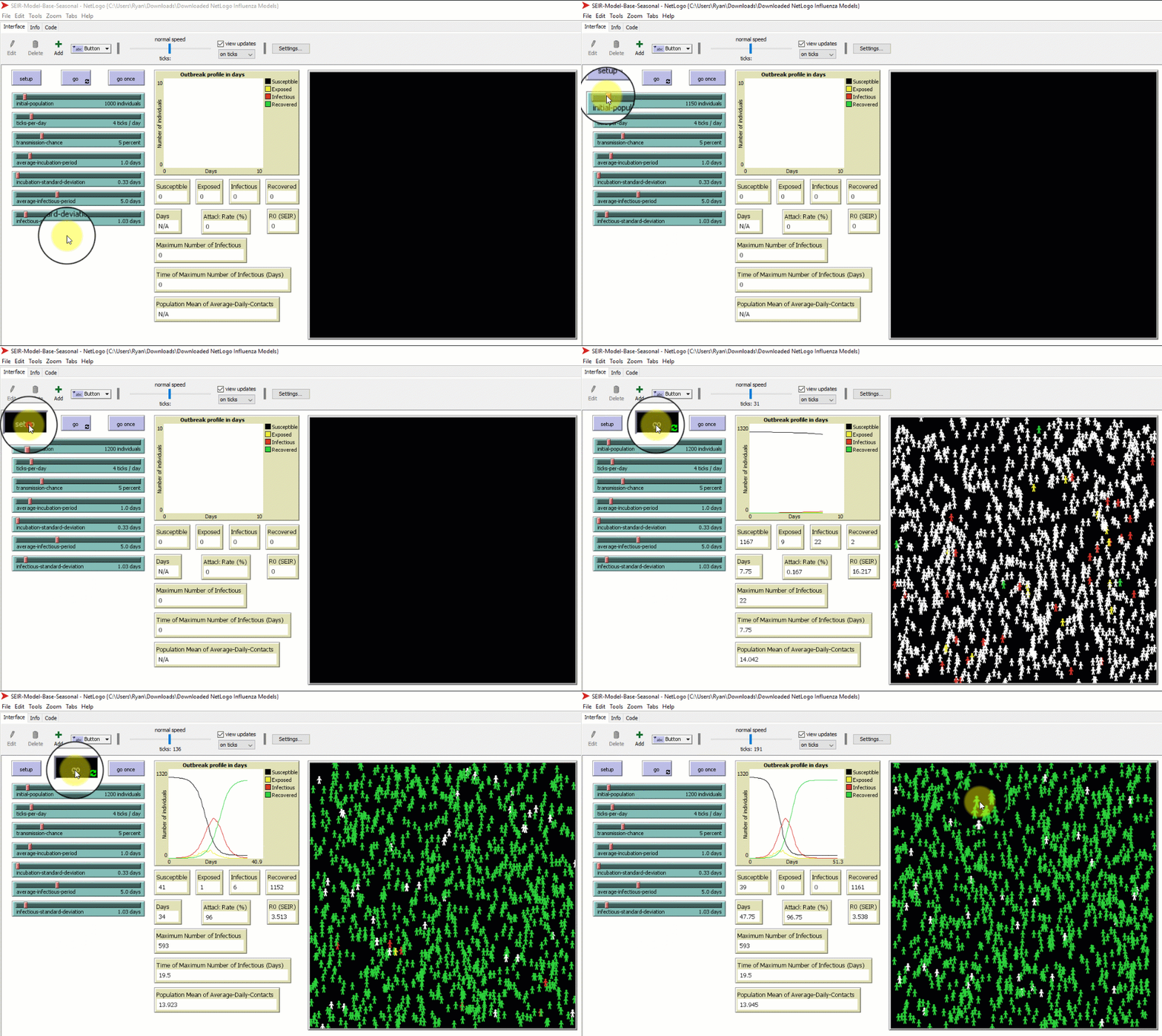
- Develop a hypothesis about which environmental parameter might affect the spread of disease on a university campus, and test this hypothesis using the base seasonal model program (SEIR-Model-Base-Seasonal). You will change ONE parameter. You will report your experimental design and findings in your ELN. We have provided an example below. Do not just copy the example.
- Run your simulation with the chosen changed parameter three (3) times. This gives you three replicates for your experiment.
- When you run the simulations, keep track of:
- Attack rate (%)
- Maximum number of infectious individuals
- Time to maximum number of infectious individuals (days)
- Reproductive number (R0)
- Make sure you include notes about your experimental design, hypothesis etc. in your lab notebook in addition to the raw data you obtain from NetLogo.
- Record your findings in the same format as the example below.
- Refer to figure 10 on how to modify a parameter and run the simulation in NetLogo.
Example
Independent variable: Initial population
Dependent variable: Spread of influenza (measured as ‘time to reach max number of infectious’)
Hypothesis: The spread of influenza on campus is affected by class density.
Null hypothesis: The spread of influenza on campus is not affected by class density, or, class density does not have a significant effect on the spread of influenza.
Prediction: Increasing initial population (which will increase population density) will decrease the time to reach maximum number of infections individuals
Experimental Design:
Control Group: Run the simulation with all the default parameter settings.
Treatment Group 1: Increase initial population by 200.
Treatment Group 2: Increase initial population by 500.
Run the simulation 3 times for each group, calculate the average time to reach maximum number of infectious individuals for each group, and compare the results from each group.
Results: ?
Conclusion: ?
4. Consider these questions with your lab partner.
-
- Which parameters are positively correlated with infection spread? (i.e. as the parameter value increases, the infection becomes more severe).
- Which parameter settings would you use to test an influenza outbreak during 1) a tutorial in ABB 136 and 2) a lecture in MDCL 1305? The links provided will give you some details about the rooms including layout.
5. Next, select one of the three control strategy SEIR models (vaccination, isolation, or antivirals). Each of these new models introduces a different set of parameters to the simulation – these are the intervention parameters (but they may also fall into the viral/environmental categories as well). These new parameters are described below in the boxes to help you select the model you would like to work with next.
Look at the new intervention model you picked, and decide what parameter (if any) you want to change. Remember that by using one of the control strategy models you are automatically introducing one new variable (e.g. flu outbreak with vaccines), but that you can customize the intervention by changing one of the settings. Be sure to write down the settings you applied.
6. Construct a hypothesis and run an experiment to test manipulation of the new intervention parameters introduced by your selected control strategy model. Run three (3) simulation replicates. Record all experimental design parameters and results in your lab notebook.
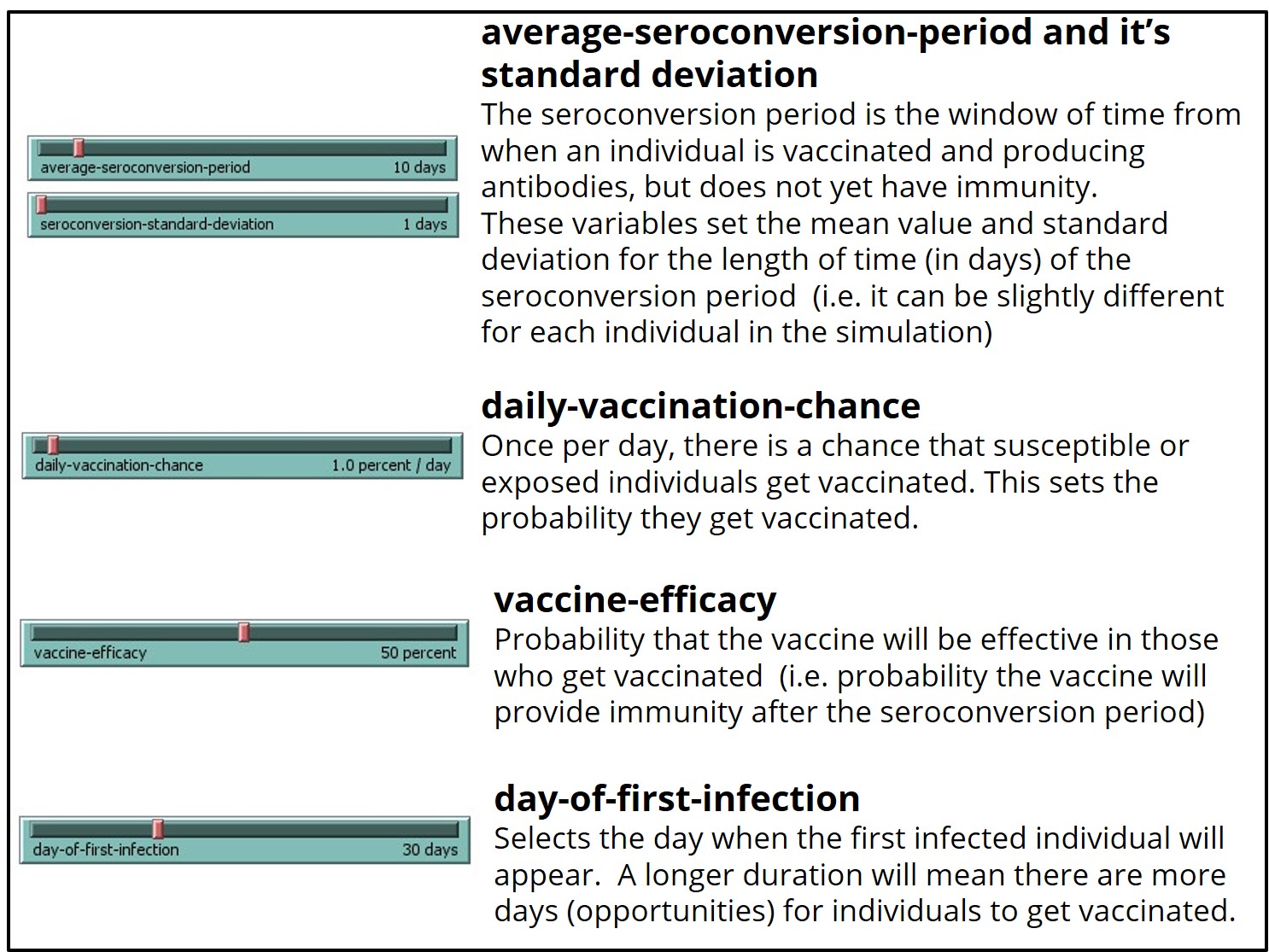
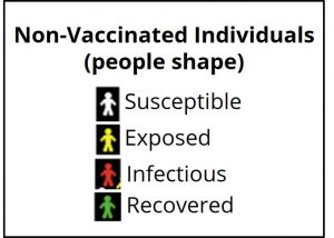
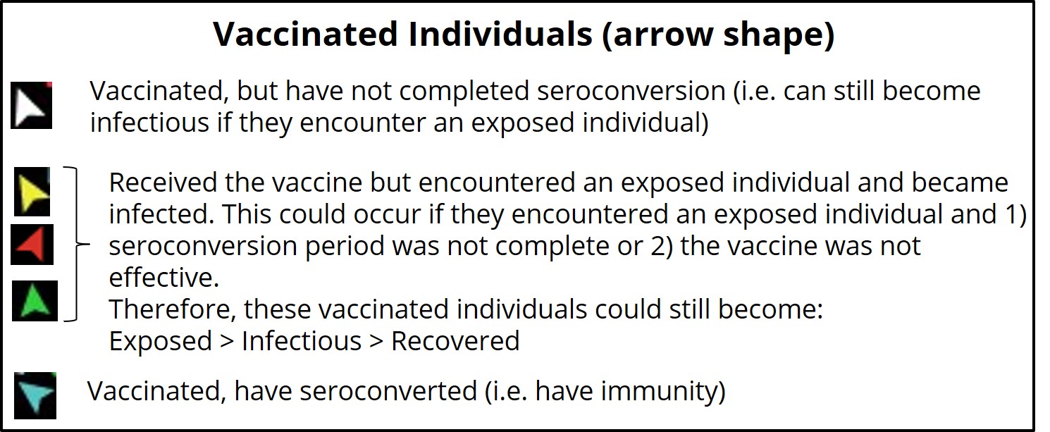
This model uses the same colors/shape as the base model (SEIR-Model-Base-Seasonal) to represent unvaccinated individuals within each category (S-E-I-R) in the simulated world space, with the following additions:
This model provides the same data outputs as the base model (SEIR-Model-Base-Seasonal), with the following additions:

If you run the SEIR-Model-Vaccination-Seasonal model with daily-vaccination-chance or the vaccine-efficacy set to 0 percent per day or percent, respectively, the model will run identical to the base model (SEIR-Model-Base-Seasonal) for seasonal influenza once the first infectious person appears.
When changing the vaccination model parameters, it is possible to prevent an outbreak from occurring at all. However, if an outbreak still does occur, pay particular attention to the length of the outbreak, the attack rate, and the maximum number of infected at one time.


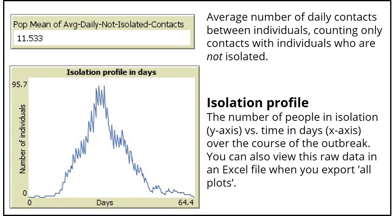
If you run the ‘SEIR-Model-Isolation’ model with daily-isolation-chance set to 0 percent, the model will run identical to the base model (SEIR-Model-Base-Seasonal).
When changing the isolation chance parameters, it is possible to prevent an outbreak from occurring at all. However, if an outbreak still does occur, pay particular attention to the length of the outbreak, the attack rate, and the maximum number of infected at one time.
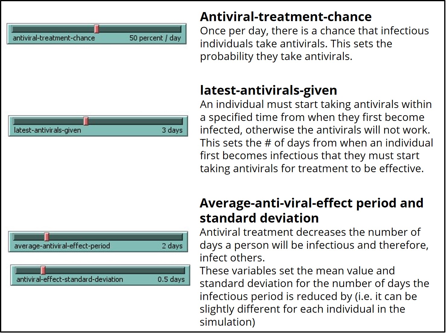
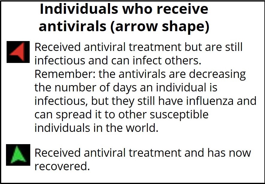
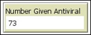
If you run the ‘SEIR-Model-antivirals’ model with antiviral-treatment-chance or latest-antivirals-given set to 0 percent or days, respectively, the model will run identical to the base model (SEIR-Model-Base-Seasonal).
When changing the antiviral parameters, it is possible to prevent an outbreak from occurring at all. However, if an outbreak still does occur, pay particular attention to the length of the outbreak, the attack rate, and the maximum number of infected at one time.
Lab Exit Checklist
- Run the ‘SEIR-Model-Base-Seasonal’ model in NetLogo with the baseline (default) parameters
- Formulate a hypothesis regarding which variable parameter(s) affects the spread of influenzas on a campus, and design an experiment to test them in NetLogo using the ‘SEIR-Model-Base-Seasonal’ model
- Record your findings for one hypothesis in your ELN using the same format as the example provided, running 3 replicate simulations
- Select one and run one of the three control strategy SEIR models, updating the settings to reflect your first experiment, as well as making a change (if you wish) to the control parameters.
- Formulate a hypothesis regarding one of the new intervention parameters introduced by the control strategy model you selected, and design an experiment to test this hypothesis in NetLogo. Run the simulation experiment 3 times.
- Record your findings using the same format as the example provided
References
Centers for Disease Control and Prevention. (n.d.). 2017-2018 Influenza Season Week 39 ending September 29, 2018. FluView. Retrieved January 8, 2021, from https://www.cdc.gov/flu/weekly/weeklyarchives2017-2018/Week39.htm
Harrison-Pitaniello, M., Shiltz, J. L., Hughes, R. E., Estep, R. L., & Mummert, A. B. (2006). Campus Outbreak! Modeling Seasonal Influenza. National Center for Case Study Teaching in Science. https://sciencecases.lib.buffalo.edu/collection/detail.html?case_id=837&id=837
Oeppen, J., & Vaupel, J. W. (2002). Broken Limits to Life Expectancy. Science, 296(5570), 1029–1031. https://doi.org/10.1126/science.1069675
Riley, J. C. (2001). Rising Life Expectancy: A Global History. Cambridge University Press. https://books.google.ca/books?hl=en&lr=&id=4Ng2Y7eJ7A0C&oi=fnd&pg=PR8&dq=Rising+Life+Expectancy:+A+Global+History&ots=81aFUSpS8K&sig=yCnCothV8xrPbj-PB9Wovmt4MgQ#v=onepage&q=Rising%20Life%20Expectancy%3A%20A%20Global%20History&f=false
Snow, J. (1854). Original map made by John Snow in 1854. Cholera cases are highlighted in black. Map of the book “On the Mode of Communication of Cholera” by John Snow, originally published in 1854 by C.F. Cheffins, Lith, Southhampton Buildings, London, England. The uploaded images is a digitally enhanced version found on the UCLA Department of Epidemiology website. https://commons.wikimedia.org/w/index.php?curid=2278605
Statistics Canada. (2019, September 17). Table 17-10-0057-01 Projected population, by projection scenario, age and sex, as of July 1 (x 1,000). https://doi.org/10.25318/1710005701-eng
Statistics Canada. (2020a, September 29). Table 17-10-0005-01 Population estimates on July 1st, by age and sex. https://doi.org/10.25318/1710000501-eng
Statistics Canada. (2020b, November 26). Table 13-10-0394-01 Leading causes of death, total population, by age group. https://doi.org/10.25318/1310039401-eng

