Sevda Montakhaby Nodeh
Perception and Attention Lab
As a cognitive researcher at the Cognition and Attention Lab at McMaster University, you are at the forefront of exploring the intricacies of proactive control within attention processes. This line of research is profoundly significant, given that the human sensory system is overwhelmed with a vast array of information at any given second, exceeding what can be processed meaningfully. The essence of research in attention is to decipher the mechanisms through which sensory input is selectively navigated and managed. This is particularly crucial in understanding how individuals anticipate and adjust in preparation for upcoming tasks or stimuli, a phenomenon especially pertinent in environments brimming with potential distractions.
In everyday life, attentional conflicts are commonplace, manifesting when goal-irrelevant information competes with goal-relevant data for attentional precedence. An example of this (one that I'm sure we are all too familiar with) is the disruption from notifications on our mobile devices, which can divert us from achieving our primary goals, such as studying or driving. From a scientific standpoint, unravelling the strategies employed by the human cognitive system to optimize the selection and sustain goal-directed behaviour represents a formidable and compelling challenge.
Your ongoing research is a direct response to this challenge, delving into how proactive control influences the ability to concentrate on task-relevant information while effectively sidelining distractions. This facet of cognitive functionality is not just a theoretical construct; it's the very foundation of daily human behaviour and interaction.
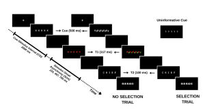
Your study methodically assesses this dynamic by engaging participants in a task where they must identify a sequence of words under varying conditions. The first word (T1) is presented in red, followed rapidly by a second word (T2) in white. The interval between the appearance of T1 and T2, known as the stimulus onset asynchrony (SOA), serves as a critical measure in your experiment. The distinctiveness of your study emerges in the way you manipulate the selective attention demands in each trial, classified into:
- No-Selection Trials: T1 appears alone, typically leading to superior identification accuracy for T1 and T2 due to a diminished cognitive load.
- Selection Trials: T1 is interspersed with a green distractor word. In these more demanding trials, the green distractor competes for attention with the red target word, resulting in decreased identification accuracy for both T1 and T2.
By introducing informative and uninformative cues, your investigation probes the role of proactive control. Informative cues give participants a preview of the upcoming trial type, allowing them to prepare mentally for the impending challenge. Conversely, uninformative cues act as control trials and offer no insight into the trial type. The hypothesis posits that such informative cues enable participants to proactively fine-tune their attentional focus in preparation for attentional conflict, potentially enhancing performance on selection trials with informative cues compared to those with uninformative cues.
For an overview of the different trial types please refer to the figure included below.
In this designed study, you are not only tackling the broader question of the role of conscious effort in attention but also contributing to a nuanced understanding of human cognitive processes, paving the way for applications that span from enhancing daily life productivity to optimizing technology interfaces for minimal cognitive disruption.
Getting Started: Loading Libraries, setting the working directory, and loading the dataset
Let's begin by running the following code in RStudio to load the required libraries. Make sure to read through the comments embedded throughout the code to understand what each line of code is doing.
Note: Shaded boxes hold the R code, with the "#" sign indicating a comment that won't execute in RStudio.
# Here we create a list called "my_packages" with all of our required libraries
my_packages <- c("tidyverse", "rstatix", "readxl", "xlsx", "emmeans", "afex",
"kableExtra", "grid", "gridExtra", "superb", "ggpubr", "lsmeans")
# Checking and extracting packages that are not already installed
not_installed <- my_packages[!(my_packages %in% installed.packages()[ , "Package"])]
# Install packages that are not already installed
if(length(not_installed)) install.packages(not_installed)
# Loading the required libraries
library(tidyverse) # for data manipulation
library(rstatix) # for statistical analyses
library(readxl) # to read excel files
library(xlsx) # to create excel files
library(kableExtra) # formatting html ANOVA tables
library(superb) # production of summary stat with adjusted error bars(Cousineau, Goulet, & Harding, 2021)
library(ggpubr) # for making plots
library(grid) # for plots
library(gridExtra) # for arranging multiple ggplots for extraction
library(lsmeans) # for pairwise comparisons
Make sure to have the required dataset ("ProactiveControlCueing.xlsx") for this exercise downloaded. Set the working directory of your current R session to the folder with the downloaded dataset. You may do this manually in R studio by clicking on the "Session" tab at the top of the screen, and then clicking on "Set Working Directory".
If the downloaded dataset file and your R session are within the same file, you may choose the option of setting your working directory to the "source file location" (the location where your current R session is saved). If they are in different folders then click on "choose directory" option and browse for the location of the downloaded dataset.
You may also do this by running the following code:
setwd(file.choose())
Once you have set your working directory either manually or by code, in the Console below you will see the full directory of your folder as the output.
Read in the downloaded dataset as "cueingData" and complete the accompanying exercises to the best of your abilities.
# Read xlsx file
cueingData = read_excel("ProactiveControlCueing.xlsx")
Files to download:
Answer Key
Exercise 1: Data Preparation and Exploration
Note: Shaded boxes hold the R code, while the white boxes display the code's output, just as it appears in RStudio.
The "#" sign indicates a comment that won't execute in RStudio.
1. Display the first few rows to understand your dataset.
head(cueingData) #Displaying the first few rows## # A tibble: 6 × 6
## ID CUE_TYPE TRIAL_TYPE SOA T1Score T2Score
## <dbl> <chr> <chr> <dbl> <dbl> <dbl>
## 1 1 INFORMATIVE NS 233 100 94.6
## 2 2 INFORMATIVE NS 233 100 97.2
## 3 3 INFORMATIVE NS 233 89.2 93.9
## 4 4 INFORMATIVE NS 233 100 91.9
## 5 5 INFORMATIVE NS 233 100 100
## 6 6 INFORMATIVE NS 233 100 97.3
2. Set up your factors and check for structure. Make sure your dependent measures are in numerical format, and that your factors and levels are set up correctly.
cueingData <- cueingData %>%
convert_as_factor(ID, CUE_TYPE, TRIAL_TYPE, SOA) #setting up factors
str(cueingData) #checking that factors and levels are set-up correctly. Checking to see that dependent measures are in numerical format.
## # A tibble: 6 × 6
## ID CUE_TYPE TRIAL_TYPE SOA T1Score T2Score
## <dbl> <chr> <chr> <dbl> <dbl> <dbl>
## 1 1 INFORMATIVE NS 233 100 94.6
## 2 2 INFORMATIVE NS 233 100 97.2
## 3 3 INFORMATIVE NS 233 89.2 93.9
## 4 4 INFORMATIVE NS 233 100 91.9
## 5 5 INFORMATIVE NS 233 100 100
## 6 6 INFORMATIVE NS 233 100 97.3
## tibble [192 × 6] (S3: tbl_df/tbl/data.frame)
## $ ID : Factor w/ 16 levels "1","2","3","4",..: 1 2 3 4 5 6 7 8 9 10 ...
## $ CUE_TYPE : Factor w/ 2 levels "INFORMATIVE",..: 1 1 1 1 1 1 1 1 1 1 ...
## $ TRIAL_TYPE: Factor w/ 2 levels "NS","S": 1 1 1 1 1 1 1 1 1 1 ...
## $ SOA : Factor w/ 3 levels "233","467","700": 1 1 1 1 1 1 1 1 1 1 ...
## $ T1Score : num [1:192] 100 100 89.2 100 100 ...
## $ T2Score : num [1:192] 94.6 97.2 93.9 91.9 100 ...
3. Perform basic data checks for missing values and data consistency.
sum(is.na(cueingData)) # Checking for missing values in the dataset
## [1] 0
summary(cueingData) # Viewing the summary of the dataset to check for inconsistencies
## ID CUE_TYPE TRIAL_TYPE SOA T1Score
## 1 : 12 INFORMATIVE :96 NS:96 233:64 Min. : 32.43
## 2 : 12 UNINFORMATIVE:96 S :96 467:64 1st Qu.: 77.78
## 3 : 12 700:64 Median : 95.87
## 4 : 12 Mean : 86.33
## 5 : 12 3rd Qu.:100.00
## 6 : 12 Max. :100.00
## (Other):120
## T2Score
## Min. : 29.63
## 1st Qu.: 83.97
## Median : 95.76
## Mean : 87.84
## 3rd Qu.:100.00
## Max. :100.00
- Is your data a balanced or an unbalanced design? (Hint: Use code to show the number of observations per combination of factors)
table(cueingData$CUE_TYPE, cueingData$TRIAL_TYPE, cueingData$SOA) #checking the number of observations per condition or combination of factors. Data is a balanced design since there is an equal number of observations per cell.
## , , = 233
##
##
## NS S
## INFORMATIVE 16 16
## UNINFORMATIVE 16 16
##
## , , = 467
##
##
## NS S
## INFORMATIVE 16 16
## UNINFORMATIVE 16 16
##
## , , = 700
##
##
## NS S
## INFORMATIVE 16 16
## UNINFORMATIVE 16 16
Exercise 2: Computing Summary Statistics
5. The Superb library requires your dataset to be in a wide format. So convert your dataset from a long to a wide format. Save it as “cueingData.wide”.
cueingData.wide <- cueingData %>%
pivot_wider(names_from = c(TRIAL_TYPE, SOA, CUE_TYPE),
values_from = c(T1Score, T2Score) )
6. Using superbPlot() and cueingData.wide calculate the mean, and standard error of the mean (SEM) measure for T1 and T2 scores at each level of the factors. Make sure to calculate Cousineau-Morey corrected SEM values.
- You must do this separately for each of your dependent measures. Save your superbplot function for T1Score as “EXP1.T1.plot” and as “EXP1.T2.plot” for T2Score.
- Re-name the levels of the factors in each plot. Currently, the levels are numbered. We want the levels of SOA to be 233, 467, and 700; the levels of cue-type as Informative and Uninformative, and the levels of trial-type as Selection and No Selection (Hint: to access the summary data use EXP1.T1.plotinsertfactorname).
EXP1.T1.plot <- superbPlot(cueingData.wide,
WSFactors = c("SOA(3)", "CueType(2)", "TrialType(2)"),
variables = c("T1Score_NS_233_INFORMATIVE", "T1Score_NS_467_INFORMATIVE",
"T1Score_NS_700_INFORMATIVE", "T1Score_NS_233_UNINFORMATIVE",
"T1Score_NS_467_UNINFORMATIVE", "T1Score_NS_700_UNINFORMATIVE",
"T1Score_S_233_INFORMATIVE", "T1Score_S_467_INFORMATIVE",
"T1Score_S_700_INFORMATIVE", "T1Score_S_233_UNINFORMATIVE",
"T1Score_S_467_UNINFORMATIVE", "T1Score_S_700_UNINFORMATIVE"),
statistic = "mean",
errorbar = "SE",
adjustments = list(
purpose = "difference",
decorrelation = "CM",
popSize = 32
),
plotStyle = "line",
factorOrder = c("SOA", "CueType", "TrialType"),
lineParams = list(size=1, linetype="dashed"),
pointParams = list(size = 3))
## superb::FYI: Here is how the within-subject variables are understood:
## SOA CueType TrialType variable
## 1 1 1 T1Score_NS_233_INFORMATIVE
## 2 1 1 T1Score_NS_467_INFORMATIVE
## 3 1 1 T1Score_NS_700_INFORMATIVE
## 1 2 1 T1Score_NS_233_UNINFORMATIVE
## 2 2 1 T1Score_NS_467_UNINFORMATIVE
## 3 2 1 T1Score_NS_700_UNINFORMATIVE
## 1 1 2 T1Score_S_233_INFORMATIVE
## 2 1 2 T1Score_S_467_INFORMATIVE
## 3 1 2 T1Score_S_700_INFORMATIVE
## 1 2 2 T1Score_S_233_UNINFORMATIVE
## 2 2 2 T1Score_S_467_UNINFORMATIVE
## 3 2 2 T1Score_S_700_UNINFORMATIVE
## superb::FYI: The HyunhFeldtEpsilon measure of sphericity per group are 0.134
## superb::FYI: Some of the groups' data are not spherical. Use error bars with caution.
EXP1.T2.plot <- superbPlot(cueingData.wide,
WSFactors = c("SOA(3)", "CueType(2)", "TrialType(2)"),
variables = c("T2Score_NS_233_INFORMATIVE", "T2Score_NS_467_INFORMATIVE",
"T2Score_NS_700_INFORMATIVE", "T2Score_NS_233_UNINFORMATIVE",
"T2Score_NS_467_UNINFORMATIVE", "T2Score_NS_700_UNINFORMATIVE",
"T2Score_S_233_INFORMATIVE", "T2Score_S_467_INFORMATIVE",
"T2Score_S_700_INFORMATIVE", "T2Score_S_233_UNINFORMATIVE",
"T2Score_S_467_UNINFORMATIVE", "T2Score_S_700_UNINFORMATIVE"),
statistic = "mean",
errorbar = "SE",
adjustments = list(
purpose = "difference",
decorrelation = "CM",
popSize = 32
),
plotStyle = "line",
factorOrder = c("SOA", "CueType", "TrialType"),
lineParams = list(size=1, linetype="dashed"),
pointParams = list(size = 3)
)
## superb::FYI: Here is how the within-subject variables are understood:
## SOA CueType TrialType variable
## 1 1 1 T2Score_NS_233_INFORMATIVE
## 2 1 1 T2Score_NS_467_INFORMATIVE
## 3 1 1 T2Score_NS_700_INFORMATIVE
## 1 2 1 T2Score_NS_233_UNINFORMATIVE
## 2 2 1 T2Score_NS_467_UNINFORMATIVE
## 3 2 1 T2Score_NS_700_UNINFORMATIVE
## 1 1 2 T2Score_S_233_INFORMATIVE
## 2 1 2 T2Score_S_467_INFORMATIVE
## 3 1 2 T2Score_S_700_INFORMATIVE
## 1 2 2 T2Score_S_233_UNINFORMATIVE
## 2 2 2 T2Score_S_467_UNINFORMATIVE
## 3 2 2 T2Score_S_700_UNINFORMATIVE
## superb::FYI: The HyunhFeldtEpsilon measure of sphericity per group are 0.226
## superb::FYI: Some of the groups' data are not spherical. Use error bars with caution.
# Re-naming levels of the factors
levels(EXP1.T1.plot$data$SOA) <- c("1" = "233", "2" = "467", "3" = "700")
levels(EXP1.T2.plot$data$SOA) <- c("1" = "233", "2" = "467", "3" = "700")
levels(EXP1.T1.plot$data$TrialType) <- c("1" = "No Selection", "2" = "Selection")
levels(EXP1.T2.plot$data$TrialType) <- c("1" = "No Selection", "2" = "Selection")
levels(EXP1.T1.plot$data$CueType) <- c("1" = "Informative", "2" = "Uninformative")
levels(EXP1.T2.plot$data$CueType) <- c("1" = "Informative", "2" = "Uninformative")
7. Let’s create a beautiful printable HTML table of the summary stats for T1 and T2 Scores. This summary table can then be used in your manuscript. I suggest that you visit the following link for guides on how to create printable tables.
- (a) Begin by extracting the summary stats data with group means and CousineauMorey SEM values from each plot function and save them as a data frame separately for T1 and T2 data (you should have two data frames with your summary stats named “EXP1.T1.summaryData” and “EXP1.T2.summaryData”)
- (b) In your two data frames with the summary stats, round your means to 1 decimal place and your SEM values to two decimal places.
- (c) Merge T1Score and T2Score summary data and save it as “EXP1_summarystat_results”
- (d) From this merged table, delete the columns with the negative SEM values (lowerwidth SEM values)
- (e) From this merged table, delete the columns with the negative SEM values (lowerwidth SEM values)
- (f) Rename the columns in this merged data frame such that the name of the columns with T1Score and T2Score means is “Means” and the columns with SEM scores for either dependent variable is “SEM”.
- (g) Caption your table as “Summary Statistics”
- (h) Set the font of your text to “Cambria” and the font size to 14
- (i) Set the headers for T1Score means and SEM columns as “T1 Accuracy (%)”.
- (j) Set the headers for T2Score means and SEM columns as “T2 Accuracy (%)”.
# Extracting summary data with CousineauMorey SEM Bars
EXP1.T1.summaryData <- data.frame(EXP1.T1.plot$data)
EXP1.T2.summaryData <- data.frame(EXP1.T2.plot$data)
# Rounding values in each column
# round(x, 1) rounds to the specified number of decimal places
EXP1.T1.summaryData$center <- round(EXP1.T1.summaryData$center,1)
EXP1.T1.summaryData$upperwidth <- round(EXP1.T1.summaryData$upperwidth,2)
EXP1.T2.summaryData$center <- round(EXP1.T2.summaryData$center,1)
EXP1.T2.summaryData$upperwidth <- round(EXP1.T2.summaryData$upperwidth,2)
# merging T1 and T2|T1 summary tables
EXP1_summarystat_results <- merge(EXP1.T1.summaryData, EXP1.T2.summaryData, by=c("TrialType","CueType","SOA"))
# Rename the column name
colnames(EXP1_summarystat_results)[colnames(EXP1_summarystat_results) == "center.x"] ="Mean"
colnames(EXP1_summarystat_results)[colnames(EXP1_summarystat_results) == "center.y"] ="Mean"
colnames(EXP1_summarystat_results)[colnames(EXP1_summarystat_results) == "upperwidth.x"] ="SEM"
colnames(EXP1_summarystat_results)[colnames(EXP1_summarystat_results) == "upperwidth.y"] ="SEM"
# deleting columns by name "lowerwidth.x" and "lowerwidth.y" in each summary table
EXP1_summarystat_results <- EXP1_summarystat_results[ , ! names(EXP1_summarystat_results) %in% c("lowerwidth.x", "lowerwidth.y")]
#removing suffixes from column names
colnames(EXP1_summarystat_results)<-gsub(".1","",colnames(EXP1_summarystat_results))
# Printable ANOVA html
EXP1_summarystat_results %>%
kbl(caption = "Summary Statistics") %>%
kable_classic(full_width = F, html_font = "Cambria", font_size = 14) %>%
add_header_above(c(" " = 3, "T1 Accuracy (%)" = 2, "T2|T1 Accuracy (%)" = 2))
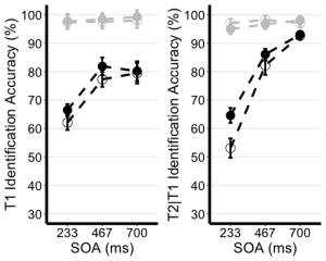
Exercise 3: Visualizing Your Data
8. Use the unedited summary statistics table from Exercise 2 (EXP1.T1.summaryData and EXP1.T3.summaryData) and the ggplot() function to create separate summary line plots for T1 and T2 scores. The Line plot will visualize the relationship between SOA and the dependent measure while considering the factors of cue-type and trial-type. Your plot must have the following characteristics:
- (a) Plot SOA on the x-axis and label the x-axis as "SOA (ms)"
- (b) Plot the dependent measure on the y-axis and label the y-axis as "T1 Identification Accuracy" for T1 plot, and "T2|T1 Identification Accuracy (%)" for the T2 plot.
- (c) Define the colour of your lines by trial type.
- (d) Define the shape of the points for each value in the line by cue--type
- (e) Use the geom_point() function to customize your point shapes. Use solid circles for informative cues, and hollow circles for uninformative cues.
- (f) Use scale_color_manual() to customize line colours. Set the colour for lines plotting selection trials to 'black', and the lines for no-selection trials to 'gray78'.
- (g) Use geom_line() to customize line type. Set line type to dashed and line width to 1.2.
- (h) Customize your y-axis. Set the minimum value to 30 and the maximum value to 100.
- (i) Use the scale_y_continuous() function to have the values on the y-axis increase in increments of 10.
- (j) Use the geom_errorbar() function to plot error bars using your calculated SEM values from the summary table.
- (k) Set plot theme to theme_classic()
- (l) Use the theme() function to customize the x-axis font size and line width. Change the font size of the axis main title to 16, and the x-axis labels to 14
- (m) Add horizontal grid lines.
- (n) Do not include a figure legend.
- (o) Store your two plots as "T1.ggplotplot" and "T2.ggplotplot"
EXP1.T1.ggplotplot <- ggplot(EXP1.T1.summaryData, aes(x=SOA, y=center, color=TrialType, shape = CueType,
group=interaction(CueType, TrialType))) +
geom_point(data=filter(EXP1.T1.summaryData, CueType == "Uninformative"), shape=1, size=4.5) + # assigning shape type to level of factor
geom_point(data=filter(EXP1.T1.summaryData, CueType == "Informative"), shape=16, size=4.5) + # assigning shape type to level of factor
geom_line(linetype="dashed", linewidth=1.2) + # change line thickness and line style
scale_color_manual(values = c("gray78", "black") ) +
xlab("SOA (ms)") +
ylab("T1 Identification Accuracy (%)") +
theme_classic() + # It has no background, no bounding box.
theme(axis.line=element_line(size=1.5), # We make the axes thicker...
axis.text = element_text(size = 14, colour = "black"), # their text bigger...
axis.title = element_text(size = 16, colour = "black"), # their labels bigger...
panel.grid.major.y = element_line(), # adding horizontal grid lines
legend.position = "none") +
coord_cartesian(ylim=c(30, 100)) +
scale_y_continuous(breaks=seq(30, 100, 10)) + # Ticks from 30-100, every 10
geom_errorbar(aes(ymin=center+lowerwidth, ymax=center+upperwidth), width = 0.12, size = 1) # adding error bars from summary table
EXP1.T2.ggplotplot <- ggplot(EXP1.T2.summaryData, aes(x=SOA, y=center, color=TrialType, shape=CueType,
group=interaction(CueType, TrialType))) +
geom_point(data=filter(EXP1.T2.summaryData, CueType == "Uninformative"), shape=1, size=4.5) + # assigning shape type to level of factor
geom_point(data=filter(EXP1.T2.summaryData, CueType == "Informative"), shape=16, size=4.5) + # assigning shape type to level of factor
geom_line(linetype="dashed", linewidth=1.2) + # change line thickness and line style
scale_color_manual(values = c("gray78", "black")) +
xlab("SOA (ms)") +
ylab("T2|T1 Identification Accuracy (%)") +
theme_classic() + # It has no background, no bounding box.
theme(axis.line=element_line(size=1.5), # We make the axes thicker...
axis.text = element_text(size = 14, colour = "black"), # their text bigger...
axis.title = element_text(size = 16, colour = "black"), # their labels bigger...
panel.grid.major.y = element_line(), # adding horizontal grid lines
legend.position = "none") +
guides(fill = guide_legend(override.aes = list(shape = 16) ),
shape = guide_legend(override.aes = list(fill = "black"))) +
coord_cartesian(ylim=c(30, 100)) +
scale_y_continuous(breaks=seq(30, 100, 10)) + # Ticks from 30-100, every 10
geom_errorbar(aes(ymin=center+lowerwidth, ymax=center+upperwidth), width = 0.12, size = 1) # adding error bars from summary table
9. Use ggarrange() to display your plots together.
ggarrange(EXP1.T1.ggplotplot, EXP1.T2.ggplotplot,
nrow = 1, ncol = 2, common.legend = F,
widths = 8, heights = 5)
Exercise 4: Main Analysis
10. Use the data in long format ("cueingData") and the anova_test() function, and compute a two-way ANOVA for each dependent variable, but on selection trials only. Set up cue-type and SOA as within-participants factors. (Hint: use the filter() function)
- (a) Set your effect size measure to partial eta squared (pes)
- (b) Make sure to generate the detailed ANOVA table.
- (c) Store your computations and "T1_2anova" and "T2_2anova".
- (d) Using get_anova_table() function display your ANOVA tables.
T1_2anova <- anova_test(
data = filter(cueingData, TRIAL_TYPE == "S"), dv = T1Score, wid = ID,
within = c(CUE_TYPE, SOA), detailed = TRUE, effect.size = "pes")
T2_2anova <- anova_test(
data = filter(cueingData, TRIAL_TYPE == "S"), dv = T2Score, wid = ID,
within = c(CUE_TYPE, SOA), detailed = TRUE, effect.size = "pes")
get_anova_table(T1_2anova)
## ANOVA Table (type III tests)
##
## Effect DFn DFd SSn SSd F p p<.05 pes
## 1 (Intercept) 1.00 15.00 534043.211 30705.523 260.886 6.80e-11 * 0.946
## 2 CUE_TYPE 1.00 15.00 253.665 506.454 7.513 1.50e-02 * 0.334
## 3 SOA 1.29 19.35 5091.853 2660.275 28.710 1.16e-05 * 0.657
## 4 CUE_TYPE:SOA 2.00 30.00 77.140 1061.051 1.091 3.49e-01 0.068
get_anova_table(T2_2anova)
## ANOVA Table (type III tests)
##
## Effect DFn DFd SSn SSd F p p<.05 pes
## 1 (Intercept) 1 15 593913.106 11288.706 789.169 2.19e-14 * 0.981
## 2 CUE_TYPE 1 15 661.761 426.947 23.250 2.24e-04 * 0.608
## 3 SOA 2 30 20001.563 3852.629 77.875 1.33e-12 * 0.838
## 4 CUE_TYPE:SOA 2 30 519.154 1298.144 5.999 6.00e-03 * 0.286
Exercise 5: Post-hoc tests
11. Filter for selection trials first, then group your data by SOA and use the pairwise_t_test() function to compare informative and uninformative trials at each level of SOA store and display your computation as "T2_sel_pwc".
T2_sel_pwc <- filter(cueingData, TRIAL_TYPE == "S") %>%
group_by(SOA) %>%
pairwise_t_test(T2Score ~ CUE_TYPE, paired = TRUE, p.adjust.method = "holm", detailed = TRUE) %>%
add_significance("p.adj")
T2_sel_pwc <- get_anova_table(T2_sel_pwc)
T2_sel_pwc
## # A tibble: 3 × 16
## SOA estimate .y. group1 group2 n1 n2 statistic p df
## <fct> <dbl> <chr> <chr> <chr> <int> <int> <dbl> <dbl> <dbl>
## 1 233 11.5 T2Score INFORMATIVE UNINFO… 16 16 4.36 5.55e-4 15
## 2 467 3.89 T2Score INFORMATIVE UNINFO… 16 16 1.97 6.8 e-2 15
## 3 700 0.356 T2Score INFORMATIVE UNINFO… 16 16 0.190 8.52e-1 15
## # ℹ 6 more variables: conf.low <dbl>, conf.high <dbl>, method <chr>,
## # alternative <chr>, p.adj <dbl>, p.adj.signif <chr>
