Maheshwar Panday
Getting comfortable with Tidyverse
Have you ever wondered how to make sense of a dataset? Sometimes datasets are available but in formats that seem confusing? Well, sometimes, the organizational format in which you receive a dataset might not make very much sense or be of much value to tell you much about the data. To gain insights from your data, sometimes you need to make use of data organization tools – in R, we call this series of tools data wrangling.
Loading the tidyverse series of packages – a group of packages (tidyr, dplyr, and ggplot2) we can readily organize, tidy and visualise our data to check that our data are being organized into sensible formats.
In this markdown, we’ll be taking a look through some of the core tidyverse operations that are among the most commonly used, and use them to wrangle a categorical dataset to succinctly present information.
A few handy resources : here are some core “cheatsheets” for data cleaning and wrangling in RStudio using the tidyverse series of packages (cheatsheets developed by posit) :
Data Wrangling : https://www.rstudio.com/wp-content/uploads/2015/02/data-wrangling-cheatsheet.pdf
Tidyr : https://bioinformatics.ccr.cancer.gov/docs/rintro/resources/tidyr_cheatsheet.pdf
Dplyr : https://nyu-cdsc.github.io/learningr/assets/data-transformation.pdf
Loading libraries
library(tidyverse) # core series of data wrangling packages.
library(dplyr) # core data wrangling grammar
library(ggplot2) # data visualisation tools
library(RColorBrewer) # colour palettes
library(here) # file directories
library(gridExtra)  # arranging plots
The dataset for this series of tidyverse exercise come from the UC Irvine Machine learning dataset repository. Summary information about the dataset and variables therein can be found at the following link : https://archive.ics.uci.edu/dataset/915/differentiated+thyroid+cancer+recurrence
Further reading about the dataset and use can be found in the source paper :
Borzooei, S., Briganti, G., Golparian, M. et al. Machine learning for risk stratification of thyroid cancer patients: a 15-year cohort study. Eur Arch Otorhinolaryngol (2023). https://doi.org/10.1007/s00405-023-08299-w
Loading a dataset and understanding its format
Load a copy of the thyroid cancer dataset and print the head (first 6 rows) of the dataset
thyroid.data <- read.csv("Thyroid_Diff.csv")
print (head(thyroid.data))

export.path <- here::here("/Tidyverse_DataWrangling")
What does it mean when a dataframe is wide, long and tidy? Why do dataframe formats matter?
dataframes have a defined structure to them and there’s a certain terminology used to describe the different structures dataframes can take on.
- Dataframes are considered TIDY when each row is a case for which observations are made in columns
- Dataframes are considered WIDE when there are more columns than rows
- Dataframes are considered LONG when there are more rows than columns.
If you view the thyroid cancer dataframe – is the dataframe tidy? Is the dataframe long or wide?
for more information on data wrangling and operations across the tidyverse, you can consult this chapter from the online book R for Data Science : 2e (information from which was used in constructing these activities) : https://r4ds.hadley.nz/data-transform
view(thyroid.data)
# the dataframe is tidy and in a wide format - wrangling will be needed to present informative counts from within the dataframe
How can I get information about my data from the data I have?
Now when you looked at the thyroid.data dataframe – every column describes something about each patient and their associated thyroid cancer. But how do you make sense of trends or readily visualise information in the dataframe? To do this, you’ll need to a little of what we call data WRANGLING. The process of organising and modifying the structure of your dataframe to present readily relevant information through statistics or succinct, targeted visualisations.
If you print the column names you see there are lots of different categorial features that describe the patient and their cancer. How can you visualise categorical data in a way that presents counts or proportions based on these categorical variables? This data wrangling activity will help you do just that. Into the tidyverse! 🙂
colnames ( thyroid.data)Understanding the pipe operator & using it to wrangle your data.
The first thing to understand how to use is the pipe operator %>%. This little data wrangling champion allows you to cleanly write and “daisy chain” a series of data handling and wrangling operations to seamlessly carry out a series of data manipulations to produce the desired structure of dataframe with the requisite columns and rows needed to produce the visualisations that best present the information contained therein.
First, the pipe operator can be applied to vectors as well as dataframes. In the same way we can “pipe” outputs of vectors into operations, we can “pipe” columns or entire dataframes into data wrangling functions to produce a required data structure.
to start for the next series of questions you will need to be comfortable using the pipe operator to wrangle your data from the thyroid cancer dataframe you loaded into RStudio. the first activity involves wrangling the dataframe to count how many thyroid cancer cases there are for each of the 4 different pathologies in the dataset.
## ------------------------------------------------------- ##
#### Using the pipe operator to pass inputs to functions ####
## ------------------------------------------------------- ##

# give this code and make it visible to the students

# try computing the mean of a vector of numbers :
no.piped.mean <- mean(c(1,2,3,4,5,6,7,8,9, 10, 11, 12))
piped.mean <- c(1,2,3,4,5,6,7,8,9,10,11, 12) %>% mean()

print (paste("mean without pipe operator: ", no.piped.mean,
             "mean with pipe operator: ", piped.mean))

## --------- wrangling the thyroid cancer dataframe ---------- ##

## --------------------------------------------- ##
##### 1. grouping thyroid cancer by pathology #####
## --------------------------------------------- ##

# this is the first step to organizing the dataframe for downstream analysis
# the pipe operator is taking the thyroid.data dataframe and applying the group_by function to it grouping rows together based on the values in the pathology column of the dataframe.
thyroid.by.pathology <- thyroid.data %>% group_by(Pathology)
print (head(thyroid.by.pathology))

## ----------------------------------------------- ##
##### 2. summarise the counts of each pathology #####
## ----------------------------------------------- ##

# now you can prepare a frequency table - of all the cases in this thyroid cancer dataset, how many cases are of EACH pathology?
# this step "pipes" the thyroid.by.pathology dataframe produced in the previous step, to the summarise function, counting the frequency of each pathology across the entire dataset
pathology.frequencies<- thyroid.by.pathology %>% summarise (Frequency = n())
print (head(pathology.frequencies))
Visual organization of your data – getting info about your data from your data
There are 4 unique cancer pathologies in this dataset – Follicular, Hurthel Cell, Micropapillary, and Papillary. How many cases of each type are in this dataset? Present your results as a frequency histogram. Annotate the bars of the frequency histogram to show the number of cases in each pathology.
Hint : use the tidyverse series of packages to wrangle your data
# Use dplyr to group by Pathology and count the number of occurrences
# this time all the steps outlined in the preliminary code chunk was piped together and brought together to produce a pathology frequency dataframe.
pathology_freq <- thyroid.data %>%
  group_by(Pathology) %>%
  summarise(Frequency = n())

# Print the frequency distribution
print(pathology_freq)

# Use ggplot2 to create a bar plot of the frequency histogram.
thyroid.cancer.freqplot <- ggplot(pathology_freq, aes(x = Pathology, y = Frequency)) +
  geom_bar(stat = "identity", fill = "lightsteelblue3") +
  geom_text(aes(label = Frequency), vjust = 1.5, hjust = 0.5) +
  theme(axis.text.x = element_text(angle = 45, hjust = 1)) +
  theme_classic()+
  labs(x = "Pathology", y = "Frequency", title = "Frequency Distribution : Pathology Categories")

# plot inspection
print (thyroid.cancer.freqplot)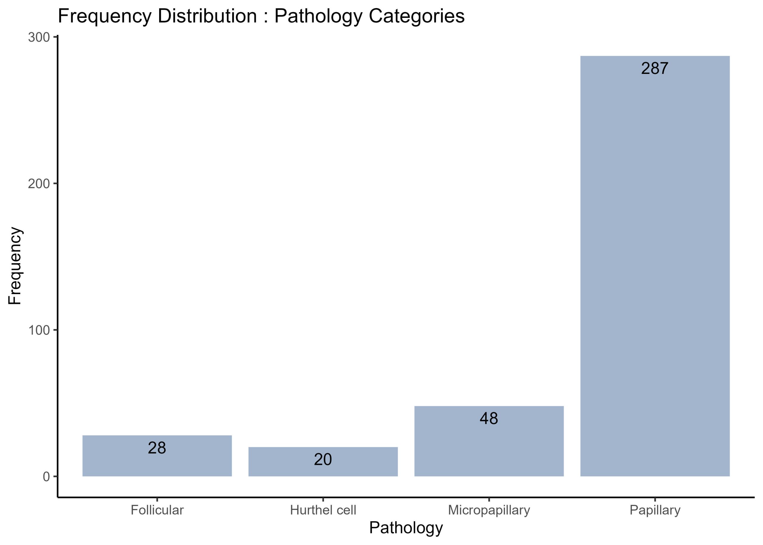
This first plot of a frequency histogram is nice because it readily visualises how many cases of each type of cancer pathology are in the dataset, but it’s important to also note that there are additional patient data that are also valuable, but not present in the previous visualisation. Supposed you would like to also know how many males and females there are for each pathology. How woud you obtain the proportions of males and females for each pathology and modify the frequency histogram above to visualise the counts of males and females for each pathology group?
Modify the frequency histogram above to show the proportions of males and females in each pathology, and annotate each bar with the counts of males and females in each pathology group.
# Group by Pathology and Gender, and count the number of occurrences
gender_pathology_freq <- thyroid.data %>%
  group_by(Pathology, Gender) %>%
  summarise(Frequency = n())

# Plot the stacked bar chart
thyroid.freqplot.by.Gender <- ggplot(gender_pathology_freq, aes(x = Pathology, y = Frequency, fill = Gender)) +
  geom_bar(stat = "identity") +
  geom_text(aes(label = Frequency), position = position_stack(vjust = 0.5)) +
  theme(axis.text.x = element_text(angle = 45, hjust = 1)) +
  theme_classic()+
  labs(x = "Pathology", y = "Frequency", fill = "Gender", title = "Frequency Distribution of Each Pathology Category by Gender") # set the fill of each bar to show the proportions of genders

# plot inspection step
print (thyroid.freqplot.by.Gender)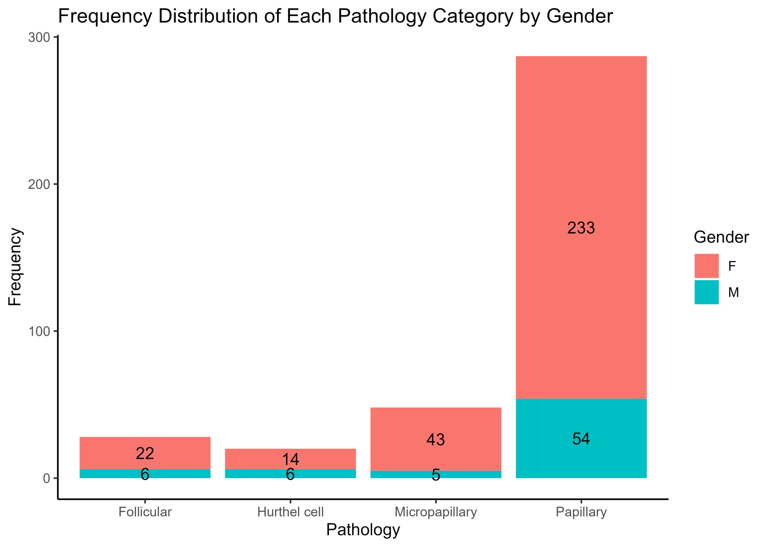
Visualising the different proportions of physical examinations by pathology
Frequency histograms are a useful way to visualise counts and prorportions, but suppose you would like to see the proportion of one set of diagnostic conditions across a series of cancer pathologies. For each patient, physical examination of the thyroid gland has been categorised into one of 5 options : diffuse goiter, multinodular goiter, normal, single nodular goiter – left, and single nodular goiter-right.
There are four distinct pathologies (as you know from the previous exercise). Suppose you are making sense of these data and want to see the prorportions of each physical diagnosis category across each of the pathologies. Yes, you could use a frequency histogram as developed previously, but alternatively you could use a pie chart to make proportions of physical diagnostic categories readily visible.
Prepare a series of 4 pie charts – one pie chart for each pathology and in each pie chart show the proportion of cases for each physical examination category.
#create a custom colour palette :
colour.palette <- c("maroon3", "mediumslateblue", "olivedrab3", "cadetblue2", "darkgoldenrod2" )

# Group by Pathology and Physical.Examination, and count the number of occurrences
pathology_exam_freq <- thyroid.data %>%
  group_by(Pathology, Physical.Examination) %>%
  summarise(Frequency = n())

# Calculate the total number of each Pathology
total_pathology <- pathology_exam_freq %>%
  group_by(Pathology) %>%
  summarise(Total = sum(Frequency))

# Join the two dataframes together
pathology_exam_freq <- left_join(pathology_exam_freq, total_pathology, by = "Pathology")

# Calculate the proportion
pathology_exam_freq <- pathology_exam_freq %>%
  mutate(Proportion = Frequency / Total)

# Create a pie chart for each Pathology - to see the distribution of physical examination values

Diagnosis.by.Pathology <- pathology_exam_freq %>%
  ggplot(aes(x = "", y = Proportion, fill = Physical.Examination)) +
  geom_bar(width = 1, stat = "identity") + # fill each bar for a physical examination category
  geom_text(aes(label = Frequency), position = position_stack(vjust = 0.5)) +
  coord_polar("y", start = 0) + # create a circular histogram- pie chart
  facet_wrap(~Pathology) + # this generates a series of 4 plots for each pathology
  theme_void() + # aesthetics
  theme(legend.position = "right") +
  scale_fill_manual(values = colour.palette)+ # fill each bar with a specific colour from palette
  labs(fill = "Physical Examination", title = "Proportion of Cases in Each Physical Examination Category by Pathology")

print (Diagnosis.by.Pathology)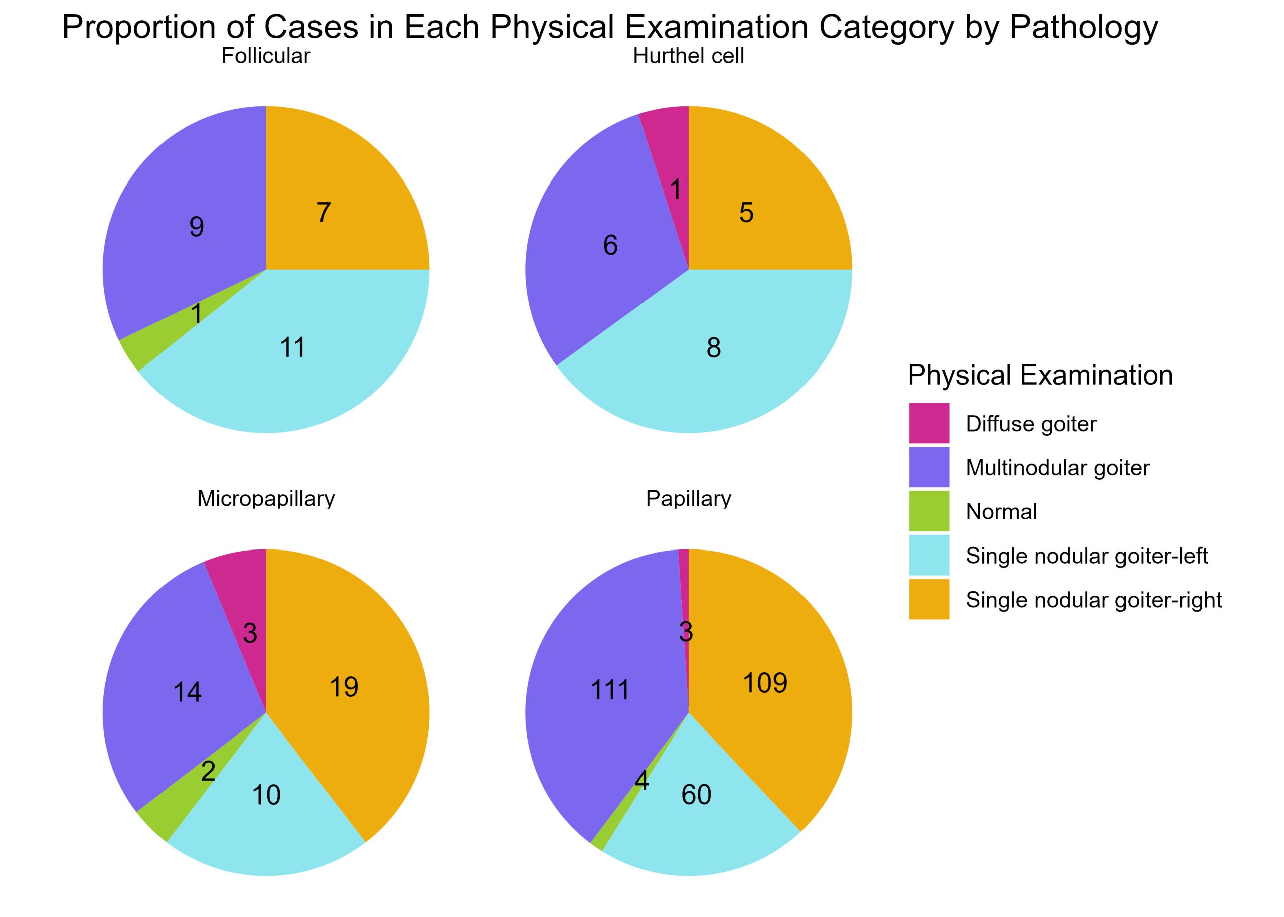
Now this is a nice way to show how many of each physical examination characteristics make up each cancer pathology. Now, just like you did for the frequency histogram above, separate these data to show the proportions of physical examination categories across each cancer pathology by Gender. This time, you need to create two series of 4 plots. One series for males and another for females. Each plot showing the proportion of physical examination categories for a given pathology.
#create a custom colour palette :
colour.palette <- c("maroon3", "mediumslateblue", "olivedrab3", "cadetblue2", "darkgoldenrod2" )

# Group by Gender, Pathology and Physical.Examination, and count the number of occurrences
gender_pathology_exam_freq <- thyroid.data %>%
  group_by(Gender, Pathology, Physical.Examination) %>%
  summarise(Frequency = n())

# Calculate the total number of each Gender and Pathology
total_gender_pathology <- gender_pathology_exam_freq %>%
  group_by(Gender, Pathology) %>%
  summarise(Total = sum(Frequency))

# Join the two dataframes together
gender_pathology_exam_freq <- left_join(gender_pathology_exam_freq, total_gender_pathology, by = c("Gender", "Pathology"))

# Calculate the proportion
gender_pathology_exam_freq <- gender_pathology_exam_freq %>%
  mutate(Proportion = Frequency / Total)

# Create a pie chart for each Gender and Pathology
Diagnosis.by.Pathology.by.Gender<- gender_pathology_exam_freq %>%
  ggplot(aes(x = "", y = Proportion, fill = Physical.Examination)) +
  geom_bar(width = 1, stat = "identity") +
  geom_text(aes(label = Frequency), position = position_stack(vjust = 0.5)) +
  coord_polar("y", start = 0) +
  facet_grid(Gender ~ Pathology) + # create a grid of plots - gender = column, pathologies = rows
  theme_void() +
  theme(legend.position = "top",
        plot.title = element_text(hjust = 0.5)) +
  scale_fill_manual(values = colour.palette)+
  labs(fill = "Physical Examination", title = "Proportion of Cases for Each Physical Examination Category by Pathology and Gender")

print (Diagnosis.by.Pathology.by.Gender)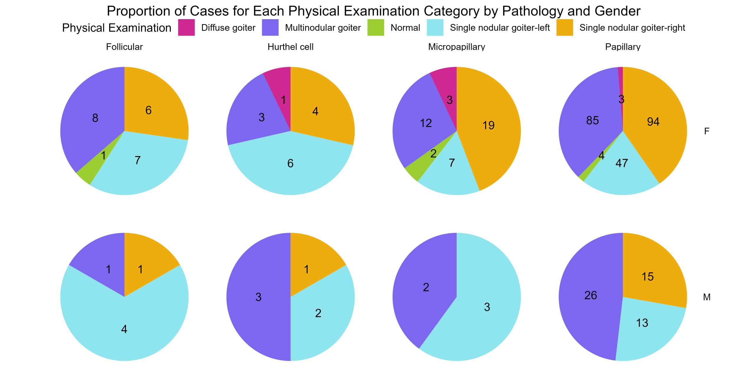
Give boxplots of age by gender for each physical diagnosis by pathology
The data wrangling grammar given by core packages in the tidyverse provide a crucial way to group and organise your data to visualise trends, counts, and proportions more simply with compelling, succinct visualisations.
A prime example of this would be to create a series of boxplots. The series of 8 piecharts you just generated in the last exercise show the proportions of physical examination categories for each pathology for each Gender. But every patient in this dataset is not the same age. It would be important to know age demographics as well. Create a series of boxplots showing the age by gender for each physical examination category for each cancer pathology. This is a series of 16 boxplots.
This time we need to use boxplots instead of piecharts or frequency histograms because we want to show the range of ages by gender for each group of categories.
# Create boxplots of Age by Gender for each Physical.Examination for each Pathology
thyroid.age.boxplots <- thyroid.data %>%
  ggplot(aes(x = Gender, y = Age, fill = Gender)) +
  geom_boxplot() +
  facet_grid(Pathology ~ Physical.Examination) + # produces a grid of plots - each row is a pathology, and each column is a physical examiantion category with boxplots of age by gender
  theme(axis.text.x = element_text(angle = 45, hjust = 1)) +
  labs(x = "Gender", y = "Age", fill = "Gender", title = "Boxplots of Age by Gender for Each Physical Examination Category by Pathology")

print (thyroid.age.boxplots)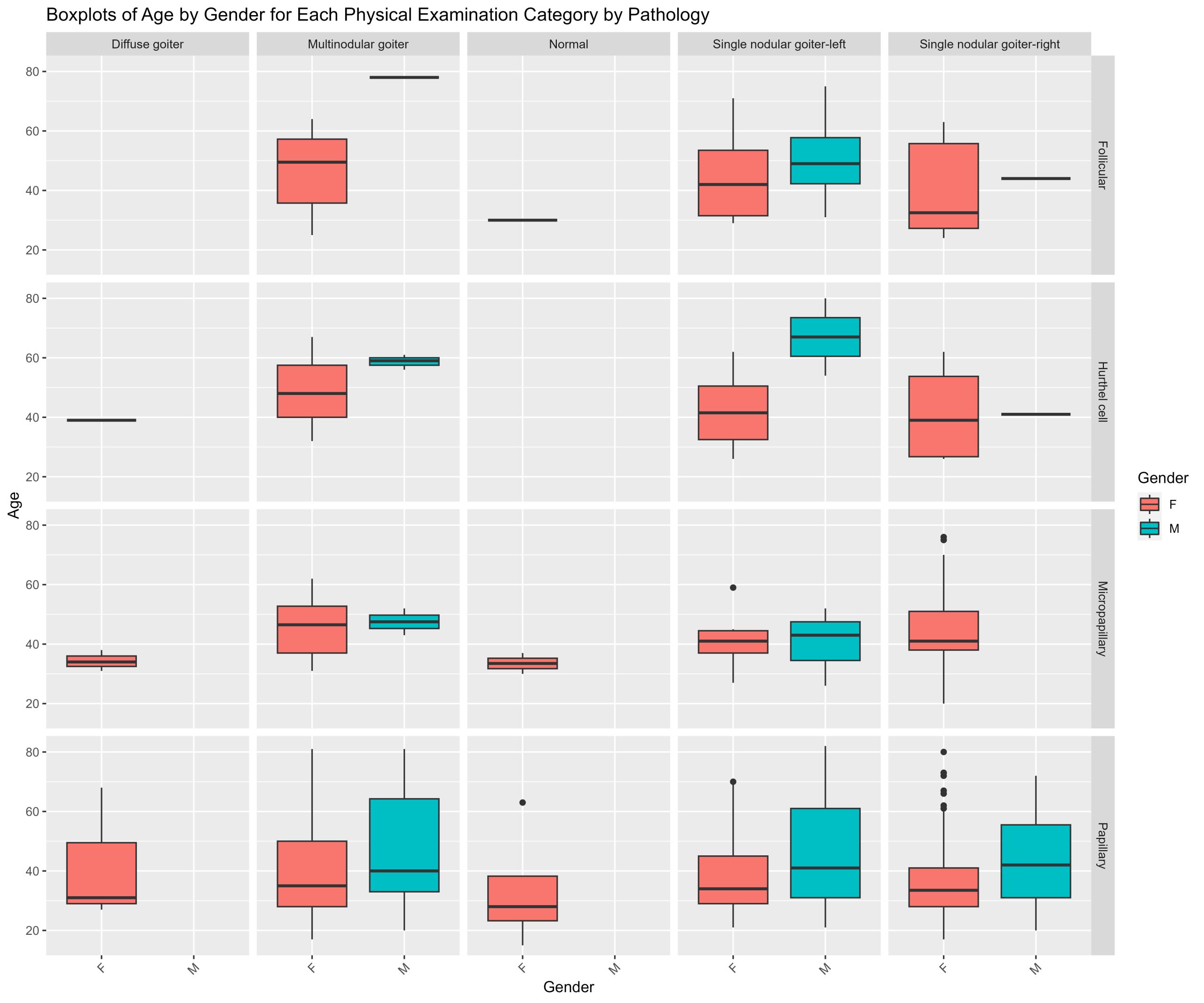
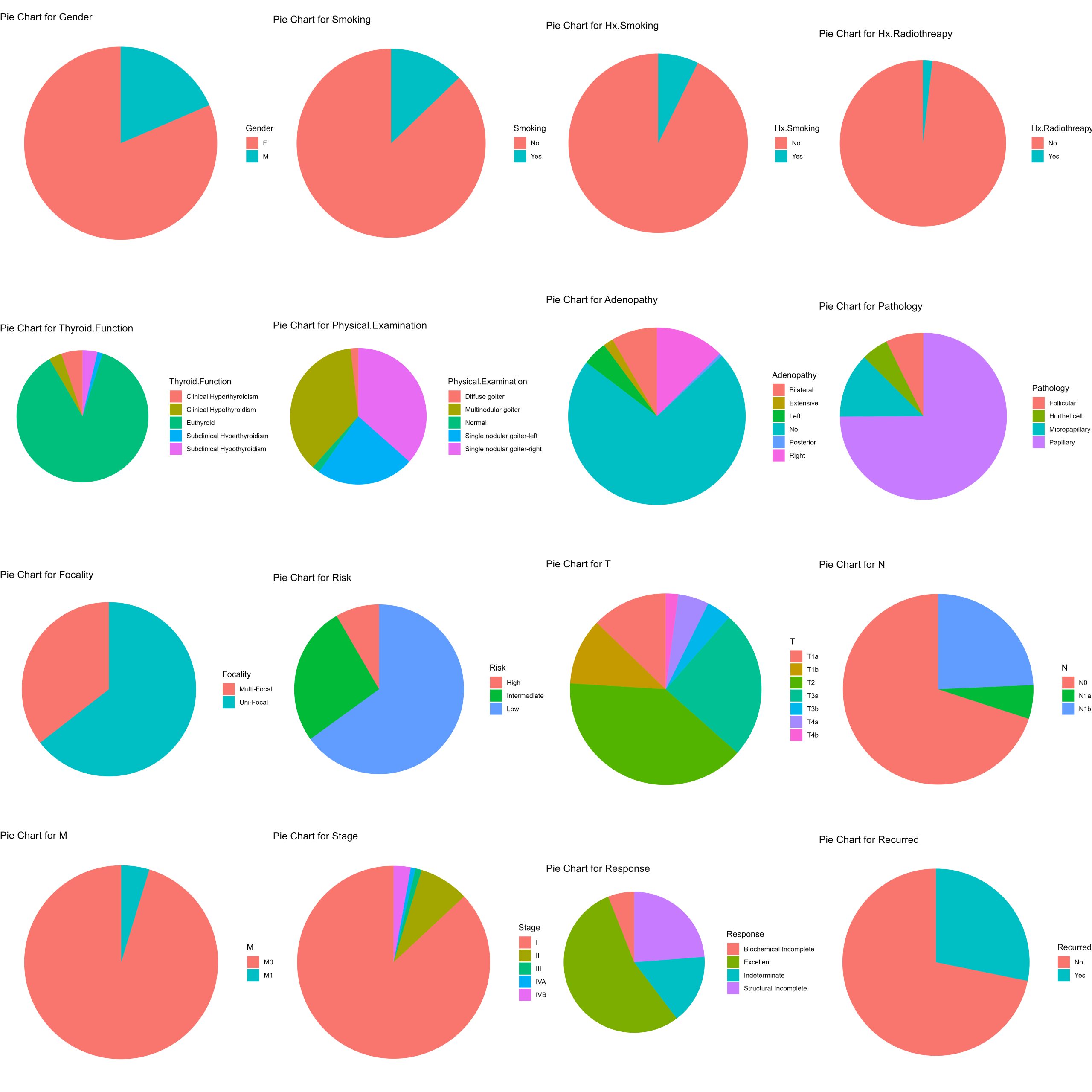
Pie charts for each feature
Although you could prepare a series of counts, prorportions or boxplots for various combinations of features nested together. One critical step is to understand what your features are, what the categorical information contained in each feature means, and what proportions of your data are found across each feature. You can accomplish this by creating pie charts for every feature except for patient age. Though you would probably perform this at the beginning before you undertake your own analysis of a categorical dataset, this process is a little more complicated so we’re saving it for last. The process involves both a series of wrangling operations and visualisation tools.
It’s from exploratory analyses like the plots generated in this grid of pie charts that chaining feature information from pathology, gender, physical examination, and age seemed interesting!
# Exclude the "Age" column
data_without_age <- thyroid.data[ , !(names(thyroid.data) %in% "Age")]

# Initialize an empty list to store the plots
plot_list <- list()

## --------------------------------------------- ##
###### loop through columns - get proportions #####
###### & Generate the pie charts each column  #####
## --------------------------------------------- ##
for (column_name in names(data_without_age)) {
  # Calculate proportions
  proportions <- data_without_age %>%
    group_by(.data[[column_name]]) %>% # group by common features.
    summarise(n = n()) %>% # produce summary statistics
    mutate(prop = n / sum(n)) # mutate produces a column with proportions in one step

  # Create pie chart
  pie_chart <- ggplot(proportions, aes(x = "", y = prop, fill = .data[[column_name]])) +
    geom_bar(width = 1, stat = "identity") +
    coord_polar("y", start = 0) +
    labs(title = paste("Pie Chart for", column_name), x = NULL, y = NULL, fill = column_name) +
    theme(plot.margin = margin (1,1,1,1, "cm"))+  # common margin to each plot
    theme_void() #aesthetics - blank backgrounds

  # Add the pie chart to the list
  plot_list[[column_name]] <- pie_chart
}

# Arrange the plots into a grid
plotgrid <- grid.arrange(grobs = plot_list, ncol = 4, returnGrob= TRUE)
Files to download:
To download, right-click and press “Save File As” or “Download Linked File”
