Colours
Colour is an important design choice in your project. Colour can convey meaning and assist with the framework for the project. However, it is important to consider colour contrast. When documents or web pages do not provide enough contrast between foreground elements (e.g., text, images) and background elements (e.g., colour, watermark images), some students will have difficulty reading the content.
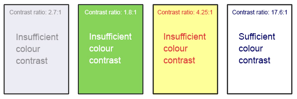
Web Content Accessibility Guidelines (WCAG 2.0) require that for level AA, “the visual presentation of text and images of text has a contrast ratio of at least 4.5 except for the following: Large-scale text and images of large-scale text have a contrast ratio of at least 3:1.”[1] The image below presents four different foreground/background colour-contrast examples to illustrate insufficient and sufficient colour-contrast ratios.
Pressbooks theme: It’s important to note that within the Pressbooks platform, the default templates used to display your core content (text size and font) will conform to WCAG 2.0 level AAA, as demonstrated in the last image below:
In addition, because Pressbooks is web-based, resizing text is possible. “Except for captions and images of text, text can be resized up to 200 percent without assistive technology and without loss of content or functionality (Level AA).”[2]
However, you should not rely on colour as the sole means of conveying information. If the point you are making depends on colour to be understood, you will need to edit your materials so that concepts presented in the visuals are not lost to those who are colour-blind or who require high contrast between colours.[3]
Design Studio Colour Palettes
Below is a selection of colour themes created by the Studio to help enhance the instructional design of your book as well as to provide readers with helpful visual cues to important information you may want to highlight. These themes are used in Pressbooks for the following preformatted textboxes: Learning Objectives, Examples, Exercises, and Key Takeaways, as well as any custom textboxes and elements (such as drop-down accordions) we may create for you.
The colour palettes below have been designed with at least Level AA accessibility in mind. To review the full-colour contrast of each theme’s colour on a webpage, select the corresponding hyperlink in the box directly below each theme. The contrast ratio numbers are also listed for reference. Note that textboxes within Pressbooks will always have a font size of at least 18. pts.
“Colour Contrast” from Queen’s Open Textbook Authoring Guide Copyright © 2017 by Queen’s University is licensed under a Creative Commons Attribution 4.0 International License, except where otherwise noted.
- Web Content Accessibility Guidelines (WCAG) 2.0, Guideline 1.4.3 Contrast (Minimum. Accessed from: https://www.w3.org/TR/2023/NOTE-UNDERSTANDING-WCAG20-20230921/visual-audio-contrast-contrast.html ↵
- Web Content Accessibility Guidelines (WCAG) 2.0, Guideline 1.4.4 Resize text Accessed from: https://www.w3.org/TR/2023/NOTE-UNDERSTANDING-WCAG20-20230921/visual-audio-contrast-scale.html ↵
- Web Content Accessibility Guidelines (WCAG) 2.0, Guideline 1.4.1 Use of Color Accessed from: https://www.w3.org/TR/UNDERSTANDING-WCAG20/visual-audio-contrast-without-color.html ↵
