Quantitative Analysis: Probability and Statistics
Three areas of quantitative are especially relevant to digital humanities scholarship: exploratory data analysis, data visualization, and statistical computing. Exploratory data analysis (EDA) is concerned with exploring data by iterating between summary (descriptive) statistics (described below), modeling techniques, and visualizations. Data visualizations, as explained above, are closely related to EDA, and are crucial to the digital humanities. A substantial amount of insightful data analysis can be performed with common techniques. Histograms provide a detailed indication of the distribution of a variable, whereas scatter plots (or scatterplots) and box plots demonstrate patterns in multivariate data (Arnold & Tilton, 2019). Information visualization and interactive approaches are newer forms of visualization that supplement standard tools. Many new visualizations have been adapted – and sometimes developed – specifically for humanities scholarship, including close and distant reading (Jänicke et al., 2015) and social network analysis (see Stefan Jänicke’s website for examples).
The concern of statistical computing is the design and implementation of software for data processing and analysis. Statistical computing is increasingly important to work in digital humanities, as the volume and complexity of humanities data grow. As emphasized above, pre-programmed, stand-alone programs limit users to a specific set of supported statistics, visualizations, and analysis methods, which may have the effect of steering a user’s analysis approach to the features that are supported by the system. Also as explained above, libraries of statistical and visualization functions for general-purpose programming languages, such as Python and R, facilitate exploratory analysis by providing users with a wide selection of preprocessing, data manipulation, analysis, and visualization functions. Machine learning libraries are also well represented in Python and R. A large number of user-contributed libraries for these tasks are freely available. They are also generally interoperable and operate on the same basic data structures. Consequently, using general-purpose languages with statistical libraries opens humanities data to a wide variety of analysis approaches (Arnold & Tilton, 2019). The following subsections describe some of the statistical paradigms that are relevant for quantitative analysis in the humanities.
Descriptive statistics involves summarized or quantitative values that describe features of a sample from a population or collection of data. Descriptive statistics consist of measures of central tendency of the sample, which summarize the main, or “typical” characteristics of a dataset, and measures of dispersion, which measure how the degree to which the data in the sample deviate from the “typical” characteristics (or central tendency). Measures of central tendency include the mean (average), mode (the value representing the most data), the median (the midpoint of a distribution of data), the minimum, and the maximum. Measures of dispersion include the variance and standard deviation (the square root of the variance), skewness, and kurtosis, and other deviation measures. A five-number summary is commonly used to describe a variable, its spread, central tendency, and potential outliers: the minimum, lower quartile, median, upper quartile, and maximum values (Arnold & Tilton, 2019).
For samples consisting of more than one variable, descriptive statistics quantify the relationship between pairs of variables. Correlation between variables is one such measure. Several correlation metrics, or correlation coefficients, can be calculated to quantify the relationship.
Inferential statistics, or inductive statistics, is used to infer the statistical properties of a population by testing hypotheses and estimating statistical properties from a sample drawn from that population. Inferential statistics therefore has a different focus from descriptive statistics. The latter is used for describing characteristics of a sample without reference to any population from which the sample was taken. Inferential statistics, in contrast, is concerned with characteristics and underlying probability distribution of the population itself. Inferential statistics includes statistical hypothesis testing, which analyzes a null hypothesis and alternative hypothesis on the data. A null hypothesis, usually denoted as H0, is a default hypothesis that some quantity or calculation is zero. For instance, a typical null hypothesis is that two populations have the same mean, or, equivalently, the difference of their means is zero. An alternative hypothesis, usually denoted as Ha, is a hypothesis that there is some change or difference in comparing two populations. Research questions are typically formulated as an alternative hypothesis. A difference in the models that H0 and Ha represent is considered to beis statistically significant if what was observed in the sample is unlikely to be observed if H0 were true, according to a threshold probability value known as the significance level, usually denoted as a. In most research, a is either 0.01 (1%) or 0.05 (5%). Widely used statistical tests in research and scholarship include Student’s t-test, the Chi-squared test, Fisher’s exact test, and analysis of variance (ANOVA).
Statistical modeling is another useful analysis approach. A statistical model is a mathematical model incorporating statistical information about the generation of sample data. A statistical model represents a mathematical relationship between random variables and non-random variables, or parameters, of the model. Statistical models are the basis for statistical hypothesis tests. A common application of statistical modeling is regression analysis, which is used for estimating the relationship between values observed in some sample, known as response variables or dependent variables, and features or predictors, also known as independent variables. For example, linear regression is used to construct a model that relates independent and dependent variable. It is called linear regression because the model is a linear combination of terms consisting of a parameter and an independent variable, and it is linear in the parameters. If the model contained a square term in one of its parameters, for example, the model would be nonlinear. The equation of a line,
[latex]y = mx + b[/latex]
is a simple linear regression model. In this case, y is the dependent variable, or response variable x is the independent variable, or predictor variable, a denotes the slope of the line, b is the y-intercept where the line intersects the y-axis, and y is the dependent variable. Both a and b are the parameters of the model. Linear regressions may also have several independent variables. For instance:
[latex]y = b_0 + b_1x_1 + b_2x_2 + b_3x_3[/latex]
is a linear model. The goal of linear regression is to calculate the parameters, b0, b1, b2, and b3, to minimize the error between observation values (y values) and predictor variables (x values). Nonlinear regression is also a statistical model that is used for more complex problems. In this model, the terms can contain nonlinear functions of the parameter. For example,
[latex]y = b_0 x /(b_1 + x)[/latex]
is a nonlinear model.
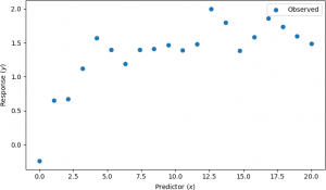
For example, suppose that explanatory variables and observations in the presence of noise are shown by the scatter plot below.
A nonlinear regression was performed, assuming the nonlinear model y = b0x / (b1 + x). The results are shown below.
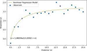
In this example, the two parameters were calculated to be b0 = 1.8659 and b1 = 2.2002.
There is a close relationship between probability and statistics and information theory, which is commonly used to study communication channels of digital information. One of the main metrics of information theory is entropy, which, in this context, is a measure used to quantify uncertainty in a random variable or a random process (a mathematical model of systems that exhibit some degree of randomness). Mutual information is a measure computed from entropies that quantifies the dependence between two variables. Mutual information is used in text analysis, particularly in collocation, in which a series of words occur together more often than would be expected by pure chance.
