3.2 Graphic Design
Graphic Design
Graphic design means creating visual concepts either by computer software or by hand to communicate a message, idea, or concept that serves a certain purpose. Uses of graphic design include: visual identity, marketing and advertising, user interface design, publication, packaging, motion design, environmental, art, and illustration.
Graphic design skills are perhaps the most broadly applicable creative skills. Almost every project, assignment, or document you produce can be enhanced by applying graphic design skills and principles.
Designing something from scratch can be a daunting task and indeed many designers find themselves stuck when they first try and launch into a new project. Fortunately, by understanding the basics of a typical graphic design process and doing a little bit of planning and research, you will have a much easier time.
Consider
Like all creative projects, it can be helpful to sit down and think about a plan before you start drafting up a design:
- What are your goals?
- What does the client or assignment ask for?
- What kind of style are you aiming for?
Graphic Design Basics
When we talk about graphic design, we are talking about a number of separate ‘elements’ that make up a whole design. You may be familiar with some of these already, but others might be completely new. It is important to think about all of these elements as you are planning and creating your graphic.
Colour
Designers and artists use a set of guidelines called colour theory to help effectively communicate ideas and create eye-catching elements for users. The use of colour theory helps with achieving a designer’s goals, which may be attracting attention, organizing content, and evoking emotion. Colour theory aids the designer in choosing the right colour combination for the desired effect.
Colour terminology: There are a number of terms designers use to talk about colour that can be helpful when creating images:
- Hue refers to the specific colour (red, blue, purple, etc.).
- Value is the lightness or darkness of a hue (e.g. maroon is a dark red with a different value than cherry red).
- Tint is when you add white to a hue.
- Shade is when you add black to a hue.
- Chroma/intensity is the brightness or dullness of a colour (think of how close to grey, or how vibrant, a colour is).
Colour Harmony: Colours can be combined in various ways, but the common harmonies are monochromatic, analogous, and complementary.
- Monochromatic harmony is developed around one hue.
- Analogous harmony refers to choosing colours on that are close to each other on the colour wheel.
- Complementary harmonies are colours that are opposite of each other on the colour wheel.
 Tip: Colour Modes
Where your graphic will end up will determine the “Colour Mode” you want to work in. Both modes will let you choose any colour, but the modes control how screens or printers display colours. If it is going to be posted online or on a screen, you should use RGB Colour Mode. For printing, you want to use CMYK Colour mode, which is seen in magazines, cards, posters etc.
It can be really helpful when you are starting out to play around with colour schemes to help you get a sense of what sort of colour scheme you might want to use for your design. There are a number of free tools like Coolors or Adobe Color that can help you try out different schemes and easily make different harmonies (you can even see thousands of schemes made by other people).
As much as colour is an important part of a design, it is equally important to consider all of the other design elements when you are working on your project.
More Design Elements
Form
Line
Shape
Size
Space
Texture
Graphic Design Principles
Once you’ve thought about all of the different elements, it’s time to combine them into a full design. There are a few basic principles to keep in mind when you are roughing out your design for the first time (and as you are iterating on it to make it better!). They are: balance, rhythm, contrast, emphasis, and movement.
Balance is the arrangement of the visual weight of objects, colours, texture, and space. Balance creates emphasis, drawing the viewers attention and dividing it into symmetrical, asymmetrical, mosaic, and radial. Visual balance is important and desirable since it provides a sense of comfort for the viewer, allows them to see all areas of the composition, and emphasizes how each part may hold interest. If a composition is unbalanced, it can give a sense of tension. The areas with the most visual weight get the most attention.
Contrast is the difference between two or more visual elements in a composition. This helps to clarify the purpose of your design by creating focal points and diverting attention to the contrasting element, while adding visual interest to a composition. Certain elements that can be used as contrast in a composition include colour, type, alignment, and size. Contrast is important since the difference between the elements makes it easier to compare and comprehend.
Emphasis is when a particular element is designed to draw the attention of a viewer. This is usually an eye-catching focal point and the area that has the most significance. Emphasis can be created by using contrasts in colour, texture, and value for the eye to be drawn to a particular area, and also by strategically placing something in the area of a composition that will draw the most attention.
Movement is the direction the viewer’s eyes naturally move around a composition. This can be created through lines, shapes, edges, colour, and patterns. Movement allows the viewer to know where to look and what to do next. The movement that is made through elements keeps visual interest and lets the viewer know of change. Some effects that create movement are blurs, curves, or the display of something already in motion (e.g. a person running).
Rhythm is the repeating elements in a composition that can unite, direct, and highlight. Rhythm can include elements that are repeating in shape, colour, tone, texture, accents, and direction. Using rhythm in a composition can create momentum and life, especially when used alongside the other principles.
 Tip: File Formats
File formats in the graphic design world can be overwhelming. In general, it’s best to save your files as whatever will have the most universal use. In this case, a PDF, PNG, or JPEG at the highest resolution possible. You might encounter the terms Vector and Raster when saving. A raster is an image made up of pixels, and a vector is an image made up of shapes, lines, and points. The difference is that you can always increase the scale of a vector (because it has no pixels), whereas a raster will start to show individual pixels.
Creating Your Design
Now that you have a plan (you’ve roughed out your design and thought through all of its elements while applying design principles), it’s time to actually use some design tools to create it. Most graphic design professionals use Adobe programs such as Illustrator, Photoshop, and InDesign to create their graphics.
Those can be both expensive and difficult to learn. Luckily, there are a number of free or less expensive alternatives that you can use to create your own high quality graphics.
Dig Deeper
Here are some extra options for you to explore for editing images that are free and/or open source.
GIMP
Inkscape
Gravit Designer
Canva
Consider: Elements of Design
Elements of Design Activity – Text version
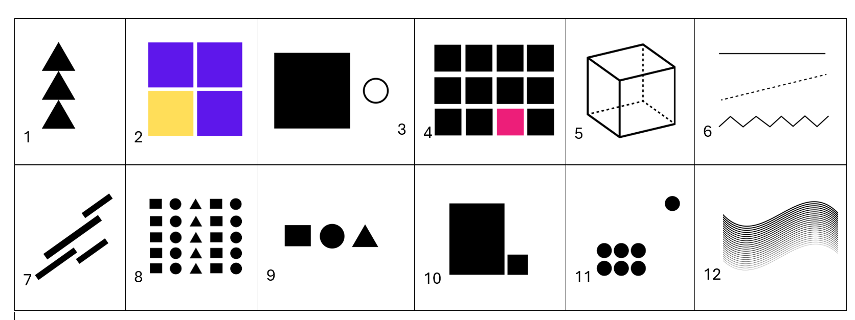
Which element of design do each of these images convey?

Description of images on chart:
- three triangles stacked on top of each other
- three purple squares, one yellow, stacked 2×2 to create a larger square
- large solid square and small outline of a circle
- 12 black squares, with one pink, stacked 4×3, with the pink square on the bottom row in the second last position
- outline of a cube
- straight line, dotted line, wavy line not overlapping
- 4 lines that do not intersect, pointing upwards at a 45 degree angle
- 5 rows of repeating images in a pattern of square, circle, triangle, square, circle
- square, circle, triangle
- large rectangle sitting beside a small rectangle
- collection of 6 circles at the bottom left, one circle top right
- wavy line with variations and gradients
Check Your Answers in footnote[1]
Activity source: Adapted from Elements of Design Activity from Graphic Design In Liberated Learners by Terry Greene et al. , CC BY-NC 4.0 . / Extracted from H5P activity for use in Print/PDF
Attribution & References
Except where otherwise noted, this page is adapted from Graphic Design In Liberated Learners by Terry Greene et al., CC BY-NC 4.0 . / Adaptation notes. Removed the liberated learners activity/assignment, added links to design apps, removed and streamlined some content to improve student learning.
-
- Balance
- Colour
- Contrast
- Emphasis
- Form
- Line
- Movement
- Rhythm
- Shape
- Size
- Space
- Texture

