2.1 Frequency Distributions and Histograms
LEARNING OBJECTIVES
- Create and interpret frequency distribution tables.
- Display, analyze, and interpret data presented in a histogram.
Once we have a set of data, we need to organize it so that we can analyze how frequently each datum occurs in the set. However, when calculating the frequency, we may need to round our answers so that they are as precise as possible.
Frequency Distributions
A frequency distribution or frequency table is a summary table of data that shows the number of observations that fall into each of several, non-overlapping classes.
Consider the following data. Twenty students were asked how many hours they worked per day. Their responses, in hours, are recorded in the table below.
| 5 | 6 | 3 | 3 | 2 | 4 | 7 | 5 | 2 | 3 |
| 5 | 6 | 5 | 4 | 4 | 3 | 5 | 2 | 5 | 3 |
Using each data value as the class, the following table lists the different data values in ascending order and their frequencies.
| CLASS | FREQUENCY |
|---|---|
| [latex]2[/latex] | [latex]3[/latex] |
| [latex]3[/latex] | [latex]5[/latex] |
| [latex]4[/latex] | [latex]3[/latex] |
| [latex]5[/latex] | [latex]6[/latex] |
| [latex]6[/latex] | [latex]2[/latex] |
| [latex]7[/latex] | [latex]1[/latex] |
A frequency is the number of observations in the data that fall into each class. According to the table, there are three students who work two hours, five students who work three hours, and so on. The sum of the values in the frequency column is [latex]20[/latex], which is the total number of students included in the sample.
A relative frequency is the ratio, fraction, or proportion of the number of times a value of the data occurs in the set of all outcomes to the total number of outcomes. To find the relative frequencies, divide each frequency by the total number of students in the sample–in this case [latex]20[/latex]. Relative frequencies can be written as fractions, percents, or decimals. The sum of the values in the relative frequency column is [latex]1[/latex] or [latex]100\%[/latex].
| CLASS | FREQUENCY | RELATIVE FREQUENCY |
|---|---|---|
| [latex]2[/latex] | [latex]3[/latex] | [latex]\displaystyle\frac{3}{20}\times 100\%=15\%[/latex] |
| [latex]3[/latex] | [latex]5[/latex] | [latex]\displaystyle\frac{5}{20} \times n100\%=25\%[/latex] |
| [latex]4[/latex] | [latex]3[/latex] | [latex]\displaystyle\frac{3}{20} \times 100\%=15\%[/latex] |
| [latex]5[/latex] | [latex]6[/latex] | [latex]\displaystyle\frac{6}{20} \times 100\%=30\%[/latex] |
| [latex]6[/latex] | [latex]2[/latex] | [latex]\displaystyle\frac{2}{20} \times 100\%=10\%[/latex] |
| [latex]7[/latex] | [latex]1[/latex] | [latex]\displaystyle\frac{1}{20}\times 100\%=5\%[/latex] |
Cumulative frequency is the accumulation of the previous frequencies. To find the cumulative frequencies, add all of the previous frequencies to the frequency for the current row, as shown in the table below. The last entry of the cumulative frequency column is the number of observations in the data.
| CLASS | FREQUENCY | RELATIVE FREQUENCY | CUMULATIVE FREQUENCY |
|---|---|---|---|
| [latex]2[/latex] | [latex]3[/latex] | [latex]15\%[/latex] | [latex]3[/latex] |
| [latex]3[/latex] | [latex]5[/latex] | [latex]25\%[/latex] | [latex]3+5=8[/latex] |
| [latex]4[/latex] | [latex]3[/latex] | [latex]15\%[/latex] | [latex]8 + 3 = 11[/latex] |
| [latex]5[/latex] | [latex]6[/latex] | [latex]30\%[/latex] | [latex]11 + 6 =17[/latex] |
| [latex]6[/latex] | [latex]2[/latex] | [latex]10\%[/latex] | [latex]17 + 2 = 19[/latex] |
| [latex]7[/latex] | [latex]1[/latex] | [latex]5\%[/latex] | [latex]19+ 1 = 20[/latex] |
Cumulative relative frequency is the accumulation of the previous relative frequencies. To find the cumulative relative frequencies, add all the previous relative frequencies to the relative frequency for the current row, as shown in the table below. The last entry of the cumulative relative frequency column is [latex]1[/latex] or [latex]100\%[/latex], indicating that [latex]100\%[/latex] of the data has been accumulated.
| CLASS | FREQUENCY | RELATIVE FREQUENCY | CUMULATIVE FREQUENCY | CUMULATIVE RELATIVE FREQUENCY |
|---|---|---|---|---|
| [latex]2[/latex] | [latex]3[/latex] | [latex]15\%[/latex] | [latex]3[/latex] | [latex]15\%[/latex] |
| [latex]3[/latex] | [latex]5[/latex] | [latex]25\%[/latex] | [latex]8[/latex] | [latex]15 \%+ 25 \%= 40\%[/latex] |
| [latex]4[/latex] | [latex]3[/latex] | [latex]15\%[/latex] | [latex]11[/latex] | [latex]40\% + 15\% = 55\%[/latex] |
| [latex]5[/latex] | [latex]6[/latex] | [latex]30\%[/latex] | [latex]17[/latex] | [latex]55\% + 30\% = 85\%[/latex] |
| [latex]6[/latex] | [latex]2[/latex] | [latex]10\%[/latex] | [latex]19[/latex] | [latex]85\% + 10\% = 95\%[/latex] |
| [latex]7[/latex] | [latex]1[/latex] | [latex]5\%[/latex] | [latex]20[/latex] | [latex]95\% + 5\% = 100\%[/latex] |
NOTES
- Because of rounding of the relative frequencies, the relative frequency column may not always sum to [latex]1[/latex] or [latex]100\%[/latex], and the last entry in the cumulative relative frequency column may not be [latex]1[/latex] or [latex]100\%[/latex]. However, they each should be close to [latex]1[/latex] or [latex]100\%[/latex]. If all of the decimals are kept in the calculations, the relative frequency column will sum to [latex]1[/latex] or [latex]100\%[/latex], and the last cumulative relative frequency will be [latex]1[/latex] or [latex]100\%[/latex].
- A simple way to round off answers is to carry the final answer to one more decimal place than was present in the original data. Round off only the final answer. Do not round off any intermediate results, if possible. If it becomes necessary to round off intermediate results, carry them to at least twice as many decimal places as the final answer. For example, the average of the three quiz scores four, six, and nine is [latex]6.3[/latex], rounded off to the nearest tenth because the data are whole numbers. Most answers will be rounded off in this manner.
EXAMPLE
The following data are the number of books bought by [latex]50[/latex] part-time college students at ABC College. Construct a frequency distribution table for this data using six classes.
| 1 | 1 | 1 | 1 | 1 | 1 | 1 | 1 | 1 | 1 |
| 1 | 2 | 2 | 2 | 2 | 2 | 2 | 2 | 2 | 2 |
| 2 | 3 | 3 | 3 | 3 | 3 | 3 | 3 | 3 | 3 |
| 3 | 3 | 3 | 3 | 3 | 3 | 3 | 4 | 4 | 4 |
| 4 | 4 | 4 | 5 | 5 | 5 | 5 | 5 | 6 | 6 |
Solution
| CLASS | FREQUENCY | RELATIVE FREQUENCY | CUMULATIVE FREQUENCY | CUMULATIVE RELATIVE FREQUENCY |
|---|---|---|---|---|
| [latex]1[/latex] | [latex]11[/latex] | [latex]22\%[/latex] | [latex]11[/latex] | [latex]22\%[/latex] |
| [latex]2[/latex] | [latex]10[/latex] | [latex]20\%[/latex] | [latex]21[/latex] | [latex]42\%[/latex] |
| [latex]3[/latex] | [latex]16[/latex] | [latex]32\%[/latex] | [latex]37[/latex] | [latex]74\%[/latex] |
| [latex]4[/latex] | [latex]6[/latex] | [latex]12\%[/latex] | [latex]43[/latex] | [latex]86\%[/latex] |
| [latex]5[/latex] | [latex]5[/latex] | [latex]10\%[/latex] | [latex]48[/latex] | [latex]96\%[/latex] |
| [latex]6[/latex] | [latex]2[/latex] | [latex]4\%[/latex] | [latex]50[/latex] | [latex]100\%[/latex] |
Frequency Distributions with Classes
Instead of using a single data value as the class, frequency distributions are often constructed using non-overlapping classes and the frequency is the number of observations from the data that fall into each class. Classes are most often used when constructing a frequency distribution for quantitative data. When setting up the classes, it is important to make sure that the classes do not overlap and that every data value falls into one of the classes. In other words, each data value must fall into one and only of the classes.
There are three steps to creating the classes for a frequency distribution:
- Determine the number of non-overlapping classes. The number of classes is somewhat subjective and is often determined by the researcher. Although there are no rules about how many classes a frequency distribution should have, general guidelines recommend using between five and twenty classes. For a smaller data set, use a smaller number of classes. For a larger data set, use a larger number of classes. When deciding on the number of classes, the goal is to have enough classes to capture the trends and patterns in the data but not so many classes that some classes contain only a few data values.
- Determine the width of the classes. As with the number of classes, there are no rules about the class width. However, general guidelines recommend that the classes all have the same width because this reduces the user may misinterpret the data. An approximate class width may be found using the following formula:
[latex]\begin{eqnarray*}\text{Approximate Class Width} & = & \frac{\text{Maximum Data Value}-\text{Minimum Data Value}}{\text{Number of Classes}}\end{eqnarray*}[/latex]
Round the number obtained from this formula to a more convenient number, for example, a whole number. For example, if the result of this formula is [latex]14.2[/latex], a convenient class width is [latex]15[/latex].
- Determine the class limits. Using the number of classes and the class width, construct the class limits. When constructing the classes, remember that every data value must fall into one and only one class. The lower class limit is the smallest possible data value that falls into that class. The upper class limit is the largest possible data value that falls into that class.
NOTES
- The classes must be non-overlapping and exhaustive. In other words, each data value in the data set must fall into one and only class.
- To prevent any misinterpretation of the data, the classes should all have the same width.
- The number of classes and the class width are subjective. It is up to the researcher to determine the number of classes and the class width. Different people may construct completely different, but equally valid, frequency distributions.
EXAMPLE
The following data are the heights (in inches to the nearest half inch) of [latex]100[/latex] male semiprofessional soccer players. Construct a frequency distribution table with eight classes for this data.
| 60 | 64 | 64.5 | 66 | 66.5 | 67 | 67.5 | 69 | 70 | 71 |
| 60.5 | 64 | 64.5 | 66 | 66.5 | 67 | 67.5 | 69 | 70 | 71 |
| 61 | 64 | 64.5 | 66.5 | 66.5 | 67 | 67.5 | 69 | 70 | 72 |
| 61 | 64 | 66 | 66.5 | 67 | 67 | 68 | 69 | 70 | 72 |
| 61.5 | 64 | 66 | 66.5 | 67 | 67 | 68 | 69 | 70 | 72 |
| 63.5 | 64.5 | 66 | 66.5 | 67 | 67.5 | 69 | 69.5 | 70 | 72.5 |
| 63.5 | 64.5 | 66 | 66.5 | 67 | 67.5 | 69 | 69.5 | 70.5 | 72.5 |
| 63.5 | 64.5 | 66 | 66.5 | 67 | 67.5 | 69 | 69.5 | 70.5 | 73 |
| 64 | 64.5 | 66 | 66.5 | 67 | 67.5 | 69 | 69.5 | 70.5 | 73.5 |
| 64 | 64.5 | 66 | 66.5 | 67 | 67.5 | 69 | 69.5 | 71 | 74 |
Solution
- There will be [latex]8[/latex] classes (given in the instructions).
- Calculate the class width. The minimum data value is [latex]60[/latex], and the maximum data value is [latex]74[/latex].
[latex]\begin{eqnarray*}\text{Approximate Class Width} & = & \frac{74-60}{8} \\ & = & 1.75\end{eqnarray*}[/latex]
Rounding this value to [latex]2[/latex], each class will have a width of [latex]2[/latex].
- Determine the classes. The first class can start at [latex]60[/latex] and go up to, but not include, [latex]62[/latex]. The second class will start at [latex]62[/latex] and go up to, but not include, [latex]64[/latex]. The third class will start at [latex]64[/latex] and go up to, but not include, [latex]66[/latex]. This process continues until the eighth clas,s that starts at [latex]74[/latex] and goes up to, but does not include, [latex]76[/latex]. (Remember, the classes must be non-overlapping, so we do not want numbers like [latex]62[/latex] to potentially fall into both the first and second classes. By writing the classes this way ([latex]62[/latex] up to but not including [latex]64[/latex]), we ensure that a number like [latex]62[/latex] will only fall into the second class.)
| CLASS | FREQUENCY | RELATIVE FREQUENCY | CUMULATIVE FREQUENCY | CUMULATIVE RELATIVE FREQUENCY |
|---|---|---|---|---|
| [latex]60[/latex] to less than [latex]62[/latex] | [latex]5[/latex] | [latex]5\%[/latex] | [latex]5[/latex] | [latex]5\%[/latex] |
| [latex]62[/latex] to less than [latex]64[/latex] | [latex]3[/latex] | [latex]3\%[/latex] | [latex]8[/latex] | [latex]8\%[/latex] |
| [latex]64[/latex] to less than [latex]66[/latex] | [latex]15[/latex] | [latex]15\%[/latex] | [latex]23[/latex] | [latex]23\%[/latex] |
| [latex]66[/latex] to less than [latex]68[/latex] | [latex]40[/latex] | [latex]40\%[/latex] | [latex]63[/latex] | [latex]63\%[/latex] |
| [latex]68[/latex] to less than [latex]70[/latex] | [latex]17[/latex] | [latex]17\%[/latex] | [latex]80[/latex] | [latex]80\%[/latex] |
| [latex]70[/latex] to less than [latex]72[/latex] | [latex]12[/latex] | [latex]12\%[/latex] | [latex]92[/latex] | [latex]92\%[/latex] |
| [latex]72[/latex] to less than [latex]74[/latex] | [latex]7[/latex] | [latex]7\%[/latex] | [latex]99[/latex] | [latex]99\%[/latex] |
| [latex]74[/latex] to less than [latex]76[/latex] | [latex]1[/latex] | [latex]1\%[/latex] | [latex]100[/latex] | [latex]100\%[/latex] |
TRY IT
The following data are the shoe sizes of 50 male students. Construct a frequency distribution table using four classes.
| 9 | 9 | 9.5 | 9.5 | 10 | 10 | 10 | 10 | 10 | 10 |
| 10.5 | 10.5 | 10.5 | 10.5 | 10.5 | 10.5 | 10.5 | 10.5 | 11 | 11 |
| 11 | 11 | 11 | 11 | 11 | 11 | 11 | 11 | 11 | 11 |
| 11 | 11.5 | 11.5 | 11.5 | 11.5 | 11.5 | 11.5 | 11.5 | 12 | 12 |
| 12 | 12 | 12 | 12 | 12 | 12.5 | 12.5 | 12.5 | 12.5 | 14 |
Click to see Solution
[latex]\begin{eqnarray*}\\ \text{Approximate Class Width} & = & \frac{14-9}{4} \\ & = & 1.25 \\ & \rightarrow & \text{Round to 2}\end{eqnarray*}[/latex]
| CLASS | FREQUENCY | RELATIVE FREQUENCY | CUMULATIVE FREQUENCY | CUMULATIVE RELATIVE FREQUENCY |
|---|---|---|---|---|
| [latex]8[/latex] to less than [latex]10[/latex] | [latex]4[/latex] | [latex]8\%[/latex] | [latex]4[/latex] | [latex]8\%[/latex] |
| [latex]10[/latex] to less than [latex]12[/latex] | [latex]34[/latex] | [latex]68\%[/latex] | [latex]38[/latex] | [latex]76\%[/latex] |
| [latex]12[/latex] to less than [latex]14[/latex] | [latex]11[/latex] | [latex]22\%[/latex] | [latex]49[/latex] | [latex]98\%[/latex] |
| [latex]14[/latex] to less than [latex]16[/latex] | [latex]1[/latex] | [latex]2\%[/latex] | [latex]50[/latex] | [latex]100\%[/latex] |
Histograms
For most of the work we do in this book, we will use a histogram to display the data. One advantage of a histogram is that it can readily display large data sets. A rule of thumb is to use a histogram when the data set consists of [latex]100[/latex] values or more.
A histogram is a visual display of a frequency distribution table. It consists of contiguous, vertical boxes with both a horizontal axis and a vertical axis. The horizontal axis is labelled with the classes or categories from the frequency distribution table. The vertical axis is labelled either frequency or relative frequency (or percent frequency or probability). The graph will have the same shape with either label on the vertical axis but the scale on the vertical axis will be different. The histogram gives us the shape of the data, the center of the data, and the spread of the data.
Recall that the frequency is the number of times an observation falls into that particular class, and the relative frequency is the frequency for the class divided by the total number of data values in the sample. For example, if three students in Mr. Ahab's English class of [latex]40[/latex] students received from [latex]90\%[/latex] to [latex]100\%[/latex], then the frequency of the [latex]90\%[/latex] to [latex]100\%[/latex] class is [latex]3[/latex] and the relative frequency is [latex]\displaystyle{\frac{3}{40}\times 100\%=7.5\%}[/latex]. So, [latex]7.5\%[/latex] of the students received between [latex]90\%[/latex] and [latex]100\%[/latex].
EXAMPLE
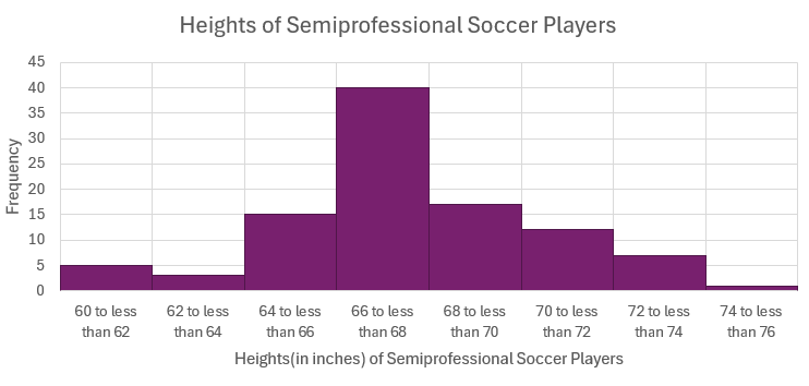
The following data are the heights (in inches to the nearest half inch) of [latex]100[/latex] male semiprofessional soccer players. Construct a histogram for this data using eight classes.
| 60 | 64 | 64.5 | 66 | 66.5 | 67 | 67.5 | 69 | 70 | 71 |
| 60.5 | 64 | 64.5 | 66 | 66.5 | 67 | 67.5 | 69 | 70 | 71 |
| 61 | 64 | 64.5 | 66.5 | 66.5 | 67 | 67.5 | 69 | 70 | 72 |
| 61 | 64 | 66 | 66.5 | 67 | 67 | 68 | 69 | 70 | 72 |
| 61.5 | 64 | 66 | 66.5 | 67 | 67 | 68 | 69 | 70 | 72 |
| 63.5 | 64.5 | 66 | 66.5 | 67 | 67.5 | 69 | 69.5 | 70 | 72.5 |
| 63.5 | 64.5 | 66 | 66.5 | 67 | 67.5 | 69 | 69.5 | 70.5 | 72.5 |
| 63.5 | 64.5 | 66 | 66.5 | 67 | 67.5 | 69 | 69.5 | 70.5 | 73 |
| 64 | 64.5 | 66 | 66.5 | 67 | 67.5 | 69 | 69.5 | 70.5 | 73.5 |
| 64 | 64.5 | 66 | 66.5 | 67 | 67.5 | 69 | 69.5 | 71 | 74 |
Solution
In a previous example, we constructed the following frequency distribution table. Here, only the frequency column is shown because this is the column that will go on the vertical axis of the histogram.
| CLASS | FREQUENCY |
|---|---|
| [latex]60[/latex] to less than [latex]62[/latex] | [latex]5[/latex] |
| [latex]62[/latex] to less than [latex]64[/latex] | [latex]3[/latex] |
| [latex]64[/latex] to less than [latex]66[/latex] | [latex]15[/latex] |
| [latex]66[/latex] to less than [latex]68[/latex] | [latex]40[/latex] |
| [latex]68[/latex] to less than [latex]70[/latex] | [latex]17[/latex] |
| [latex]70[/latex] to less than [latex]72[/latex] | [latex]12[/latex] |
| [latex]72[/latex] to less than [latex]74[/latex] | [latex]7[/latex] |
| [latex]74[/latex] to less than [latex]76[/latex] | [latex]1[/latex] |
EXAMPLE
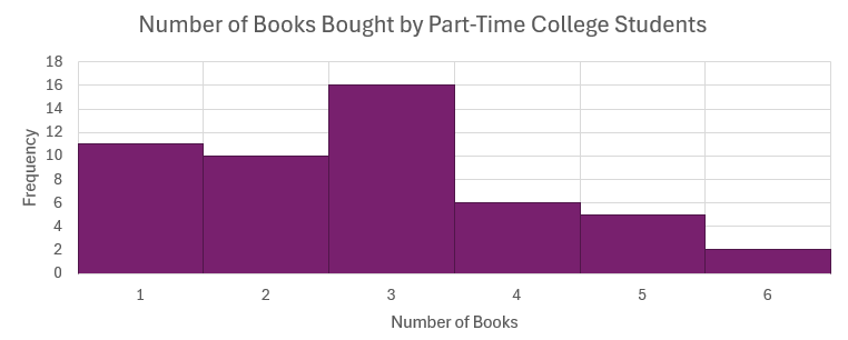
The following data are the number of books bought by [latex]50[/latex] part-time college students at ABC College. Construct a histogram for this data using six classes.
| 1 | 1 | 1 | 1 | 1 | 1 | 1 | 1 | 1 | 1 |
| 1 | 2 | 2 | 2 | 2 | 2 | 2 | 2 | 2 | 2 |
| 2 | 3 | 3 | 3 | 3 | 3 | 3 | 3 | 3 | 3 |
| 3 | 3 | 3 | 3 | 3 | 3 | 3 | 4 | 4 | 4 |
| 4 | 4 | 4 | 5 | 5 | 5 | 5 | 5 | 6 | 6 |
Solution
In a previous example, we constructed the following frequency distribution table. Here, only the frequency column is shown because this is the column that will go on the vertical axis of the histogram.
| CLASS | FREQUENCY |
|---|---|
| [latex]1[/latex] | [latex]11[/latex] |
| [latex]2[/latex] | [latex]10[/latex] |
| [latex]3[/latex] | [latex]16[/latex] |
| [latex]4[/latex] | [latex]6[/latex] |
| [latex]5[/latex] | [latex]5[/latex] |
| [latex]6[/latex] | [latex]2[/latex] |
CREATING A FREQUENCY DISTRIBUTION AND HISTOGRAM IN EXCEL
In order to create a frequency distribution and its corresponding histogram in Excel, we need to use the Analysis ToolPak. Follow these instructions to add the Analysis ToolPak.
- Enter your data into a worksheet.
- Determine the classes for the frequency distribution. Using these classes, create a Bin column that contains the upper limit for each class.
- Go to the Data tab and click on Data Analysis. If you do not see Data Analysis in the Data tab, you will need to install the Analysis ToolPak.
- In the Data Analysis window, select Histogram. Click OK.
- In the Input range, enter the cell range for the data.
- In the Bin range, enter the cell range for the Bin column.
- Select the location where you want the output to appear.
- Select Chart Output to produce the corresponding histogram for the frequency distribution.
- Click OK.
NOTE
The histogram produced by Excel uses the frequency column from the frequency table on the vertical axis, not the relative frequency column.
Video: "Frequency Tables, Bar Charts, Pie Charts, Histograms, Grouped & Ungrouped Data Distributions" by Joshua Emmanuel [8:41] is licensed under the Standard YouTube License.Transcript and closed captions available on YouTube.
Video: "How to Construct a Histogram in Excel using built-in Data Analysis" by Joshua Emmanuel [1:59] is licensed under the Standard YouTube License.Transcript and closed captions available on YouTube.
Exercises
- Fifty part-time students were asked how many courses they were taking this term. The (incomplete) results are shown below:
# of Courses Frequency Relative Frequency Cumulative Relative Frequency [latex]1[/latex] [latex]30[/latex] [latex]60\%[/latex] [latex]2[/latex] [latex]15[/latex] [latex]3[/latex] - Fill in the blanks in the table
- What percent of students take exactly two courses?
- What percent of students take one or two courses?
Click to see Answer
-
# of Courses Frequency Relative Frequency Cumulative Relative Frequency [latex]1[/latex] [latex]30[/latex] [latex]60%[/latex] [latex]60%[/latex] [latex]2[/latex] [latex]15[/latex] [latex]30%[/latex] [latex]90%[/latex] [latex]3[/latex] [latex]5[/latex] [latex]10%[/latex] [latex]100%[/latex] - [latex]30%[/latex]
- [latex]90%[/latex]
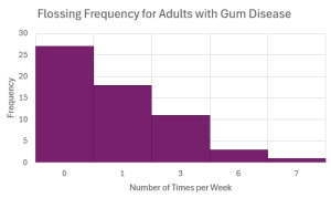
- Sixty adults with gum disease were asked the number of times per week they used to floss before their diagnosis. The (incomplete) results are shown below:
# Flossing per Week Frequency Relative Frequency Cumulative Frequency Cumulative Relative Frequency [latex]0[/latex] [latex]27[/latex] [latex]45\%[/latex] [latex]1[/latex] [latex]18[/latex] [latex]3[/latex] [latex]93.33\%[/latex] [latex]6[/latex] [latex]3[/latex] [latex]5\%[/latex] [latex]7[/latex] [latex]1[/latex] [latex]1.67\%[/latex] - Fill in the blanks in the table.
- How many adults flossed more than three times per week?
- What percent of adults flossed six times per week?
- What percent of adults flossed at most three times per week?
- Construct the histogram for this frequency distribution table.
Click to see Answer
-
# Flossings per Week Frequency Relative Frequency Cumulative Frequency Cumulative Relative Frequency [latex]0[/latex] [latex]27[/latex] [latex]45\%[/latex] 27 [latex]45\%[/latex] [latex]1[/latex] [latex]18[/latex] [latex]30\%[/latex] 45 [latex]75\%[/latex] [latex]3[/latex] [latex]11[/latex] [latex]18.33\%[/latex] 56 [latex]93.33\%[/latex] [latex]6[/latex] [latex]3[/latex] [latex]5\%[/latex] 59 [latex]98.33\%[/latex] [latex]7[/latex] [latex]1[/latex] [latex]1.67\%[/latex] 60 [latex]100\%[/latex] - [latex]4[/latex]
- [latex]5\%[/latex]
- [latex]93.33\%[/latex]
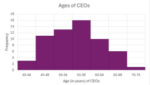
- Forbes magazine published data on the best small firms in 2012. These were firms which had been publicly traded for at least a year, have a stock price of at least [latex]\$5[/latex] per share, and have reported annual revenue between [latex]\$5[/latex] million and [latex]\$1[/latex] billion. The table below shows the ages of the chief executive officers for the first [latex]60[/latex] ranked firms.
Class Frequency Relative Frequency Cumulative Frequency Cumulative Relative Frequency [latex]40-44[/latex] [latex]3[/latex] [latex]45-49[/latex] [latex]11[/latex] [latex]50-54[/latex] [latex]13[/latex] [latex]55-59[/latex] [latex]16[/latex] [latex]60-64[/latex] [latex]10[/latex] [latex]65-69[/latex] [latex]6[/latex] [latex]70-74[/latex] [latex]1[/latex] - Complete the frequency distribution table.
- How many CEOs are between [latex]55[/latex] and [latex]64[/latex] years of age?
- What percentage of CEOs are [latex]65[/latex] years or older?
- What percentage of CEOs are under [latex]50[/latex] years of age?
- How many CEOs are younger than [latex]55[/latex] years of age?
- Construct the histogram for this frequency distribution.
Click to see Answer
-
Class Frequency Relative Frequency Cumulative Frequency Cumulative Relative Frequency [latex]40-44[/latex] [latex]3[/latex] [latex]5\%[/latex] [latex]3[/latex] [latex]5\%[/latex] [latex]45-49[/latex] [latex]11[/latex] [latex]18.33\%[/latex] [latex]14[/latex] [latex]23.33\%[/latex] [latex]50-54[/latex] [latex]13[/latex] [latex]21.67\%[/latex] [latex]27[/latex] [latex]45\%[/latex] [latex]55-59[/latex] [latex]16[/latex] [latex]26.67\%[/latex] [latex]43[/latex] [latex]71.67\%[/latex] [latex]60-64[/latex] [latex]10[/latex] [latex]16.67\%[/latex] [latex]53[/latex] [latex]88.33\%[/latex] [latex]65-69[/latex] [latex]6[/latex] [latex]10\%[/latex] [latex]59[/latex] [latex]98.33\%[/latex] [latex]70-74[/latex] [latex]1[/latex] [latex]1.67\%[/latex] [latex]60[/latex] [latex]100\%[/latex] - [latex]26[/latex]
- [latex]11.67\%[/latex]
- [latex]23.33\%[/latex]
- [latex]27[/latex]
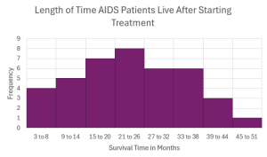
- Studies are often done by pharmaceutical companies to determine the effectiveness of a treatment program. Suppose that a new AIDS antibody drug is currently under study. It is given to patients once the AIDS symptoms have revealed themselves. Of interest is the length of time in months patients live once starting the treatment. A researcher follows [latex]40[/latex] AIDS patients from the start of treatment until their deaths. The following data (in months) are collected.
16 3 4 11 15 16 17 22 44 37 14 24 25 15 26 27 33 29 35 44 13 21 22 10 12 8 40 32 26 27 31 34 29 17 8 24 18 47 33 34 - Construct a frequency distribution for this data using eight classes.
- How many patients live between 15 and 20 months?
- How many patients live more than 32 months?
- What percentage of patients live between 27 and 44 months?
- What percentage of patients live less than 15 months?
- Construct the histogram for this frequency distribution.
Click to see Answer
The answer will vary depending on the chosen classes.
-
Class Frequency Relative Frequency Cumulative Frequency Cumulative Relative Frequency [latex]3-8[/latex] [latex]4[/latex] [latex]10\%[/latex] [latex]4[/latex] [latex]10\%[/latex] [latex]9-14[/latex] [latex]5[/latex] [latex]12.5\%[/latex] [latex]9[/latex] [latex]22.5\%[/latex] [latex]15-20[/latex] [latex]7[/latex] [latex]17.5\%[/latex] [latex]16[/latex] [latex]40\%[/latex] [latex]21-26[/latex] [latex]8[/latex] [latex]20\%[/latex] [latex]24[/latex] [latex]60\%[/latex] [latex]27-32[/latex] [latex]6[/latex] [latex]15\%[/latex] [latex]30[/latex] [latex]75\%[/latex] [latex]33-38[/latex] [latex]6[/latex] [latex]15\%[/latex] [latex]36[/latex] [latex]90\%[/latex] [latex]39-44[/latex] [latex]3[/latex] [latex]7.5\%[/latex] [latex]39[/latex] [latex]97.5\%[/latex] [latex]45-50[/latex] [latex]1[/latex] [latex]2.5\%[/latex] [latex]40[/latex] [latex]100\%[/latex] - [latex]7[/latex]
- [latex]10[/latex]
- [latex]37.5\%[/latex]
- [latex]22.5\%[/latex]
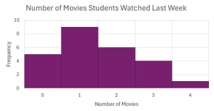
- Twenty-five randomly selected students were asked the number of movies they watched the previous week. The results are as follows.
Number of Movies Frequency Relative Frequency Cumulative Frequency Cumulative Relative Frequency [latex]0[/latex] [latex]5[/latex] [latex]1[/latex] [latex]9[/latex] [latex]2[/latex] [latex]6[/latex] [latex]3[/latex] [latex]4[/latex] [latex]4[/latex] [latex]1[/latex] - Complete the frequency distribution table.
- How many students watched less than two movies last week?
- How many students watched between one and three movies last week?
- What percentage of students watched one or more movies last week?
- What percentage of students watched three or four movies last week?
- Construct the histogram for the frequency distribution table.
Click to see Answer
-
Number of Movies Frequency Relative Frequency Cumulative Frequency Cumulative Relative Frequency [latex]0[/latex] [latex]5[/latex] [latex]20\%[/latex] [latex]5[/latex] [latex]20\%[/latex] [latex]1[/latex] [latex]9[/latex] [latex]36\%[/latex] [latex]14[/latex] [latex]56\%[/latex] [latex]2[/latex] [latex]6[/latex] [latex]24\%[/latex] [latex]20[/latex] [latex]80\%[/latex] [latex]3[/latex] [latex]4[/latex] [latex]16\%[/latex] [latex]24[/latex] [latex]96\%[/latex] [latex]4[/latex] [latex]1[/latex] [latex]4\%[/latex] [latex]1[/latex] [latex]100\%[/latex] - [latex]14[/latex]
- [latex]19[/latex]
- [latex]80\%[/latex]
- [latex]20\%[/latex]
- How much time does it take to travel to work in a particular region? The table below shows the commute time for a sample of workers in the region who are at least [latex]16[/latex] years old and do not work at home.
24.0 24.3 25.9 18.9 27.5 17.9 21.8 20.9 16.7 27.3 18.2 24.7 20.0 22.6 23.9 18.0 31.4 22.3 24.0 25.5 24.7 24.6 28.1 24.9 22.6 23.6 23.4 25.7 24.8 25.5 21.2 25.7 23.1 23.0 23.9 26.0 16.3 23.1 21.4 21.5 27.0 27.0 18.6 31.7 23.3 30.1 22.9 23.3 21.7 18.6 - Construct the frequency distribution table for this data using six classes.
- Which class contains the most data? What percentage of the data does this represent?
- What percentage of commuters in the sample take the longest to get to work?
- How many commuters in the sample take the least amount of time to get to work?
- Construct the corresponding histogram for the frequency distribution.
Click to see Answer
The answer will vary depending on the chosen classes.
-
Classes Frequency Relative Frequency Cumulative Frequency Cumulative Relative Frequency [latex]16[/latex] to under [latex]19[/latex] [latex]8[/latex] [latex]16\%[/latex] [latex]8[/latex] [latex]16\%[/latex] [latex]19[/latex] to under [latex]22[/latex] [latex]7[/latex] [latex]14\%[/latex] [latex]15[/latex] [latex]30\%[/latex] [latex]22[/latex] to under [latex]25[/latex] [latex]21[/latex] [latex]42\%[/latex] [latex]36[/latex] [latex]72\%[/latex] [latex]25[/latex] to under [latex]28[/latex] [latex]10[/latex] [latex]20\%[/latex] [latex]46[/latex] [latex]92\%[/latex] [latex]28[/latex] to under [latex]31[/latex] [latex]2[/latex] [latex]4\%[/latex] [latex]48[/latex] [latex]96\%[/latex] [latex]31[/latex] to under [latex]34[/latex] [latex]2[/latex] [latex]4\%[/latex] [latex]50[/latex] [latex]100\%[/latex] - [latex]21[/latex] to under [latex]25[/latex]; [latex]42\%[/latex]
- [latex]4\%[/latex]
- [latex]8[/latex]

"2.2 Histograms, Frequency Polygons, and Time Series Graphs" and "2.7 Exercices" from Introduction to Statistics by Valerie Watts is licensed under a Creative Commons Attribution-NonCommercial-ShareAlike 4.0 International License, except where otherwise noted.
