12.2 Scatter Diagrams
LEARNING OBJECTIVES
- Define independent and dependent variables.
- Create and analyze scatter diagrams.
Independent and Dependent Variables
An independent variable (or the [latex]x[/latex]-variable) is called the explanatory or predictor variable. The independent variable is used for prediction and provides the basis for estimation. The independent variable may be thought of as the input value and is used to determine the output value (the value of the dependent variable).
A dependent variable (or the [latex]y[/latex]-variable) is called the response or outcome variable. The dependent variable is the variable being predicted or estimated based on the value of the independent variable. The dependent variable may be thought of as the output value and is determined by the input value (the value of the independent variable).
EXAMPLE
Svetlana tutors to make extra money for college. For each tutoring session, she charges a one-time fee of [latex]\$25[/latex] plus [latex]\$25[/latex] per hour of tutoring. The two variables are the number of hours per session and the amount of money earned per session.
- The number of hours per session is the independent variable because it can be used to predict the value of the other variable (the amount of money earned per session).
- The amount of money earned per session is the dependent variable because its value can be determined from the value of the other variable (the number of hours per session).
Scatter Diagrams
Before we begin discussing correlation and linear regression, we need to consider ways to display the relationship between the independent variable [latex]x[/latex] and the dependent variable [latex]y[/latex]. The most common and easiest way to illustrate the relationship between the two variables is with a scatter diagram.
A scatter diagram (or scatter plot) is a graphical presentation of the relationship between two numerical variables. Each point on the scatter diagram represents the values of two variables. The [latex]x[/latex]-coordinate is the value of the independent variable, and the [latex]y[/latex]-coordinate is the value of the corresponding dependent variable.
To construct a scatter diagram:
- Identify the independent and dependent variables.
- Assign the independent variable to the horizontal or [latex]x[/latex]-axis. Assign the dependent variable to the vertical or [latex]y[/latex]-axis.
- Plot the points on an [latex](x,y)[/latex]-grid.
- Label the axes, including both the variable names and units.
- Include a chart title. A common chart title is independent variable vs dependent variable, using the actual names of the variables.
EXAMPLE
In Europe and Asia, m-commerce is popular. M-commerce users have special mobile phones that work like electronic wallets as well as provide phone and internet services. Users can do everything from paying for parking to buying a TV set or soda from a machine to banking to checking sports scores on the internet. Data for the number of users from years 2000 through 2004 is given in the table below.
| Year | Number of Users (in millions) |
| 2000 | 0.5 |
| 2002 | 20.0 |
| 2003 | 33.0 |
| 2004 | 47.0 |
Which variable is the independent variable? Which variable is the dependent variable? Construct a scatter diagram for this data.
Solution
- The year is the independent variable because it can be used to predict the value of the other variable (the number of users).
- The number of users is the dependent variable because its value can be determined from the value of the other variable (year).

TRY IT
Amelia plays basketball for her high school. She wants to improve her play so she can compete at the college level. The table below records the number of hours she spends practicing her jump shot before a game and the number of points she scored in the following game.
| Hours Spent Practicing Jump Shot | Points Scored in Game |
| 5 | 15 |
| 7 | 22 |
| 9 | 28 |
| 10 | 31 |
| 11 | 33 |
| 12 | 36 |
Which variable is the independent variable? Which variable is the dependent variable? Construct a scatter diagram for this data.
Click to see Solution
- The hours spent practicing jump shots is the independent variable because it can be used to predict the value of the other variable (points scored in the game).
- The points scored in a game are the dependent variable because its value can be determined from the value of the other variable (hours spent practicing jump shots).

CONSTRUCTING A SCATTER DIAGRAM IN EXCEL
To create a scatter diagram in Excel:
- Identify the independent and dependent variables.
- If necessary, rearrange the columns so that the column containing the independent variable data is on the left and the dependent variable is on the right. (Excel always places the variable on the left on the horizontal axis.)
- Go to the Insert tab. In the Charts group, click on Scatter. Select the scatter diagram with only markers (points).
- Using the chart tools, add axis titles, including both the variable names and units on the axes.
- Using the chart tools, add a chart title. A common chart title is independent variable vs dependent variable, using the actual names of the variables.
Visit the Microsoft page for more information about creating a scatter diagram in Excel.
We can determine the strength of the relationship by looking at the scatter diagram to see how close the points are to a line, a power function, an exponential function, or to some other type of function. The stronger the relationship, the better the corresponding regression model (linear, exponential, etc.) will be at predicting values of the dependent variable.
When we look at a scatter diagram, we want to notice the overall pattern and any deviations from the pattern. The scatter diagrams shown below illustrate these concepts.


In this chapter, we are only concerned with the strength and direction of the linear relationship between the independent and dependent variables. In the next section, we will learn about a numerical measure, the correlation coefficient, that measures the strength and direction of the linear relationship.
Because linear patterns are quite common, we are interested in scatter diagrams that show a linear pattern. The linear relationship is strong if the points are close to a straight line, except in the case of a horizontal line where there is no relationship. If a scatter diagram shows a linear relationship, we would like to create a model based on this apparent linear relationship. This model is constructed through a process called simple linear regression. However, we only calculate a regression line if one of the variables, [latex]x[/latex], helps to explain or predict the other variable, [latex]y[/latex]. If [latex]x[/latex] is the independent variable and [latex]y[/latex] is the dependent variable, then we can use a regression line to predict a value for [latex]y[/latex] for a given value of [latex]x[/latex].
Video: "Basic Excel Business Analytics #44: Intro To Linear Regression & Scatter Chart" by excelisfun [15:46] is licensed under the Standard YouTube License.Transcript and closed captions available on YouTube.
Exercises
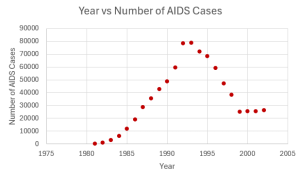
- The table below contains real data for the first two decades of AIDS cases.
Year Number of AIDS Cases 1981 319 1982 1,170 1983 3,076 1984 6,240 1985 11,776 1986 19,032 1987 28,564 1988 35,447 1989 42,674 1990 48,634 1991 59,660 1992 78,530 1993 78,834 1994 71,874 1995 68,505 1996 59,347 1997 47,149 1998 38,393 1999 25,174 2000 25,522 2001 25,643 2002 26,464 - Which variable is the independent variable, and which variable is the dependent variable?
- Construct a scatter diagram for this data.
Click to see Answer
- Independent: Year; Dependent: Number of AIDS Cases
- A specialty cleaning company charges an equipment fee and an hourly labour fee. A linear equation that expresses the total amount of the fee the company charges for each session is [latex]y=50+100x[/latex].
- What are the independent and dependent variables?
- What is the [latex]y[/latex]-intercept? Interpret the [latex]y[/latex]-intercept using complete sentences.
- What is the slope? Interpret the slope using complete sentences.
Click to see Answer
- Independent: Number of Hours of Labour; Dependent: Total Amount of Fee
- [latex]50[/latex]. When the number of hours of labour is [latex]0[/latex], the total amount is [latex]\$50[/latex].
- [latex]100[/latex]. For each extra hour of labour, the total amount increases by [latex]\$100[/latex].
- Due to erosion, a river shoreline is losing several thousand pounds of soil each year. A linear equation that expresses the total amount of soil lost per year is [latex]y=12,000x[/latex].
- What are the independent and dependent variables?
- How many pounds of soil does the shoreline lose in a year?
- What is the [latex]y[/latex]-intercept? Interpret its meaning.
Click to see Answer
- Independent: Year; Dependent: Amount of Soil Lost
- [latex]12,000[/latex]
- [latex]0[/latex]. There is no soil lost in year [latex]0[/latex].
- For each of the following situations, state the independent variable and the dependent variable.
- A study is done to determine if elderly drivers are involved in more motor vehicle fatalities than other drivers. The number of fatalities per [latex]100,000[/latex] drivers is compared to the age of drivers.
- A study is done to determine if the weekly grocery bill changes based on the number of family members.
- Insurance companies base life insurance premiums partially on the age of the applicant.
- Utility bills vary according to power consumption.
- A study is done to determine if a higher education reduces the crime rate in a population.
Click to see Answer
- Independent: Age of driver; Dependent: Number of fatalities
- Independent: Number of family members; Dependent: Weekly grocery bill
- Independent: Age of applicant; Dependent: Life insurance premium
- Independent: Power consumption; Dependent: Amount of utility bill
- Independent: Years of education; Dependent: Crime rate
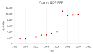
- The Gross Domestic Product Purchasing Power Parity is an indication of a country’s currency value compared to another country. The table below shows the GDP PPP of Cuba as compared to US dollars. Construct a scatter plot of the data.
Year Cuba’s PPP 1999 1,700 2000 1,700 2002 2,300 2003 2,900 2004 3,000 2005 3,500 2006 4,000 2007 11,000 2008 9,500 2009 9,700 2010 9,900 Click to see Answer
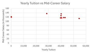
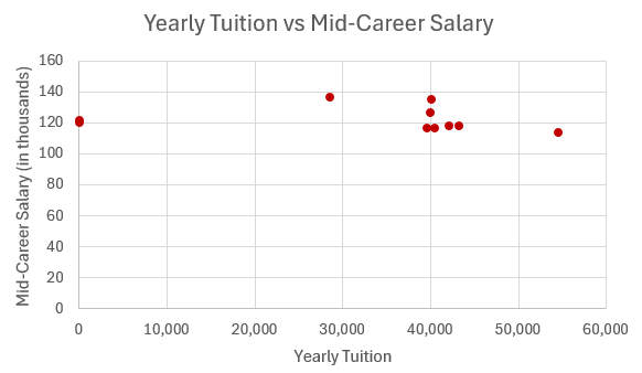
- Does the higher cost of tuition translate into higher-paying jobs? The table lists the top ten colleges based on mid-career salary and the associated yearly tuition costs. Construct a scatter plot of the data.
School Mid-Career Salary (in thousands) Yearly Tuition Princeton 137 28,540 Harvey Mudd 135 40,133 CalTech 127 39,900 US Naval Academy 122 0 West Point 120 0 MIT 118 42,050 Lehigh University 118 43,220 NYU-Poly 117 39,565 Babson College 117 40,400 Stanford 114 54,506 Click to see Answer
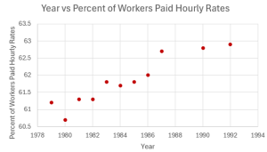
- The table below gives the percent of workers who are paid hourly rates for the years 1979 to 1992.
Year Percent of Workers Paid Hourly Rates 1979 61.2 1980 60.7 1981 61.3 1982 61.3 1983 61.8 1984 61.7 1985 61.8 1986 62.0 1987 62.7 1990 62.8 1992 62.9 - Decide which variable should be the independent variable and which should be the dependent variable.
- Draw a scatter plot of the ordered pairs.
Click to see Answer
- Independent: year; Dependent: percent of workers paid hourly rate
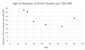
- Recently, the annual number of driver deaths per [latex]100,000[/latex] for the selected age groups was as follows:
Age Number of Driver Deaths per [latex]100,000[/latex] 17.5 38 22 36 29.5 24 44.5 20 64.5 18 80 28 - Decide which variable should be the independent variable and which should be the dependent variable.
- Draw a scatter plot of the data.
Click to see Answer
- Independent: age; Dependent: number of driver deaths per [latex]100,000[/latex]
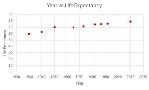
- The table below shows the life expectancy for an individual born in the United States in certain years.
Year of Birth Life Expectancy 1930 59.7 1940 62.9 1950 70.2 1965 69.7 1973 71.4 1982 74.5 1987 75 1992 75.7 2010 78.7 - Decide which variable should be the independent variable and which should be the dependent variable.
- Draw a scatter plot of the ordered pairs.
Click to see Answer
- Independent: year; Dependent: life expectancy
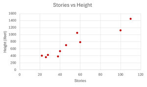
- The height (sidewalk to roof) of notable tall buildings in America is compared to the number of stories of the building (beginning at street level).
Height (in feet) Number of Stories 1,050 57 428 28 362 26 529 40 790 60 401 22 380 38 1,454 110 1,127 100 700 46 - Decide which variable should be the independent variable and which should be the dependent variable.
- Draw the scatter diagram for this data.
Click to see Answer
- Independent: number of stories; Dependent: height
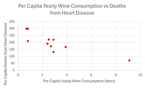
- The following table shows data on average per capita wine consumption and heart disease rate in a random sample of 10 countries.
Per Capita Yearly Wine Consumption in Liters Per Capita Death from Heart Disease 2.5 221 3.9 167 2.9 131 2.4 191 2.9 220 0.8 297 9.1 71 2.7 172 0.8 211 0.7 300 - Decide which variable should be the independent variable and which should be the dependent variable.
- Draw a scatter plot of the ordered pairs.
Click to see Answer
- Independent: yearly wine consumption; Dependent: death from heart disease
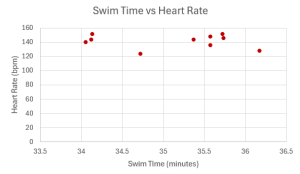
- The following table consists of one student athlete’s time (in minutes) to swim 2000 meters and the student’s heart rate (beats per minute) after swimming on a random sample of 10 days.
Swim Time Heart Rate 34.12 144 35.72 152 34.72 124 34.05 140 34.13 152 35.73 146 36.17 128 35.57 136 35.37 144 35.57 148 - Decide which variable should be the independent variable and which should be the dependent variable.
- Draw a scatter plot of the ordered pairs.
Click to see Answer
- Independent: swim time; Dependent: heart rate
"12.3 Scatter Diagrams" and “12.8 Exercises” from Introduction to Statistics by Valerie Watts is licensed under a Creative Commons Attribution-NonCommercial-ShareAlike 4.0 International License, except where otherwise noted.
