12.3 Correlation
LEARNING OBJECTIVES
- Calculate and interpret the correlation coefficient.
The purpose of simple linear regression is to build a linear model that can be used to make predictions of the [latex]y[/latex] variable for a given value of the [latex]x[/latex] variable. Of course, we want the model to give us good predictions—there is no point in using a model that gives bad or inaccurate predictions. But how can we tell if the linear model will provide accurate predictions? As we have seen, we can examine the scatter diagram for a set of data to get a sense of the strength and direction of the linear relationship between the independent variable [latex]x[/latex] and the dependent variable [latex]y[/latex]. But we would like a numerical measure of the strength and direction of the linear relationship we observe on the scatter diagram. This numerical measure is called the correlation coefficient.
The correlation coefficient was developed by Karl Pearson in the early 1900s and is sometimes referred to as Pearson's correlation coefficient. Denoted by [latex]r[/latex], the correlation coefficient is a numerical measure of the strength and direction of the linear relationship between the independent variable [latex]x[/latex] and the dependent variable [latex]y[/latex]. Although there is an algebraic formula to find the value of [latex]r[/latex], we will perform the calculation using the built-in function in Excel.
Interpreting the Correlation Coefficient
What does the value of [latex]r[/latex] tell us?
- The value of the correlation coefficient [latex]r[/latex] is always a number between [latex]-1[/latex] and [latex]1[/latex].
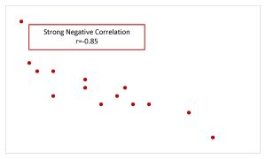
- Values of [latex]r[/latex] close to [latex]1[/latex] or [latex]-1[/latex] indicate a strong linear relationship between [latex]x[/latex] and [latex]y[/latex]. If [latex]r=1[/latex], then there is a perfect, positive correlation between [latex]x[/latex] and [latex]y[/latex], in which case the points on the scatter diagram would all lie on a straight line that rises from left to right. If [latex]r=-1[/latex], then there is a perfect, negative correlation between [latex]x[/latex] and [latex]y[/latex], in which case the points on the scatter diagram would all line on a straight line that falls from left to right.
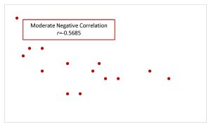
- Values of [latex]r[/latex] close to [latex]0.5[/latex] or [latex]-0.5[/latex] indicate a moderate linear relationship between [latex]x[/latex] and [latex]y[/latex].
- Values of [latex]r[/latex] close to [latex]0[/latex] indicate a weak linear relationship between [latex]x[/latex] and [latex]y[/latex]. If [latex]r=0[/latex], then there is no correlation between [latex]x[/latex] and [latex]y[/latex].
What does the sign of [latex]r[/latex] tell us?
- A positive value of [latex]r[/latex] means that the points on the scatter diagram have the general tendency to rise from left to right. In other words, when [latex]x[/latex] increases, [latex]y[/latex] tends to increase, and when [latex]x[/latex] decreases, [latex]y[/latex] tends to decrease.
- A negative value of [latex]r[/latex] means that the points on the scatter diagram have the general tendency to fall from left to right. In other words, when [latex]x[/latex] increases, [latex]y[/latex] tends to decrease, and when [latex]x[/latex] decreases, [latex]y[/latex] tends to increase.
| Positive Correlation | Negative Correlation | |
|---|---|---|
| Strong Correlation | 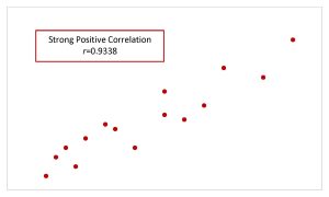 |
 |
| Moderate Correlation | 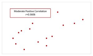 |
 |
| Weak Correlation | 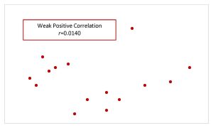 |
 |
CALCULATING THE CORRELATION COEFFICIENT IN EXCEL
To calculate the correlation coefficient, use the correl(array,array) function. Enter the cell array containing the independent variable data into one of the arrays and enter the cell array containing the dependent variable data into the other array.
The output from the correl function is the value of the correlation coefficient.
Visit the Microsoft page for more information about the correl function.
NOTE
The arrays containing the independent and dependent variable data may be entered into the correl function in either order. The output from the correl function does not depend on the order in which the arrays are entered.
EXAMPLE
A statistics professor wants to study the relationship between a student's score on the third exam in the course and their final exam score. The professor took a random sample of [latex]11[/latex] students and recorded their third exam score (out of [latex]80[/latex]) and their final exam score (out of [latex]200[/latex]). The results are recorded in the table below.
| Student | Third Exam Score | Final Exam Score |
|---|---|---|
| 1 | 65 | 175 |
| 2 | 67 | 133 |
| 3 | 71 | 185 |
| 4 | 71 | 163 |
| 5 | 66 | 126 |
| 6 | 75 | 198 |
| 7 | 67 | 153 |
| 8 | 70 | 163 |
| 9 | 71 | 159 |
| 10 | 69 | 151 |
| 11 | 69 | 159 |
- Find the correlation coefficient for this data.
- Interpret the correlation coefficient found in part 1.
Solution
- Enter the data into an Excel spreadsheet. For this example, suppose we entered the data (without the column headings) so that the student column is in column A from A1 to A11, the third exam score is in column B from B1 to B11, and the final exam score is in column C from C1 to C11.
Function correl Field 1 B1:B11 Field 2 C1:C11 Answer 0.6631 The value of the correlation coefficient is [latex]r=0.6631[/latex].
By examining the scatter diagram for this data, shown below, we can see that the points are rising from left to right (corresponding to the fact that [latex]r[/latex] is positive) and the general pattern of points corresponds to a moderate linear relationship (corresponding to the fact that [latex]r[/latex] is close to [latex]0.5[/latex]).

- There is a moderate, positive linear relationship between the third test score and the final exam score.

NOTES
- In this case, the value of [latex]r[/latex] is close to [latex]0.5[/latex], so we would consider this a moderate linear relationship.
- When writing down the interpretation of the correlation coefficient, remember to be specific to the question using the actual names of the independent and dependent variables. Also make sure to include in the sentence the strength of the linear relationship (strong, moderate, or weak) and the direction of the linear relationship (positive or negative).
TRY IT
SCUBA divers have maximum dive times they cannot exceed when going to different depths. The data in the table below shows different depths with the maximum dive times in minutes.
| Depth (in feet) | Maximum Dive Time (in minutes) |
|---|---|
| 50 | 80 |
| 60 | 55 |
| 70 | 45 |
| 80 | 35 |
| 90 | 25 |
| 100 | 22 |
- Find the correlation coefficient for this data.
- Interpret the correlation coefficient found in part 1.
Click to see Solution
- [latex]\displaystyle{r=-0.9629}[/latex]
- There is a strong, negative linear relationship between depth and maximum dive time.
Correlation versus Causation
The correlation coefficient only measures the correlation between two variables, not causation. A strong correlation between two variables does not mean that changes in one variable actually cause changes in the other variable. The correlation coefficient can only tell us that changes in the independent variable and dependent variable are related. In general, remember that "correlation does not equal causation."
Video: "Using Excel to calculate a correlation coefficient || interpret relationship between variables" by Matt Macarty [5:22] is licensed under the Standard YouTube License.Transcript and closed captions available on YouTube.
Exercises
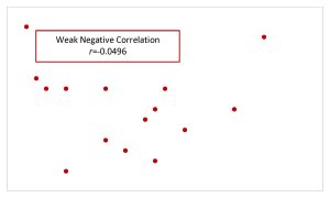
- For each scatter diagram shown below, determine if the value of the correlation coefficient indicates a strong, moderate, or weak linear relationship and a positive or negative linear relationship.
Click to see Answer
- strong, positive
- moderate, negative
- weak, positive
-
- What does an [latex]r[/latex] value of [latex]0[/latex] mean?
Click to see Answer
There is no linear relationship between the independent and dependent variables.
- Interpret each of the following values of [latex]r[/latex].
- [latex]r=0.67[/latex]
- [latex]r=-0.12[/latex]
- [latex]r=-0.93[/latex]
Click to see Answer
- There is a moderate, positive linear relationship between the independent and dependent variables.
- There is a weak, negative linear relationship between the independent and dependent variables.
- There is a strong, negative linear relationship between the independent and dependent variables.
- In a random sample of ten professional athletes, the number of endorsements the player has and the amount of money (in millions of dollars) the player earns are recorded in the table below.
Player Number of Endorsements Money Earned (in millions) 1 0 2 2 3 8 3 2 7 4 1 3 5 5 13 6 5 12 7 4 9 8 3 9 9 0 3 10 4 10 - Calculate the correlation coefficient.
- Interpret the correlation coefficient.
Click to see Answer
- [latex]0.9786[/latex]
- There is a strong, positive linear relationship between the number of endorsements and money earned.
- The table below gives the percentage of workers who are paid hourly rates for the years 1979 to 1992.
Year Percent of Workers Paid Hourly Rates 1979 61.2 1980 60.7 1981 61.3 1982 61.3 1983 61.8 1984 61.7 1985 61.8 1986 62.0 1987 62.7 1990 62.8 1992 62.9 - Find the correlation coefficient
- Interpret the correlation coefficient.
Click to see Answer
- [latex]0.9448[/latex]
- There is a strong, positive linear relationship between the year and the percentage of workers paid an hourly rate.
- The table below contains real data for the first two decades of AIDS cases.
Year Number of AIDS Cases 1981 319 1982 1,170 1983 3,076 1984 6,240 1985 11,776 1986 19,032 1987 28,564 1988 35,447 1989 42,674 1990 48,634 1991 59,660 1992 78,530 1993 78,834 1994 71,874 1995 68,505 1996 59,347 1997 47,149 1998 38,393 1999 25,174 2000 25,522 2001 25,643 2002 26,464 - Calculate the correlation coefficient.
- Interpret the correlation coefficient.
Click to see Answer
- [latex]0.4526[/latex]
- There is a moderate, positive linear relationship between the year and the number of AIDS cases.
- Recently, the annual number of driver deaths per [latex]100,000[/latex] for the selected age groups was as follows:
Age Number of Driver Deaths per [latex]100,000[/latex] 17.5 38 22 36 29.5 24 44.5 20 64.5 18 80 28 - Find the correlation coefficient.
- Interpret the correlation coefficient.
Click to see Answer
- [latex]-0.5787[/latex]
- There is a moderate, negative linear relationship between age and the number of driver deaths per [latex]100,000[/latex].
- The table below shows the life expectancy for an individual born in the United States in certain years.
Year of Birth Life Expectancy 1930 59.7 1940 62.9 1950 70.2 1965 69.7 1973 71.4 1982 74.5 1987 75 1992 75.7 2010 78.7 - Find the correlation coefficient
- Interpret the correlation coefficient.
Click to see Answer
- [latex]0.9614[/latex]
- There is a strong, positive linear relationship between year and life expectancy.
- The height (sidewalk to roof) of notable tall buildings in America is compared to the number of stories of the building (beginning at street level).
Height (in feet) Number of Stories 1,050 57 428 28 362 26 529 40 790 60 401 22 380 38 1,454 110 1,127 100 700 46 - Find the correlation coefficient
- Interpret the correlation coefficient.
Click to see Answer
- [latex]0.9436[/latex]
- There is a strong, positive linear relationship between number of stories and height.
- The following table shows data on average per capita wine consumption and heart disease rate in a random sample of 10 countries.
Per Capita Yearly Wine Consumption in Liters Per Capita Death from Heart Disease 2.5 221 3.9 167 2.9 131 2.4 191 2.9 220 0.8 297 9.1 71 2.7 172 0.8 211 0.7 300 - Find the correlation coefficient
- Interpret the correlation coefficient.
Click to see Answer
- [latex]-0.8359[/latex]
- There is a strong, negative linear relationship between per capita yearly wine consumption and per capita deaths from heart disease.
- The following table consists of one student athlete’s time (in minutes) to swim 2000 meters and the student’s heart rate (beats per minute) after swimming on a random sample of 10 days.
Swim Time Heart Rate 34.12 144 35.72 152 34.72 124 34.05 140 34.13 152 35.73 146 36.17 128 35.57 136 35.37 144 35.57 148 - Find the correlation coefficient
- Interpret the correlation coefficient.
Click to see Answer
- [latex]-0.1236[/latex]
- There is a weak, negative linear relationship between swim time and heart rate.


"12.4 Correlation" and “12.8 Exercises” from Introduction to Statistics by Valerie Watts is licensed under a Creative Commons Attribution-NonCommercial-ShareAlike 4.0 International License, except where otherwise noted.
