Accessibility Quick Start Guide
In this section:
When creating content on FanshaweOnline, consider the following best practices:
Best Practices to Maximize FOL Accessibility
1. Use Templates
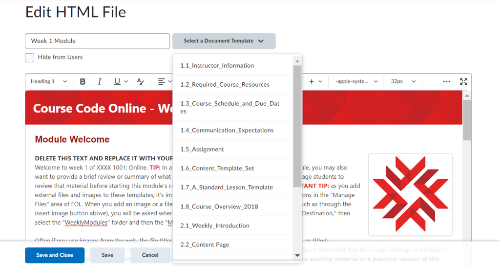
FanshaweOnline contains premade course templates that are designed with accessibility in mind; they include accessible colour, font and structural elements.
If you are in the School of Language and Liberal Studies, LLS has a series of online and blended templates for various modes of delivery and content (including the WRIT curriculum). For help using and accessing the templates, please reach out to your educational support technology (EST) or eLearning Coordinator for more help.
Additional college-approved template options can also be found directly within the FOL environment. For additional help using these templates, you can reach out to the Center for Online and Blended Learning or Learning Systems Services for more information.
Be consistent: use the Weekly Introduction for all introductory pages, the content page for all course content, etc.
Each FOL content page requires a title. Give each page a descriptive, unique title.
Video Example
Below is an example of how a screen reader navigates content topic titles in FOL.
Direct link: NVDA – FOL Page Titles [0:59] by Kathy Day. Captions are available on YouTube.
Where Can I View the Templates?
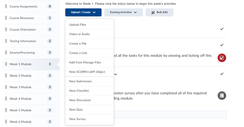
In course content, select the “Upload/Create” button and then select “Create a File,” which will create a blank HTML page. Choose an appropriate template in the Select a Document Template menu before you add any content, and click “Save” to apply the template.
2. Use Appropriate Fonts and Color Contrast
Font
Use the built-in editor tools to change the font. All font options are available on the FOL editor toolbar.
- Use a sans-serif font with a minimum size of 16. If you’re using a template, the font size should be set for you, but always check. In FOL, the recommended font from the dropdown editor is LATO, and the recommended/default font size is 19xp
- Avoid excessive italics
- Left align text for languages that read left to right.
Colour Contrast
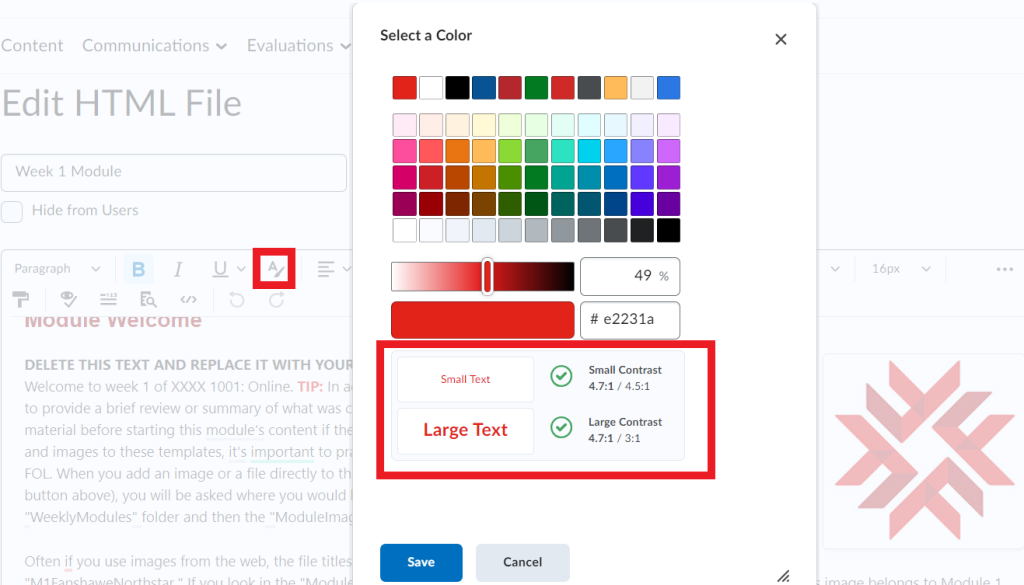
Contrast must be at least 4.5:1 for normal text (11-12 points) and 3:1 for large text (18 points +). Use the Accessibility Checker to verify.
To select font colours:
- Highlight the text
- Select the Select Color button in the toolbar
- In the Select a Color dialogue, use the sliders to change your colour until the contrast is at least 4.5:1
Do not use colour alone to convey meaning or emphasis. You may use coloured text to highlight content, but the best practice would be to also bold the text and include an indication, such as “important” or “remember” in text form. Further, ensure charts and diagrams do not rely on colour alone to convey meaning or relationships; consider using different line shapes, symbols, and labels.
![]() Refer to section 3.2 Headings, Fonts, and Hyperlinks of this guide for more information.
Refer to section 3.2 Headings, Fonts, and Hyperlinks of this guide for more information.
3. Write Descriptive Linked Text
Use linked text, not bare URLs. Write a description of the link destination, highlight the relevant text, and use the Insert Quicklink button to add a link.
Self-describing links are useful for all learners. A good descriptive hyperlink tells the reader what the linked resource is, a reason to visit the page, and who hosts it.
- Hyperlink text should be unique and descriptive.
- Do not rely on surrounding text to provide context.
- Do not paste URLs as text.
- Read a URL aloud to yourself. Is it a pleasant experience? Assistive technology will read the full URL aloud if present. Avoid including the full URL. If you feel it must be included, consider using a link shortener like bitly.
- Do not hyperlink phrases such as “click here,” “Link:,” “See,” or “click for details.”
- Users know they must click on a hyperlink. Consider telling users where the link will take them and why they might want to go.
- Assistive technology indicates links to users. Using “Link: example” will read as “Link link: example.”
- If multiple hyperlinks link to the same destination, make the link text the same.
Consider the accessibility of the resource you are linking to. Also, consider indicating that you are linking to a video or an interactive element.
Adding Hyperlinks in FOL (Quicklink)
- Highlight your descriptive text
- Select the link icon (looks like a small chain)
- Or, press Control (Command on macOS) and K
- Paste the URL in the dialogue that appears

Additionally, you can insert a link via the format toolbar:
- Choose the Insert Quicklink button and select the URL.
- Paste the URL in the appropriate field and add your descriptive text in the Title field.
- Select Insert

Note: In FanshaweOnline, when adding links, the default option is to allow links to “Open in New Window.” This is the recommended setting.
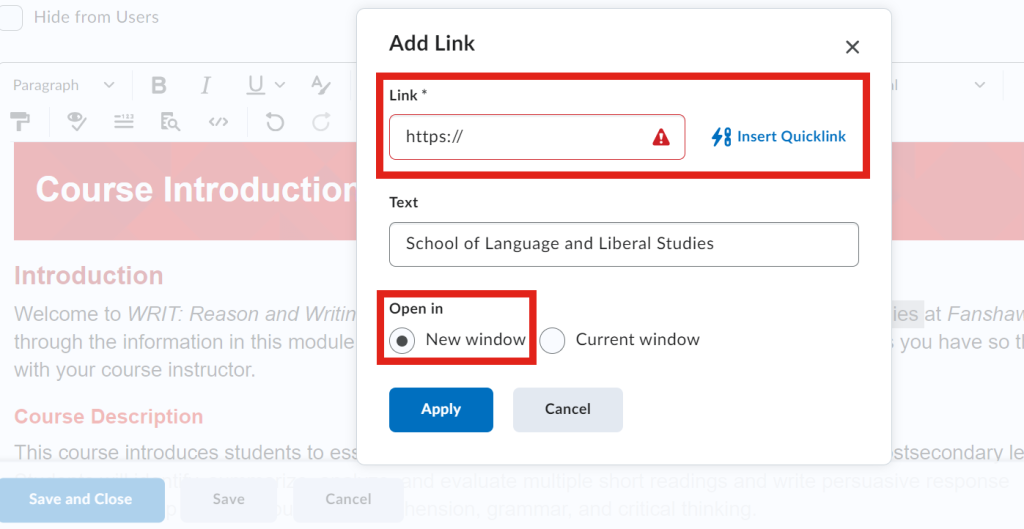
Try to choose the most accessible resource available. The University of Washington Disabilities, Opportunities, Internetworking, and Technology Center suggests avoiding PDFs. They suggest providing PDFs only as a secondary, alternate source of the information presented in HTML.
Uploaded documents (Word, PDF, etc.) must be checked for accessibility before you add them to your FOL course. See the other Appendices in this guide for help with WORD, PowerPoint and PDF files.
Video Example
Below is an example of how a screen reader navigates a descriptive link in FOL
Direct link: NVDA – FOL Descriptive Links [0:11] by Kathy Day. Captions are available on YouTube.
![]() Refer to section 3.2 Headings, Fonts, and Hyperlinks of this guide for more information.
Refer to section 3.2 Headings, Fonts, and Hyperlinks of this guide for more information.
4. Use Tools for Structure
Use built-in tools for headings, lists, and tables.
Headings
Headings allow learners to understand the logical structure of the page and navigate to different sections. Assistive technology can convey this structure to screen readers and speech-to-text software if the headings are properly formatted, not simply larger and bold text.
Pages should begin with an H1, with H2s, H3s, etc. nested below. Headings must be in sequential order. Do not skip a heading level. Body or paragraph text may follow any heading level. (Note: If the heading levels are not in order, the Accessibility Checker will report that the Heading order must be sequential.) The HTML editor offers tools to build proper heading hierarchies. Highlight text and choose the appropriate heading level.
Consider H1 as the title, H2 as section headings, H3 as sub-section headings, etc.

Video Example
Below is an example of how a screen reader navigates a page in FOL with the use of Headings.
Direct link: JAWS – FOL Headings [0:33] by Kathy Day. Captions are available on YouTube.
Lists
Bulleted (unordered) lists should be used for a list of items with no emphasis on their order, and numbered (ordered) lists should be used for items where sequential order is necessary, such as steps in a process. Properly formatted lists organize your information effectively and communicate it to assistive technology users as you intended. Do not manually insert symbols and use Tab to create indents. The Accessibility Checker may note improperly formatted lists.
To make a properly formatted list:
- Select the content you wish to make into a list
- Select the List menu button

Video Example
Below is an example of how a screen reader navigates a list in FOL.
Direct link: NVDA – FOL Lists [0:34] by Kathy Day. Captions are available on YouTube.
Tables
Properly formatted tables are accessible to text-to-speech and screen reader software. Use the built-in tool to create a table.
Here are some common errors the Accessibility checker will flag in table formatting:
- Tables must have captions.
- How to fix: set a brief descriptive text to indicate the content of the table. The simplest way is via the Accessibility checker tool, which will prompt for a caption. This will add <caption> to within the <table> element.
- Tables must have at least one header.
- How to fix: the simplest way is via the Accessibility checker tool which will prompt you to choose table header to “Header Row” or “Header Column”, which will change the selected data cells <td> to header cells <the>.
- Table headers must be associated with cells.
- How to fix: Set header scope to “Row” or “Column” for simple table header, which will add scope attribute (<th scope=”row”> or <th scope=”col”) to associate header cells and data cells.
*If that all seems rather complicated, do not worry, the FOL accessibility checker will walk you through step-by-step to make tables accessible.

Video Example
Below is an example of how a screen reader navigates a table in FOL.
Direct link: NVDA – FOL Tables [0:37] by Kathy Day. Captions are available on YouTube.
5. Include Alternative Text
Screen reader software can read users’ descriptions of images. The alt text should convey the information and context of the image in a concise way.
When adding an image, you will be prompted to add alternative text. Mark decorative images using the This image is decorative checkbox. Note: This method limits alt text to 200 characters.
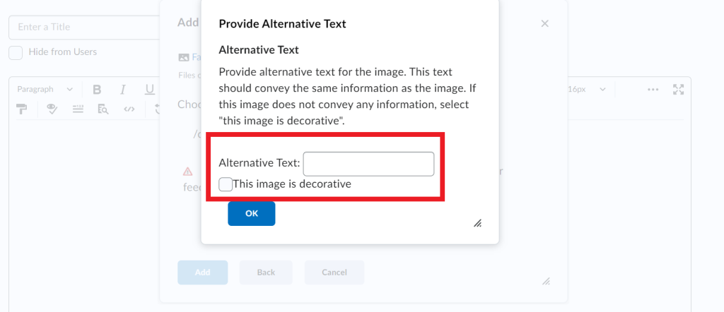
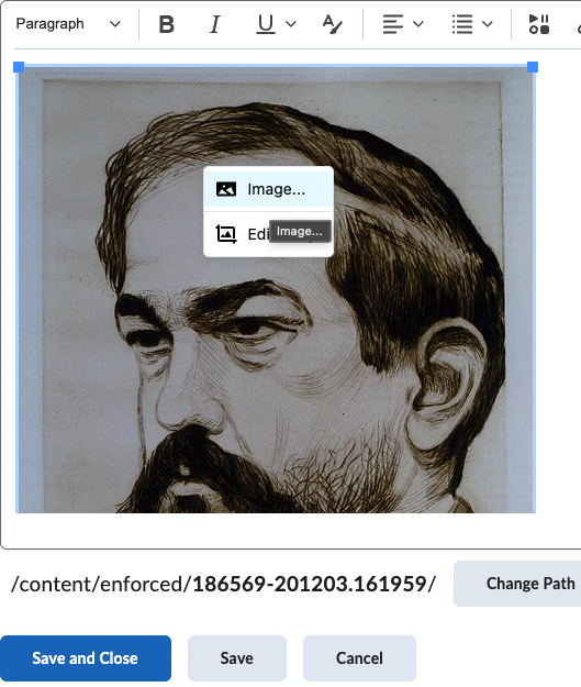
If you have an existing image without alt text, right-click on the image and select Image:
Enter alt text in Alternative description field and click Save:
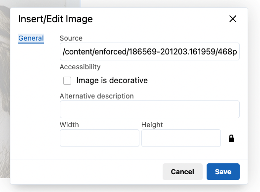
Adding alt text using this method does not impose a character limit.
The Accessibility Checker will display “Images must have alternative text” if alt text is not added. Alt text can also be added from inside the accessibility report panel.
Consider why each image has been included. Some images may be a useful way to break up blocks of text and reinforce information. However, avoid adding numerous decorative images, as this will unnecessarily clutter the content pages.
Video Example
Below is an example of how a screen reader navigates an image with ALT text in FOL.
Direct link: NVDA – FOL Images [0:26] by Kathy Day. Captions are available on YouTube.
![]()
Refer to section 3.6 Images and Alt Text of this guide for more information.
6. Caption and Transcribe Media
Embedded or linked videos should be captioned. Audio recordings should have a transcript attached. Ensure media does not automatically play. When choosing videos from services such as YouTube, make sure to select videos that contain either captions or transcripts. Ensure videos have accurate closed captions. When uploading your own videos, ensure that you make use of the captions and subtitles tool within YouTube or the captions tool in Screenpal (applies to LLS only). When sharing or uploading audio, be sure to include transcripts or alternate information for audio recordings (i.e., Podcasts, audio instructions, etc.) if possible.
Kaltura (Captioning) – Captioning Kaltura Videos
Kaltura is FOLs integrated video sharing and screen recording software.
Kaltura uses automatic speech recognition (ASR) technology to generate captions automatically, a process that converts the audio content of a video into text and displays the text at the bottom of the video screen. When a video is uploaded, the captioning process begins immediately. Captions are created based on the video’s audio track and the audio content is assumed to be in the English language. The captioning process may take several minutes to several hours to complete, depending on the length of the video.
Captions do not display by default; users watching a video must click the “CC” button in the video player to display captions.
Please see the Kaltura Knowledge Base for more information about using captions in Kaltura.
Reach out to your EST or Learning Systems Services for questions about using Kaltura MyMedia in FanshaweOnline.
For more detailed information about captioning and transcripts, review Humber College’s open resource, Making Accessible Media, for additional help.
![]() Refer to section 3.7 Multimedia (Audio & Video) of this guide for more information.
Refer to section 3.7 Multimedia (Audio & Video) of this guide for more information.
7. Run the Accessibility Checker
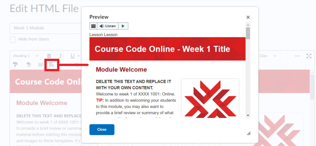
The accessibility checker may catch common accessibility issues in your content and offer suggestions to help you fix the issues. The accessibility checker is available on the HTML editor toolbar in FOL.
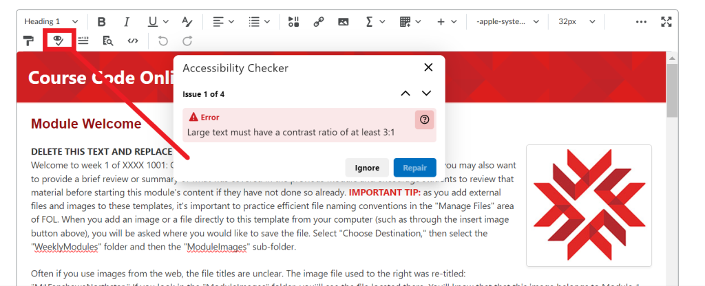
How to Locate the Checker Tool
NOTE: Third-party external learning tools are not part of the system check. Tools that plugin to FOL, such as Zoom, H5P, publisher resources, and Kaltura are not checked by the System Check.
Consider the following manual and automated checks to maximize the accessibility of your FOL content:
| Accessibility Consideration | Best Practices |
|---|---|
| Prefer HTML, Word documents, and PowerPoint files. Use accessibility checkers in Brightspace, Word, and PowerPoint.
Avoid PDFs as they are exceedingly difficult to make accessible. |
Use Upload/Create > Create a File to create HTML pages.
Use Upload/Create > Upload Files to add Word and PowerPoint documents. |
| Use font size 16 minimum and prefer sans-serif fonts. | Use the provided templates. |
| Use headings. | Add headings using the Styles menu. Apply headings in sequential order without skipping a heading level. |
| Use numbered lists for steps in a process and bulleted lists for groupings of items. | Use the List menu in the FOL editor. |
| Provide meaningful text descriptions of link destinations. Do not include raw URLs or unclear link text such as “click here” or “read more.” |
|
| Ensure adequate colour contrast, and do not use colour alone to differentiate or emphasize. | The FOL accessibility checker will flag inaccessible colour contrast.
Use colour and a symbol or text-based cue to differentiate information. |
| Provide alternative text. | Add a description of the image when adding images to HTML pages.
Check This image is decorative for images that are not necessary to understand information or present the same information that is already available in text format. |
| Tables are only used to represent data. | Do not use an invisible table for alignment or layout purposes.
Tables must have header rows and/or columns. Avoid blank, merged, and split cells. |
| Math content must be accessible. | Use the FOL Brightspace Equation Editor to create accessible math and notation. |
| Caption videos and transcribe audio. | Use Kaltura to host video content. Edit automatically generated captions and use Insert Stuff > My Media to add video content.
Use Word’s transcription tools to provide a text equivalent of audio content. |
| Any external learning tools and activities are accessible. | Look for accessibility information on the platform or vendor’s webpage. Prepare an alternative activity or assessment in the event of an inaccessibility. |
8. Be Aware of ReadSpeaker Tool
ReadSpeaker has been integrated into FanshaweOnline to support Fanshawe College’s strategic goals and Universal Design for Learning (UDL) principles. ReadSpeaker is a cloud-based software that helps break down barriers to education by speech-enabling content to ensure it’s accessible to students with diverse abilities and learning styles. Type your examples here.
The benefits of text-to-speech software:
- Supports different learning styles\
- Provides mixed presentation for low literacy readers
- MP3 audio files provide access to content on the go
- Increases opportunities to learn for students with learning disabilities
- Improves access to content for learners with mild visual impairments
- Helps ESL students increase reading comprehension and vocabulary
The advantages of using ReadSpeaker are:
- Stream or download as .mp3 files to listen later
- Cloud-based technology that does not require a software download
- webReader enables speech for web pages (HTML files) in the FOL Content area
- docReader enables speech for non-html documents by converting them to a web-readable format
- Documents can be viewed and listened to in web browsers on PCs, laptops and mobile devices
- Both webReader and docReader interfaces are simple and intuitive to use, requiring low physical effort
For more information on ReadsSpeaker, please see the help guide within FanshaweOnline.
ReadSpeaker webReader
With the ReadSpeaker webReader, the content of HTML files in FanshaweOnline (FOL) can be read aloud to you. You won’t need to download any software, and it works with a web browser:
- Safari and Chrome on Macs
- IE, Edge, Chrome, Firefox or Safari on Windows PCs and laptops
- Safari and Chrome on iOS mobile devices
- Chrome and Edge on Windows mobile devices
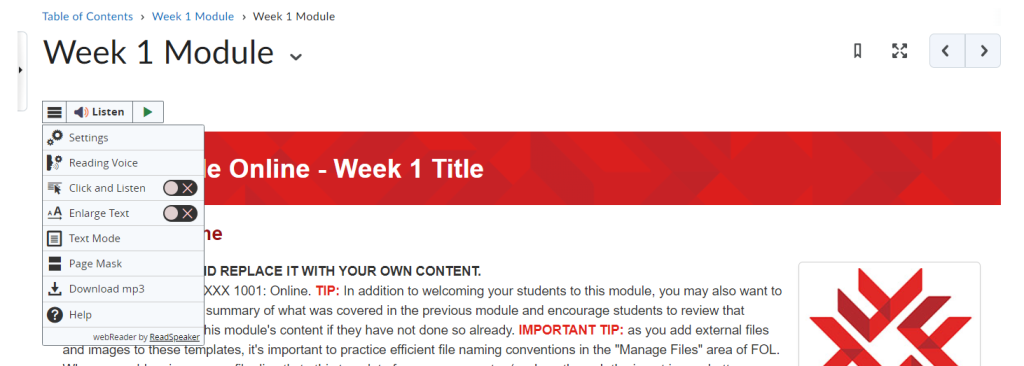
ReadSpeaker docReader
ReadSpeaker docReader allows non-HTML documents in FOL Content to be read out loud to you.
The Open with docReader button is located at the bottom of the Document Viewer when you are reading non-html content in FanshaweOnline. You simply click the Open with docReader button to open the content in docReader. docReader converts the text into a web-readable format, so you can use docReader on mobile devices that don’t have the native software installed. The following document formats are supported in FanshaweOnline:
- Microsoft PowerPoint (.pps, .ppt, .pptx)
- Microsoft Word (.doc, .docx)
- Portable Document Format (.pdf)
- Rich Text Format (.rtf)
- Apache OpenOffice/LibreOffice Presentation, Open Document Presentation (.odp)
- Apache OpenOffice/LibreOffice Writer, Open Document Text (.odt)
ePub (.epub)

Moving forward…
Focus on creation and revision, not remediation. Use the practices in this guide the next time you create a page or update an existing one. Don’t focus on going back and fixing every page you have. Focus on making your new content more inclusive and accessible.
Use this Brightspace Accessibility Checklist (PDF, 306 KB) to check your FOL content as you work.
Video Examples
To view the video examples listed above in an interactive H5P, please visit FanshaweOnline Screen Reader Video Examples in the back matter of this guide.
Further Readings
Below are some additional links to resources for accessibility and Brightspace (FOL):
- D2L article on using the Brightspace Accessibility Checker.
- Meeting web content accessibility standards.
- Accessible courses and course material.
- Video: New Accessibility Checker in Brightspace HTML Editor
- UW DOIT Center 20 Tips for Teaching Accessible Online Courses.
Preset document or file format, used for consistency without having to recreate each time
Colour contrast is the difference in saturation, brightness, and pigment of different elements relative to one another. A contrast ratio of at least 4.5:1 between text and background is required by common accessibility standards.
Also known as a link, a hyperlink directs users to a different portion of a document or page, or an entirely different document or page, once clicked or tapped by users.
Text that is larger and more distinct than regular paragraph text, used to convey the organization of content.
The HTML attribute (alt='' '') used in HTML documents to specify alternative text that is to be rendered when the element to which it is applied cannot be rendered. It is used by "screen reader" software so that a person who is listening to the content of a webpage (for instance, a person who is blind) can interact with this element.
A text equivalent of audio content in a video, displayed synchronously. Closed captions are toggled on or off by viewers, as opposed to open captions that are burned into the video and always displayed.

