3.4 Colour and Contrast
Ask Yourself
![]()
Are your course designs strictly monochrome, or do you like to use colour? How can you use colour in a way that supports all learners?
Using colour is an easy way to add visual interest to course content. By following a few steps, it’s easy to ensure colour is used in a way that won’t exclude any students from engaging with colourful courses.
Both colour and colour contrast are important to consider because not all students process colour in the same way. Students with colour blindness won’t process colour the same way as others, and students with vision impairments require text that is clear and legible if they do not use screen readers.
Here are a few ways to improve your use of colour:
Don’t use colour alone, to convey concepts. Not everyone sees colour the same way, and screen readers won’t convey colour at all, so students might miss key information if it’s conveyed only via colour.
Don’t let this discourage the use of colour on a page. Instead, ensure any concepts are also conveyed in another visual way.
| Incorrect | Correct |
|---|---|
| Key terms to study for the exam will be conveyed in red, like so:
“The agora is worth exploring as a prototype for modern public spaces.” |
Key terms to study for the exam will be conveyed in red, followed by (!), like so:
“The agora (!) is worth exploring as a prototype for modern public spaces.” |
Ensure link colour is distinct from surrounding text colour. Links should be clearly distinguishable from their surrounding text, not only through underlining, but also via colour. By default, links in Microsoft Word become blue and links in USask’s instance of Canvas become green. When writing documents or webpages, avoid using these same blues or greens for regular text.
Use a contrast of 7:1 for text and background colours. A variety of colour combinations are available when writing your course content, however only a limited number are truly accessible. While you may have no issue reading your colourful text, it may lack the necessary contrast against its background to be legible for students who have vision impairments.
Text may be readable for those with a screen reader; however, it’s important to note that not all students with vision impairments will use a screen reader.
Web Resources
![]() The WebAIM Contrast Checker will allow you to input the hex codes for two colours (text and background) to ensure there is sufficient contrast between them.
The WebAIM Contrast Checker will allow you to input the hex codes for two colours (text and background) to ensure there is sufficient contrast between them.
Wondering how to get the hex codes for your colours? Try these steps:
- Microsoft Word documents
- Highlight the word(s) that you want to investigate
- Click the “Home” tab on the ribbon
- Font colour: Under the “Font” section, click the down chevron icon beside “Font Color”
- Background colour: Under the “Paragraph” section, click the down chevron icon beside “Shading”
- Click “More colors…”
- Click the “Custom” tab
- Copy the # and the numbers/letters in the “Hex” field
- FanshaweOnline HTML/Editor pages
- Click </> to access the html editor
- Press CONTROL+F on Windows or COMMAND+F on Mac
- Type in the first few words of the text that you want to investigate
- On the same line as the words you’re investigating, look for “color: #…”
- Copy the # and the numbers/letters that follow
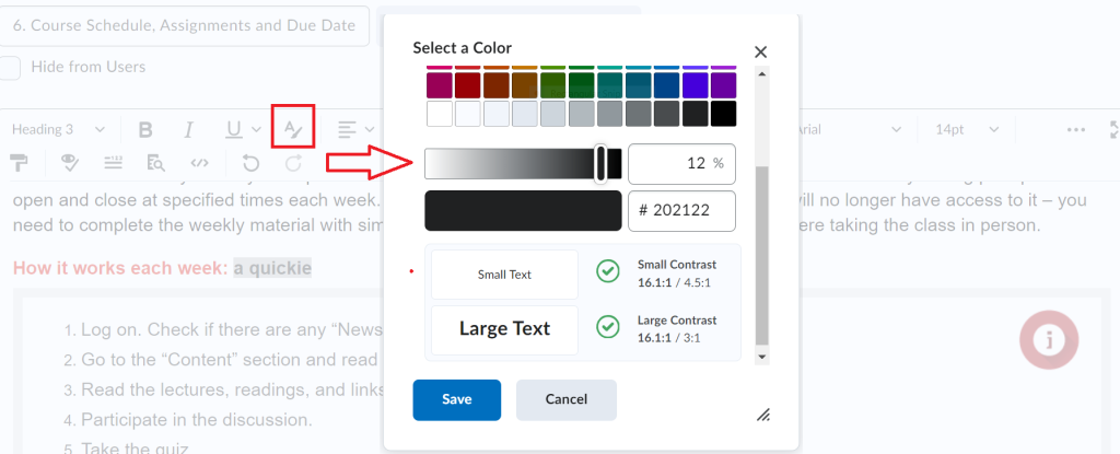
- Note: when working on an HTML page, you can also use the “Select Color” button on the editor to choose different colours for text; you’ll be able to view the built-in colour contact checker to ensure that your colour choices are correct for accessibility (see Figure 3.2 below).

For more information on FOL Accessibility, refer to Appendix 4: FanshaweOnline Accessibility in this guide.
Reflection: One Small Step
![]()
Skim your course for a single element with colour. Check if the colour is accessible based on the recommendations above.

