17 RStudio Workshop: T-Tests
T-tests in R are one of the most common tests in statistics and are used to figure out if there’s a real difference between the averages of two groups. There are two types: one for comparing two separate groups and one for comparing two related groups. To use a t-test correctly, there are assumptions to keep in mind which I have listed below, along with the appropriate tests and corresponding codes you can use to check for them. However I will not be diving too much into them, they’re here for you to read through on your own. But you should speak with your supervisor regarding these assumptions and check for them if you are concerned with your data violating them. Remember, while it’s good to follow these rules, sometimes you can still get useful results even if you don’t follow them exactly. Just be careful and think about what your numbers mean before you start comparing them.
- Normality: The group data you collect should be spread out in a certain way that makes sense, and should follow a roughly normal distribution which is shaped like a bell curve. This is more important when you have only a small number of data points (less than 30).
- You can visually inspect the normality of your data using histograms, density plots, or Q-Q plots. For a more formal test, you can use the “Shapiro-Wilk test shapiro.test()” function or the “Anderson-Darling test ad.test()” function from the “nortest” package.
Shapiro-Wilk test for normality shapiro.test(data_vector)
Anderson-Darling test for normality (install and load "nortest" package) ad.test(data_vector)
- Homogeneity of Variance (Equal Variances): If you’re comparing two different things, the numbers you collect should be similar in terms of how much they spread out. This assumption is essential for the validity of the independent samples t-test. Some variations of the t-test allow for unequal variances.
- To test the homogeneity of variances between two groups, you can use Levene’s test leveneTest() function from the “car” package or Bartlett’s test bartlett.test() function from the base R. Levene’s test for homogeneity of variances ç) leveneTest(data_vector ~ group_variable)
- Bartlett’s test for homogeneity of variances
bartlett.test(data_vector ~ group_variable)
Remember to replace “data_vector” with your actual data and “group_variable” with the variable, or column name in the data file that defines your groups. It’s important to note that these tests can be sensitive to sample size and may not always provide conclusive results. It’s a good practice to complement formal tests with visual assessments of your data, such as plots, to make informed judgments about the assumptions. Additionally, if your data violates the assumptions, you might consider using robust alternatives or non-parametric tests that are less sensitive to these assumptions.
ONE-SAMPLE T-TEST
Used to compare the mean of one sample to a known standard (or theoretical/hypothetical) mean (μ). It allows you to answer the following research questions:
- Whether the mean of the sample is equal to the known mean?
- Whether the mean of the sample is less than the known mean?
- Whether the mean of the sample is greater than the known mean?
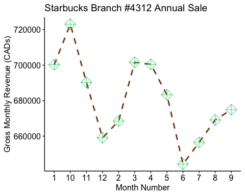
For example: let’s say we wanted to test whether the annual revenue for a branch of Starbucks was less than the usual amount (mu or μ = 900 K).
Using a function from the “readxl” library, we will load the excel file “OneSampleT_Test.xlsx” in R under the data_vector name “starbucks_rev”.
Tip: You can import and work with various data file formats (e.g., CSV, Excel, JSON) directly in RStudio using functions like read.csv() or read_excel().
starbucks_rev <- read_excel(file.choose())# orstarbucks_rev <-read_excel("OneSampleT_Test.xlsx")
Computing Summary Statistics
Let’s first compute some summary statistics of our data!
# Statistical summaries of monthly revenuesummary(starbucks_rev$monthly_rev)
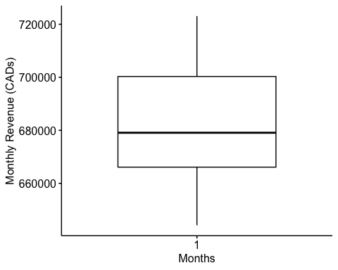
## Min. 1st Qu. Median Mean 3rd Qu. Max. ## 644201 666112 679089 680923 700306 723093
Here:
- Min.= the minimum value in the column
- 1st Qu. = the first quartile. 25% of values are lower than this.
- Median = the median value. Half the values are lower; half are higher.
- 3rd Qu. = the third quartile. 75% of values are higher than this.
- Max.= the maximum value
Visualization
Now that we have summarized our data, let’s make some plots.
Before doing so, this next code here is a little plot aesthetics cheat sheet I like to use when generating my plots. I copy and paste this code into all of my R scripts, it just makes the process of designing plots easier.
For a more comprehensive overview of all ~600 colours go to: Colours in R
# No margin around chartpar(mar=c(0,0,0,0))# Empty chartplot(0, 0, type = "n", xlim =c(0, 1), ylim =c(0, 1), axes = FALSE, xlab = "", ylab = "")# Settingsline <- 25col <- 5# Add color backgroundrect( rep((0:(col -1)/col),line) , sort(rep((0:(line -1)/line),col),decreasing=T), rep((1:col/col),line) , sort(rep((1:line/line),col),decreasing=T), border = "white" , col=colours()[seq(1,line*col)])# Color namestext( rep((0:(col -1)/col),line)+0.1 , sort(rep((0:(line -1)/line),col),decreasing=T)+0.015 , colors()[seq(1,line*col)] , cex=1)
# This code will generate the chart of shape typesdf_shapes <-data.frame(shape = 0:24)ggplot(df_shapes, aes(0, 0, shape = shape)) +geom_point(aes(shape = shape), size = 5, fill = 'red') +scale_shape_identity() +facet_wrap(~shape) +theme_void()
# This code will generate the chart of line typespar(mar=c(0,0,0,0))# Set up the plotting areaplot(NA, xlim=c(0,1), ylim=c(6.5, -0.5),xaxt="n", yaxt="n",xlab=NA, ylab=NA )# Draw the linesfor (i in0:6) {points(c(0.25,1), c(i,i), lty=i, lwd=2, type="l")}# Add labelstext(0, 0, "0. 'blank'" , adj=c(0,.5))text(0, 1, "1. 'solid'" , adj=c(0,.5))text(0, 2, "2. 'dashed'" , adj=c(0,.5))text(0, 3, "3. 'dotted'" , adj=c(0,.5))text(0, 4, "4. 'dotdash'" , adj=c(0,.5))text(0, 5, "5. 'longdash'", adj=c(0,.5))text(0, 6, "6. 'twodash'" , adj=c(0,.5))
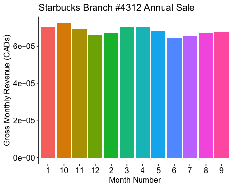
ggplot(starbucks_rev, aes(x=Month, y=monthly_rev, group = 1)) +geom_line(color='saddlebrown', linewidth=1, linetype='dashed') +# here we are designing what the lines look like, consult the cheat sheet # above for line optionstheme_pubr() +#changes overall look of the plot there are many theme options geom_point(shape=9, color='seagreen3', size=5) +#here we are designing how # we want each points on the plot to look like. Consult the cheat sheet in the #code chunk above for different point shapes. labs(x = "Month Number", y = "Gross Monthly Revenue (CADs)", title = "Starbucks Branch #4312 Annual Sale")
If you are interested in the design aspect of ggplots such as the different themes or other customization options I recommend the following guide ggplot2 themes and background colours
# Bar plotggplot(starbucks_rev, aes(x=Month, y=monthly_rev, fill=as.factor(Month)) ) +geom_bar(stat = "identity") +theme_pubr() +theme(legend.position="none") +labs(x = "Month Number", y = "Gross Monthly Revenue (CADs)", title = "Starbucks Branch #4312 Annual Sale")
ggboxplot(starbucks_rev$monthly_rev, ylab = "Monthly Revenue (CADs)", xlab = "Months",ggtheme =theme_pubr())
Computing a One Sample T-Test
# Lets compute the t-testt.test(starbucks_rev$monthly_rev, #a numeric vector containing our data valuesmu = 900000, #the theoretical mean. Default is 0 but you can change it. #For our example, in 2022 the average annual revenue for a single store was 900K so we will set#that up. alternative = "less") #the alternative hypothesis. Allowed value is one ## One Sample t-test
## data: starbucks_rev$monthly_rev## t = -33.013, df = 11, p-value = 1.176e-12## alternative hypothesis: true mean is less than 9e+05## 95 percent confidence interval:## -Inf 692840.8## sample estimates:## mean of x ## 680923
# of “two.sided”(default), “greater” or “less”.
Interpreting Results The result of the t.test() function is a list containing the following components:
- statistic = the value of the t-test statistics
- parameter = the degrees of freedom for the t-test statistics
- p.value = the p-value for the test
- conf.int = a confidence interval for the mean appropriate to the specified alternative hypothesis.
- estimate = the means of the two groups being compared (in the case of independent t-test) or difference in means (in the case of paired t-test).
Reporting The p-value of the test is 1.176e-12, which is less than the significance level alpha = 0.05. Therefore, we can conclude that the annual income of the Starbucks branch is significantly less than the typical amount ($900K) with a p-value = 1.18 10^{-12}.
UNPAIRED TWO-SAMPLE T-TEST
What if you wanted to compare two sample means?
For example, suppose that we have asked 100 individuals: 50 Adolescents (13-18 years) and 50 Adults (18+ years in age) to keep track and report the number of times they’ve visited Starbucks in a given month. We want to know if the mean number of visits for adolescents is significantly different from that of Adults.
An unpaired sample t-test allows you to investigate the same type of research questions as you did with a one sample t-test, however, instead of having a known mean, you are comparing the mean of two sample groups you’ve likely gathered data from.
# Importing data sett2data <-read_excel("TwoSampleT_Test.xlsx")# If .txt tab file, use this read.delim()# Or, if .csv file, use this read.csv()
# Lets check our datahead(t2data) #looking at the first 6 rows of data
## # A tibble: 6 × 2## Group StarbucksRun## <chr> <dbl>## 1 Adolescents 26## 2 Adolescents 16## 3 Adolescents 16## 4 Adolescents 23## 5 Adolescents 24## 6 Adolescents 20
# Or print all dataprint(t2data)
## # A tibble: 100 × 2## Group StarbucksRun## <chr> <dbl>## 1 Adolescents 26## 2 Adolescents 16## 3 Adolescents 16## 4 Adolescents 23## 5 Adolescents 24## 6 Adolescents 20## 7 Adolescents 23## 8 Adolescents 23## 9 Adolescents 22## 10 Adolescents 19## # ℹ 90 more rows
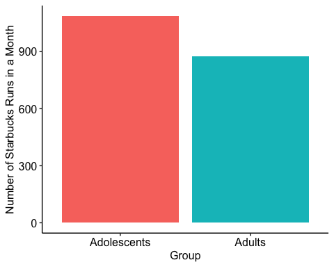
# Compute summary statistics by groups:group_by(t2data, Group) %>%summarise(count =n(),mean =mean(StarbucksRun, na.rm = TRUE),sd =sd(StarbucksRun, na.rm = TRUE) )
## # A tibble: 2 × 4## Group count mean sd## <chr> <int> <dbl> <dbl>## 1 Adolescents 50 21.8 5.14## 2 Adults 50 17.5 9.03
Visualization
# Bar plotggplot(t2data, aes(x=Group, y=StarbucksRun, fill=as.factor(Group)) ) +geom_bar(stat = "identity") +theme_pubr() +theme(legend.position="none") +labs(x = "Group", y = "Number of Starbucks Runs in a Month")
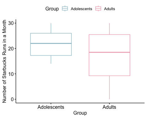
ggboxplot(t2data, x = "Group", y = "StarbucksRun", color = "Group", palette =c("lightblue3", "pink2"),ylab = "Number of Starbucks Runs in a Month", xlab = "Group")
# Compute t-testt.test.2 <-t.test(StarbucksRun ~ Group, data = t2data,alternative ="two.sided", #the alternative hypothesis. #Allowed value is one of “two.sided” (default), “greater” or # “less”. You may choose one depending on the type of # research question you are posing. var.equal = TRUE) #a logical variable indicating whether to # treat the two variances as being equal. If TRUE then the pooled variance is # used to estimate the variance otherwise the Welch test is used.t.test.2
## ## Two Sample t-test## ## data: StarbucksRun by Group## t = 2.9139, df = 98, p-value = 0.004422## alternative hypothesis: true difference in means between group Adolescents and group Adults is not equal to 0## 95 percent confidence interval:## 1.365205 7.194795## sample estimates:## mean in group Adolescents mean in group Adults ## 21.76 17.48
The p-value of the test is 0.004422, which is less than the significance level alpha = 0.05. We can conclude that an Adolescent’s average visit to Starbucks is significantly different from that of an Adult with a p-value = 0.004.
Note that here we used a t-test to determine whether the means of the two samples are different, which are called two-tailed tests. The following are examples of one-tailed t-tests:
- If we wanted to test whether the average Adolescent’s Starbucks run is less than that of an Adult’s we can use the following code:
t.test(StarbucksRun ~ Group, data = t2data, var.equal = TRUE, alternative = "less")
- If we wanted to test whether the average Adolescent’s Starbucks run is greater than that of an Adult’s we can use the following code:
t.test(StarbucksRun ~ Group, data = t2data, var.equal = TRUE, alternative = "greater")
