21 RStudio Workshop: Mixed Three-Way ANOVA
Now let’s put all of our training thus far together and run through a complex experimental design (2x2x3).
- Dependent variable: TestScore
- Between-participant factor: Exercise (Mindfulness x Yoga)
- Within-participant factors: Beverage (Coffee x Placebo) and Sleep (0/5/8 hrs)
In this hypothetical experiment, two groups of participants are placed into a 3-month long exercise program. One group attends 3 yoga sessions a week, the other is asked to complete mindfulness practices three times a week at home for an hour.
After a month of engaging in exercise, participants are asked to attend 6 lectures administered at different time points. After a lecture, they are asked to come back the next day to be quizzed on the lecture content after having slept for either 0, 5, or 8 hours. At the time of the test, they are either given coffee or a placebo (decaffeinated hot beverage). Therefore, across the two exercise groups, all participants experience different levels of sleep and beverage manipulation.
Here we are interested in whether test scores suffer from a lack of sleep. We are also interested in whether those who engage in yoga practices are more resilient to the negative effect of sleep on learning. Moreover, we are interested in whether coffee can alleviate the effect of sleeplessness on test performance.
# Data Prepmydata3 <-read_excel("3way_mixed_Sample_DataFile.xlsx") #importing data file# Set-up factorsmydata3 <- mydata3 %>%convert_as_factor(ID, Gender, Exercise, Beverage, Sleep)str(mydata3) #checking factors/levels
## tibble [1,032 × 7] (S3: tbl_df/tbl/data.frame)
## $ ID : Factor w/ 172 levels “23936”,”25440″,..: 10 71 6 70 147 129 74 62 21 38 …
## $ Gender : Factor w/ 3 levels “F”,”M”,”Non-Binary”: 1 1 1 1 1 1 1 3 1 2 …
## $ Age : num [1:1032] 22 22 23 22 22 24 22 22 23 22 …
## $ Exercise : Factor w/ 2 levels “Mindfulness”,..: 1 1 1 1 1 1 1 1 1 1 …
## $ Beverage : Factor w/ 2 levels “Coffee”,”Placebo”: 1 1 1 1 1 1 1 1 1 1 …
## $ Sleep : Factor w/ 3 levels “0”,”5″,”8″: 1 1 1 1 1 1 1 1 1 1 …
## $ TestScore: num [1:1032] 89.3 91.6 88.1 92.1 99 …
Let’s check to make sure that we have a balanced design. As in we have an equal number of participants/observations at every combination of our three variables.
# Generating frequency tables to check balance of designtable(mydata3$Beverage, mydata3$Sleep, mydata3$Exercise)
# we are organizing the number of observations per every combination of the within-subjects factors at either level of the between-subjects variable
## , , = Mindfulness
##
##
## 0 5 8
## Coffee 86 86 86
## Placebo 86 86 86
##
## , , = Yoga
##
##
## 0 5 8
## Coffee 86 86 86
## Placebo 86 86 86
We can see that we have an equal number of observations (n=86) across all levels of our three factors (i.e., per cell), compared to an unbalanced design, which has an unequal number of observations. In this case, the numbers in your frequency table will not all be equal.
If your experiment has an unbalanced design, I would recommend the following resource. However, once you are comfortable with the codes here you should be easily able to do the same analyses with your unbalanced design with some tweaks/adjustments.
Unbalanced ANOVA resource: https://www.r-bloggers.com/2011/02/r-tutorial-series-two-way-anova-with-unequal-sample-sizes/
Summary statistics
Now let’s compute some basic summary statistics.
# Computing a summary Statistics table for each independent variableanova3.summary.statistics <-data.frame (mydata3 %>%group_by(Exercise, Beverage, Sleep) %>%get_summary_stats(TestScore, type = "full") )
Here I am looking for average performance along with standard error of the mean values, which I will later use for my error bars when making figures. Some other measures that you can use are listed under the info card for the get_summary_stats function and include: type = c(“mean_sd”, “mean_se”, “mean_ci”, “median_iqr”, “median_mad”, “quantile”, “mean”, “median”, “min”, “max”)
For example, you may be interested in using mean standard deviation values for your error bars, in which case you can use “mean_sd”. You may also use “full” as your type to get all the measures!
Tip: You can explore what each function offers with examples by putting a “?” right before the empty function, as shown below. It will open up the information sheet for the function on the Help tab to your bottom right on R studio. Try it!
?get_summary_stats()
Publishable Tables Now, while this is a nice table, if you want to include summary statistics in your final thesis paper, follow the next steps to generate nice printable tables!
# Create a copy and maintain the original with full summary statistics which we # will use for plotsanova3.summary.statistics.print <- anova3.summary.statistics# Deleting the column "variable" by name since we only have one dependent variableanova3.summary.statistics.print <-subset(anova3.summary.statistics.print, select =-c(variable))# Selecting columns by name that we want to include in our final table#colnames(anova3.summary.statistics) #print column names to see options anova3.summary.statistics.print <-subset(anova3.summary.statistics.print, select =c(Exercise, Beverage, Sleep, n, mean, se))# Let's round our numerical values in select columns to 3 significant figures, # but you may choose to change this depending on your own preferenceanova3.summary.statistics.print$mean <-signif(anova3.summary.statistics.print$mean,3) anova3.summary.statistics.print$se <-signif(anova3.summary.statistics.print$se,3) # Next we will change column names to make them nicer#colnames(T2.summary.statistics) # print all column names in data framecolnames(anova3.summary.statistics.print)[colnames(anova3.summary.statistics.print) =="n"] ="N"colnames(anova3.summary.statistics.print)[colnames(anova3.summary.statistics.print) =="mean"] ="Mean"colnames(anova3.summary.statistics.print)[colnames(anova3.summary.statistics.print) =="se"] ="SEM"colnames(anova3.summary.statistics.print)[colnames(anova3.summary.statistics.print) =="Sleep"] ="Sleep (hrs)"# Generating the Printable Summary Stat Table # Make sure to remove the comments sign "#" from the code below when running to create and view the publishable table#anova3.summary.statistics.print %>% # kbl(caption = "Summary Statistics") %>% # Title of the table# kable_classic(full_width = F, html_font = "Cambria", font_size = 10) %>% # add_header_above(c(" " = 4, "Test Score (%)" = 2)) # adding header to columns #in table by position. E.g., # for the first 5 columns we do not want a header so we leave empty space. # Over the last two columns we specified the header name.
Summarizing Demographic Info
# Selecting rows of data only if ID value is uniquemydata3unique <- mydata3 %>%distinct(mydata3$ID, .keep_all=TRUE) # Looking at the distribution of "Gender" per grouptable(mydata3unique$Gender, mydata3unique$Exercise)
##
## Mindfulness Yoga
## F 40 60
## M 39 21
## Non-Binary 7 5
nrow(mydata3unique) # total number of participants
# Mean Age Per Group mydata3unique %>%group_by(Exercise) %>%get_summary_stats(Age, type ="mean")
## # A tibble: 2 × 4
## Exercise variable n mean
## <fct> <fct> <dbl> <dbl>
## 1 Mindfulness Age 86 22.6
## 2 Yoga Age 86 22.2
Reporting Sample Size We recruited 172 participants from the introductory psychology undergraduate participant pool at McMaster University in exchange for partial course credit. Participants were randomly assigned to either the mindfulness condition (n=86; 39 males and 7 non-binary; Mage = 22.6 years) or the yoga condition (n=86; 21 males and 5 non-binary; Mage = 22.2 years).
Visualization
You will notice that the code I will be using for plotting the data for this data set is different than the ones previously used.
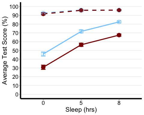
The first one we will create is a line plot. So here we want to specify which factor we want on our x-axis, as well as which summary measure of our dependent variable we want on our y-axis. In this case, we want the Sleep factor (with 3 levels) on the x-axis, and mean TestScore on the y-axis Next we want to choose some other identifiable feature of the graph to represent our other two independent variables. In this case, we differentiated the two levels of the Exercise variable by the colour of the lines and line type or shape to represent the different beverages consumed. You may choose any of the ones in the cheat sheet and more!
Tip: One thing to keep in mind is that you should design your plots such that if a reader is colour-blind or chooses to print your results in black-white, they can still easily distinguish between the different factors in your plot. Hence, we will also use the shape of our points to specify BLOCK_TYPE
LINE PLOT
# Notice that I am using the summary stat table with the full range of data not the printable oneanova3.lineplot <-ggplot(anova3.summary.statistics, aes(x=Sleep, y=mean, color=Exercise, group=interaction(Exercise, Beverage))) +geom_point(data=filter(anova3.summary.statistics, Exercise =="Yoga"),shape=19, size=4.5) +#assigning point type 19 from cheat sheet to one level of factorgeom_point(data=filter(anova3.summary.statistics, Exercise =="Mindfulness"), shape=1, size=4.5) +#assigning point type 1 from cheat sheet to other level of factorgeom_line(data=filter(anova3.summary.statistics, Beverage =="Coffee"),linetype="dashed", linewidth=1.2) +#assigning line type to one level of factorgeom_line(data=filter(anova3.summary.statistics, Beverage =="Placebo"), linetype="solid", linewidth=1.2) +#assigning line type to other level of factorscale_color_manual(values =c("skyblue1", "darkred") ) +xlab("Sleep (hrs)") +#add title to x-axisylab("Average Test Score (%)") +#add title to y-axistheme_classic() +#this theme has no background, no bounding box. theme(axis.line=element_line(linewidth=1.5), #thickness of x-axis lineaxis.text =element_text(size = 14, colour = "black"),axis.title =element_text(size = 16, colour = "black"),panel.grid.major.y =element_line(), # adding horizontal grid lineslegend.position = "none") +coord_cartesian(ylim=c(0, 100)) +scale_y_continuous(breaks=seq(00, 100, 10)) +# Ticks on y-axis from 0-100, jumps by 10 geom_errorbar(aes(ymin=mean+se, ymax=mean-se), width = 0.12, size = 1) #adding error bars
## Warning: Using `size` aesthetic for lines was deprecated in ggplot2 3.4.0.## ℹ Please use `linewidth` instead.## This warning is displayed once every 8 hours.## Call `lifecycle::last_lifecycle_warnings()` to see where this warning was## generated.
anova3.lineplot
In the following code, we can make a custom legend for any figure. Feel free to play around with this code. I prefer to create my legend separate from the function I use to plot my data, just because the internal code for making the plots are a bit restrictive aesthetics-wise, especially if we are plotting more than 2 factors.
plot.new() legend("center", # location on screen (center, upper right, etc)title=" Exercise Beverage ", # bit of a hack here but I put lots of space to align with legend levelslegend=c("Yoga","Mindfulness","Placebo","Coffee"), col=c("skyblue1", "darkred",'black','black'), pch=c(1,19,NA,NA), # assigning point shapes pt.cex = 2, # setting point sizelty =c(0,0,1,2), lwd =c(NA,NA,2,2), # assigning line type bty="o", # border around legend boxbox.lwd = 2, # thickness of border line border=T, # border around legend boxhoriz = T, # title is horizontaltitle.font = 2.5, cex = 0.765# size of the legend box )
I recommend this link for more options with editing the boxplots
BOX PLOT
anova3.bxp <-ggboxplot( mydata3, x = "Sleep", y = "TestScore",color = "Exercise", palette = "grey",facet.by = "Beverage", #specifying grouping variables for faceting the plot # into multiple panelsbxp.errorbar = TRUE, bxp.errorbar.width = 1,xlab = "Sleep (hrs)", ylab = "Judgement of Learning (JOL; %)" ) +theme(axis.line=element_line(linewidth=1.5), #thickness of x-axis lineaxis.text =element_text(size = 14, colour = "black"),axis.title =element_text(size = 16, colour = "black"),panel.grid.major.y =element_line() ) +# adding horizontal grid linesscale_y_continuous(breaks=seq(0, 100, 10)) # Ticks on y-axis from 0-100, # jumps by 10 anova3.bxp
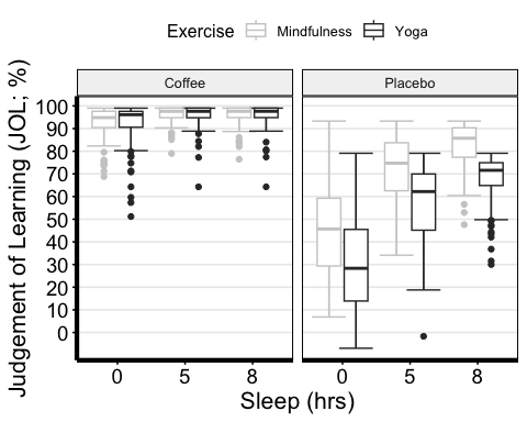
Now, I used the “grey” colour palette, which is boring if you ask me. While there are many options when it comes to customizing the colour palette of your plot, here is a super cool and useful library for Scientific Journal and Sci-Fi Themed Color Palettes for ggplot2. Go to the following link to see all the available options and different ways of implementing them into your plots.
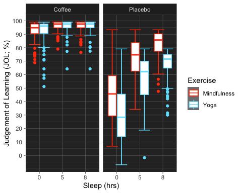
anova3.bxp.tron <- anova3.bxp +theme_dark() +#changing theme of plottheme (panel.background =element_rect(fill = "#2D2D2D") )+#changing plot# background colorscale_color_tron()
## Scale for colour is already present.## Adding another scale for colour, which will replace the existing scale.
#This palette is inspired by the colours used in Tron Legacy. It is suitable for#displaying data when using a dark themeanova3.bxp.tron
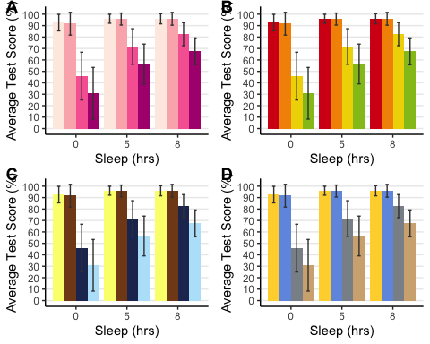
BAR PLOT
anova3.barplot <-ggplot(anova3.summary.statistics, aes(x =factor(Sleep), y = mean, fill = Beverage:Exercise)) +geom_bar(stat = "identity", position = "dodge") +geom_errorbar(aes(ymax = mean + sd, ymin = mean - sd), #standard error barsposition =position_dodge(0.9), width = 0.25, color = "Gray25") +xlab("Sleep (hrs)") +ylab("Average Test Score (%)") +scale_fill_brewer(palette = "RdPu") +theme_classic() +theme(legend.position = "none", # no legendpanel.grid.major.y =element_line() ) +# adding horizontal grid linesscale_y_continuous(breaks=seq(0, 100, 10)) # Ticks on y-axis from 0-100, jumps by 10
# Let's do some exploring with these different colour palettes #This palette is inspired by the colours used in the TV show The Simpsonsanova3.barplot.springfield <- anova3.barplot +scale_fill_simpsons()
## Scale for fill is already present.## Adding another scale for fill, which will replace the existing scale.
#This palette is inspired by the colours used in the TV show Rick and Mortyanova3.barplot.schwifty <- anova3.barplot +scale_fill_rickandmorty()
## Scale for fill is already present.## Adding another scale for fill, which will replace the existing scale.
#This colour palette is inspired by Frontiers:anova3.barplot.default <- anova3.barplot +scale_fill_frontiers()
## Scale for fill is already present.## Adding another scale for fill, which will replace the existing scale.
Now, what if we wanted to publish all these different variations of the bar plot on the same page? Using the following function, we can organize two or more plots into the same page for printing. By specifying the number of columns, you are organizing the plots horizontally, each occupying a column. By specifying the number of rows you can organize the plots vertically. We can also adjust the size of this figure with all three plots. Depending on how similar the plots are, you can also request to have a common legend by entering “T” for “common.legend”, wherein R will automatically generate a legend for you. However, I prefer to create my own legend, which we will do in the next chunk of code.
barplots <-arrangeGrob(anova3.barplot, anova3.barplot.default, anova3.barplot.schwifty, anova3.barplot.springfield,nrow = 2, ncol = 2)
# Add labels to the arranged plotsbarplots.gg <-as_ggplot(barplots) +#transform to a ggplotdraw_plot_label(label =c("A", "B", "C", "D"), size = 14, #add labelsx =c(0, 0.5, 0, 0.5), #specifying location of labels horizontallyy =c(1.017, 1.017, 0.53, 0.53)) #specifying location of labels #vertically# You can play around with the vertical and horizontal coordinates # (corresponding to the label in the order they are listed).
barplots.gg
Computing Three-Way ANOVA
There are a bunch of options when it comes to conducting a three-way ANOVA. The afex library in particular provides three functions for calculating ANOVAs. These functions produce the same output but differ in the way how to specify the ANOVA.
- aov_car()
- aov_ez()
- aov_4()
I will continue using the same function that we used for our two-way ANOVAs. However, I would encourage you to look into these other functions on your own time to find the one that you are most comfortable using, or if the options may be more useful to you. Here are the following resources to get you started on the afex library:
# Three-Way Mixed ANOVA (2 BLOCK_TYPE x 2 TRIAL-TYPE x 3 SOA)anova3.aov <-anova_test(data = mydata3, dv = TestScore, wid = ID, #factor containing individuals/subjects identifier. Should be unique # per individual.between = Exercise, #(optional) between-subject factor variable(s)within =c(Beverage, Sleep), #(optional) within-subjects factor variablesdetailed = TRUE, #If TRUE, returns extra information (sums of squares columns, #intercept row, etc.)effect.size = "ges"#generalized eta squared or "pes" (partial eta squared), #the option "both" is bugged and currently doesn't work )# Applies the Greenhouse Geisser correction to effects only when sphericity is violatedanova3.aov <-get_anova_table(anova3.aov, correction = "auto")# ?get_anova_table() to see other viable correction options
Now, I prefer to report two measures of effect size, both partial and generalized eta square values. So to add pes I decided to calculate it by hand. I also report the standard error of the mean value by hand included below:
# Calculate partial eta square and add it as a new column named "pes"# Codes for MSE and pes retrieved from # https://sherif.io/2014/12/10/ANOVA_in_R.htmlanova3.aov$pes = anova3.aov$SSn/(anova3.aov$SSn + anova3.aov$SSd)# Calculate mean sum of error and add it as a new column named "MSE"anova3.aov$MSE = anova3.aov$SSd/anova3.aov$DFd#store ANOVA tables as a dataframeanova3.aov <-data.frame(anova3.aov)# Deleting intercept info (first row)anova3.aov <- anova3.aov[-1, ] #removing first row# Okay, let's make some beautiful printable ANOVA tables# Selecting which values by column name we want to report from the detailed ANOVA tableanova3.aov.printable <- anova3.aov %>%select("Effect", "DFn", "DFd", "F", "MSE", "p", "p..05", "pes", "ges") # Rename columnscolnames(anova3.aov.printable)[colnames(anova3.aov.printable) =="pes"] ="η2P"colnames(anova3.aov.printable)[colnames(anova3.aov.printable) =="ges"] ="η2G"colnames(anova3.aov.printable)[colnames(anova3.aov.printable) =="p..05"] ="sig"#anova3.aov.printable %>%# kbl(caption = "THREE-WAY MIXED ANOVA") %>%# kable_classic(full_width = F, html_font = "Cambria", font_size = 10) %>%# add_header_above(c(" " = 2, "Test Score (%)" = 8)) %>%# add_footnote("Correction: Greenhouse Geisser")
Post Hoc Analyses
The rule of thumb is to decompose the highest-order interaction. If there was a significant three-way interaction effect, you should decompose it into: 1. Simple two-way interaction: essentially you must run two two-way interactions at each level of a third variable. If there are any significant two-way interactions, then you must further decompose it into… 2. Simple simple main effect: run one-way ANOVA at each level of a second variable. If there is a significant effect here then conduct a … 3. Simple simple pairwise comparisons: run pairwise or other post-hoc comparisons.
If you have read through the two-way and one-way ANOVA models earlier in the document, then you should have no issues with the following next few steps. As you can see, decomposing high-order interactions is very intuitive, you are simply retracing your steps to get to the bottom of where the differences lie between our groups and their levels.
If you don’t have a significant three-way interaction… which is the case in the current example, then you need to determine whether you have any statistically significant two-way interactions. In our case, we have two: 1. Beverage x sleep interaction, which is analogous to a significant interaction from a within-subjects two-way ANOVA 2. Exercise x beverage interaction, which is comparable to a significant interaction from a mixed two-way ANOVA. In this case, we will retrace our steps by conducting one-way ANOVAs looking into the effect of one factor at every level of the other factor it is interacting with (i.e., simple main effects analyses) and then pairwise comparisons if necessary.
# Decomposing the Exercise x Beverage and Beverage x Sleep Interactions
# Analyzing the simple simple main effect of Exercise at each level of Beverage:
mydata3.coffee <- anova_test(data = filter(mydata3, Beverage == “Coffee”), wid = ID, within = Sleep, between = Exercise,
dv= TestScore, detailed = TRUE, effect.size = “pes”)
mydata3.placebo <- anova_test(data = filter(mydata3, Beverage == “Placebo”), wid = ID, within = Sleep,
between = Exercise, dv= TestScore, detailed = TRUE, effect.size = “pes”)
#Extracting ANOVA tables as data-frames
mydata3.coffee <- data.frame (get_anova_table(mydata3.coffee, correction = “auto”) )
mydata3.placebo <- data.frame (get_anova_table(mydata3.placebo, correction = “auto”) )
# Let’s make nice printable tables; note that I skipped calculating the MSE and opted to not have generalized eta squared in my table. # That was done purely to keep this guide a bit shorter. You are well equipped with the proper codes in the previous ANOVAs to calculate # them on your own. Deleting intercept info (first row)
mydata3.coffee <- mydata3.coffee[–1, ]
mydata3.placebo <- mydata3.placebo[–1, ]
# colnames(mydata3.coffee) #get all column names
# Select Columns to keep by name
mydata3.coffee <- mydata3.coffee %>% select(“Effect”, “DFn”, “DFd”, “F”, “p”, “p..05”, “pes”)
mydata3.placebo <- mydata3.placebo %>% select(“Effect”, “DFn”, “DFd”, “F”, “p”, “p..05”, “pes”)
# Combining tables
mydata3.ss.results <- cbind(mydata3.coffee , mydata3.placebo)
# Rename columns
colnames(mydata3.ss.results)[colnames(mydata3.ss.results) == “pes”] =“η2P”
colnames(mydata3.ss.results)[colnames(mydata3.ss.results) == “ges”] =“η2G”
colnames(mydata3.ss.results)[colnames(mydata3.ss.results) == “p..05”] =“sig”
# Making printable ANOVA html
mydata3.ss.results %>%
kbl(caption = “Simple Simple Main Effect of Exercise at each level
of Beverage”) %>%
kable_classic(full_width = F, html_font = “Cambria”, font_size = 10) %>%
add_header_above(c(” ” = 1, “Coffee” = 7, “Placebo” = 7)) %>%
add_footnote(“Correction: Greenhouse Geisser”)
Since there are no significant two-way interactions, we will not be conducting pair-wise comparisons.
Reporting We submitted test scores to a three-way ANOVA with Beverage (Coffee vs. Placebo) and Sleep (0/5/8 hours) as within-participant variables and Exercise (yoga vs. mindfulness) as a between-participant variable. The ANOVA showed a significant main effect of exercise [F(1,170) = 33.0, MSE = 472.7, p <0.001, partial eta squared = 0.163], beverage [F(1,170) = 1222.8, MSE = 266.3, p <0.001, partial eta squared = 0.878], and sleep [F(1.3,219.3) = 525.1, MSE = 111.2, p <0.001, partial eta squared = 0.755]. There was also a significant exercise-by-beverage interaction [F(1,170) = 52.2, MSE = 266.3, p <0.001, partial eta squared = 0.235] as well as a beverage-by-sleep interaction [F(1.5,257.3) = 462.1, MSE = 68.8, p <0.001, partial eta squared = 0.731]. These interactions were decomposed by submitting test scores from the coffee and placebo conditions to separate mixed two-way ANOVAs with sleep as a within-participant factor, and Exercise as a between-participant variable.
A separate analysis of the placebo condition revealed a significant effect of exercise [F(1,170) = 45.3, p <0.001, partial eta squared = 0.210] and effect of sleep [F(1.4,238.4) = 238.4, p <0.001, partial eta squared = 0.771]. Analysis of the coffee condition revealed only a significant effect of sleep [F(1.2,206.8) = 46.9, p <0.001, partial eta squared = 0.216].
Practice
If you are interested in putting your newfound skills to the test then I have included two data sets as well as a separate script with all the answers. I highly recommend that you analyze the data on your own using the codes mentioned here and just check your answers with the script.
The first data set is named “HW1_RTut.xlsx”. In this example, we have two random samples, groups A and B. We have a certain numerical measure under the column “Value”. We are interested in whether there is a significant difference between the two groups.
The second data set is named “HW2_RTut.xlsx”. And is as such:
- Participants represent different individuals.
- WithinSubjectVar is a within-subjects variable with three levels (repeated measures).
- BetweenSubjectVar is a between-subjects variable with two levels (Group A and Group B). 4. Response is a continuous variable.
We are interested in the effect of the WithinSubjectVar and BetweenSubjectVar on Response
