Pressbooks OER
The eCampus Ontario Pressbooks publishing platform is a common OER platform used within Ontario post-secondary institutions, and was used for the creation of this book. Pressbooks, as a platform, presents the opportunity to publish web books in a reasonably accessible system. At present, Pressbooks does not have any built-in accessibility [1], so users who create these books must assess their books using other accessibility tools.
While Pressbooks provides an accessible starting point, OER created in Pressbooks are only as accessible as the content that is added, imported, or created within them.
Questions to ask about OER published in Pressbooks
- Does the content added contain any of the issues we reviewed in Top Issues to Check for?
- Is the theme used for this particular OER considered accessible?
- Has the creator enabled downloadable formats or created alternate formats?
- Has the creator used a large number of H1 headings, or have they started their content with H2 and beyond?
- Does the OER have a creative commons license that will allow you to adapt/modify small sections that don’t meet accessibility requirements, and make them available in your LMS?
As you review a potential OER for inclusion in your course, consider the following issues related to the platforms the OER is built upon.
Pressbooks

Check the user-added content
Using what you now know about some key accessibility themes identified in this book, review the content of pages in the OER for issues. The first 3 issues will be easily visible as you review a page. You’ll probably need to use a tool such as the Wave accessibility checker to effectively check page and document structure.
- Does the content include text equivalents for visual features (images, videos, interactive activities)?
- Are descriptive links and labelling used for links, captions on images, etc?
- Do colours of text/background have good contrast? Are means other than colour used to convey meaning?
- Has the creator used proper heading structure? Do downloadable documents have appropriate structure?
Check the Book Theme

Choose a style that has an accessible font and good spacing between the characters and lines. Look for:
- Books that use a sans serif font. These are easier to read for a variety of learning disabilities.
- Books that use a font that has distinct characters. In other words, different letters should not look nearly identical. One test to check this is called the “I l 1” test. Each should look fairly different from one another if you have picked a good font.
- Books with good spacing between letters. Fonts that are very cramped are more difficult to read.
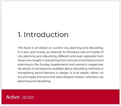
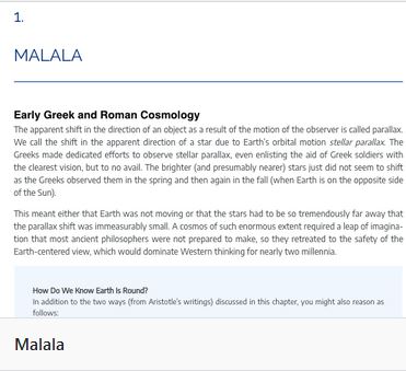
Recommended themes for accessibility are:
- Malala
- Jacobs
You can see an example of a book with a customized version of this theme – Communication Essentials for College. eCampus Ontario Pressbooks typically default to the Malala theme, although individual creators can switch the theme at their discretion.
Check for alternate formats
Are PDF or other format types available to download from the Pressbook that you’re reviewing? While OER creators/adapters may not have the ability to control the way Pressbooks exports PDFs or other files, the availability of other formats can still improve accessibility and usability for our students. Having a “downloadable” version of the book may enable users with poor internet, students who use reading and note taking tools and others to have more access to the OER materials.
Finally, editable files, even if not perfect, could allow students, adaptive technologists and other supports to adjust the content to their own needs, which also improves overall accessibility of the book.
Check the CC license
When you’re reviewing, keep an eye on the CC license. If an OER textbook does not have a no-derivatives clause on it’s open license, you should be able to put necessary content into another format within your LMS, without having to adapt the entire book. So, if the majority of the OER has accessibility features, but one area or topic is not as accessible, you could remediate just that section and have your students use it within the LMS, to improve accessibility.
Key Takeaways
Attribution & References
Except where otherwise noted, Platform and Software Specific Issues by Jen Booth is licensed under CC BY-NC 4.0. This page makes use of content adapted from the following sources:
- “Pressbooks: Check the book theme” is adapted from Making Pressbooks Accessible by McLaughlin Library, University of Guelph, CC BY 4.0. / A derivative of Accessibility Toolkit 2nd Edition by BCcampus, which is licensed under a CC BY 4.0 License.
- Pressbooks is currently working on developing this feature, so this may improve in the near future ↵

