The User Interface
11 Responsive Design
 Learning Outcomes
When you have completed this chapter, you will be able to:
- Describe the benefits of responsive design for the web.
- Implement media queries that modify the layout and style of a web page to suit the width of each client’s browser.
In the early 2000’s, many web sites had two versions – a mobile version and a desktop version. When a user arrived at their site, they would run a JavaScript program to determine whether the user was viewing on a mobile or desktop browser, then automatically route them to the appropriate version of their site.
But maintaining two separate web sites was costly. In 2010, Ethan Marcotte, a web designer responsible for The Boston Globe’s web site, proposed a new way. The idea was to use the newly-released CSS Media Queries (which are essentially if statements) to create web sites that reconfigured themselves to fit any screen size. He called this new idea Responsive Design, and it caught on fast. Today almost every web site incorporates responsive design elements.
What is a Responsive Web Site?
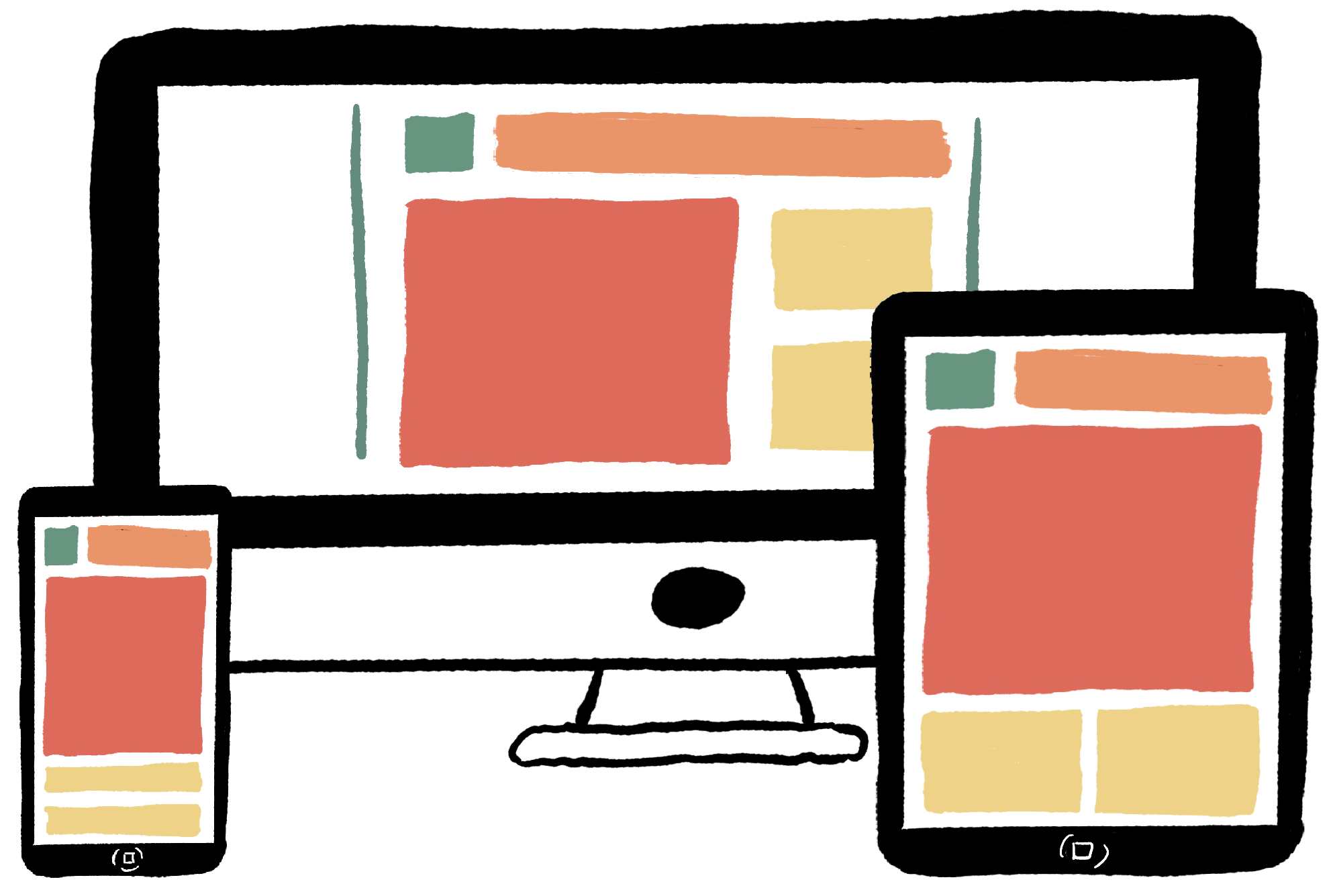
Responsive web sites change their CSS rules to best fit the user’s browser. For example, a responsive web site might have 3 columns on a desktop or laptop browser, but only 1 column on a phone or tablet browser.
 Do It Yourself
The Boston Globe web site remains a classic example of responsive web design. Go to https://www.bostonglobe.com/ on a Chrome browser (on your desktop or laptop) and enter the developer tools.
Try slowly changing the width of the content window and watch as the page rearranges itself to fit the new size. As you resize the window, Chrome will report the width in a little box in the top right. Try to find the exact cut point where one layout or style set changes into another.
Now press the Toggle Device button (or hit ctrl-shift-M on Windows) and select different phone and tablet simulations to see how the site looks on each one.
These days almost every web site is responsive. Pick another favorite site and repeat the above steps. How does this site change or rearrange itself in response to a changing browser width?
Two Pillars of Responsive Web Design
Responsive Web Design involves two core CSS technologies.
- Flexible Elements.
- CSS Media Queries.
Flexible Elements and Images
You already know this. Use max-width, margin: auto;, display: flex;, and % values for widths instead of px values. Then your HTML elements will grow and shrink to fit the browser.
CSS Media Queries
Being flexible is good, but three or more elements placed side by side are unlikely to look good on a narrow phone display. CSS Media Queries let you write different CSS rules for different sized screens. You can write CSS Media Queries to:
- display a single column for phones but more columns for wider devices;
- change font sizes, colors, and other properties depending on browser width;
- hide some content on smaller browsers and show it on larger browsers.
In a responsive design, the HTML of the page is the same on every client, but the style rules are tailored to the device or browser on which the page is viewed.
- Media = The device you’re displaying on.
- Query = The question you ask before deciding which CSS rules to use.
How It Works
To create a media query, put an @media tag in your style sheet and then specify CSS rules that apply on some browsers but not on others. For example, you might want your h1 headings to be bigger on wide browsers and smaller on narrow browsers.
In your style sheet you could have the following rules:
h1 {
    font-size: 40px;
    color: red;
}

@media (max-width:480px) {
    h1 {
        font-size:20px;
    }
}
In the example above, the first CSS rule sets a font size and a color for all h1 elements. The second rule also applies to h1 elements, but it’s inside a media query (colored above).
- The first colored line says that the rules in this Media Query are only for screens up to 480 pixels wide. The syntax (brackets, colon, spacing, px, @, etc.) is all important!
- Then there are braces { } with another CSS rule nested inside. This rule also applies to h1 elements, but because it comes later in the file, its property-value pairs will override the earlier rule on smaller screens. (See the CSS Cascade sections in the CSS for Style chapter.)
The result is that on this page, h1 elements will always be red, but will use a larger or smaller font depending on the browser width.
The first example has only one rule inside the media query, but you can put as many rules as you like in there:
@media (max-width:480px) {
    h1 {
        font-size:20px;
    }

    p {
       font-family: sans-serif;
       color: blue;
    }
}
You can also have different media queries for different sized browsers.
 Do It Yourself
In order to test your media queries, you will need some way of knowing what size your screen is. If you can access the developer tools in your browser, you should see the size in the top right corner as you make it grow and shrink. When viewing mobile layouts, the screen size will be displayed at the top of the screen.
If your browser doesn’t support this for some reason, you can use the screensize.html JavaScript app from the Full Stack Example Pack to monitor your screen size.
 Do It Yourself
To see a set of media queries in action, grow or shrink this window. You will see the background color of the text box below change at different widths.
This behavior is enabled using multiple media queries similar to the ones shown below. For example, at a screen width 1000 pixels, the three first rules all apply, so the third one wins.
.example { background-color: #de324c; }
@media screen and (max-width: 1700px) {
  .responsive--example { background-color: #f4895f; }
}
@media screen and (max-width: 1450px) {
  .example { background-color: #f8e16f; }
}
@media screen and (max-width: 1200px) {
  .example { background-color: #95cf92; }
}
@media screen and (max-width: 950px) {
  .example { background-color: #369acc; }
}
@media screen and (max-width: 700px) {
  .example { background-color: #9656a2; }
}
Adjusting the Number of Columns
Mobile layouts usually have one column. Desktop layouts often have 2 or more columns. Here’s one way to accomplish this using media queries
Set the default to multiple columns (desktop)
- Use
display: flexfor the div container - Add an element within the container for each column
- Set a width (%) for the elements inside the container that makes sense for the number of columns you want
- Set other flexbox properties as appropriate (justify-content, etc.)
- Adjust padding, margin, font-size and other properties as appropriate
Write a media query for a single column (mobile)
- Create a media query with max-width set to the point where you want to transition from one column to multi-columns
- Set
display: blockfor the div container (that’s the default setting for the display property) - Use
width: 100%;orwidth: auto;for the elements inside the container (auto is the default setting) - Adjust padding, margin, font-size and other properties as appropriate
Another Option
Here’s another way to accomplish the same transition…
- In the media query, leave the container as
display: flex; - Set
flex-direction: column;for a single column of elements - Set
flex-direction: row;(the default setting) for multiple columns of elements - Adjust padding, margin, font-size and other properties as appropriate
 Do It Yourself
Download mediaquery.html from Full Stack Example Pack. This file gives you the CSS and HTML code for a layout that transitions at a width of 768 pixels. Note that this example sets the height property on the content divs. This is usually not advisable, but we’re doing it so that we don’t have to enter lots of content to have substantially-sized divs.
Hiding and Showing Elements
Sometimes, “less is more” for mobile users. You can set display: none to completely hide an element on mobile screens. Then for larger screens, set it to flex, block, or inline depending on what kind of element it is:
- Flex is for flexbox containers.
- Block is for elements like p, h1, div that separate from other elements vertically.
- Inline is for elements that get embedded in the text of other elements, like a, img, span, b, etc. (Usually, you wouldn’t hide an inline element, though.)
More Advanced Media Queries
You can replace max-width with min-width to specify rules that apply only on wide browsers.
@media (min-width:481px) {
    /* rules go here */
}
You can use the logical operator and to write a rule for medium-sized browsers.
@media (min-width:500px) and (max-width:700px) {
    /* rules go here */
}
You can write media queries for CSS rules that only apply when the user is printing the page (recipe sites use this a lot).
@media print {
    /* rules go here */
}
You can put media queries in a link tag so that an entire style sheet is activated only for certain browsers
<link rel="stylesheet" media="(max-width :400px)" href="phone.css">
For a complete list of everything a media query can do, go to: https://developer.mozilla.org/en/CSS/Media_queries.
 Check Your Understanding
 Coding Practice
- Restructure the HTML in the mediaquery.html file from the Full Stack Example Pack so that there is a jumbotron above two rows of 3 columns. Then rewrite the CSS so that at 768px, the third box in each column is hidden, and then at 480px, the site transitions to a vertical layout.
- Restructure the HTML in the mediaquery.html file from the Full Stack Example Pack so that the site displays as a grid of 2 rows and 4 columns. Then write media queries so that it drops to 2 columns at 768px and one column at 480px. This is a little challenging to do with flexboxes. The key is to nest one set of flexboxes within another. You could also research how to use the CSS grid or float properties if you want to try to do it a different way.
- Time to bring it all together! Create a responsive version of your portfolio site. The site should have multiple pages (main page, about, work, etc.) and each page should display well on a phone, tablet, or desktop.
- The desktop version should be 2 or more columns
- The mobile version should be 1 column
- At least one element on the desktop version should be hidden on a phone
- There should a change or two to font sizes, colors, or other basic properties
- The navigation bar should make sense for both the desktop and the mobile versions of the site


Feedback/Errata