Programming on the Client Side
22 Input Elements
 Learning Outcomes
When you have completed this chapter, you will be able to:
- Use input elements effectively to collect information from the user.
- Design client-side web apps that respond to input element events and use input element contents to perform tasks for the user.
In the last few chapters, you learned a little bit about how input, processing, and output works in a client-side JavaScript app.
- Input can, so far, come from events such as mouse clicks and movements.
- Processing happens in response to events.
- Output consists of changes to the Document Object Model.
This is a good start, but to create more useful apps, we would need to be able to collect more detailed input from the user. HTML input elements fill this gap.
HTML contains input elements for text, numbers, colors, dates, and so on. The exact details of how each input element behaves is controlled by the browser, but every input element has a value attribute that (in most cases) can be set by the user as they interact with it. When keyboard or mouse events happen, JavaScript event listeners can retrieve the values set by the user. Most web apps use input elements in some way.
Later in this book, we will also introduce the form element, which can be used along with input elements to send data to the server for processing. But for now, we are only operating on the client side, so we will not use form elements in this chapter.
A Very Basic Input Element
We’ve already seen how to use an input element to create a button. But by changing the type, an input element can take a number of different forms. Here’s a simple pair of input elements that could be used together to get a string from the user.
<input type="text">
<input type="button" value="Submit">
The first input element creates a simple text box. The second, which we have seen before, creates a button.
 Do It Yourself
Create a new page using one of the template HTML files in the Full Stack Example Pack. Put the two input elements shown above into the body element and load the page into a browser.
Add a few more text boxes. Note that everything appears side by side because by default input elements have their display property set to inline. If you change display to block, they will stack one on top of the other. Another way to get them to stack is to put them into a div with display: flex and flex-direction: column.
Styling Input Elements
You can use the input tag selector along with id and class selectors to write CSS rules to style input elements however you like. The default styles tend to be very basic, so you will probably want to override them. There is also a CSS attribute selector that can be useful when you want to style all elements of one input type in the same way.
For example, you can use the selector input[type=text] to select just text boxes (watch the spacing). Here’s a rule that makes the textboxes look a bit better:
input[type=text] {
    font: sans-serif;
    font-size: 24px;
    background-color: paleturquoise;
    color: royalblue;
    border: 3px solid royalblue ;
    border-radius: 4px;
}
 Do It Yourself
Continue to work on the file you created in the last Do it Yourself box.
Write some CSS rules to override the font, color, border, width, and other properties of the input elements to make them look a bit less basic. Don’t forget, as we covered in the last chapter, that with buttons you should use the hover and active pseudo-classes to make sure that they still act like buttons after changing their colors and other properties.
Now try making things line up and look like they belong together. Try putting them inside a div element with display: flex, then using % widths to make them line up horizontally and take up a sensible amount of space. A large sans-serif font is always a good idea as well.
Retrieving the Input
In order to get anything from an input element, you need to be able to pull it out of the DOM. You can do this in all the same ways you would retrieve any other DOM element, for example by assigning an id attribute and using document.getElementById. Once you have the element, its contents will be contained in the value attribute.
 Do It Yourself
Continue to work on the file from the previous Do it Yourself boxes.
Give a text input element the id “myinput”, like this:
<input type="text" id="myinput">
Then load the page, open the JavaScript console and try the following:
const e = document.getElementById("myinput");
e.value;
typeof e.value;
The value reported will probably be an empty string. Now type something into the text box and try the last two lines again. This time, it should report the value that the user typed.
Finally, edit the file and add a value attribute to your text input element, like this:
<input type="text" id="myinput" value="some text">
When you reload the page, the textbox will be pre-filled with the default value you chose. The user can still change it.
Just like any other HTML element, an input element can have event listeners attached. Here is a list of useful events that input elements can respond to.
- click: Triggered when the user clicks on the input element (most useful for buttons).
- change: Triggered when the user changes the value, then presses enter or leaves the element by tabbing or clicking away .
- input: Triggered on every individual act of input, typically every keystroke.
- focus: Triggered when the element gains focus (usually when the user clicks on it or tabs into it)
- blur: Triggered when the element loses focus (usually when the user clicks or tabs away from it)
- When the event in question is triggered, the input element can be accessed using the this keyword in the listener. The current value in the input element will be in this.value.
 Do It Yourself
Continue to work on the file from the previous Do it Yourself boxes.
In a script element in the head of the page, attach an event listener to the input event for one of your input elements. In the body of the listener, echo the current value to the console. Here’s what the code might look like:
document.getElementById("myinput").addEventListener("input", function(event) {
    console.log(this.value);
});
Note that the element above was retrieved and then the listener added all on one line. Note also that this code should be embedded in the window load event listener (see the Events chapter).
Now load the page, open the console and type something into the input element to see the contents reported. Try changing the event the code responds to. Experiment with change, focus, blur, and click to see the differences in when each event is triggered.
More Input Types and Attributes
To create a good user interface for the user, it’s a good idea to use input attributes to constrain the user where possible.
The type Attribute
Here are some other possibilities for the type attribute of an input element that will help to constrain user input.
- password: Usually masks user input.
- number, range: Usually restricts the user to numeric input.
- date, time: Usually restricts the user to pre-formatted date and time strings.
- color: Usually restricts the user to an HTML color code.
- image: This is a button type that can be used to create a button with an image on it instead of text.
In addition, there are some other specialized input types that operate a little differently, such as drop-down lists, check boxes, radio buttons, and text areas.
No matter what the type of the input element, the value attribute always contains a string. If the string represents a number you will have to use parseInt or parseFloat to convert it. If it’s a date or a time, you may have to do some string processing to interpret it effectively.
 Do It Yourself
Continue to work on the file from the previous Do it Yourself boxes.
Change the type of the input element to one of the options above, and reload to see how it appears in your browser. Try using it and use an event to report the value you set as you use the element.
Here are a few other attributes you can use to further constrain and prompt the user.
The placeholder Attribute
For text input elements, this creates a “ghost” value in the text box that disappears when the user types something. It can add an extra level of prompting. In the example below, the text box will show “userid” greyed out until the user enters something.
<input type="text" placeholder="userid">
maxlength: For text and similar input elements, this sets a maximum input size. The example below restricts the input to 5 characters at most.
<input type="text" maxlength="5">
The max, min, and step Attributes
For number and range input elements, these attributes put limits on what the user can enter using the arrow controls. The default step size is 1. If you set it to 2, the user can only go up and down by 2’s. If you set it to 0.1 they can enter floats with 1 decimal place accuracy. The example below restricts the user to multiples of 5 between 0 and 100.
<input type="number" min="0" max="100" step="5" value="0">
You can also use min, max, and step with date and time input elements. Use the format “YYYY-MM-DD” for a date and “HH:MM” for a time. The step value specifies number of days for a date and number of seconds for a time.
The autofocus Attribute
This attribute does not require a value. If it is present, the input element will automatically get focus when the page is loaded. For example, if you put autofocus on a text input element as in the example below, the user can start typing as soon as the page loads. They don’t have to click on the element first.
<input type="text" autofocus>
The readonly and disabled Attributes
These attributes do not require a value (but you can optionally set disabled to true or false in JavaScript). The readonly attribute prevents the user from changing the value.
<input type="text" readonly>
The disabled attribute greys out the element and prevents it from getting focus.
<input type="text" disabled>
 Do It Yourself
Continue to work on the file from the previous Do it Yourself boxes.
Experiment with the attributes above and make sure you understand what they do.
Now create a button that, when pressed, disables all the other input elements on the page. When pressed again, it should re-enable them (use a variable to track the enabled/disabled status).
Client-side Web Apps
When you harness the power of input elements, you can create client-side web apps with many of the same input capabilities as a native GUI app.
 Do It Yourself
An example of a very simple client-side web app is shown in the additionQuiz.htmlfile from the Full Stack Example Pack. This program contains two JavaScript functions.
- The newProblem function creates and presents a new question to the user and clears out any old answers or feedback. It’s called by the window load event and by a button click event.
- The second (anonymous) function checks the user’s answer and gives feedback. It’s called by a different button click event.
Notice the use of span elements with unique id attributes. They allow the values for the two operands to be set without rewriting the entire paragraph element that contains them.
 Check Your Understanding
 Coding Practice
- Add some style and layout to the additionQuiz.html file from the Full Stack Example Pack. Use CSS and flexbox div elements to make it look as attractive as you can. Modify the code so that the feedback comes in different colors with a different image depending on whether the user got the answer right or not.
- Create a web app from scratch that allows the user to convert Canadian dollars to another currency of your choice. Add style and layout elements to make it look good.
- Create a text input element with a light gray background. When the user clicks in the text input element to enter text, the background should change to white. When they leave the text input element, it should revert to light gray again.
- Add to the previous exercise so that when the user changes the text input element, a thank you message appears somewhere in the HTML document.
- Get arithmetic.htmlfrom the Full Stack Example Pack. This file is the interface for a very simple calculator with five functions. Add JavaScript code (as well as any necessary HTML tags or attributes) so that when the user presses the “Do It” button, the selected arithmetic operation is performed and the result is placed in the read only text box to the right of the equals sign.
- Modify your solution from the last question so that any time the user changes any of the form elements, the result updates automatically. You will need to use the change or input event for this. Now that the answer is automatically refreshing, you don’t need the “Do It” button any more, so you can remove it.
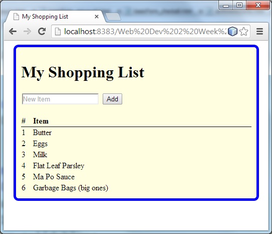 Make a simple shopping list app. It should give the user a text box and a button to press. When they press the button, it should add the text they entered to an array and display the array somewhere on the page as a numbered list.
- Add a delete button to the shopping list app. When pressed, it should search for an item that matches the text box in the array, then remove it from the array and refresh the entire list.
- For an even nicer shopping list user interface, present a delete option for each array element. You could will have to add event listeners to the buttons every time you create or recreate them. You could use the id attribute of each button to hold the array element that the button is supposed to delete (e.g., id=”0″, id=”1″, etc.)
- Now make the currency converter from Exercise 3 better. Research how to add drop down lists to allow the user to pick the “from” and “to” currency, then perform different calculations depending on what they choose. Make the converter robust so that if the user enter a non-numeric value it recovers gracefully, and make sure it always shows two digits for the cents.


Feedback/Errata