The User Interface
9 Flexible Design
 Learning Outcomes
When you have completed this chapter, you will be able to:
- Create flexible side-by-side layouts using % units and the CSS Flexbox properties.
- Build a simple navigation bar using HTML lists and the CSS “element element” selector.
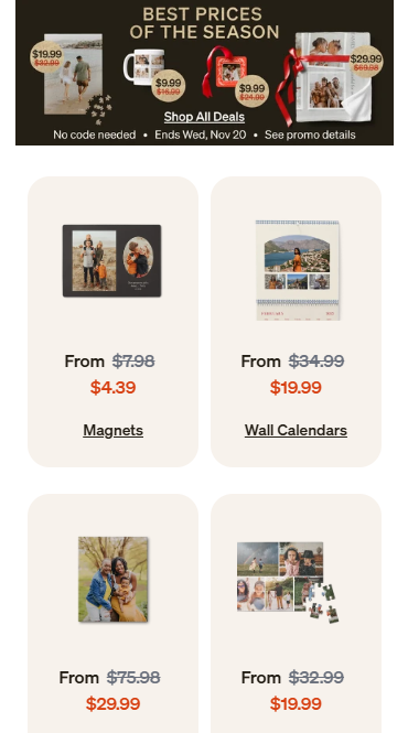
Even though mobile-first design is mostly vertical, there are times when you may need two elements to sit side by side in a horizontal layout.
For example, a logo that is part of your banner might be best placed beside the title of your site. Or you might have a small gallery of thumbnail images or a navigation section where you want the buttons to be laid out horizontally. The image on the right is a screen capture from the shutterfly.com mobile web site showing offers laid out in a grid pattern.
This chapter will help you create flexible horizontal layouts that could be used for mobile or for desktop users.
The % Unit in CSS
A starting point for flexibility in horizontal layouts is to specify widths in percentages.
The images below are inside a div element. They have their width set to 50%. Instead of using px units to tell the browser exactly how many pixels wide they should be, we’re telling it to use 50% of the pixels available. The browser will look at the width of the containing element (in this case a div element) and set the widths of the contained elements accordingly.

If you want a little space, you can use the margin property. The example below has margin set to 1% and width set to 48%. Each picture has margin on the left and right, so it’s 1% + 48% + 1% = 50% for each picture.


The Problem of Borders
You can use % for width, margin, and padding, but not for border-width. Border widths must always be set using px.
To make your life easier, set the CSS property box-sizing: border-box; on all your elements. This changes the box model calculations so that width includes the border and padding. (I always use this setting, and include it in my reset rule on every page.)
Below are four image elements with borders, padding, width and margin set. With box-sizing: border-box also set, as long as margin + margin + width = 25% for every image, they’ll fit horizontally in the space.


Introducing CSS Flexbox
There are lots of ways to make flexible, horizontal layouts in CSS, but CSS Flexbox is by far the easiest. With a flexbox, you can lay out any kind of content horizontally quickly and easily (divs, paragraphs, links, images, etc).
This is a flexbox.
It’s a div element with the display: flex; property. It has three p elements inside it.
The p elements have a margin and padding and a background-color.
You can make your boxes the same width as well.
In this example, I set width to 35% for each p element.
35% plus margin for three elements adds up to more than 100% but it doesn’t matter.
Flexboxes are very forgiving!
And here’s another look you could go for:
The width is 20%.
The margin is 2%.
And justify-content: space-between; on the containing div.
This is just the tip of the flexbox iceberg! You will learn more about flexbox later . Or you can go to w3schools and learn more yourself.
 Do It Yourself
Are you on a desktop browser? Widen and narrow the window to watch the flexboxes above automatically resize.
 Do It Yourself
Here are the CSS rules and the HTML structure for the first set of flexboxes shown above. Try them out on your own web page.
#flex1 {
    display: flex;
}

.flex1 {
    margin-left:3px;
    margin-right:3px;
    padding:10px;
    background-color: rgb(255, 217, 0);
}
<div id="flex1">
    <p class="flex1"> ... </p>
    <p class="flex1"> ... </p>
    <p class="flex1"> ... </p>
</div>
Vertical Flexboxes
You can also make a flexbox stack things vertically instead of horizontally. Use flex-direction: column; on the containing div for this.
This is a flexbox with flex-direction: column;.
The p elements have a margin and padding and a background-color.
But they have no width property so they fill the available space.
If you don’t want wide items, you can set a width and you can also center the items using align-items: center; on the containing div.
This is a flexbox with flex-direction: column; and align-items: center;.
The p elements have a width of 50%.
They are centered in the space.
Flexbox Navigation Bars
Flexboxes make it easy to create navbars (navigation bars) that are easy to see and easy to tap.
The navbar below is a div with display: flex;. Inside the div are some a elements with padding, background-color, and margin-right to space them out. (The div also has padding and a different background-color.)
The navbar below is the same, but the a elements have width: 25%; to make them stretch out and the left and right padding of the divs has been set to 0.
In the navbar below, the links have a border radius in the top left and right corners, then the active link is colored the same as the content below it to make the page look like it has tabs.
Pro Tip: Using the Right Elements
A navigation bar is a list of links. So if we are to follow the rule mentioned in an earlier chapter that you should use the HTML element that matches the content, navigation bars should really be contained in a ul (unordered list) element with each a (link) element inside an li (list item) element. (Additionally, the HTML semantic element nav should probably contain the entire thing.) This would be more correct but it complicates the design and requires more overriding of the default CSS styles, which is why I deliberately presented the navigation bars above using a simplified structure.
To create navbars with ul and li elements:
- Use
display: flex;on the ul element. - Use
display: inline;on the li elements. (List container items li havedisplay: block;by default. This causes the browser to lay them out vertically, like paragraphs. Butdisplay: inline;puts them side by side and gets rid of the bullet as well.) - Set padding and margin on everything and/or use a reset rule to get rid of the default box model properties on ul and li.
- To keep your links large and clickable, put extra padding on the a elements, not on the li elements.
Pro Tip: Selecting the Right Elements
Sometimes you want different styles in each section. For example, your navbar, content, and footer might all have different link styles. You could accomplish this with the class and id attributes along with the .class and #id selectors. But you could also use the element element selector. When you separate two selectors by a space character (selector1 selector2) it selects any element that matches selector2, but only if that element is contained within an element that matches selector1.
Here are some examples.
ul a {
    color: red;
}
The above makes a elements red, but only if they’re inside a ul element.
#content a {
    color:blue;
}
The above makes a elements blue, but only if they’re inside the element with id="content".
Folding Menus
Many mobile web sites make use of the hamburger icon ![]() to hide visually complex content like a navigation section. When the user clicks the hamburger icon, it’s typically replaced with an
to hide visually complex content like a navigation section. When the user clicks the hamburger icon, it’s typically replaced with an ![]() icon and a large menu pops up containing all the links. When the user clicks the
icon and a large menu pops up containing all the links. When the user clicks the ![]() , it folds back into the hamburger icon
, it folds back into the hamburger icon ![]() again. There are a number of ways to do this, but most of them involve JavaScript so we’ll leave that discussion until later.
again. There are a number of ways to do this, but most of them involve JavaScript so we’ll leave that discussion until later.
 Check Your Understanding
 Coding Practice
- Add some horizontal layout elements to your mobile portfolio. Test using the phone view in the developer tools of your browser.
- Create an easily clickable navbar links to go to at least two other pages (maybe employment.html and school.html).
- Copy and paste this page into two new files to match the names you chose for the navbar, then split up the content appropriately between the pages.
- Think about where else you might be able to effectively use horizontal layouts on a mobile site and add any other flexible horizontal layouts that seem appropriate.
- Add any other CSS you need in order to make things look nice. Remember – lots of whitespace, flexible layouts, and colors!


Feedback/Errata