The User Interface
8 Designing for Mobile Users
 Learning Outcomes
When you have completed this chapter, you will be able to:
- Evaluate the effectiveness of basic design choices in web apps for mobile users.
- Design mobile-friendly vertical layouts using the CSS box model properties.
 Now you have been introduced to the basics of HTML, CSS, and the separation of concerns between the two languages, it’s time to look at how to use those tools to design for real world users. Users of the web come in two basic flavors: Mobile (phones and tablets) and Desktop (that is, widescreen users on laptop or desktop computers). Taking our cue from where the industry is at, we’re going to look at how to design for mobile first.
There are a couple of reasons to prioritize mobile users. The first is that mobile devices now account for about three times as much web traffic as desktop devices. And the second reason is that (good news!) it’s actually much easier to develop a basic mobile layout using HTML and CSS than it is to develop a desktop layout.
What Mobile Users Want
Mobile users on a web site are often visiting the site while doing something else. They’re there to get some information to help them with some specific task. They tend to spend about half the time on any given site and load half as many pages as desktop users do. Generally speaking, mobile users want to get in, quickly find the info they’re looking for, and then get out.
There are a number of things we can do to design for mobile users:
1. Think Vertical
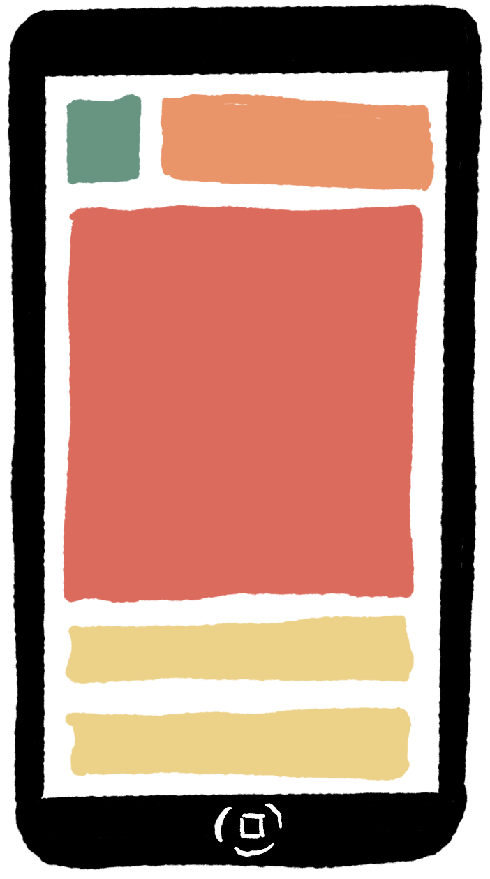
Mobile devices are tall and skinny. Vertical scrolling is good for mobile users, horizontal scrolling is bad. To design a mobile page, start by laying it out in vertical sections. Use a div element for each section, each with its own unique id attribute.
Here’s a simple 4-section design:
- header
- navigation
- content
- footer
Pro Tip: Use Semantic Elements
Instead of using div elements, you could also use semantic elements. Semantic elements work just like divs but they have more meaningful names, like header, footer, section, article, and so on. Using these elements can help browsers present content in a more meaningful way for people with accessibility issues. They can also help search engines decide what content is most important on a page.
 Do It Yourself
If you’re reading this on a mobile device (or even if you’re not), scroll up and down to see if you can pick out the header, navigation, content, and footer sections. What information is in each section? Does this web site use divs or semantic elements? Does this web site fit the above pattern perfectly or are there some exceptions?
Pro Tip: Force a Narrow Layout
Your mobile layout will look best if it stays at least somewhat narrow. If a user looks at it with a wide desktop monitor, it might not look as good. One way to keep it narrow for all users is to Put all the sections inside a single div with an id of container or something similar, then use the CSS properties max-width and margin to keep your content narrow and centered on any page.
The max-width property can be set to 768px (px = pixels), which is the standard width of a tablet in portrait mode. The margin property can be set to auto to keep the content centered on wide browsers.
 Do It Yourself
Here’s a template for a mobile-first site (see template-mobile.html on the Full Stack Example Pack):
<!doctype html>
<html>
<head>
    <meta charset=utf-8>
    <title>Title Goes Here</title>
</head>
<body>
    <div id="container">
        <div id="header"> ... </div>
        <div id="nav"> ... </div>
        <div id="content"> .... </div>
        <div id="footer"> ... </div>
    </div>
</body>
</html>
Add some content (headings, paragraphs, images, links, etc.) to each of the four main sections. If you need some generic text to pad out the content, you can get some classic (and non-classic) Lorem Ipsum filler text from lipsum.com.
Then add this style rule to an internal or external stylesheet:
#container {
    max-width: 768px;
    margin: auto;
    background-color:lightblue;
}
Load the site in a desktop browser and maximize it. you should see a light blue, centered strip of content. Then make the browser narrower and wider and watch what happens to the content.
Give each of the four main sections a different background color and style them a little so you can pick them out separately.
It won’t look that great yet, but we’ll soon be able to make it look better.
 Do It Yourself
You should always try to test your site on a phone. Unfortunately, unless you have a way of publicly hosting your web site, you won’t be able to do that.
![]()
The second best option is to test on a simulated phone. On Chrome, open the developer tools. In the top left, you’ll see a toggle device button like the one shown here. Press it to view your page as it would be displayed on various phones. Click on the “Dimensions” for the list of available phone simulators.
2. Keep it Simple
Mobile users will move on if they don’t find what they’re looking for quickly, so you should try to make it easy for them. Use an uncomplicated, commonly available, sans-serif font such as Arial, Verdana, Trebuchet, or the generic sans-serif. Focus in on the key content mobile users are looking for (the fewer words, the better) and use lots of whitespace by mastering the CSS Box Model properties.
In the CSS Box Model, every element has a content area (i.e., the text of a paragraph, or the image in an img element). Then outside that content area is some whitespace called the padding, then a border, then more whitespace called the margin. The margin separates one element from another, while the padding separates the border from the content.
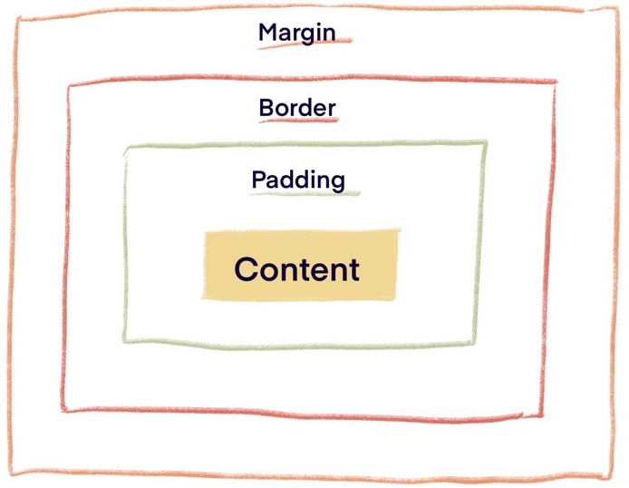
The Content, Padding, and Margin
You can specify the width of the content area and the size of the padding, border, and margin using in pixels px units. (As we saw before, you can also use max-width to set a flexible width.)
Here’s an example:
#container {
    margin: 20px;
    padding: 10px;
    width: 150px;
    background-color: beige;
}
Note that the padding is part of the element, but the margin is not. This means if you set a background-color on an element, the padding will be colored, but the margin will not.
The Border
You can set the border width, style, and color separately:
#container{
   border-width: 5px;
   border-style: solid;
   border-color: royalblue;
}
Or all at once:
#container{
    border: 5px solid royalblue;
}
Border styles include solid, double, dotted, dashed, and none.
You can also give your element rounded corners with the border-radius property. This property sets the radius for a circle that is used to draw the corners:
#container{
    border-radius: 20px;
}
The Sides of the Box
You can set separate left, right, top, and bottom sizes separately for every box model property.
This rule sets a padding of 10px on all 4 sides, then increases the padding on the top:
#container{
    ...
    padding: 10px;
    padding-top: 30px;
}
Pro Tip: CSS Reset Rule
The browser’s default padding and margin settings should not be relied on because they’re not always the same on every browser.
The * (asterisk) selector selects every element type. You can use this to create a reset rule that sets padding and margin to 0 on all elements at once. Then you can override with more specific rules as you require.
* {
    padding: 0;
    margin: 0;
}
And while you’re at it, why not reset font family and font size too?
See the w3schools selector reference for more.
 Do It Yourself
Continue to work on the template from above. Add CSS rules to space out your content using the box model properties. You can add generic spacing rules to all div elements, then tweak them for each section as necessary by adding rules that only apply to a given id.
div {
   padding:20px;
}
#content {
   padding: 10px;
}
The two rules above conflict for the div with id="content", but the second rule will prevail because the id selector is more specific than the div selector.
3. Be Flexible
Every mobile phone model has a different screen width, and can view web sites in portrait or landscape orientation. It’s important to make your layout flexible enough to fit any screen. The default setting for the width property is auto (short for “automatic”). This allows the browser to choose the appropriate width to fit the screen and content. If you don’t have a need to set width, don’t do it, or set it to auto to make sure it remains flexible! Let the browser decide how big things should be.
We will discuss flexibility at length in the next chapter.
4. Make Navigation Easy
Phone users need links that are easy to find, easy to see, and easy to tap.
Use padding and background colors on a elements to increase the size of a link. This makes it easier to see and easier to tap for mobile users.
The “good” link above is easy to see and easy to tap. That’s because the a element has padding and background color.
The “bad” link is easy to see but harder to tap because the a element doesn’t have padding around it. The padding is on a div element container instead. So you have to tap the word itself to use the link.
The “ugly” link is not easy to see or easy to tap.
 Do It Yourself
Tap the edge of the green area on the good and bad links. See the difference?
Right click and “inspect” the three links to see how they were made and find the differences in how CSS properties were applied.
5. Be Mobile-Friendly
Here are a few last things to think about when you’re designing for phone users.
Always Use the Viewport meta Tag
The tag below is really important for phone users. It tells their browsers to make the width of the page they display (the viewport) equal to the width of the phone screen. Otherwise, the phone browser might zoom out or only show you part of the page.
<meta name="viewport" content="width=device-width">
You should always include this tag in the head section of your documents. The template-mobile.html file in the Full Stack Example Pack contains this tag.
Avoid Hover effects
Hovering means moving the mouse over an element without clicking or tapping. We only have one hover effect right now – the HTML title attribute that creates pop-up tool tips. Later we will cover other ways to use CSS and JavaScript to create hover effects.
But most phone and tablet screens don’t support hovering very well. It’s ok to use the title attribute and other hover effects once you know how, but don’t make it so that the user needs to be able to hover to use your site effectively.
Save Bandwidth
The word “bandwidth” refers to how much data a user has to download before they can see your site.
Phone users are often using their mobile data plans. These plans can be expensive and slow. Big image files might cost your users money and make it longer for your site to load.
If you are using a really big image, but setting the width so it’s never shown at full size on the page, you are wasting bandwidth. Consider using an image editing program to create a smaller version of the image for your web site. Reducing the width (and height) can have a dramatic effect on the size of an image. For example, a 700 pixel wide image might be 750 kilobytes in size, while a 200 pixel wide version is only 75 kilobytes.
 Coding Practice
- Make a new version of your portfolio (copy and paste it to a new file name) then make it mobile friendly.
- If you haven’t already, move the CSS rules into an external stylesheet linked by a link element.
- Put all the content inside a container div and set it up with max-width and margin: auto so that it never gets too wide.
- Create the four main sections with div elements (header, navbar, content, footer). Paste the appropriate content into each section.
- Add any other CSS you need in order to make things look nice. Remember – lots of whitespace!


Feedback/Errata