The User Interface
10 Designing for Desktop Users
 Learning Outcomes
When you have completed this chapter, you will be able to:
- Design simple and effective desktop layouts using the HTML and CSS techniques introduced in previous chapters.
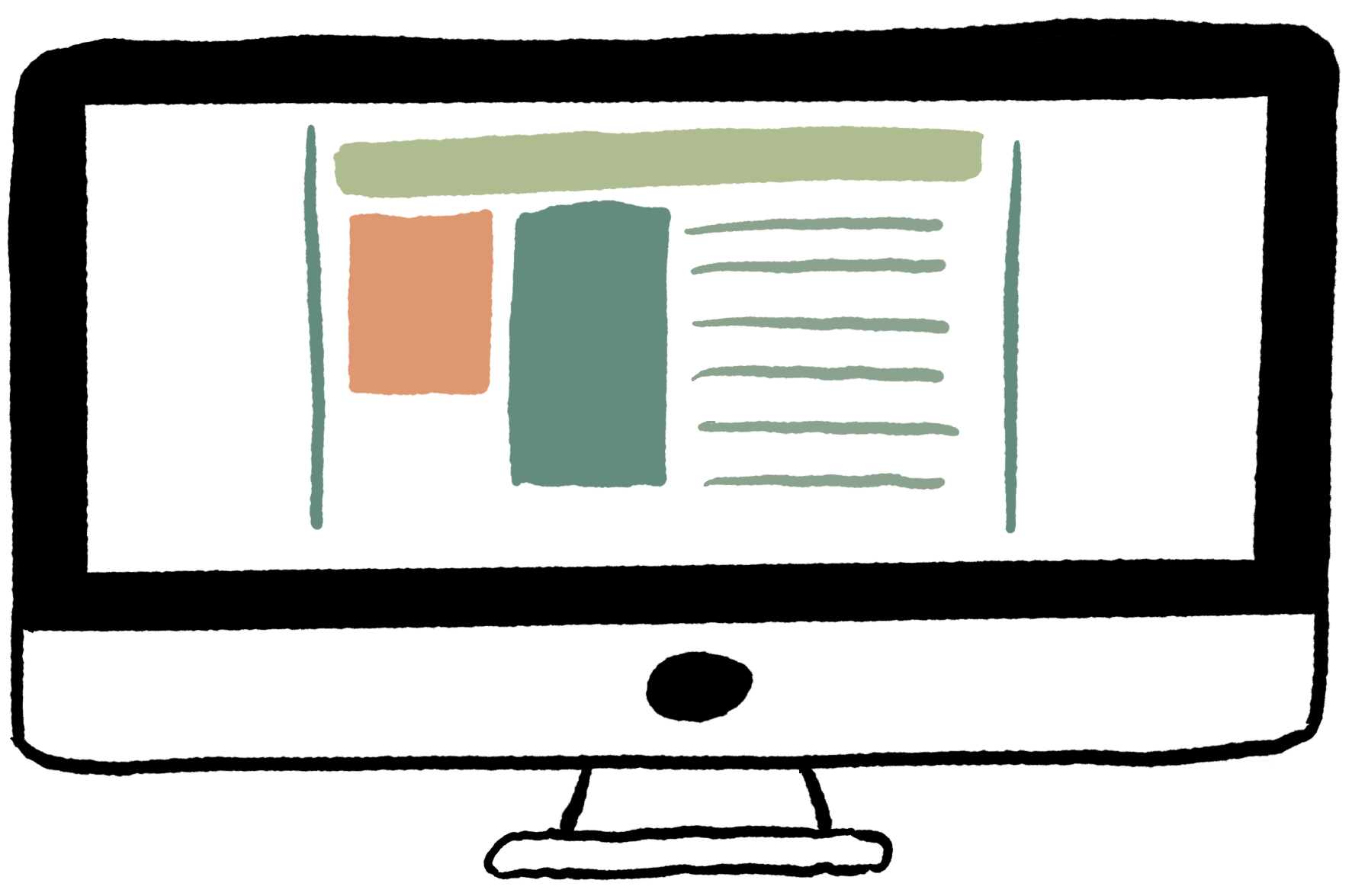 For the activities in this book, you can mostly focus on simple, mobile-friendly designs. But for those who want to design for wide desktop screens (when we say “desktop” we mean any wide browser, including laptops and tablets in landscape orientation), this chapter contains a few tips, tricks, and pointers to further reading.
Here’s some good news: You don’t need any new tools in order to make the desktop layouts shown here. Your mastery of basic HTML and CSS, box model properties, flexible widths, and the CSS flexbox will be enough.
Three Basic Desktop Layouts
In contrast to sites designed for mobile users, desktop users on wide browsers can handle a more visually complex design. Desktop designs often include multiple columns or grids of information, and pack a lot more information into the page by laying out content horizontally as well as vertically. Nevertheless, sites that are designed for desktop will often still use many mobile-first principles: lots of whitespace, clean fonts, flexible sizing, and easy navigation are the hallmarks of modern web design no matter who you’re designing for.
A Very Simple Desktop Layout
The first layout below has 3 main sections (divs). The image on the left shows a basic “wireframe” layout, and the image on the right shows the three main divs involved as red, orange, and green rectangles. In this layout, the navbar is at the top, followed by a large div that is sometimes known as a jumbotron, and typically contains a large background image with text on top, or perhaps a slideshow. Then the content is in the two horizontally laid out divs below the jumbotron.
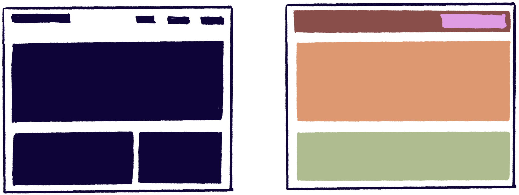
Some notes on this layout:
- To get horizontally laid out content boxes, place two divs into a single containing div configured as a flexbox.
- One way to make the top right section of each layout is to create a new flexbox div inside the navbar div and use
float: right;to move it over. - For a dedicated desktop site, you could get away with fixed widths, but it’s still a good idea to use flexbox, % units, max-width, and
margin: auto;to make the design flexible. - A top-level container div can be useful to set consistent margins, but it’s not essential. You can also use a top-level container as a vertical flexbox containing three other, horizontal flexboxes.
Getting a Bit Fancier
The second example shown below is just a little more complicated, with more content boxes and a footer. It can be laid out with four top-level divs, shown as red, orange, green, and violet rectangles in the image beside it.
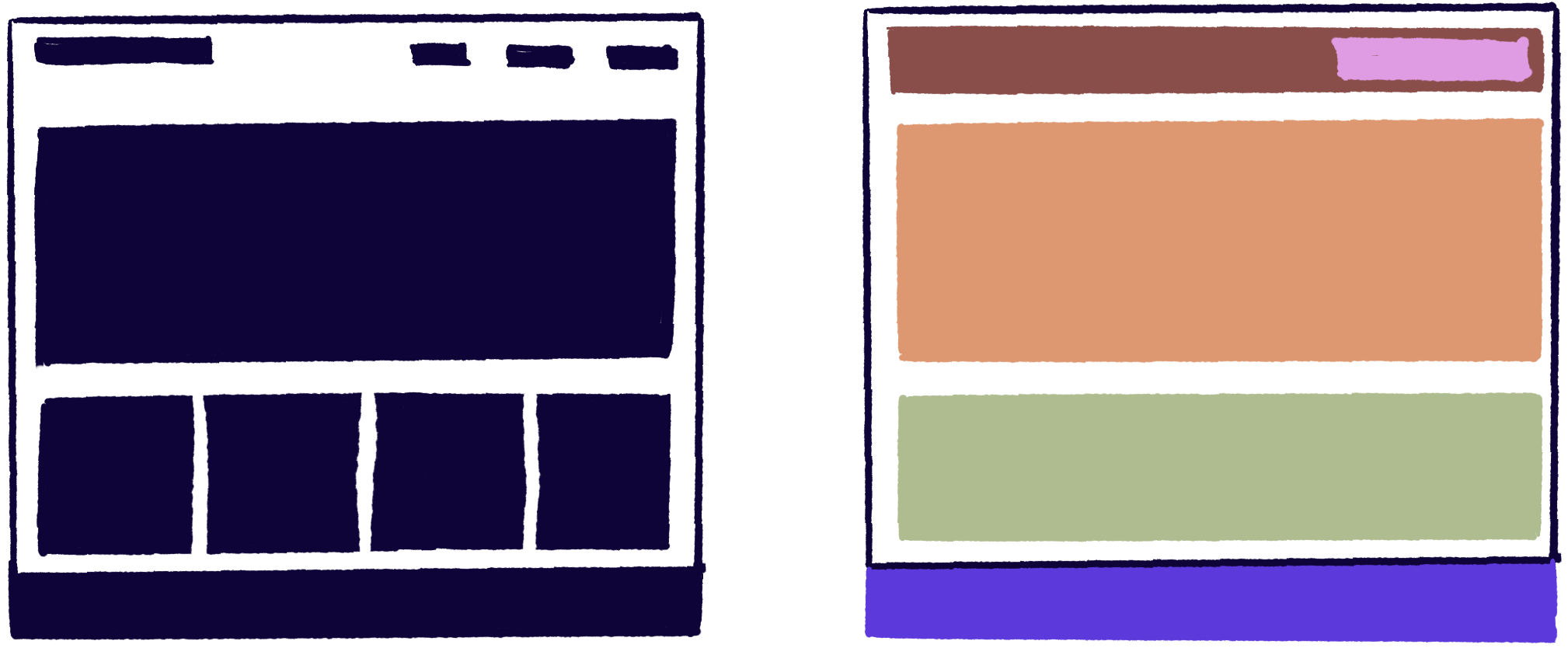
Note that the if the designer uses a container div, the footer would probably not be inside the container
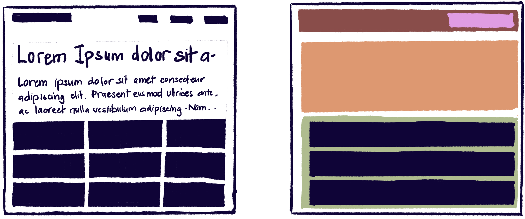
A Grid Layout
Finally, here’s a more complicated grid layout. Again, the navbar is at the top, but this time the content is laid out in a grid pattern. This can be created by putting flexbox divs within flexbox divs, and the layout shown on the right assumes that this is how the layout is made. But there is also a CSS display: grid option you could explore that is designed just for this purpose.
Even More Desktop Layouts
All the examples in this chapter originally came from designshack.net. You can find even more layout ideas, tips and tricks, and sample code there and in lots of other places on the web too.
 Coding Practice
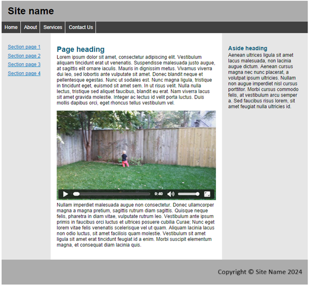
- Try to re-create the layout shown below as closely as possible (using your own text and image). The total width is 1000 pixels and should be centered in a browser wider than that. All fonts are sans-serif. The text is Lorem Ipsum, a Latin text that has been in use for the last 500 years (!) by typesetters creating example layouts. You read more about it and download some text at lipsum.com.
- For more design exercises, try to create one of the other layouts shown above. Use Lorem Ipsum text and images from the web to make it come to life.
- Make a desktop version of your portfolio website, based on one of the ideas above.
-
- Copy your original portfolio website to a new folder.
- Create the necessary sections with div elements (header, navbar, content, footer). Paste the appropriate content into each section. Use different content divs for employment, school, hobbies, etc.
- Use CSS to create the layout for the site. you can (temporarily or permanently) use background colors for a quick visual of the extent of each div.
- Add any other CSS you need in order to make things look nice. Remember – lots of whitespace, flexible layouts, and colors!
-

Feedback/Errata