6 Technique: Sketching Digitally with Photoshop
michealg1
- Find a reference Image
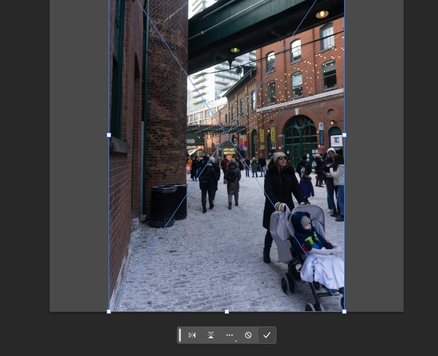
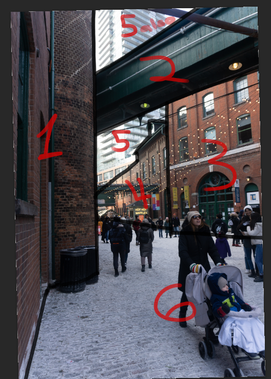
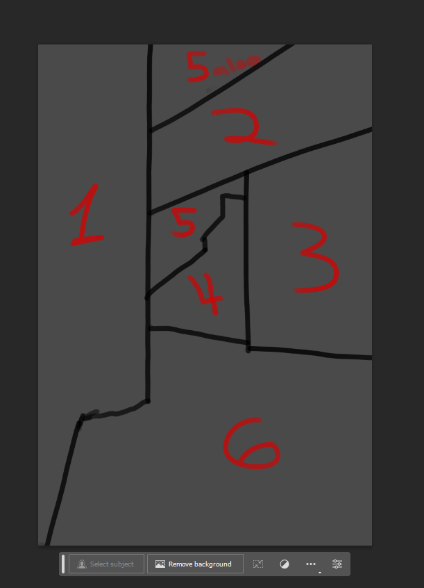
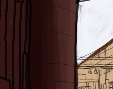
A good reference goes a long way toward making things easier to draw and nicer to look at. Make sure that there are clear leading lines and focal points. We will be using the following image as a reference for the following tutorial:

2. Opening and Setting up Photoshop
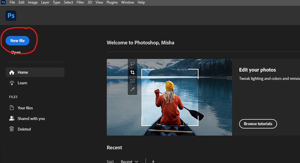
There are other programs that are specifically built for digital painting like Clip Studio Paint or Procreate but for the purpose of this tutorial, we will be using Photoshop as a digital painting software. To get started in Photoshop, we will be creating a new file by pressing the ‘new file’ option located in the top left corner.
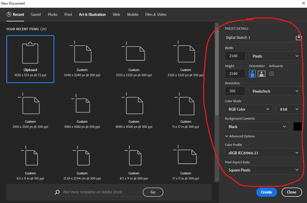
 You will be prompted with the following pop-up page. Change the options to the following settings.
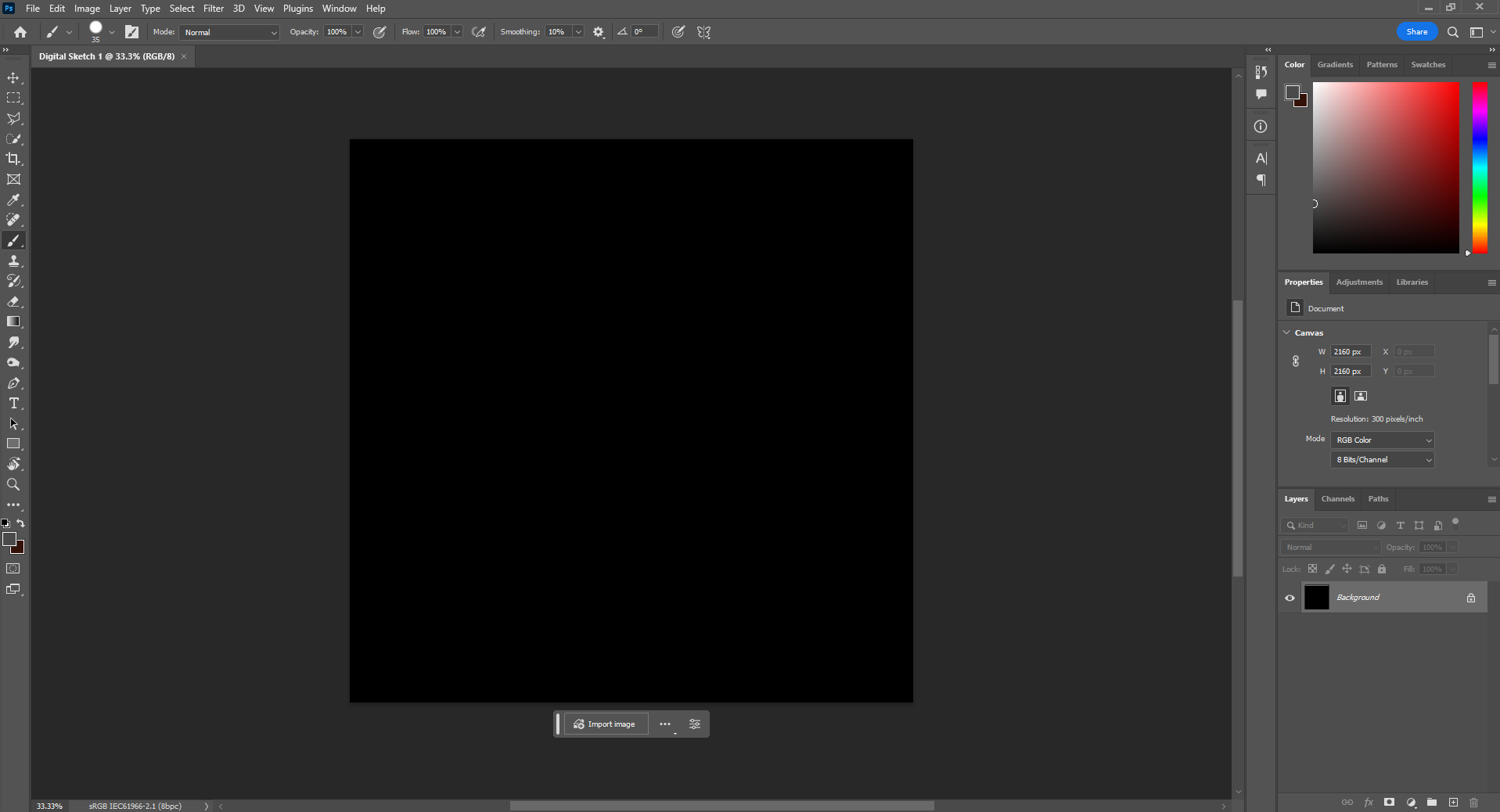
This should be the layout of your work area.
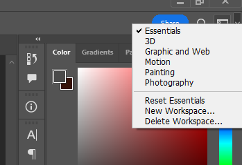
If not, we can reset our layout to the “Essentials” option by clicking the “Choose a Workspace” box in the top right corner.
3. Setting up the Canvas and Importing our Reference Photo
The best practice for any painting (digital or not) is setting up the canvas. To do this, we will be creating a new fill layer with a halftone colour. You can do this by selecting “Layer” > “New Fill Layer” > “Solid Color”.
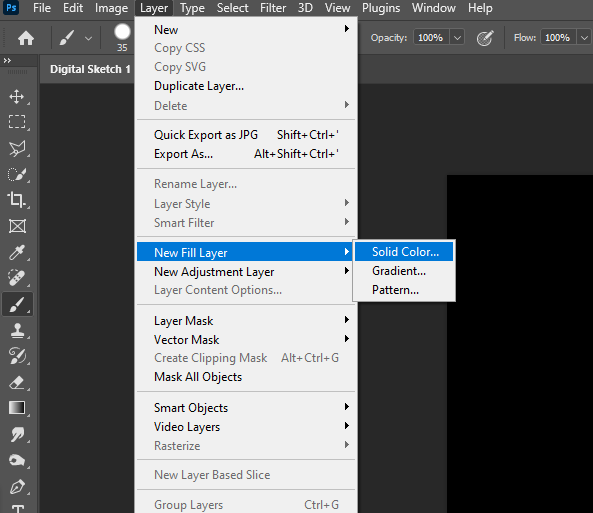
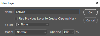
The following popup will appear. Change the name to “Canvas” and click OK.
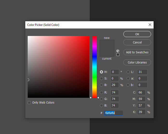
The following Color Picker will let us choose our fill layer colour. Set the colour to a mid-tone on the greyscale as follows and click OK.
To import our reference photo, we must first create a new layer (we will be creating a lot of these) by clicking the box beside the garbage can on the bottom right.
To insert our reference photo, we can simply drag and drop our image onto our canvas and click commit (the check mark).
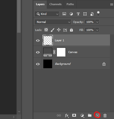
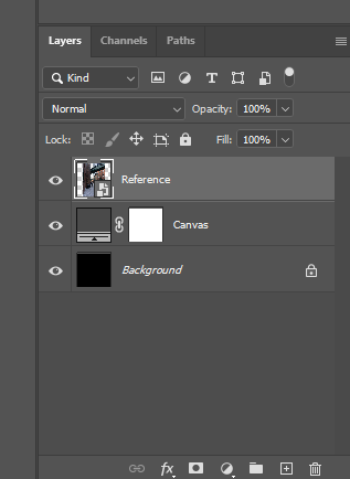
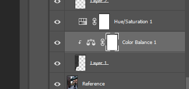
Make sure to keep our layers organized. This is the number one mistake that digital painters make. We can make sure that we are editing in the layer that we want to edit in by checking that the specific layer in question is highlighted. We can also rename layers by double-clicking on the layer name. You should have something that looks like the following in your layers tab.
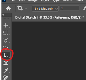
Before moving on to the “Brush Tool”, we need to crop our canvas so that it is roughly the same size as our reference image. To do this, select the crop tool (5th option in the tools panel on the left)
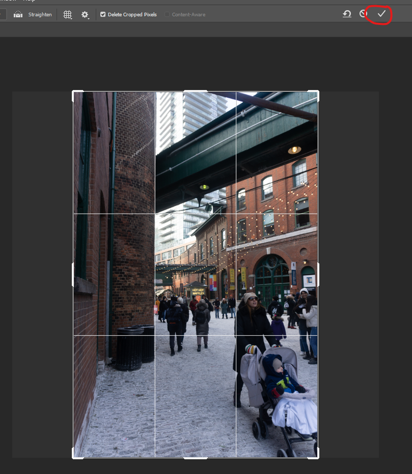
Crop to the size of your reference image and click “Commit current crop operation” (the checkmark at the top).
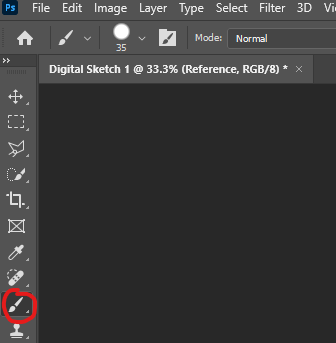
4. Brush Tool
The paintbrush tool is what we will primarily be working with in regard to this tutorial. There are many shortcuts and more advanced techniques for making our job easier, but we will be sticking with the basics. The “Brush Tool” is the 9th option on your tools tab (the very left sidebar)
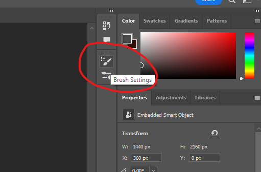
We will also be opening up our brush settings panel.
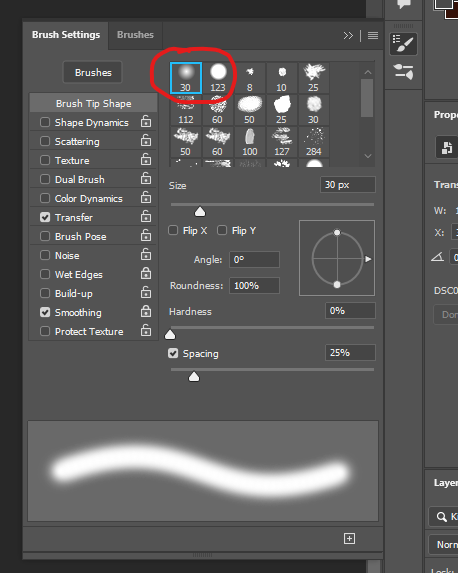
Within this panel, we are able to change our brush tip, angle, size, spacing, etc. The only two brushes that you will ever use are the soft round brush and the soft hard brush (the first two default options). Select the hard round brush for subsequent steps (the second option).
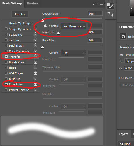
We will only be turning on two advanced options, “Transfer” and “Smoothing”. The “Transfer” option is the most important as it allows us to change opacity depending on how hard we press on our stylus. Make sure you have the following settings.
To change the colour of our pen, we can use the colour panel located at the top right corner. Select black for the following steps.
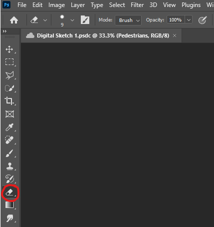
5. Erase Tool
The “Erase tool” is another important tool to be knowledgeable of. This tool is self-explanatory, if you want to erase the pixels that you place (from the brush or some other source) simply click and drag on the canvas. Within this tool, you are also able to change the tip to your liking exactly like the “Brush tool”. The “Erase tool” is the 12th option on the tool menu.
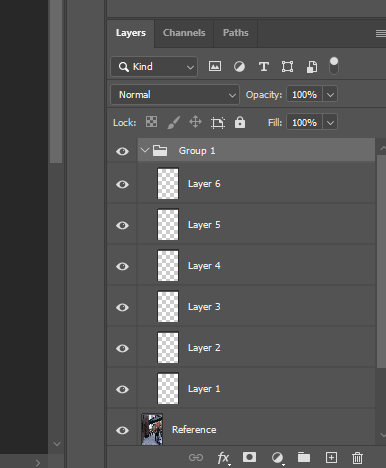
6. Organizing our Sketch
We want to begin by separating our elements within the painting. Based on our reference photo, I see 6 major sections (stay with me, I promise it will make sense soon). Create 6 layers and group them by holding shift or CTRL until our new layers are selected and press CTRL + G. You should have something that looks like the following in your layers panel.
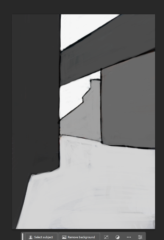
With our brush tool selected (hard round brush & black colour), outline each section. I have included the sections with and without the reference photo. I have also numbered each section for better clarity in this tutorial.
Our next step is to fill in the area of our sketch. By selecting hues on the greyscale, we can create a hierarchy in our sketch while avoiding colour theory for now. To increase our brush size quickly, you can press either [ or ] to increase or decrease the brush size quickly. Our hierarchy needs to flow from either dark to light or light to dark. For this image, we see that the first section is the darkest out of the six, so we will be colouring it the darkest. You Should end up with something like this:
Again, make sure you are editing the appropriate layer or else the following steps will either not work or not be effective.
7. Colouring our Sketch
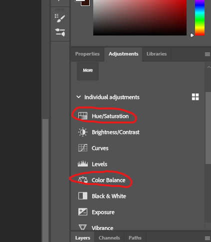
Using Photoshop magic, we are able to colour our sections extensively and non-destructively. To do this, we need to create “Hue/Saturation” and “Color Balance” adjustment layers for each section layer that we created earlier. To do this, select the “Adjustments” tab (beside the layers tab on the top right side). Select “Hue/Saturation” and “Color Balance”.
You should have something that looks like the following:
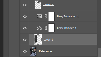
Next, we need to clip them to our drawing layer. To do this, first select our drawing layer and then right-click the “Color Balance 1” layer. This opens up different options, we want to select “create clipping mask”.
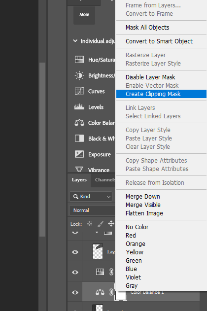
You should have something that looks like the following:
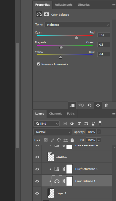
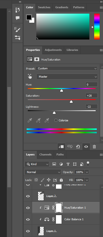
Repeat this process until you have a “Hue/Saturation” and “Color Balance” adjustment layer clipped to each drawing layer. After having done so, we are able to fiddle around in the settings of these clipped adjustment layers. Double-clicking on the respective adjustment logo (scales in the case of “Color Balance 1”) we are able to see the adjustment settings. Play with the dials until you are happy with the colour of your section. NOTICE: the more saturated your baselayer colour is, the lower the impact you will have with these setting sliders. These are my settings for section 1:
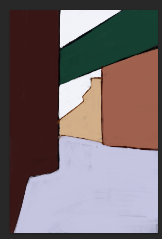
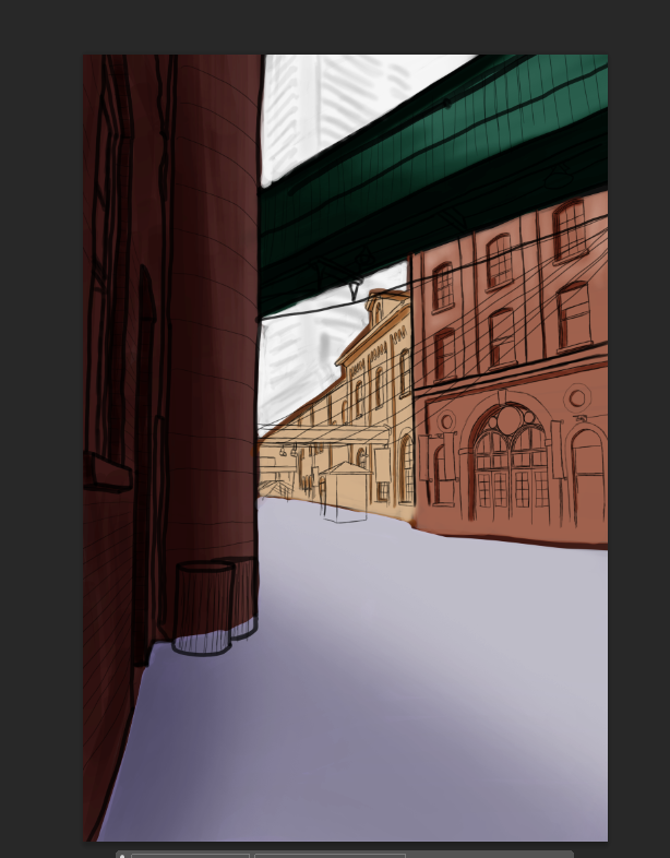
Do the same for each of your drawing layers until you are satisfied with the result. This is what my base colours look like:
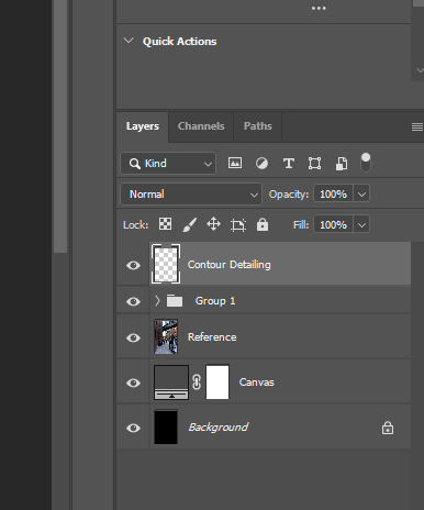
8. Contour Detailing
Our Sketch looks bare bones right now so our next step is to add in our details. We will be adding a new layer above our grouped layers like this:
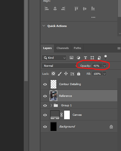
In this layer, we will be using a black hard round brush to add in the outlines of our contours. To help us with this we will be moving our reference layer above the grouped layers but below our “Contour Detailing” layer. Additionally, we will be lowering the opacity so that it is easier to see what we are drawing. The opacity slider is just above our layers:
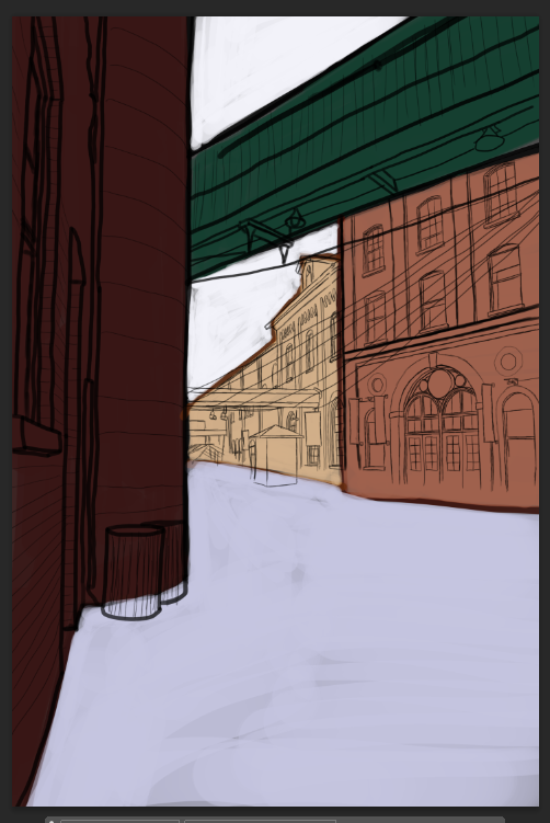
This is what my details look like:
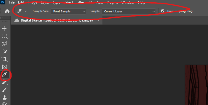
9. Creating Forms
Though our detailing has given us some sense of form, adding shadows to our original grouped drawing layers will make things look more 3D. To do this, make sure you have the respective layer selected within our grouped section (I will be starting with “Layer 1”). After selecting the layer we want to work on, select the “Eyedropper Tool” (7th option in the tools menu). This tool will select the current colour or hue wherever you click with it on the canvas. This is helpful when we are creating gradients. To begin, make sure you have the following settings selected:
The following video is just a demonstration of the process for creating gradients within Photoshop. The key is to get used to transitioning between the “Brush Tool” and the “Eyedropper Tool”. To do this seamlessly, use the shortcuts “b” for the brush and “I” for the eyedropper. Though, as you might have already been able to experience, you can create some gradation with the brush tool alone, it is very limited.
Apply this technique to our sketch by selecting the layer we want to work in and select the brush tool. In the colour panel, move up and down on the grey scale (do not select pigment). I would recommend starting with a darker hue first for the shadows and then a slightly lighter hue for highlights. Keep the base as the mid-tone for the respective section. Example:
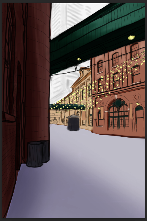
These are what my final forms look like:
10. Final Detailing
Our final round of detailing will come from explicitly placing and colouring objects that we detailed earlier but couldn’t quite colour distinctly. We will work on this by creating a new layer and renaming it “Final Detailing”. We can use the hard brush tool and eyedropper as previously gone over in previous sections but this time using colours explicitly (not limiting ourselves to just the greyscale). This is what my final detailing looks like:
11. Adding Pedestrians
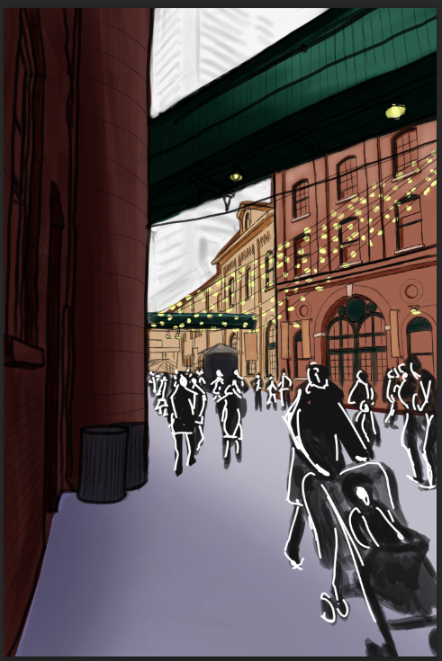
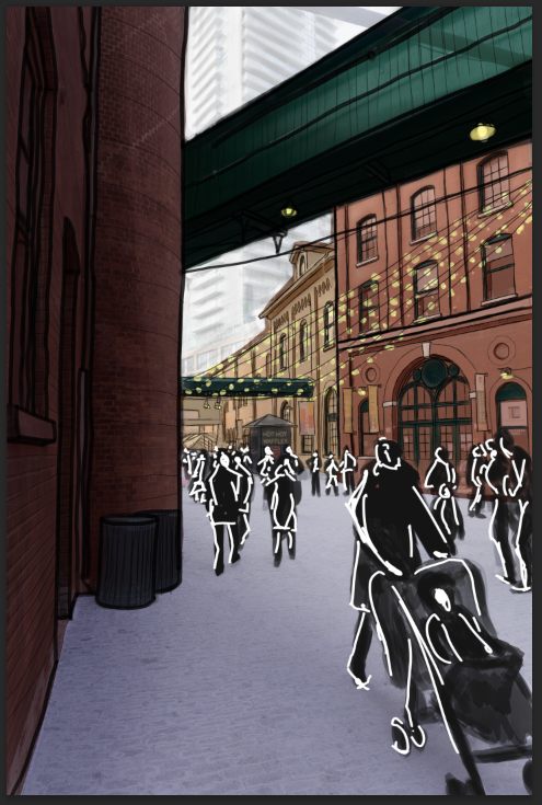
Similar to the previous step, we will be using the same tools and workflow already outlined to create pedestrians. To start, we need to make a new layer as always. There are many ways to stylize pedestrians in urban sketches so go with whatever you think is best. The only rule to follow is perspective. Remember that most people will be centred at the vanishing line. Obviously, some people are shorter/taller than others, but this rule remains law regardless. This is what my final sketch looks like:
Discussion
The purpose of this tutorial was to create a digital sketch. Our final result might not seem to be the most realistic compared to our actual photo but what it does have is character and style. Of course, it is the skill of the artist that carries the quality of the sketch so make sure to practice. A tip to quickly add realism is to keep our original photo overlapping with our sketch. Though we cannot technically call it a pure sketch anymore, it is a happy middle ground between the two. Another point of criticism from this workflow is that it relies heavily on copying straight from our reference photo. This is completely ok as we are beginners and are just learning the process. Though I do encourage everyone to eventually try and train their eye to sketch without copying, do not feel bad for doing so as even professionals copy from their reference photos! An important distinction is to make sure you copy responsibly while respecting copyright laws and to always be honest about the process of your work (if you choose to work with AI).
Author: Micheal Glazyrin
