25 Layout fundamentals for Reports & Posters (alignment, text justification, placement, colour)
michealg1
Introduction
The quality of reports and posters is not only dictated by their content but also by their presentation. Putting great effort into your presentation is important so the viewer can understand and follow along with what you are trying to communicate. Our reports need to be concise, clean, and readable so that even a passer-by can pick up on the narrative or the type of content being shown. This can be achieved by the establishment of a hierarchy through alignment, placement, text justification, colour, and size.
Hierarchy
Hierarchy, when we are talking about formatting, is how we guide the reader through our document. When we establish a hierarchy in our posters or reports, we want to be actively thinking about where we want our viewers to be looking and in what order. Before placing our content onto our presentation document, ask yourself what you want to be the focus of the presentation, what can be the secondary focus, and what do you want to show last. Using the following rules allows us to establish a hierarchy (from importance to insignificance):
Bold Text —-> Thin Text
Vibrant Colour —-> Muted Colour
Top Left Placement —-> Bottom Right Placement
Large Size —-> Small Size
For example, an image that is vibrant and contrasting has a lot more potential to attract the viewer’s eye than an image that is very muted and dull. Large bold text is a lot more attractive to the eye than small and thin text.
Alignment
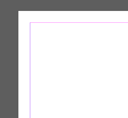
Alignment is the most important principle of good formatting. To make sure that our document does not look messy, we align content. The most basic alignment element at our disposal is the margins of our document. These usually are automatically created in document software such as Word, Google Docs, and Indesign and are there to make sure that your document is printer-compatible (so content is not cut). The margins appear as a purple line on our 8.5 x 11 document:
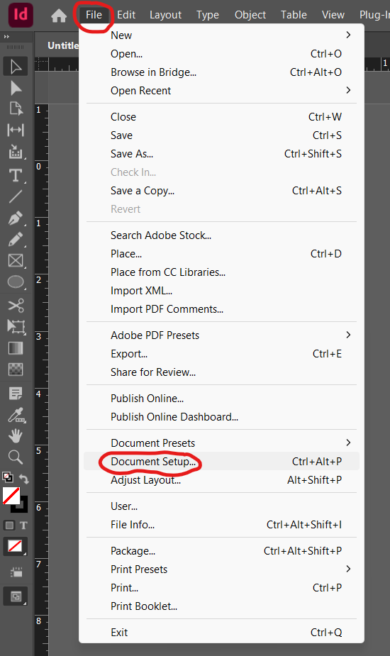
 To change the margins, you can access the settings by clicking the “File” dropdown menu and selecting the “Document Setup” option:
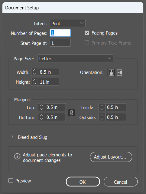
 You will have a popup that looks like the following to change margin settings:
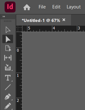
 Margins are technically classified as “Guides” in Indesign but are not directly editable with either selection tool, unlike normal guides. To create “Guides” we must first bring up the “Rulers” if they are not on by default. To quickly bring them up, use the shortcut CTRL + R or select the option to show them in the “View” dropdown menu. This is what they should look like:
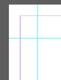
 To create guides, we must click and drag on either the top ruler to create horizontal guides or on the left side ruler to create perpendicular guides. Click, drag, and drop wherever you wish to have a guide to perfectly align your elements. Your guides should appear as blue lines on your page:
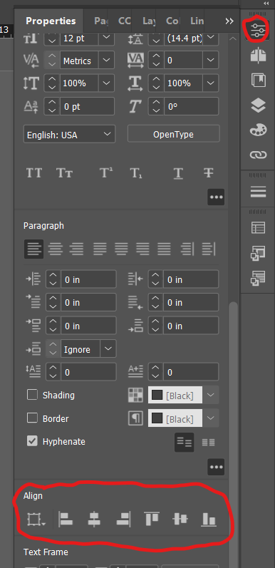
 We can also align content based on its position to other content. In our properties menu, after selecting an element, we have access to alignment options. We can either align to centers or edges:
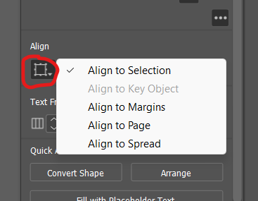
 We can also change what we are aligning to. By clicking the jagged square, we can bring up options to align our element to the selection, to the page, to the spread, to the key object, or to the margins:
Text Justification
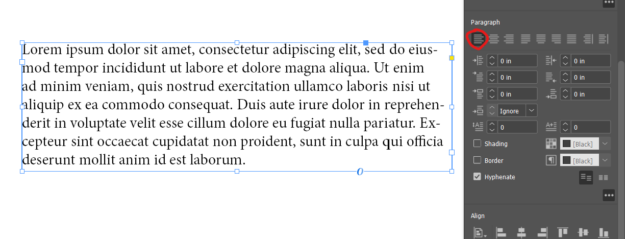
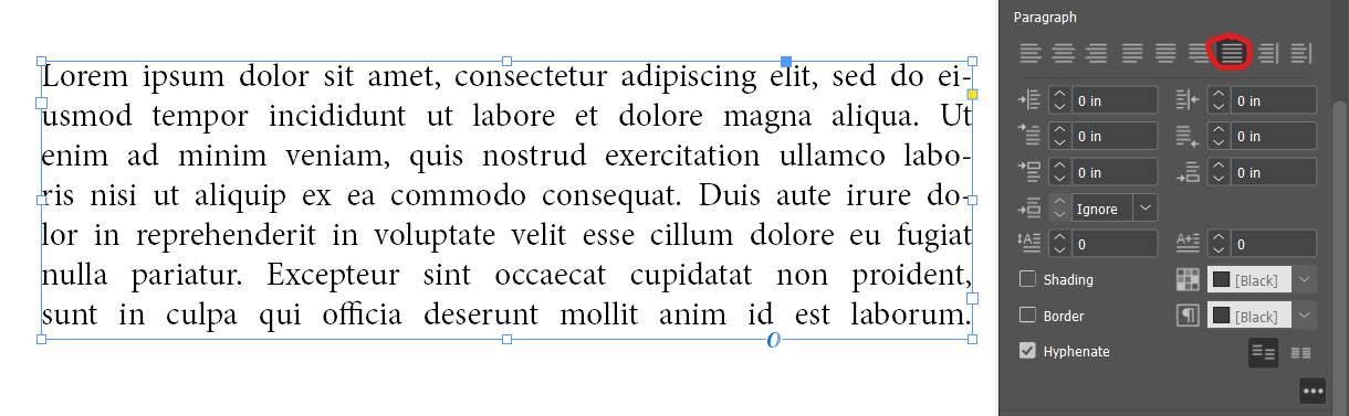
Text justification needs to be just as consistent as possible. In 90% of use cases, you will only be using the “Align Left” option in the “Paragraph” section in the “Properties” panel:
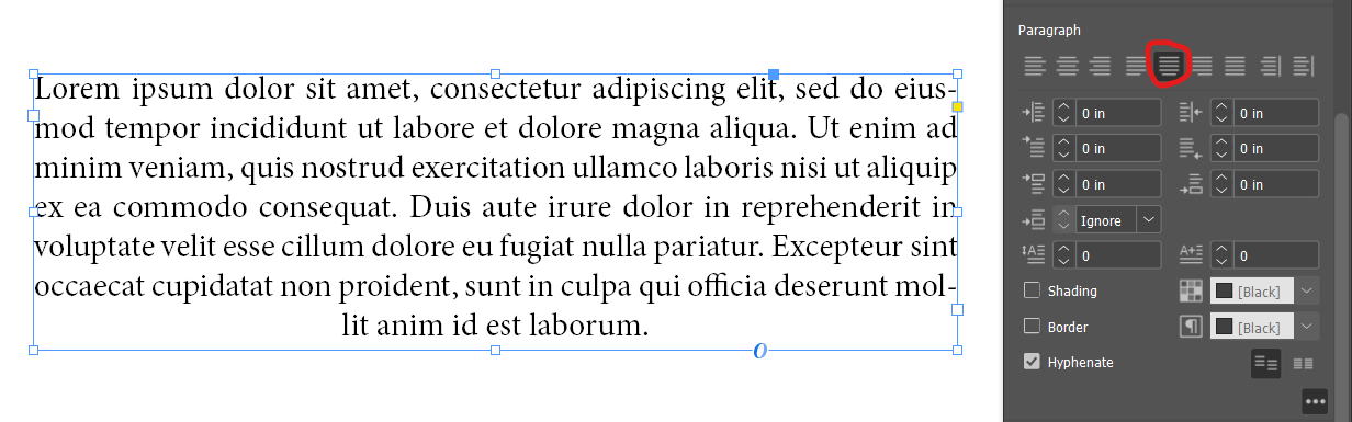
 The “Justify All” option is an alternative to the “Align Left” option but only use this option if you feel confident enough. In some cases, it improves readability and creates a more defined textbox, but in other cases, it may make the element look messy. I would recommend only using this option for lengthier texts:
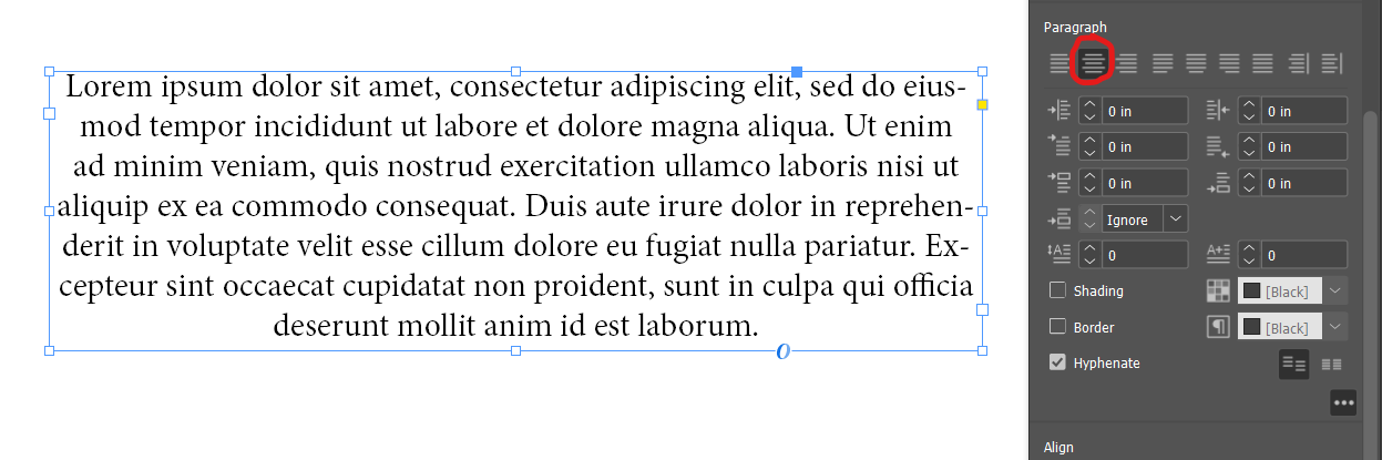
The second most common use case is the “Align center” option for text alignment. I typically only reserve this alignment option for a quick description of an image or graphic on a poster:
The alternative, similar to the “Align left” option, is the “Justify with the last line aligned center” option:
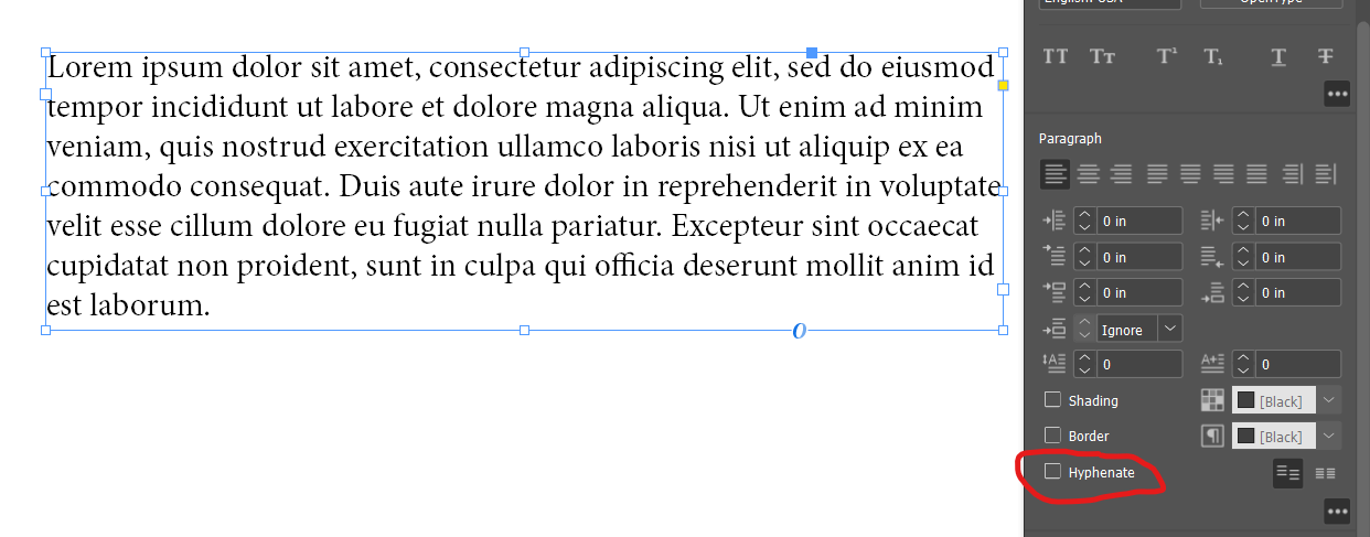
Turning off the hyphenation could greatly improve or downgrade the aesthetic of your text elements. This option is usually determined on a case-by-case basis so use this setting as you see fit:
Placement
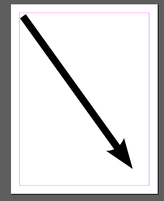
The placement of our elements needs to follow the hierarchy that we desire to establish. Since most Western viewers read a poster or a report from left to right & top to bottom, we want to prioritize this natural flow. Visualization of how the reader will naturally read our document:
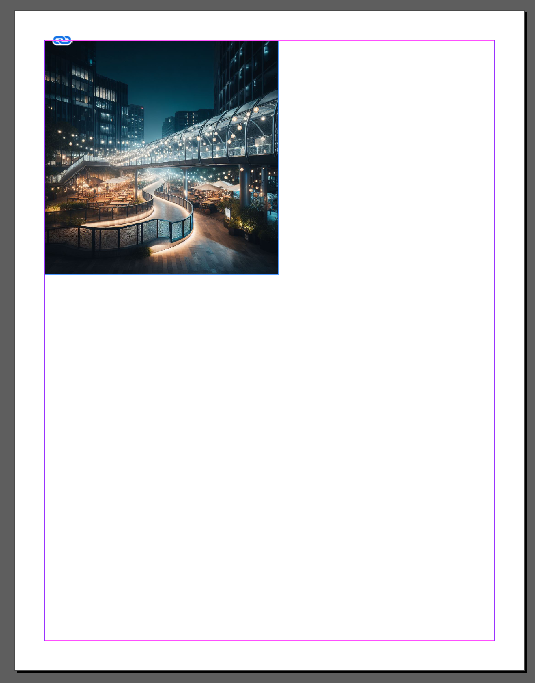
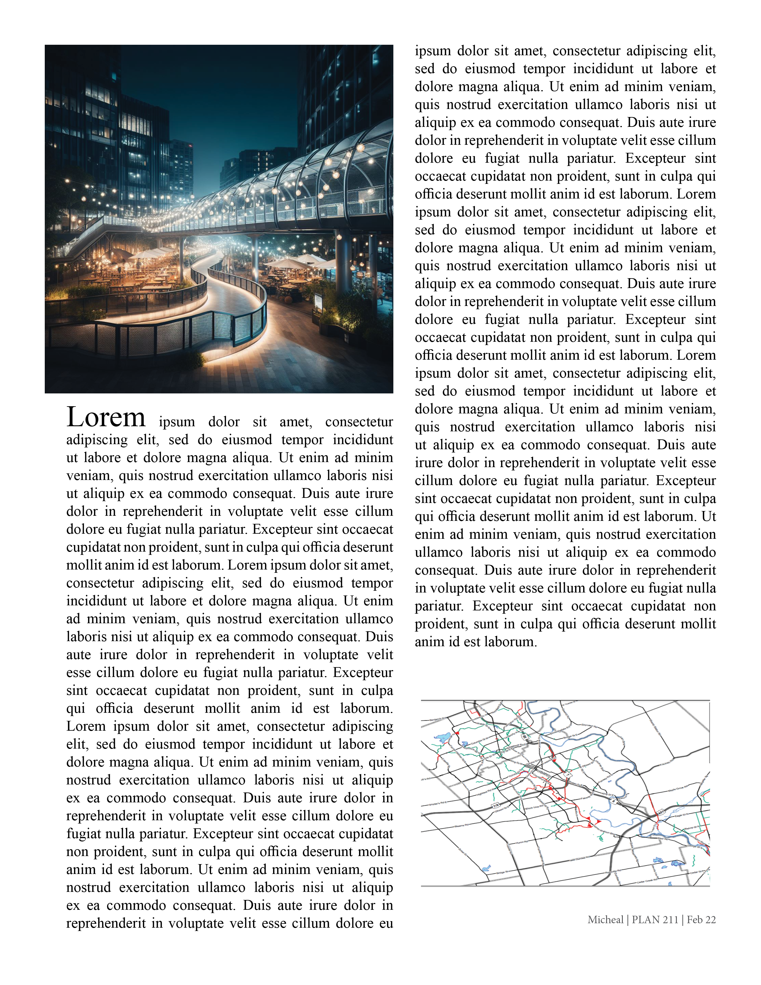
To take advantage of this natural flow, we will need to prioritize our most important elements at the top left corner. For posters, this usually involves showing our most impressive or readable graphic (like a render). This image needs to be the largest to again guide our viewer’s attention:
Text needs to accompany this image to justify and explain its existence. We have two options here depending on if we are making a report or a poster. We can either have the text go underneath the image or beside it. For the purposes of this tutorial, I will be placing it underneath in a report-style layout:
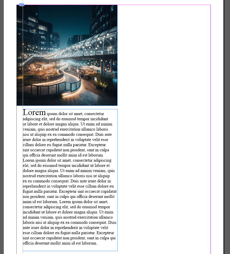 I created a guide that is 0.25 inch away from the margin to align my textbox to and aligned the right edge of the textbox to the right edge of the image. This alignment created a structure for the document and established a Hierarchy. By putting the text slightly away from the margin, the viewer will look at the text after looking at the image and will know that the text is second in line to be viewed as the first word is much larger and bolded. This is important if we have multiple text boxes like in the next example:
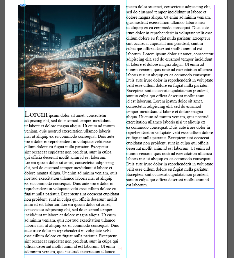 To Fill in the remaining space, I will be placing another element that is smaller and less visually attractive/more technical. This image will not take priority as our primary image has more contrasting colours, is larger, and is situated at the top left of the page. Understanding how hierarchy is formed is how we remain consistent in formatting our documents:
Author: Micheal Glazyrin
