22 Drawing Type | Design Concept: Cross-Section
michealg1
What are cross-sections?
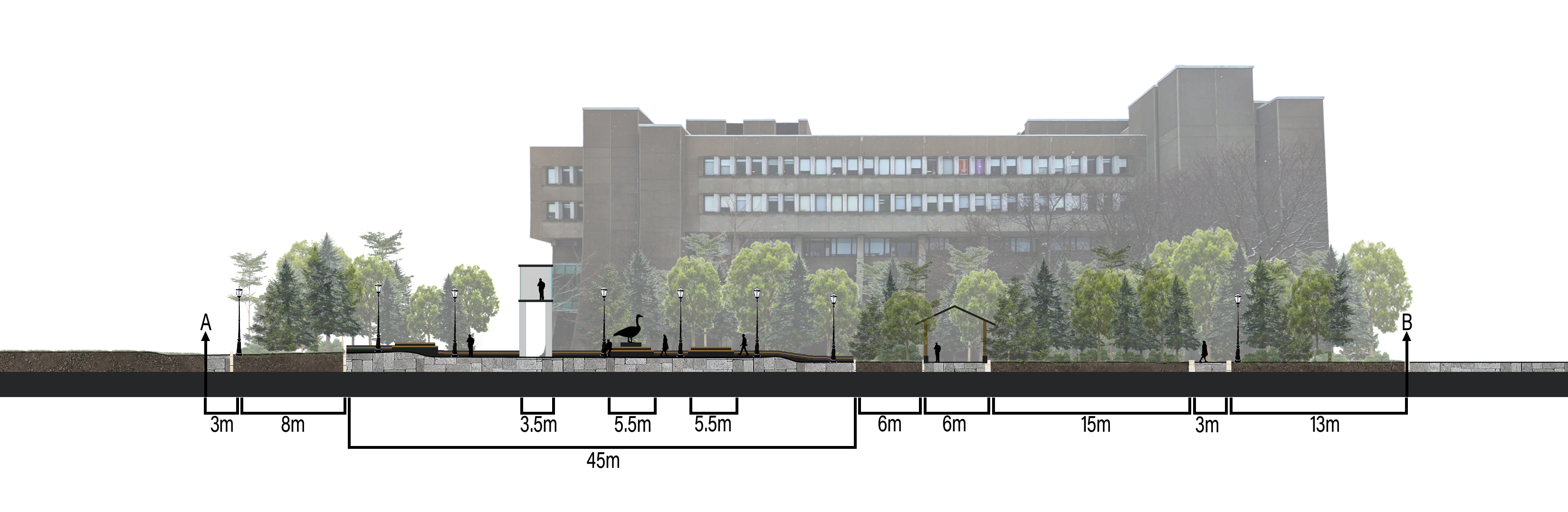
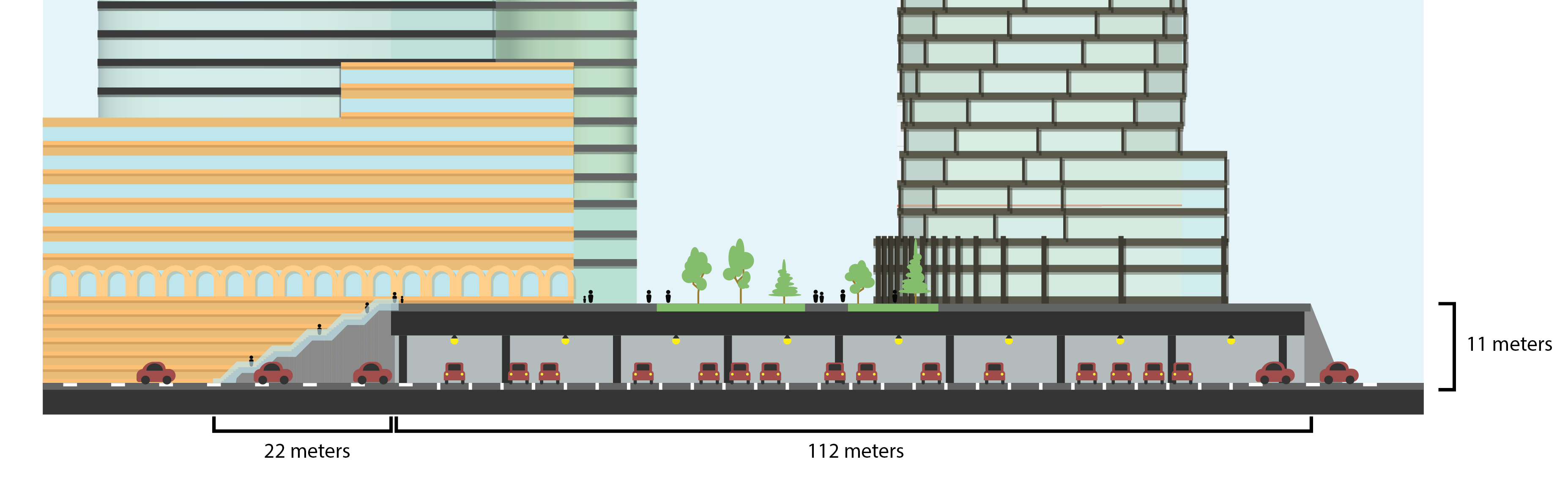
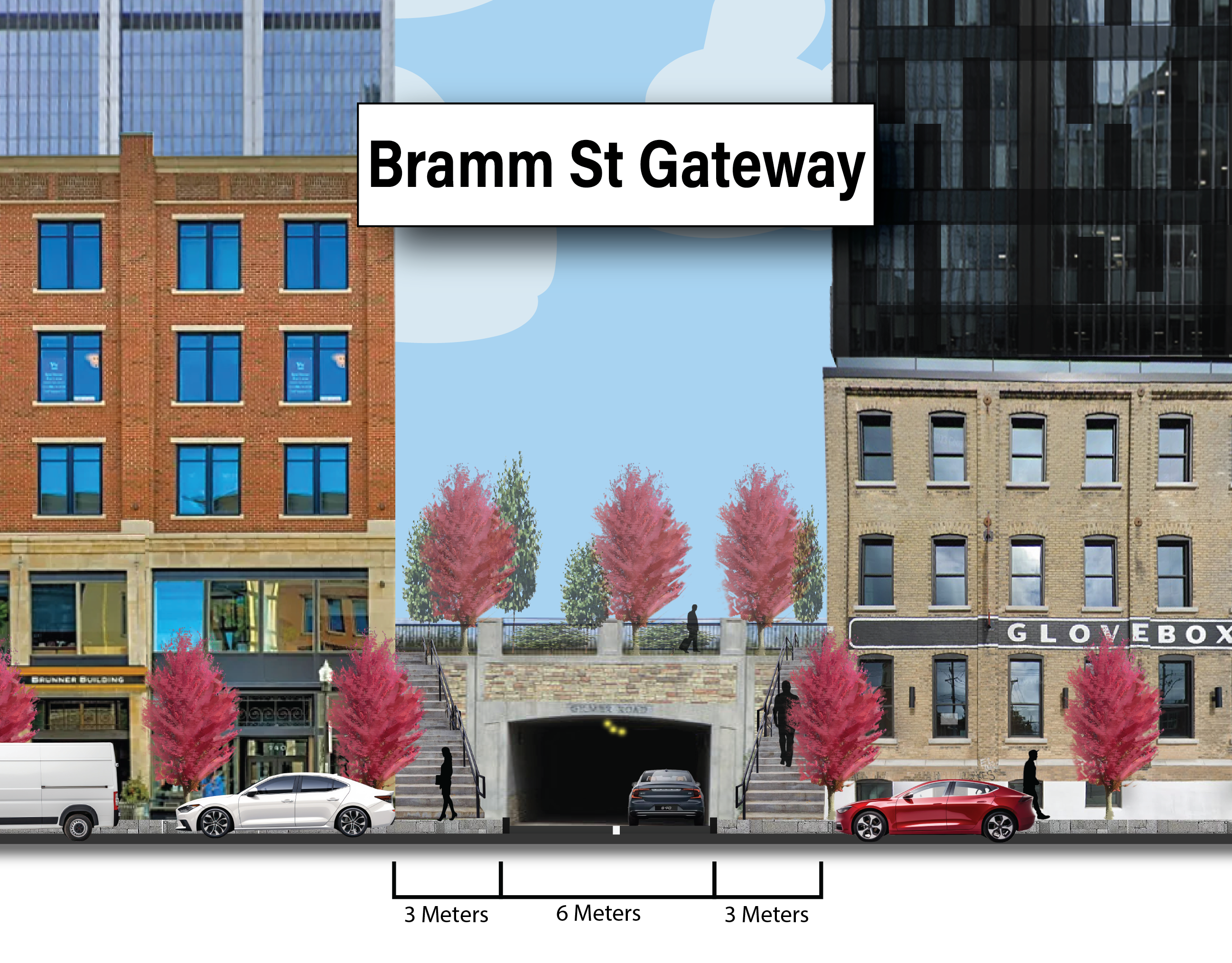
Cross sections give a simplified view of a system or relationship that might not be entirely apparent to the viewer as it is either hidden infrastructure or a change in elevation. We might be interested in showing the relationship between air pollution buffers, stormwater management practices, or changes in elevation that must be addressed. This tutorial will show you how to create something that looks like the following:
Contour Exporting
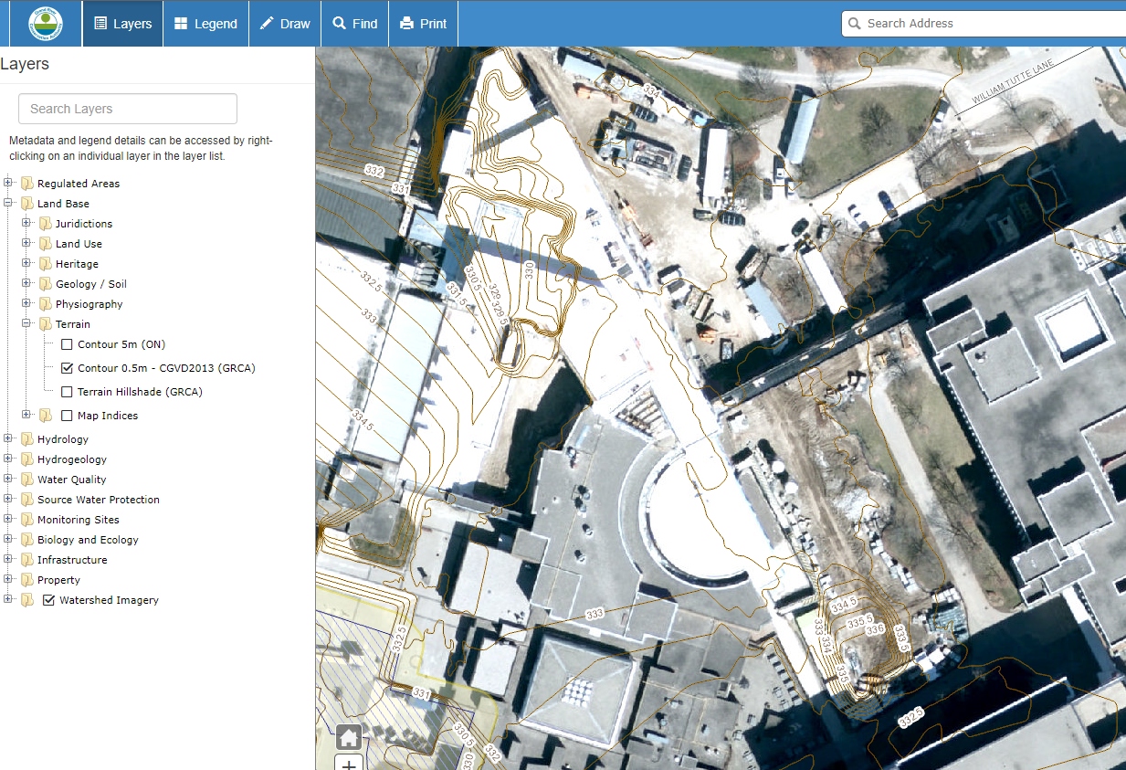
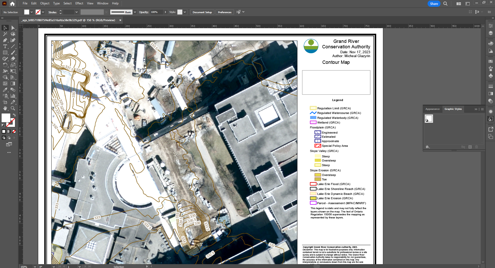
First, we will need to export our elevation contours from GRCA. Follow the following link and select the city in which you are going to be working in LINK. Zoom onto your site and select “Contour 0.5m” under “Land Base” > “Terrain” > “Contour 0.5m”. Your map should look like the following:
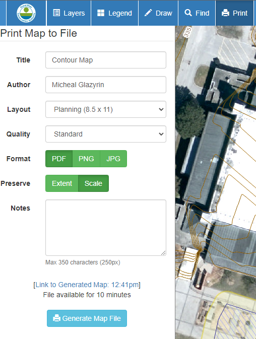
Next, export your map under the “Print” option found at the top option bar. Name your map, fill in your name as the author, set the file format as a PDF, and select the preserve scale option. When you are finished, hit generate and click the “Link to Generated Map” to open up your file. Your options should look like the following:
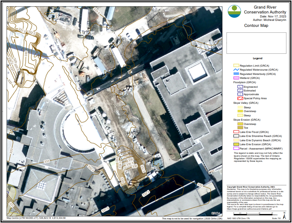
The following is how your map should look like:
Importing and Setting up in Illustrator
For our next step, import your contour PDF into Illustrator. You can easily do this by dragging your PDF from your files into the Illustrator home screen. You should have something that looks like the following:
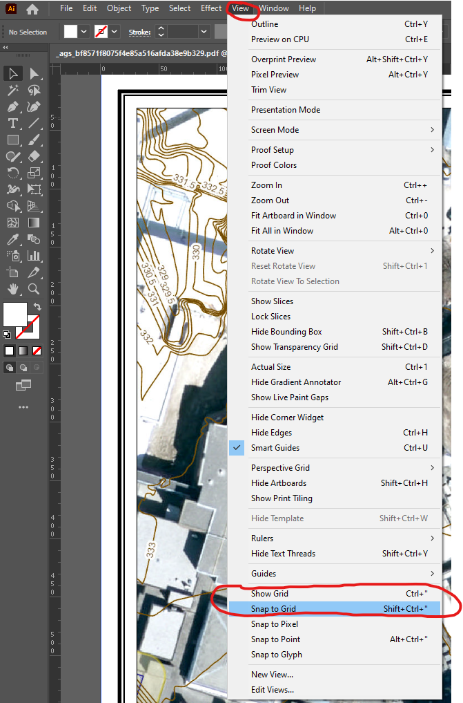
We will be mapping the elevation contours from the aerial view to a cross-section view. To begin, use the shortcut CTRL + R on Windows or COMMAND + R on Mac to bring up the artboard rulers. Additionally, we want to bring up the grid To do this, select the “View” option from the top taskbar, and select “Show Grid”.
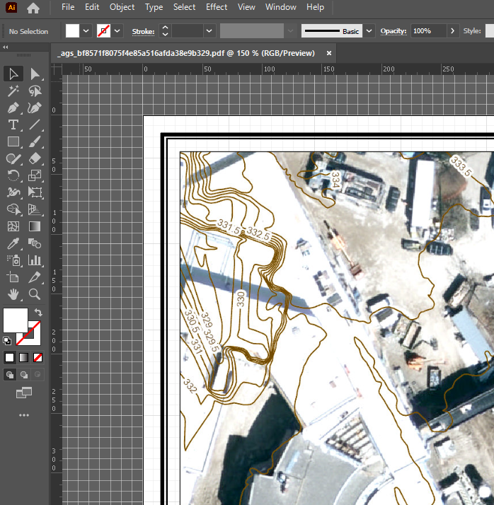
Your document should look like the following:
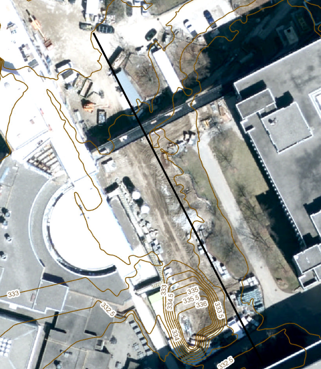
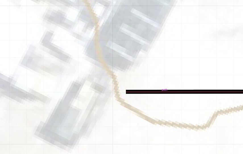
Next, we want to draw a line across our site. To begin, create a new layer and make sure this layer is selected when you are drawing any new elements. This line will represent the ‘cut’ that the transect shows. Keep in mind what you want to show important elements of your site by positioning your ‘cut’ appropriately. Use the pen tool to draw a black line across your site to show your ‘cut’. My ‘cut’ looks like the following:
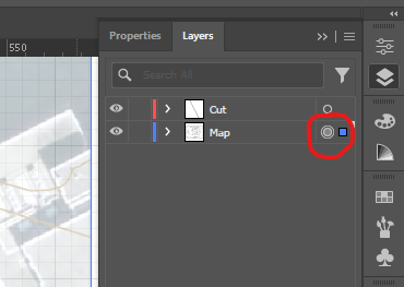
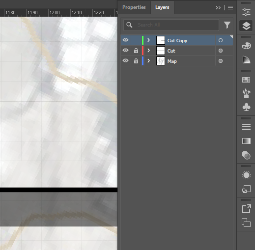
Change the opacity of our map to the point where we can clearly see the document’s grid lines. This can be done by clicking the circle for our map layer. A box with the associated layer colour will appear next to the circle to show that you selected all of the contents. Your Layers panel should look like the following:
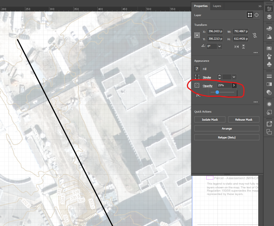
 In our properties panel, we can change the opacity of all of our elements for the Map layer that we selected. I have changed my opacity to 25%. Your properties panel and artboard should look like the following:
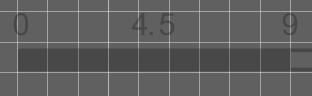
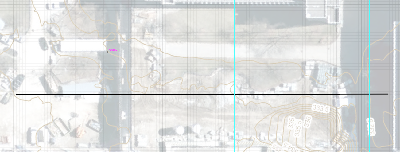
Using the scale bar on our map, we want to scale our map and artboard so that it aligns to the grid units in our document. We need to remember that our contour lines show a 0.5m change in elevation. The easiest way to think about scaling our document is to assume that one meter on the scale bar is the length/width of every grid tile. Using this logic, we can scale our document until our scale bar represents the 1:1 ratio between meters and grid tile. Using the “Selection tool”, I will select all elements using the CTRL + A shortcut and scale 9 meters on the scale bar to 9 grid tiles. Make sure to hold SHIFT while rescaling to make sure none of your elements are distorted. My scale bar now looks like this on the document grid:
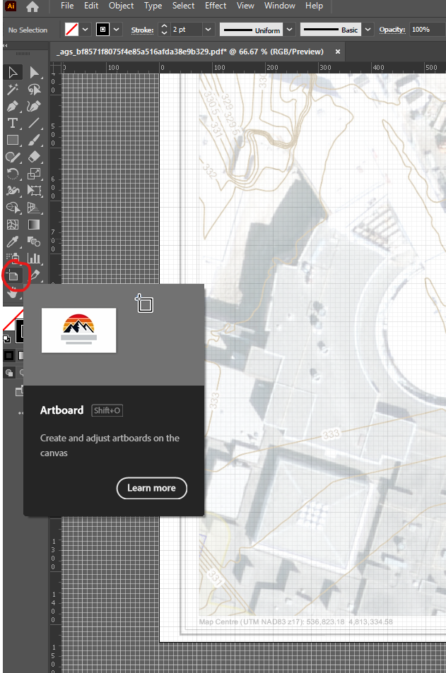
Next, we want to overlap our artboard with our new document size. To do this, use the “Artboard” tool to resize the document so that it overlaps with our elements.
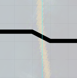
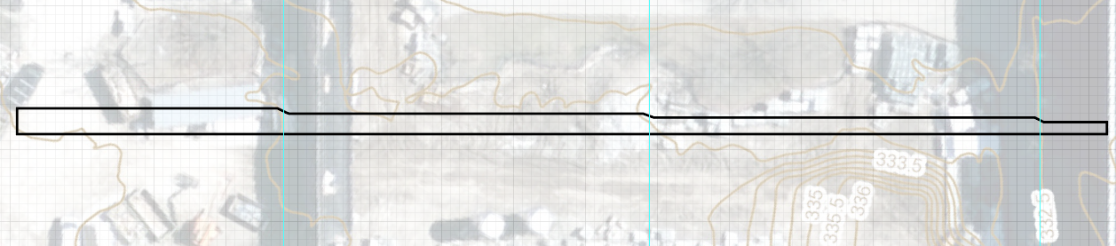
Next, we want to align our ‘cut’ to the grid. The line that we have drawn needs to be parallel to the grid so that it overlaps with one of the horizontal grid lines. To do this, use CTRL + A on Windows or COMMAND + A on Mac to select all elements. You can then use the “Selection” tool located on the left panel to rotate all of the elements. You can use the arrow keys on the keyboard to move the elements by one pixel in each cardinal direction. This is how my ‘cut’ line lines up with the grid:
Cross Section Elevation
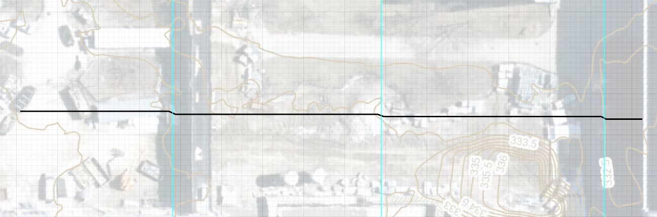
Our next step is to denote elevation on our cross-section. We will begin by adding a ruler line whenever we observe a change in elevation. We can tell when there is a change in elevation when our ‘cut’ line intersects with one of the contour lines on our contour map. To do this, simply click and drag from the horizontal edge document ruler that we opened in the previous section. drag this ruler line on top of our contour / ‘cut’ line intersection. I have a total of three intersection points. My document now looks like the following:
For the following step, we need to remember that our grid represents one meter in real life. Since our contour lines show a 0.5m change in elevation, our ‘cut’ line needs to rise by half a grid square at each ruler line (our ‘cut’ line/elevation contour intersection points). Use the pen too to draw our new “cut” line. Though not entirely accurate, we can assume that the change in elevation occurs in the span of one meter of length (one grid square). Hold shift while using the pen tool to draw lines that are perfectly perpendicular, horizontal, or run across at a 45-degree angle. Example:
 My new ‘cut’ line looks like the following:
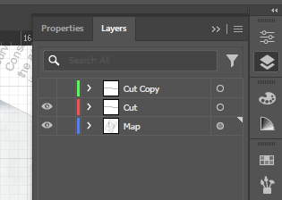
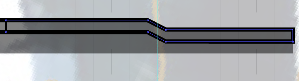
Create a new layer with a copy of the ‘cut’ line for future ease of use. Make sure to copy and paste the line into a new layer using CTRL + C and CTRL + SHIFT + V to copy in place (COMMAND + C and COMMAND + SHIFT + V on Mac). We can hide the Cut copy layer for now. Your layers should look something like this:
 Next, we want to enclose our line into a shape. Use the pen tool again to connect the two ends of the of the ‘cut’ line so that it becomes a shape. It should look like the following:
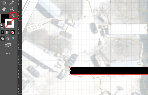
By Clicking on the “Swap Fill and Stroke” option in the left panel, we can quickly change the stroke colour and the fill colour settings. We want to make sure that our shape is filled in with black and that our stroke has no colour. This black void area is called ” poché “. The settings should look like this:
Land and Pathway Texturing
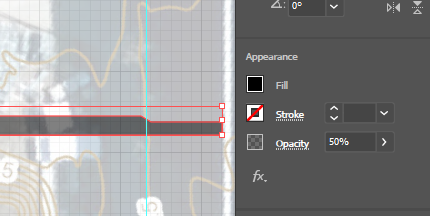
We want to communicate the sort of land which we are cutting through with our cross-section. To give the impression of land textures without making it seem that we are showing the geology under the ‘cut’ line, we need to segment our zones into thin strips above the poché. To do this, we need to work within our “Cut Copy” layer that we created earlier. But first, select the elements in our “Cut” layer and turn down the opacity. Example:
Next, select the “Cut Copy” layer and turn on visibility. We can also lock the other layers to make sure we are not editing anything in those layers. Your Layers panel should look like the following:
 We need to copy the ‘cut’ line and drag it down below where our current cut line is located. To do this, we can use our regular copy and pasting skills. However, a faster and more accurate way of doing this is to click and drag on the element while holding ALT. Drag our new ‘cut’ line below our actual ‘cut’ line. Make sure that the space in between the two lines is thin enough to give enough context for the texture but not large enough to give the impression that we are looking underground. Example:
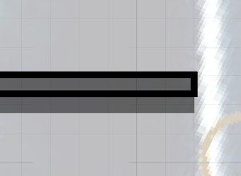
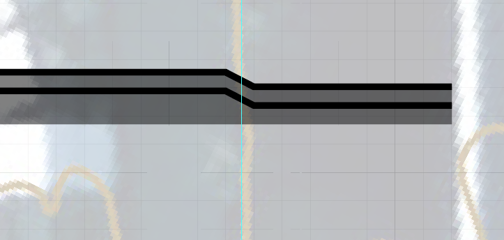 Next, close up the two ‘cut’ lines to create a complete shape. Example:
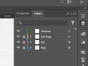
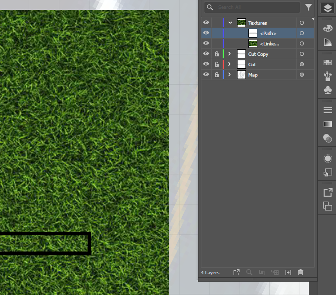
 We can lock the “Cut Copy” layer and create a new “Textures” layer. Your Layer Panel should look like this:
Depending on where we want to add in soil/grass/pavement/brick ground textures, we will be creating shapes within our “Cut Copy” shape. However, these new shapes will be drawn in our “Textures” layers. Using the pen tool, trace the segments into which you wish to paste your texture into. I suggest first making a shape and pasting your texture before moving on to the next segment of your ground. First I will be drawing the shape:
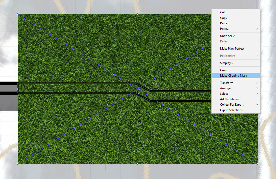
 I will be bringing in a grass texture next. Make sure that your texture element is below your shape element in the layers panel. You can drag and drop to reorder the hierarchy of the elements in the layers panel. The following is what your setup should look like for the next step:
With both of our elements selected, right-click on either of the elements and select “Make Clipping Mask” like the following:
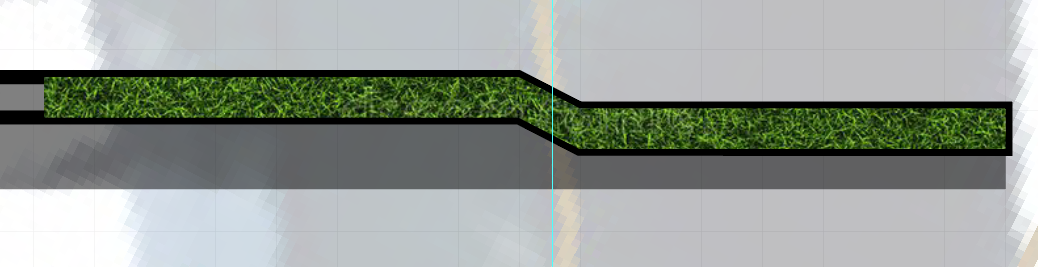
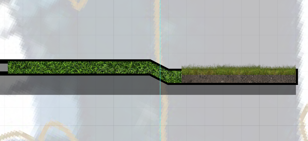
This is what our grass segment looks like:
Alternatively, we can make the segment a soil texture and add a grass texture on top using the same technique and a technique demonstrated in the next section. Example of both approaches side by side:
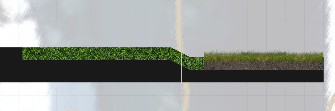
 After filling in your entire ground section with textures, you can turn off your “Cut Copy” layer and change the “Cut” layer colour to a less harsh black to make the elements look clean and digestible. Again, I have both approaches to texturing. Example:
Creating Cutouts
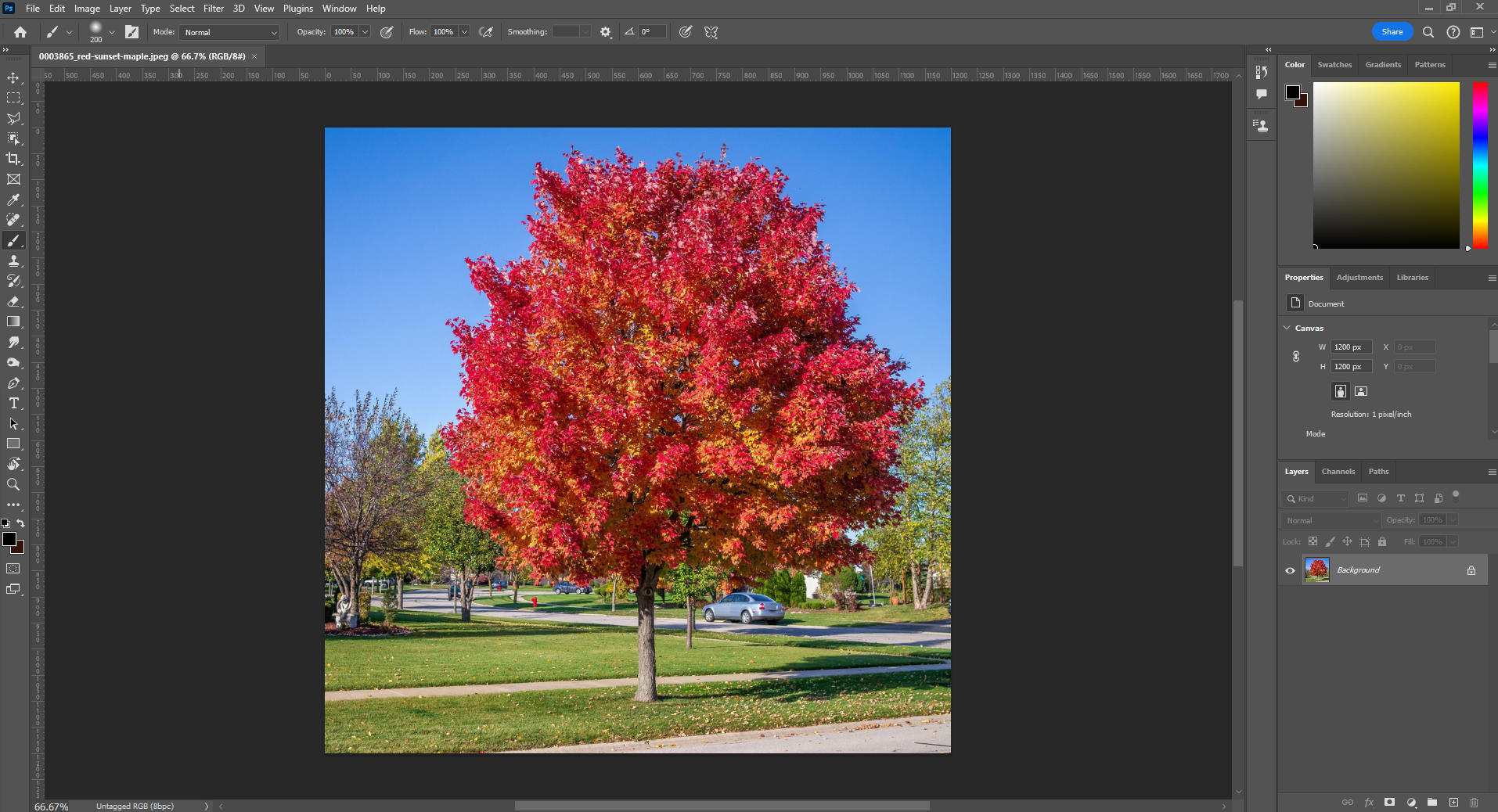
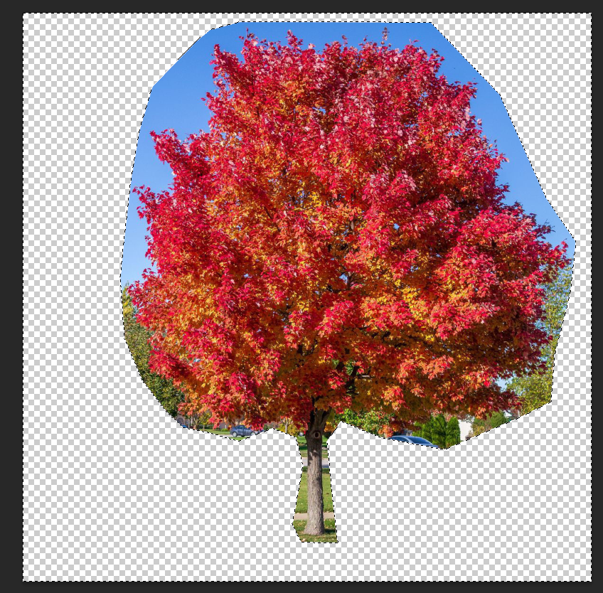
We wish to populate our cross-section with entourage, vegetation, and structures to give more context and life to our design. To do this, we will need to find reference photos or images online to cut out and isolate in Photoshop. Ideally, your reference photos are realistic and have a high pixel count. Begin by dragging and dropping your reference photo into Photoshop. For this example, I will be using the hardest and most complex reference for the sake of demonstrating all techniques at once and how they can be mixed to achieve the best result. I will be trying to cut out this maple tree while showing my process step-by-step:
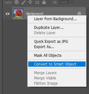
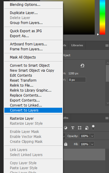
The first step in this process is to make sure that we convert our image into a layer. To do this, right-click on the layer and “Convert to Smart Object”.
Do the same thing again but this time click “Convert to Layers”.
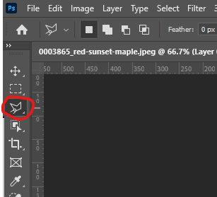
Select the “Polygon Lasso tool”. This tool is used to create a selection. If you have simple geometric selections that need to be made, this tool might be enough to create a complete cutout. For more tricky references like this tree, we will need to work a little bit harder.
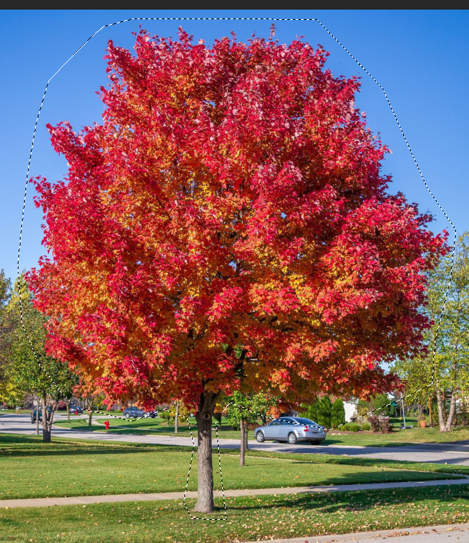
With our “Polygon Lasso tool” select the rough area around the tree. Make sure to close off your selection by clicking on the original point that you placed to start the selection. For example:
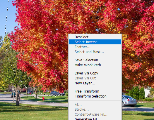
 If we right-click our selection area, we have the option to select inverse. Select this option.
 Having selected the inverse of our original selection, we can delete the surrounding content with the hit of BACKSPACE. Your file should look like this:
We can quickly deselect by using the shortcut CTRL + D on Windows or COMMAND + D on Mac. We can also deselect by right-clicking on our selection and pressing the “Deselect” option. After deselecting, our next step is to select pixels by colour. To do this open the “Select” tab from the options bar on the top and choose the “Color Range” option.
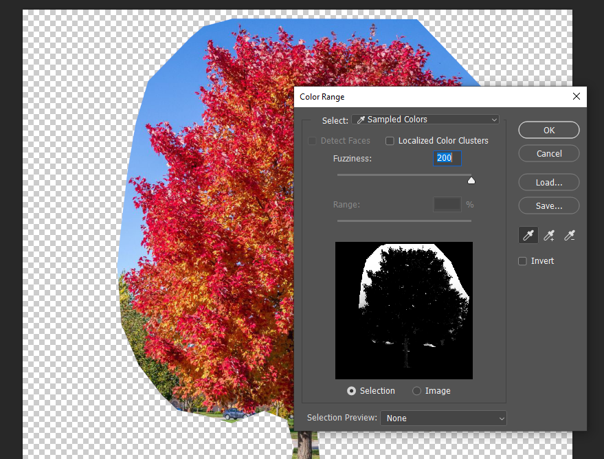
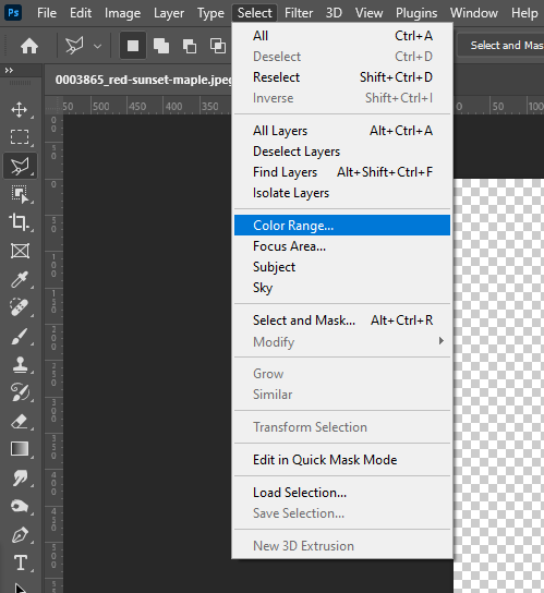 The following panel will appear. You will notice that your cursor will appear as an eyedropper which selects the colour that you click on within your file. For example, I will wish to remove all the blue from my file so I will be clicking on the blue area with the eyedropper. The “Fuzziness” slider extends the colour range within your colour selection. This means that the higher the fuzziness, the higher the selection range. Since we don’t want any blue on our red tree, we will be sliding this setting to the max.
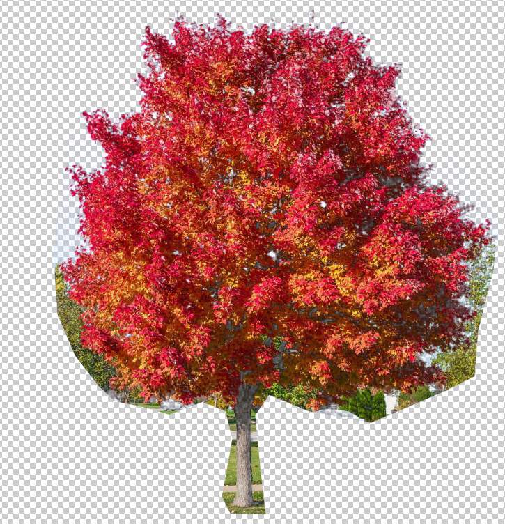
 After pressing “OK” you can delete the selection to remove the selected colour. This is what my file looks like now:
Next, we will be doing the same process but selecting the green areas of our photo. Be careful as a lot of the colour range overlaps with our tree. Play with the fuzziness slider until you are happy with the selection. This is what my file looks like now:
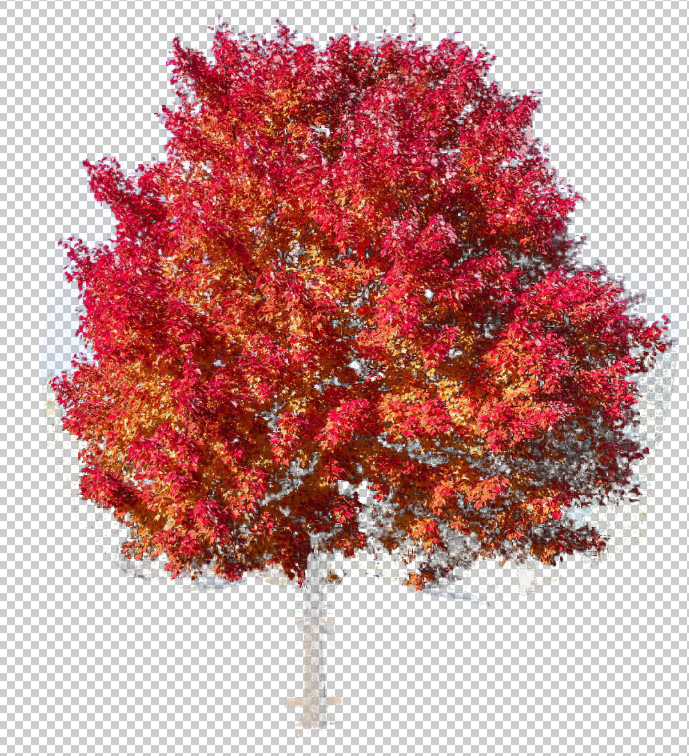
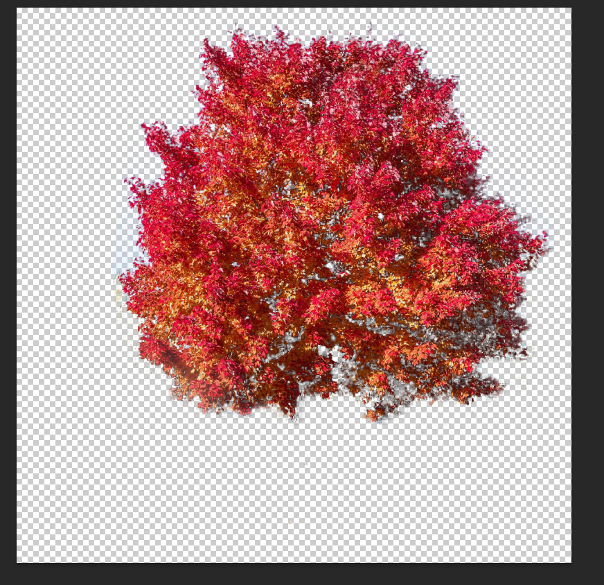
You will notice that our trunk is gone or fading. Not to worry, we will be recovering it later. Our next step is to remove the faded/ghost areas with the erase tool. This is what my file looks like after erasing:
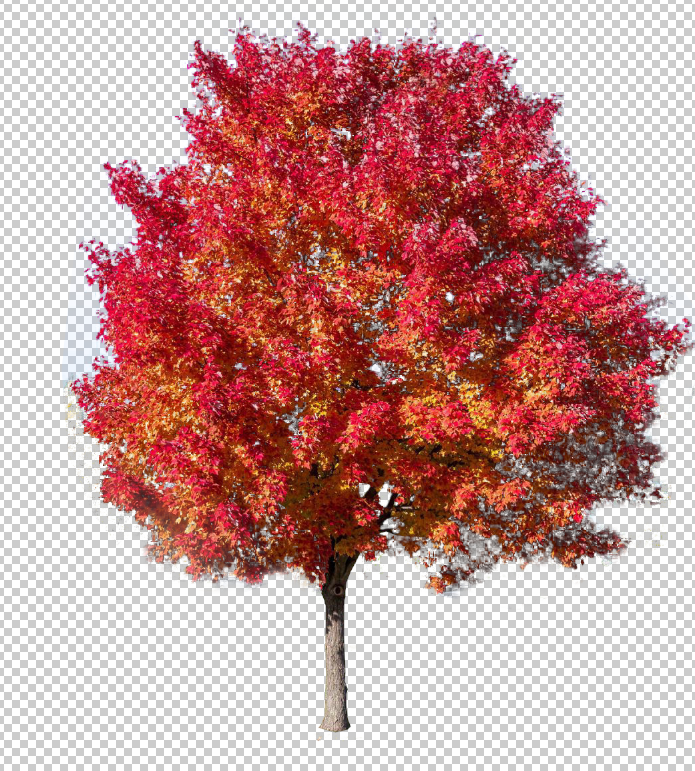
To add back our tree trunk and some of our tree, reimport the reference image and make sure that it is converted to a layer. Using the lasso tool, select the tree trunk and some of the inside of the tree. Tip: zoom in and out to have a more accurate selection with the “Polygonal Lasso tool”. This is what my selection looks like:

Select the inverse and delete. Doing some cleanup with the erase tool, I manually erased some of the green that was caught in the selection. This is what my final file looks like before exporting:
To export, use the following directory:
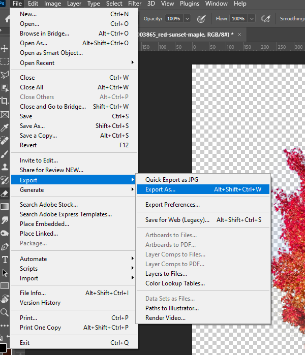
The export panel should pop up. We will be exporting our file as a PNG because this file format allows us to have a transparent background. Make sure you have the following settings aside from “Canvas Size” which is variable depending on your reference photo. Once you are happy, hit “Export”. Export settings:
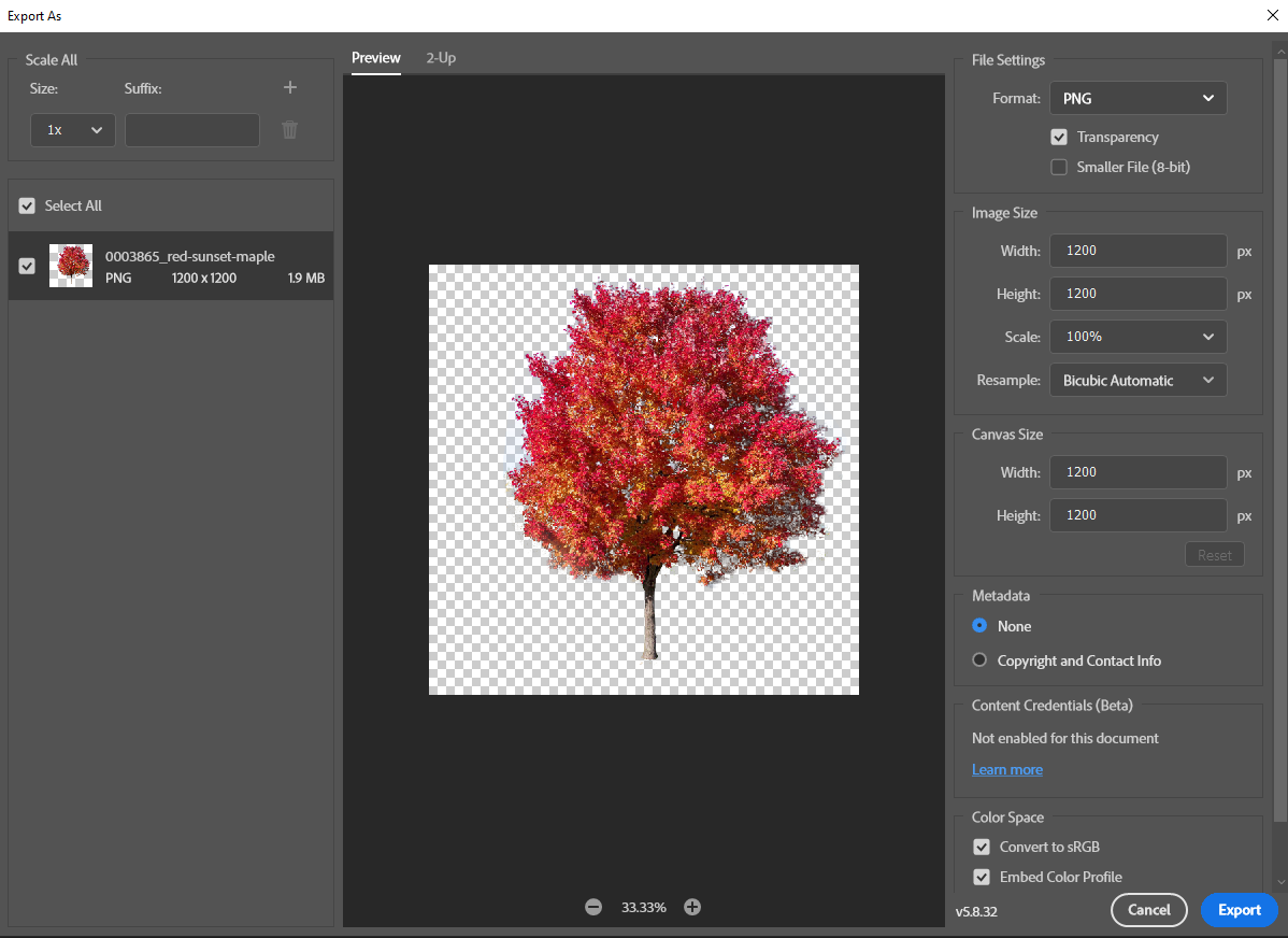 Using a mix of techniques that have been demonstrated, you should be able to create cutouts of any element you come across. You might also come across reference images that are already PNGs that have transparent backgrounds.
Cutout Placement
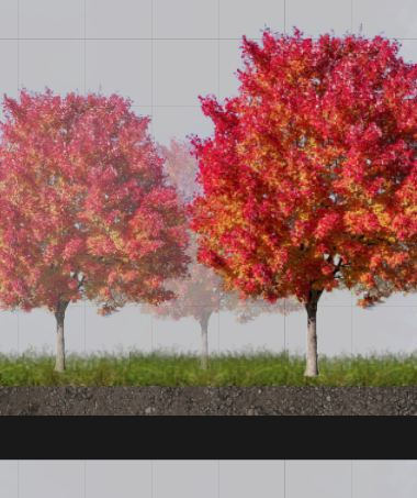
Taking the cutouts that we made in the previous section, we can drag and drop them onto our cross-section. Rescale the images so that make sense based on the scale that we established in previous sections. When placing your elements, keep in mind how far the element is away from our ‘cut’ line. For example, trees that are further away will have less opacity to give the illusion of depth in our transect. Example:
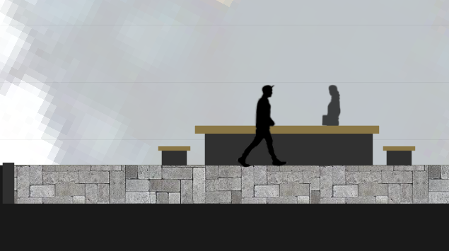
 A quick and easy way of denoting simple elements like a bench or seating is to directly draw using the shape tools by creating ellipses or rectangles. Example:
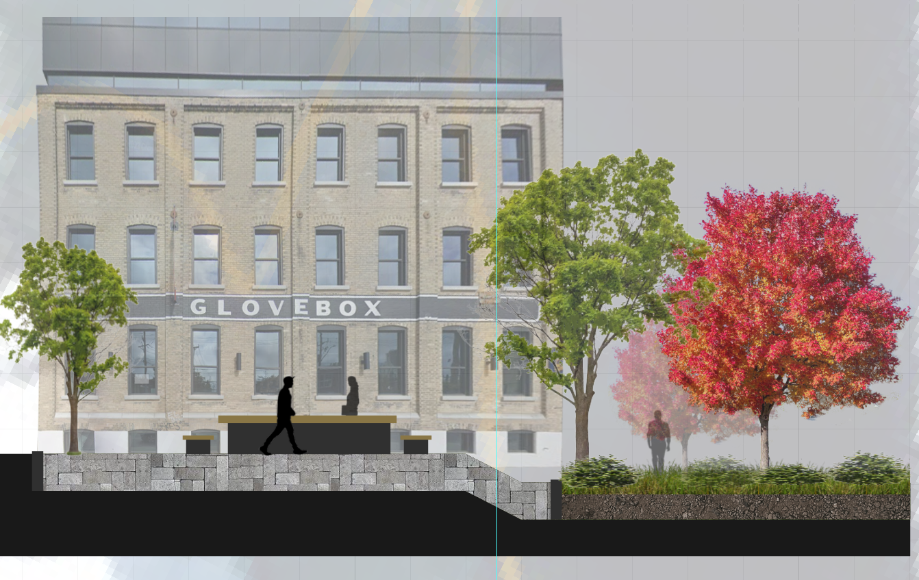
 At this point, we can start thinking about how we will fill in our background. With only the foreground showing, it might make or visualization feel incomplete. Try filling in your background with buildings and vegetation where it makes sense. Example:
 To create a more natural sense of vegetation, try to skew, rotate, and resize the cutouts to create randomness. Manipulate the order of your elements on the layers panel depending on the hierarchy of your element in relation to overlapping elements.
Labeling Widths
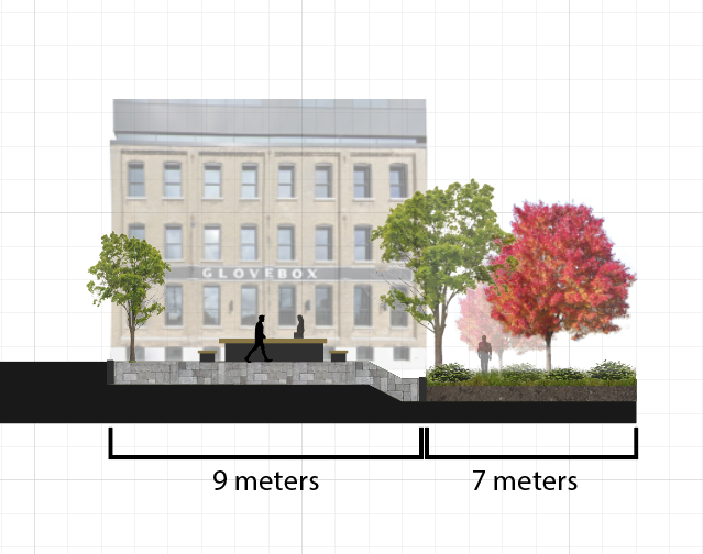
An important element of any cross-section is the width measurements of the elements that you wish to communicate to your viewer. Based on the scale that we established earlier, this step is made much easier. Since we scaled our transect so that one grid cell is equal to one meter in real life, all we have to do is count our grid cells.
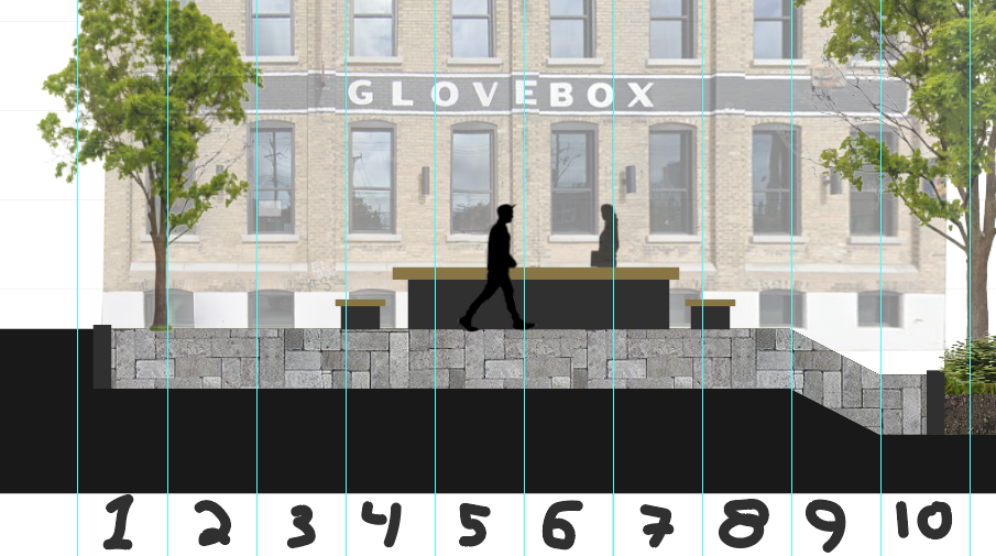
I placed rulers and numbered each grid cell to make it easier to see. We can see that there are roughly 9 meters of permeable pedestrian area. We can create a simple scale bar with the Pen tool and create a textbox for our measurements. Example:
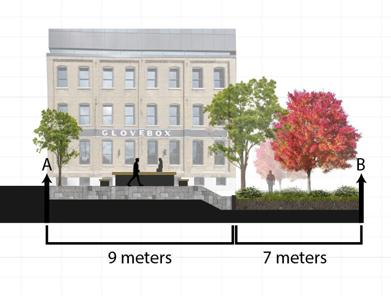
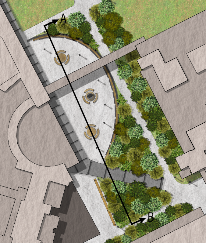
Cutting-plane
It is important to orientate our viewer on our site plan when looking at the cross-section. To do this, we will create arrows to show where our cutting plane is located and in which direction the viewer is looking at when observing the cross-section. To do this, simply create an arrow with either A or B on top (one side of the cross-section will be labelled A and the other B). The same denotation will go on your site plan, exactly where we made the original ‘cut’ line. Example:
Completed Example:
Additional Examples
Author: Micheal Glazyrin
