10 Analysis: Legibility (Lynch)
michealg1
Lynch’s Legibility Analysis
Kevin Lynch proposed a method for observing the city in a more legible and clear way by simplifying its characteristics into 5 components. These components are paths, edges, districts, nodes, and landmarks. The point of such a simplification is to make sure that city characteristics are able to be seen on a map but are also “presented sharply and intensely to the senses” (Lynch, 1960). Since all maps are already simplifications of reality, it makes sense why Lynch would apply a qualitative analysis of the character of a city.
Step 1: Figure Ground
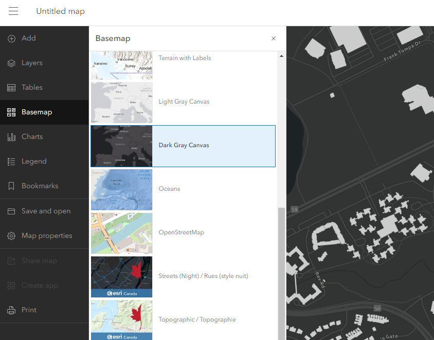
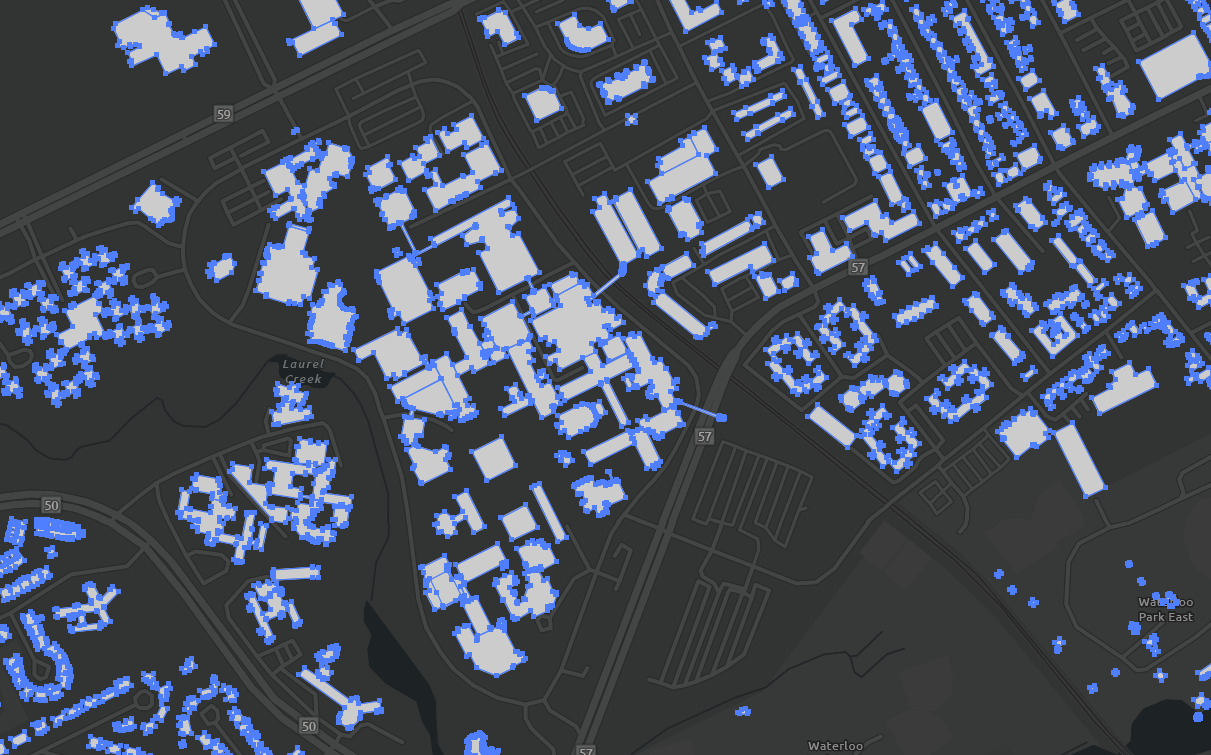
To begin our legibility analysis, we first need to create a simple figure-ground. To start this process, we will begin by exporting a map from ArcGIS Online. Please refer to “18. Drawing Type: Location Map” section of this Urban Design Studio Skills Guide to get the full process on how to do this. The only additional step would be to change the theme of the map to something more simple than satellite imagery. To do this, select the “Basemap” option from the left side panel and choose “Dark Gray Canvas”. You can export the map now.
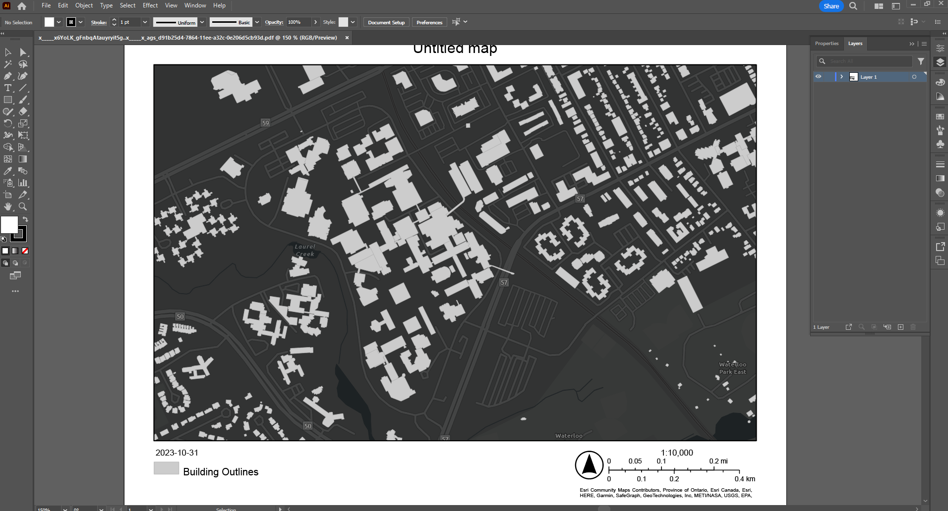
With our exported map, we can drag and drop the pdf file into Adobe Illustrator. You should have something that looks like the following:
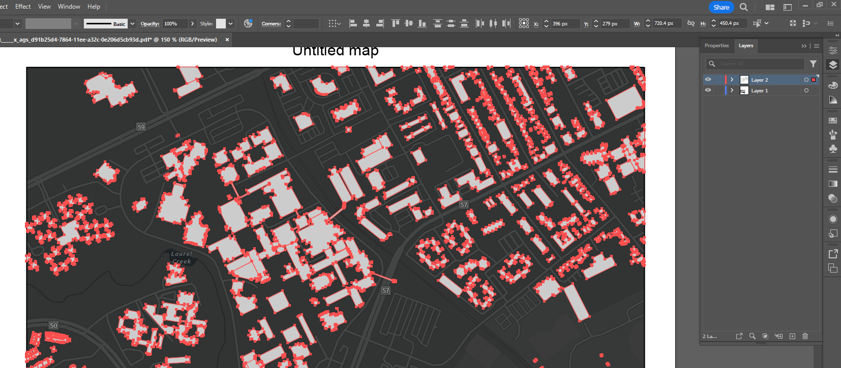
Next, we want to separate the elements we are interested in from the ones we are not interested in. We will be creating a new layer and copying our building shapes, north arrow, scales, and georeferences. To do this, select the direct select tool on the left side panel.
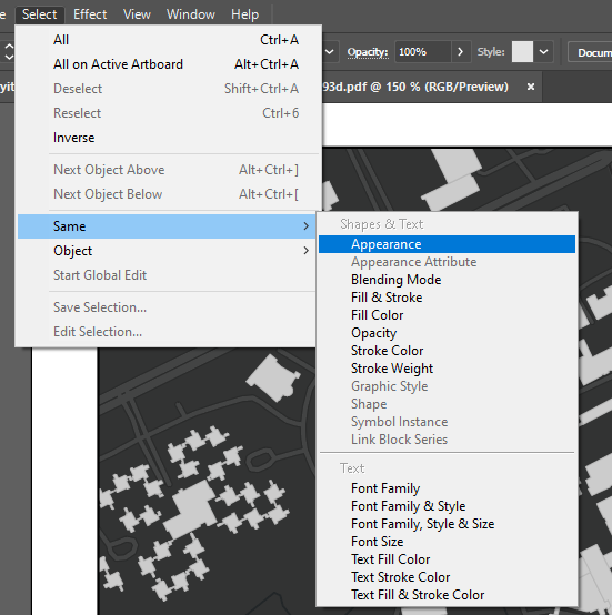
Click on one building with the direct select tool (making sure it is selected with a blue outline), click the “Select” > “Same” > “Appearance” tab at the top.
Your buildings should appear to be selected like the following:
To Accurately copy the buildings to a new layer, use the shortcut CTRL+C, make sure to have your new layer selected, and use the shortcut CTRL+SHIFT+V on windows or Command+SHIFT+V on mac in the new layer. You will know you did this step correctly if the colour of your selection changes to that of the new layer.
 Use the direct select tool to copy the north arrow, scale, and georeferences onto our new layer. For greater clarity, I will make the buildings black. If we turn off the visibility (eye icon next to the layer) of our original layer, we should have something that looks like the following:
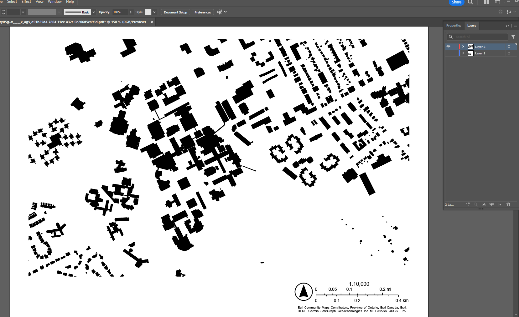
This will be the base map for our Lynch Legibility Analysis.
Nodes
The following excerpt is how Kevin Lynch Defines nodes:
“Nodes are points, the strategic spots in a city into which an observer can enter, and which are the intensive foci to and from which he is travelling. They may be primarily junctions, places of a break in transportation, a crossing or convergence of paths, or moments of shift from one structure to another.” (Lynch, pg 46)
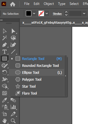
We will be using stylized circles to denote focal points. To do this, right-click on the “Rectangle” tool on the left side panel and select “Ellipse Tool”.
Next, to draw a perfect circle, hold shift while dragging with the “Ellipse Tool”. You are able to reposition the circle with the “selection tool”.
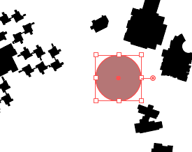
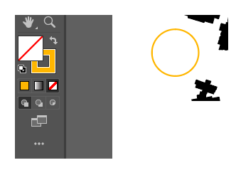
To create a more legible node, we will be stylizing it by changing the stroke colour. To change the fill colour box to transparent, click the “None” option. To change the stroke colour, double-click the “Fill and Stroke” option and select a colour with the colour picker. Your left panel options and circle should look like the following:
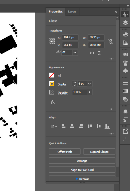
Next, we want to change the stroke characteristics. I will increase the line width to 6pt in the properties panel located in the right-side panel.
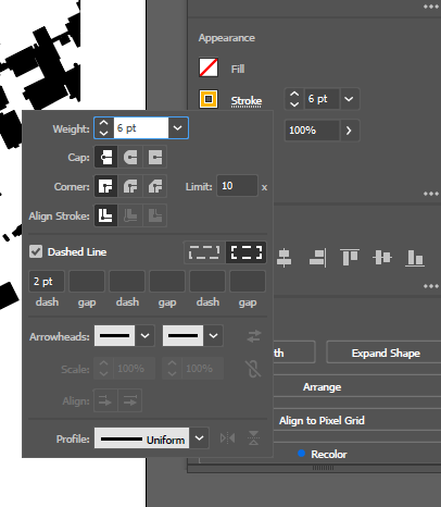
Next, I will be changing the stroke line to be a dashed line. To do this, select “Stroke” (next to the stroke width option) to open up the stroke panel. Checkmark “Dashed line” and change the dash gaps to 2pt like the following:
Your node should look like the following:

Copy, paste, and adjust this circle to your liking. Include a node to applicable locations as defined by Lynch.
Paths & Edges
The following excerpt is how Kevin Lynch Defines nodes:
“Paths are the channels along which the observer customarily, occasionally,
or potentially moves. They may be streets, walkways, transit lines, canals, railroads”
(Lynch, pg 46)
The following excerpt is how Kevin Lynch Defines nodes:
“Edges are the linear elements not used or considered as paths by the observer. They are
the boundaries between two phases, linear breaks in continuity: shores, railroad cuts, edges of development, and walls.”
(Lynch, pg 46)
To denote paths and edges, we will be using stylized lines. To do this, select the “Pen” tool from the left side panel.
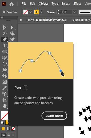
To create lines, you are able to click on our map to create anchor points with the tool. These anchor points will be automatically joined by a line segment. You are able to hold down your left click when creating new anchor points to have a curved line segment. Once you are satisfied with your line, press Enter to stop drawing a line. The following is an example line created using the “Pen” tool:
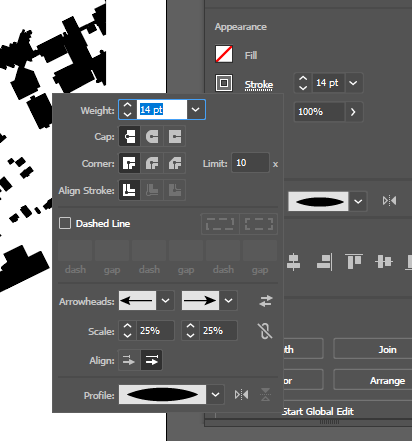
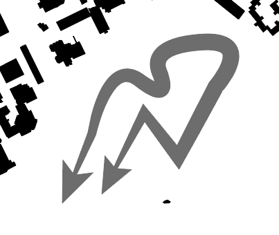
You are able to change the stroke and fill settings the same way as described in the Nodes section. Additionally, we want to add arrowheads and the profile of the line. To do this, open up the stroke options panel again and select arrowheads for the endpoints of our line. Select a new width profile from the options. The following is what my settings are and what my line looks like now.
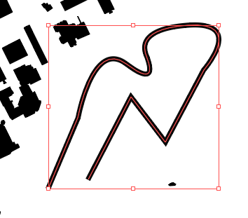
If you are unhappy with the way your line looks, you are able to shift the anchor points to your liking. To do this, select your line’s anchor points with the direct select tool and move the anchor point to a position of your choosing. The following is an example of how I moved around anchor points with the “Direct Selection” tool.
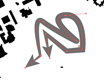
Copy, paste, and adjust the lines that you create to your liking. Include a path to applicable locations as defined by Lynch.
Districts
The following excerpt is how Kevin Lynch Defines Districts:
“Districts are the medium-to-Iarge sections of the city, conceived of as having two-dimensional extent,
which the observer mentally enters “inside of,” and which are recognized as having some common, identifying character”
(Lynch, pg 46)
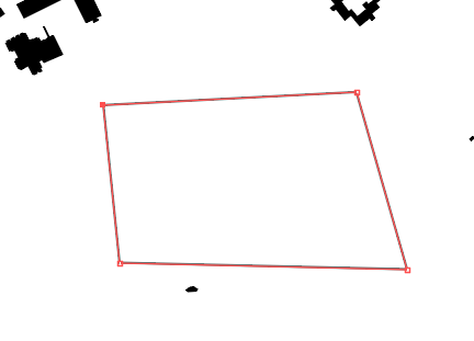
To denote districts, we will be making closed shapes with the “Pen” tool. Select the pen tool again and trace a district you want to denote according to Lynch’s definition. To create a closed shape, make sure to click back to your original anchor point that you started the shape off with. The following is an example of a closed shape created using the “Pen” tool.
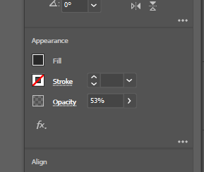
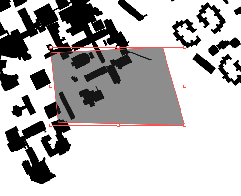
Again, use the stroke and fill options to create a legible visual distinction for districts. I recommend setting the stroke to “None” and the fill colour to a dark grey. You should have something that looks like the following:
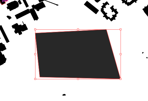
Something that you might want to do is to change the opacity of the shape. To do this, you can go back to the properties panel again and use the opacity slider under the stroke line weight.
This makes it so that your buildings are able to appear when you overlay your district distinctions on top of them. Example:
Copy, paste, and adjust the shapes that you create to your liking. Include districts to applicable locations as defined by Lynch.
Landmarks
The following excerpt is how Kevin Lynch Defines Landmarks:
“Landmarks are another type of point-reference, but in this case, the observer does not enter within them, they
are external. They are usually a rather simply defined physical object: building, sign, store, or mountain.”
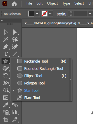
To denote landmarks, we will simply be using the “Star Tool”. We can right-click the “Rectangle” tool again as we did for ellipses but this time we will select the “Star Tool” as follows:
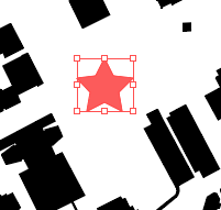
Similar to previous sections, change the stroke and fill settings to your liking. If you wish to have your star be perfectly straight, hold shift while dragging out your shape. The following is what my Landmark distinction looks like:
 Copy, paste, and adjust the shapes that you create to your liking. Include Landmarks to applicable locations as defined by Lynch.
Legend and Titles
Like any proper map, we need to have a legend and titles for our map components. To do this, we are able to copy, paste, and adjust the elements that we already created onto our legend. Additionally, we are able to save graphic styles to apply to new components that we create. To save a graphic style, select the element that you want to copy the style of and select the “Graphic Styles” panel from the panels on the right.
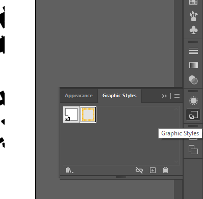
To save a new graphic style, click the small box beside the trashcan on the “Graphic Styles” panel. You can now see that I saved my path and node graphic styles.
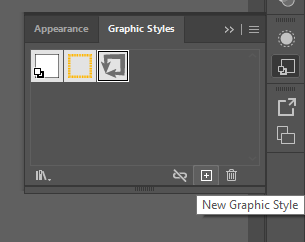 To apply a graphic style, simply create a new element, open up the “Graphic Styles” panel, and select one of your saved graphic styles. As an example, I applied the node graphic style to my landmark element.
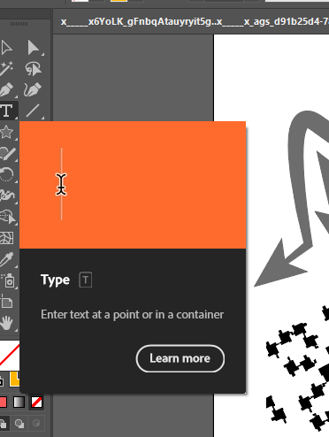
 To create titles, we will use the “Type” tool. Simply select this tool from the left side panel and drag out a textbox on your map as follows:
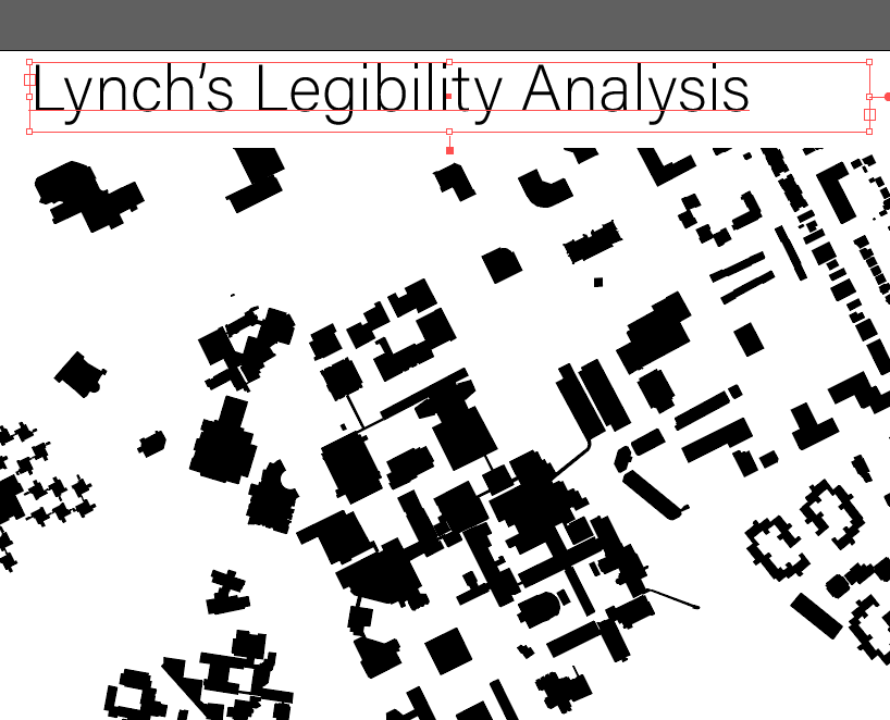
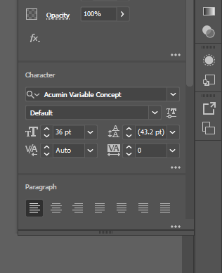
You are able to change your text options in the “Properties” panel similar to all other elements gone over previously. Similarly, use the direct select tool to reposition the textbox to your liking. For text options, a new “Character” section will appear in the “Properties” panel:
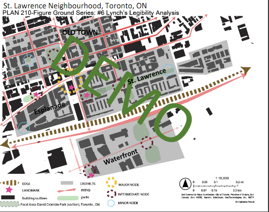
Final Result
The following is what a finished Lynch Legibility Analysis looks like:
Reference
Lynch, K. (1960). The image of the city.
Author: Micheal Glazyrin
