24 Getting Started with Creating Presentation Boards (Posters)
Presentation Board Layout
Intro to Column Widths and Guides
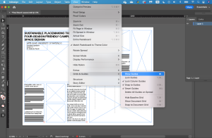
In InDesign the presentation board layout file provided on learn or create a new document (36×48 inches). If rulers, guides, and frame edges do not already appear, turn them on by:
- View > Show Rulers
- View > Grids & Guides > Show Guides
- View > Extras > Show Frame Edges
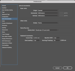
Make sure your measurements are in millimeters. If they are not, set them by:
- InDesign > Preferences > Units & Increments…
- Set Ruler Units to Millimeters
- Set Stroke to Points
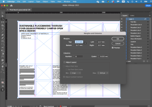
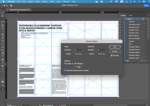
The provided layout, the layout is loosely based on a 6 column, 9 row grid with the following measurements:
- 12.7 mm (0.5”) margins all
around - 6 columns with 9.525 mm
(0.375”) gutters - 9 rows with 9.25 mm (0.364”)
gutters
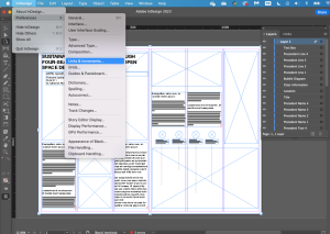
To change the size of the gutters, click Layout > Create Guides, and enter your values. You can also edit guides by holding the guideline and dragging it to your desired destination. Guides will be helpful when you resize your image and text frames.
TIP: Designers often use the “rule of thirds”. It is best practice to use columns and rows for guides (or a multiple of 3).
If the layers panel is not open, add it to
your workspace by clicking:
- Window > Layers
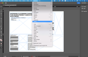
Select the frame you would like to add by clicking it in the layers panel.
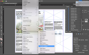
To place your image:
- Click File > Place
- Select your image
- Click Open
Adjust the image to fit the frame. A quick method is to click the “Content-Aware Fit” option in the Frame Fitting section of the Properties panel. You can also try the other frame fitting options to determine the best fit for your image. To manually adjust your image, double click on your image, and move/resize accordingly.
NOTE: The selection frame for an image is orange and the selection frame for an image frame is blue.
To resize both your image and frame together proportionally, hold SHIFT and
move corners as appropriate. Add and fit all your images to their respective frames.
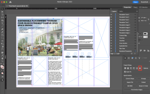
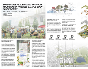
NOTE: The template has 4 spaces for precedent images. If you have more,
you can duplicate the frame/text boxes/leading lines. You should also move the precedent images and leading lines to accurately represent elements in your plan view.
Be sure to add all 4 of the draft illustrations noted in the poster mock-up to the right, and specified in the assignment description and rubric.
Be sure to add a text box at the bottom of the poster for REFERENCES:
References should also be lined up along the bottom, in 10-12 point font.
EXAMPLE:
References: Literature: APA format for lit refs, but all in a row divided by semi-colons. Precedents (L to R): www.website.ca; www.website.ca, etc. Entourage: www.mrcutout.com, www.nonscandanavia.com. Model: cadmapper, nameofwarehousesource
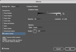
To apply an effect to a frame, select the frame, and click Object > Effects > Gradient Feather.
NOTE: The template already has this effect applied to the rendered perspective frame and the plan view frame.
To remove the effect, click Object > Effects > Gradient Feather.
To apply a gradient feather to the top, in the Options section:
- Set Type to Linear
- Set Angle to 90
Similarly, to apply it to the bottom, right, or left side, set angle to -90, 0, or 180,
respectively. You can adjust the extent of the gradient by dragging the gradient stops.
TEXT BOXES: TYPE, CHARACTER STYLES, AND JUSTIFICATION
The template has placeholder text inputted in the text boxes. To replace the placeholder text with your text:
- Double click the text box
- Select all (Command or CTRL + A)
- Delete placeholder text
- Paste your text
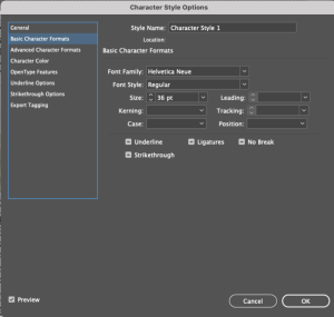
An easy method to manage various text styles is to set up your character styles for
the project. To set up character styles:
- Open the Character Styles panel. If you don’t see it on your workspace, you can turn it on by clicking Window > Styles > Character Styles
- Click the bottom left + button to add a style. Double click on the style to open the pop-up box
- Click Basic Character Formats
- Set your Style Name, choose the Font Family, Font Style, and Size
- Click OK
- Repeat to create all your character styles
TIP: Check out the following links for font pairing and font sizing ideas:
https://www.indesignskills.com/tutorials/font-pairing/
https://www.adobe.com/express/learn/blog/10-ways-to-pair-fonts-for-maximum-impact
https://showitbetter.co/what-font-size-touse-in-your-boards/
To format the text:
- Select the text,
- Choose the appropriate character
styles option from the drop-down
menu in the Properties panel.
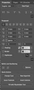
Your text should be left justified. To apply left justification:
- Open the Properties panel
- Select Align Left under the Paragraph tab
- Uncheck Hyphenate to avoid word splitting.
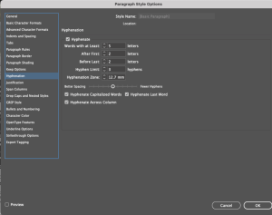
TIP: If you want to keep hyphenated text, adjust the hyphenation settings by clicking Paragraph Styles > Hyphenations.
TIPS AND TRICKS
To personalize your board and graphics, establish a cohesive colour scheme. Check out the following link for premade colour palettes: https://coolors.co/
When designing your own presentation board layouts, you should consider:
- Orientation – Which orientation gives your project a natural flow?
- Visual Hierarchy – Which images do you want to emphasize? Which one are supplementary? What order do you want your guests to view them in? Use these common layout patterns to inform your designs: https://vanseodesign.com/webdesign/3-design-layouts/.
- Negative Space – Provide visual breaks across your board and guide the readers’ eye. Consider size and placement of negative space between both images and text.
- Balance and Harmony – Avoid layouts being top-heavy or bottom-heavy by carefully consider the placement of stronger visuals. Consider horizontal balance by following the rule of thirds: https://visme.co/blog/layout-design/
EXTRA RESOURCES
| Layout design ideas: | Pinterest accounts: @1starchitecture, @showitbetter |
| Layout design ideas and tips: | https://www.firstinarchitecture.co.uk/architecture-presentation-board-tips/ |
| Tips for layout designs: | https://www.archisoup.com/studio-guide/architecture-presentation-boards |
| Free downloadable presentation templates: | https://competitions.archi/competition/free-project-boards-templates-pack-20- inspirations/ |
| A Complete Guide to using InDesign for your Architecture Presentation Boards – Surviving Architecture | https://www.youtube.com/watch?v=GIpJ9Fruvo&ab_channel=SurvivingArchitecture |
| Composition in Presentation Boards and Architecture using Indesign –Show it Better | https://www.youtube.com/watch?v=dqC5RBYW1HE&ab_channel=ShowItBetter |
| Life Changing In-Design Tricks You MUST know for Professional Architecture Portfolio | https://www.youtube.com/watch?v=V8hbUeuB5nM&ab_channel=ArchiHacks |
