33 Tips for Describing Visuals
Part of your preparation for a lecture is thinking about how you will describe any visual content for anyone who cannot access it visually. By describing visuals during spoken lecture, you ensure that all audience members can access the information in your presentation in an equally effective and integrated manner. Here are some tips.
Watch the short video providing general information about visual descriptions:
Identify which visual content needs to be described
Visual content can be organized into two categories: meaningful content and decorative content.
Meaningful Content: Meaningful content adds meaning or context to your materials. It commonly consists of diagrams, graphs, and maps. All meaningful visual content must be described verbally to your audience.
Decorative Content: Decorative content is visuals that provide no meaningful information or context; are only for visual formatting; or are fully redundant to text content accompanying the visual. Decorative visual content does not need to be described. Decorative content is usually images like icons, logos, and illustrations.
The easiest way to identify if a visual is meaningful or decorative is to remove the visual and ask if the content still makes sense without it. If your content loses meaning or context, then it is a meaningful visual and should be described to your audience.
Provide appropriate descriptions of meaningful visual content
Meaningful visual content should be described to the extent needed to understand the presentation. For simpler visuals, choose clear and concise descriptions. If the visual contains meaningful text, repeat the same words.
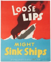
For example, “An American World War II poster by Seymour R. Goff, with the phrase ‘Loose Lips Might Sink Ships’”.
For visuals that convey complex ideas or includes a lot of information or insights, such as diagrams, graphs, or maps, describe only the necessary information that you want your audience to pick up from the visual.
Bar Graphs
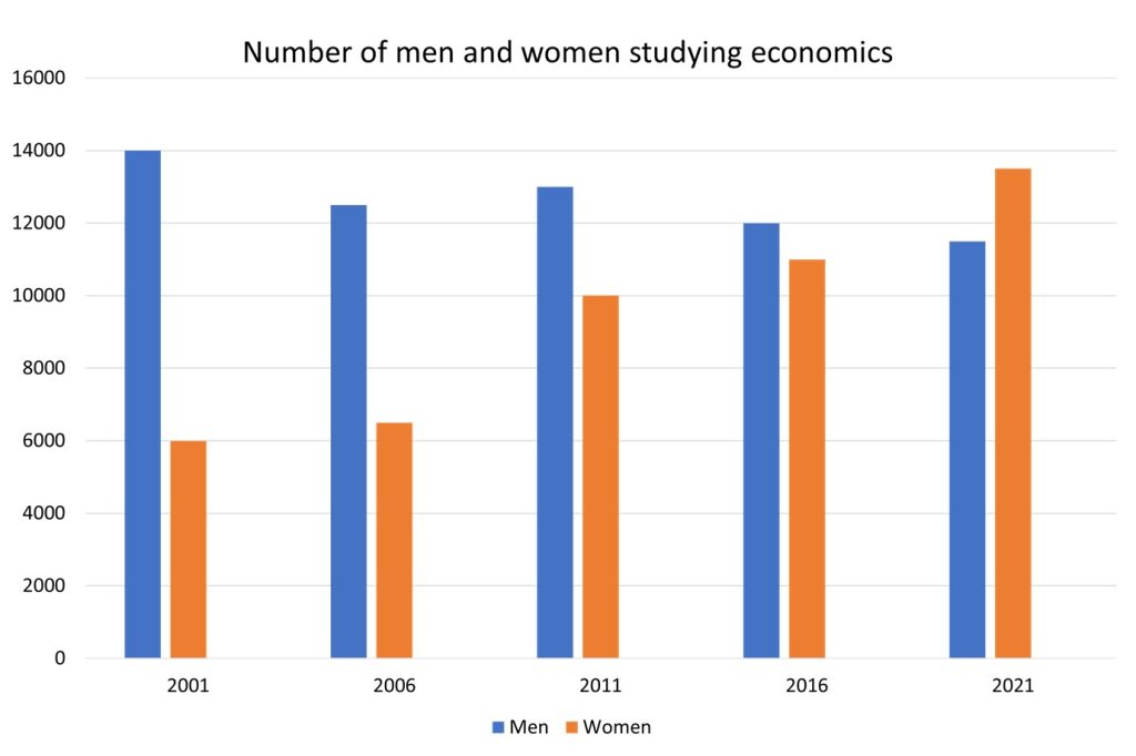
For example, “This bar chart illustrates the number of men and women studying economics at Canadian universities between 2001 and 2021 at 5-year intervals. It shows an upward trend in the number of female economic students while the number of male students seems to have levelled off.”
A simple alt text like “Bar chart showing number of women and men studying economics” would not suffice. It fails to provide a detailed description of the data represented in the graph.
If you are sharing a video that does not have audio, narrate what is happening. If essential visual information is not described in a video you are sharing, provide a description of the visual information so the audience can understand the content being shared.
Pie Charts
Now, let’s consider a pie chart showing the distribution of student majors in a college.
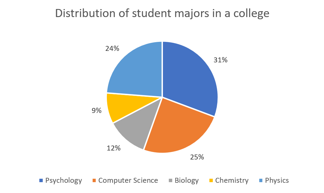
Here’s a possible correct description:
`The pie chart, titled ‘’Distribution of student majors in college”, is divided into five sections. The largest section, representing 31% of the pie, is labeled ‘Psychology. The next largest section is ‘Computer Science’, which makes up 25% of the pie. The rest of the sections are ‘Physics’, ‘Biology’ and ‘Chemistry’ make up 24%, 12% and 9% respectively.`
These descriptions provide a detailed, text-based representation of the data in the visuals. They allow individuals using screen readers to access the same information as those who can see the graph or chart.
Here’s a possible incorrect Description:
“A pie chart with five sections.”
Again, this description is incorrect because it doesn’t provide any information about what each section represents or their proportions. It doesn’t allow the user to understand the data conveyed by the chart.
Read all displayed text aloud
All of the information that is on each slide—including titles and instructions—should be read aloud. You do not have to read each text word-for-word unless it is a quotation, but you should give at least as much detail verbally as is provided visually.
Describe other visual information
It is important to be mindful of other information channels you might be using that rely on visuals. For instance, interactive content such as polls or quizzes often rely on audience members being able to see results. For example, if you poll audience members—by asking them to raise hands or asking them to participate in an online poll, the results may not be obvious for anyone with a vision or cognitive disability, as well as anyone who may be joining only virtually by phone, or with no video for any reason. If you are using these components, describe the results as they come in so audience members can equally participate.
Use simple and inclusive language
- Use simple and inclusive language in your descriptions.
- Define specialty terms and avoid or explain jargon, acronyms, and idioms.
- Speak clearly and avoid speaking too fast.
- Try to keep descriptions succinct and to the point
References
Some parts of this article were remixed from the article Describing Visuals by Niagara College licensed under CC BY 4.0 International.
