12 Figures
Overview
As we saw in the flow chart introducing this part, figures (charts, diagrams, illustrations, plots) are shown to represent many forms of data and its trends, including relationships between different variables. This chapter will describe different types of figures and also cautionary examples of misrepresenting data.
Sections in this chapter
- Essential Parts of a Figure
- Diagrams, Photos, Animations, and Flow Charts
- Bar Graphs, Pie Charts, and Histograms
- Box Plots
- Scatter Plots and Line Plots
- Sankey Charts
- Spectra
Essential Parts of a Figure
There are several things that almost every figure should contain (Figure 12.1):
- A title
- Labelled axes with units if applicable
- Appropriate axes scales
- Appropriate precision
- A legend (separate or integrated)
- A caption
If you are missing any of the above, your figure at best will be confusing, and at worst will mislead the reader and misrepresent your data.
Below are some common mistakes in graphic design. Many of these will be addressed below or in the chapter on Accessible and Ethical Design.
- The wrong type of figure for the data
- Axis scaled inappropriately (e.g., 0-10 when max. value was 6)
- Labels and text are too small
- Colours are too light for printing
- Colours are difficult to distinguish in greyscale
- Colours are difficult to distinguish for colour-blind persons
- Axis label is missing units
- Axes numbers have the wrong precision; too much (10.000, 11.000, 12.000) or too little
Diagrams, Photos, Animations, and Flow Charts
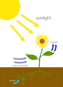
These are figures that don’t necessarily contain data but convey important information about an instrument, procedure, or process. These types of figures (Figures 12.2, 12.3) are useful in the Introduction to explain an abstract concept, or in the Methods section to show how something works.


Bar Graphs, Pie Charts, and Histograms
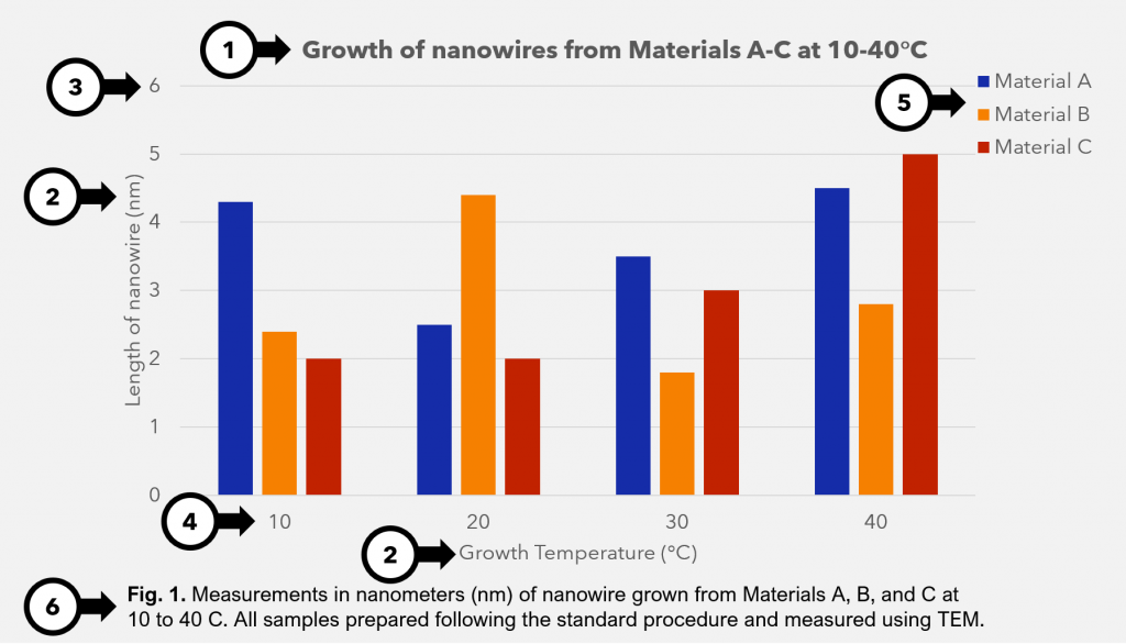
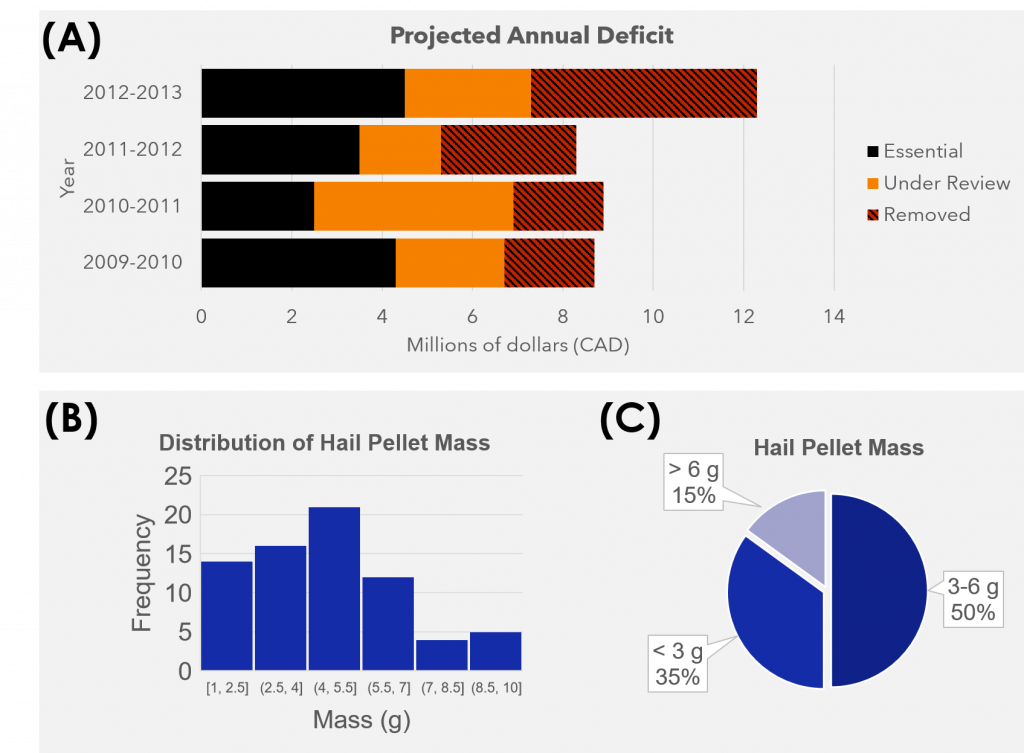
These three types of graphs all show amounts, either frequencies across groups (Bar Graph) or relative to a whole (Pie Chart or Histogram). Bar charts are a clear way of presenting a trend in data. In a vertical bar chart (more common), the measured variable is on the Y-axis while the categorical variable is on the X-axis. Bar charts can be clustered like in Figure 12.1 or stacked like in Figure 12.4A to show different subsets of data.
Histograms show the frequencies (Y-axis) of an occurrence within the data of data split into bins. In Example Figure 12.4B, the data contains a list of hail pellet masses in grams, and the data plots the frequency that the hail pellet was ranged from 1-2.5 g, 2.5-4 g, etc. The selection of bin size can change how the data looks and should be carefully considered. The Pie Chart in Figure 12.4C shows the same data in a different way, but the designer chose to focus on the idea that most hail pellets are 3-6 grams in mass.
Bar charts should be used to depict amounts or frequencies, but not means. If you are trying to depict means of your data (i.e. multiple measurements averaged within separate categories), it’s better to use a Box Plot or another type of graph that shows the distribution of data.
Box Plots
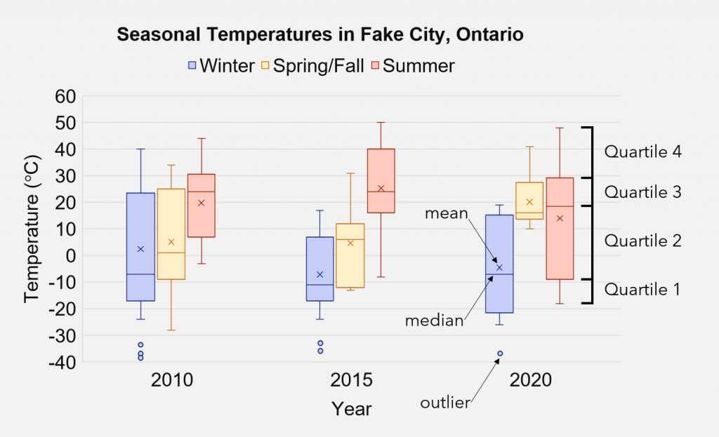
Box plots (also called Box and Whisker Plots) and related graphs (Stem and Leaf, Violin) effectively show the distribution of data within categories (Figure 12.5). They contain information about the spread of the data; it’s quartiles, the median, the mean, and outliers.
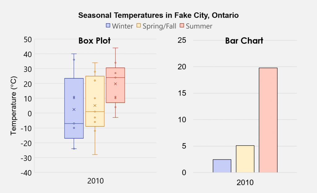
Box Plot vs. Bar Chart
Look at the figure below (Figure 12.6) to see the differences between a Box Plot and Bar Chart when showing a collection of data, and it’s mean. The Box Plot contains much more information than the Bar Chart, in the same amount of space.
Scatter Plots and Line Plots
Scatter plots are correlations of two variables plotted as X and Y coordinates (Figure 12.7). Data is usually plotted in this way when we are interested in knowing if there is a relationship between the changes in the two variables. In most cases, there is an independent variable (plotted on the X-axis) and a dependent variable (plotted on the Y-axis).
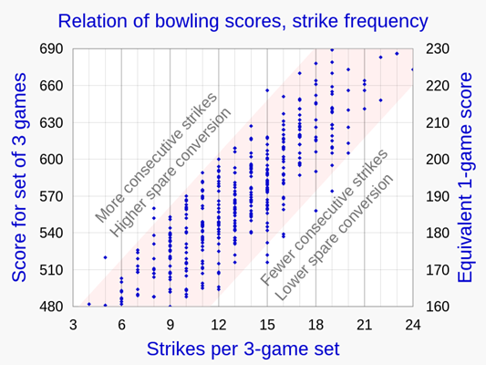

A regression line or curve indicates a statistically valid relationship between the two variables, and the regression equation with the statistical parameters are given. Scatter Plots are often misused in this way to imply causation between the two variables (see below).
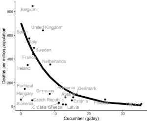
Correlation vs Causation and Misrepresenting Data
This example of shoddy data analysis was posted by Markus Eichhorn (@markus_eichhorn): [1]
“Cucumber consumption has a negative association with COVID deaths. But stay off the lettuce. Yes, it’s another shoddy COVID preprint!”
Scatter plots can have a connecting line between the data points (rather than a regression line). This line can only be added if each point in the series of related values is from the same source and is dependent on the previous values. DO NOT connect the dots when the measurements are made independently!
Line Plots are similar to scatter plots, but the data on the X-axis can be ordinal rather than continuous. In the example in Figure 12.9, the X-axis of both plots is time. For the Scatter Plot, the time is in minutes and is a continuous scalar variable. In contrast, in the Line Plot the variable is the month, which can is ordinal (has a proper order) but the amount of time within and between each month can vary slightly.
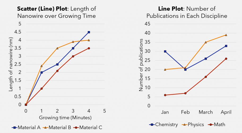
The use of different symbols and different line types (solid, dash, dots) for each data set helps the reader in distinguishing between the different sets. Line plots can also be made that don’t show individual data points with markers. These graphs are useful for showing trends, particularly when the independent variable is time.
Sankey Charts
Sankey Charts are like diagrams mixed with flow charts and are sometimes called Sankey Diagrams. These types of figures can very effectively show large amounts of data with several variables (see the UK Energy Flowchart below). They are best for showing how something changes over time or throughout a process.
Charts can effectively show large amounts of data.
The annual UK energy flow chart, in the format of a Sankey diagram, shows a lot of data including amounts of energy (as equivalents of the mass of oil), relative amounts, how it is generated, supply versus consumption, import versus export… Can you imagine trying to see all this information in a black-and-white table?
https://www.gov.uk/government/collections/energy-flow-charts
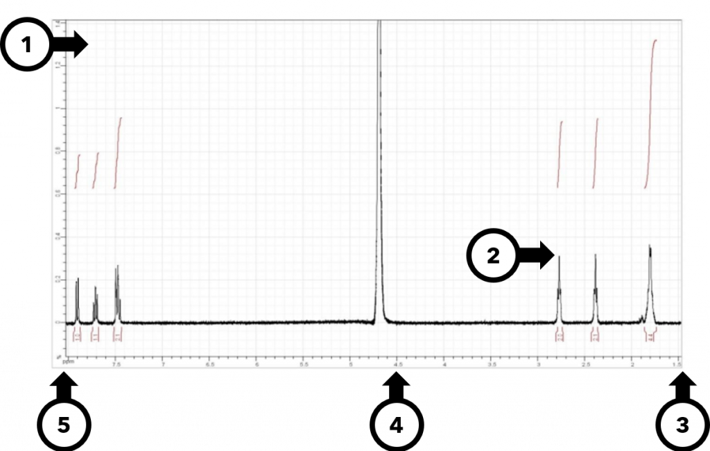
Spectra
Chemical spectra are also sometimes presented as figures within scientific communications. With spectra, it is important to make sure that the resolution is sufficient when the figure is reduced to the size it will appear in the printed paper. This is particularly true of axis labels. In the spectrum, label the protons (as they are characterized in your experimental), and ensure that your X-axis is clear with units indicated (Figure 12.10).
- Susana C Fonseca, Ioar Rivas, Dora Romaguera, Marcos Quijal-Zamorano, Wienczyslawa Czarlewski, Alain Vidal, Joao A Fonseca, Joan Ballester, Josep M Anto, Xavier Basagana, Luis M Cunha, Jean Bousquet. Association between consumption of vegetables and COVID-19 mortality at a country level in Europe. DOI: https://doi.org/10.1101/2020.07.17.20155846 (accessed 2022-09-18).
